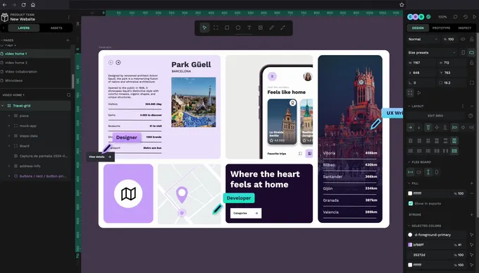
Penpot 2.0 release is out now!
Find out more
Penpot

CSS Grid & Flex Layout: best of both worlds

CSS Grid Layout and Flex Layout are Penpot’s ground-breaking responsive layout features that make Design and Code easier and faster.

Try our Flex Layout template

Play around and learn more about the perks of this magical feature!
Download playground template
Penpot's official launch
Don't know how to use templates in Penpot? Learn more

Better and faster collaboration between designers and developers

Flex Layout is a powerful collaborative feature in Penpot that allows designers to create their designs in a layout and it automatically shows as it is on the web page thanks to dynamic CSS flexbox web standards.

Let's walk through it

Whether you’re new to Flex Layout or not, there are quite a few functionalities that make Penpot Flex Layout unique. Check them out here!
Are you familiar with Penpot at all? Penpot is the first open-source design & prototyping tool that allows true collaboration between designers and developers. Explore the Penpot site to discover more.
How to use Flex layout? First steps...

Key features of Penpot Flex Layout

Absolute position

Sometimes you need to freely position an element in a specific place regardless of the size of the layout where it belongs. Now you can exclude elements from the Flex Layout flow using absolute position.

Smart spacing

Managing Flex Layout spacing is even more intuitive now! Visualize paddings, margins and gaps and drag to resize them. Even better! When creating Flex Layouts, the spacing is predicted by Penpot, speeding-up your design composition.

Z-index management

With the new z-index option you can decide the order of overlapping elements while keeping the layers' order. This is yet another capability that brings the power of CSS standards to your Penpot designs!

It’s a wrap!

This property is a useful tool for creating dynamic and adaptable layouts that can adjust, for example, to different screen sizes and device orientations. This feature determines whether flex items should wrap onto multiple lines or not if they exceed the available space within the container.

CSS Grid Layout. You didn't expect this!

A new exclusive CSS functionality is now available with Penpot 2.0 release. While developers naturally adapt to the CSS open-standards of Grid Layout, designers bridge the gap between their ideas and the final web output.