AI
Penpot AI workflows explained
What AI workflows are, how Penpot MCP connects your files to agents, and when they’re worth using on real product work.
Beginners
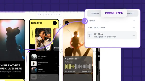
Learn what prototyping is, why it matters, and how to get started. From low-fidelity sketches to interactive flows, this guide covers everything you need to build better products before a single line of code is written.
Tools
Turn design updates into automated workflows. Learn how to connect Penpot with GitHub Actions, GitLab CI/CD, Slack, and custom scripts using APIs, access tokens, and webhooks.
Tools
Discover 8 advanced Penpot features that help product teams reduce design-to-development friction, create more efficient workflows, and maintain consistency at scale.

Compare Penpot and Figma on the criteria enterprise teams care about most: data sovereignty, pricing predictability, developer integration, and long-term scalability.

Once you've decided to bring Penpot into your own infrastructure, the next step is making sure your instance runs smoothly, stays secure, and scales with your team. Learn how to self-host Penpot in your infrastructure.
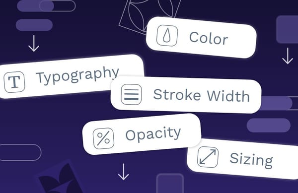
Design tokens bring together design and development teams with a single, unified language for expressing color, fonts, sizing, and more.
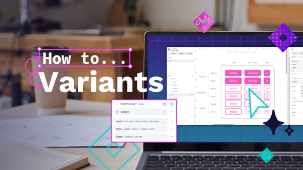
Component variants are a way to create different variations of a component. Does your component need different sizes? Colors? Levels of elevation? Variants make it easy to define these properties, and choose between them when you’re using a component in your designs.
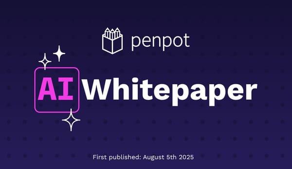
This piece explains some of Penpot's relevant findings around AI and UI Design, what we’re building (and why) and what you should expect from us in the future.
Design tokens create a single source of truth for design decisions, making your design system more maintainable, scalable, and consistent.
Learn about Design and Code: our insights on collaboration and more.
The fastest and simplest way to get started with Penpot and AI workflows from scratch. Learn how to get started with Penpot and Cursor, a code editor with an integrated AI client.
One of the fastest ways to set up Penpot for AI workflows in just 6 steps, no coding required, and only using free, open, and/or low-cost tools.
Penpot design tokens support both basic calculations and complex math functions. Let’s explore how you can use both to level up your design systems.
The following “token-aware” approach treats prompts like structured contracts instead of a wish-list or diary, so you get better outputs in fewer iterations (and with fewer prompt credits).
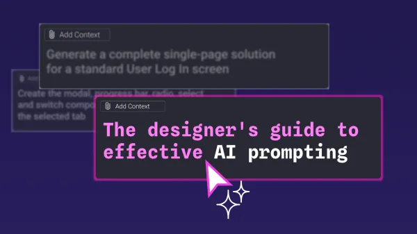
Learn how to write structured, token‑aware AI prompts in Penpot so you get cleaner design systems, fewer hallucinations, and faster, production‑ready outputs.
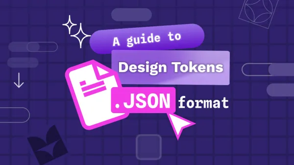
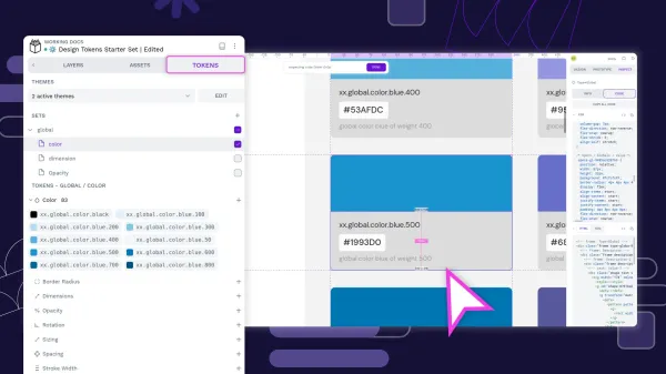
Learn about the design tokens JSON file format and how Penpot works with it.

Why are design platforms overlooked in cloud repatriation plans? Discover 5 reasons enterprises self-host design tools for security, compliance, and cost control.
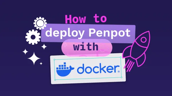
Step-by-step guide to deploying Penpot with Docker. Covers installation, configuration, version management, backups, HTTPS setup, and authentication for self-hosted instances.

Design tokens eliminate inconsistency and speed up designer-developer collaboration. Explore 6 benefits that make them essential for enterprise design systems.
Compare Penpot and Figma on the criteria enterprise teams care about most: data sovereignty, pricing predictability, developer integration, and long-term scalability.

In this guide, we’ll explore six of the best Adobe XD alternatives, following its sunset in June 2023, highlighting their features, pros and cons, and which tools may serve as the best long-term replacement for your team.

Penpot bridges the design-development gap by eliminating the translation layer that creates friction in traditional workflows.