The designer's guide to effective AI prompting
Learn how to write structured, token‑aware AI prompts in Penpot so you get cleaner design systems, fewer hallucinations, and faster, production‑ready outputs.
Learn how to write structured, token‑aware AI prompts in Penpot so you get cleaner design systems, fewer hallucinations, and faster, production‑ready outputs.
Learn about the design tokens JSON file format and how Penpot works with it.
Why are design platforms overlooked in cloud repatriation plans? Discover 5 reasons enterprises self-host design tools for security, compliance, and cost control.
Step-by-step guide to deploying Penpot with Docker. Covers installation, configuration, version management, backups, HTTPS setup, and authentication for self-hosted instances.

Design tokens eliminate inconsistency and speed up designer-developer collaboration. Explore 6 benefits that make them essential for enterprise design systems.

Compare Penpot and Figma on the criteria enterprise teams care about most: data sovereignty, pricing predictability, developer integration, and long-term scalability.

In this guide, we’ll explore six of the best Adobe XD alternatives, following its sunset in June 2023, highlighting their features, pros and cons, and which tools may serve as the best long-term replacement for your team.

Penpot bridges the design-development gap by eliminating the translation layer that creates friction in traditional workflows.
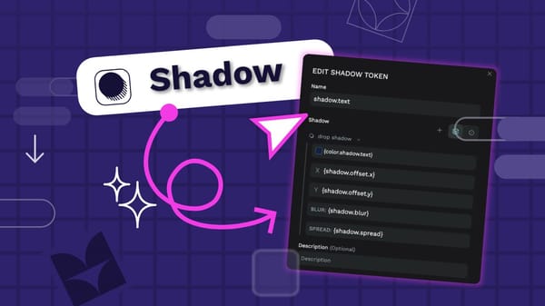
Using shadows carefully and consistently in your UI design can make it feel polished. Shadow design tokens help you implement the consistency and quickly update your shadows across your design system.
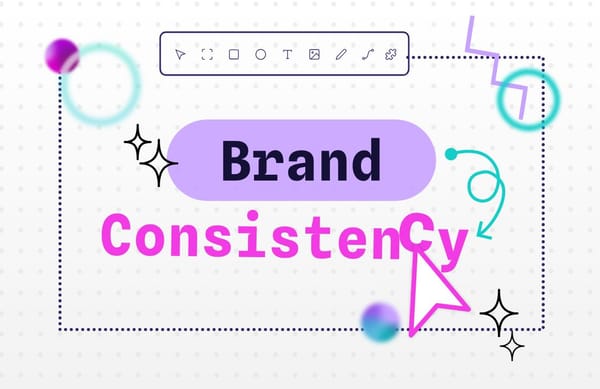
Brand consistency is the disciplined, repeatable presentation of one identity-visual, verbal, and experiential-whenever and wherever audiences encounter you

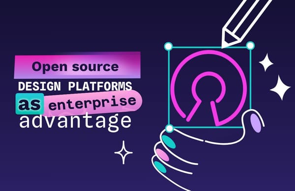
Penpot gives enterprise teams something most SaaS design tools simply cannot offer: full control over a design platformplatform, without sacrificing collaboration, performance, or product velocity. But how?
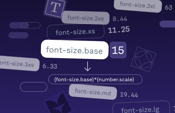
A proportional typographic scale is a hierarchy for font sizes that uses a consistent mathematical ratio. Design tokens are ideal for creating these scales.
Tutorial
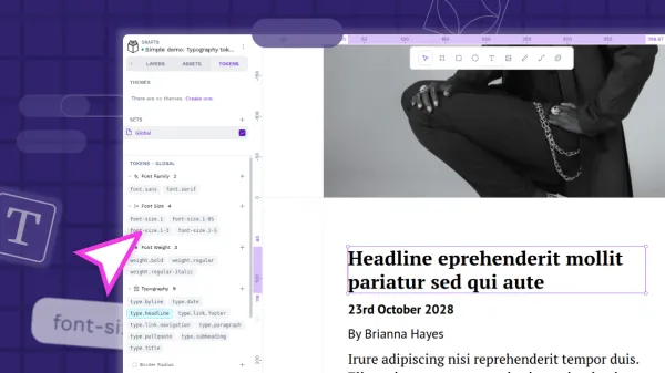
Typography design tokens are a way to save your text styles for reuse across your projects. The typography composite token combines multiple typography-related properties in one mega token.
Design
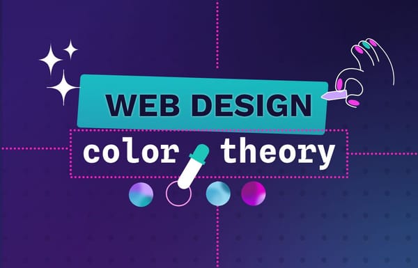
Colors bring a webpage to life, and some of our most engaging digital experiences wouldn’t work without a good use of color theory. What different colors go together? Are the basics of color theory enough?
Open Source
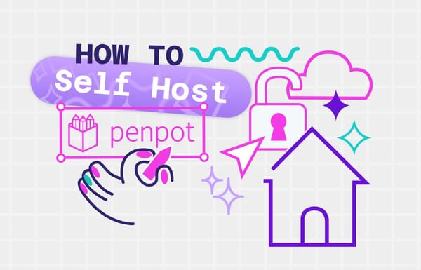
Once you've decided to bring Penpot into your own infrastructure, the next step is making sure your instance runs smoothly, stays secure, and scales with your team. Learn how to self-host Penpot in your infrastructure.
Beginners
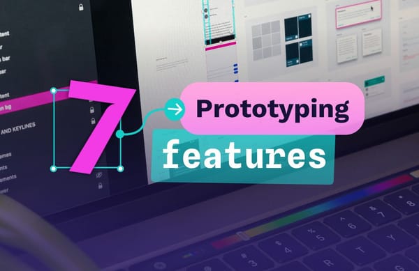
Prototypes are essential in any major build, but their role has evolved. Today they go beyond visual mockups, helping teams catch issues early, test connections, validate assumptions with real data, and keep designers, developers, and stakeholders aligned.
Tutorial
Color design tokens and asset colors are both ways you can store colors in Penpot for reuse. There are some key differences that might affect which you choose to use in your project.
Design
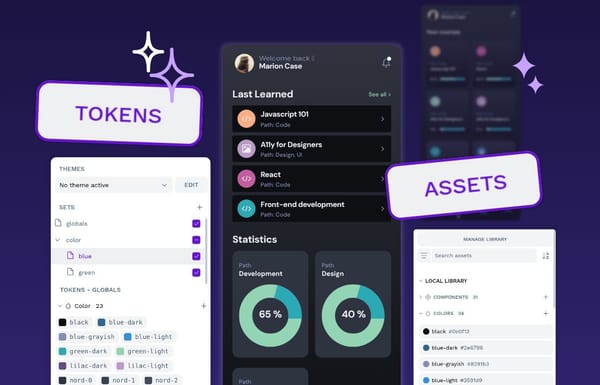
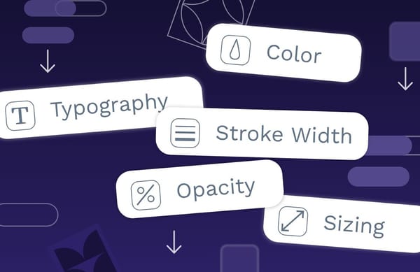
Design tokens bring together design and development teams with a single, unified language for expressing color, fonts, sizing, and more.
Open Source
Whether it’s scaling across hundreds of designers or self-hosting and customizing an instance to meet strict requirements, open-source software gives enterprises the control they need to succeed - and one of the biggest advantages is flexibility.
Code
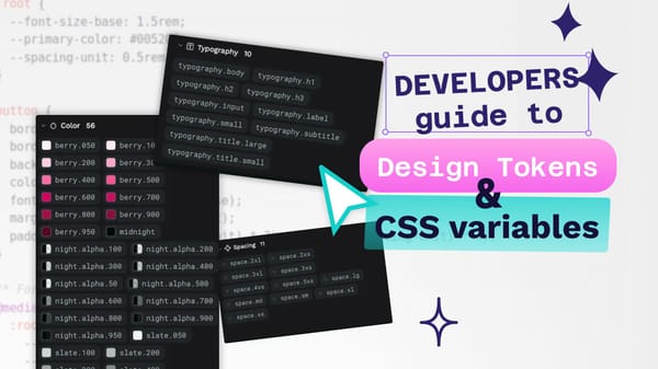
Design tokens are a platform-agnostic representation of your design decisions, while CSS variables provide a way to implement these decisions in the browser.
Design
This article explores how you can use component variants to simplify, scale, and future-proof your design system, helping you design more efficiently as your projects grow.
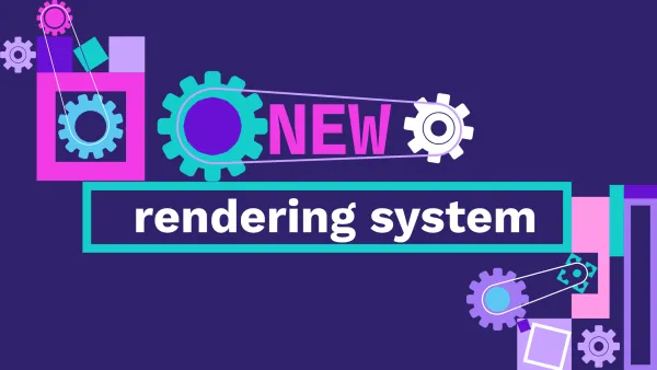
Penpot
One of the hardest challenges in building a design tool like Penpot is rendering performance. As designs grow in complexity, ensuring smooth performance becomes increasingly difficult.
Code
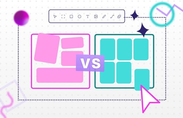
Understanding what is Grid vs. Flexbox and how to use them can help you build cleaner layouts, write less code, and avoid frustrating design issues down the line.
Beginners
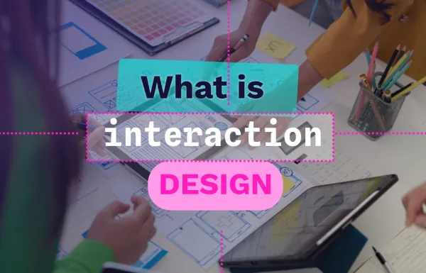
In this article, we'll break down what makes interaction design different from other types of design, go over its key ideas, and share the tools and steps designers use to create great digital interactions.