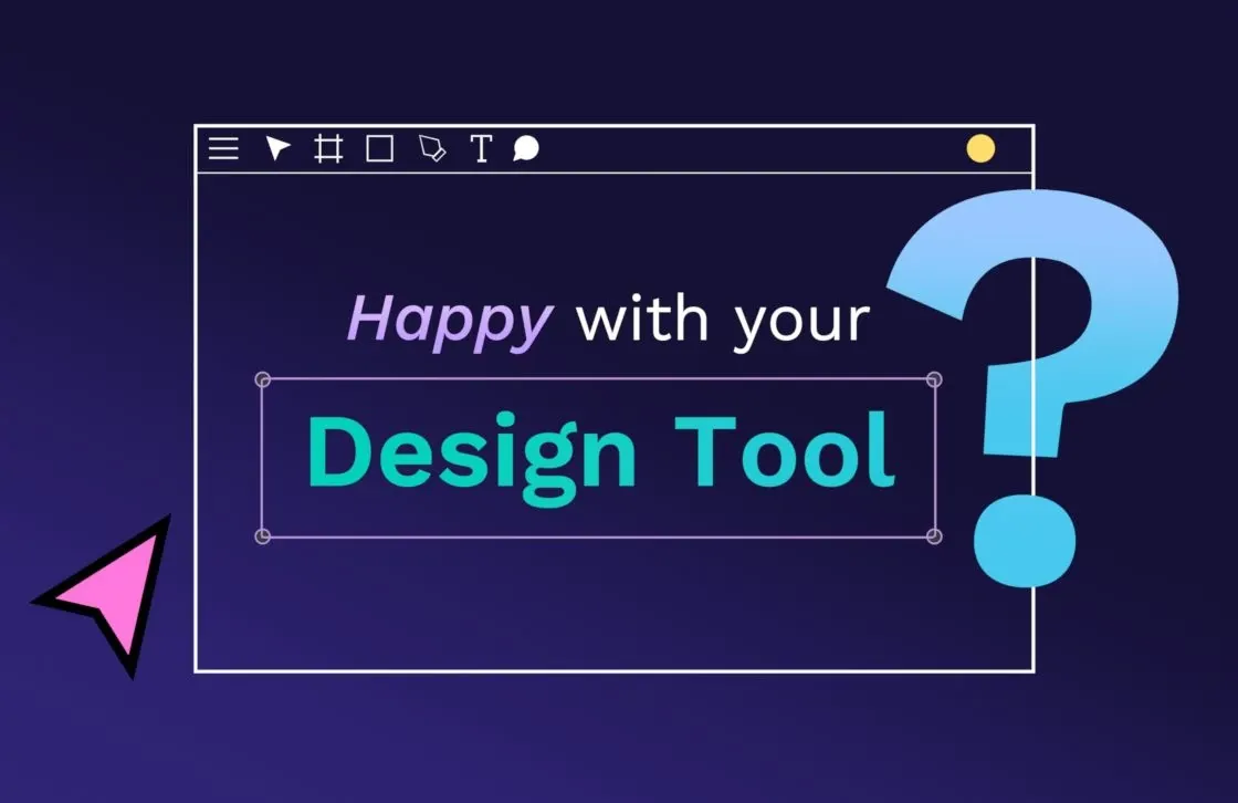
5 reasons why CSS Grid Layout is key for designers

CSS grid layouts aren't new, but they're still incredibly powerful and allow you to do some truly amazing things with your web design. It's perfect for designers who want to form better working partnerships with the developers since it’s made for both professional roles to use and adapt easily.
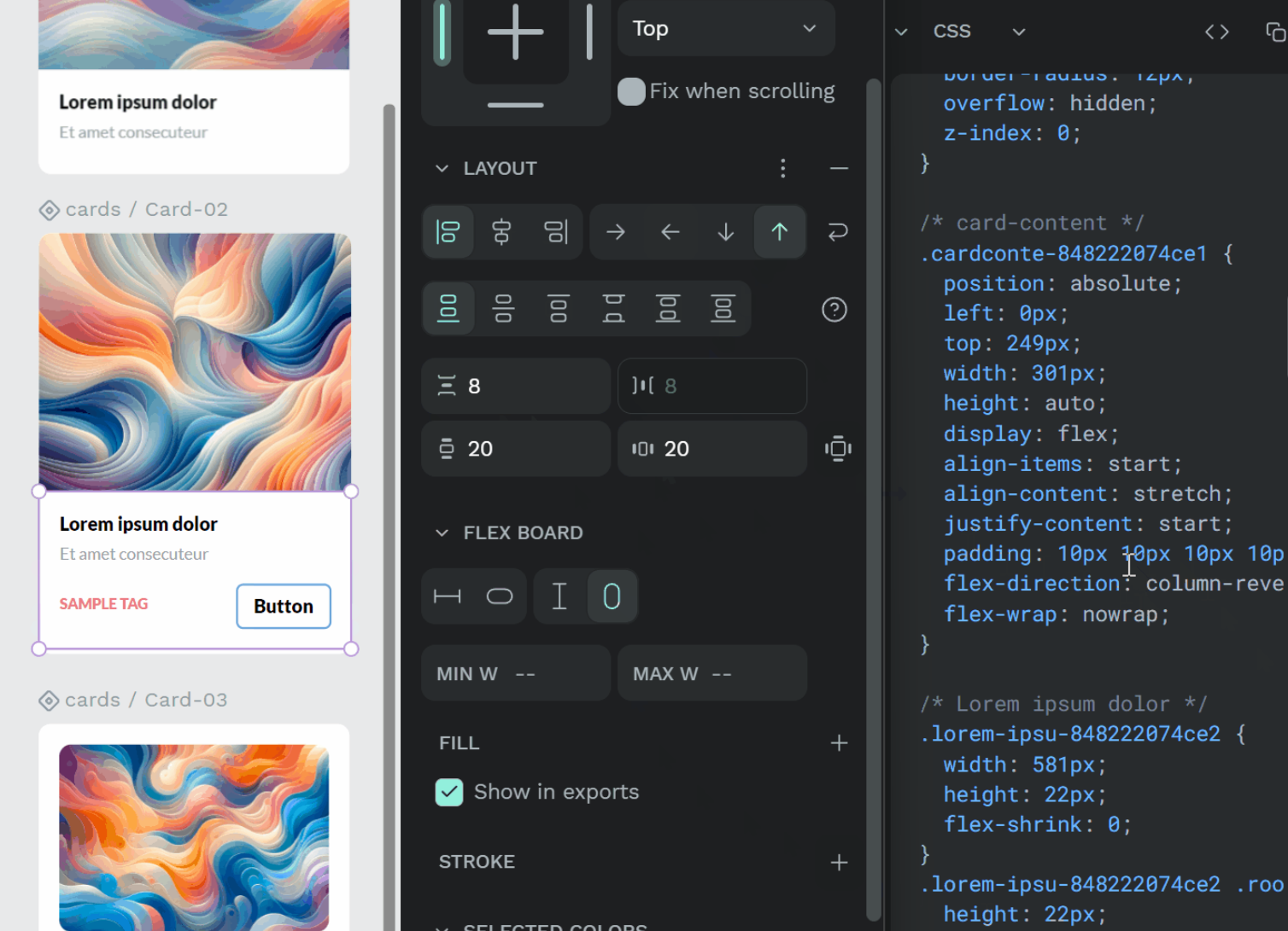
CSS Grid takes the grid layout to the next level. Not only can designers break up their pages into smaller sections, but they can customize each element's size so it fits exactly where they want it. Now, designers can position items relative to one another without wasting time designing the spaces between each one.
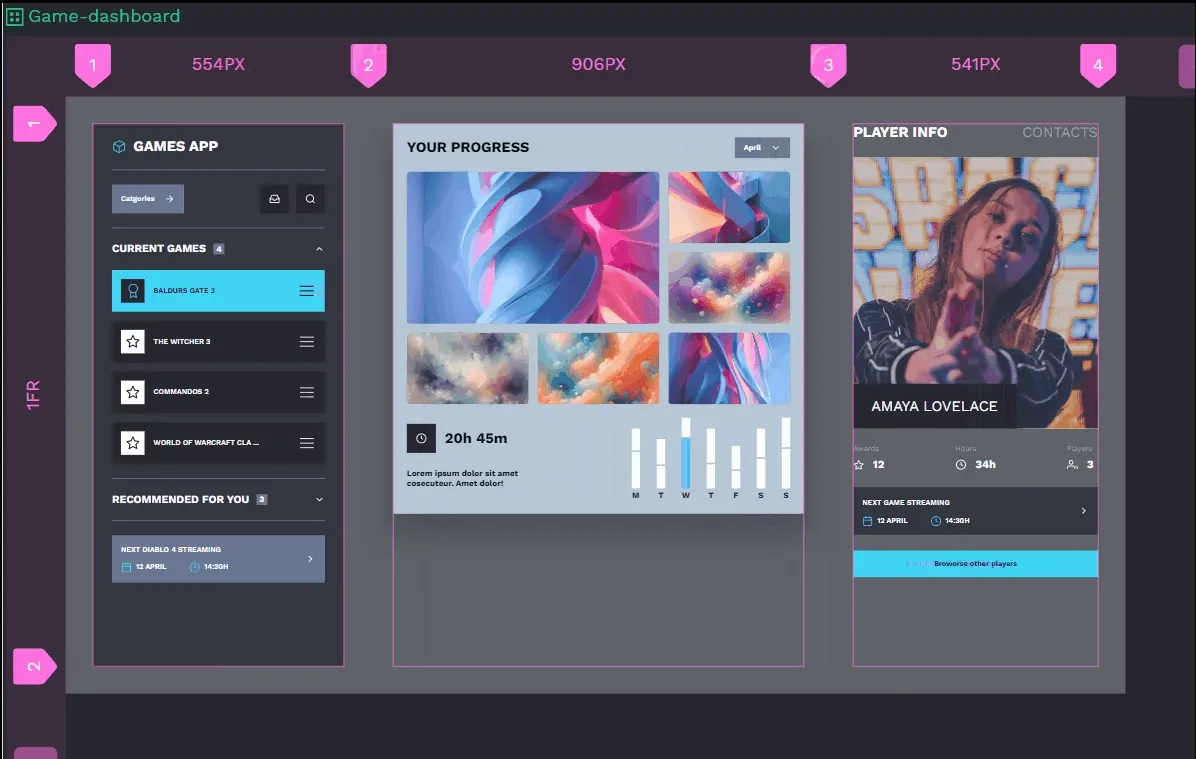
Penpot’s Grid Layout feature embraces the possibilities that CSS grid systems provide. This ground-breaking approach to design makes it easy to align and distribute items inside a container with just the right amount of control.
Introduction video of CSS Grid Layout new feature
1. Improves efficiency
If you’ve never used a CSS grid layout, it can seem very different compared to other tools. However, the learning curve is worth it.
First, you have the flexibility to create things just the way you want without needing help from other departments. You can adjust the position of an item within the grid, for example, knowing it will be in the exact same place in the final product. You don't have to ask developers to manually change the HTML markup with every new thing you try.
Ideal for complex designs where elements need to be aligned in both vertical and horizontal dimensions.
From a developer standpoint, CSS grid users enjoy the use of the “fr unit" and the repeat () function, which act like shortcuts to reduce the overall code needed to perform frequent tasks. This saves many hours of time and a lot of unnecessary frustration when making multiple websites with similar elements. It’s simple enough for some designers to master, too.
2. Encourages experimentation
Traditional HTML design systems don’t always provide the best ROI for the work involved. They actually discourage teams from trying new things and thinking big — especially in the final stages of development when you pretty much have everything set. A CSS grid layout allows you to make changes without a large commitment of resources, allowing you to experiment whenever you want to test something new.
Have you ever wondered what a site could look like with only a few changes? Have you then gone on to ignore that thought because it was just too much work to have the developers change the HTML?
Create forms to align components easily and make your designs adapt responsively to any device.
If you do get the brilliant thought of moving UI elements a bit to the left or changing the entire order of a stacked design, what can you do? With CSS grid layout, you can simply move things around to look their best without creating extra work for already stressed teams. For creatives who want their site to look just right, CSS grid layouts will help you cross that finish line.
3. Enhances responsiveness
With an ever-increasing number of operating systems, browsers, and devices, getting the perfect look for all users can be a challenge. What’s wonderful on a 12” tablet screen may look ridiculous on a desktop layout.
CSS grid layouts take some of that uncertainty away, offering a better look at your final creation. Penpot’s design layouts feature, for example, offers over 30 different screen size presets, so you can ensure your design works on everything from an Apple watch to a Google phone.
CSS grid layout isn’t just responsive for the screen. It’s also responsive for each element.
When creating an element that’s just a bit too big for its cell, the cell will automatically resize to accommodate. There’s no need to go into the code and manually adjust up and down until everything fits. Designers can create elements without fear that adding another word or two will throw the entire webpage out of alignment.
4. Brings designers and developers together
The design and development teams must work closely to produce the perfect product. Making communication between the two departments as easy as possible helps develop that much-needed rapport. When the two departments are in sync, things are less likely to be misunderstood and easier to fix if they are.
When everyone understands each other, the final product turns out exactly like what everyone envisions, not just what one team does. There's one thing that can always be improved: the workflow between design teams and development teams.
That's where the CSS grid layout comes in. Not only is it intuitive enough for designers to work in directly — even with little to no code experience — but it also reduces unnecessary development iterations. Designers can create with no limits and require less of the development teams.
It’s even more beneficial for teams that work within a design system. With pre-approved colors, fonts, and logos (and their accompanying code snippets), CSS grid designs have a better chance of passing through the prototype stage easily. Everyone can do their best work with confidence in a faithful final translation into code.
Penpot’s comments and history tools help you see who did what and when. You can skip emails and Slack threads and communicate directly in Penpot’s tools instead.
5. Creates less work for developers
Penpot’s CSS Grid Layout offers a better way of working since it results in less overall code and smaller files. It creates some of the same results through a cleaner, more simplified HTML markup. While this may not seem like a big deal for a designer, it’s a consideration to take into account for those who deal in technical details (like developers). For developer teams with a goal to reduce code bloat, this can be a game changer.
Also, CSS grid layout is supported by all major browsers. So, if you create something in the layout specifically for Firefox, it will appear exactly the same in Edge.
What about sites whose audience prefers more experimental browser types? CSS grid layout has wide support from the coding and debugging community, making it the ideal choice. If a bug pops up from a relatively unknown browser, the developers can quickly find a solution within the community and implement it immediately. This allows designers to create with confidence, knowing their projects will render correctly on every device.
When to use CSS Grid
The CSS grid layout works well in almost any project. Its emphasis on open communication makes it ideal for cross-collaborative teams where design and development work hand-in-hand.
The technology is incredibly useful in initial design, wireframing, and prototyping. Using a feature like Penpot’s CSS Grid Layout right from the start means you won't need to first create your sketch, then copy the good parts over to the prototype, and finally drop the final version into a CSS tool. Instead, you can do it all in Penpot, so your best work can be site-ready with fewer steps.
What if you don't need a CSS tool right away? Grid Layout works even in bits and pieces. You don’t have to use the CSS Grid Layout for every piece of your project. You can still use other Penpot features to enable collaboration, live previews, and comment histories.
Use it for what you feel comfortable with, even if this means enhancing an old design by overwriting with newer CSS grid elements.
Designers and developers creating any type of project with blocks, columns, and rows are best served by this new way of working. It eliminates so many of the manual code adjustments that legacy HTML systems relied on and comes with handy nesting features to keep site designs better organized.
For best results, use Grid Layout in adherence to a style guide or design system and avoid even more back-and-forth between teams.
Your next steps for CSS Grid Layout success
You may be wondering how to jump right in. With Penpot’s CSS Grid Layout functionality, it’s a pretty simple process. Even if you’re not familiar with code, you can begin creating designs that your developer teams can collaborate on and help take to the next level.
Which of your web projects could benefit from Penpot’s CSS Grid Layout? Sign up for a free account and begin your next design today.
Related Blogs
Check out our other blogs from informative topic guides to tutorials on how to get the most of Penpot.
 Laura Kalbag
 Laura Kalbag
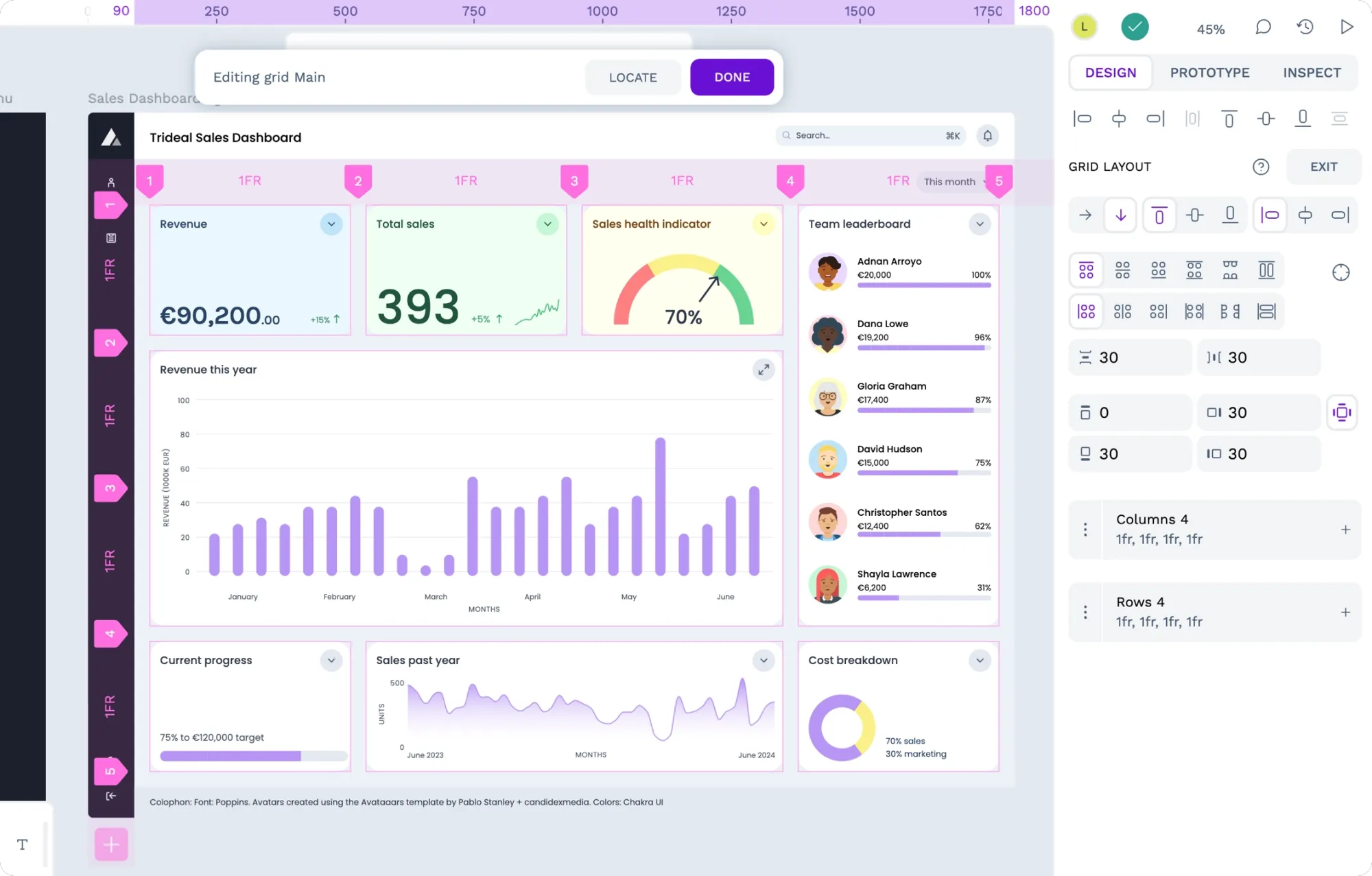 Laura Kalbag
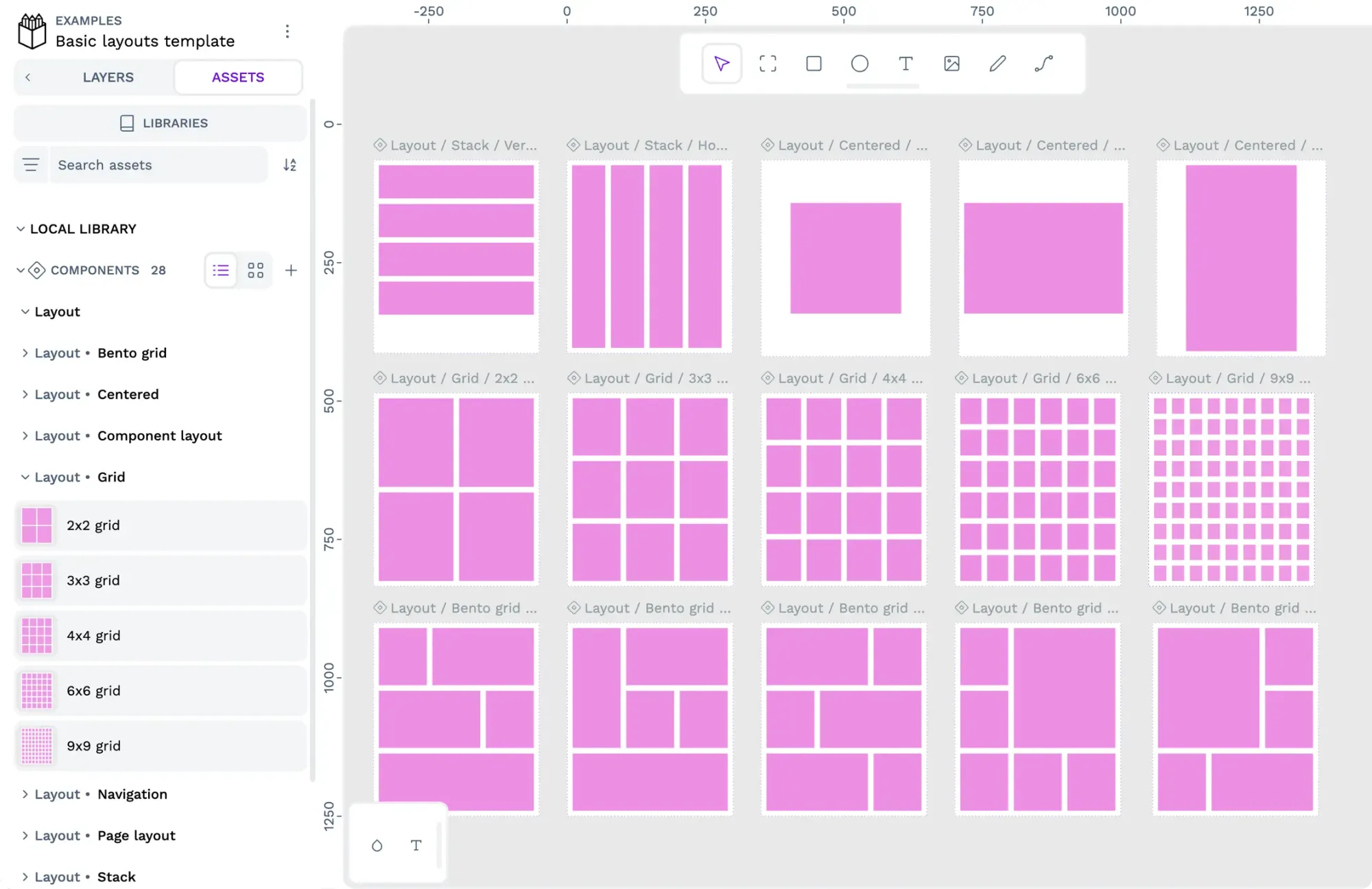 Paula Tienza