20 UI elements every designer needs in their toolkit

UI design elements are the pieces that create an engaging website or app experience. Users can’t interact with a site to achieve their goals without them. From clicking links to submitting forms, each user action depends on fully functional and intuitive design elements to get the job done.
However, UI design elements go beyond the typical button, with some of the top UI elements more imaginative and complex than the popular elements of the past.
Get to know the common UI design element categories and the options available for your next project.
Navigational UI design elements
Users need well-placed and easy-to-access navigational tools to get from one part of a site to the next. The UI design elements most associated with this function include the following:
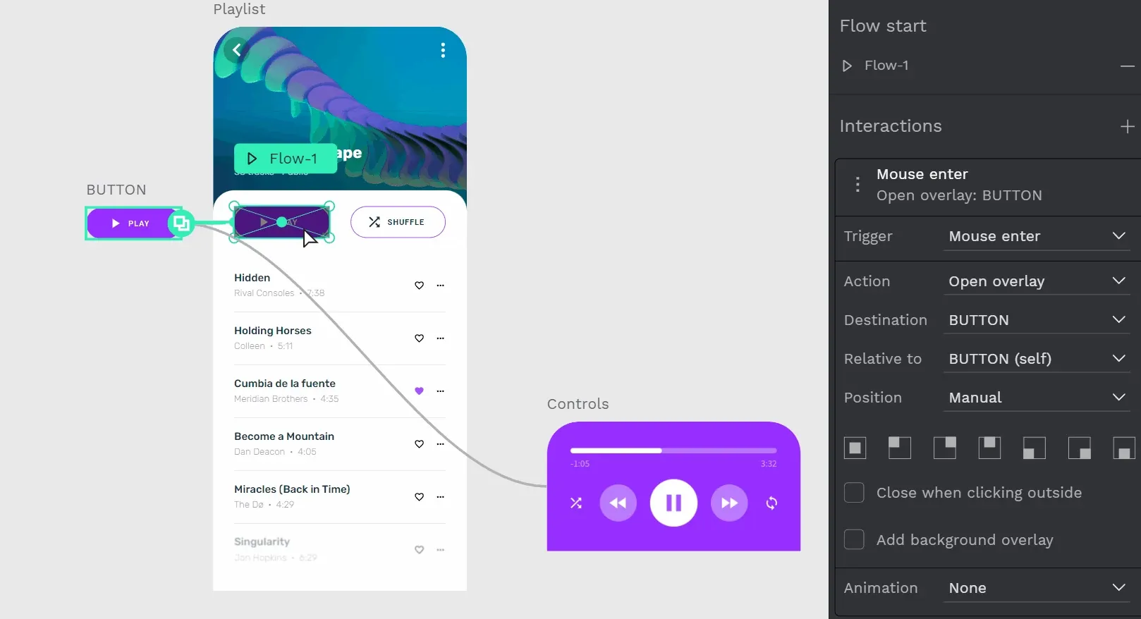
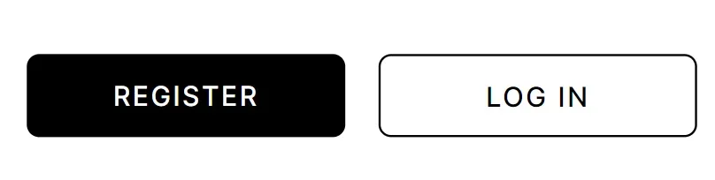
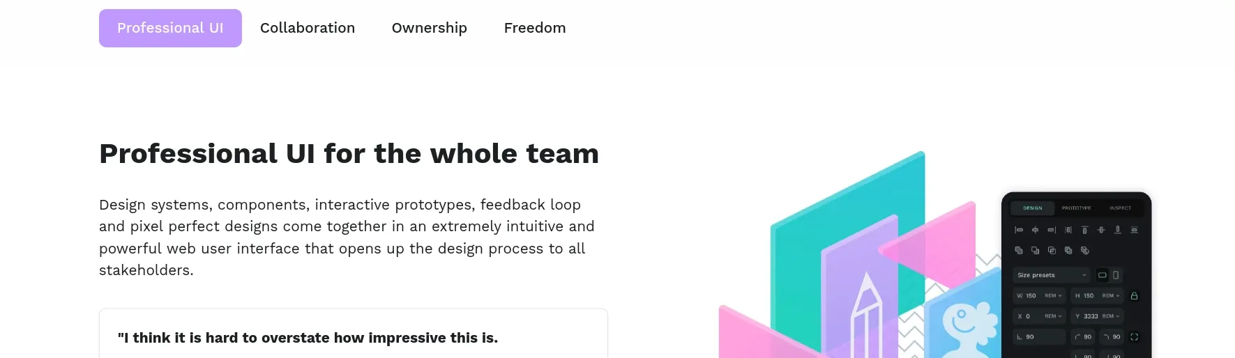
1.Buttons
Users click a button to take an action on a website or within an app, most often to go somewhere else. Buttons can also be used to submit information, save changes, open a new tab or menu, or cancel a previous action. Buttons may not always be button-like and can appear as text or icons.
Check Renan's mini video tutorial, a member of our Penpot Community, to learn more about how to make a button on Penpot.
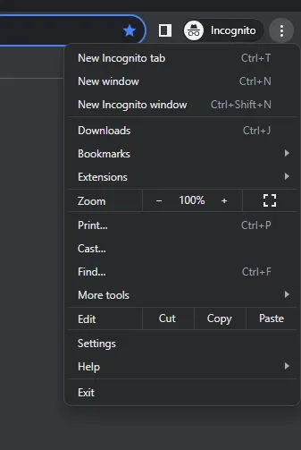
2.Menus
Just like when used at a restaurant, web menus give users choices of where to go next in an online environment. Menu items may include the home page, a product category, an FAQ page, or a link to a contact form for additional information.
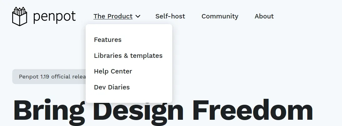
Menus come in different forms. Popular menus used today include:
- Bento: Named after the Japanese lunchbox with small partitions for different foods, it allows designers to show multiple items in a small area using a grid-like form. More important boxes are larger; most have rounded edges to keep a particular aesthetic.
- Hamburger: You’ve probably seen this menu at the top or bottom corner of browsers and apps, displayed as three stacked horizontal lines. When clicked, the menu expands to show navigation or settings options.
- Doner: Similar to a hamburger menu, this UI design element is also made of three lines, although the length of each line decreases from top to bottom. Clicking the menu presents options for navigating or filtering out results.
- Meatballs: With three dots instead of lines, the menu expands to show options for users on a website or app.
3.Breadcrumbs
It’s not practical for users to continuously hit the “return” button to get back to where they came from, and breadcrumbs offer a more seamless approach. They work in a hierarchy to show users the places they previously visited, similar to a family tree.

4.Tabs
To showcase the most common or popular pages within a site, UI designers may rely on tabs. Users click on them to navigate between sections of a site or app without navigating more complicated link trees or menus.
Container UI design elements
When designers want to group like UI element items together inside a defined space, they have containers to help them. These design elements come in various forms but mimic a box or a picture frame. Containers usually have titles, descriptions, and actions users can take to interact with the container and its elements.
5.Cards
These rectangular objects include information or assets that users can engage with, move, or sort to their liking.
6.Carousels
These may look like cards, but they have a rotating functionality that automatically surfaces new information to the top or allows users to “flip” through the assets to see the items they find more interesting or useful.
7.Accordions
Designed to appear like the folds of an accordion, users can interact with this UI design element by fanning out card-like assets to see more at once, then collapse them again when finished.
Accordions empower users to choose how they use the space, minimizing less important content to make room for expanding items they want to explore more carefully.
Informational UI design elements
Some parts of a website serve two purposes: to give the user a way to interact and to share important information about their experience. When implemented correctly, informational UI design elements prevent misunderstandings and frustrations.
8.Progress bars
When users fill out a form or wait for an order to process, they may see an empty 3D horizontal bar that slowly fills up with red, green, or another color as a process takes place.
These bars let users know that something is still happening behind the scenes even if it doesn’t appear to be, which encourages patience.
9.Loaders
These work just like progress bars but may not show measurable progress to a user. Instead, they appear as icons going through a set animation, like an hourglass continually refilling or a gear turning.
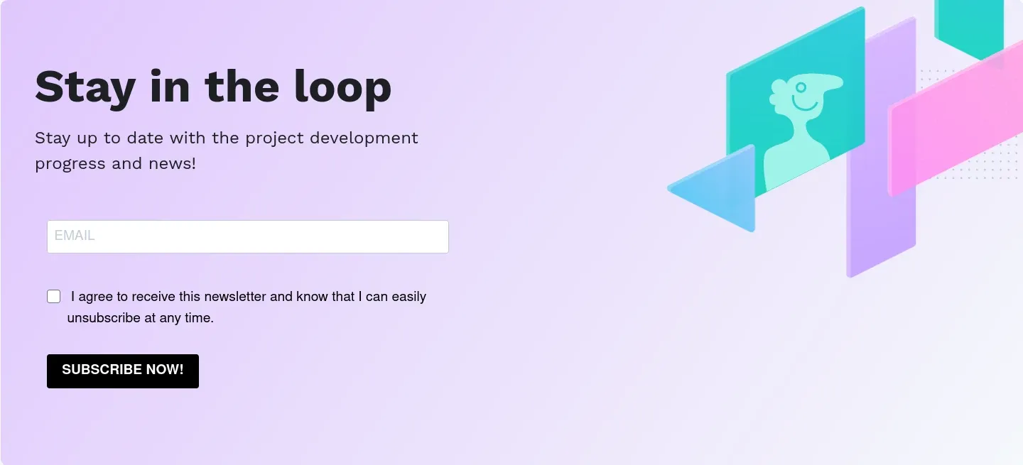
10.Notifications
When important information must be conveyed to the user quickly, it may appear as a pop-up notification, SMS message, or even a small icon. These notifications may also include sound to help attract the attention of the user.
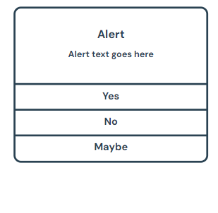
11.Modals
When a notification won’t go away without a specific action being taken, it’s considered a modal. Modals prevent users from going any further in their experience until they correct a problem, typically by providing more information or closing another window.
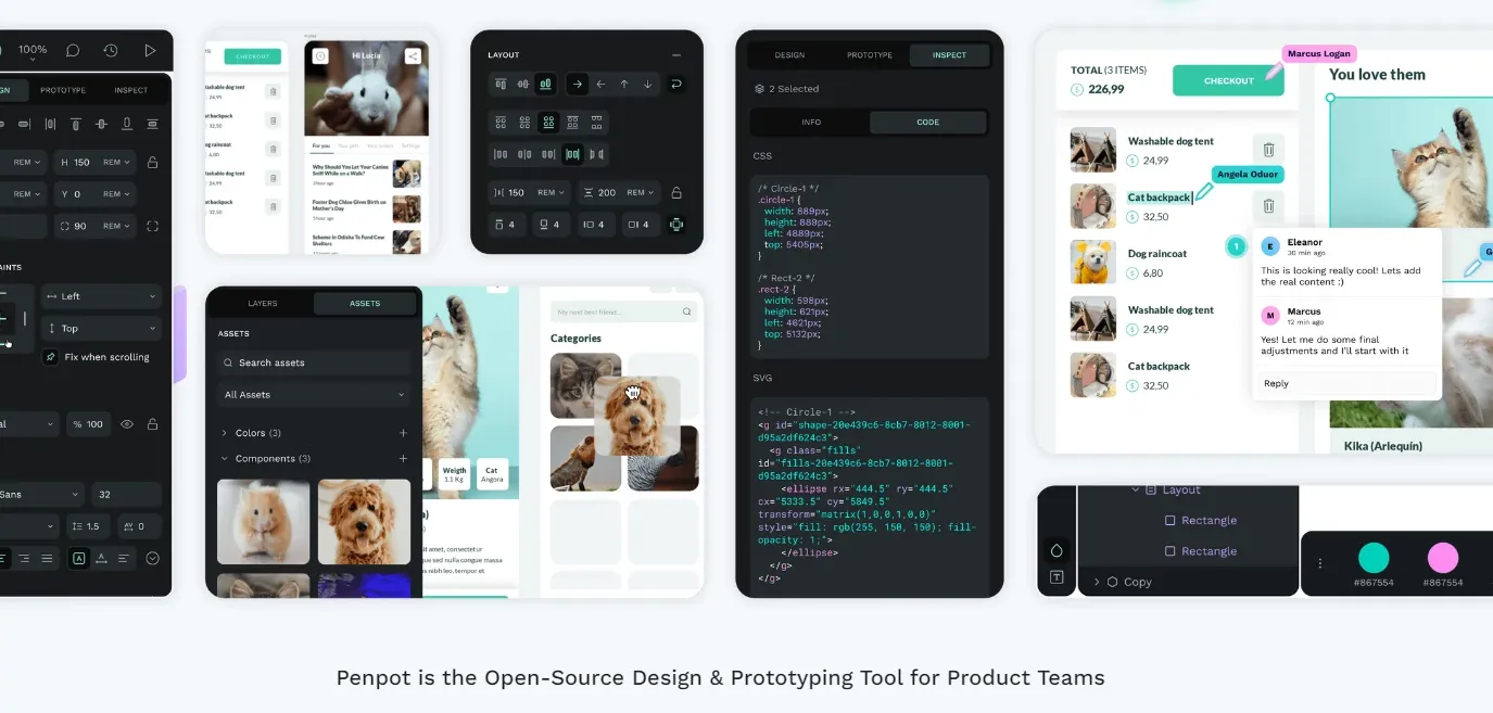
Input control UI design elements
Users need a way to provide information to the website, and this category of UI design helps them do so efficiently, effectively, and with few errors. By setting up parameters and keeping the design simple, app and website users can input information and move on to their next task.
12.Text fields
The most basic design elements appear as blank squares or boxes for users to type in. They may have limits, including the type and number of characters used.
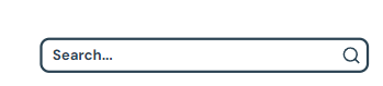
13.Search fields
Part navigation and part input, search fields help users articulate what they’re looking for by providing a text field connected to a search indexing app. Categorized articles or assets get discovered when they match terms used by the searcher, creating another useful way to engage with the content.
14.Comments
These are text fields to attach to the current website or app page. They create a thread of text responses for users to engage with over time.

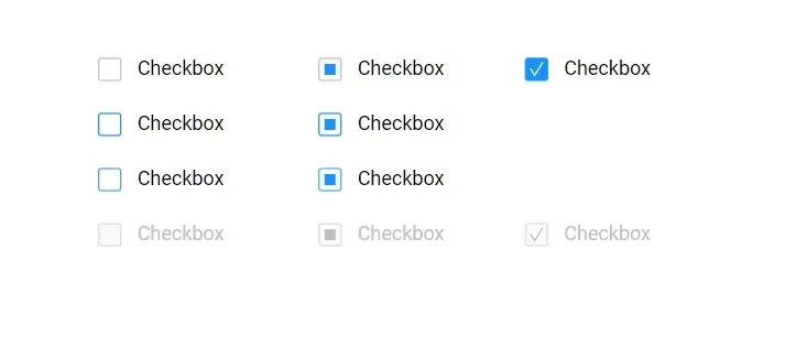
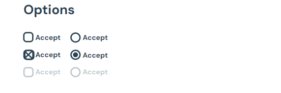
15.Checkboxes
There are few things simpler than clicking a box to indicate a choice. Checkboxes help users share preferences for marketing opt-in permissions and other important forms.
16.Radio buttons
Radio buttons work similarly to checkboxes. However, with radio boxes, only one selection is allowed per category. If a second button is clicked, the previous selection becomes unselected.
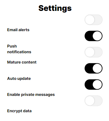
17.Toggles
When there are just two choices for a selection, a toggle helps users indicate their preference. Toggles offer a highly visual way of turning a setting on or off.
18.Dropdown menus
With a different function than navigation menus, these menus are used for inputting information that is more standardized than entering text. For example, giving users a dropdown to select their state ensures everyone uses the same two-letter format with no misspellings.
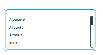
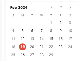
19.Pickers
A picker works best when users need to select from a long list of options or information combinations (like dates). They can look like a wheel, slider, or calendar to help users get just the right information put into a form.
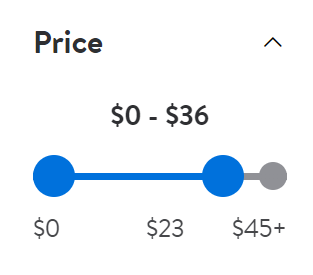
20.Slider controls
When a customer wants to select a numerical value within a range, a slide enables that action. It’s commonly used on retail sites as a filtering feature; users might drag the slider to $25 to only show products priced below this amount.
Choosing the right UI design elements for your project
UI design elements have one goal: to make it easier for users to engage with your product. They should support your overall aesthetic and brand identity but not at the expense of customer usability. Sometimes, the best way to know if a design element works is by trying it out with user testers.
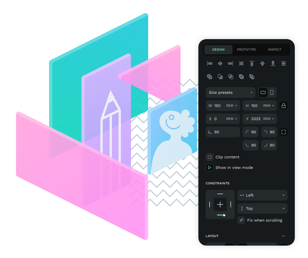
Penpot makes it easy to create a mockup of your UI design and share it with others for feedback. Once you know what works (and what doesn’t), you can make thoughtful tweaks to provide a better user experience.
Why not read our beginners guide to Penpot and create your first design today? With Penpot’s free software and library of templates for common applications, you can get started in minutes.
Related Blogs
We have more blogs about UI and many other design related topics. Here's a few examples of helpful articles to help you get the most out of Penpot.
 Paula Tienza
 Paula Tienza
 Carolina Alves Portugal
 Paula Tienza