6 world-class UI design examples (and what to learn from them)
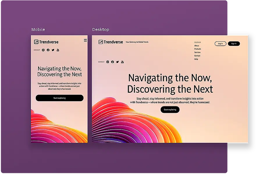
What makes one website or app more successful than another? While product offerings and customer service certainly play a part, your UI design is your users/customers’ first impressions of your organizations. Users have become increasingly aware of how they engage with a site or app, and each click can bring them satisfaction or frustration.
How are you approaching UI design in your user experience? These examples of UI design applications may inspire you to improve your user interface for everyone.
1. Martie - online grocery shopping
Martie 2 is an online grocery outlet that uses whimsical fonts and illustrations to highlight its low-cost pantry items, household goods, and more. Customers can see the deep discount on each item at a glance and add it to their cart without ever visiting the product detail page.
Site visitors who mouse over “Add to Cart” are rewarded with an animated button that appears to be clicked — a small but fulfilling detail. Once added to the cart, the “Elsewhere price” (competitor price) changes to a satisfying “You’re saving $XX.XX” message to remind shoppers how much they save with each click.
What you can learn from it
Martie knows its shoppers are price-conscious and seek out the site to save big. Its UI design not only feels fun, but it also helps shoppers see their savings as they fill their carts.
You should use the same principle when designing your UI. Let your customers’ wants inform your design so they see the value in your product or service right away. If you design with them in mind, you’ll be more likely to build a UI that works best for them in their quest to stretch their budget.
2. Lemonade - insurance platform
Insurance platform Lemonade stands out with its use of white space, ink-style illustrations, and signature pink accents. Since it handles insurance differently than the big brands, it needed a way to explain how it works in terms understood by everyone. Its simple yet effective illustrations do just that.
Lemonade’s visual experience is consistent across the desktop and mobile formats, making the most of available screen space with graphics that fit size parameters well.
What you can learn from it
Lemonade knows that shoppers want to better understand the products and services they buy, including how their money is being used. With a transparent buying process and useful illustrations, companies can assure customers that they are a good match for the shoppers’ hard-earned cash.
Follow this example by being upfront with your mission and vision for your brand, including it in explainers or illustrations that break down what makes your business unique. Even complicated concepts become approachable in this manner, especially when your illustrated object lessons contain items everyone understands — like pizza!
3. Peacock - streaming service
The UI between many of the top streaming services is pretty similar, but Peacock’s interface feels bold, fresh, and visually enticing.
The Kid’s profile UI is especially easy to navigate: when a title is hovered over on the home page, a small window appears showing additional information, including the latest Rotten Tomatoes rating. Upon clicking the title, more information is revealed, including the IMDB rating. This gives parents more insights into the movies and shows most likely to delight younger audiences.
What you can learn from it
There’s so much competition for streaming media today. Peacock’s thoughtful additions of IMDB and Rotten Tomato’s ratings help sort through the clutter. They’re also well-known to most consumers, more so than the limited internal streaming platform rating systems used by competitors. Empowering users to make better decisions is always a good design choice.
You can also harness the power of these UI design decisions on your own site by embedding content from authoritative sources. Choose an element with social proof (like the IMDB reviews above) to help users benefit from the “wisdom of the crowds.” People enjoy being part of something bigger than themselves; your UI design can do just that.
It’s important to note that depending on your design team, this may not be an optimization implemented solely by UI designers. Adding social proof can often straddle the responsibilities of UX and UI, making it important that these two closely related teams are in constant communication throughout the design process.
4. Zenni - eye wear retailer
Affordable eye wear retailer Zenni has been using innovative “try-on” services to help bring additional value to its UI design. With this feature, users upload a photo of themselves as the backdrop for various frames and try them on, much like using social media filters.
Now, the store has added AI-based image search to help users find their favorite looks. How does it work? Shoppers simply click the “Visual Search” icon to bring up the tool, then upload a photo featuring their ideal pair of frames. Using reverse image tech, Zenni matches the glasses to similar products in its inventory and offers these as suggested matches for the user based on size, shape, color, and style.
What you can learn from it
It’s common for shoppers not to be able to describe the products they want. With glasses, which don’t have notable product names, it’s more a matter of “I know it when I see it.” By incorporating a tool like Zenni’s Visual Search to scan images, you can help buyers find items that look like the things they already love.
If something this technical isn’t a possibility, a lookbook with top styles from social media, the news, and celebrity styles may fit the bill. Shoppers who want to “get the look” won’t have to try hard to replicate the items owned by their favorite trendsetters.
5. Exploding Kittens - board game
The popular board game Exploding Kittens uses its website to introduce new players to its product line and give loyal players updates on what’s new.
With its signature big-eyed kitten illustrations and comical language, the brand stays consistent while educating buyers on what it’s all about. During its Christmas campaign, the “Start Here” product feature helped shoppers find the right product for themselves or a loved one.
What you can learn from it
Decision fatigue is a real issue for users, who are estimated to make over 35,000 decisions a day. Exploding Kittens helps them narrow down the options and find the right product for their needs — all while using humor and wit to make it incredibly fun.
You can follow this example by narrowing down your products into categories that solve an identifiable need, whether it’s based on price, purpose, or occasion. A UI design that calls out common problems and then addresses them directly is one that site visitors will appreciate and return to for their next problem, too.
6. Duolingo - language learning app
The language learning app Duolingo has undergone quite a few design changes over the years. Its service works just as well for desktop users as mobile users, something that’s not always the case for interactive learning platforms. With an intuitive UI, it helps learners move along their learning paths seamlessly, so they almost don’t realize how fast they are learning.
One notably useful UI design feature is the learning path visual, which lets users see how far they’ve come. By switching to a Guidebook view, learners can see all of the phrases and concepts they’ve mastered to help them tie the gamification into real-world language skills.
What you can learn from it
Showing past progress, providing a clear path for what’s ahead, and demonstrating real-world relevance all matter to users and should have a place in any good UI design theme.
If your app or site monitors user progress, give users access to these insights with a well-designed map or other visual element. Make it easy for them to see — at a glance — just how far they’ve come and how you’ve played a role in their accomplishments.
How to create UI design features that matter to users
Creating the best app or website experience requires thousands of conscious choices. Most of the best apps, however, started with just a simple mockup and a clear mission on what to accomplish. These world-class design examples likewise started out modestly, with wireframing and prototyping to reflect what each user would need to do to get the best experience.
Penpot’s design tool helps designers break down the most complex app ideas into manageable chunks. Start with the basics and add thoughtful extras over time. Share with stakeholders and beta testers to get an idea of how they engage. Make changes before launch or even revisit design choices later as you get a better feel for your user audience.
Our tool is completely open-source and always free, making it easy to customize to fit your needs. Start working with our full library of UI design templates and you’ll be well on your way to creating a world-class design of your own.
Related Blogs
Check out our other blogs from informative topic guides to tutorials on how to get the most of Penpot.
