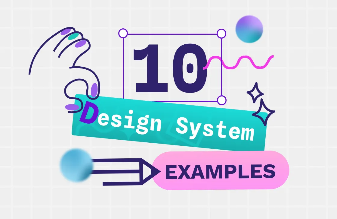
10 design system examples (and what you can learn from them)
Some of the top design systems can even inspire other brands to be more intentional with their work and create a better user experience.

A design system offers many benefits for organizations. It offers consistency, an improved workflow, and collaboration between teams from all over the world. Some top design systems can even inspire other brands to be more intentional with their work and create a better user experience.
What is a design system?
A design system is a set of accepted standards for designers and developers to use when making products. It often includes the necessary building blocks for a brand's digital creations, such as asset libraries, content guides, color palettes, and accessibility guidelines.
Why share a design system?
With so many proprietary assets currently protected by brands, you may wonder why some have chosen to share their system widely with the world. Being open with things like font, color choice, and word style can benefit brands by offering:
Accountability. Sharing a design system shows a dedication to accessibility or sustainability in tangible ways. It replaces lip service with action.
Attention. A great design system is bound to be shared again and again, giving the brand that creates it the best form of press. The creator of these best practices gets credit, even in competitive industries where it can be difficult to stand out.
Attraction. A brand looking to hire the best and brightest designers or developers can use its design system to show off the work that's being done – and possibly even attract future employees. The design system shows the values of the company in a way that an About Me page just can’t; would-be employees can see the proof of the culture before joining.
Trust. Sharing internal information like a design system or being open-source helps foster trust with the wider community. You show users that you have nothing to hide and that they can trust your brand to act with integrity.
Top design system examples
What makes a design system the best? It’s not an individual asset like a font or color. While these elements do matter, it’s how these elements get tied together into a cohesive plan and packaged up for use that makes the following design systems stand out.
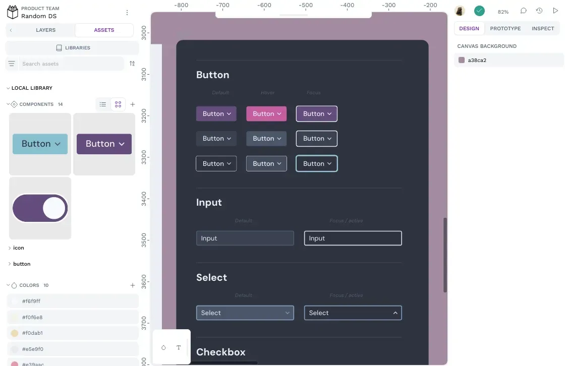
1. Shopify
Shopify’s open-source design system is named Polaris. It offers many reusable elements that a modern e-commerce business would need to create an engaging customer experience. Because stores that use the Shopify platform can be any size, in any industry, with any number of goals, components are made to be extremely flexible and easy to use.
The design system also provides many accessible resources, especially for those who may not be well-versed in design systems or even the creation of a store site. While it’s made for developers, it’s written in a way that anyone can understand. The clean, minimalist interface helps users focus on what matters so they can build quickly.
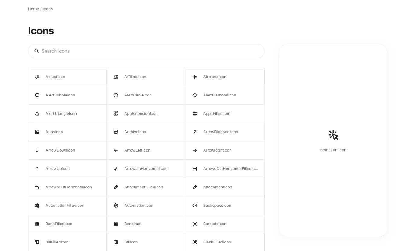
Extremely versatile and clearly written, the design system shines with its links to user resources and tutorials. Even if it’s the first time creating a Shopify app, developers can get up to speed quickly with the provided tools.
What you can learn:
Design elements don't mean much if developers don't know how to use them. Shopify ensures its best practices happen with even less experienced developers by giving them plenty of step-by-step tutorials.
They also use smart naming conventions to ensure there is little room for confusion. For instance, Shopify’s tokens all follow the same naming pattern: type, concept, element, role, prominence, and state. This means that their color tokens are easily understandable and can continue to grow without turning their design system into a mess.
When creating your own design system, consider how you’ll make it easily adaptable. By creating conventions and resources early, you can be far more certain that your design system will be used consistently and in the way you intended.
2. Goldman Sachs
Goldman Sachs aims to be the gold standard of design systems. Impressive elements include its custom typeface, named "Goldman Sans," which aims to make even the tiniest printed materials easy to read and understand. It reduces confusion between similar letters, like "5" and "S," while also ensuring that numbered columns in financial documents line up correctly.
This font is just one feature of the design system, but the way the company calls it out and explains it is especially notable. Because the brand incorporates so much educational and background material into the design system, users can come away with not just "what" to do but also "why" it's done.
For instance, in their section on data visualization, Goldman Sachs explains how they use color to create a smarter way of presenting data to their users. In this case, they incorporate more or less intense shades of color to create a graph that people can understand at a glance.
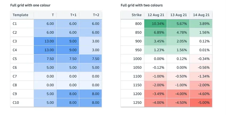
Even the choosing and testing of the color system is documented so users can see how the company adopted the final tones and hues. This origin story not only makes for entertaining reading but also emphasizes the care and consideration that went into making the design system one to beat.
What you can learn:
The backstory of a design system matters as much as the elements. People who understand creative motivation are more likely to put it into practice in an appropriate manner. Share how you came to your values and why they are important.
3. Samsung
Samsung’s design system for smartwatch app developers offers several detailed resources for creating the best user interface. This is especially useful because designing for a smartwatch is very different than designing for a smartphone. The recommendations in the design system call out the challenges and opportunities developers have to engage users. They then share how to serve these customers as they work and play in various user settings.
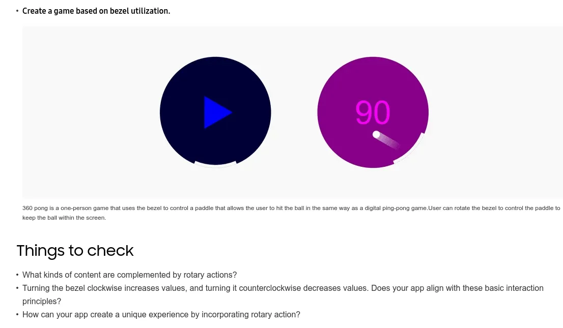
For example, the timely info tab shares how to give users info within seconds. The bezel control tab shares best practices for designing within the bezel and deciding what functions it should provide. Each tab wraps up with questions to help the design team troubleshoot, such as “Turning the bezel clockwise increases values, and turning it counterclockwise decreases values. Does your app align with these basic interaction principles?”
What you can learn:
Samsung anticipates the learning curve that developers have when pivoting to a wearables environment. It also creates educational content with several checkpoints to test user understanding. The best design system acknowledges the likely missteps of implementing new technology and guides teams through fixing them early in the process.
4. Liferay Lexicon
The Liferay Lexicon design system is a language framework for creating within the Liferay ecosystem. It provides patterns, components, language recommendations, satellites, and models to build from. Like most design systems, it focuses on simplification and consistency but also features a robust educational aspect.
The actual design system documentation is minimalist, with little to no illustrations. However, it does use graphics to demonstrate best practices. In the Writing tab, you’ll find Liferay’s approach to language and style, which is emphasized through “Do” and “Don’t” illustrations.
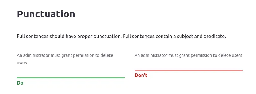
This approach ensures designers and developers are creating with similar styles, even if it’s been a while since they used the phrases “sentence case” or “ordinal rules.”
What you can learn:
People are highly visual but can get overwhelmed by too many graphics. Liferay takes a direct approach to educating users by using images only when it matters, such as in screensh
ots of actual elements. By limiting the unnecessary items in your design system documentation, you can ensure the important things get communicated.
5. Carbon
IBM’s open-source design system, "Carbon," is highly respected and based on the IBM Design Language, and it’s one of our favorites. In addition to having a complete library of patterns and functions, it also has an incredibly comprehensive section on accessibility guidelines.
IBM’s design system encourages inclusiveness in two ways. First, IBM focuses a lot of attention on educating developers and designers on the kinds of accessibility challenges they're trying to overcome.
For instance, they show an example of blurred or tunnel vision so designers can better understand this challenge.
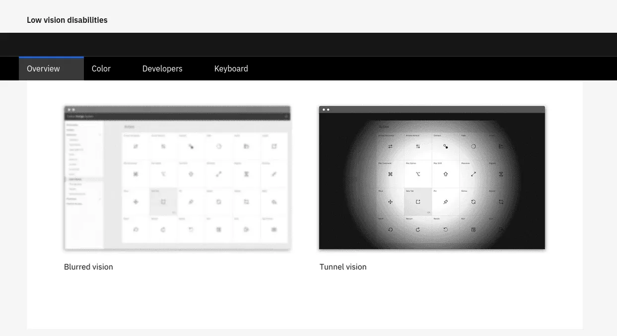
It’s one thing to explain you’re trying to create a design that is accessible to those with visual impairments, but it’s a whole other thing to understand what that means.
Secondly, IBM shares specific best practices that can make a product more accessible. For example, they explain how data tables can be designed to be more accessible by using specific elements and attributes to make them readable for those using screen readers.
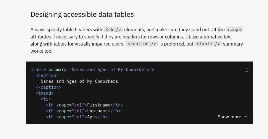
What we like about this is that it’s incredibly specific. Where some design systems might just say make sure data tables can be read by screen readers, Carbon provides specific recommendations on how to get that done.
What you can learn:
Creating a more inclusive online experience is something that every website and product should aspire to. IBM shows that if you want to ensure that everyone can use your product, you need to start that process with your design system.
And when you do, don’t just state your intent. Educate your team on the accessibility challenges different people face and teach them proven best practices that can make a noticeable difference for millions of people worldwide.
6. Just Eat takeaway
Food delivery service technology company Just Eat Takeaway has its own design system, which it lovingly called PIE (Principles for Interfaces and Experiences). This food-themed library has all the pieces you would expect, including components, patterns, and support. It even explains what a design system is using colorful recipe analogies because everyone understands food.
It also includes access to a dedicated support team with resources specifically made for designers. The design system calls out the support and shares the available support models, such as mentoring or help with cleanup.
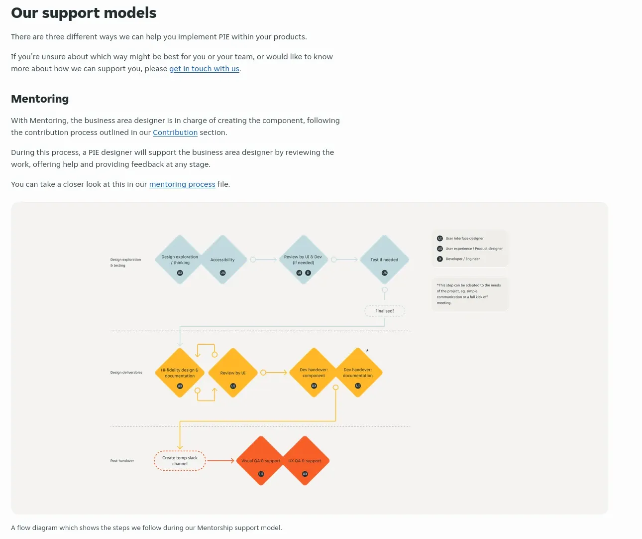
Why is this important? While many companies share their design system, documentation, and FAQs, it’s not always clear where someone would go if they need additional help. Links to an external knowledge base in a community may be a common-sense next step, but PIE levels up and leaves no question about their support role.
What you can learn:
In a world where it’s very common to link to a generic help page, chatbot pop-up, or support email, companies with a higher level of support should call out this differentiator. The design system may be the perfect place to do that, including a dedicated page with what designers can expect when they reach out for support.
Not everyone will have a dedicated team on standby for mentoring. Explaining just what you’re willing to do for the design community (however small an effort) sets the right expectations. It ensures users are aware of available support, making it accessible and easily integrated into the workflow.
7. Google
Google latest version of its open-source Material design system: Material 3 is beautiful, whimsical, and relatable design system that demonstrates what’s possible when design is pushed to the forefront.
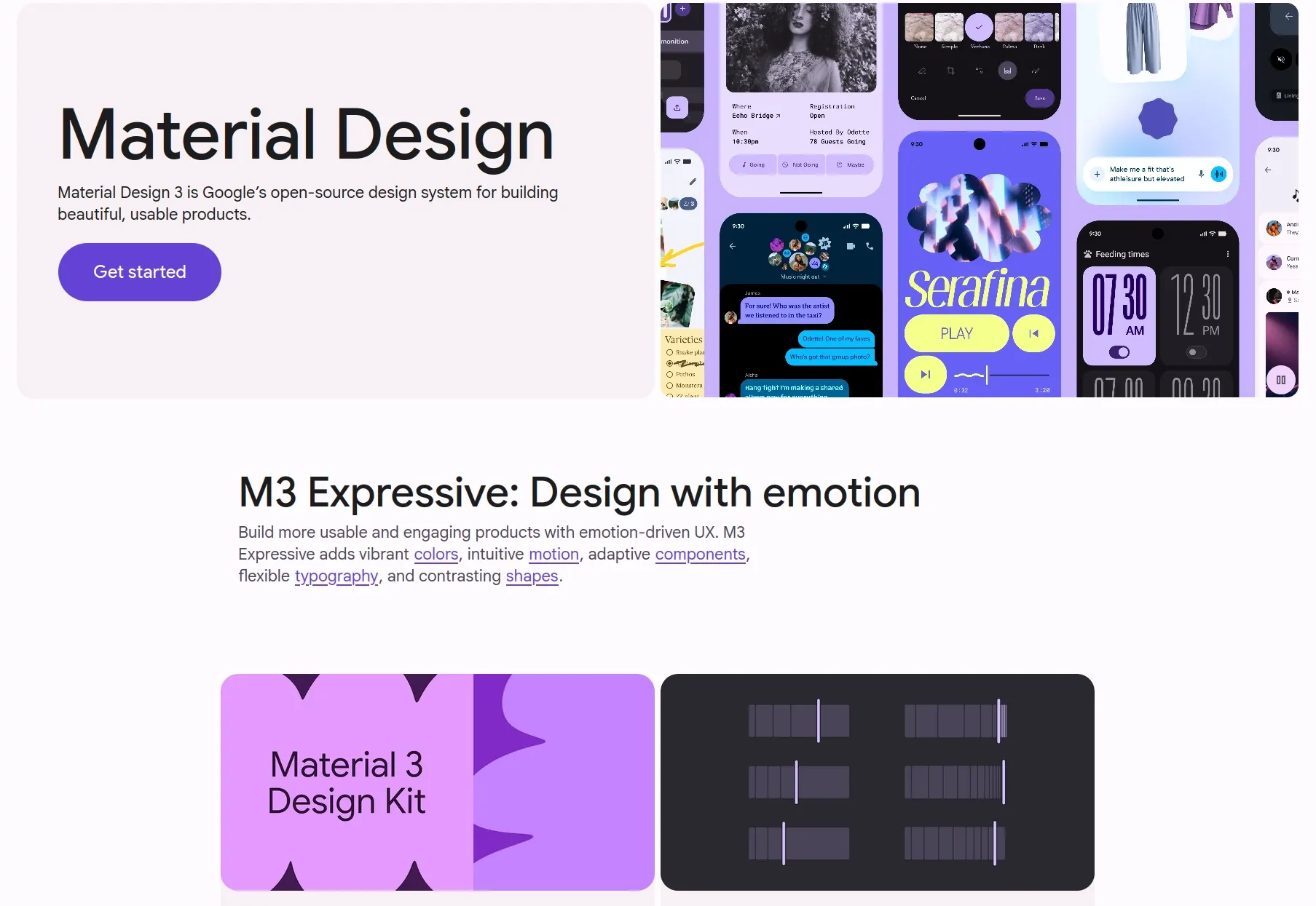
Everything, from the home page to the components library, is focused on aesthetics. The large iconography, bold graphics, and rounded edges mimic the newest Google offerings and invite designers to jump into something shown to delight users.
The Getting Started page offers the best look at the design system’s creative energy. It not only looks good, but it's useful, too. No matter the skill set, users can get started right away, whether it’s learning what open-source technology is or getting the best practices for accessibility. Google manages to make both those researching UX for the first time and senior developers feel they’ve come to the right place.
What you can learn:
If there’s a page to take from Google’s book (besides being stunningly beautiful), it’s that you can be all things to all people if you’re intentional about it. Google’s design system wastes no space or resources on things that don’t pertain to Material 3, but it offers up everything needed to get started — no matter who you are.
This is a kind of accessibility you don’t always see with design systems. Instead of creating a “members only” club for developers, consider a design system that meets any curious user at their particular knowledge level.
8. GitLab
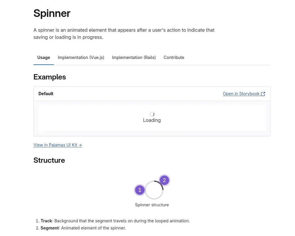
For such a large product like GitLab to remain a community resource, a comprehensive design system is needed. GitLab’s Pajamas documents almost every little detail and balances the needs of designers and developers with its branded assets and technical files.
Where it shines, however, is in the real-world examples it provides for components. From tooltips to spinners to skeleton loaders, each element has a documentation page for users to review. Users can click to load the element in the interactive UI tool Storybook. This lets them see an example of the element in action and review how it would look within their own project. The company even includes socks in its design systems— a comical addition that shows off the personality of the teams behind GitLab.
What you can learn:
GitLab does more than explain components and provide documentation. It shows their product in action. This effectively advertises their work and educates users in an interactive way.
By creating a design system that includes components in real-world environments, designers and developers know exactly what components to pick for their next product. It’s also the easiest way to explain concepts like infinite scrolls, which are best understood by seeing.
9. GitLab
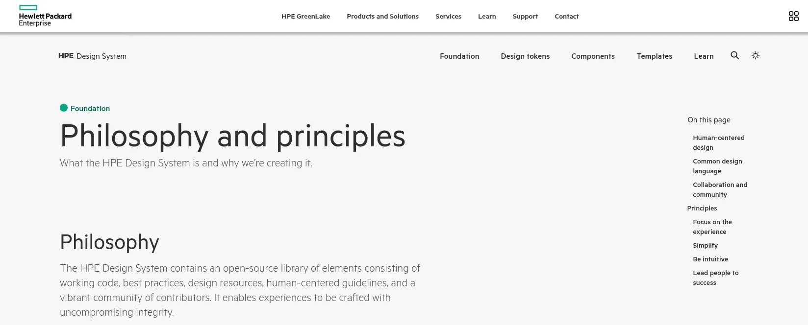
The HPE Design System is an open-source library of components and principles for app developers to freely use. It’s stored on the HP website and comes with documentation, updates, and guides to help even those without much experience get started immediately.
While it’s loaded with components, it’s free of much of the jargon in design systems today. Most notable is principle #4 of the design system: Lead people to success.
This short but powerful explanation of why the design system exists serves as a reminder of why anyone should create a design system in the first place. According to HPE, it’s to create a path, and it simplifies many of the design decisions into four main buckets:
- Show only interactions for the current context
- Organize in the way that makes the most sense
- Show new fields when it matters
- Safeguard the experience to keep users from making errors
This essential roadmap should be what all UI is about, and HPE explains it beautifully in its documentation. It’s an example of their greater design system language and its clarity.
What you can learn:
“Begin with the end in mind.” That’s a great approach toward a design system and may need to be spelled out in your library of resources. Because people can get caught up in iconography and font sizing, it’s easy to forget what the end user needs to achieve with your product. Consider sharing a path to success, much like HP did, that uses your own brand language.
10. Firefox
Firefox’s design system, Acorn, is a comprehensive documentation of all things Firefox, spanning desktop and mobile app products. It's a dynamic resource that's constantly updated to stay in sync with the evolving Firefox product line. In addition to the standard assets like iconography and component library, Firefox's design system stands out with its unique offerings, such as a Glossary for common terms and an FAQ.
The most notable aspect of the design system is how the company handles content. The Tone Scale is especially well-written, with examples of the tone used for various scenarios and what that might look like. The scale ranges from “non-expressive” to “full expression.”
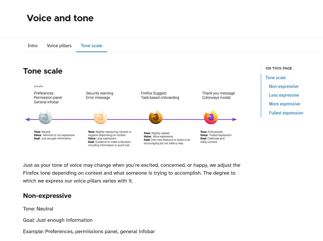
For example, Firefox recommends “less expressive” — or slightly negative tone — for security warnings. It recommends “fullest expression” — or enthusiastic — for messages of celebration or thanks.
What you can learn:
Tone can be challenging to capture correctly, especially when creating a product used by different cultures and audiences. A design library that includes content guidelines for tone and similarly challenging stylistic elements ensures designers and developers spend less time trying to emote properly through the UI.
Creating a design system that inspires others
At the heart of every design choice, is an attempt to put users first. The goal is always to make the product more helpful, more accessible, or just more fun for them.
By creating and publishing your design system online, you are doing just that. You are creating a document that has the potential to inspire others, build trust, and even create a strong connection to your brand.
Before putting your design system on display, ensure it’s in top shape by getting feedback from both internal users and external partners. Many of the design systems we’ve featured welcome suggestions, either from external GitHub communities or through their own communication channels.
Ready to start your design system? Penpot’s free design app makes it easy to begin. You can manage components from your design systems to help you create your best work.
Related Blogs
Check out our other blogs, from informative topic guides to tutorials on how to get the most out of Penpot.
 Paula Tienza
 Paula Tienza
 Paula Tienza
 Paula Tienza