Penpot UI design software: A beginner’s guide

The most complex innovations often start with a simple process. Penpot’s free, open-source app helps to document design ideas in a way that’s simple enough, even for those with no design experience.
So, even if you’ve never created a digital sketch or mockup before, this step-by-step tutorial will get you well on the path to making the next big thing.
Setting up Penpot
What do you need to begin using Penpot right away? Just your computer. In fact, one of Penpot’s best features is that it runs on your browser, so you don’t have to download or install any additional software. You can even use it on notebook computers with minimal processing power or memory; it’s a lightweight app that only requires you to be online when you use it.
To begin, go to the Penpot site from the latest Google Chrome, Mozilla Firefox or Safari browser. (Other browsers may not offer the best experience.)
You’ll be prompted to set up an account if you’ve never used it before, opting between an email/password login, Google login, or GitHub/GitLab account login.
Finding your way around
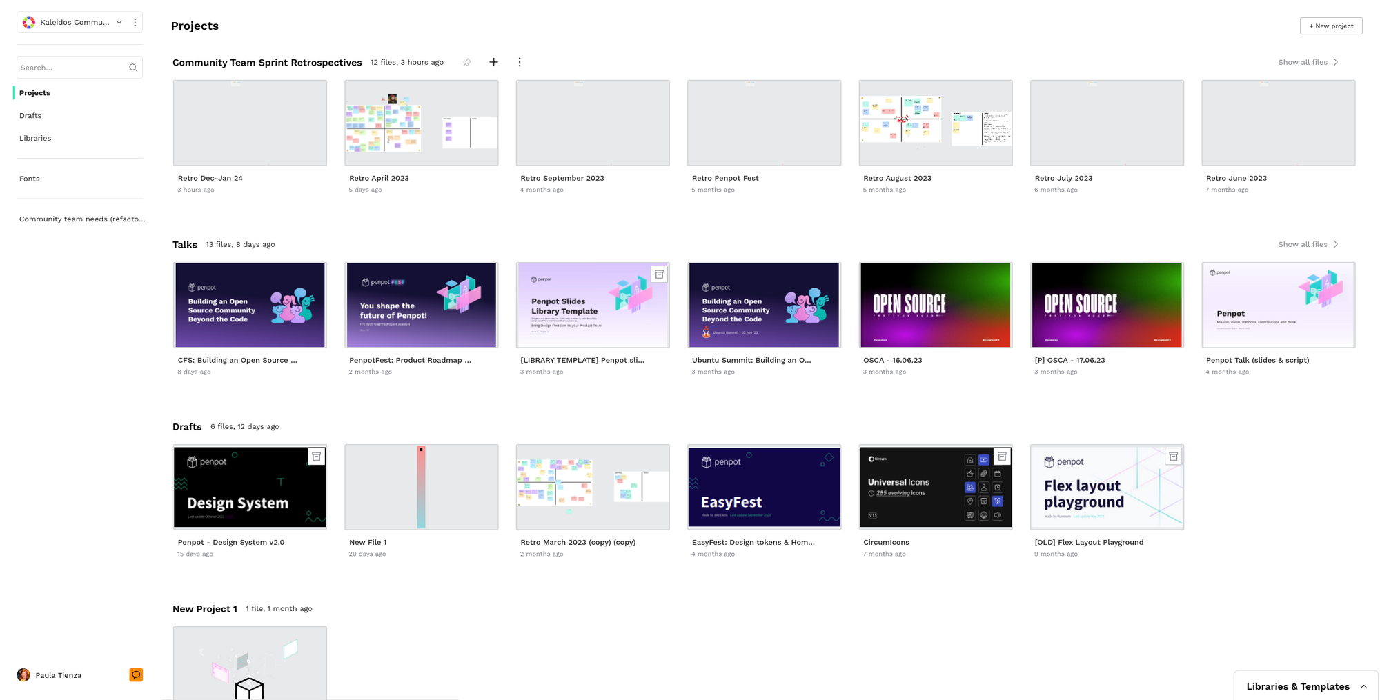
With your account set up, you’ll be immediately placed into the Penpot interface, which has three main parts: Dashboard, Workspace, and View Mode. Moving between them is necessary to build, add to, and review your project, as well as share it with others for feedback.
Dashboard
This is where you'll create, save, and store files, as well as manage the sharing of any projects. If you need to find a past project, go here. You'll also upload custom fonts to this Dashboard and check it for notifications about team comments or changes. If you want to use a pre-existing template to jump-start your project, it’s located here in the Dashboard.
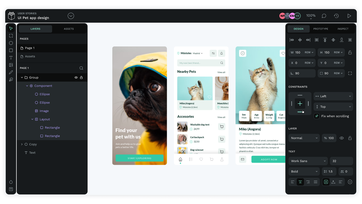
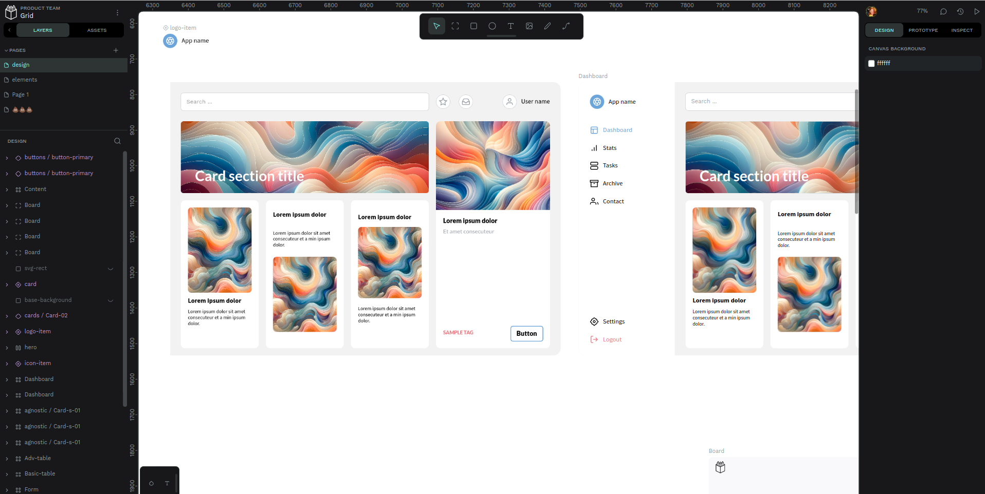
Workspace
This is where the design magic happens! Draw new designs, drag and drop assets, change colors and sizing, and manage design layers. You can also zoom in and out, see who is viewing the project, and check the editing history to undo any unwanted changes. Prototyping and Inspection capabilities can be accessed from the Workspace.
View Mode
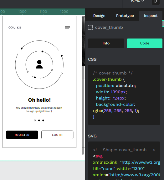
When your UI design is ready for review, share it with others from here. Not only can you share individual pages as well as complete boards, but this is also where the animations and transitions will take effect. Consider this to be the big presentation where you show off your work. View Mode also features the Inspect functionality, so details like measurements and distances for each object can be seen. If you need CSS code snippets for styles, you can access them – along with SVG markup – here.
Starting your first design
One of the quickest and easiest ways to make your first Penpot design is by starting with a template, the tutorial for beginners is a good one to start with. Penpot offers a wide selection of kits to modify and adapt to your unique needs. Uploading and using a template is easy, watch this video and learn how to use a template.
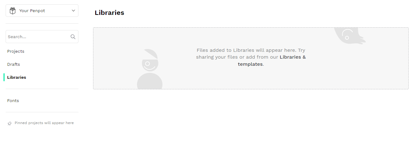
Libraries and templates promo video
Penpot has a library of resources. Just be sure to download the .penpot template file and remember where you saved it. When you’re ready to work on it, go to the Libraries tab on your Dashboard. Then, drag and drop the template file into the upload box. You’ll be asked to accept the file before it is imported.
Organizing a template
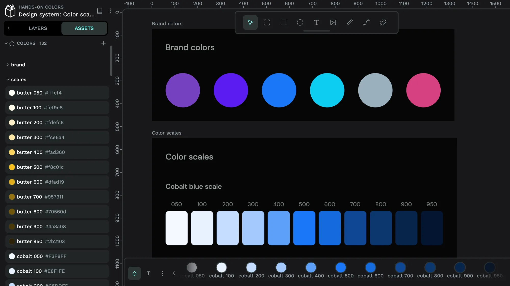
For this example, we are using the mobile UI kit template. It comes with many different sample web app pages shown as layers within a single page, but you may not find all of them useful. Start by duplicating or deleting them in the Layers tab on the left hand until you have what you need to edit.
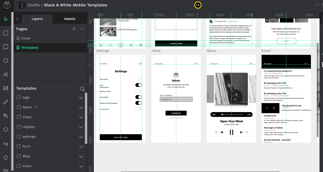
First, locate the layer that represents the app function or view you want to delete. If you aren’t sure which layer goes with which illustration, hover over the layer with your mouse and watch which one appears highlighted. Right-click on the layer you no longer want and select Delete. You can also use this hover/right-click method to duplicate a layer, cut and paste it in another location, add it to a board, or rotate it.
Now that you have just the sample illustrations you want for your project, you can now start with one of them to begin editing. Find one that most matches your idea. It’s okay if you don’t use much of one; deleting it and starting almost completely over is still easier than creating one from scratch, especially if you want to maintain the sizing of the template example.
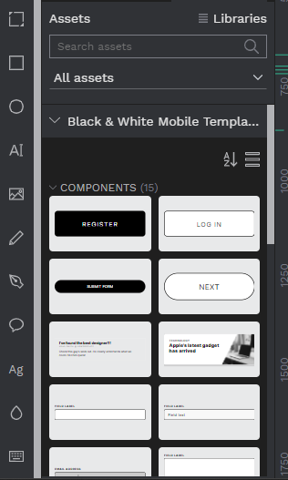
Collecting your assets
You’ll most likely want to personalize templates with your own fonts, graphics, and other components. To get started using your own assets, go to the Dashboard and click on the Libraries tab. Here, you can drag and drop files to use in your UI design and even share them with other users. To add fonts, click on the Fonts tab and upload font files by dragging and dropping them into the uploader.
(Note: Be sure you own the rights to any fonts you use before uploading them.)
With your library full of custom components and fonts, you can now resume editing your UI design template.
Editing a template
To begin working on your edited template design, click on the Drafts tab from your Dashboard. You'll be taken to your project to resume editing. You can begin with any layer that you want to edit by clicking on the layer from the left-hand side. Remove individual assets within each layer by deleting them or adding new ones from your library.
When you have placed an asset where you want it on your design, you can adjust the color, shape, size, and more with the tools on the right-hand side of the workstation. The easiest way to manipulate assets is by using the shortcuts in Penpot, which closely mirror shortcuts in other design tools, like Blender 3D. Rather than trying to remember all of the shortcuts, click the keyboard icon at the bottom of the far-left toolbar. This action brings up the list of shortcuts to select from and the search bar for finding the shortcut you want.
You can also mark up each illustration directly with the tools on the far left of the Workspace. Draw freehand with pencil, make ellipsis, change the color palette, or add text. Upload images directly from your computer by choosing the image icon and selecting the image file you want to import.
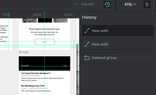
Your progress saves as you work, but you can see the history at any time by clicking the clock icon on the top of the right-hand side of the screen. It will show you some actions you have taken and give you the chance to go back to that save point.
Creating a design from scratch
Templates may not be the best fit for your project, so Penpot also offers a blank canvas for getting creative with your ideas. To start from the beginning with a new UI design, go to your Dashboard and click the New Project button with the plus sign on the right side of your screen. It will bring up a new project under your file list that you can select and launch in the Workspace.
This Workspace will have no parameters assigned so that you can make infinite use of the canvas. Penpot offers convenient tools for making even your most unique designs more ordered. The grid function, dynamic alignment, rulers, and guides help you stay within the limits and make components in a similar size and format.
Sharing, viewing, and collaborating
Your design is just the beginning of your project, but it’s an important one. With your rough sketch now in digital form, you can ask for feedback from teammates, clients, and stakeholders to help get it to the next stage of reality. Add comments to your design at any time by clicking the speech bubble icon on the left-hand side of the Workspace.
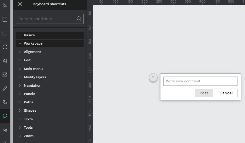
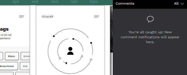
With this icon highlighted, any place you click on the design will create a comment field. Add your notes, ask for advice, or share directions with others. A running notes list will populate on the right-hand side of the Workspace when the Comments icon is selected and active. You can see what others have to say about the project here.
This is only the beginning of what you can do with Penpot. After your initial design is complete, use the Prototype tab on the right-hand side of the page to add interactions and workflows on how users will experience your design. Or, select Inspect to see screen sizes, CSS code, and other element details to help you plan for the development phase.
Penpot’s design tools are sophisticated enough for the most advanced platform designs but take little time to master. Even if you haven't been involved in this stage of UI work, the simple interface and intuitive collaboration tools will have everyone building better things together.
Looking for more Penpot tutorials?
Click below to view one of our other tutorials on how to use Penpot. Wether you are just starting out with the program or have been using it for a while we have interesting guides to help you get creative.
 Laura Kalbag
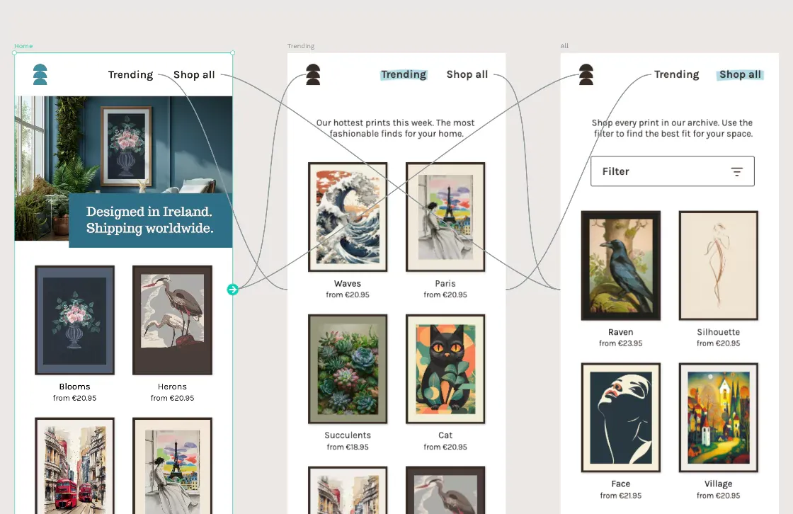 Laura Kalbag
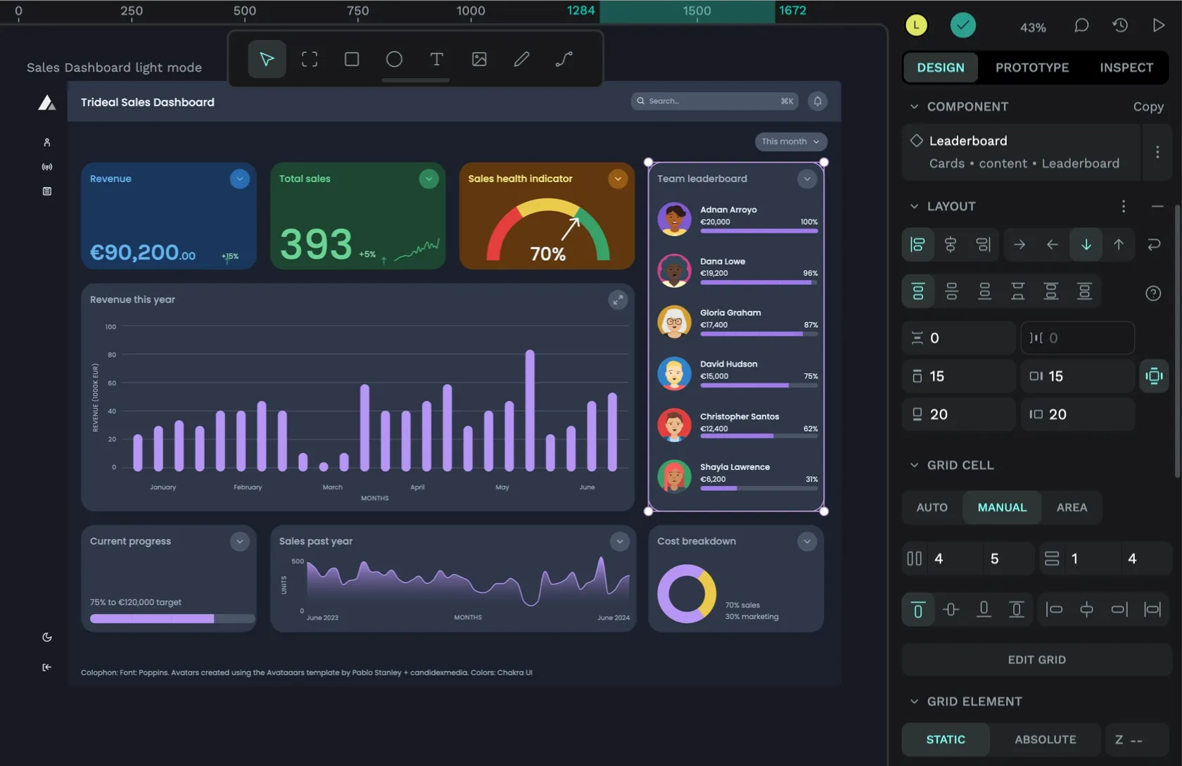 Laura Kalbag
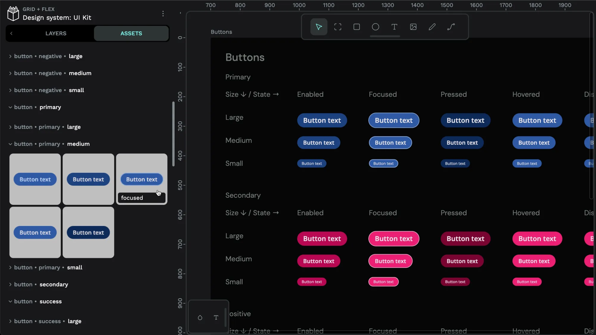 Laura Kalbag