Ant Design v6
Description
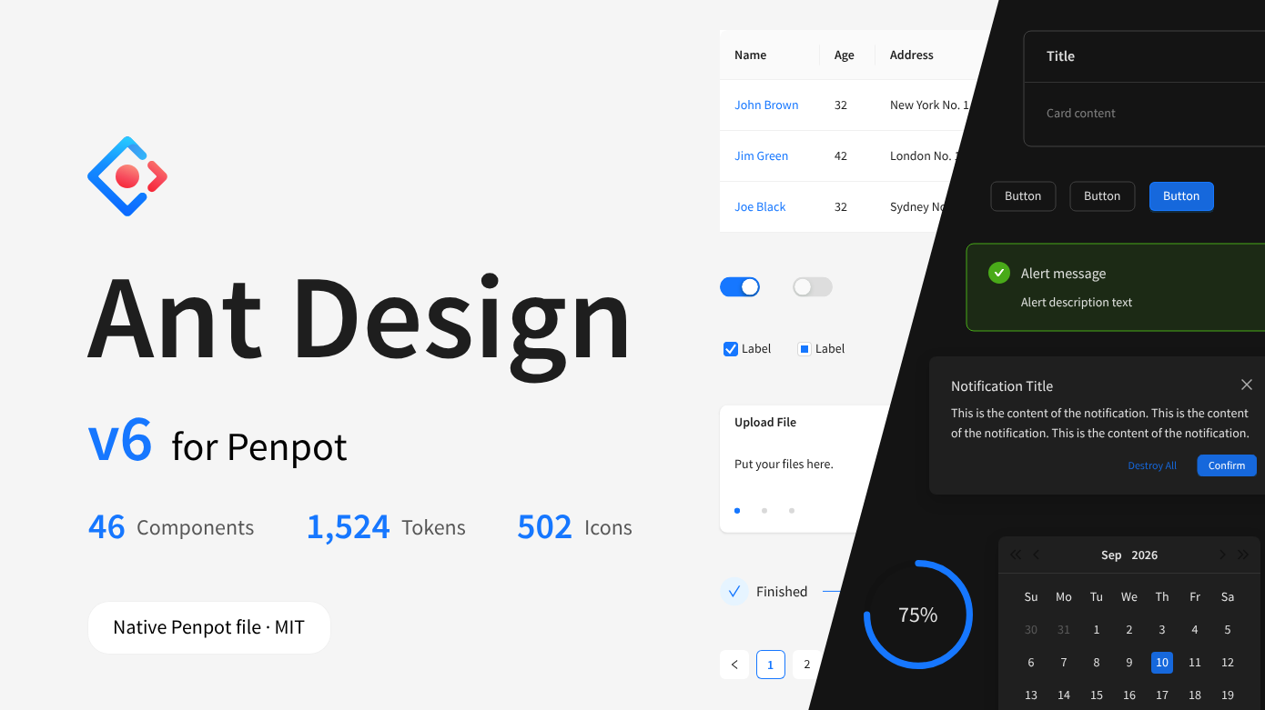
A faithful Ant Design v6 component library as a single native Penpot file.
Every component is built as a variant set with antd-exact geometry and naming, bound to a complete design-token system that mirrors antd's own architecture (seed → map → alias → components; 12 sets / 1,524 tokens; light · dark themes × default · compact densities). The file includes a documentation page for every component plus group indexes and foundations, 502 icons from @ant-design/icons, and demo screens.
Details
- Last update:
- Sep 27, 2026
- Published:
- Sep 27, 2026
This template/library was created by a member or group of members from the Penpot community. While we can’t guarantee everything will work perfectly, you can report any issues using the “Report this file” button—our team will look into it.
You can browse, use, and manage templates directly from the Template Panel in the app or explore them through our website. Most templates are built by community contributors, so feel free to experiment and adapt them to your needs.
Want to contribute your own template? That’d be amazing!
Follow our template contribution guide to get started. Once it’s ready, submit it for review and help other teams get inspired and save time with your design.
Let’s grow the Penpot template library together—one great idea at a time.
Contact [email protected] for questions and updates on your file.