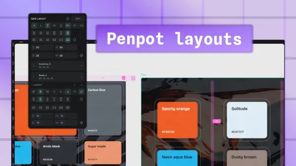
The ultimate guide to Penpot layouts
Everything you need to know about Penpot layouts, whether you want static and pixel-precise, or flexible and responsive. Including designing in CSS Flex and Grid.

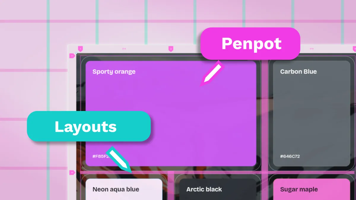
There’s a few different ways you can use Penpot layouts to organize elements on the canvas. You can be pixel-precise, or create dynamic, responsive autolayouts with Flex and Grid. Flex and Grid layouts have the same properties as code, so you can design as code without worrying about any of your design decisions getting lost in translation. (And without having to learn how to code if you don’t want to!)
Static layouts
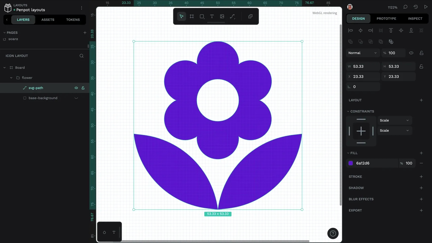
Layouts are static in Penpot by default. You can just drag elements to where you want them on the canvas, or use the X and Y coordinates to position them. In UI design, you might use static layouts for elements with fixed proportions like icons, social media graphics, or digital illustrations.
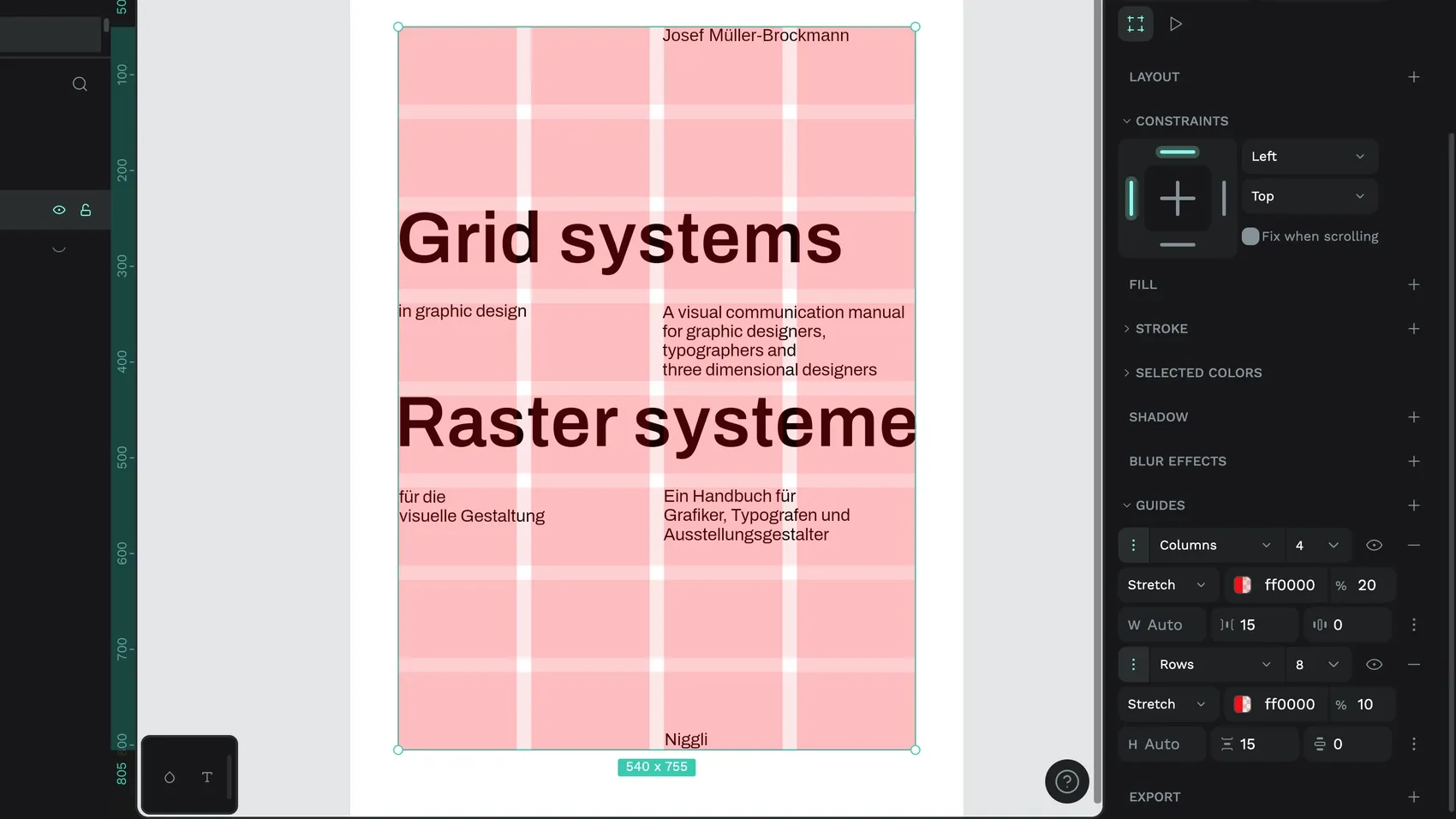
If you want to create fixed layouts for print media, you might want to use Guides to position your elements. For more on guides, read my blog post about the difference between background grids (Guides) and grid layouts.
While it’s useful to have pixel-precise control over layouts, we’re not machines, and sometimes we need tools to shortcut alignment and distribution without having to do the math. You’ll find the buttons for aligning and distributing multiple design elements at the top of the Design Panel.
As I mentioned above, you can hold down Alt or . keyboard shortcuts to check a design element’s measurements as well as its alignment. You’ll also get the same measurements and rulers when selecting a design element with the Inspect panel open.
You might notice when moving elements around that Penpot has dynamic alignment to help you snap elements to align to each other without needing to nudge pixels or use measurements. If you want to turn off the option for dynamic alignment, or any of the snapping options (snap to ruler guide, snap to guide, snap to pixel) you can do this from the Preferences menu.
Responsive automated layouts in Penpot
Now let’s get to the exciting stuff! (Well, it is for me.)
We’re rarely designing for fixed content at a fixed size any more. Browsers render at any width, interfaces get translated into languages with different word lengths, and templates get filled with different text and images every time.
Responsive design started a movement of designing for that flexibility, but most of us ended up making separate layouts for “mobile, tablet, desktop” and hoping nothing broke in between. Intrinsic design and declarative design evolved responsive design: instead of a banner that's 100px tall on mobile, 90px on tablet and 80px on desktop, you set it to fit the height of its contents, and it just works at every size. In Penpot, you design those layouts as code, so designers and developers use the same terminology, and the design intent survives all the way into the final product.
In Penpot, just like in modern web technologies, your two choices for responsive automated layouts are (CSS) Flex and (CSS) Grid. You can use Flex and Grid to lay out whole pages/views/boards, or position two tiny design elements in relation to each other. You can nest Flex layouts inside Grid layouts, and Grid layouts inside Flex layouts to construct more complex layouts, giving you fine-grained control of the alignment, distribution, and spacing at every level of your design hierarchy.
What’s the difference between Flex and Grid?
Flex layouts are ideal for unpredictable quantities or sizes of content. Elements inside the layout can flow horizontally like a row or vertically like a column. You can choose how the elements inside the flex container (also known as “Flex elements”) are aligned and are distributed, as well as spacing around the flex container (padding) and in between the flex elements (gaps.) You can even set flex layouts to wrap to the next row or column when their contents exceed the width or height or their container.
Grid layouts are useful when you have a fixed amount of content, and want to define your layout across both horizontal and vertical directions at once. They’re ideal for classic graphic design grid layouts… you define the number of columns and rows in your grid and their dimensions. Like Flex layouts, you can also choose the direction, alignment, distribution and spacing. Unlike Flex layouts, you can make grid cells span multiple columns and rows, and label grid areas.
Sometimes the best way to work out whether you want a Flex or Grid layout is to try one option, see if you can make the layout behave how you want, and if not, try the other!
 Laura Kalbag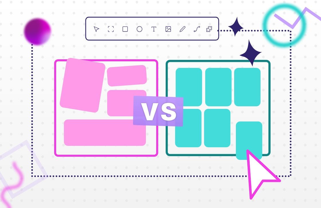
Remember that you can always nest one type of layout inside another to create more complex layouts and hierarchies.
How to create Flex and Grid layouts in Penpot
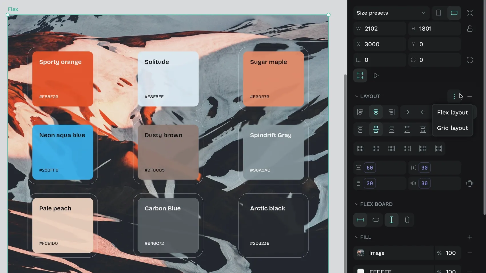
You can create a Flex or Grid layout from a board, and add elements into the layout. Or select a group, or multiple elements, and add a new Flex or Grid layout.
Find Layout in the Design panel.
If you create a layout from existing elements, Penpot will do its best to recreate your static layout in a more dynamic format. In the case of grids, Penpot will create enough columns and rows to fit all the grid elements.
Flex and Grid layouts share a lot of the same properties, but they also have a few properties unique to each layout type.
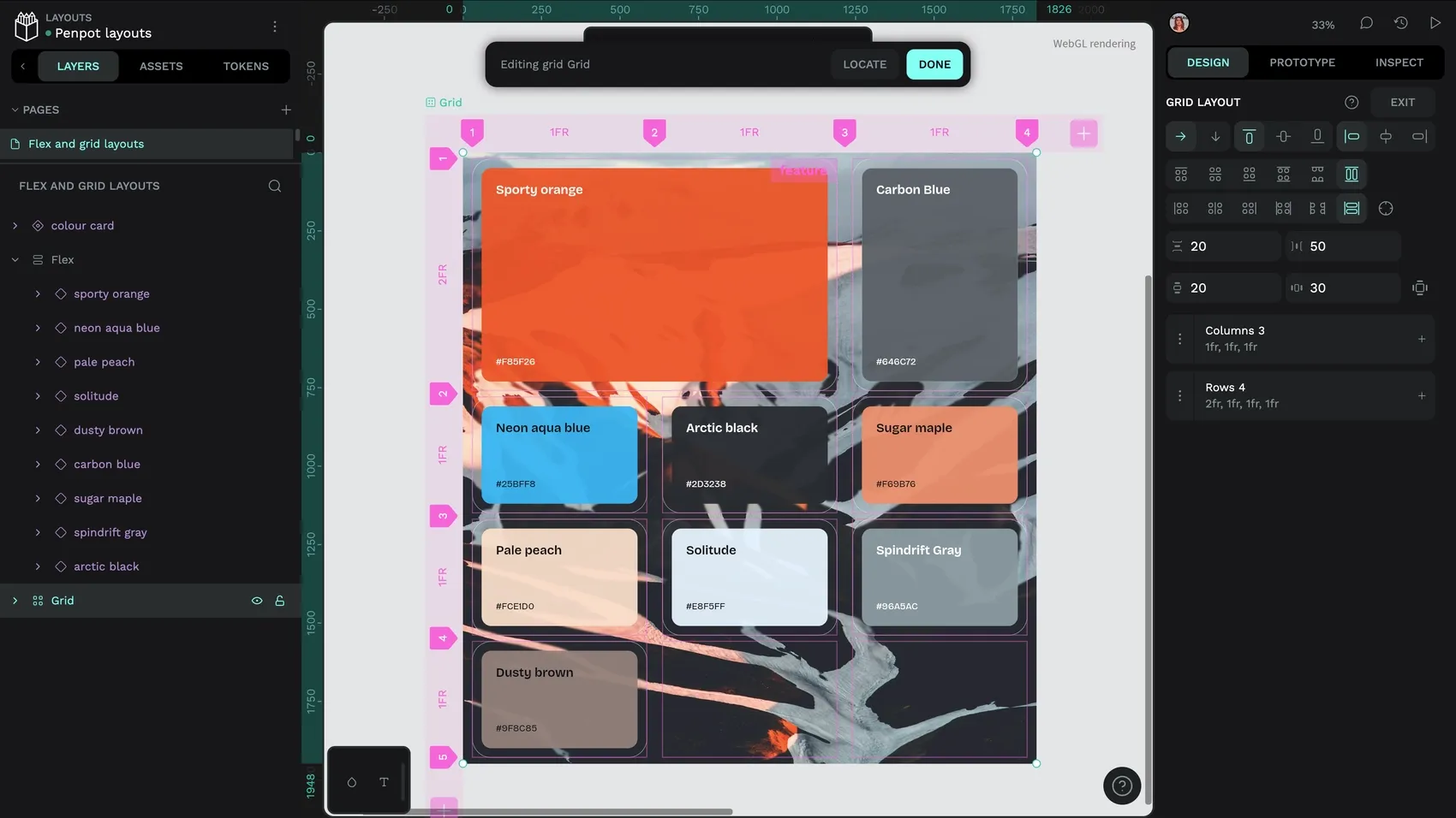
Direction and flow
Flex has flex direction, and Grid has grid direction. The direction is how elements inside the layout flow from the start to the end of the layout.
- Flex direction: sets the visual order for your flex elements:
- Row: Flex elements flow across a row from start to end.
- Row-reverse: Flex elements flow across a row from end to start.
- Column: Flex elements flow from top to bottom of a column.
- Column-reverse: Flex elements flow from bottom to top of a column.
- Flex wrap: on/off sets whether your flex elements should wrap on to a second column or row if they run out of space. This is one of the most useful features for responsive layouts… for example, if you add an extra link to your navigation bar, it doesn’t get squished or cut off, it gets added to a new row.
- Grid direction: row fills the grid across the rows from start to end first, filling a row before continuing from the beginning of the next row. This is probably the most conventional grid direction in UI design.
- Grid direction: column fills the grid down the columns from start to end first, filling a column down its rows, and then continuing from the top of the next column. Great for newspaper-style column layouts.
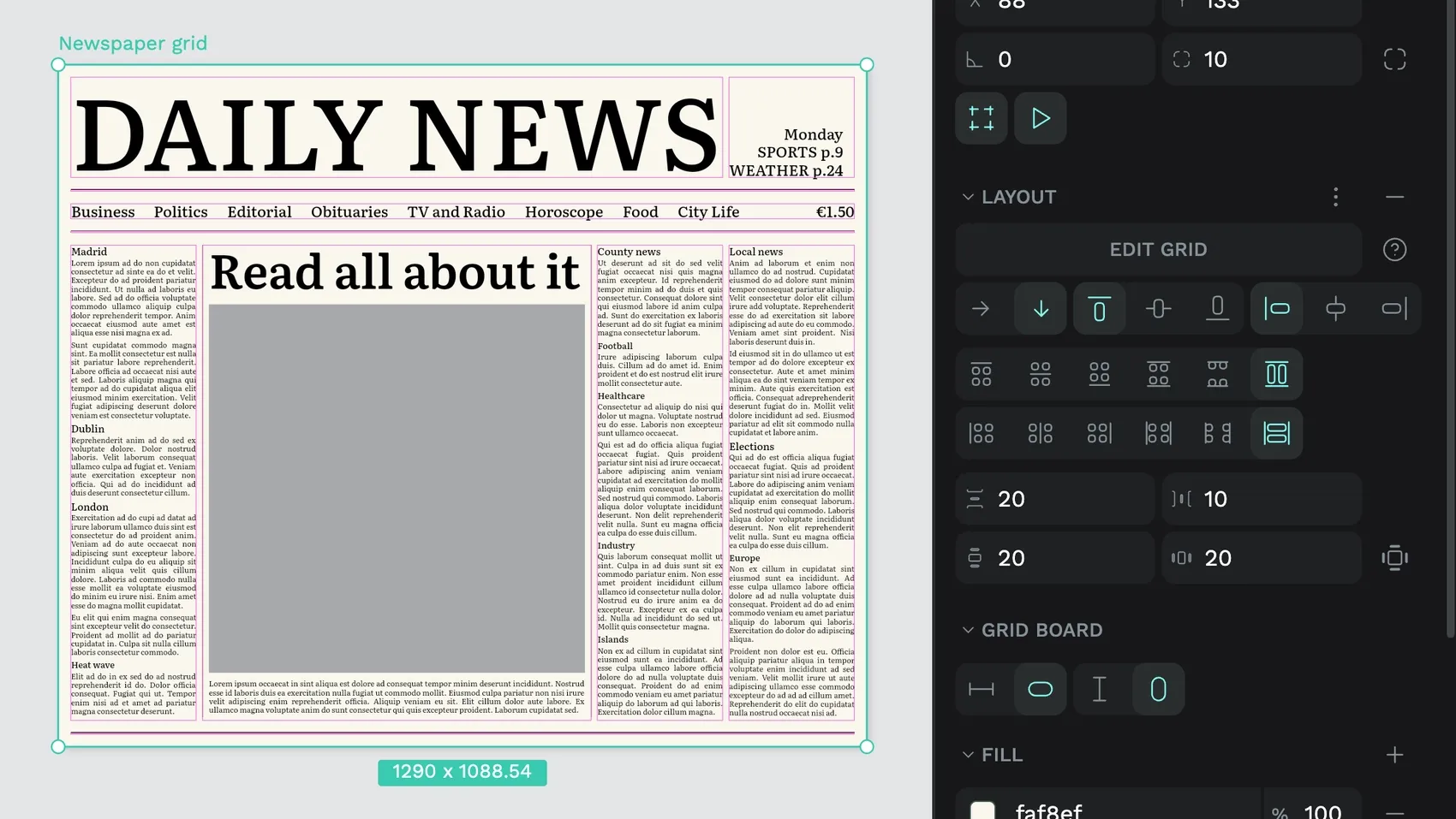
Your layer order will stay the same regardless of the flex and grid direction. This is because the direction changes the visual order, not the source order. It’s worth bearing this in mind if you want the visual order to match the code’s source order for accessibility reasons (accessible products are better products!) To ensure your visual order matches your source order, change the order of your layers to reflect the visual order before applying the layout direction.
Gaps and padding
Gaps and padding are how you control the spacing inside and around your Flex and Grid layouts.
Gaps
Gaps are the spaces between your columns and rows. They are always equal. (For unequal spacing, check out margins!) Row gaps are the gaps between rows, and column gaps are the gaps between columns. If you’re creating a Flex layout, row gaps will be enabled if you’re using a column direction, and column gaps will be enabled if you’re using a row direction. However, if you’re using the flex wrapping option, both row and column gaps will be enabled. Grid layouts always have both gap options enabled.
Padding
Padding is the spacing inside your layout, around your flex and grid elements. You can set the vertical (top and bottom) and horizontal (left and right/start and end) padding values together, or use the 4-sided padding option to set a different value for each side of your layout.
Gaps and padding are probably the properties where you’re most likely to use design tokens, to help you keep your spacing consistent across layouts.
Board sizing
One of the keys to responsive layouts is in the board sizing. You can find the properties for board sizing in the Flex board or Grid board section in the Design panel when you have your flex or grid layout selected. These settings control the width and height of your board/layout.
The options you see here will depend on whether your layout is inside another flex or grid layout. By default (layouts not inside other layouts), you will see two sets of options:
- Fix width/fix height: This is the default option for board sizing. It fixes the width and/or height of your board to match the board’s pixel width and height defined at the top of the Design panel.
- Fit content (horizontal)/fit content (vertical): This is your first responsive option. Here you can set your board to fit the width (horizontal) or height (vertical) of your content. The layout’s size will adjust dynamically according to the size of the elements inside it. If you want to mimic the behavior of a web browser viewport, set your board to a fixed width and fit content vertically. You can adjust the board width manually (or use design tokens to mimic breakpoint sizes) to see how the layout reflows vertically.
If your layout is nested inside another layout, you will also get the Width 100%/Height 100% (often referred to as fill width and height) as another responsive option under the Flex element and Grid element properties. Here you can set your board to fill the width and height of its container. This is a useful option if your element is inside a grid and you want it to fill the whole grid cell to make the grid structure more visible, or if you want your element to just fill all the available space regardless of the size of its own contents.
Impossible layout sizes
Keep in mind that there are some impossible combinations of automatic heights and widths. For example, a flex layout using fit content width containing a flex element using 100% fill width means there’s no value from which the layout or element widths can be determined. Or if a grid cell with a row height of auto contains a grid element with a height of 100% fill, there’s no value to determine the height. In these cases, Penpot will set a fixed width/height on either the layout or element when you set the second value that creates the impossible combination.
Penpot’s grid editor
Hover over a grid layout on the canvas, and you’ll get an outline of its grid. To check out the grid in more detail, or make changes, you’ll want to open up the grid editor. Open up the grid editor by double-clicking the grid on the canvas, or from the Edit Grid button in the Design panel when you have the grid board selected.
The grid editor is where you set up your grid layout’s columns and rows. Here you’ll see the same grid layout settings, with the addition of an interactive visualized grid design viewport over your canvas, as well as Columns and Rows settings.
From the grid design viewport, you can adjust your grid right there on the canvas, adding new columns and rows from the + buttons and inputting sizes for each column and row. You can also drag to resize the rows and columns using fixed pixel values.
Grid columns and rows
When editing a grid layout, the number of columns and rows, and their sizes, are listed in the Design panel. From there you can add an extra column or row using the + button or edit the existing columns and rows from the contextual menu.
This menu expands into a list of inputs for each column or row. The first input is the size, and the second input is the unit of measurement:
- fr (fraction unit) is an equal fraction of the available space. You can use frs to create multiple-column grids with equal-sized columns, or use a 1fr width column to take up the rest of the space left by fixed-size columns.
- Auto matches the width or height of the content inside the grid cell.
- px (pixel) is the height or width in pixels, you know those right?!
- % (percentage) sets a column or row a percentage of the overall container width (for columns) or height (for rows.) Percentages are different from fr units as they are always relative to the size of the container rather than the available space.
You can combine different units for each column and row which often means you can simplify your grid. For example, if you have a three-column grid, where a content area spans the first two columns, and a sidebar spans the third column, you actually only need a two-column grid: column 1 (content column) with a width of 2fr, and column 2 (sidebar column) with a width of 1fr.
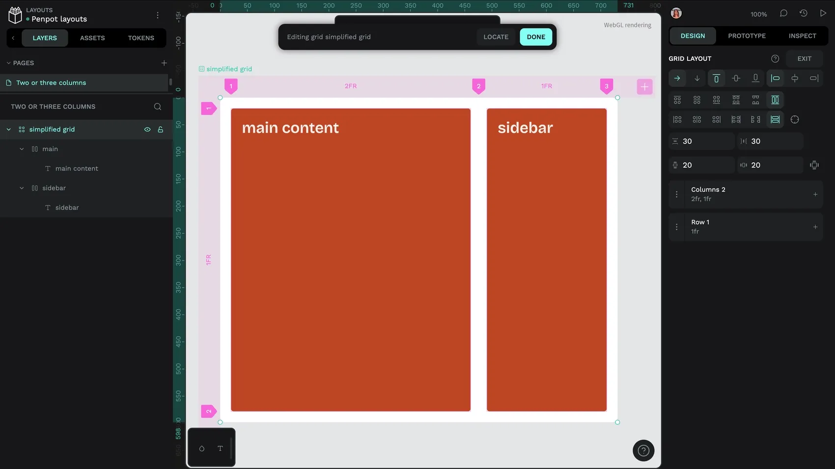
Customizing grid cells and spanning multiple columns and rows
Where a grid cell begins and ends is determined by its column and row line numbers. These are the big numbers along the top and left of the grid design viewport. You can reference these numbers when making changes to grid cells.
When viewing the grid design viewport, you can select any grid cell to customize its settings further. For each option, you can override the grid layout’s overall settings for alignment for your selected grid cell.
- Auto is the default behavior of a grid cell, and here you can set the column and row lines where this grid cell starts.
- Manual is where you can choose if your grid cell should span multiple columns and rows. For example, if your grid cell starts at column line 2, and you want it to span two columns, set the end column line number to 4.
- Area gives you a place to name your grid cell. This is particularly useful if you have a cell spanning multiple columns or rows for a specific purpose like “navigation” or a “banner.” The area name is also accessible in the Code in the Inspect panel, making it easier for you to understand the purpose of the layout during the development process.
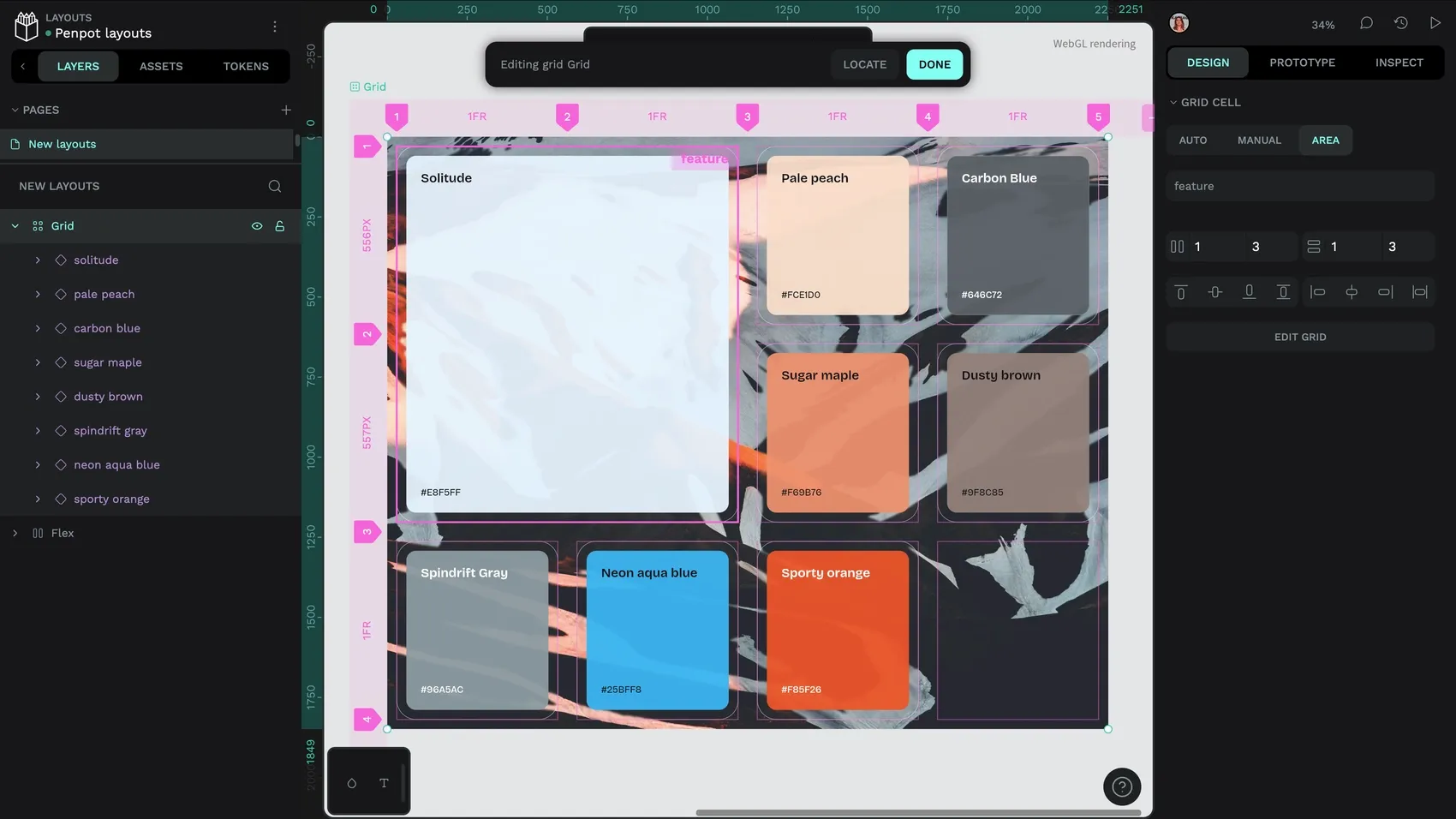
Adding elements to Flex and Grid layouts
As I mentioned earlier, you can create a flex or grid layout from an existing group of design elements or board containing elements, and the elements will automatically be added to the layout. To add new elements to your layout, you can drag or paste them into the layout on the canvas, or drag the element’s layer in the Layers panel so it’s nested under the layout’s layer.
Note that if there aren’t enough grid cells to accommodate a new grid element, Penpot will automatically add an extra column or row to contain it.
Flex element and grid element properties
Flex and grid elements have their own sizing properties that can override the properties of their parent layouts. These properties are the same as the board sizing properties including fix, fit, and fill. But there are also unique properties available to flex and grid elements:
- Static/Absolute: Static positioning is the default, and any element with static positioning will follow its parent’s flex or grid layout. Absolute positioning takes your element out of the layout’s flow, while still keeping it in the layers list. This can be helpful if you want to create overlapping layouts or fix an element in place relative to its parent container. However, it does limit the flexibility of your layout. If you want overlapping layouts, using margins might be a better approach (see below.)
- Z (
z-index): The z-index is a property for overriding the visual stacking order of an element across the z-axis. By default, the stacking order follows Penpot’s layer order, with the highest layer on top, and the lowest layer underneath. Z-index allows you to override the stacking with a number value. The highest numbered element will appear at the top, and the lowest number at the bottom. Z-index is particularly useful for setting the stack order for overlapping elements. For example, an element with z-index 3 will appear above an element with z-index 2. - Align self: Align self offers you three alignment properties for overriding the alignment rules set on the parent layout. So if you wanted all the items to be aligned to the middle of a flex layout except the first item which is aligned to the left/start, you would set middle alignment to the flex layout, and left/start to the flex element.
- Margins: Margins are the spacing outside an element, and can be valuable where you want to introduce different spacing on some flex or grid elements. Like padding, margins can be applied to the horizontal and vertical margins, or to each side of the element separately. Margins are very handy when you want to create overlapping elements in a layout. You can use negative margins (margins with a negative value) to pull an element to overlap its previous and next siblings, and then use z-index to set the stack order for the overlapping elements.
Flexible layouts are the future
I genuinely believe that flexible layouts can improve our design practice for the better. Considering the flexibility and responsiveness of what we design helps us create products that work better for more people. Declarative design helps us think in a way that works better in code, and makes the design to development process so much easier.
For more resources on Flex and Grid layouts, I’ve created many layout templates and shared them on the Penpot Hub. There are also a few Hands-on live streams where I’ve walked through creating flex and grid layouts from start to finish:
To create responsive flexible layouts in Penpot, you can sign up for free.
Related Blogs
Looking for more posts about grids, layouts, and UI design with Penpot? Get started here:
 Laura Kalbag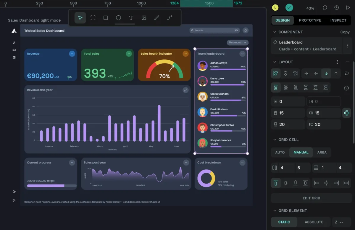
 Laura Kalbag
 Paula Tienza