Background grids vs grid layouts: what’s the difference?
Background grids are guides you use to help you manually position design elements by eye. Grid layouts automate layouts (often responsively) based on the design rules you provide.

Often I see people coming to Penpot knowing that they want a grid, but unsure about whether they want to use a background grid or a grid layout. If you are one of these people, this tutorial is for you! And you can jump down to learn about the differences. If you’re new to grids in UI design, read on and let me explain the basics first.
Why use a grid?
The concept of “grids” is treasured in visual design, especially if you come from a traditional graphic design background like me. You create a series of columns and rows, or even just vertical and horizontal lines. And then you align design elements to these columns and rows, giving consistency and order to a layout.
If your columns and rows are evenly distributed, it makes for a rhythm that people find visually pleasing. You can leave an empty space in your grid to help group elements and create a visual hierarchy, or draw attention to an element with the negative space around it.
Design elements can span multiple columns or rows of your grid; this is a handy way to accommodate differently-sized design elements inside a single grid.
The most basic grid in UI design is a single-column layout. It’s usually one column of content like text and images with spacing on either side of the column. You’ll most likely see these layouts for mobile devices and other narrow viewports where you scroll down the page and don’t have much horizontal space available.
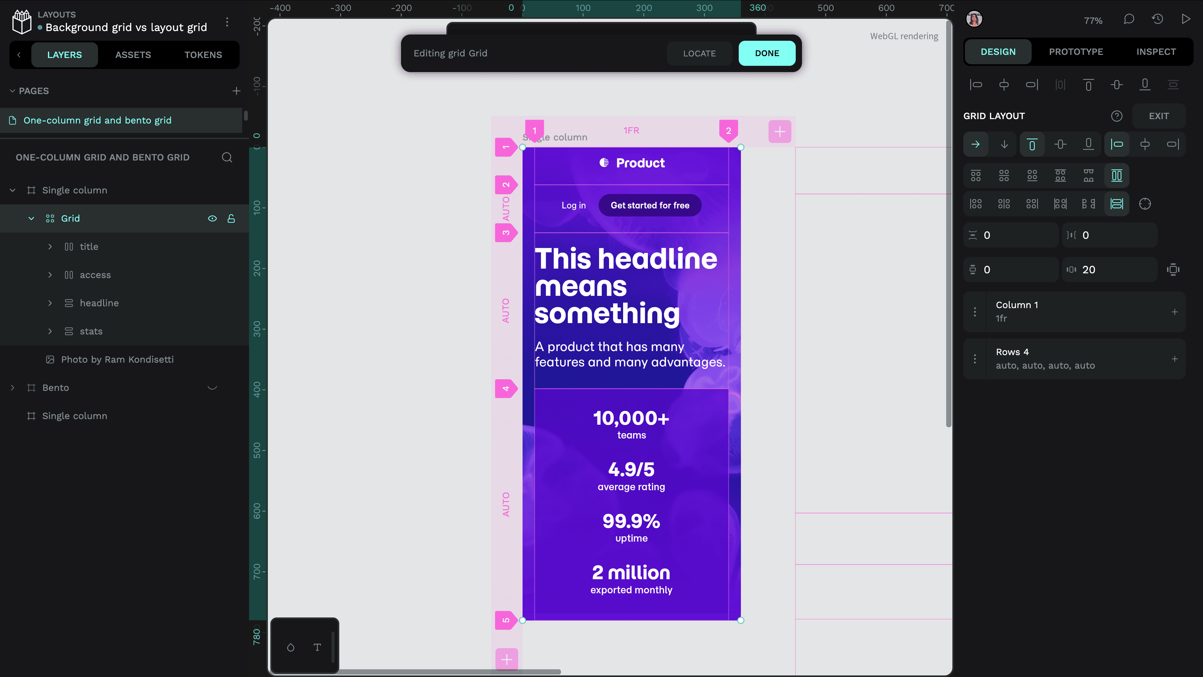
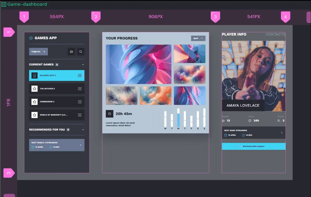
When you’ve got more space to play with, your grids can be more complex. Another common grid in UI design is a multi-column and multi-row grid where some elements span multiple columns and rows for a “bento box” design, inspired by the Japanese lunchbox layout.
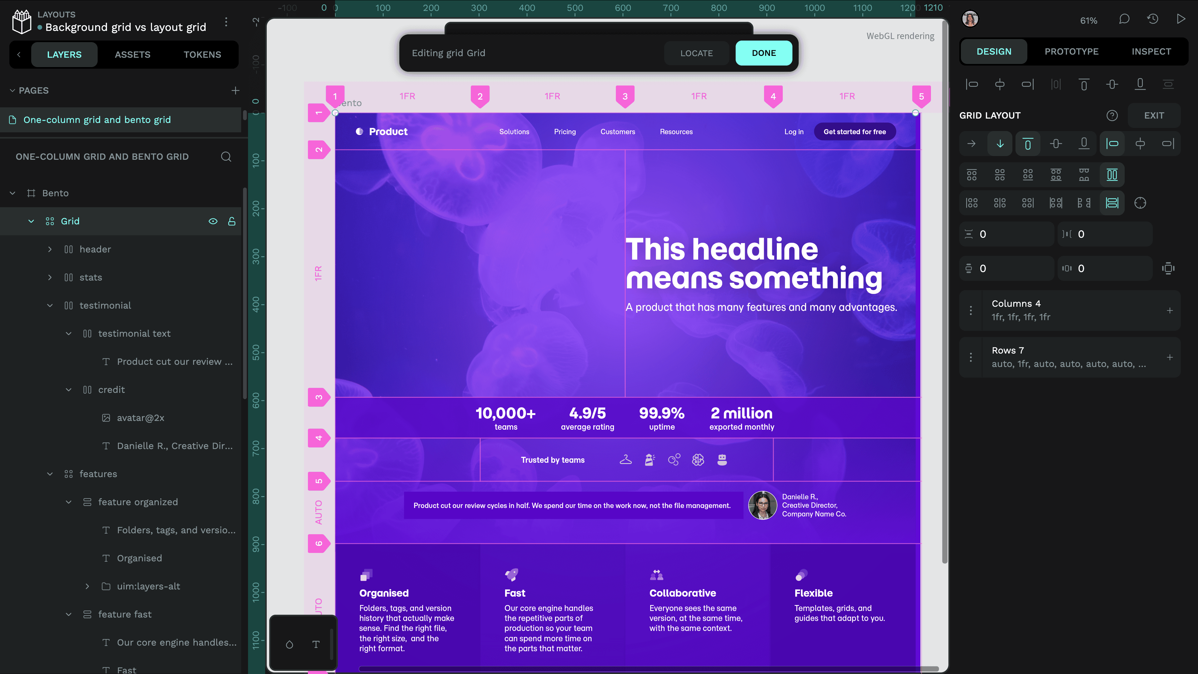
Bento box grids are common for dashboard layouts containing many cards.
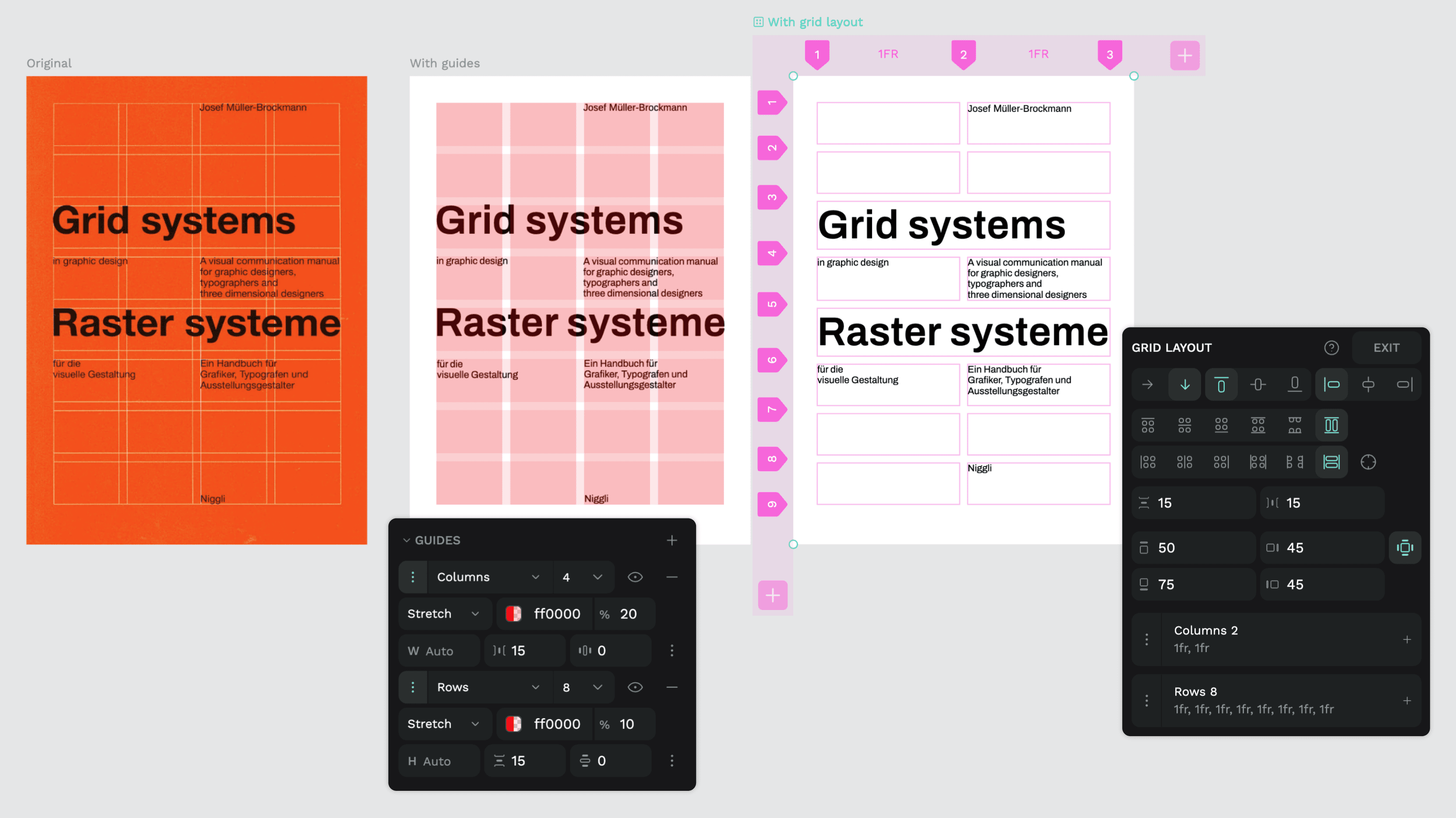
Background grids (guides): you do the work
In more traditional graphic design, you often use a “background grid,” where you set up your grid columns and rows in the background of your design area, and then manually position your design elements in the foreground by eye, using the grid as a guide for alignment.
In Penpot, background grids are called “Guides” because they guide how you align your layouts, but they don’t control the layouts; you do. Each board can have its own guides.
How to add guides in Penpot
To add a new guide, select the board and add a guide from the Guides section towards the end of the Design panel.
By default, a new guide will be a square grid, similar to a pixel grid. You can choose different guide types from the dropdown menu:
Square guide
The number value alongside the square guide is the pixel size of each square in the grid.
Use the context menu to change the color and opacity of the grid lines.
Columns guide
The number value alongside the columns guide is the quantity of columns. By default, the columns are set to an auto width, stretching to fill the width of the board. But you can also set a fixed pixel width for the columns and choose to align the fixed-width columns to the Left, Center, or Right.
You can set gutter sizes to control the space between the columns, and margins to control the space on either side of the columns.
You can also change the color and opacity of the columns, the same as the other guides.
Rows guide
The number value alongside the rows guide is (you guessed it!) the quantity of rows. By default, the rows are set at an auto height, stretching to fill the height of the board. But you can also set a fixed pixel height for the rows and choose to align the fixed-height rows to the Top, Center, or Bottom.
You can set gutter sizes to control the space between the rows, and margins to control the space above and below the rows.
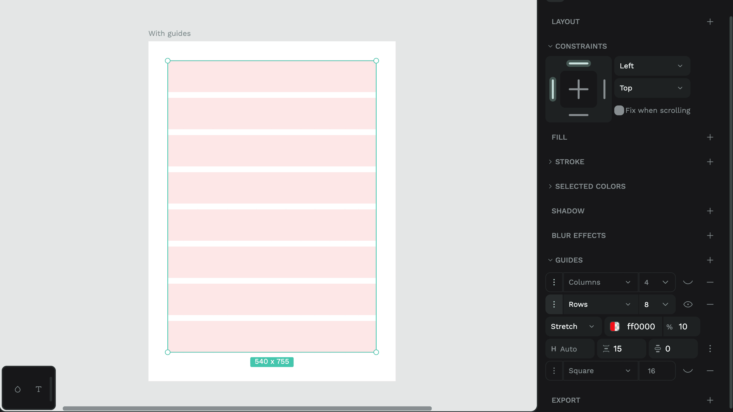
When you make any adjustments to the default square, columns, or rows guides, you have the option to set your chosen guide as default, or revert to the default guide.
Reverting to default will reset your guide to its default values.
Combining multiple guides
You can add and combine as many guides of different types as you want, dragging them to change their layer order.
Want to create complex guide grids and share them across your Penpot boards and files? Try this fantastic Guides & Grids Manager Penpot plugin by Stas Haas.
If you want simple alignment guide lines across your whole canvas, regardless of the boards, try dragging a ruler guide from the horizontal or vertical canvas rulers.
Background guides can be useful if you have a precise layout that you need to use for print output like poster or book design. But if you want layouts that can respond to differently-sized viewports (responsive design) or automatically handle unpredictable quantities and sizes of content, that’s where grid layouts really shine.
Grid layouts: automate the work
There are four big reasons to use grid layouts instead of background grids (guides):
- Grid layouts automate the design layout process. You define the rules–the columns, rows, their sizes and spacing–and the design elements will flow into place without you having to manually align anything.
- Grid layout columns don’t have to be the same width, and grid layout rows don’t have to be the same height. They don’t even have to use the same units of measurement for their widths and heights.
- Grid layouts can be responsive. You can set them to use flexible units like auto, % or fr (more on units below!) and they will fill the available space or fit the content put inside them.
- Penpot grid layouts are CSS code. You don’t have to write the code, but because it’s using the same concepts and terminology, you can grab the CSS properties or code from the Inspect panel, and it will render exactly as you designed it in the browser.
How to create a grid layout
You can create a grid layout from a group of existing elements, or make an empty grid layout on a board:
- Select your group of elements or board.
- From the Design panel, use the + button alongside Layouts to add a layout, and choose Grid layout.
If you made a grid for existing design elements, Penpot will create enough columns and rows to accommodate all your elements. Otherwise, it will create a default grid layout with two columns and two rows.
Once you’ve added a grid layout to a board or group, its layer icon will change to a 2x2 mini grid, and the Design panel will show all the grid options and properties in the Layouts section.
Setting up grid columns and rows
Select the grid on the canvas or Layers panel, and use the Edit Grid button to open up the grid editor view. From here, you can change the number of columns and rows, their widths and heights, alignment and content distribution, the gaps between columns and rows, and the padding around the outside of the columns and rows.
As I mentioned earlier, your grid layouts can mix and match column and row sizes and units, unlike background grids (guides) where columns and rows use the same sizes and units.
There are a few more key concepts to be aware of when using grid layouts.
Grid cells
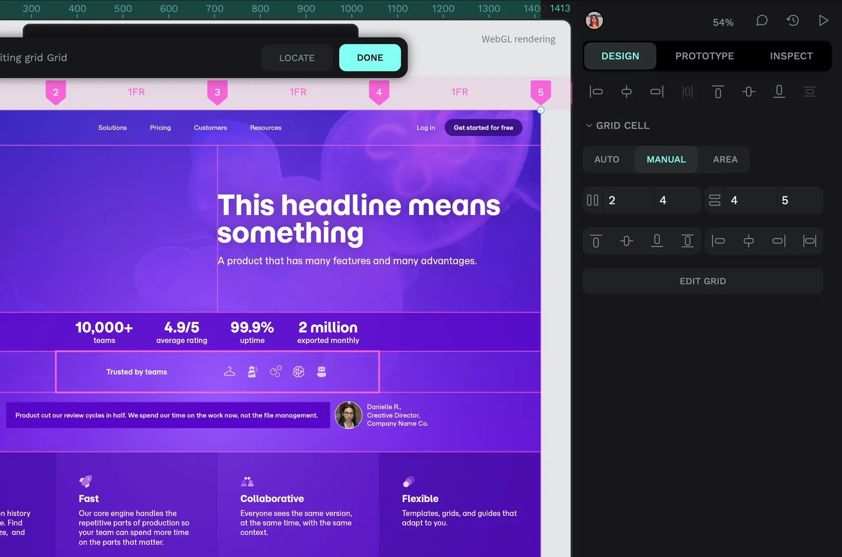
Grid cells are defined as the space between two column lines and two row lines. These are the numbered lines in the grid editor view. These grid lines become important when you want a grid cell to span more than one column and/or more than one row. You can select the grid cell by clicking inside this space, and you’ll get extra grid cell options. If you choose the Manual option, you can specify the grid column lines and grid row lines where the grid cell should start and end.
For example, if the grid cell for the logo icons should span two columns and one row in the middle of the grid, its start column line is 2, and its end column line is 4, its start row line is 4, and its end row line is 5.
Grid areas
Grid areas are another option for grid cells. Once you’ve set up a grid cell, you can choose the Area option to give it a name. The names will be shown as labels overlaid on the grid, and will also be visible in the code, making the layout of your grid easier to visualize during development.
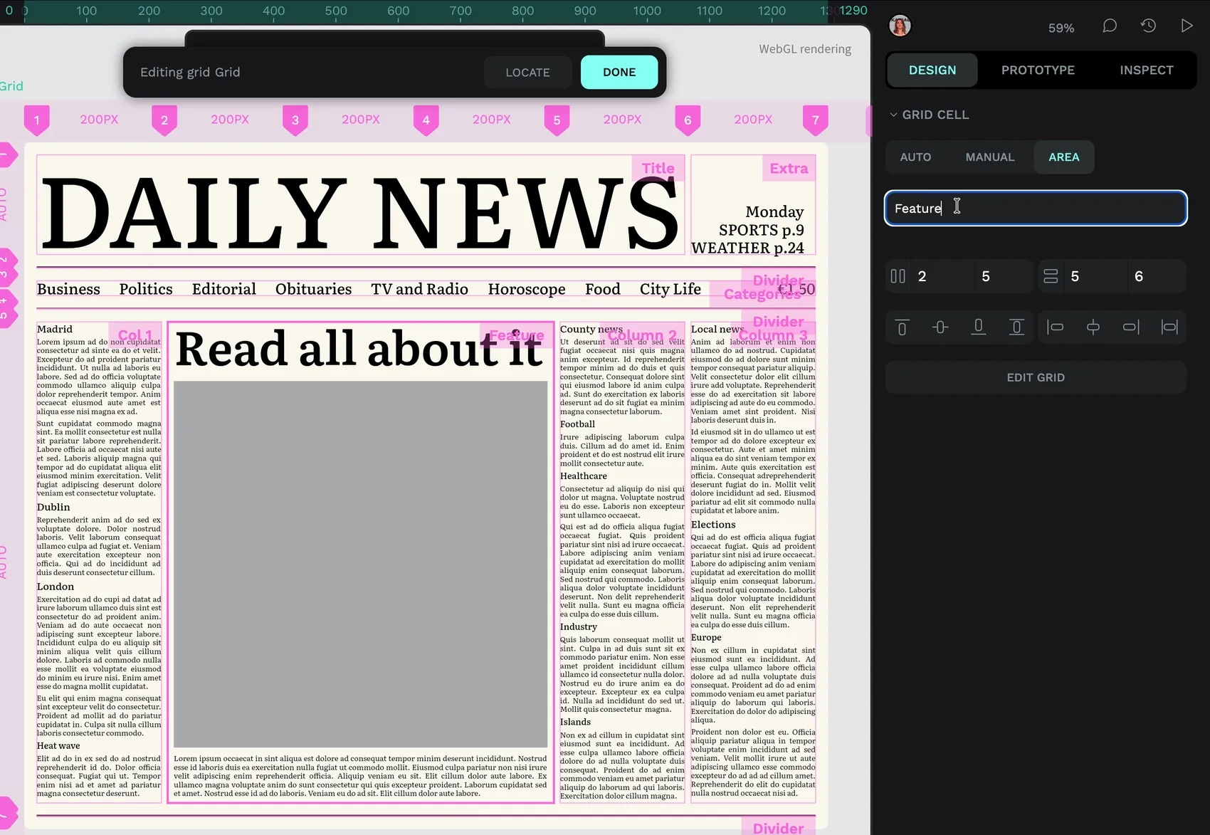
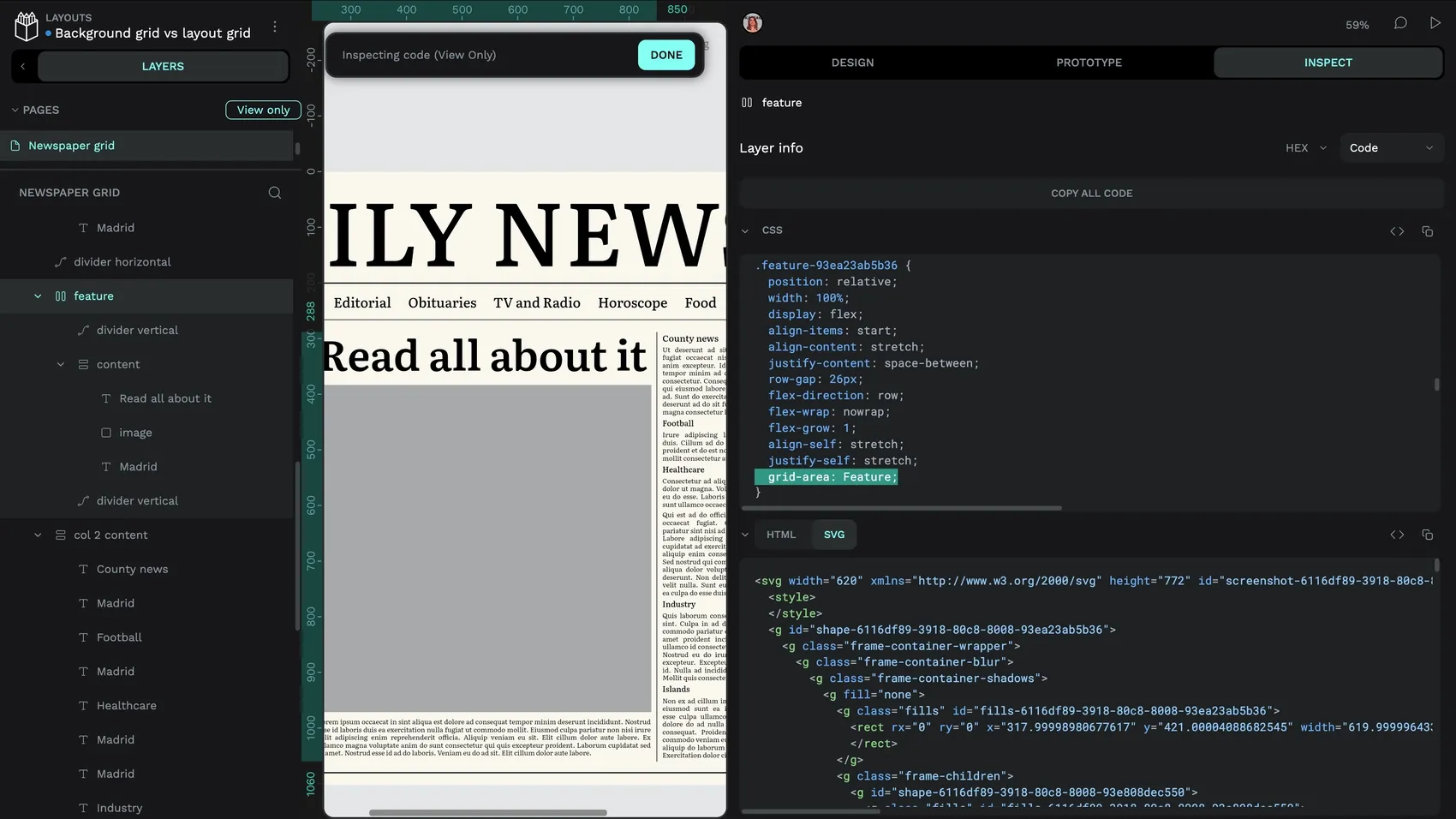
grid-area property is named Feature too.Auto width and height
You can set your column widths and row heights to auto to make them fit the height and width of the design elements inside the column or row. This is particularly powerful when combined with the fr unit for the remaining columns or rows.
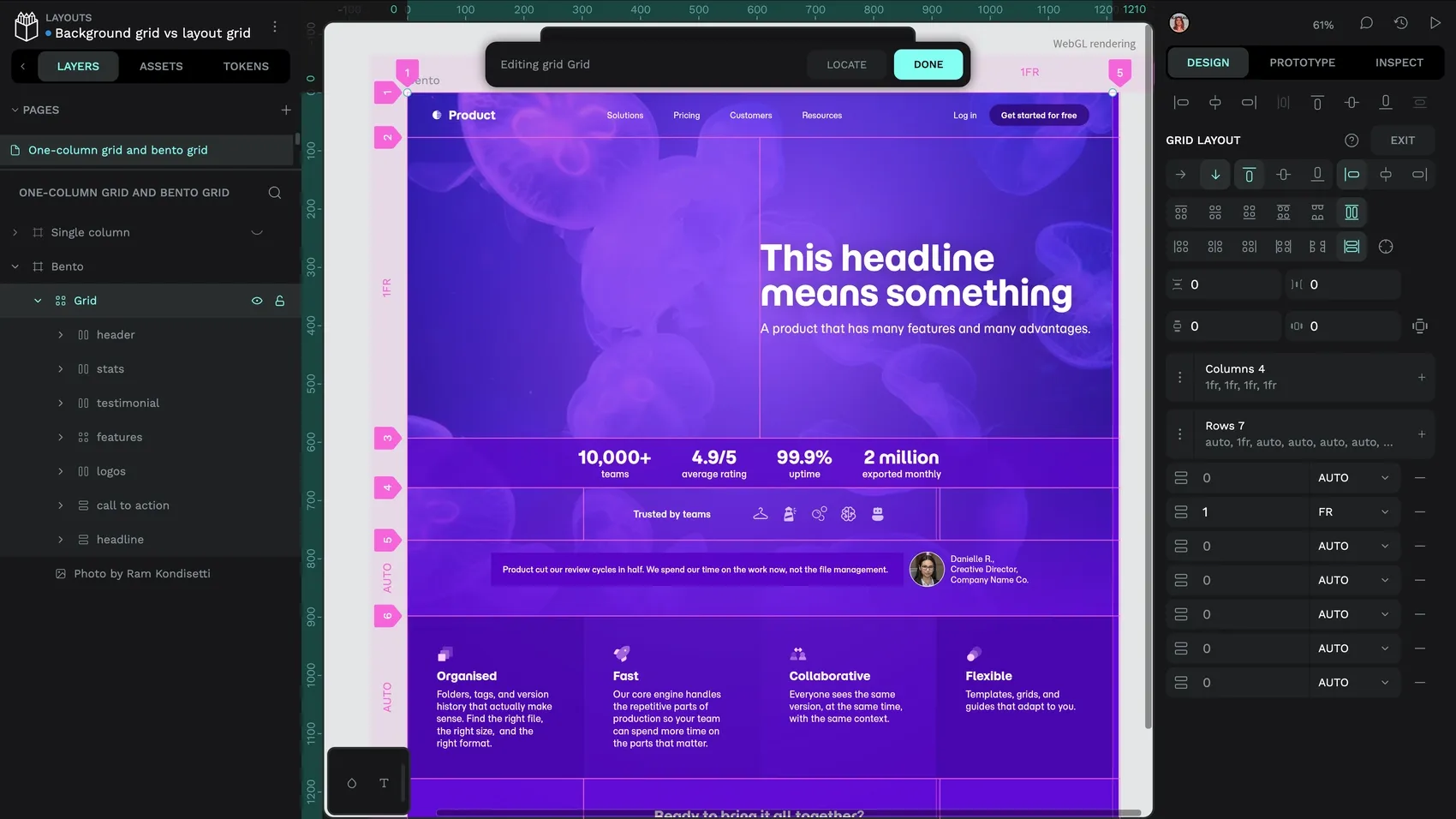
auto, fitting its content’s height, except the headline row which fills the remaining space (1fr.)Fr width and height
The fr or “flex” unit is another unit of measurement for columns or rows. It tells the column or row to take up a proportion of the available or leftover space. If you wanted to create a flexible layout with three equal-width columns, regardless of the width of the overall grid, you would make each column 1fr wide. If you wanted one of the columns to be twice as wide as the other columns, you would set it to 2fr wide.
Grid flow direction
As grid layouts are automated, you can choose whether the elements you put inside the grid flow across the rows or down the columns, using the arrow buttons. A more complex grid row might reflect the direction your users read in, but you can use a different flow direction for unusual layouts like mimicking newspaper columns.
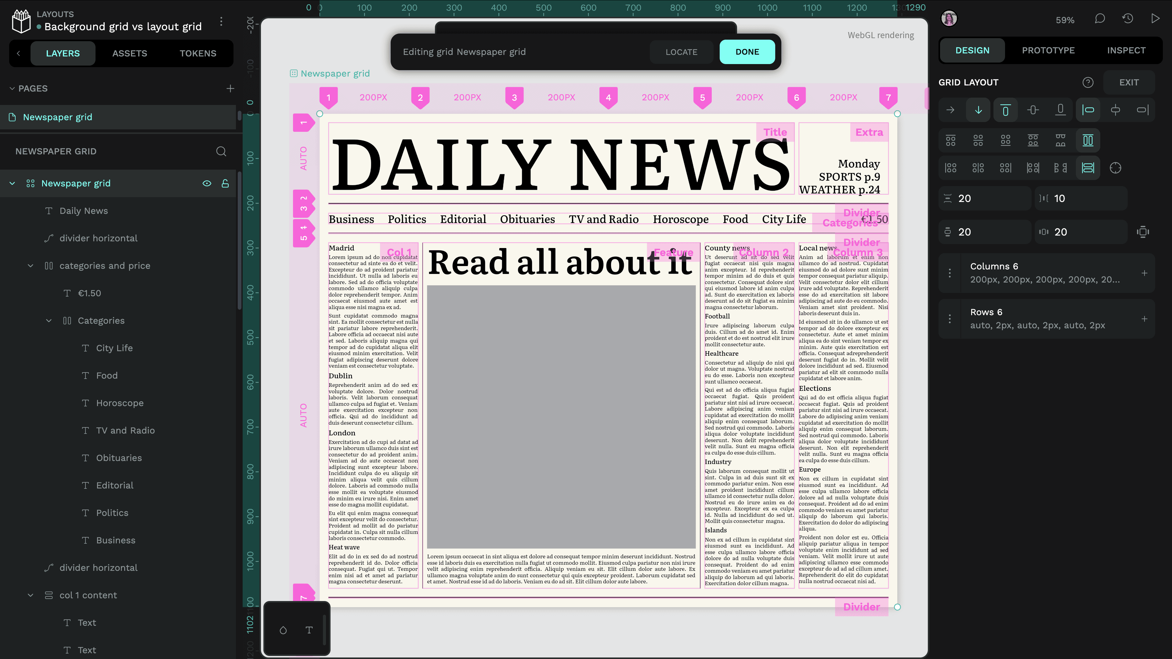
Alignment and justification
With grid layouts you have advanced controls for how you align and justify content within the grid. Align defines how grid items are positioned along the grid flow direction, and justify defines how grid items are positioned along the opposite axis. So for a grid that is set to flow in the row direction, the alignment will determine how the grid items are aligned horizontally, and the justification will determine how grid items are aligned vertically.
Grid board
The grid board sizing is how you define the height and width of your overall grid container.
- When the grid board height or width is fixed, it will use the pixel height or width measurements for the board.
- If the grid board height or width is set to fit content, it will resize to fit (or hug) the height or width of its contents.
- If the grid container is inside another flexible layout (either grid or flex layouts), you will also have the fill option, where your height and width can fill the available space in its layout.
Keep in mind that not all grid column and row sizing units are compatible with all grid board column and row sizing units. For example, you can’t combine columns and rows using fr units with the fit content board sizing, as the fr size relies on a defined container size, and fit content relies on defined grid item sizes.
Grid items
Any design element you place inside a grid layout becomes a grid item and gains extra layout properties. You can choose its alignment and margins independently from the rest of the grid, and whether the item should keep its default dimensions or stretch to fill the height and width of the grid cell.
The easiest way to get familiar with how grid layouts work is to try them out! You can find out even more about Penpot’s Grid layouts in the User Guide and from the Related Blogs section at the end of this tutorial.
Terminology
There are different terms used in guides vs grid layouts. If you come from traditional graphic design and want to translate your background grids into grid layouts (or vice versa!) here’s what the different terminology means:
What about tables?
You can also use a grid layout for tabular data. Although, with the complexity and unpredictability of data content, you might prefer to leave the layout of a table to the platform where your design is displayed. Web browsers and other UIs have algorithms to optimize the display of tables based on the quantity and shape of the data, and these are likely to be more complex than anything you can define in a design platform.
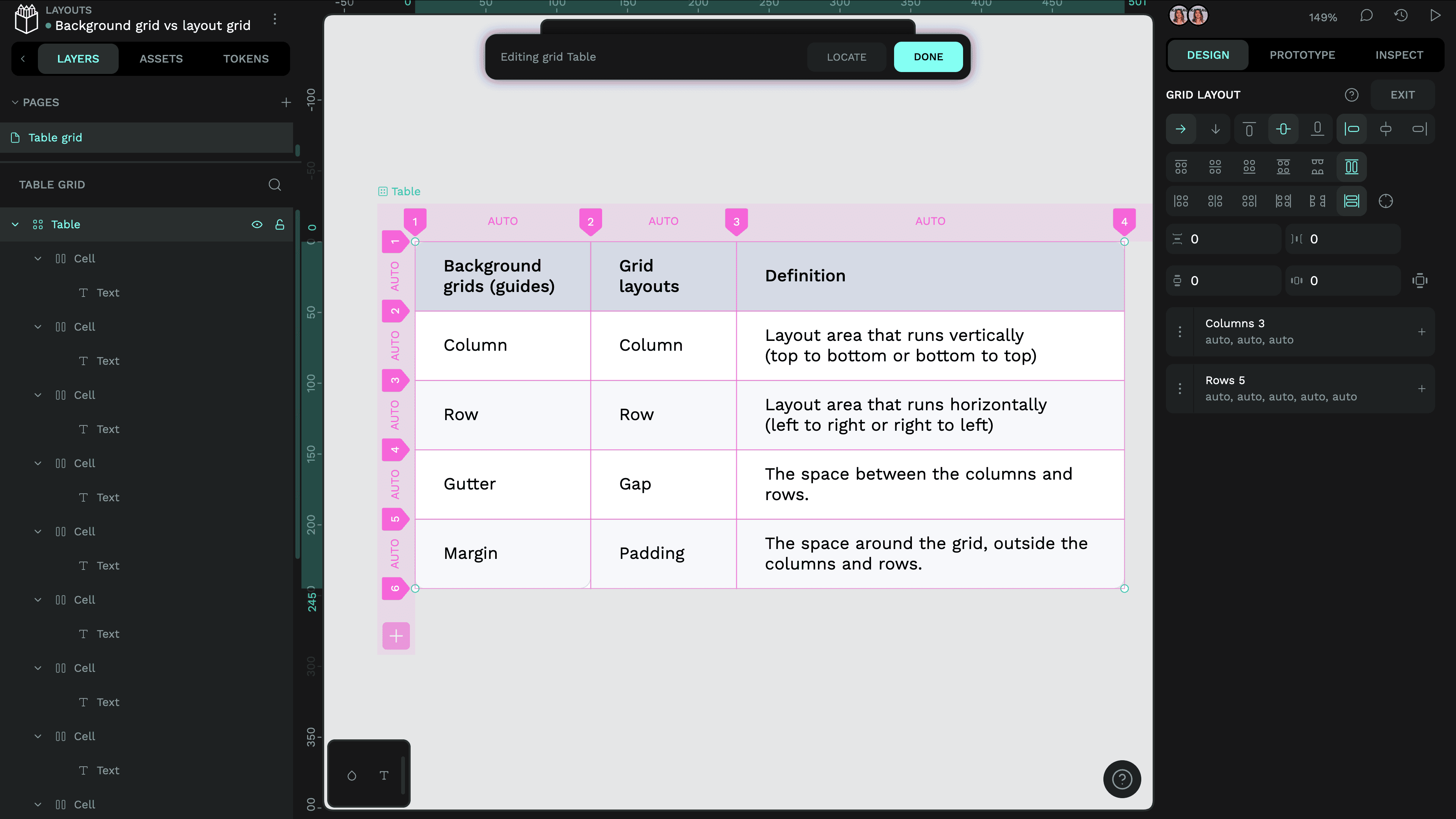
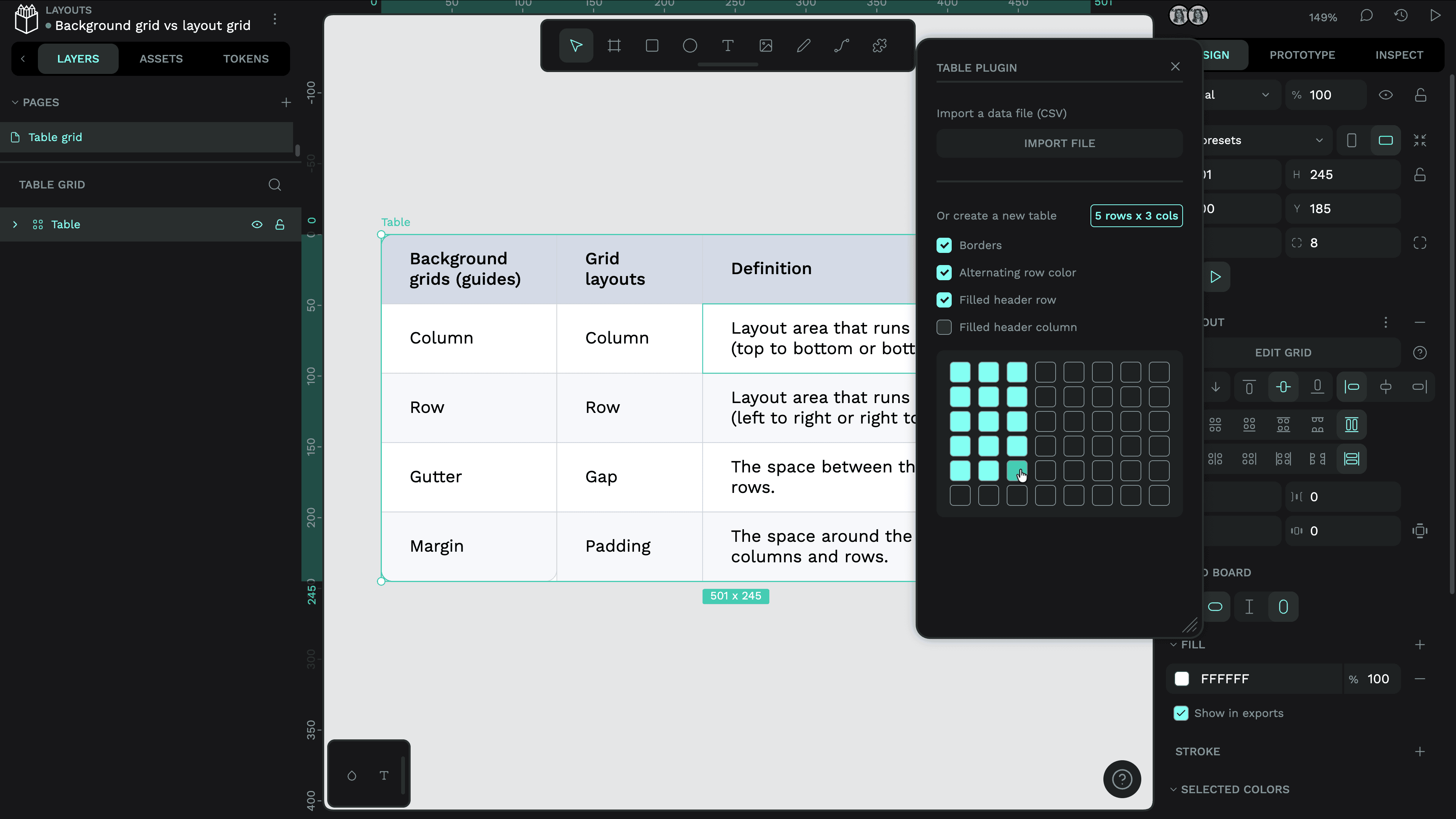
If you want to use a grid layouts for tabular data in Penpot, try the Penpot team’s Tables plugin to speed up the production and styling of the layout.
What about pixel grids?
Are you designing teeny tiny elements like icons where whole pixel alignment matters? Then you want a pixel grid! In Penpot, you can view the pixel grid by zooming in.
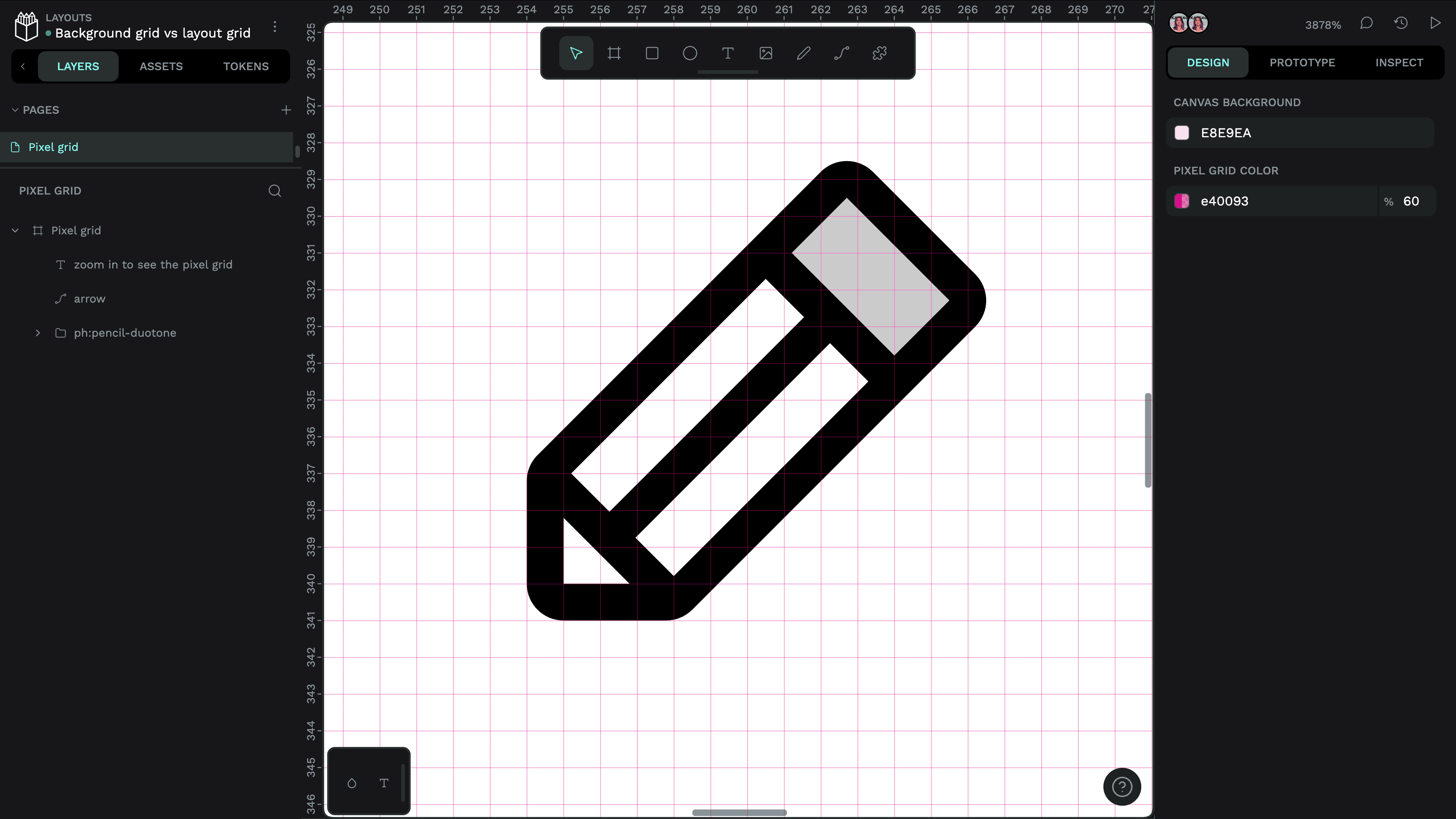
You can click the canvas to change the color and opacity of the pixel grid from the Design panel, and show/hide the pixel grid from the View menu or using the shift + , shortcut.
What about flex layouts?
If you want layouts where overflowing content wraps, or to control a layout horizontally or vertically but not both at the same time, you might want to use flex layouts. Flex layouts have more flexibility, and are often more useful for the layouts of components or small patterns. You can find out more about flex layouts from the Related blogs section below, or read about flex layouts in Penpot’s user guide.
Related blogs
 Laura Kalbag
 Laura Kalbag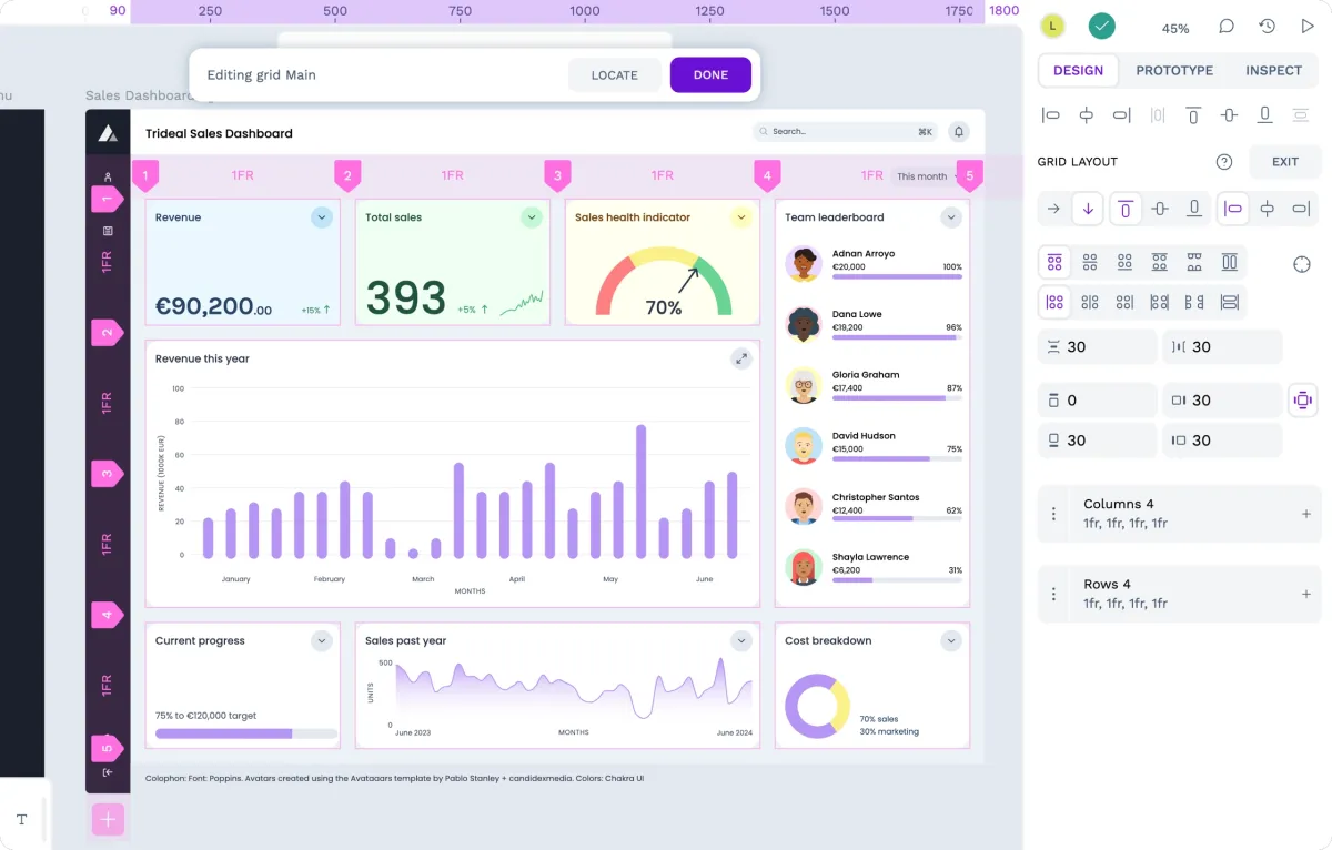
 Laura Kalbag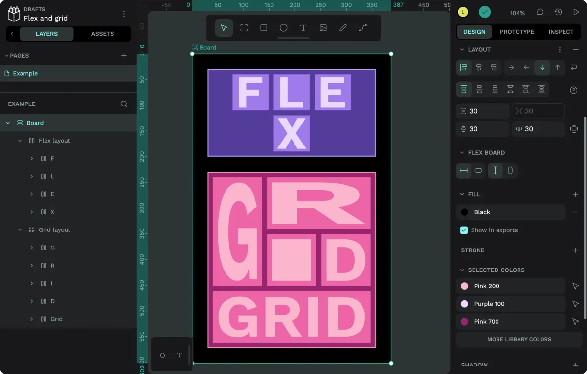
 Paula Tienza