Figma to Penpot terminology cheatsheet
Switching from Figma to Penpot? Here’s what everything is called, from boards and flex layout to design tokens and Inspect.

You’re migrating from Figma to Penpot, hello and welcome! You’ll probably find that many features feel familiar from other design platforms, but there are key differences. And sometimes it’s just the case that you’re looking for a specific feature but it has a different name in Penpot. I’ve written this cheatsheet covering the differences in terminology for you!
Boards
| Penpot | Figma |
|---|---|
| Boards | Frames |
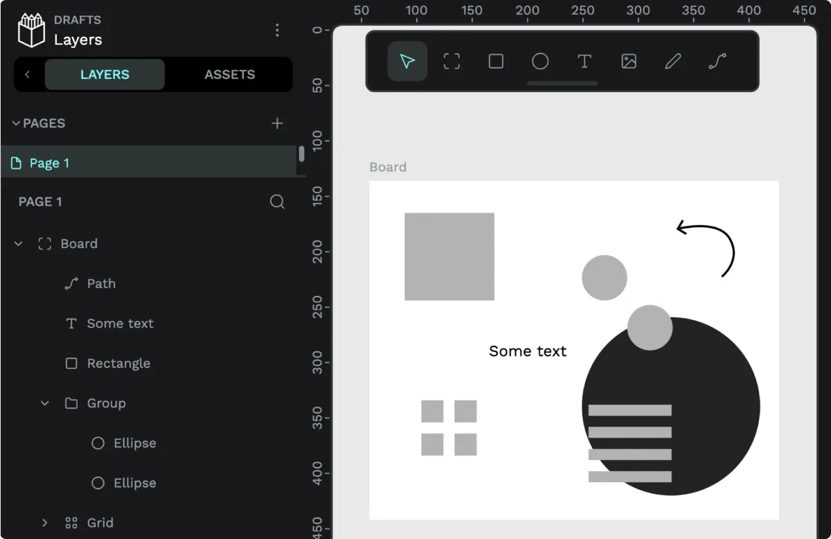
One of the biggest but simplest differences between Figma and Penpot is the containers you use on the canvas for organization and layout. Penpot calls these boards. You can create a board from the board tool in the toolbar or using the shortcut B.
Creating a board from the toolbar.
Colors, typography, and design tokens
| Penpot | Figma |
|---|---|
| Assets | Styles |
| Colors | Color styles |
| Typographies | Text styles |
| Design tokens | Variables |
| Design token sets | Collections |
| Design token themes | Modes |
Where Figma has Assets and Styles, in Penpot, you store Colors, Typographies and Components under the Assets tab. This is also where you can publish your stored assets as Libraries to share with your team.
Find components (and any Colors and Typographies) in the Assets tab.
Colors and Typographies are a handy way to save colors and text styles for reuse later, but you can also store them as design tokens. Design tokens don’t just support colors and typographies, but spacing, dimensions, shadows, and much more. Penpot’s design tokens are similar to Figma’s variables, however they natively use the W3C Design Tokens Community Group format so they work easily with any other tool that shares this format.
While you can organize Figma’s variables into Collections, Penpot’s design tokens have sets, which you can selectively apply to create themes. Themes are a little like Figma’s Modes, but in Penpot themes you can combine sets across a group, and several groups can be active simultaneously.
Find Tokens and design token themes in the Tokens tab.
Layouts
| Penpot | Figma |
|---|---|
| Flex layout | Auto layout |
| Absolute (positioning) | Ignore auto layout |
| Fit content | Hug contents |
| Guides | Layout guides |
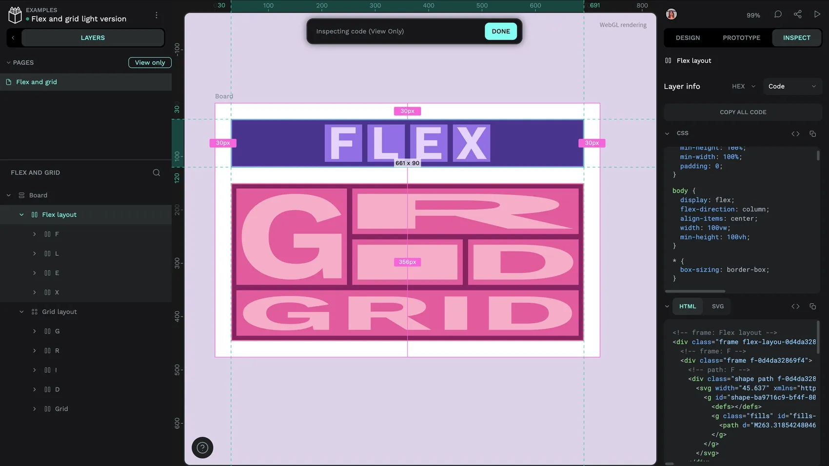
In Penpot, you can choose between Flex layout and Grid layout for automated flexible layouts. Flex layout is similar to Figma’s auto layout, but Penpot takes its properties (as well as its name!) from CSS Flexbox. Penpot’s Grid layout uses the same properties as CSS Grid. This means that as you’re designing your layouts, you’re creating them as code. They work exactly the same way as they do in the browser, and any user with any role can get the CSS properties or code from the Inspect tab.
Flex and Grid layouts work exactly as they do in a web browser.
Following the CSS Flexbox properties and values, Penpot uses “Fit content” to describe when a layout is automatically sized to its contents, not “Hug contents” like Figma. And when you want an element to ignore its flex or grid parent layout? Look for the Absolute positioning option in the element’s layout properties.
Guides in Penpot can be columns, rows, or an old-school square grid, as well as rulers. You might know these as “layout guides” in Figma.
Inspect
| Penpot | Figma |
|---|---|
| Inspect | Dev Mode |
If you’re a developer you might recognize more terminology here: in Penpot we “Inspect” our designs, rather than moving to a different Dev Mode as in Figma. Inspect is found in the workspace or View mode, and any user can access the properties and code for the selected element on the canvas.
View mode
| Penpot | Figma |
|---|---|
| View mode | Present / Play prototype |
Similar to Figma’s “Present” or “Play prototype” options, Penpot has View mode. View mode is where you can share or present your designs, as well as testing your prototypes. While in View mode, you can also generate (and destroy) share links, leave comments, and inspect the design’s code.
Use the play button to launch View mode.
Community resources
And if you’re looking for community resources, check out the Penpot Hub for a whole variety of libraries, templates and plugins.
Moving your whole team over?
Now you know what the features are called, you can start moving your designs across. If you’re thinking bigger than a personal project, Penpot works for enterprise teams too, however large or distributed you are.
Designers and developers work in the same place, and designs are built on the same CSS foundations developers already use. That means less time translating between design and code, and more time building. You can also host Penpot on your own servers, so your data stays under your control.
If you’d like to see how Penpot could fit your organization’s workflow, take a look at our pricing or get in touch with our Sales team.
Get started with Penpot
We have loads of introductory tutorials right here on the Penpot blog, you can also find links to videos and other educational content in our Learning center.
 Laura Kalbag
 Laura Kalbag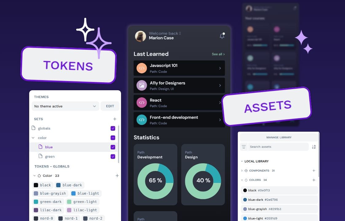
 Laura Kalbag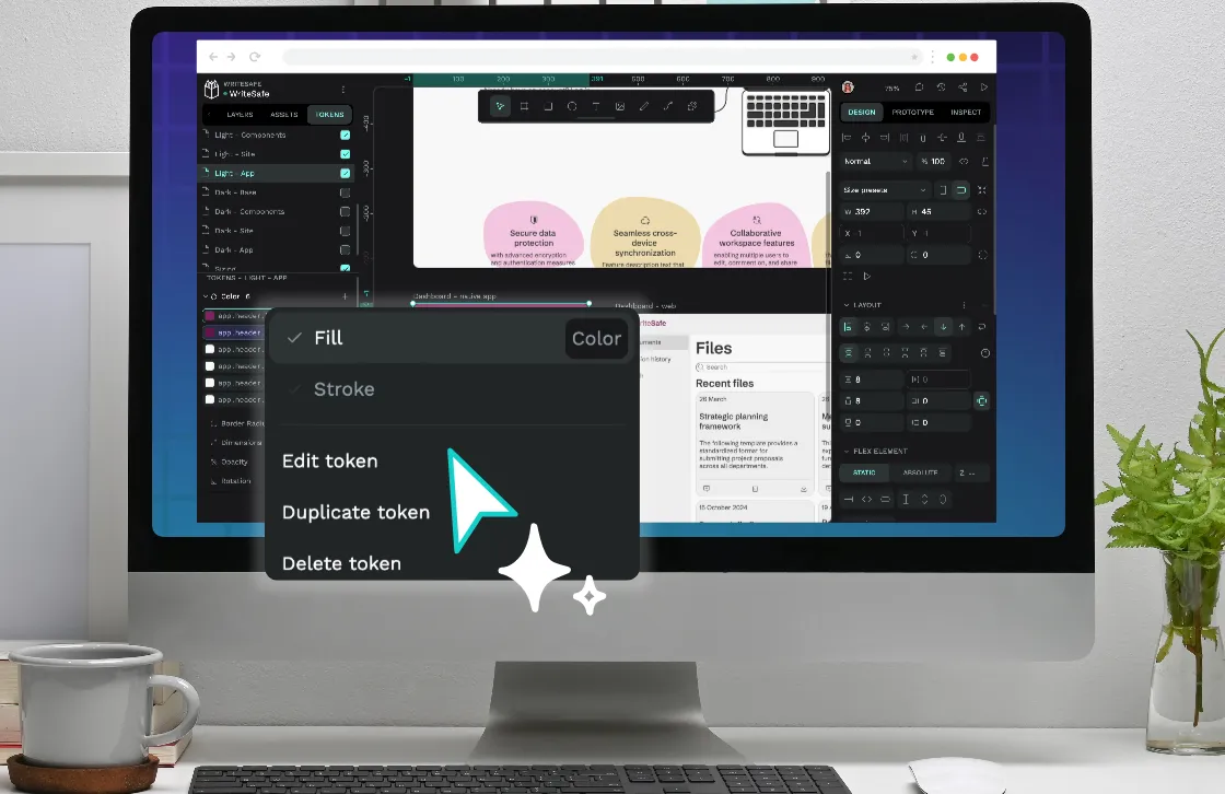
 Laura Kalbag
 Laura Kalbag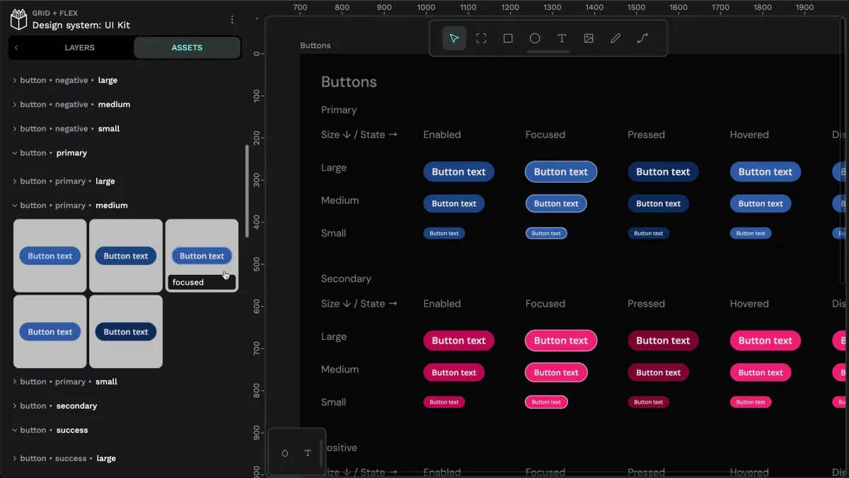
 Laura Kalbag