What is declarative design and why is it the future?
Declarative design means setting rules a design follows, not detailing how it looks in every situation. Let’s compare it to other approaches (with examples!)


Watch the hands-on live session where I discuss the value of declarative design.
When I started out designing for the web, we would create designs at a fixed 1024 pixels wide. It was considered just about a safe width that could be displayed in most web browsers on most computer screens without having to scroll horizontally. If the screen was a lot wider than 1024 pixels, we centered our design in the middle of the page. We looked back at the previous era where people were creating designs at 800 pixels wide and luxuriated in the space we had available to us.
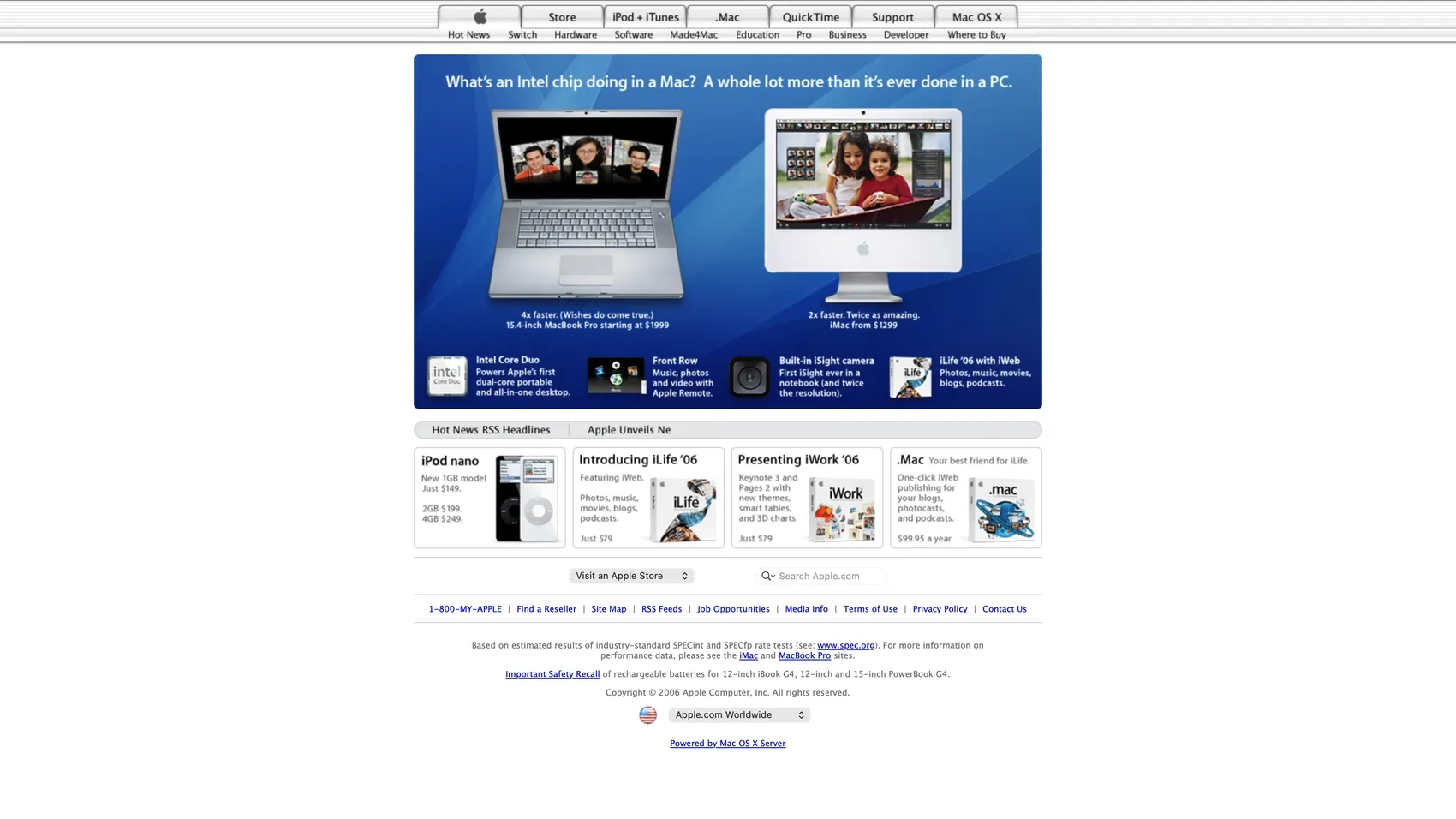
This approach to web design worked well for people like me coming from a more traditional graphic design background. We were used to designing for print, where a printed poster, booklet, CD cover, or book, always had a fixed height and width. We had absolute control over every millimeter of our design and how the final product would look. And so we took our paper-based print design precision into a pixel-precise web design approach (sometimes known as imperative design).
Fallbacks and progressive enhancement
On the development side, we had fallbacks and progressive enhancement as best practices we could use when that pixel-precision didn’t quite work. These were often necessary as each browser could render a web page in wildly different ways, even more so across different browser versions, and browsers didn’t auto-update like they do now.
When the content contained varying lengths of text, we could use scrollable areas. When an image didn’t load, the user would get the alternative text. (If someone had bothered writing it!) If the chosen “web-safe” font wasn’t on the user’s device, we could fallback to the system font, or use a font family stack to specify similar fonts that were an acceptable substitution.
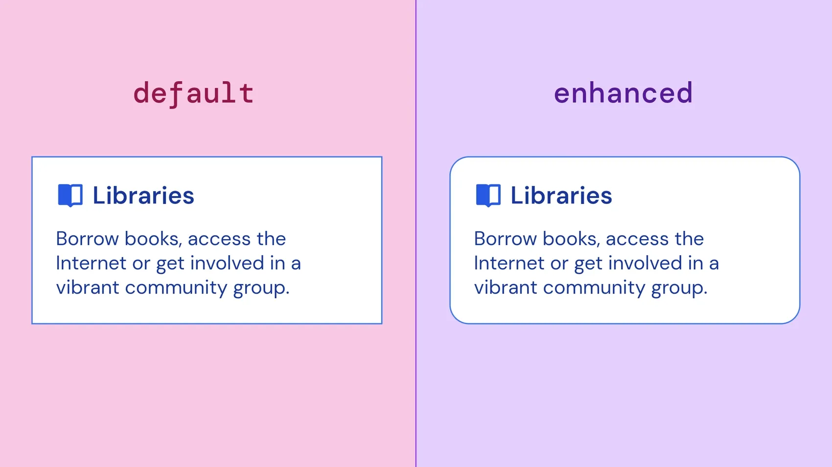
border-radiusWe could start using new features available to us in CSS like border-radius for rounded corners (circa 2015), but we would use progressive enhancement; a box could have an acceptable default of square corners for most people, and those whose browsers supported rounded corners would get the curvy version.
Providing alternative design options meant we gave up a little bit of control over how the final product looked, but we increased the chances that it wouldn’t be broken, and that the person using that final product had a good experience.
Even though these fallbacks and progressive enhancements were design decisions, their use and execution was mostly the developers’ responsibility as they involved code. If you were lucky, designers and developers could work out a solution together.
Eventually 1024 pixels wasn’t enough anymore. The mobile web meant that people could get a version of our sites with web browsers on their phones. Then came smartphones, then apps. As UI designers, we needed to be able to design for flexibility.
Flexible and responsive design
In modern UI design, we’ve accepted that we are rarely faced with fixed content and fixed device sizes. We are usually designing for a moving target (sometimes literally): web browsers that can render at any size on any device, UIs that need to work in multiple languages which have different character sizes and word lengths, or templates for content that’ll have different text and media every time it’s used. And we don’t have the time to design a different version for every possible combination.
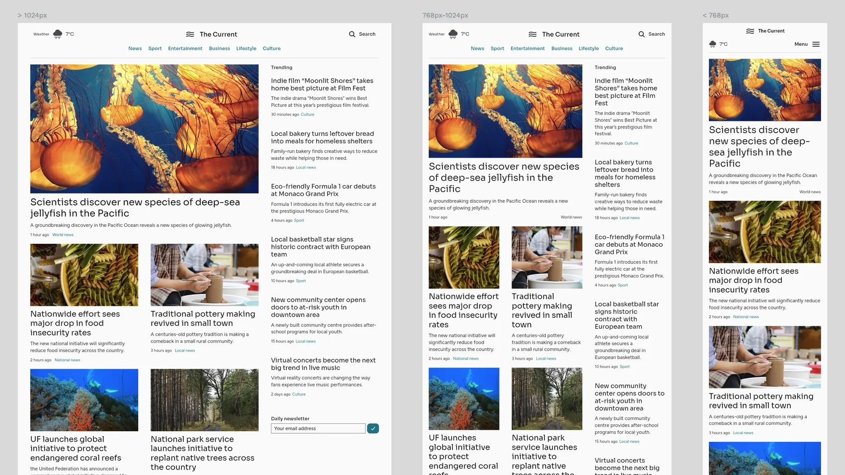
Responsive design started a movement of designing for the built-in flexibility of the web. Instead of designs using predefined fixed sizes, responsive design responds to the width of the browser viewport, using media queries for breakpoints (where the design “breaks”) to define constraints. We could decide to make a menu vertical on a narrow mobile-width viewport, and horizontal on a wide desktop-width viewport. We could choose a single-column layout for narrow viewports and a multi-column layout for wider viewports.
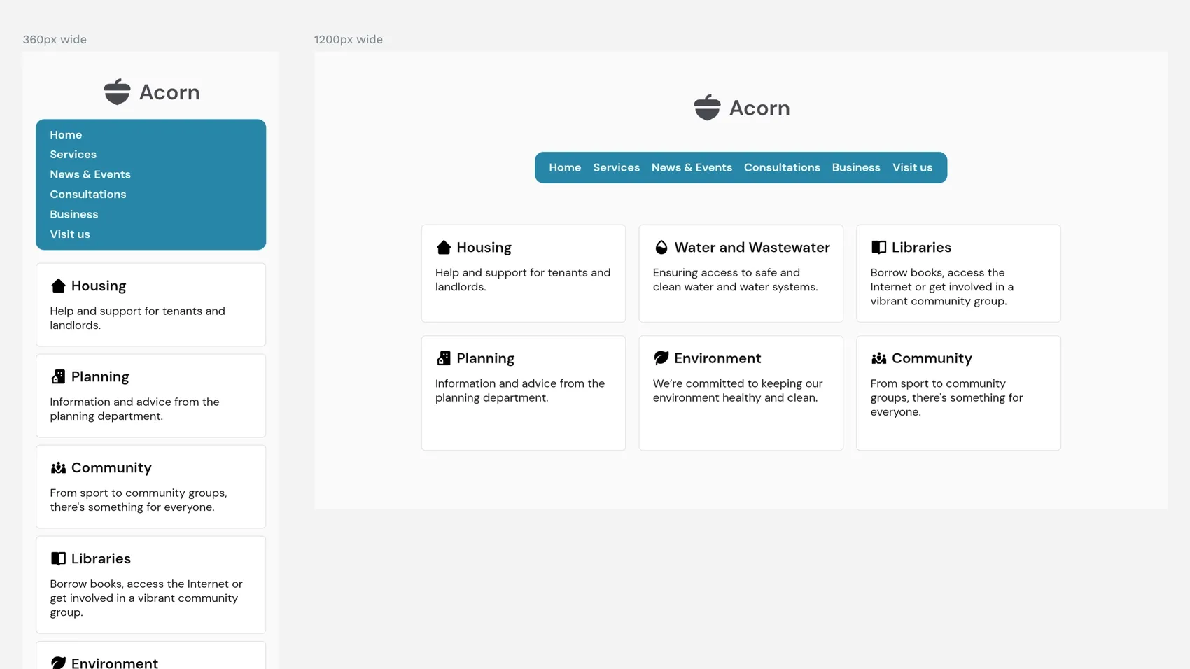
While breakpoint-based designs were more flexible than our fixed-width creations, many of us ended up designing different layouts for the most popular “mobile, tablet, desktop” breakpoints without putting much thought into where a design might break in between. It was hard to visualize and test these in-between points using a design platform.
Again, developers often end up making the design decisions here, working out the constraints at the stage of implementing the design in the browser. And, again, if you have a good designer-developer relationship, it might be a collaborative process.
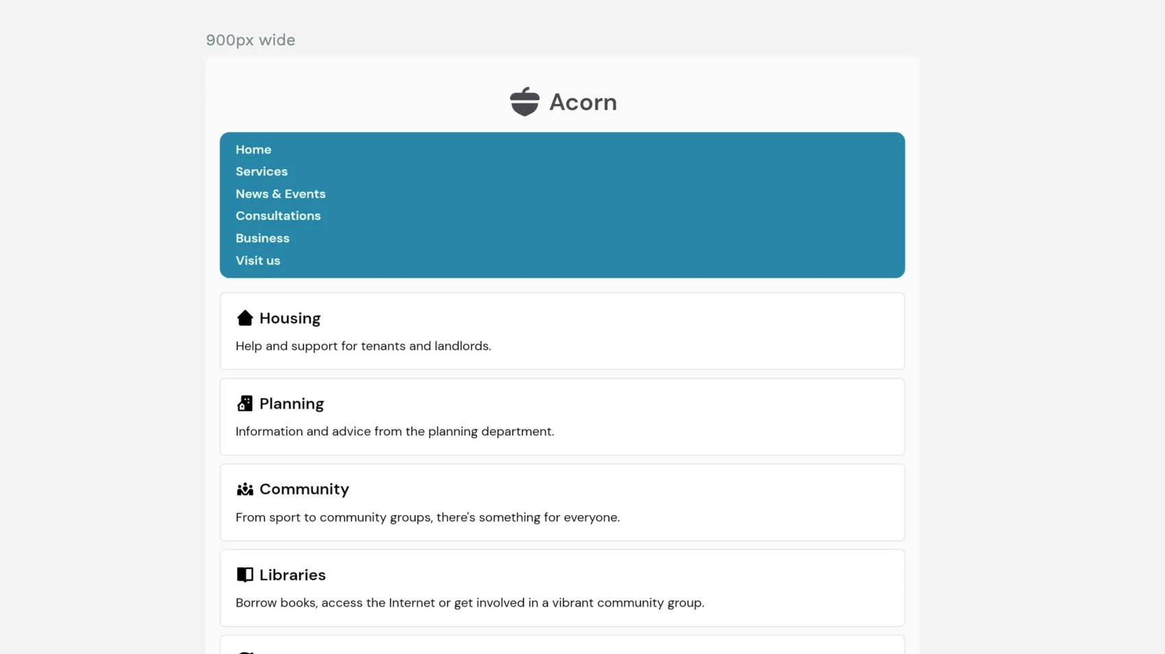
But, more often than not, our final products end up broken between breakpoint sizes. You can see this on many of your favorite sites and apps! Sometimes there’s weird empty spaces, images that are way too big, content that just looks a little wrong, all because you’ve decided to browse at a slightly unusual viewport size: mobile in landscape, tablet in portrait, split screen on a laptop.
There is a way to make this easier!
What is declarative design?
Nowadays, responsive design has evolved thanks to intrinsic and declarative design.
Jen Simmons originated intrinsic web design in 2018, focusing on the CSS layout features that were arriving in browsers around that time. Flexbox and Grid layouts (these might sound familiar if you use Penpot!) gave us more control over a flexible layout, and ways to combine different layout types for complex and sophisticated structures.

CSS Flexbox provided layouts that could grow and shrink depending on their container and contents. CSS Grid provided two-dimensional layouts where you could control columns and rows together. Both types of layouts could bring together fixed and flexible elements simultaneously, as well as new flexible ways to size things: the fr unit, the auto keyword, and functions like minmax() and clamp().
Designing for the layout features that are intrinsic (or native) to the browser, means you can make the most of what the browser is good at, like complex layout logic and calculations.
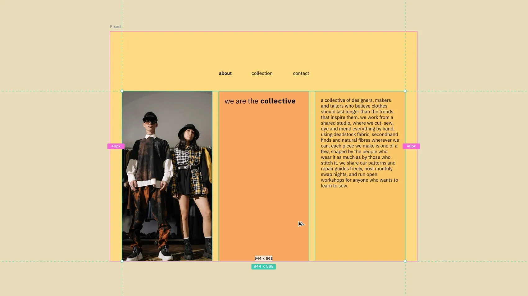
With a fixed design, you’d have to work out that your three column layout needs 3x columns that are 301.3333 recurring pixels wide if it’s going to have 40px padding on each side, 20px spacing between each column, and still fit inside 1024px. And that only works in a viewport that’s 1024px wide.
In intrinsic design, you say you want 3x columns of 1fr wide with 40px padding, 20px column gaps, and that’ll work in most viewport sizes. You could even switch out the fixed pixel sizes for the simple vw (viewport width) unit. Then 40px padding becomes ~4vw and column gap becomes ~2vw, adapting depending on the width of the viewport. You could use your vw value as the default inside a clamp function to specify minimum and maximum values, so your padding and gaps don’t become too tight or too roomy.
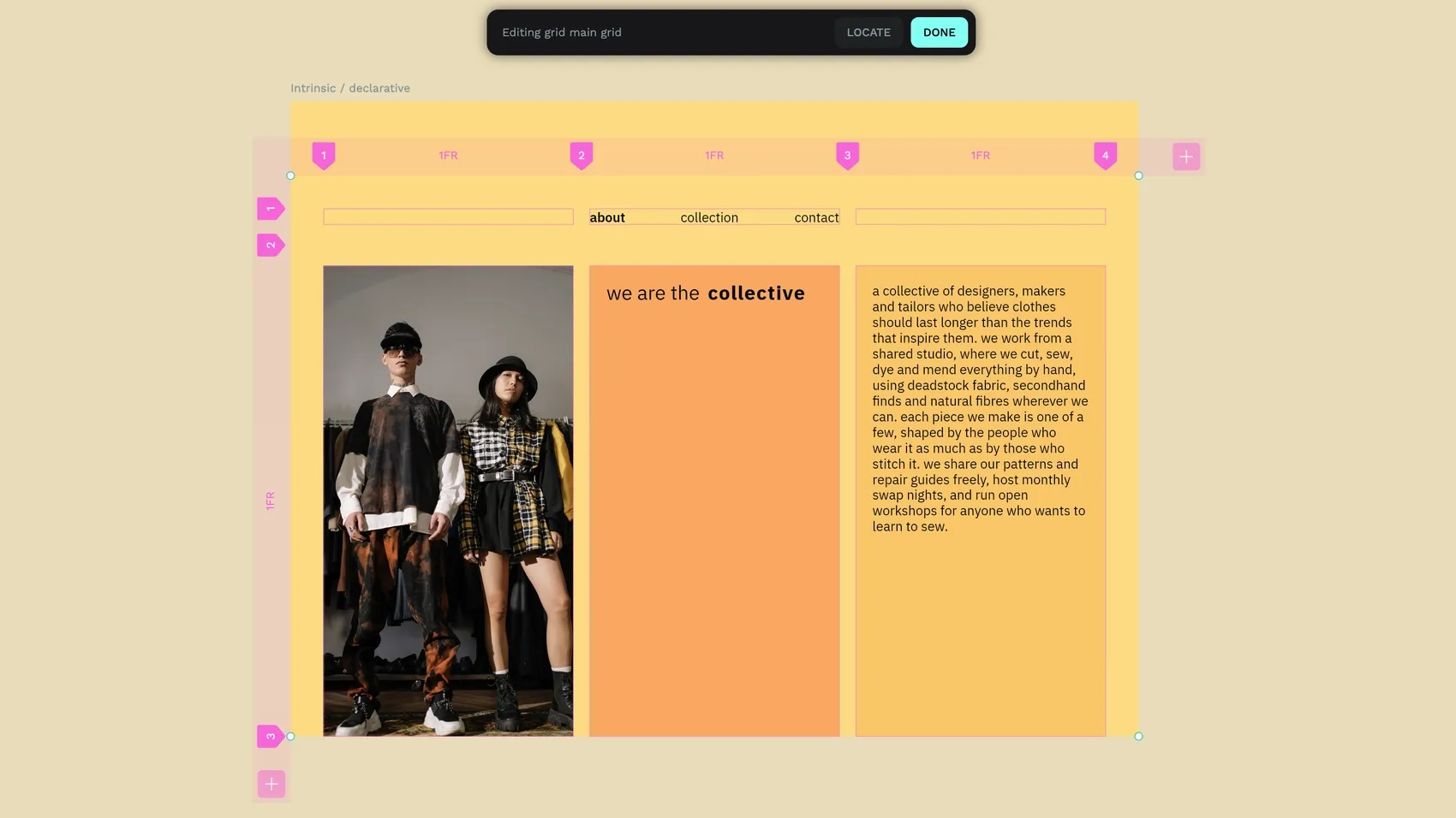
In 2022, Jeremy Keith built on intrinsic design when he came up with declarative design. Declarative design means creating the rules your design should follow, instead of deciding exactly how it looks in every situation. Instead of saying the column must always be 301.3333px wide, you say the column should take up 1fr of the space, no matter how wide that is.
Not having to do every design for 2+ viewport sizes… that’s a lot simpler, right?!
You design layouts through rules and constraints rather than describing the pixel value of each property of each element in painstaking detail, or specifying new and different values for every single breakpoint.
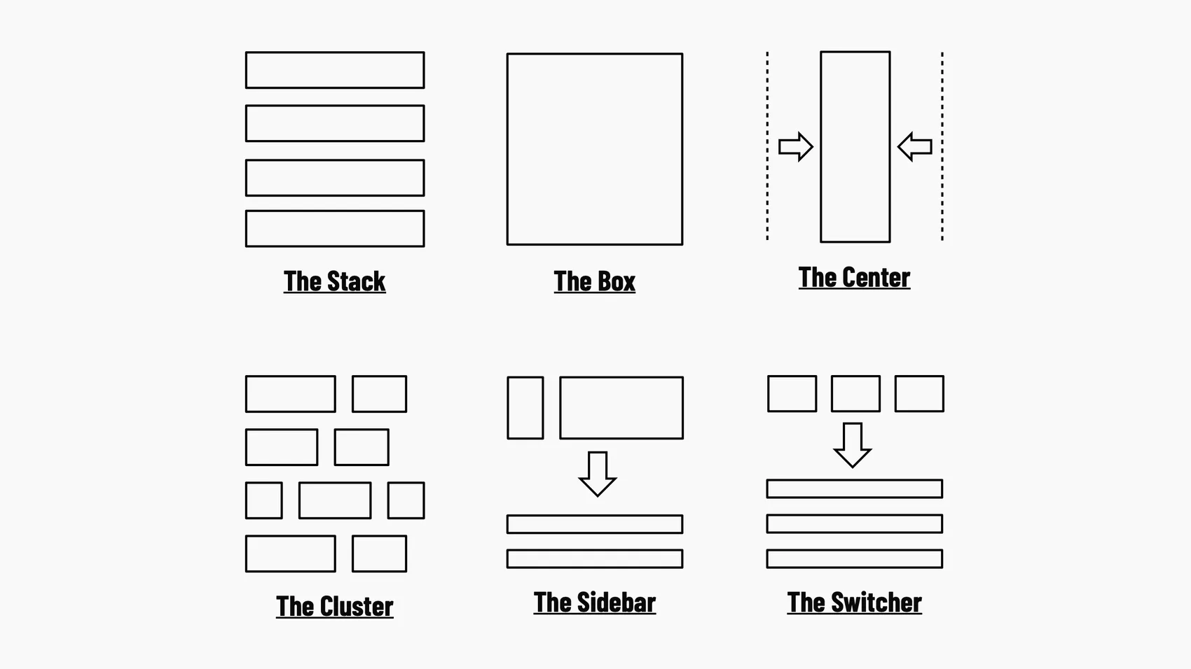
And while these layouts might seem complicated compared to arranging and aligning elements using X and Y coordinates, they give you the ultimate combination of flexibility and control. You can assume every element is flexible by default, and then decide where you need to impose control.
Knowing your medium
Declarative design, like responsive design, does require a basic understanding of what’s possible in the web browser. But that doesn’t mean you have to be able to code like a developer. I like to think of it as knowing your medium, in the same way that a book designer understands how different paper weights affect the print, and how colors translate from screen to ink.
Knowing our medium as UI designers is understanding the elements available to us, their native behaviors and customizable properties. The more you know about your medium, the more you can take advantage of its built-in features and benefits. As Andy Bell puts it, “Be the browser’s mentor, not its micromanager.”
Fixed design vs responsive design vs declarative design
I feel like these are tricky concepts to get across, so here’s one final example comparing the different design approaches for a navigation menu layout:

- Fixed design: The navigation menu has a width of 390px. It is centered horizontally on the page using margin: auto. If you change the number of links in the navigation, you have to adjust the width of the navigation container or the links will be cut off when they exceed the width of the container. You can’t have more links than will fit into that 390px.
- Responsive design: The navigation menu has a width of 200px for 599px wide viewports or narrower, a width of 400px for 600px wide viewports or wider. It is centered horizontally using margin: auto. The links are floated, so they reflow to a second row if they exceed the width of the navigation container, or you can change the width of the navigation at that viewport size to create a better flow.
- Declarative design: The navigation menu is set to fit the width of its contents using flexbox. It is centered horizontally on the page using flexbox. The links are set to flex-wrap so if they exceed the width of the navigation container, they reflow to a second and third row. The navigation automatically fits on every viewport size, no numbers or calculations needed, just a description of the design intent.
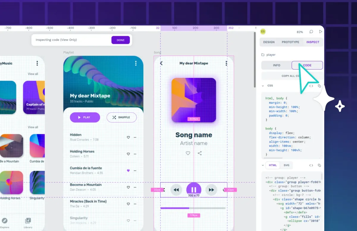
Declarative design frees you from the unattainable ideal of pixel-precise control (“imperative design”) over a layout. It was always impossible to translate fixed pixel layouts precisely into code for an inherently flexible browser viewport. Now you can design layouts with these specific yet flexible instructions that align perfectly with code. In fact, in Penpot, what you see in the Design panel is reflected in the Inspect tab, so all the terminology is the same for both designers and developers.
Declarative design is the future
As UI designers, the formats for our final products are going to keep expanding, evolving and changing, faster than we can possibly keep up. VR headsets, car dashboards, smart watches and glasses are just the beginning. It’s impossible to design for this many formats and that’s before we even get to the development stage. As Pablo Ruiz-Múzquiz, Penpot’s CEO, wrote in his article on Does Declarative Design foster superior collaboration with developers?:
Developers spend too much time figuring out the inherent behavior rules that stem from a particular design. This is where a lot of design translation gets lost. By adopting a Declarative approach to design, designers can help teams speed up the development cycle.
And it’s not only that creating declarative designs that can adapt to, and accommodate, their destination makes our work easier. Designing accessible, consistent, user-friendly experiences makes our products more usable and successful with the end user. Everybody wins!
Sign up for Penpot to start doing declarative design today.
Related Blogs
Want more articles and tutorials about Penpot, design and code? Start here:
 Laura Kalbag
 Paula Tienza
 Paula Tienza

 Paula Tienza