UX projects for beginners: A step-by-step guide to designing on Penpot
Learn how to start your first UX design project with Penpot. Follow six beginner-friendly steps from user research to a clickable prototype, no experience required.

Starting your first UX design project can feel like a lot at once, especially if you have never opened a design tool before. Between learning new tools, understanding design principles, and turning your ideas into something real, it’s easy to wonder where to even begin. Every designer starts somewhere, and the right tool can make those first steps feel less overwhelming and a lot more empowering.
Penpot is free and open source, built for both designers and developers, you can skip expensive subscriptions and jump straight into real projects. Because it’s built on open web standards like SVG, CSS Grid, and Flex Layout, the interfaces you design behave much more like the websites and apps they will eventually become.
This article walks you through creating a beginner‑friendly UX project using Penpot, from understanding your users’ problem to mapping the flow, wireframing key screens, and building a clickable prototype ready for feedback.
📷 Image 1 alt: a hands-on photo from the Kaleidos archive (someone sketching or working on a laptop)
What is a UX design project?
A UX design project is a process for creating or improving a product so it works better for the people who use it. It requires designers to understand user needs, define a clear solution, and design an experience that’s easy and pleasant to use.
Your first UX project is a great place to learn to balance what users need with what can actually be built. If you’re new to the field, our guide to what UX design is covers the basics first.
Why use Penpot for your first project?
Penpot is built around one idea: design and code should speak the same language. That matters more than it sounds. A lot of the friction between designers and developers comes from handing over pictures of an interface and hoping everyone reads them the same way. They rarely do.
Take a button. If you build it with Flex Layout, its padding, spacing and alignment behave the way CSS does, so when the text changes, the button adjusts. Developers can open the Instpect tab and see the code behind it. For a portfolio piece that’s a nice bonus, because it shows you understand how your designs get built.
You also don’t have to do this alone. With Penpot’s collaboration features, you can invite mentors, friends, or clients to comment on your design and, later, to test your prototype. And because the same file takes you from your first sketch to handoff, you won’t waste energy moving work back and forth between separate design and development tools.
What are some top UX design projects for beginners?
If you’re stuck on what to build, pick a project that is simple enough to finish but complex enough to challenge you. Here are three beginner-friendly ideas, each one a good chance to practice a different part of Penpot:
1. Personal portfolio landing page
- The challenge: Design a one-page site that shows who you are and what you’ve made.
- UX skill: Prioritizing content. Decide what someone needs to see at first glance and what can wait further down.
- In Penpot: Master Flex Layout and Grid Layout to ensure your gallery looks great on both mobile and desktop screens.
2. "Smart" to-do list app
- The challenge: Create a task manager that lets people sort and prioritize their tasks.
- UX skill: Designing for speed. If adding a task takes more than a few seconds, nobody will use it.
- In Penpot: Practice using components for repeated elements like checkboxes and task cards.
3. UX course library interface
- The challenge: Design a browsing experience for finding UX courses and resources.
- UX skill: Helping people find the right thing without drowning in options. How do they filter, compare and save what they like? Can you promote community creation?
- In Penpot: Build a card layout with CSS Grid and check how it holds up with ten items or two hundred.
If you’d rather not start from a blank board, Penpot’s templates, give you a head start. You can swap out components, adjust spacing, and upload custom fonts until it feels like yours, and you’ll learn a lot about how other designers structure their files along the way.
6 steps to finishing your first UX project
To make the UX project design journey concrete, let’s follow one example from start to finish: a simple mobile app that helps new plant owners track watering schedules. You can also adapt these steps for any of the ideas above (or your own idea).
These steps follow the design thinking process. They go in order, but expect to loop back: testing in Step 6 will probably send you back to Step 3 or 4.
1. Understand the problem and research your users (Empathize)
Before you open a Penpot board, you need to know why you are designing. A clear purpose keeps every screen and interaction tied to a real problem instead of turning into decoration. Here, the problem is that people buy houseplants but forget to water them, which leads to dead plants and guilty owners.
The goal of our app is to create a system to remind users to water their plants based on their specific species.
To understand the need, talk to people who own plants. Friends and family are fine for a first project. Ask open questions that let them tell their own story, like “How do you usually keep track of when to water your plants?” or “Tell me about a plant you’ve had for a while. How do you take care of it?”
2. Create personas, scenarios, and requirements (Define)
To make sure you know who you're building for, turn what you learned in your interviews into a "persona": a fictional character based on the patterns you noticed, like what people were trying to do, what got in their way and what helped. Your persona won’t represent everyone who might use your app, but it should capture the needs and frustrations that came up most often.
An example persona for this UX project might be “Busy Bob,” a 30-year-old restaurant employee who works long hours and often forgets to take care of his plants.
In our scenario, Bob is part of a new restaurant opening and is scheduled to work long hours. But his friend just gave him a new spider plant for his birthday. A lovely gift, and also a small living responsibility! He wants to add it to the app and set reminders to water it, no matter how busy his work schedule becomes.
That gives you a clear problem statement: busy plant owners like Bob need a low-effort way to remember watering, because their work schedule changes from week to week.
Given this, a few requirements of the app would be to have a simple “Add Plant” button, a library of plant care resources, a list of reminders connected to phone notifications, and a check box feature to mark each watering session as “done.”
3. Map the user journey and outline key screens (Ideate)
Before you design a single screen, you must map the logic connecting them. Mapping the user journey helps you catch logical gaps early, so every button has a destination and every user action has a clear result.
Start by turning Bob’s problem into a question, like “How might we make watering feel effortless on a busy week?”, and let it guide the flow.
For our plant app, instead of starting with a list of screens, keep asking yourself one question: "What happens next?". If Bob clicks "Add Plant," where does he go? What happens if he makes a mistake? Does he need a "Back" button? What does the "Success" screen look like after he saves his schedule? What happens after Bob sets his watering schedule — does he receive reminders, and what if he snoozes or ignores them? (He will. We all do.)
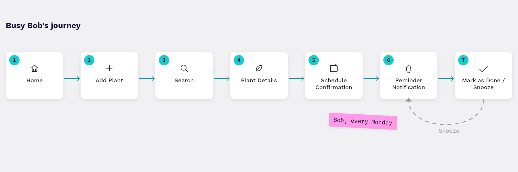
For Busy Bob, the journey might be: Home → Add Plant → Search → Plant Details → Schedule Confirmation → Reminder Notification → Mark as Done/Snooze
You don't need complex software for this: pen and paper are enough for rough ideas. But Penpot’s infinite canvas is a great way to organize these thoughts. You can drag and drop simple rectangles to represent screens and use arrows to visualize the flow, helping you determine exactly which screens you need to build (like Home, Search, Plant Details, Confirmation, and Reminder/Notification States) so you don’t waste time designing features no one will use.
Low-fidelity wireframes are the skeleton of your app. When you create wireframes (simple, grayscale layouts with basic shapes and placeholder text), you can check whether your information hierarchy makes sense without getting caught up in colors, fonts, or other aesthetic details. At this stage, the structure is the only goal.
A simple wireframing process might look like this:
- Set up your board: Open a new Penpot file. Create a new board and select a mobile size (Android or iPhone preset).
- Use libraries: You don't need to draw every box from scratch. Add a free wireframing kit from Penpot Hub to your file as a library, then drag pre-made headers, image placeholders, and buttons from the Assets panel onto your board.
- Make the plant app wireframe: Create a rectangle for the plant image, a text block for the plant name, and a large button for "Water Me." The plant would approve. Keep it grayscale to focus on layout.
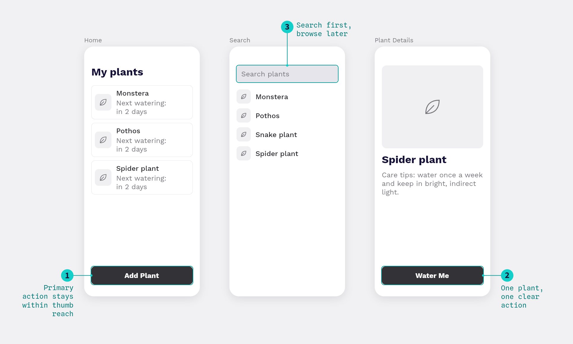
Penpot pro tip: Use Flex Layout on your buttons and lists even at this early stage. It saves you from nudging every element by hand later, when you inevitably rename a button or add one more plant to the list. To do this, select a group of items and add "Flex Layout" from the right sidebar. This ensures that if you change the text from "Water" to "Mark as Watered," the button resizes on its own, just like in real code.
5. Build a clickable prototype and add annotations (Test)
Turning flat wireframes into an interactive experience is where your design comes alive. It’s also simpler than you might think in Penpot.
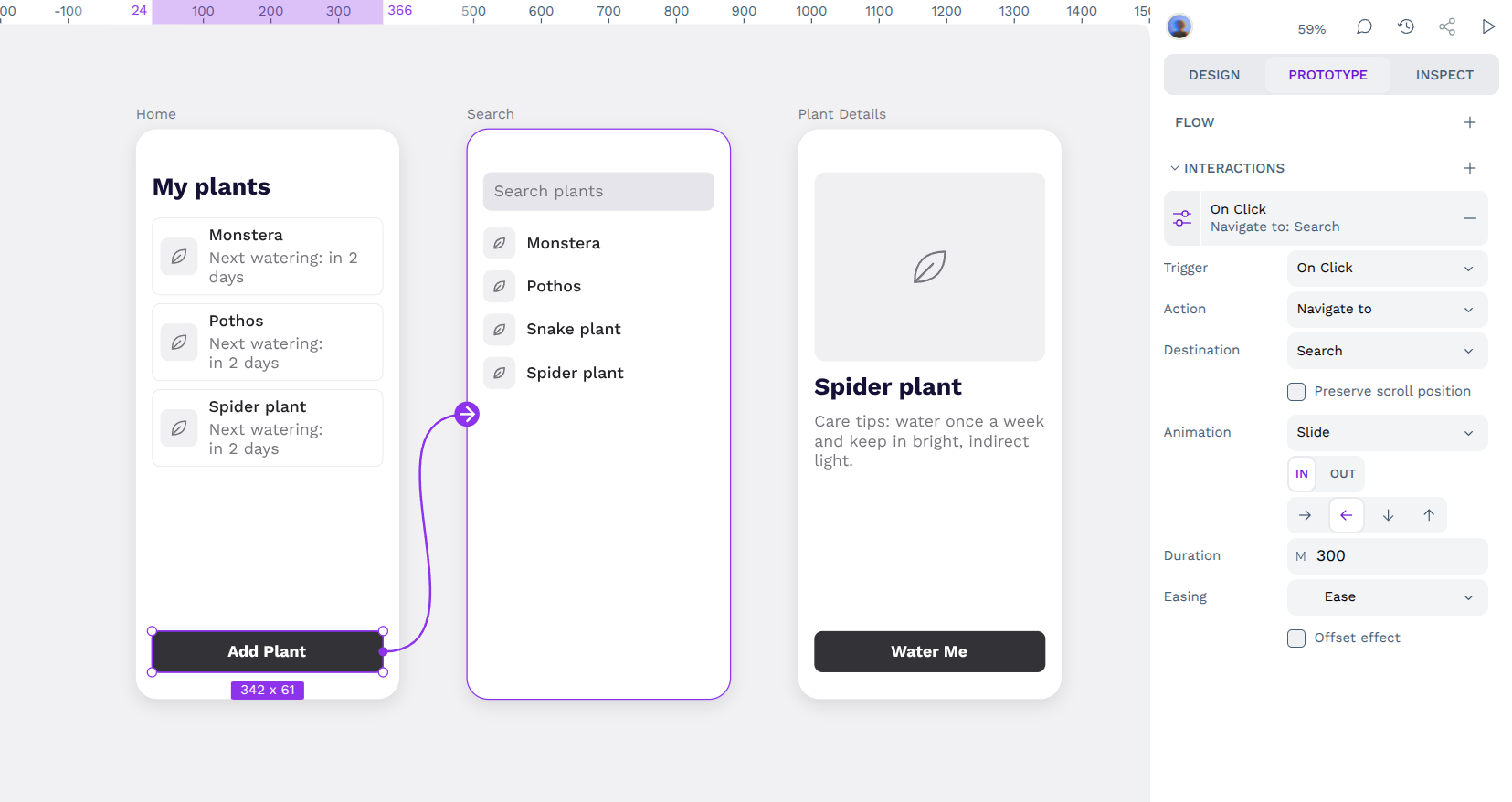
Once your wireframes are solid, you can turn them into a prototype people can click through. It takes fewer steps than you might expect, and it’s the moment your design starts behaving like an actual app, with transitions and interactions that help you (and your testers) understand the flow. Do this in Penpot by:
- Connecting the screens: Switch to the Prototype tab in the right sidebar. Click on your "Add Plant" button and drag the connecting line to the "Search Screen" board.
- Define interactions: Choose an interaction trigger (such as "On Click") and an animation (such as "Slide" or "Dissolve") to make the transition feel natural.
- Annotations: Leave notes for developers (or your future self) about how features should work. like "This list should sort alphabetically." You can add an annotation directly to a component, or use comments and short notes next to your screens.
6. Test and iterate based on real user feedback
User feedback is how you find out whether your design solves the problem you set out to solve. A design isn’t finished until someone has used it.
Testing with real users (like those friends or mentors mentioned earlier) shows you blind spots you couldn't have seen on your own. What feels obvious to you, because you designed it, might completely confuse your users. That's valuable information that should reshape your next iteration.
Friends and family are a good place to start, but they’ll probably be kinder than strangers would. “I love it!” is nice to hear, but it won’t tell you where people got stuck. If you can, add one or two people who don’t know you, and pay more attention to what testers do than to what they say.
Here’s a simple way to test with your own small group:
- Sharing your work: Click the Play button in Penpot to enter "View Mode" and preview your prototype. Copy the share link and send it to the friends you interviewed in Step 1.
- Asking them to perform a specific task: "Show me how you would add a new cactus to this app."
- Iterating: If they get stuck looking for the "Add" button, go back to your design and make that button bigger or a different color, or move it to a more obvious location.
You should repeat this process as many times as needed to get it right.
Start your first UX journey with Penpot for free
The best way to learn UX is by doing, and you don’t need permission or a paying client to start. Penpot gives you the freedom to explore the same tools professional teams use, like CSS Grid and Flex Layout, without the barrier of subscription fees or proprietary formats. Plus, everything you create can be exported to widely used file formats for later use in most other design platforms. You’ll never be locked into Penpot, and you’ll always own your own work.
Whether you are building a plant care app, your portfolio, or something nobody has thought of yet, it starts the same way: with one empty board and a question about the people you’re designing for.
Ready to start? Head over to Penpot, create a free account, and launch your first project today.
Related blogs
Looking for more to read about UX Design? Check these out:
 Miryam González Duque

 Laura Kalbag

 Paula Tienza
 Paula Tienza