Designing with breakpoints and design tokens in Penpot
Learn how to implement maintainable developer-friendly breakpoints with design tokens and themes.

Breakpoints can help you control how your responsive design renders at specific sizes. Layouts on the web, and many other modern platforms, automatically respond to the height and width of the device. The content fills the available space, and we impose rules and structure on the layouts to hopefully make content more readable and easier to use.
Jump straight to the breakpoints tutorial.
The practice of responsive design is about working with the built-in flexibility of these platforms, so you can design for many different devices at once, rather than having to create a different design for every single device. But the same layouts, font sizes, and line lengths can’t possibly work for every viewport size, and this is where breakpoints come in.
In UI design, you’ll often see mockups for mobile, tablet, and desktop; the same design at three different breakpoints (or viewport sizes.) We tend choose these specific viewports because we reason that these are the most common sizes at which users will experience our designs. It makes sense to optimize for the most popular viewports, providing that the designs still display reasonably for the in-between viewport sizes.
But, as we’ve increasingly seen over the last twenty years, the most popular device sizes change with every new phone and laptop release… and that’s before we even start thinking about web browsers on headsets and watches. There is also an argument that it’s more future-proof and maintainable to create element/component-specific breakpoints, but let’s save that discussion for another time!
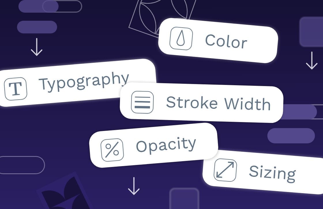
Now we’ve covered the basics, let’s jump into how you can use breakpoints with design tokens in Penpot. New to design tokens? Read this intro to design tokens first!
Creating design tokens for typescales with breakpoints
Inspired by a question on the Penpot community, I created a demo for a design that has a different typographic scale (or typescale) depending on the viewport size. And uses design tokens for the implementation.
Here’s the result:
Switching between themes to see the different viewport sizes in action.
By the end of this tutorial you’ll have token sets, three breakpoint themes, and one viewport flex board whose width and typescale change when you switch themes.
My demo uses explicit font sizes I calculated for each typescale. But it would work similarly for a base size token multiplied through your typescale. Read more about proportional typographic hierarchies using design tokens.
Let’s look at how I’ve set up the file. You can follow along in the Penpot file.
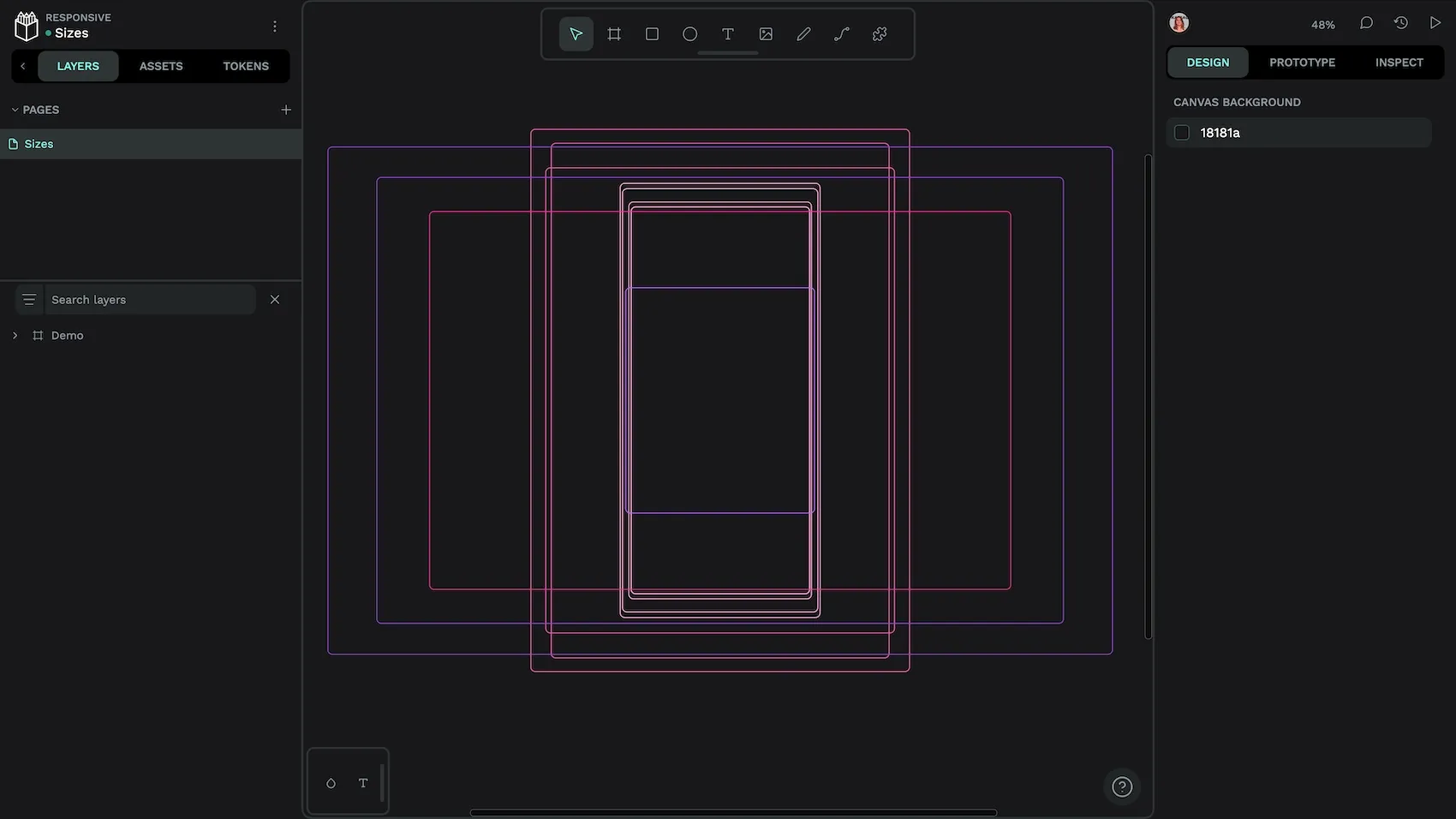
One board to represent all viewports
Using one board for your design is fundamental to this responsive approach. The board will change widths depending on the chosen viewport size. We have to design the content inside it to be flexible so it works for as many viewports as possible. When the content breaks, we’ll use breakpoints to specify how it should behave.
To make the board mimic a responsive viewport:
- Set the board to used a flex layout.
- Set the flex board width property to fixed.
- Set the flex board height to fit content.
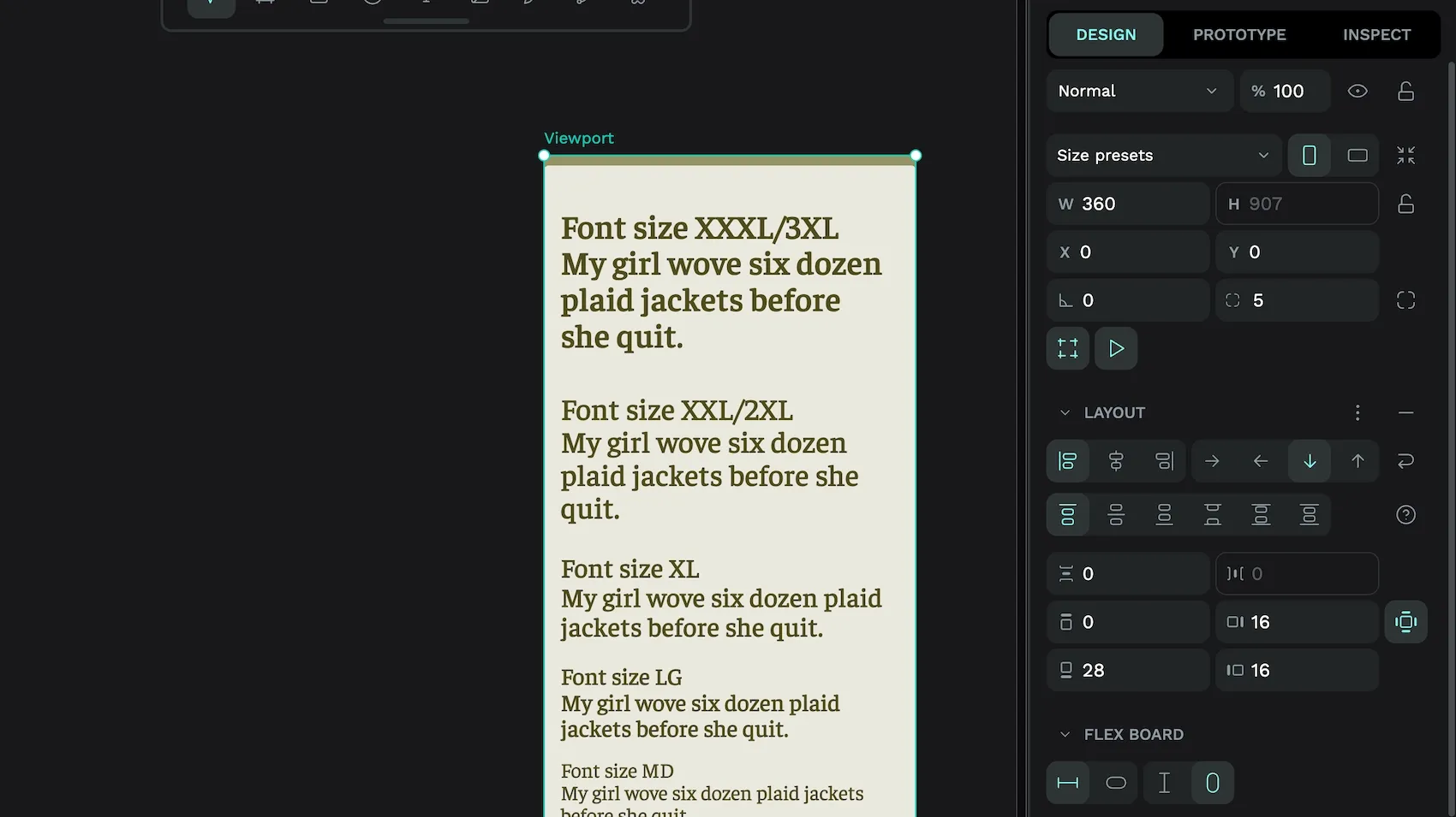
This will make the height of the content inside the board determine the height of the viewport but keep the same width regardless of its content. The width will be determined by a design token.
Now let’s get into the design tokens setup for how we define the responsive widths.
Set up token sets for each breakpoint
First, I set up my token sets:
- Global set: all the design tokens that should be applied to all breakpoints.
- Breakpoint / Mobile set: tokens that only apply to the mobile breakpoint.
- Breakpoint / Tablet set: only apply to the tablet breakpoint.
- Breakpoint / Desktop set: only apply to the desktop breakpoint.
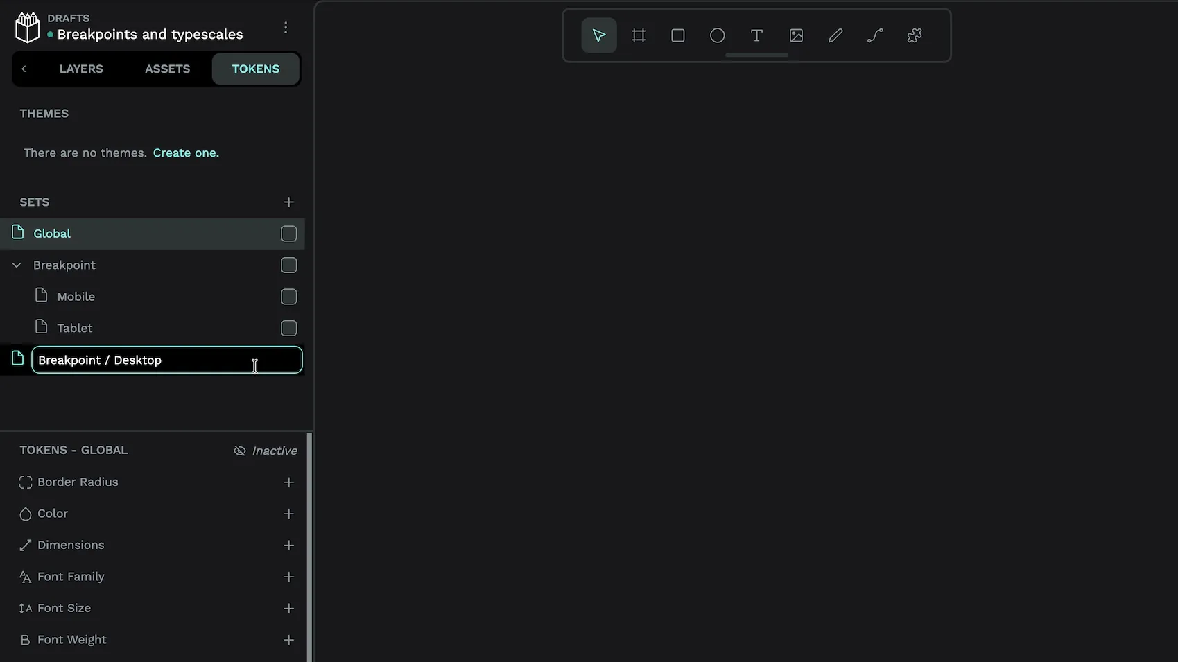
I’ve grouped my breakpoint sets (using / in the name). You don’t have to do this, I just find it helps me visualise the overall tokens structure better.
Now, let’s look at what’s inside my sets:
In my Global set, there is:
- a font family type token,
family.default. I applied this token to all text elements. - a funky shadow type token,
shadow.viewportfor the top border effect on the viewport. Applied to the viewport board. (This is not necessary for the breakpoints, just my stylistic choice!) - spacing type tokens,
spacing.sm,spacing.mdand so on. Applied to the viewport padding and text element margins. You might choose to scale the spacing along with the viewport size, in which case you’d move these tokens into the breakpoint sets.
In the Breakpoint / Mobile set:
- a dimension type token,
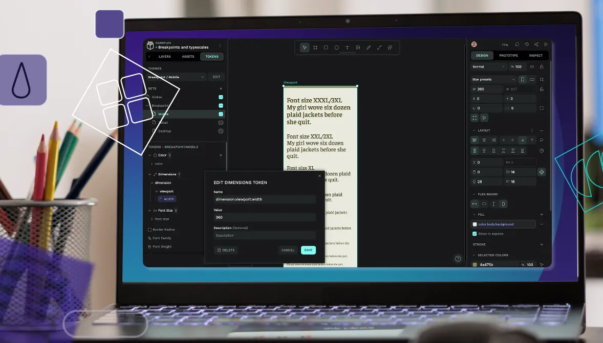
dimension.viewport.width. This has a value of360, representing the width of the viewport on mobile devices. Applied to the viewport width. - font size type tokens,
font-size.sm,font-size.mdand so on. These tokens are where the type scale is defined. These are applied to their relevant text elements. - optional color type tokens,
color.body.background,color.body.border, andcolor.body.text. These tokens are applied to their relevant elements so each breakpoint has a different color theme. For mobile, this is a gold/green-yellow color. (Again, these color tokens are not necessary for breakpoints, just my way to highlight the theme changes at-a-glance.)
In the Breakpoint / Tablet set:
The same tokens as the Breakpoint / Mobile set, with the values tweaked for tablet scale. For example, the dimension.viewport.width has a value of 960, the type scale is tweaked so the largest font sizes are bigger than on mobile (e.g. font-size.xl: 26 → 33), and the color theme is green.
In the Breakpoint / Desktop set:
The same tokens as the Breakpoint / Mobile and Breakpoint / Tablet sets, again tweaked for Desktop. The dimension.viewport.width has a value of 1200, the type scale defines the largest font sizes as even bigger than on tablet (e.g. font-size.xl: 33 → 39), and the color theme is blue.
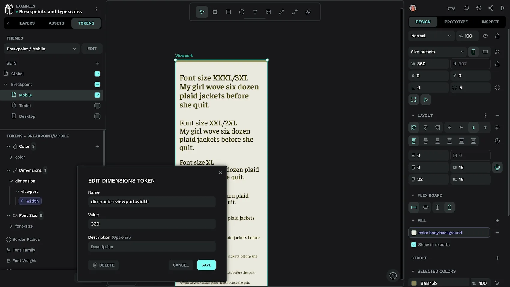
dimension.viewport.width token in the Mobile set.You can create design tokens for each token type using the + add token button alongside that token type (e.g. Dimension) in the Tokens panel.
Create token themes
The themes are where the magic happens. I have three token themes set up in the Tokens tab. Each theme is in the Breakpoint group. You can create and set up theme groups when you create the theme. Theme groups (also known as “modes”) are useful if you want to have other themes that can be applied independently of the Breakpoint themes, like light and dark modes.
My themes are:
- Breakpoint (group) Mobile (theme): Global set and Breakpoint / Mobile set enabled.
- Breakpoint (group) Tablet (theme): Global set and Breakpoint / Tablet set enabled.
- Breakpoint (group) Desktop (theme): Global set and Breakpoint / Desktop set enabled.
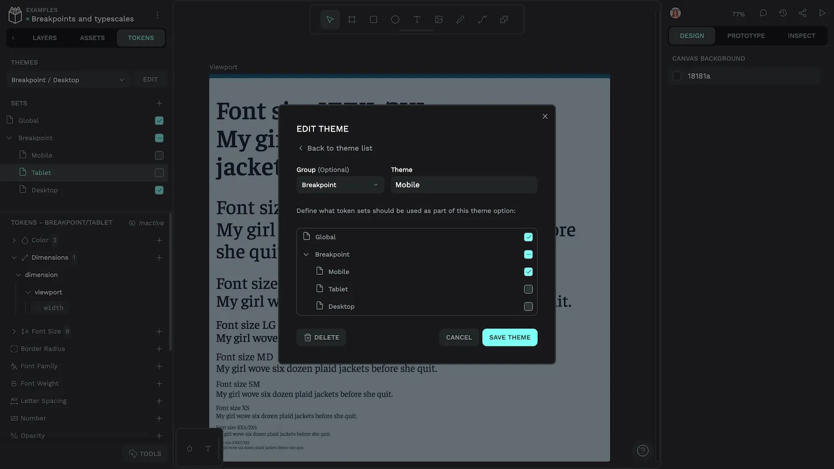
Each theme tells Penpot to enable and disable combinations of token sets. When the token names are the same across multiple sets, like the breakpoint sets, Penpot uses the value from the enabled set. This means that, if you’ve applied the dimension.viewport.width token to the Viewport board’s width property, the width property will update according to the token value in the currently enabled theme.
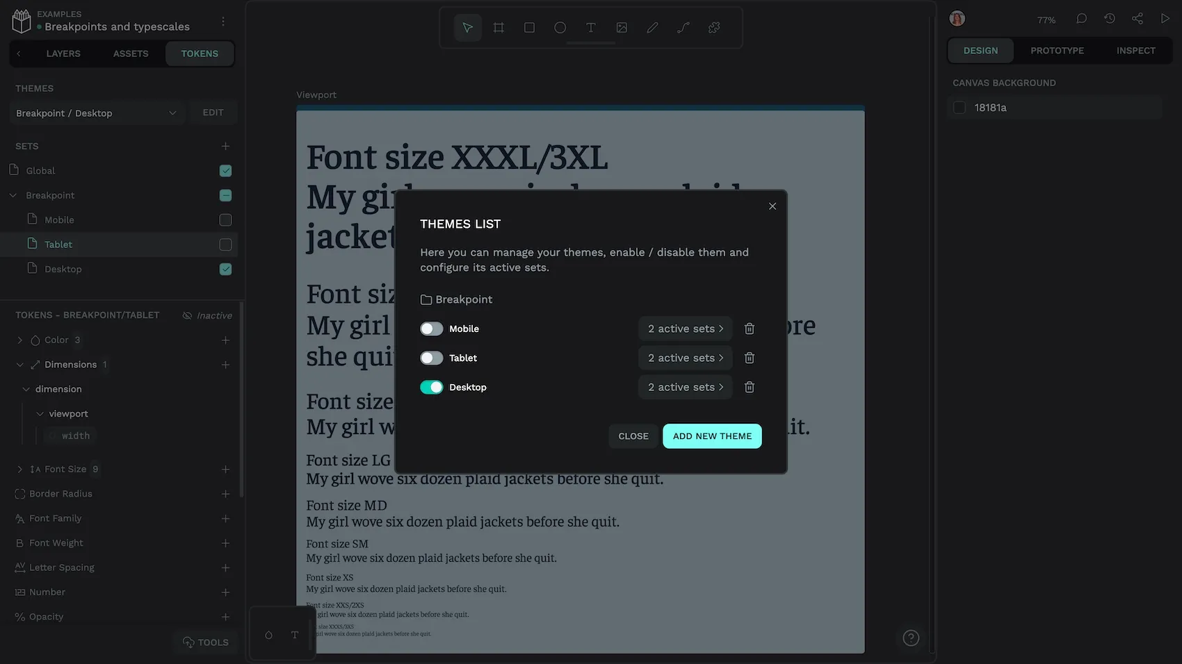
With these themes set up, you can use the theme menu at the top of the Tokens tab to switch between breakpoints.
This approach would also work for proportional typescales based on multiplying a base value token. You can check out how I did this in the hands-on demo file from our Penpot ✕ Tokens Studio live stream.
Benefits of using token themes for breakpoints
There are multiple benefits when you use token themes for responsive design:
- You don’t have to create and maintain multiple versions of a design. All your design decisions are covered in one board.
- The differences between your designs at each breakpoint are clearly defined in your design tokens. (Nobody is left to play spot-the-difference during the development process!)
- Design tokens and flexible layouts work well with components. You can iterate over your component design by testing it at different viewport sizes.
- You can have as many theme combinations as you want… you can create brand themes, test zoom levels, or even mimic what happens to a design when your preferred font doesn’t load.
There are two limitations when designing responsively like this in Penpot:
- There’s no media queries in Penpot (yet?!) so while your board and theme is mimicking the behaviour of a viewport, this will not translate directly into the Inspect panel code. Although (as I mentioned above) you are creating rules that are easily interpreted into media queries by some code or another human.
- You can’t view your different viewport boards side-by-side automatically. However, you can easily copy your boards in each breakpoint state and paste them into another file to preview or share them side-by-side.
Copying viewport boards from each theme into another Penpot file to display side-by-side.
Penpot Enterprise includes native design tokens, as well as unlimited teams and unlimited storage, capped at a flat $950 a month for enterprises. Get in touch with our team to explore how Penpot’s design token system fits your organization’s workflow.
Related blogs
We have many other posts about design tokens, design systems, and UI design topics. Here’s a few examples of articles to get you started:
 Laura Kalbag
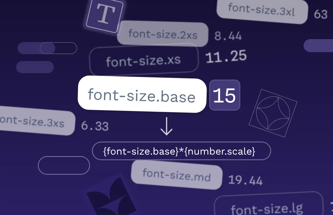
 Laura Kalbag
 Laura Kalbag