The Three-Stroke Problem
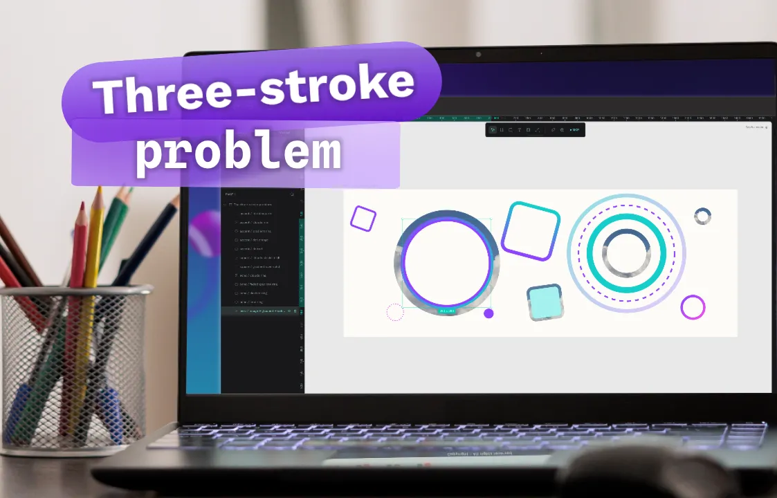
When three kinds of strokes entangle with each other, the resulting design system is chaotic for most initial conditions. Let's go through the stroke rendering in design software.

When three bodies orbit each other, the resulting dynamical system is chaotic for most initial conditions
This is the statement of the well-known physics problem used to explain the instability and chaotic nature of three celestial bodies. The three-body problem shows that, according to Newtonian mechanics, the way these three bodies interact with one another is unpredictable and causes a rapid growth of uncertainty
It strikes me as a great analogy for some of the challenges we faced in Penpot while migrating to WebGL rendering, with a focus on what I've named "The Three-Stroke Problem". Paraphrasing the original statement, we could say this problem poses the following:
When three kinds of strokes entangle with each other, the resulting design system is chaotic for most initial conditions.
Let's start with the basics: what is a stroke?
A stroke, also referred to as a border, is a line that wraps around a layer. In design software, the stroke properties can be updated to customize its style, size, and color. ([1])
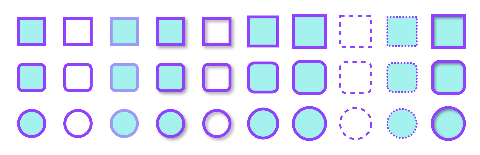
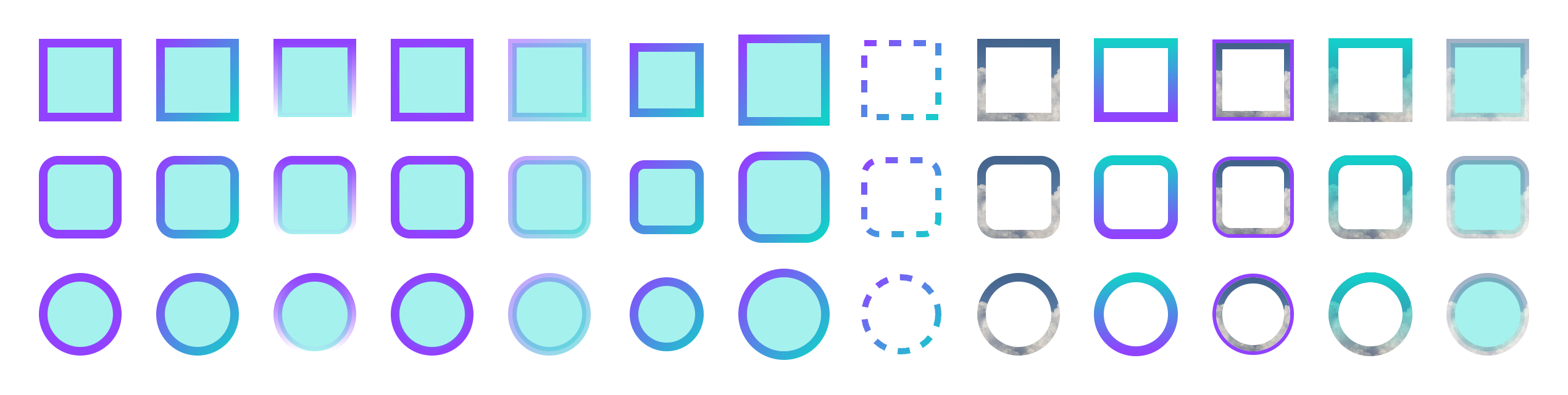
This definition is correct and precise: it's the line that surrounds and delimits a shape. What characterizes this line is that it doesn't have to be a solid line; it can have different styles (dashed, dotted), and the definition also mentions other properties such as size and color.
Here's an example of shapes in Penpot using different stroke styles. ([6])
Strokes across formats
In CSS, the equivalent would be the border property. Its main properties can be used like this: border: <width> <style> <color>. The border-radius property defines the corner-rounding radius and is applied to the shape. There are also independent CSS properties for each border property: border-width, border-style, and border-color ([3])
<!DOCTYPE html>
<html lang="en">
  <head>
    <meta charset="UTF-8">
    <link rel="stylesheet" href="./style.css">
    <meta name="viewport" content="width=device-width, initial-scale=1.0">
    <title>Border Styles</title>
  </head>
  <body>
  <div class="box solid"></div>
  <div class="box dotted"></div>
  <div class="box dashed"></div>
  </body>
</html>
.box {
    width: 200px;
    height: 200px;
    padding: 16px;
    margin: 12px 0;
    font-family: sans-serif;
    background: #c7ff4fFF;
}

.solid {
    border: 10px solid #f76e28FF;
}

.dotted {
    border: 10px dotted #f76e28FF;
    border-radius: 50px;
}

.dashed {
    border: 10px dashed #f76e28FF;
    border-radius: 100%;
}
In SVG, the format used by Penpot's original renderer, which we're replacing with the WebGL renderer, the equivalent of these styles would be the following ([2]):
<svg width="240" height="700" viewBox="0 0 240 700" xmlns="http://www.w3.org/2000/svg">
  <!-- 1) Solid -->
  <rect
    x="20" y="20"
    width="200" height="200"
    fill="#c7ff4f"
    stroke="#f76e28"
    stroke-width="10"
  />

  <!-- 2) Dotted + border-radius: 50px -->
  <rect
    x="20" y="244"
    width="200" height="200"
    rx="50" ry="50"
    fill="#c7ff4f"
    stroke="#f76e28"
    stroke-width="10"
    stroke-linecap="round"
    stroke-dasharray="1 18"
  />

  <!-- 3) Dashed circle -->
  <circle
    cx="120" cy="568"
    r="95"
    fill="#c7ff4f"
    stroke="#f76e28"
    stroke-width="10"
    stroke-dasharray="20 12"
  />
</svg>
Enter the three strokes
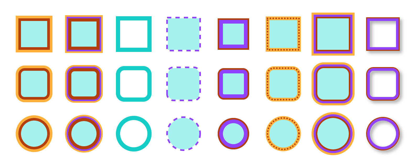
There's one more relevant property to add to this definition: the type of stroke according to its position relative to the shape it delimits. And this is where we run into the three-stroke problem: inner, center, and outer stroke. ([7])
- Inner Stroke: Sits completely inside the shape. Its width runs from the edge of the shape inward
- Center Stroke: Half of the stroke sits inside the shape and the other half outside. Half of the defined width falls inside the shape, and the other half outside
- Outer Stroke: Sits completely outside the shape. Its width runs from the edge of the shape outward
This is where the party starts, because the paths that bring us together begin to diverge.
First of all: in CSS, the default border is of the inner type. For this reason, if we want outer or center borders, we have to "push" the borders outward or inward (using negative values) with the outline and outline-offset properties. outline is the equivalent of border but with an outer-type stroke.
For the "center" border, we'll have to move the border inward by half of the width we've used:
.outer {
  outline: 10px solid #f76e28FF;
}

.center {
  outline: 10px solid #f76e28FF;
  outline-offset: -5px;
}
On the other hand, while in CSS you need to juggle to get a centered stroke, in SVG the centered stroke is the default. To get inner and outer strokes you have to apply clips and masks:
<svg width="520" height="170" viewBox="0 0 520 170" xmlns="http://www.w3.org/2000/svg">
  <defs>
    <clipPath id="clipRect">
      <rect x="20" y="20" width="120" height="120" rx="20"/>
    </clipPath>

    <mask id="outerOnly">
      <rect width="100%" height="100%" fill="white"/>
      <!-- remove anything on/inside original shape -->
      <rect x="380" y="20" width="120" height="120" rx="20" fill="black"/>
    </mask>
  </defs>

  <!-- CENTER (default) -->
  <rect x="200" y="20" width="120" height="120" rx="20"
        fill="#c7ff4f" stroke="#f76e28" stroke-width="12"/>

  <!-- INNER (clipped centered stroke) -->
  <g clip-path="url(#clipRect)">
    <rect x="20" y="20" width="120" height="120" rx="20"
          fill="#c7ff4f" stroke="#f76e28" stroke-width="12"/>
  </g>

  <!-- OUTER (masked centered stroke) -->
  <rect x="380" y="20" width="120" height="120" rx="20"
        fill="#c7ff4f"/>
  <rect x="380" y="20" width="120" height="120" rx="20"
        fill="none" stroke="#f76e28" stroke-width="12" mask="url(#outerOnly)"/>
</svg>
How we do it in the WebGL renderer
So what are we doing in the WebGL renderer? In this case, at Penpot we decided to use the well-known Skia 2D rendering library. At a high level, Skia offers the SkPaint class ([4]), which lets you define how a shape is painted. The Paint type can be Fill, Stroke, or StrokeFill. For what we do in Penpot, we end up using a combination of the different Paints and their stroke methods ([5]). Here's how we do it in Skia:
// Inner stroke: Skia strokes are always centered on the geometry,
// so we inset the rect by width/2. The stroke then spans from the
// shape edge inward -> fully inside the shape.
SkPaint stroke;
stroke.setAntiAlias(true);
stroke.setStyle(SkPaint::kStroke_Style);
stroke.setStrokeWidth(strokeWidth);
stroke.setColor(0xFFF76E28);

const SkRect innerRect = rect.makeInset(strokeWidth / 2, strokeWidth / 2);
canvas->drawRect(innerRect, stroke);
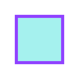
// Center stroke: this is Skia's native behavior. The stroke
// straddles the boundary, half inside, half outside. We draw
// directly on the shape rect, no offset needed.
SkPaint stroke;
stroke.setAntiAlias(true);
stroke.setStyle(SkPaint::kStroke_Style);
stroke.setStrokeWidth(strokeWidth);
stroke.setColor(0xFF14CECA);

canvas->drawRect(rect, stroke);
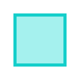
// Outer stroke: outset the rect by width/2 so the centered stroke
// spans from the shape edge outward -> fully outside the shape.
SkPaint stroke;
stroke.setAntiAlias(true);
stroke.setStyle(SkPaint::kStroke_Style);
stroke.setStrokeWidth(strokeWidth);
stroke.setColor(0xFFFC8CFF);

const SkRect outerRect = rect.makeOutset(strokeWidth / 2, strokeWidth / 2);
canvas->drawRect(outerRect, stroke);
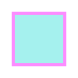
Paths: not everything is a square
So far it seems simple, or at least intuitive. However, in the design world not everything is squares. We don't live in Minecraft. That's why, once we start bringing in more complex shapes like Paths, adding Paints and drawing each shape twice is no longer enough. We have to reach for other Skia functions for the inner and outer strokes. By default, strokes in Skia are centered (as in SVG), so in that case there's nothing specific to do.
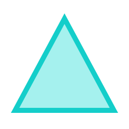
Assuming this triangle path:
  const SkPath path = SkPathBuilder()
                          .moveTo(128, 37)
                          .lineTo(226, 219)
                          .lineTo(30, 219)
                          .close()
                          .detach();

  const float strokeWidth = 10;

  SkPaint fill;
  fill.setAntiAlias(true);
  fill.setStyle(SkPaint::kFill_Style);
  fill.setColor(0xFFA5F1EE);
  canvas->drawPath(path, fill);
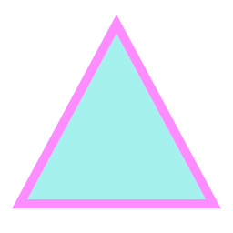
// Inner stroke: centered stroke at double width, clipped to the path.
SkPaint stroke;
stroke.setAntiAlias(true);
stroke.setStyle(SkPaint::kStroke_Style);
stroke.setStrokeWidth(strokeWidth * 2);
stroke.setColor(0xFF9042FF);

canvas->save();
canvas->clipPath(path, SkClipOp::kIntersect, /*antialias=*/true);
canvas->drawPath(path, stroke);
canvas->restore();
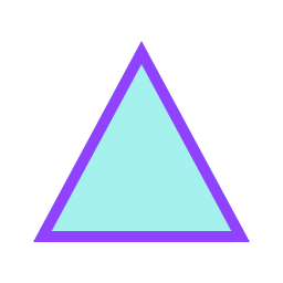
// Center stroke: Skia's native behavior, nothing to correct.
SkPaint stroke;
stroke.setAntiAlias(true);
stroke.setStyle(SkPaint::kStroke_Style);
stroke.setStrokeWidth(strokeWidth);
stroke.setColor(0xFF14CECA);

canvas->drawPath(path, stroke);
// Outer stroke: draw a centered stroke at DOUBLE width into an
// isolated layer, then erase the shape's interior with kClear.
// Only the outside half of the stroke survives. The layer is
// essential: kClear must erase the layer, not the fill below.
SkPaint stroke;
stroke.setAntiAlias(true);
stroke.setStyle(SkPaint::kStroke_Style);
stroke.setStrokeWidth(strokeWidth * 2);
stroke.setColor(0xFFFC8CFF);

canvas->saveLayer(nullptr, nullptr);
canvas->drawPath(path, stroke);

SkPaint clear;
clear.setAntiAlias(true);
clear.setBlendMode(SkBlendMode::kClear);
canvas->drawPath(path, clear);
canvas->restore();
Dashed and dotted styles
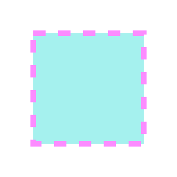
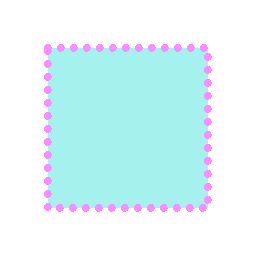
Depending on the stroke's style, we also have to get creative and use the appropriate SkPathEffect when dealing with dotted or dashed strokes:
SkPaint stroke;
stroke.setAntiAlias(true);
stroke.setStyle(SkPaint::kStroke_Style);
stroke.setStrokeWidth(strokeWidth);
stroke.setColor(0xFFFC8CFF);

const SkScalar intervals[] = {strokeWidth + 10, strokeWidth + 10};
stroke.setPathEffect(SkDashPathEffect::Make(intervals, 0.0f));

canvas->drawRect(rect, stroke);
SkPaint stroke;
stroke.setAntiAlias(true);
stroke.setStyle(SkPaint::kStroke_Style);
stroke.setStrokeWidth(strokeWidth);
stroke.setColor(0xFFFC8CFF);

SkPath circle = SkPath::Circle(0, 0, strokeWidth / 2);
const float advance = strokeWidth + 5;  // spacing between dot centers
stroke.setPathEffect(SkPath1DPathEffect::Make(
    circle, advance, /*phase=*/0.0f, SkPath1DPathEffect::kTranslate_Style));

canvas->drawRect(rect, stroke);
As we can see, what we said at the beginning of the post is coming true: there are many variables to keep track of, and we need to contain the chaos of the system.
One more variable: multiple strokes
All of that sounds good until a new variable shows up, a variable that isn't a property of the stroke, but of the shape: the number of strokes it can have. Everything seemed too good to be true, but sometimes design asks us to go a little further.
In Penpot's case, multiple borders have always been supported. After all, with SVG all you have to do is add more elements. In the WebGL renderer we do something similar: we just add as many borders as the shape has, in the specified order.
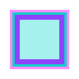
void draw(SkCanvas* canvas) {
      canvas->clear(SK_ColorWHITE);

      const SkRect rect = SkRect::MakeXYWH(48, 48, 160, 160);
      const float w = 16;

      SkPaint p;
      p.setAntiAlias(true);

      // Fill
      p.setStyle(SkPaint::kFill_Style);
      p.setColor(0xFFA5F1EE);
      canvas->drawRect(rect, p);

      p.setStyle(SkPaint::kStroke_Style);
      p.setStrokeWidth(w);

      // Outer stroke: outset by w/2 -> spans from shape edge outward.
      p.setColor(0xFFFC8CFF);                    // pink
      canvas->drawRect(rect.makeOutset(w / 2, w / 2), p);

      // Center stroke: on the rect itself -> half in, half out.
      // Overlaps the inner half of the outer stroke; drawn later, so it wins.
      p.setColor(0xFF14CECA);
      canvas->drawRect(rect, p);

      // Inner stroke: inset by w/2 -> spans from shape edge inward.
      // Drawn last, covers the inner half of the center stroke.
      p.setColor(0xFF9042FF);
      canvas->drawRect(rect.makeInset(w / 2, w / 2), p);
  }
As we can see, we have to draw each stroke individually (plus the fill)
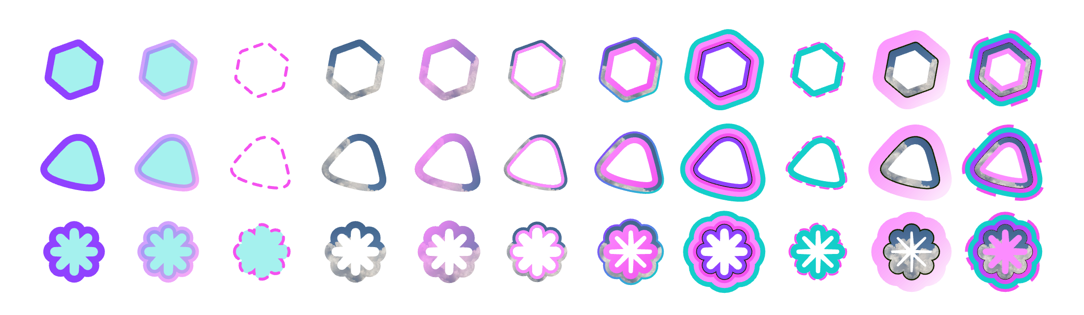
In CSS, however, supporting multiple strokes on the same shape couldn't be done through any border-type property (though that may change soon!). You always use some workaround as a visual trick to add several borders. The most classic one is the box-shadow property, which does support multiple shadows. The shadow is drawn solid (with no blur), and that gives you the stroke effect:
.multi-border {
    border-radius: 20px;
    background: #A5F1EE;
    box-shadow:
      inset 0 0 0 6px #9042FF,
      0 0 0 6px #A5F1EE,
      0 0 0 12px #14CECA,
      0 0 0 18px #FC8CFFAA;
}
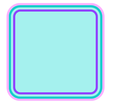
As we can observe, this works for outer stroke and inner stroke too. In the latter case, using the `inset` setting does the trick. That said, it looks like we'll soon have the option to add multiple borders in CSS declaratively!
Wrapping up
We started with a system that, like three orbiting bodies, seemed destined for chaos: three kinds of strokes, three formats that each disagree about what the "default" stroke is, and a growing pile of variables on top.
The takeaway: thanks to using the WebGL render, we have far more flexibility when implementing visual elements related to borders compared to what we could do in SVG.
And we're not done yet. There's still plenty of room to keep pushing what strokes can do in Penpot, with features like stroke to path (converting a stroke into an editable path shape of its own) and individual strokes per side (setting a different stroke for each edge of a shape).
The three-stroke party continues 🎉
- (1) https://www.codecademy.com/resources/docs/uiux/stroke
- (2) https://www.w3schools.com/graphics/svg_stroking.asp
- (3) https://www.geeksforgeeks.org/css/css-borders/
- (4) https://skia.org/docs/user/api/skpaint_overview/
- (5) https://api.skia.org/classSkPaint.html (check stroke methods)
- (6) https://help.penpot.app/user-guide/designing/color-stroke/
- (7) https://inkscape-manuals.readthedocs.io/en/latest/strokes.html