The quick guide to Penpot layouts
You’ve used a design tool before, and you just want to know the basics to help you get started with Penpot layouts. This is the extra quick explainer just for you!

You’ve used a design tool before, and you just want to know the basics to help you get started with Penpot layouts. This is the extra quick explainer just for you!
There are four key concepts you need to know to get started with Penpot layouts:
1: Static layouts
By default in Penpot, layouts are static. You can drag elements around the canvas or use the X and Y coordinates to position them. If you select multiple elements at once, you can align and distribute them using the buttons at the top of the Design panel.
Hold down Alt or press the . keyboard shortcut to view a design element’s measurements.
2: Boards
As Penpot’s canvas is infinite, a board (sometimes called “frames” in other design platforms) becomes your container. It can represent a page, a view, a screen, or anything else you need it to be! Boards can have a fixed height or width, or fit the height and width of their contents for responsive layouts.
Find the board tool in the Toolbar, or use the B keyboard shortcut.
When you create a board, a collection of preset sizes are shown in the Design panel.
3: Flex layouts
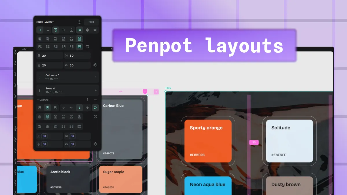
Flex layouts are ideal for unpredictable quantities or sizes of content. You can choose their flex direction (horizontally like a row or vertically like a column), choose how their contents align and are distributed, and the spacing around and in between. You can even set Flex layouts to wrap to the next row or column when their contents exceed the width or height of their container.
4: Grid layouts
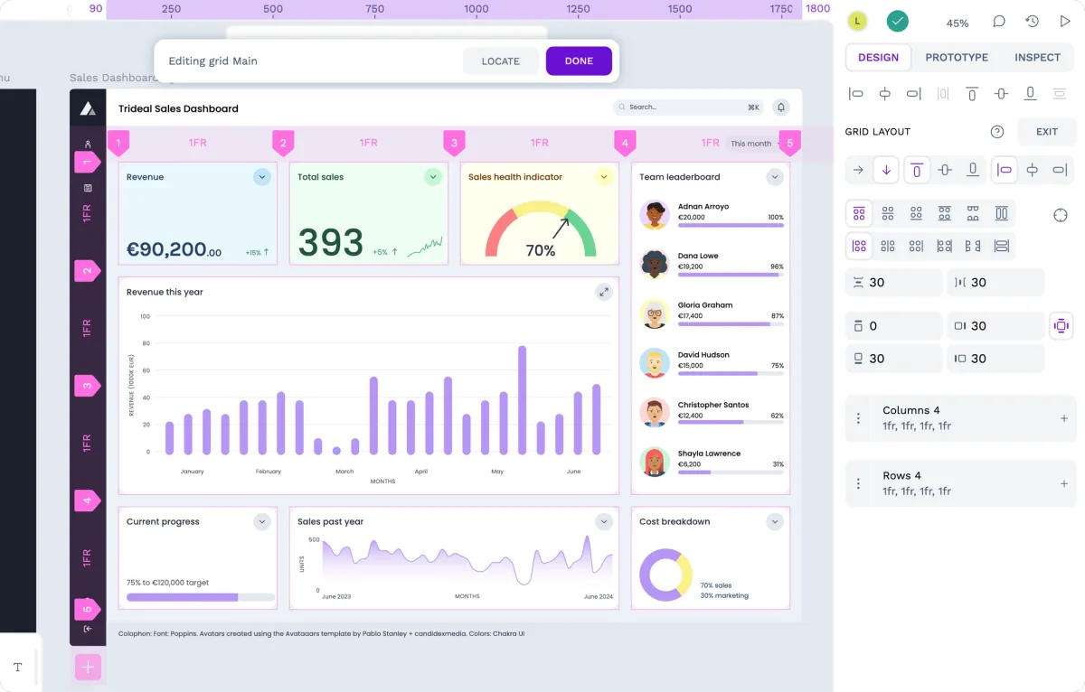
Grid layouts are useful when you have a fixed amount of content, and want to define your layout across both horizontal and vertical directions at once. You define the number of columns and rows in your grid and their dimensions. Like Flex layouts, you can also choose the direction, alignment, distribution and spacing. Unlike Flex layouts, you can make grid cells span multiple columns and rows, and label grid areas.
To create a Flex or Grid layout, select a board or group and use the + button alongside Layouts in the Design panel to choose between Flex and Grid. Or use Shift + A for Flex layout, or Ctrl/Cmd + Shift + A for Grid layout.
Flex and Grid layouts use CSS Flexbox and CSS Grid, and you can get the code (CSS properties and full CSS) for these layouts from the Inspect panel. Your Flex and Grid layouts will work the same in the browser as they do in Penpot.
Get started with Penpot templates
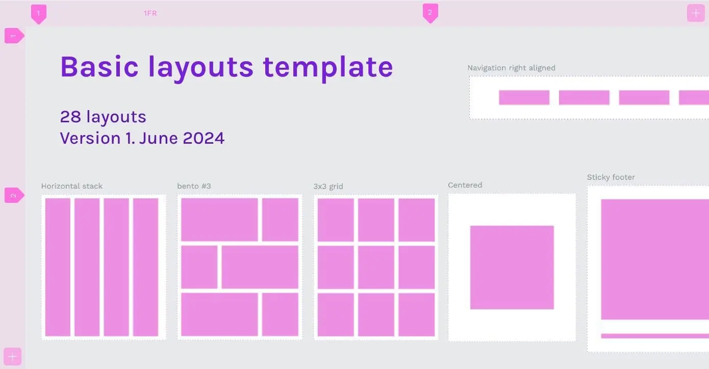
If you want to play with layouts, rather than reading about layouts, download my free basic layouts template from Penpot’s Libraries and Templates:
You can create static and precise, or flexible and responsive layouts in Penpot for free. Sign up to get started today.
Related Blogs
We have many more posts about grids, layouts, and UI design with Penpot. Start here:
 Laura Kalbag
 Laura Kalbag
 Laura Kalbag