8 advanced Penpot features for product teams (and why you should use them)
Discover 8 advanced Penpot features that help product teams reduce design-to-development friction, create more efficient workflows, and maintain consistency at scale.

Product teams face a lot of pressure to deliver high-quality UX in a limited time. Getting everyone from product design to development on the same page can be tricky. The root problem isn’t just poor communication; it’s that traditional design tools can create an artificial barrier between design and development, adding unnecessary steps in the collaboration process.
Designers often work in one reality (fonts, color, and user flows), while developers work in another (turning design decisions into functional code). Product managers get caught in the middle trying to translate between them. Teams spend time on clarifying intent instead of building new features.
Penpot is an open-source design platform that’s fundamentally different from traditional design tools. Built on web standards rather than proprietary formats, Penpot eliminates the translation layer that causes most design-development friction, provided you know how to get the most out of its features. Let’s dive into Penpot’s highlights so you can speed up your next project.
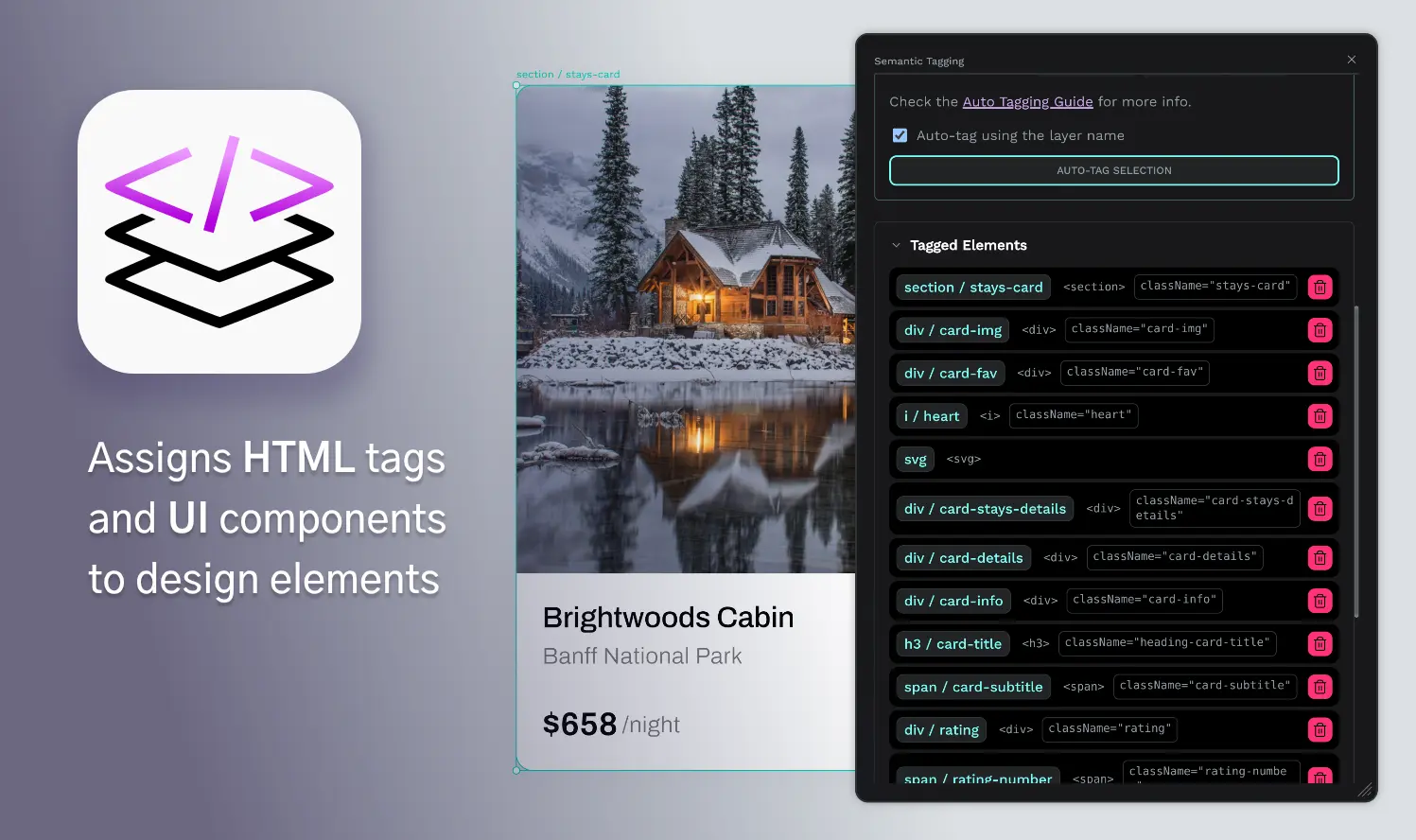
1. Design systems at scale
Large product teams often struggle with design system maintenance across multiple products and features. They can spend hours updating the same component across several files or chasing inconsistencies and detachments, like realizing a button style changed in the mobile app but not the web dashboard. All of this can lead to headaches and brand drift.
Penpot’s libraries simplify how you store components, document their recommended use through annotations, and sync updated versions of components across multiple projects. Beyond simple component libraries, design systems can help your team organize updates through interconnected libraries categorized by function, brand elements, or team needs.
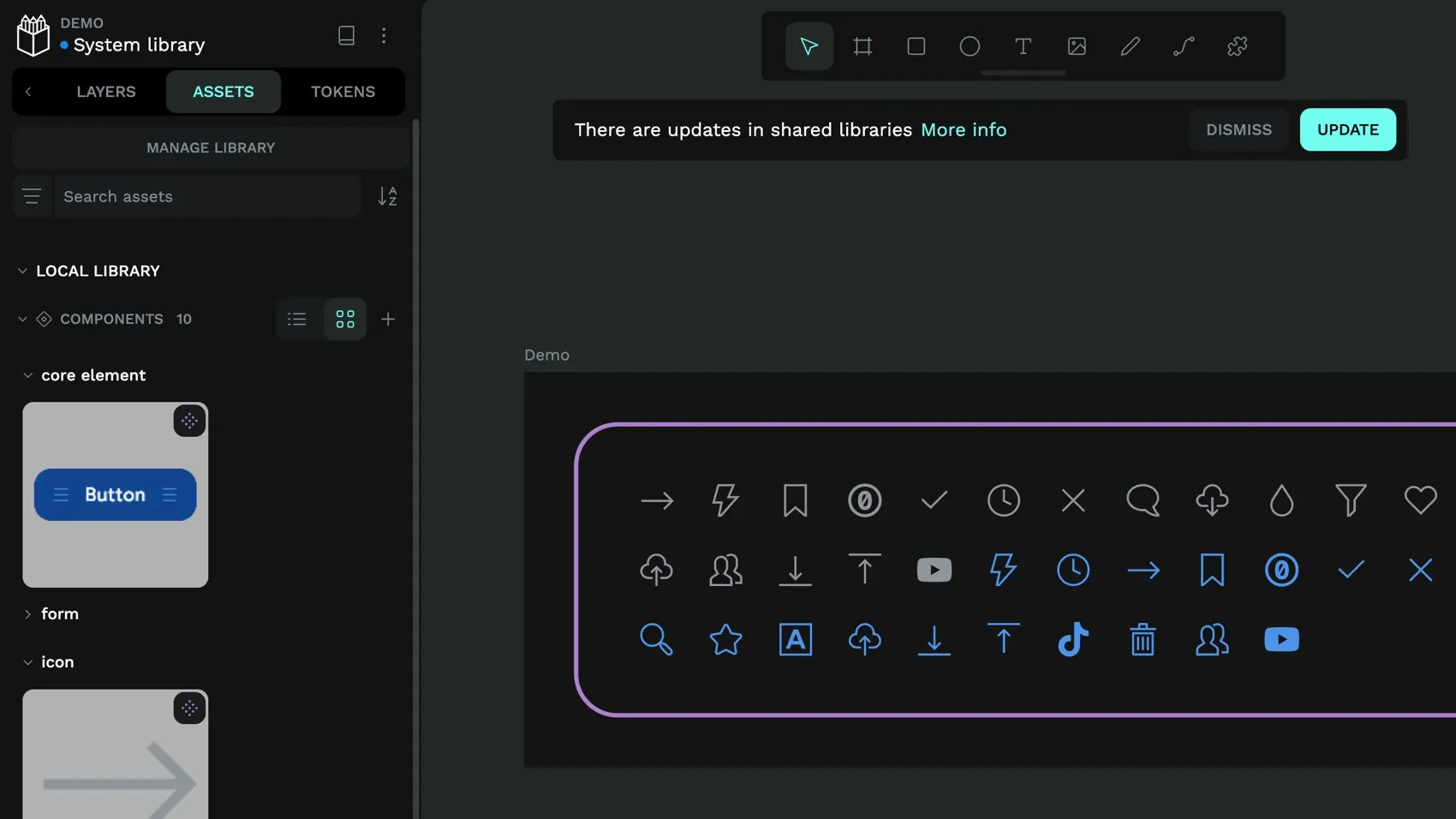
While traditional design tools can force everything into single large files, Penpot lets you create separate libraries for different design system traits. You can create one library for colors, another for UI components, and still another for brand elements (like style guidelines).
Then, when it comes time to find and update a design component, you only need to look in the parent library and make the change to that one component, and it updates across every instance in your design system.
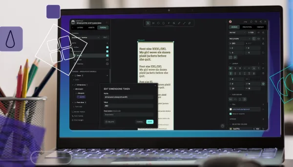
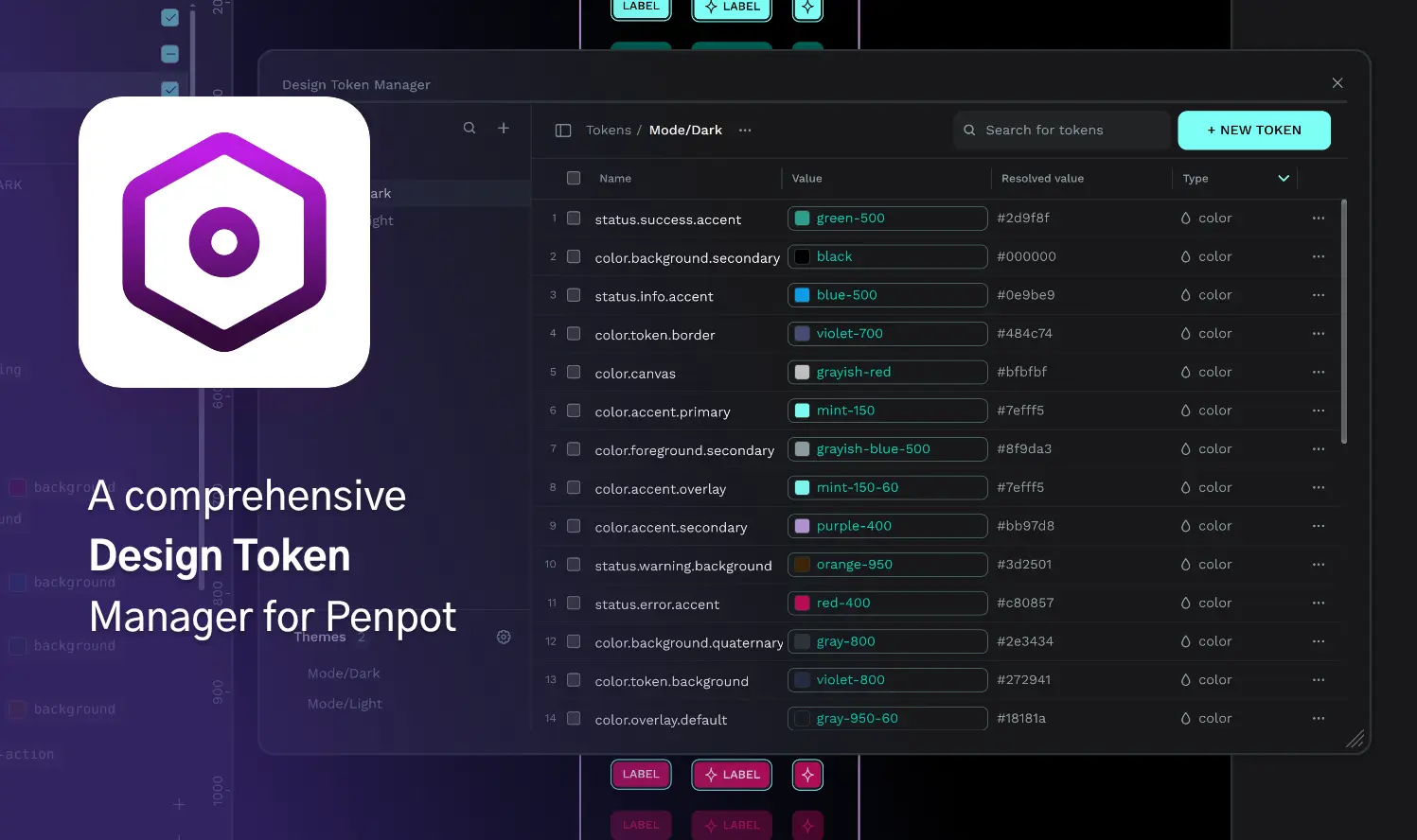
2. Design tokens
Design tokens solve the problem of information getting lost or changed when design decisions are manually translated into code.
With Penpot’s native tokens, designers and developers speak the same language. When a designer updates the primary button color token, that change is immediately available in token exports and code formats (like JSON or CSS), reducing the need for manual reinterpretation or updates by developers.
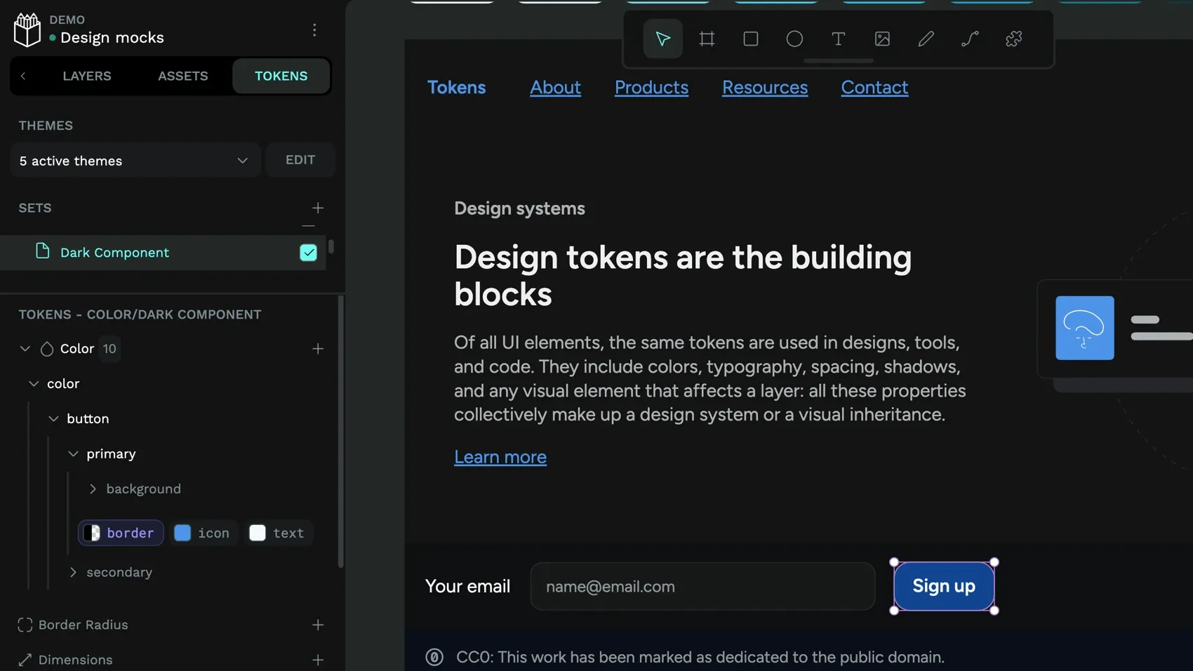
Penpot is the first design platform to natively support the W3C Design Tokens Community Group spec and creates a genuine bridge between design decisions and code implementation. Design tokens store the smallest repeatable elements of your design (colors, spacing, typography, shadows) as named variables that maintain consistency across your entire product ecosystem.
With design tokens, you can:
- Combine multiple token sets to create themes
- Switch between themes for light or dark modes and brand variations
- Export code in standard JSON format
You can import existing tokens from your development workflow or export Penpot tokens to integrate with your development workflow.
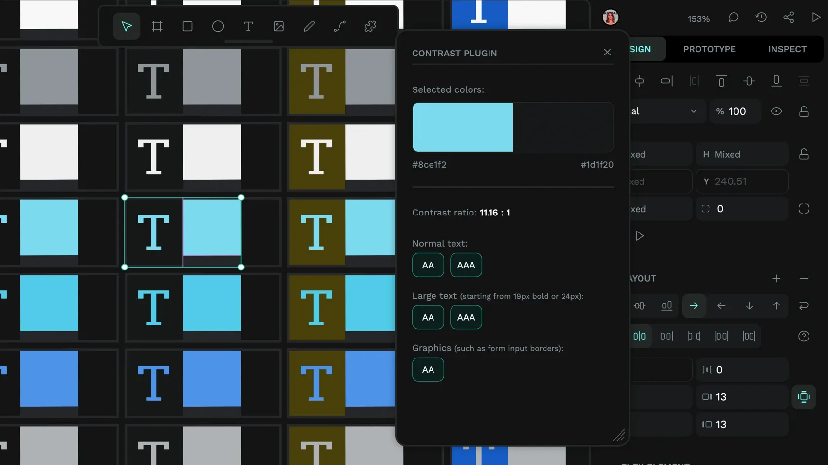
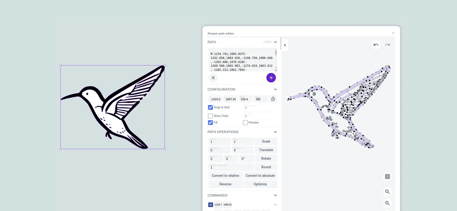
3. Inspect panel
The typical design-to-development handoff requires teams to interpret and approximate, which can lead to a much different implementation than the original design intent. Penpot’s Inspect panel eliminates this problem by providing the exact specifications developers need.
The Inspect panel provides code snippets directly from your design files. This isn’t just design measurement; it’s actual HTML, CSS, and SVG code that developers can copy and use. Since Penpot uses CSS Flexbox and Grid for layouts, the CSS properties you see in the Inspect tab match how the layout will render in the browser when applied in your front‑end code.
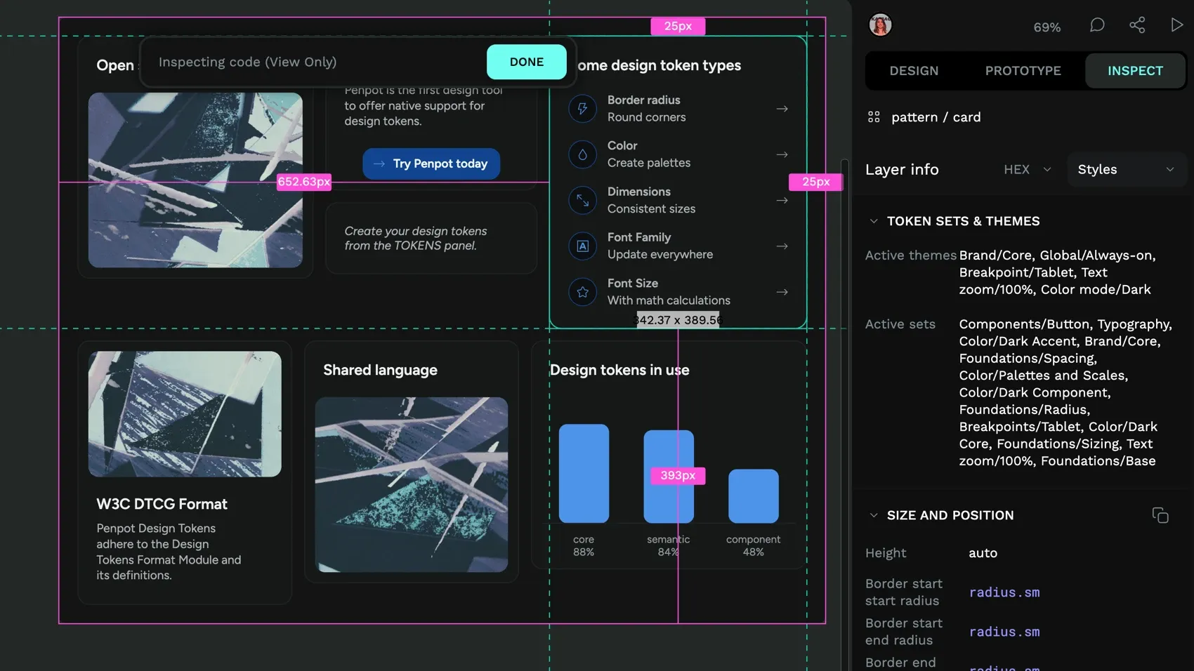
Developers can trust that the properties are as the designer intended, reducing unnecessary back and forth. And using the Inspect panel is as simple as clicking on it, no extra roles or payment plans required. So, even those with no coding experience can use it to get an understanding of how the design can be implemented.
4. CSS Flex and Grid layout
Penpot’s layout system is built directly on CSS Flexbox and CSS Grid standards, allowing designers to create responsive layouts using the same logic developers use in production code. This helps your design and development teams stay aligned and keep your workflows in sync. It also gives teams the confidence that what they make will be usable in a variety of responsive web environments, from desktop browsers to the smallest handheld devices.
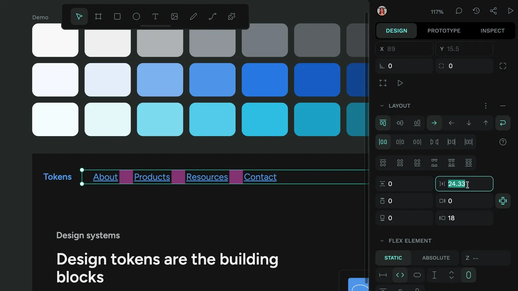
Flex and Grid layouts include:
- Nested layout systems combining Flex and Grid
- Responsive behavior that adapts to different container sizes
- Layout components that can be saved and reused across projects
- Code generated for complex responsive layouts
Because designers manipulate the same properties (justify-content, align-items, grid-template-columns) that developers use in code, the layout should behave consistently both in Penpot and in the browser. This reduces the chances of a “simple” layout update requiring extensive development work to implement properly.
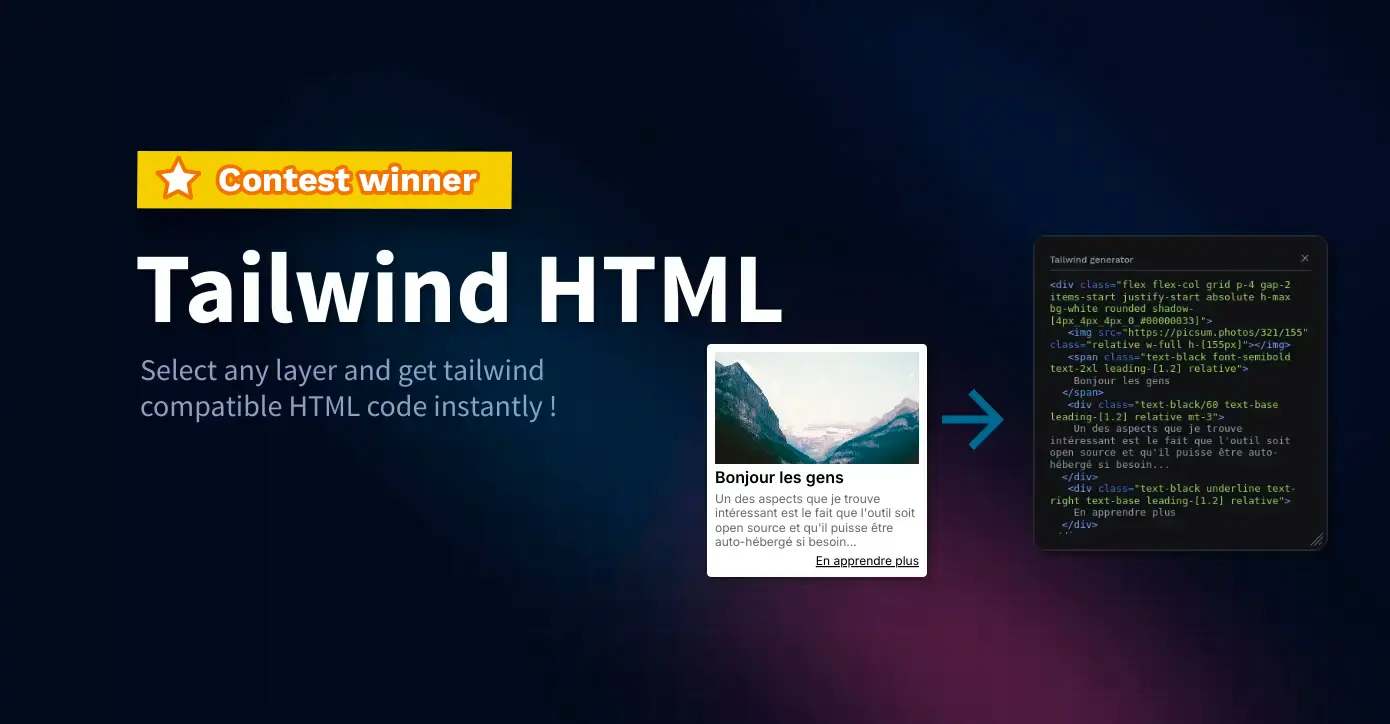
5. Open plugin system
Generic design tools built for everyone don’t always serve a product team’s unique workflow requirements. Penpot’s open plugin system allows your team to create custom solutions for your specific needs or adopt community-built tools to address common problems. This adaptability means Penpot can be tweaked to fit into your workflow rather than forcing your team to adapt to tool limitations.
Because plugins are built with HTML, CSS, and JavaScript, any developer can build them without learning a proprietary development environment. Since plugins use standard web technologies, your existing developers can easily create custom solutions, reducing dependency on tool vendors for workflow improvements. This extends further with MCP server support, which allows AI agents to interact directly with design files and connect Penpot to the AI-powered tools and automations already embedded in your development workflow.
Many developers share their plugins openly in Penpot Hub, so teams can install and, where licensing allows, adapt them.
6. Self-hosting
While Penpot is simple to start using from a web browser, some teams may need the enhanced privacy and security of self-hosting. Penpot offers full control over design data, infrastructure, and customization when using container tools like Docker or Kubernetes, or a managed service like Elestio. It also gives your team a way to customize integrations with your own internal systems.
Self-hosting offers the same product features as the cloud version and gives companies in sensitive industries the control they need to implement their own regulatory and data‑protection requirements. It’s also ideal for teams with custom data pipelines.
With self-hosting, Penpot can become part of your broader product development infrastructure rather than an isolated design tool.
7. Custom fonts
Many design teams have invested significantly in custom typography as part of their brand identity. To maintain a consistent brand, you’ll need these specific fonts that often aren’t available in standard font libraries. Penpot’s system ensures these fonts are consistently available to all team members, so you don’t have to rely on each person installing fonts individually.
Custom fonts are managed at the team dashboard level, making them immediately available across all team projects. The system supports TTF, OTF, and WOFF formats and automatically groups font variants into families.
Unlike tools that force teams to approximate brand fonts with system alternatives, Penpot ensures brand consistency by supporting the exact fonts your brand needs. And prevents developers from picking a font they think looks the same.
8. Comments
Effective product development requires constant feedback loops between designers, developers, product managers, and stakeholders. Penpot’s commenting system stops the context switching that occurs when feedback happens in separate tools like Slack or email. It keeps feedback directly attached to the relevant design elements, so teams can maintain better context and reduce miscommunication.
Penpot supports collaborative commenting with:
- Design-linked comments that move with elements
- Notifications and mentions for directed feedback requests
- Marking comment threads as read
- Team-wide visibility for collaborative feedback loops
Give your product team the design platform it needs
The future of product development belongs to design and development teams that can move easily between design and code without losing intent, consistency, or speed.
Penpot’s advanced features address the specific problems that slow down product development: inconsistent design systems, design-to-code friction, limited tools, and fragmented feedback loops. Get in touch with our team to explore how Penpot can fit into your product development workflow.
Related Blogs
Want to learn more about Penpot for teams? Here are more articles:
 Paula Tienza
 Laura Kalbag
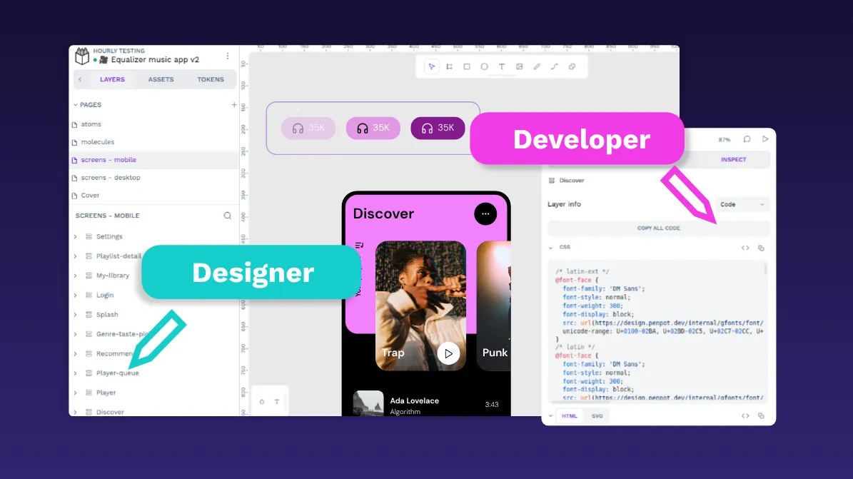
 Paula Tienza
 Carolina Alves Portugal
 Yamila Moreno