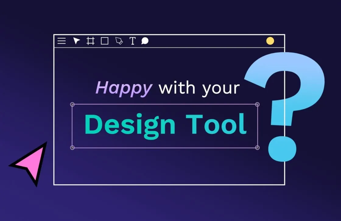
7 crucial design system elements for teams and how to create them
Design systems offer numerous benefits for organizations, such as helping teams collaborate, reducing build time, and ensuring consistency. When used to create new products, design systems help even new team members get up to speed quickly.

Design systems offer numerous benefits for organizations, such as helping teams collaborate, reducing build time, and ensuring consistency. When used to create new products, design systems help even new team members get up to speed quickly.
However, design systems are only as good as their parts. While companies differ on what exact components they include, most aim for a balance of design, coding, and marketing to make sure teams stay on the same page. These six components will ensure maximum adoption by teams as long as you follow the best practices for creating them.
1. Component library
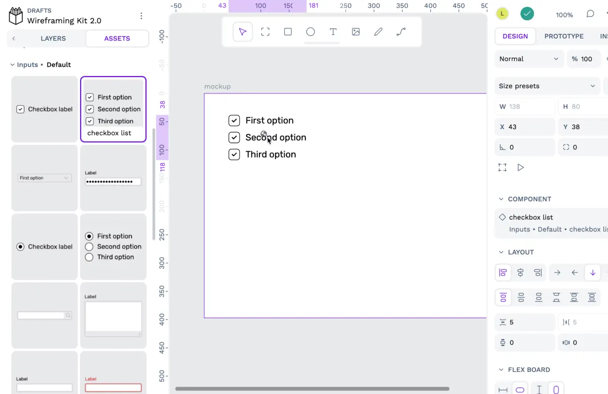
A component library is a collection of pre-made UI components that have been tested to work and fit the overall design values of an organization or product. It encourages a plug-and-play approach to design and discourages designers from making last-minute or one-off elements.
The new advanced Components system available in Penpot now
Component libraries can also include a more complex series of components called patterns, earning it the alternative name of "pattern library." Other items included in these libraries include buttons, menus, icons, navigation tools, and forms, all designed with a consistent aesthetic and UI design.
Why include it
Component libraries save designers time and effort since they don't have to have new components created for each project. Instead, they can pull elements from the component library with the assurance that the components work well and fit the brand's aesthetic.
These pre-made elements also allow designers to try out different options to see what fits — they can test different components until they find just the right one without wasting resources. When these coded building blocks get called up for use by designers, the coding part has already largely been done, saving time and frustration for teams who don't traditionally work closely together.
Developers can then use their resources in better ways, such as problem-solving or consulting on new component categories.
Tips for making a good component library
The first thing you should do is audit the existing UI and create an inventory of what’s needed. This helps you resolve any larger UI issues and ensures you don’t build on poor foundational elements. Make sure to include tools that everyone should use. This way, every user has what they need to put components to work.
Just providing the raw materials to create something isn’t enough to actually create it. You should share your tools and framework, as well as create documentation so knowledge is shared. Publish everything you can to explain how you made the component, why you made it, and advice for using it properly. This documentation should include samples of the components in action and community feedback.
If possible, always reuse good UI. When you solve a problem and include it as a solution in your component library, see what other problems can be solved with just a few minor tweaks.
2. Brand style guide
The brand style guide contains guidelines for any printed or digital materials representing your brand. It includes fonts, color palettes, trademarked language, logos, taglines, and things considered intellectual property.

Why include it
A brand style guide (or brand kit) ensures anything created by your brand is instantly recognizable as coming from you and represents you well to the public. It helps keep both internal and external design and communications teams using the same assets.
Including it in the design system ensures everyone has access to it, from designers to product testers. They can take ownership of the brand’s visual elements and ensure everything they work on meets these standards. If a developer sees an element that doesn’t meet the brand style guide, for example, they can ensure it gets fixed and save trouble down the road.
Tips for making a good brand style guide
In addition to including each visual item, explain how it can and cannot be used. For example, you may want to specify that logos shouldn’t be used on a white background or brand taglines can be printed on mugs and t-shirts. For communicating values, ideas, or principles where you don’t have brand-owned imagery, consider using stock photography to help communicate the aesthetic in a clear way.
3. Brand values
Brand values are often included as part of a brand kit, but they can also stand alone in a more comprehensive document. Establishing and documenting your mission, values, and goals is critical to creating a united company working together.
Why include them
Your brand values build your brand's identity. By keeping these in your component library, anyone can use the values to quickly decide if a new component belongs. If the new component furthers the goals and values of the organization, it fits. If not, it needs to be reworked. Having the brand values readily accessible to everyone reduces the unnecessary work of fixing assets and components that don’t fit a brand identity.
Tips for making good brand values
Start with your brand story first. How did the company or product come about? Why was it needed in the world? Why should people care? By establishing a firm sense of purpose first, everything that comes after should fit into the brand better. Vision, values, and mission can be incorporated into all brand kit elements.
4. Design principles
Design principles are personalized, creative standards for the organization making them; they inform every aspect of making things within that organization. They are typically one line or phrase, such as Google Calendar’s “Fast, visually appealing, and joyous to use.” Catchy, thoughtful, or serious, these simple rules give team members a standard for each item they make.
Why include them
While design principles can be a more intangible set of values, they can have as much influence on the creative process as any other component. They ensure that everyone, especially those without formal design roles, thinks about the role design plays in a good product.
When asking, "Does this fit our design principles?" teams are more likely to be thoughtful and intentional with their choices. They may even innovate in better ways than without these principles.
Tips for making good design principles
Design principles are very personal to each organization, for instance UK Government Design Principles, but these best practices are a good place to start:
- Start with just a few principles: Fewer than five will make sure people are focusing on the most important things so core values won't get lost in the shuffle.
- Find the “do”: Readers of your design principles should immediately be able to identify what they need to do. Each should prompt action, whether it’s to do something or stop doing something. While not always a binary request, the principle should prompt a task that can be completed before moving on.
- Consider taglines: The catchier a principle is, the more likely people will be to remember it. You want team members to know them off the top of their heads and not have to search documentation to use them.
- Keep it short: Design principles should be clear and to the point so everyone, regardless of background or language fluency, can understand their true intent.
5. Icon library
Icon libraries are part branding, part design, and part UI interface since they get used in so many places. They include all possible icons used in everything from brochures to websites to the email signatures used by employees.
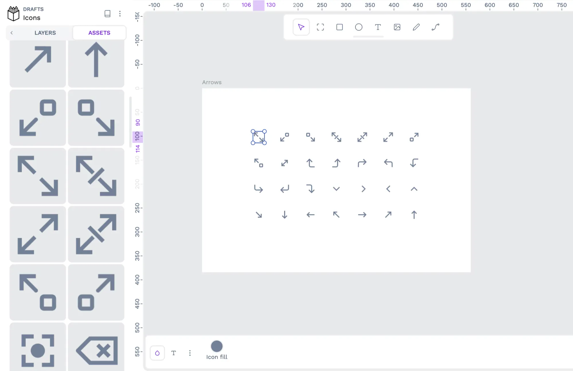
Why use it
Icons are powerful tools for creating consistent brand experiences. Consider them small logos that people recognize at a glance as part of your overall design aesthetic. The best brands are known as much for their iconography as the physical products they create. Keeping the dozens or hundreds of icons in one place makes it easy to offer a consistent aesthetic across all teams.
Tips for making a good icon library
For the icon design, consider what already works and don't reinvent things too much. People already associate certain icons with common tasks (a question mark for an FAQ or Help Guide, for example). Don't change too much and risk alienating users.
If you have especially popular or notable icons, use them as the standard. Recognition takes time to build, and you can pass on the success of an older icon to new ones you model after it.
Finally, be sure to test icons in all environments, including mobile, desktop, and app UIs. Some will just not work for all things, and creating different versions may be necessary.
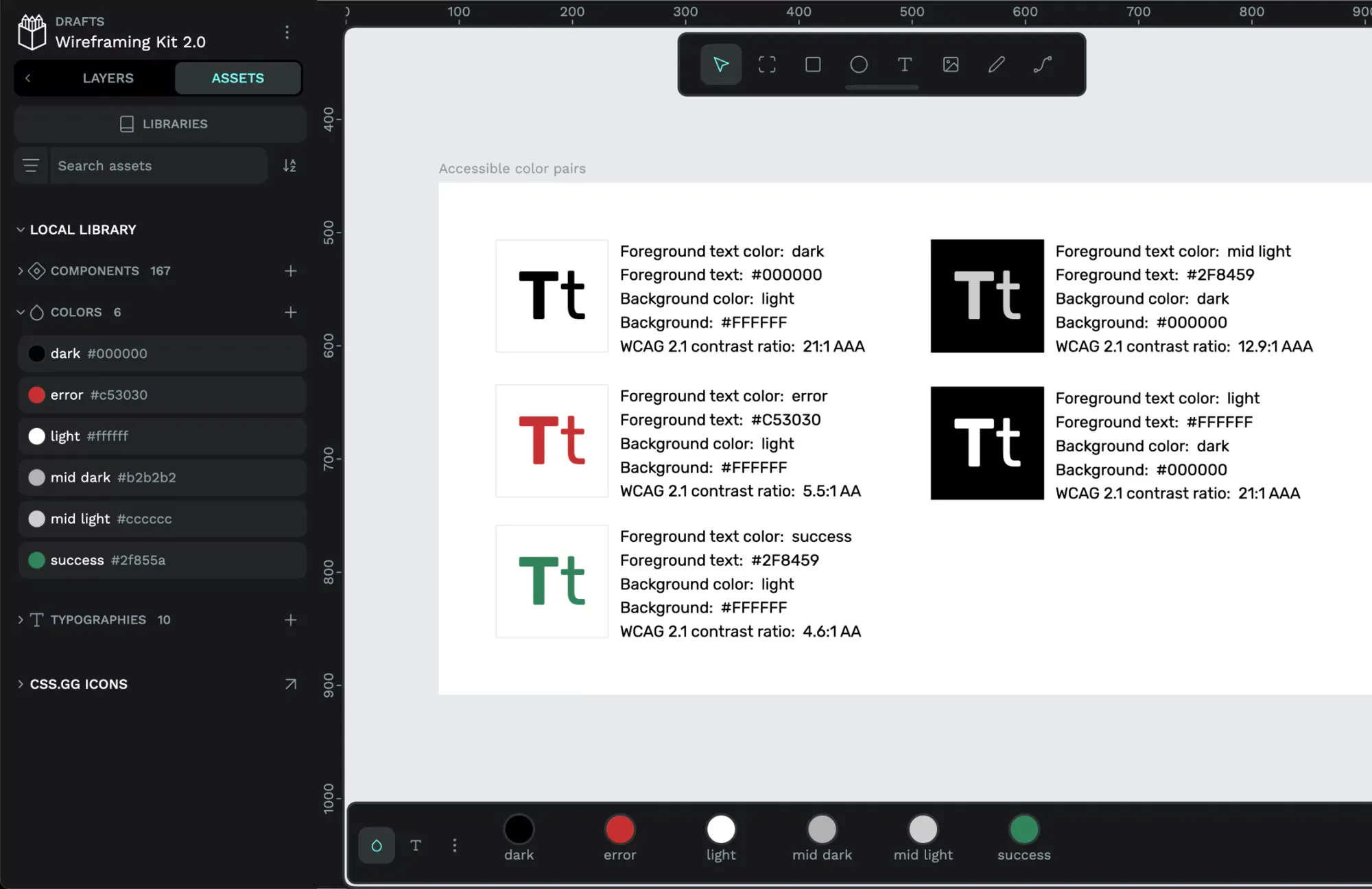
6. Accessibility guidelines
Accessibility guidelines help more people not only use the items within the design system but also use the design system itself. It looks at users with limited vision, cognitive differences, or neurodiversity and proactively addresses challenges they may have in enjoying full use of the products.
Why use it
Creating accessible assets and products isn’t just the right thing to do from a moral perspective; it may also be legally required. As the web standards for usability and accessibility evolve over time, designers and developers will be tasked with meeting them to avoid liability. They will also want to exceed the minimum legal requirements to be recognized as leaders in the space and the creators of competitive products in the market.
Tips for making good accessibility guidelines
The internet is full of examples of how top brands are making design systems and products more accessible through very detailed guidelines. The best path is to check them out and adapt them for your own organization.
Video of Accessibility for designers with expert Stephanie Walter
The General Services Administration (GSA) sets a bar for how accessibility is approached in its U.S. Web Design System (USWDS) standards. They include things like usability sections with each component, support for screen readers, and color choices for sensory-sensitive users.
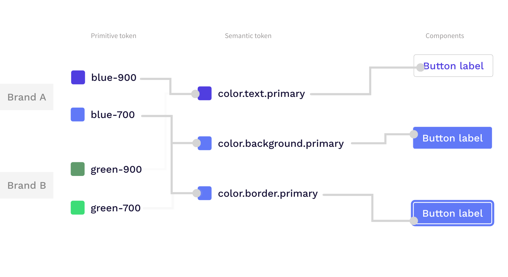
7. Design tokens
Design tokens are named entities that store key design decisions in your design system, such as preferred colors, typography, spacing, shadows, and other visual attributes.
Importantly, design tokens are cross-platform functional. This means if you create a design token defining your chosen typography, that design token will ensure your typography is consistent across all platforms and form factors.
Why use them
Design tokens are a key part of any design system because they help keep projects consistent and scalable.
Designers and developers can use these tokens throughout the project to store design choices, which are then referenced throughout the product development process. This allows for products to look consistent even when they're used on different platforms or devices.
The advantage of this is that there is less room for error since there is a single source of truth to reference. Also, if one day a style needs to be updated, you can simply update the token, and those changes are automatically reflected in all the places where that token was used.
Tips for creating good design tokens
When creating design tokens, consider the following best practices:
- Keep it simple: Start with a minimal set of tokens and expand as needed. Having too many tokens can become overwhelming and difficult to maintain.
- Use meaningful names: Choose clear and descriptive names for your tokens, making it easy for team members to understand their purpose and usage.
- Organize your tokens: Group related tokens together and use a hierarchical structure for better organization and clarity.
- Document your tokens: Provide clear documentation explaining the purpose, usage, and relationships of your design tokens. This helps with adoption and consistency across teams.
- Integrate with tools: Ensure that your team uses a tool like Penpot that will help you make the most out of your design tokens.
The evolution of a design system
Each of these elements plays a living, breathing role in the success of your design system. As they each get updated, the overall system gets an update, too. By approaching changes with intent and understanding how they affect each part of the system, you can better prioritize the things that matter.
Try out one of our Design System templates and get inspiration for the next step of your design journey.
Related Blogs
Check out our other blogs, from informative topic guides to tutorials on how to get the most out of Penpot.
 Paula Tienza
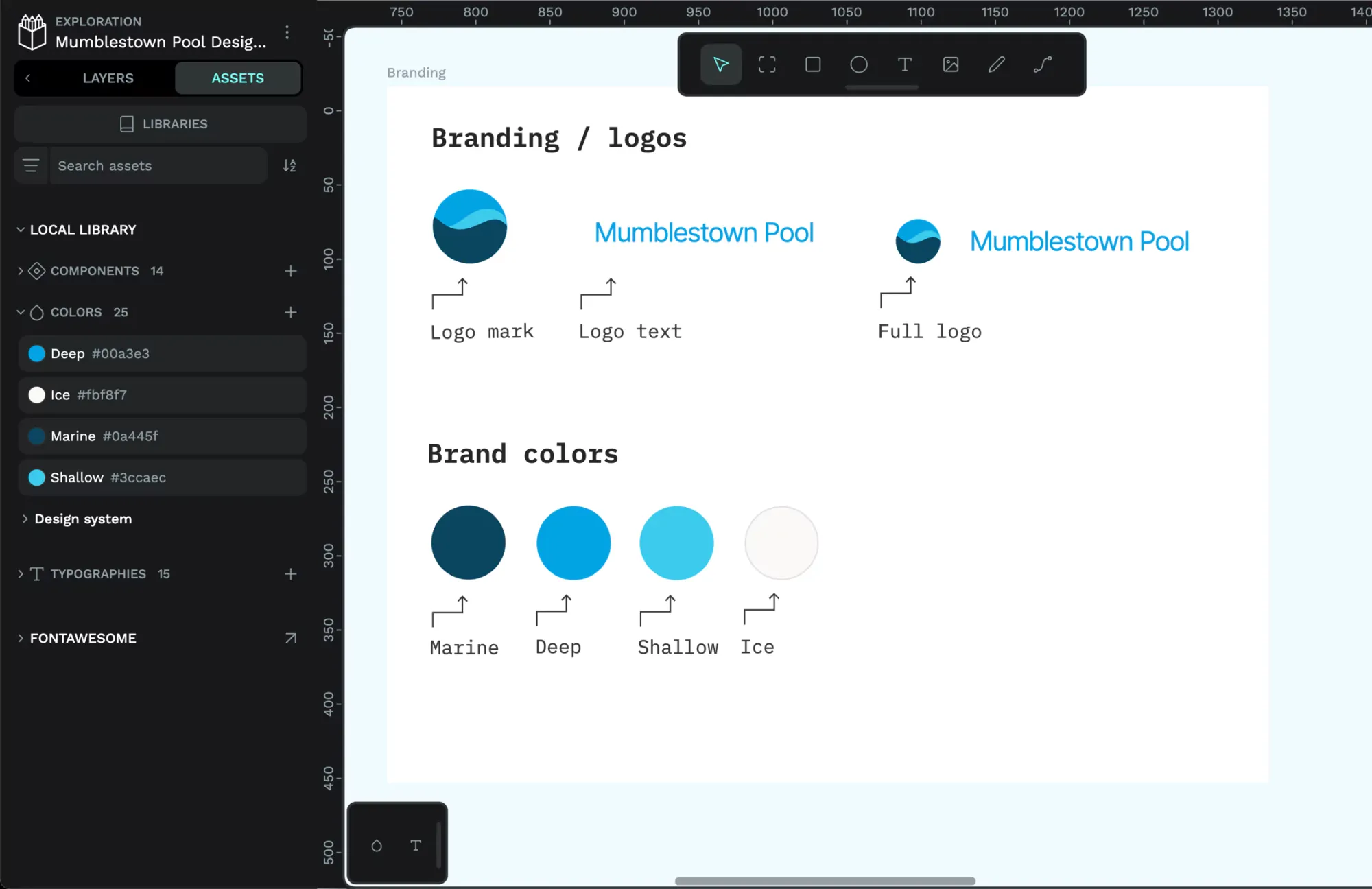 Laura Kalbag
 Paula Tienza
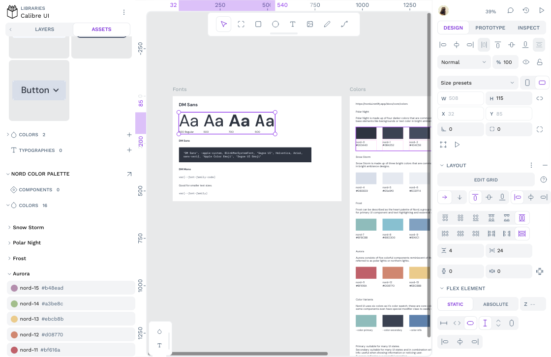 Paula Tienza