UX accessibility: 8 best practices for more inclusive design
By focusing on accessibility in UX design from the very first sketch of your app or site, you can get everyone thinking about the best way to serve every user. Find out how!

Companies often say they want to be more inclusive or accessible, but these goals must start even before their products enter the market.
By focusing on accessibility in UX design from the very first sketch of your app or site, you can get everyone thinking about the best way to serve every user and even reduce major frustrations later in the iteration process.
What is accessibility in UX design?
Accessibility in user experience (UX) design centers around ensuring that everyone, including those with disabilities, can use products and services.
In the context of digital products such as websites and apps, designers look for ways to ensure that people with visual, auditory, cognitive, or motor impairments can access and use the functionality in the same way as other users.
UX designers can focus on accessibility by asking the following questions during the design process:
- Can all users perceive that the information presented is there?
- Can all users understand the information and act upon it?
- Can all users navigate and interact with the product or service?
Accessibility often includes ensuring a website or app can be interpreted by commonly used assistive technologies, such as screen readers and text-to-speech interfaces.
Accessibility vs. usability
It’s common to confuse accessibility and usability because they share some of the same goals. However, the main distinction is that accessibility focuses on ensuring people with disabilities can use the site or app, while usability focuses on the overall experience for every user.
For example, accessibility ensures people with disabilities can see and hear the content on a site and interact with it using assistive technology. This generally means following best practices set out by organizations like the Web Content Accessibility Guidelines (WCAG) and would include details like alternative text for images.
Usability looks at measurements like how effective the site is for helping every user achieve their goals or how effective an interaction is overall. An example would be having clearly labeled navigation or a workflow that’s easy for new users to learn and master quickly.
Why accessibility matters
While making your product more accessible requires a little more planning and effort, the benefits are substantial. With benefits for both the company and the user, accessibility has driven change for digital products in every industry.
Inclusion
Ensuring everyone can use your product is the right thing to do, but it also opens you up to a larger audience.
Making your product more accessible means that there are more people out there who can actually use it, which can help grow your customer base. Improving this access makes sense from an altruistic perspective and for financial purposes.
Legality
Improving accessibility is also important from a legal perspective. Refusing to make even the most basic accommodations for those with impairments could open you to liability or legal troubles.
The European Accessibility Act (EAA) and Americans with Disabilities Act (ADA) both require digital products to be available to users with disabilities. If you’re not in the US or EU, take some time to check your local laws to see what is legally required of your business when it comes to accessibility.
Better experience
Accessible design doesn’t just make your product better for people with disabilities — it’s also a smart way to improve your product experience for everyone. Whether it’s better color contrast, the ability to adjust the font size, or compatibility with common assistive technology apps, these changes can empower anyone to get more out of your product.
For instance, look at the captions on videos. Originally, captions were for deaf people and people with hearing loss while watching movies and TV, but now just over half of Americans under 30 prefer to watch TV this way.
When it comes to accessibility, more choices are always the best option so your product can be enjoyed however your customers prefer it.
Brand enhancement
Accessibility boosts brand recognition in two ways. First, it helps establish your reputation as an inclusive company. With a more inclusive site or app design, your users can’t help but associate their experience with your brand values.
Second, it can have technical benefits, such as helping you rank higher in Google searches. Many of the same technical site details that enhance UX accessibility also help Google and other search engines’ bots find your content and rank it.
8 UX accessibility best practices
These accessibility guidelines also make for good overall design. They have been grouped into categories according to their purpose and technology type.
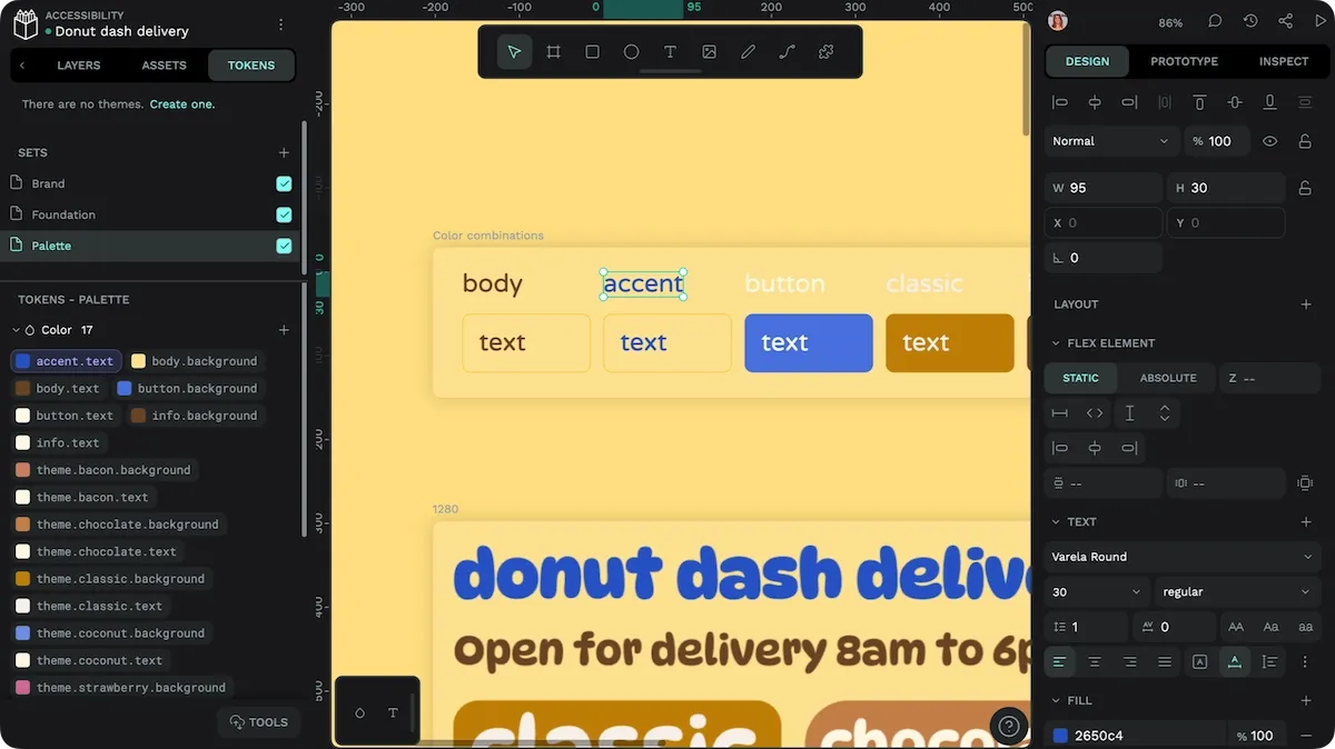
1. Use sufficient color contrast for text and interface elements
The Web Content Accessibility Guidelines recommend specific contrast ratios.
For regular text, the contrast ratio between the text color and its background should be at least 4.5:1. This ensures that the text stands out clearly against the background, making it easier to read for most users, including those with low vision.
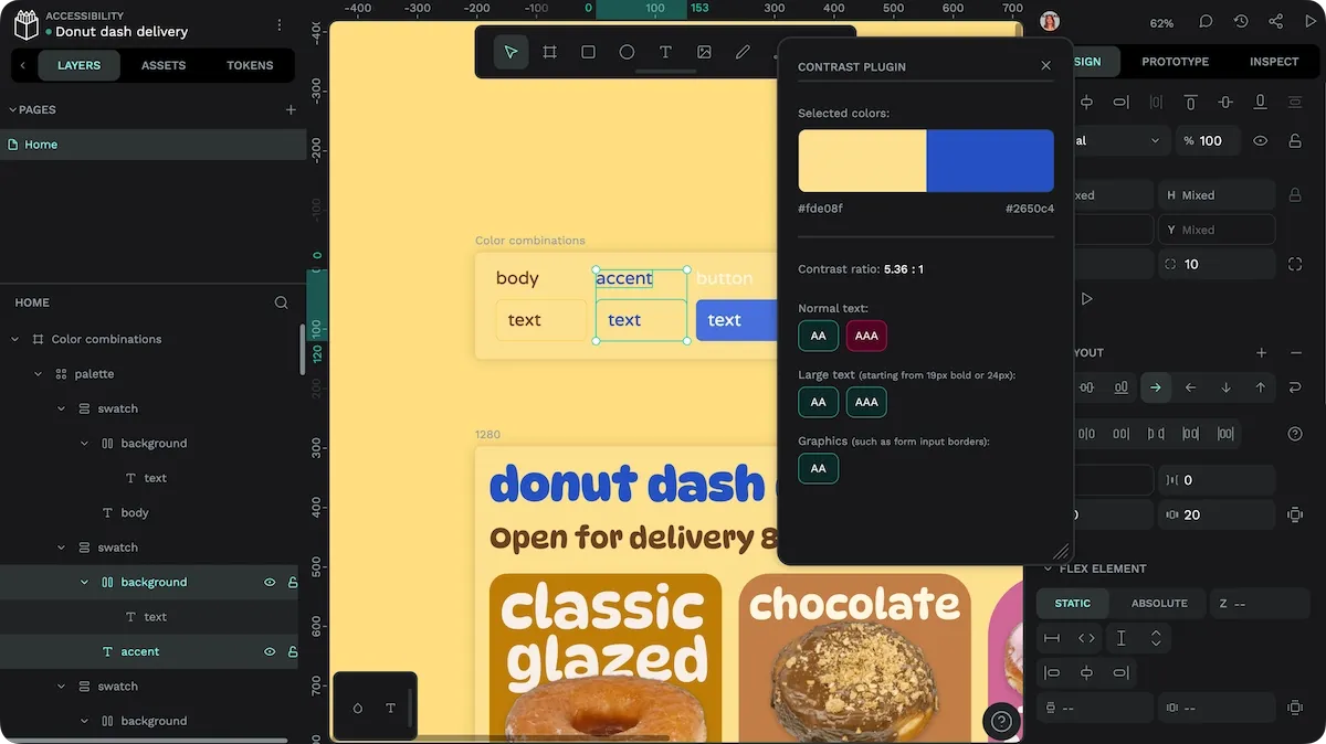
Large text, considered at least 18 points in bold or 24 points in regular weight, should have at least a 3:1 ratio. Logos don’t follow the same requirements.
Designers should also avoid relying on color alone to convey information. Not everyone can see color similarly, so a higher contrast won’t fix all accessibility issues.
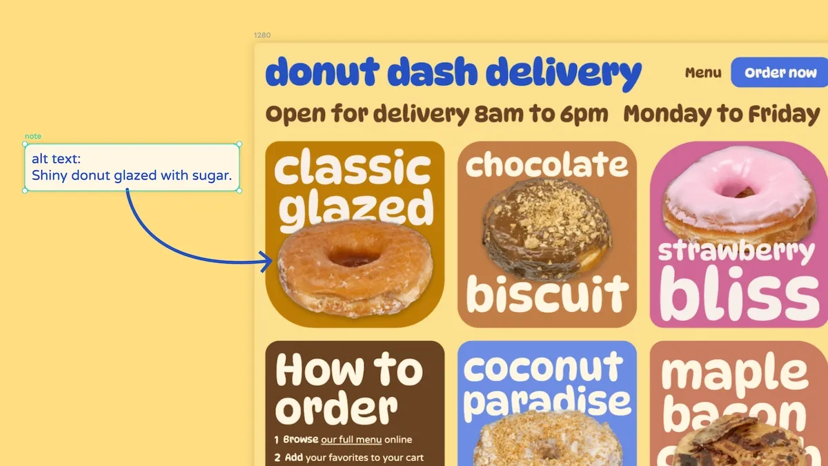
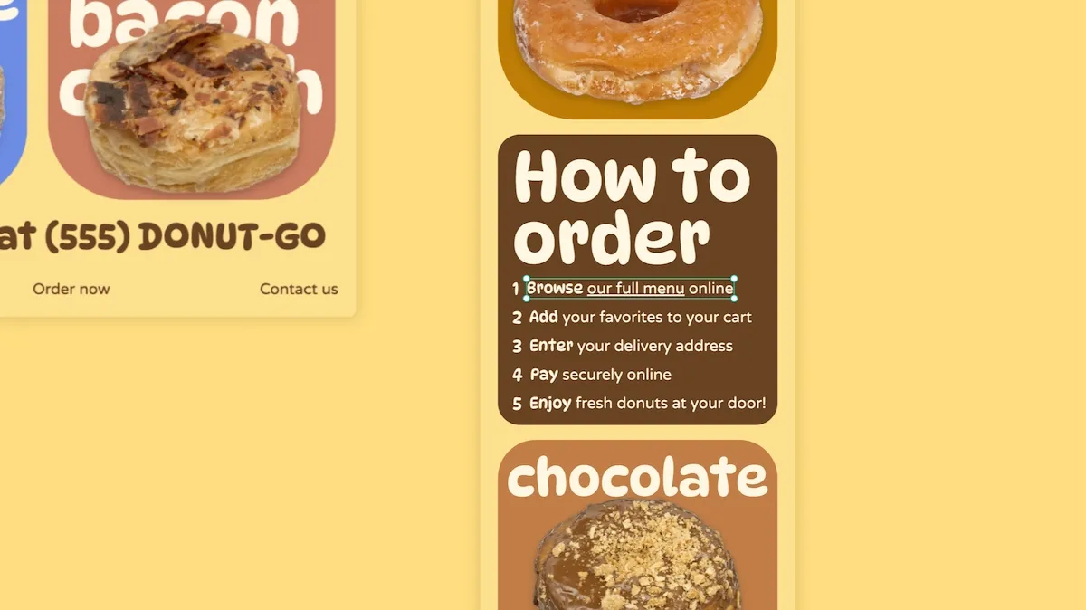
2. Provide alternative text for visuals and videos
As screen readers and text-to-speech technology become more commonplace, even among those without disabilities, it makes sense to prioritize this requirement for your design. Some common recommendations include:
- Alt text should be concise, descriptive, and include context, such as why the image is relevant to the accompanying text.
- Short videos or animated gifs can be described through alt text, but a transcript and/or captions will be needed to give users the full context of the content.
- If it makes sense to use keywords naturally when describing images, do so. But avoid keyword stuffing (when you use keywords in alt text to affect your search engine rankings–it doesn’t work anyway!)
- Label decorative images within the design’s HTML so screen readers ignore them.
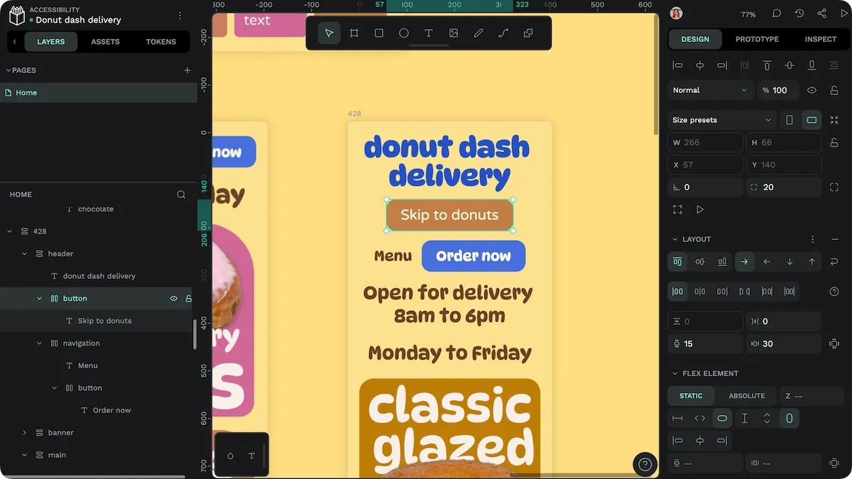
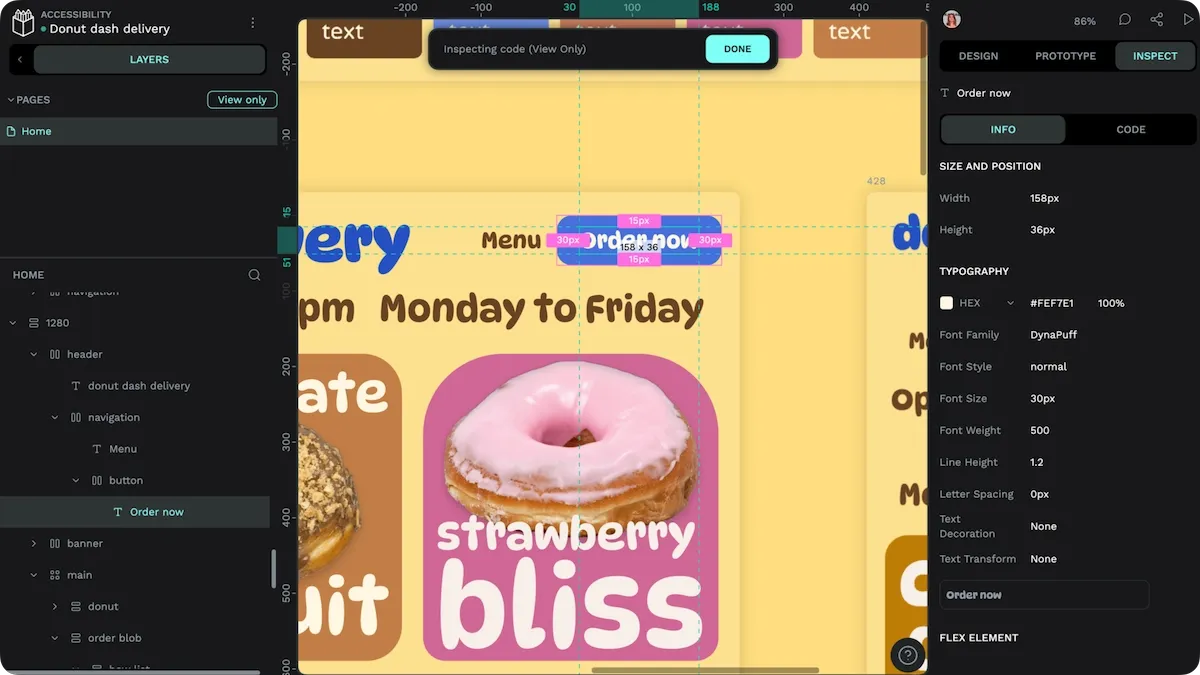
3. Enable keyboard navigation for all interactive elements
Since users with disabilities often rely more on keyboards to interact with site or app elements, it’s important to make functions on your site work with keyboard input. Common elements and actions include scrolling content, tabbing through forms, and hitting enter to submit or activate buttons.
Tab order should be logical, and follow the order the content is displayed. You can also include skip links to give users an easy way to get through unnecessary or repetitive site content and go to the main interactive item on each page.
4. Design a clear and consistent navigation structure
Seamless navigation matters to all users, but by addressing the needs of those with disabilities, you also help the wider audience get more from your app.
Things to consider include:
- Create a consistent layout, including the positioning of elements across pages. Site maps, links, buttons, and forms should be in the same spot on every screen.
- Use clear labels for links. Avoid terms like “Click here” or “More,” and instead say “Chat with us” or “FAQs.”
- Consider multiple paths to each resource, including header menus, site maps, and search navigation.
- Look for ways to incorporate breadcrumbs, which tell users where they are in a navigation path and allow them to click back to a previous page more easily.
- Use a hierarchical design to put the more important links or resources at the top of the page.
- Look at great examples of UI for best practices already consistently used across the web and apps.
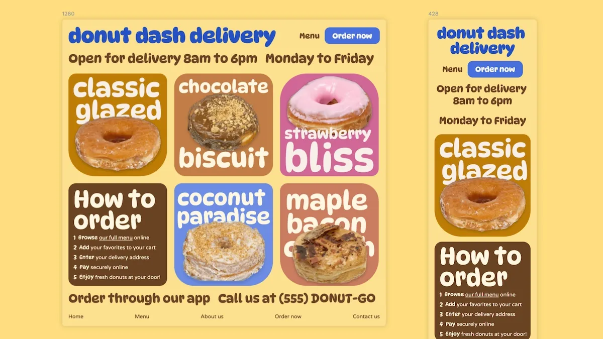
5. Allow users to resize text without breaking the layout
Screen sizes differ from device to device, and the choice of app vs. desktop experience can also affect how large content renders on the page. To help all users see things better (not just those with visual impairments), consider a design that lets them zoom in and out.
WCAG recommends allowing text to be resized up to 200% without affecting the site’s functionality, but you don’t have to stop there. Most browsers support multiple options for zooming pages and text, including zooming the whole page by default, making it easy to resize text without breaking the layout.
6. Provide captions and transcripts
Users increasingly rely on transcripts and captions to help them understand content in high-noise environments or to learn according to more visual learning styles. By providing text-based support, you ensure more viewers can enjoy your content and even stay on the page or in the app longer.
The bonus? Higher engagement signals to search engines that your content delivers on its promises and may positively affect your search ranking. Text also makes it easier for search engines and other bots to index your content.
7. Make interactive elements large enough for easy tapping on mobile devices
Constantly hitting the wrong buttons or links on a mobile touch screen can frustrate users and discourage them from revisiting your site or app.
To reduce the chance of mistakes, space your elements far enough apart to work on several devices and for people of all sizes and ages. Make interactive elements “target size” large enough to hit the first time without repeating. The WCAG recommends a minimum touch target of 24x24 pixels.
8. Use meaningful HTML
HTML is the language used to describe a web page’s content and interface to web browsers. There are different HTML elements for describing different types of content, such as paragraph, link, header, navigation, or form. Using the correct or most relevant HTML element helps assistive technologies describe the content of a page to the user, as well as quickly identifying and navigating to the correct section of a page based on a user’s request. Then the user isn’t required to scroll or tab through every part of the page to find the area they want.
Understanding the HTML elements available to you helps you bring more accessibility to your website and ensures you keep up with changes in assistive devices.
Upgrade your design skills with Penpot
Using a design tool like Penpot can simplify the design process, especially when considering accessibility.
Once you create elements that are truly accessible, you can easily replicate efforts with the reusable component libraries many users make and store with the Penpot platform. Also, the various collaborative and testing tools make getting teammates’ input and collecting user feedback easy.
Ready to get started? Sign up for a free Penpot account and explore our Learning Center for more ideas and tips.
Related Blogs
We have even more posts about UX and accessibility. Here’s a few examples of handy articles to help you get the most out of Penpot.
 Laura Kalbag
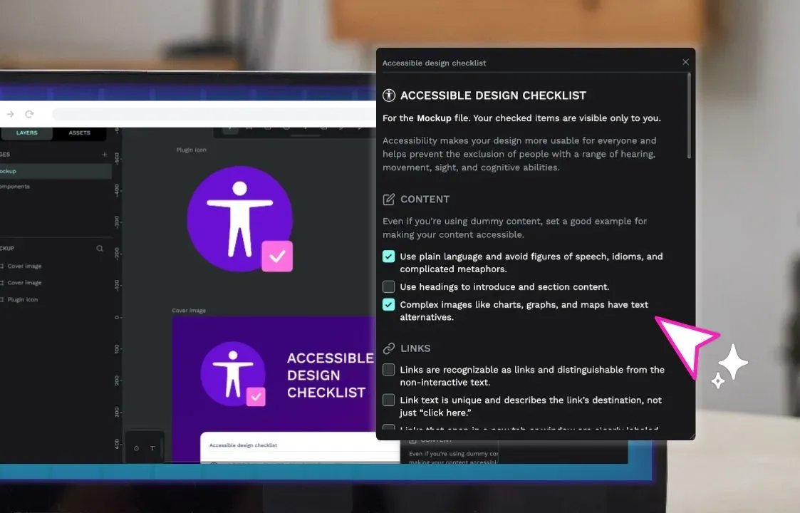 Paula Tienza
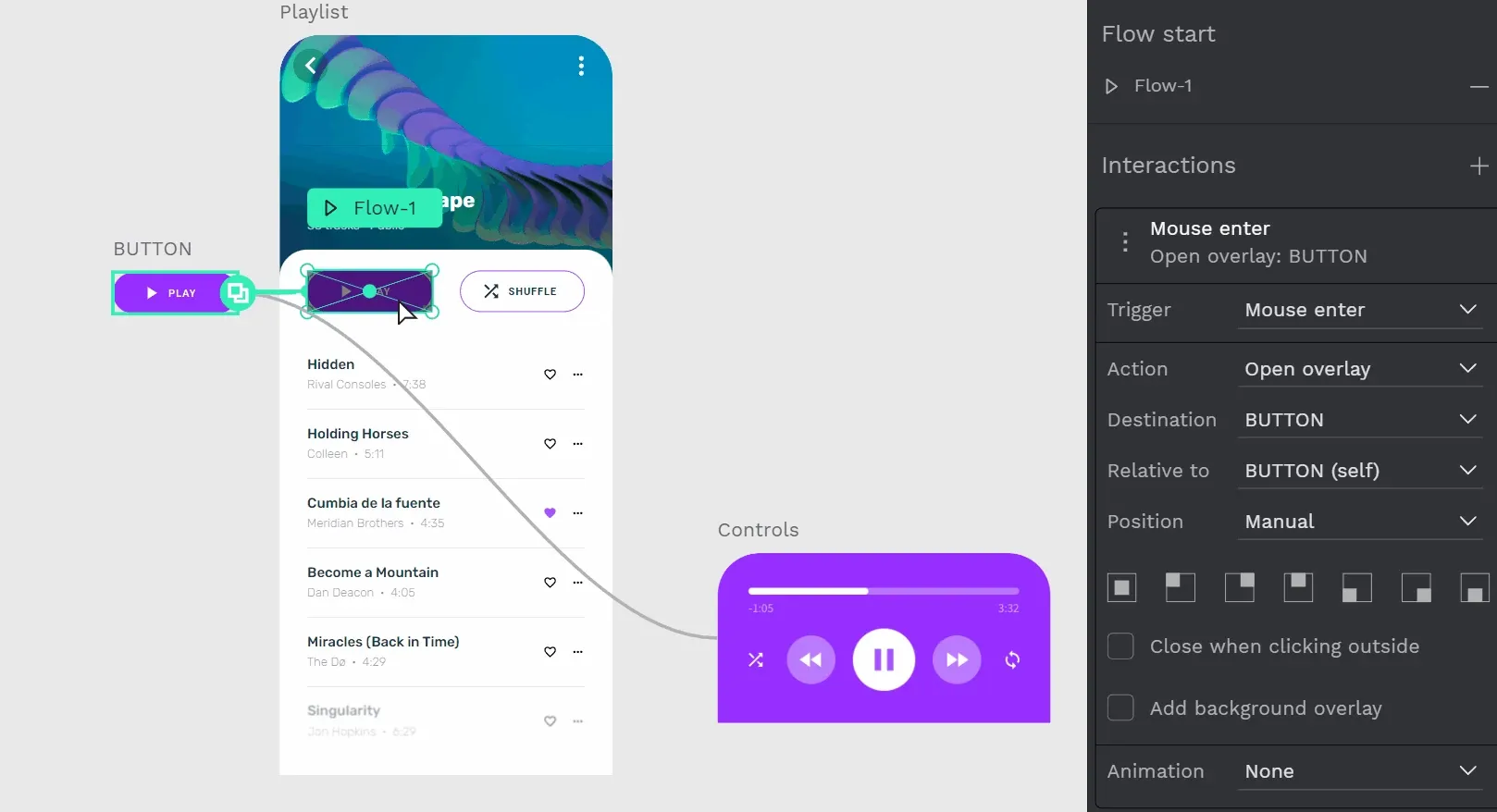 Elena Scilinguo
 Paula Tienza