Tutorial: Creating wireframes with Penpot
Learn how to design, present, and share wireframes with Penpot using our Wireframing Kit library to get started quickly.

Wireframes are low-fidelity skeleton designs focusing on content, interface elements, navigation, and layout. They’re usually grayscale line drawings with no imagery, color, or attractive typography. You might be tempted to draw wireframes by hand, but using a design tool like Penpot can speed up the process, allowing you to speedily reposition objects and concentrate on the substance of your design.
The idea is to focus on the user experience, build up a kind of interface inventory, and hash out the rough layout and hierarchy while not getting sidetracked by all the pretty things that can distract us designers. Some designers even use handwriting fonts to emphasize the early-stage nature of their wireframes and prevent stakeholders from thinking these designs might be high-fidelity mockups. (This has really happened to me… and yet I’ve never had the confidence to rock the wireframe style on an actual site design.)
1: Create a team and add the wireframing kit
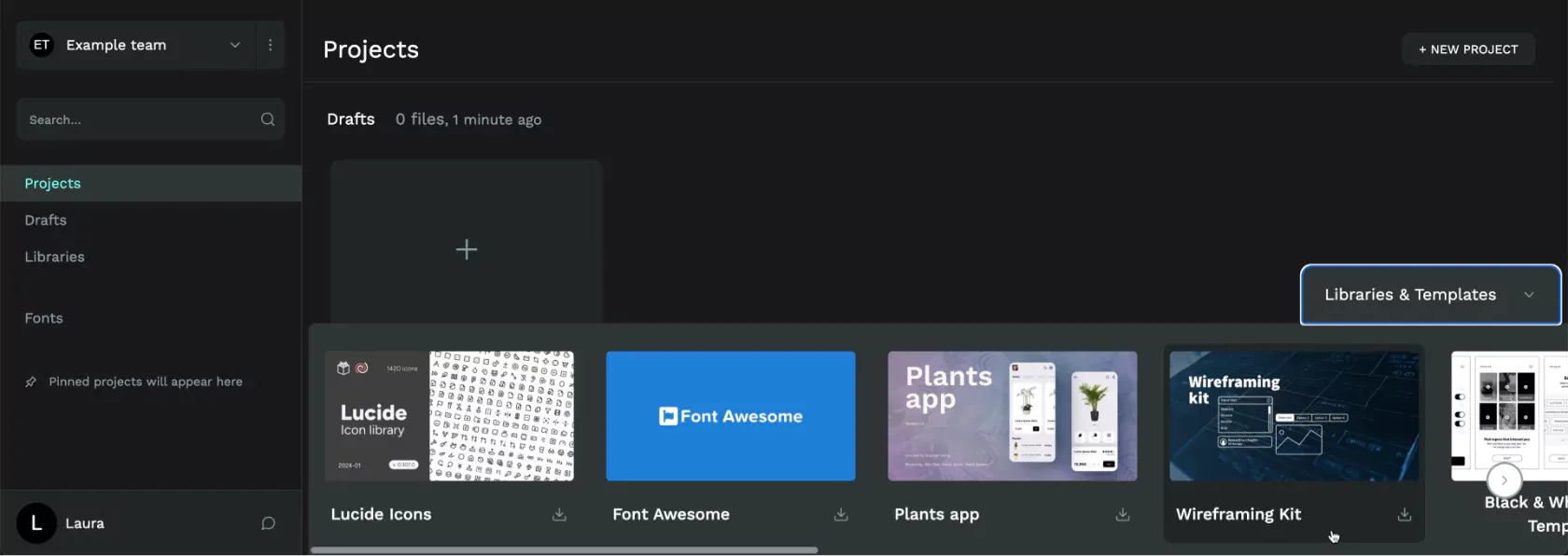
Even if you’re not working with other people right now, creating a team for your project gives you an easy way to have shared libraries ready for use inside each new project. If you haven’t already created a team, create a team from the top left menu in the Dashboard.
Then, with your team selected in the Dashboard, add the Penpot Wireframing Kit from the Library & Templates pane at the bottom of the Dashboard. (You can also download the Wireframing Kit locally from our Libraries & Templates page) You can easily make your own wireframing components in the future, but the Penpot library is a great way to get started quickly.
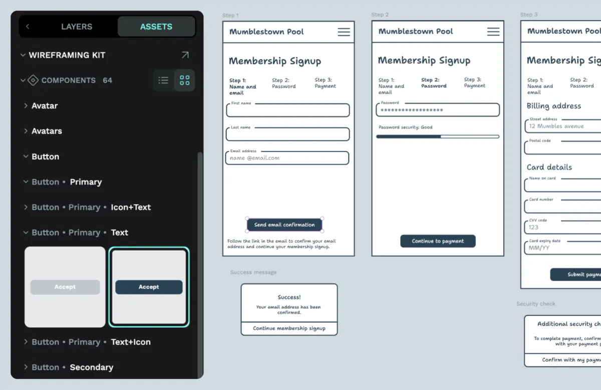
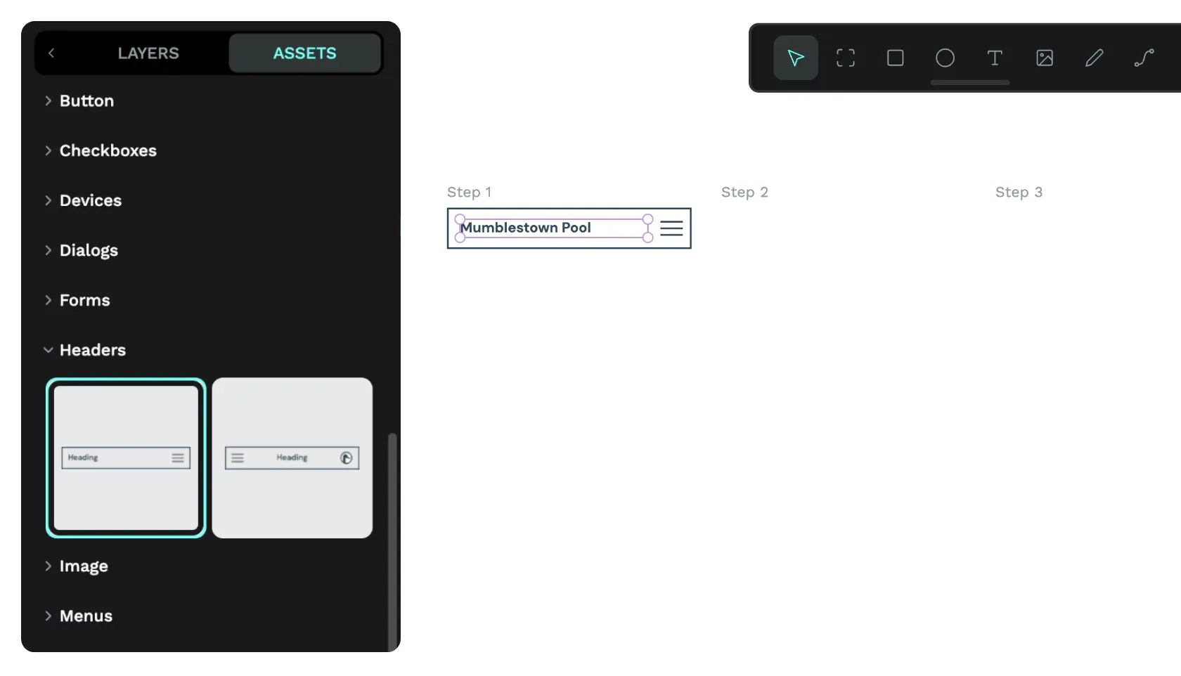
Create a new file or open an existing file. Go to the Assets tab in the left sidebar and use the plus icon button to add the Wireframing Kit to your file.
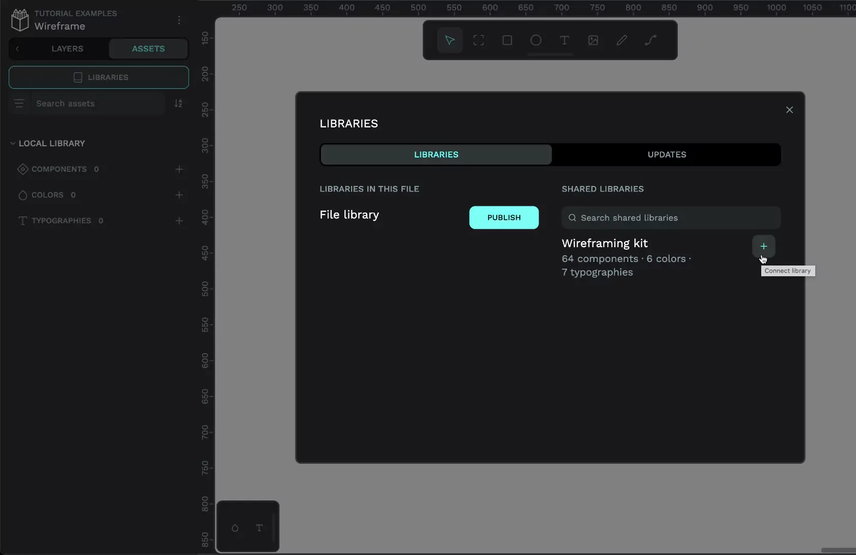
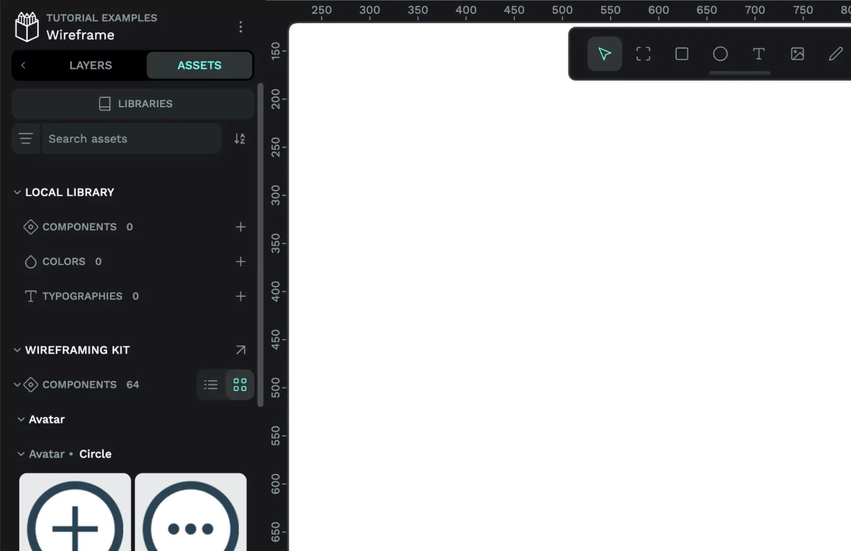
Once you’ve added the Wireframing Kit to your file, you can find the components, colors, and typographies in the Assets panel.
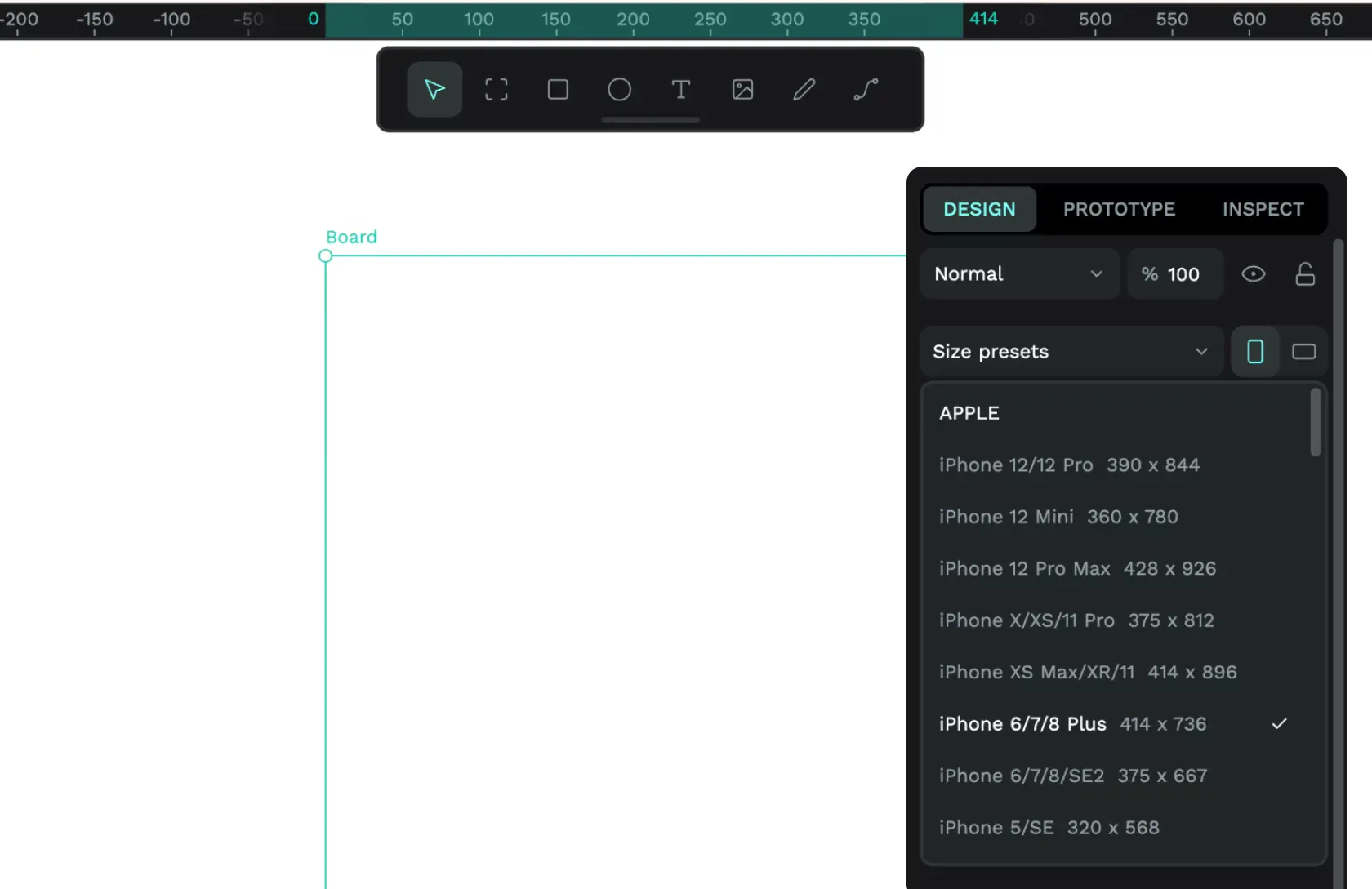
2: Create a board for each screen, view, or step
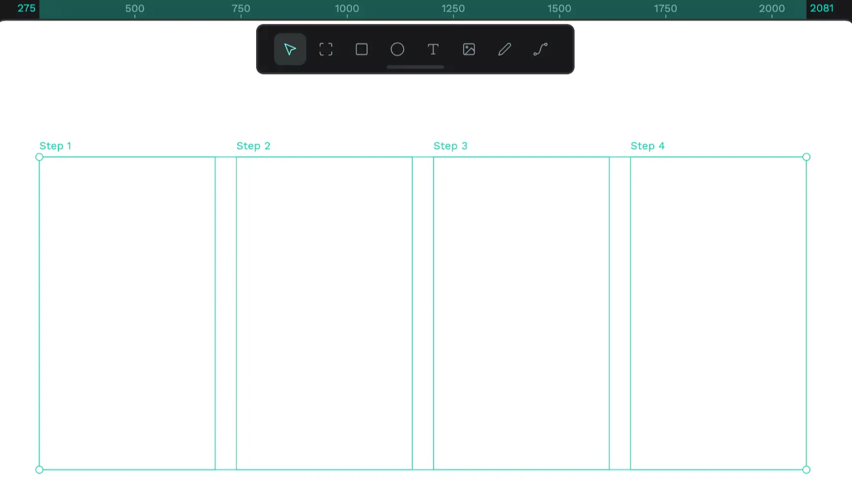
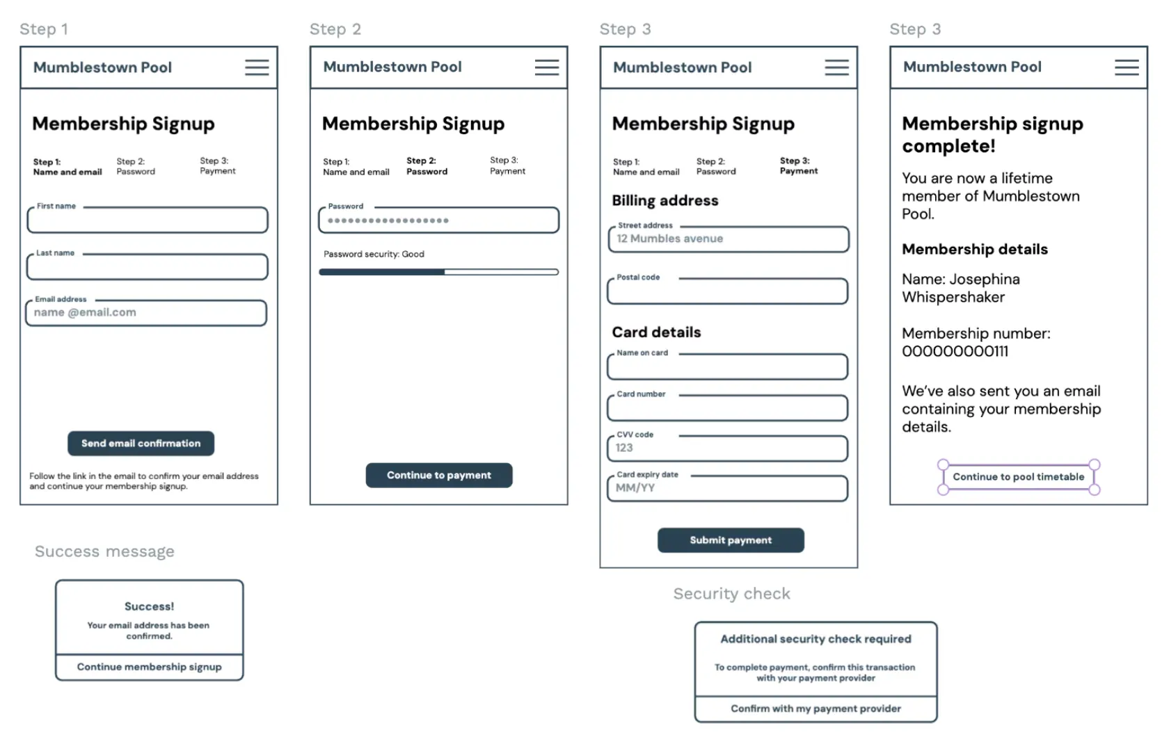
The next step is to create a board for each screen, view, or step you’re wireframing. It can be helpful to use steps you might’ve outlined in a user journey.
For this project, I’m creating wireframes for the mobile view of a website, so I’m using the Apple iPhone 6/7/8 Plus size preset. The pixel-precise layout shouldn’t matter for a wireframe. Wireframes are a very low-fidelity format, but this gives me a default board size for consistency across my wireframes.
I’ve created a board for each step of this website’s sign-up process.
3: Drag wireframing kit components onto your board to quickly mock up wireframes
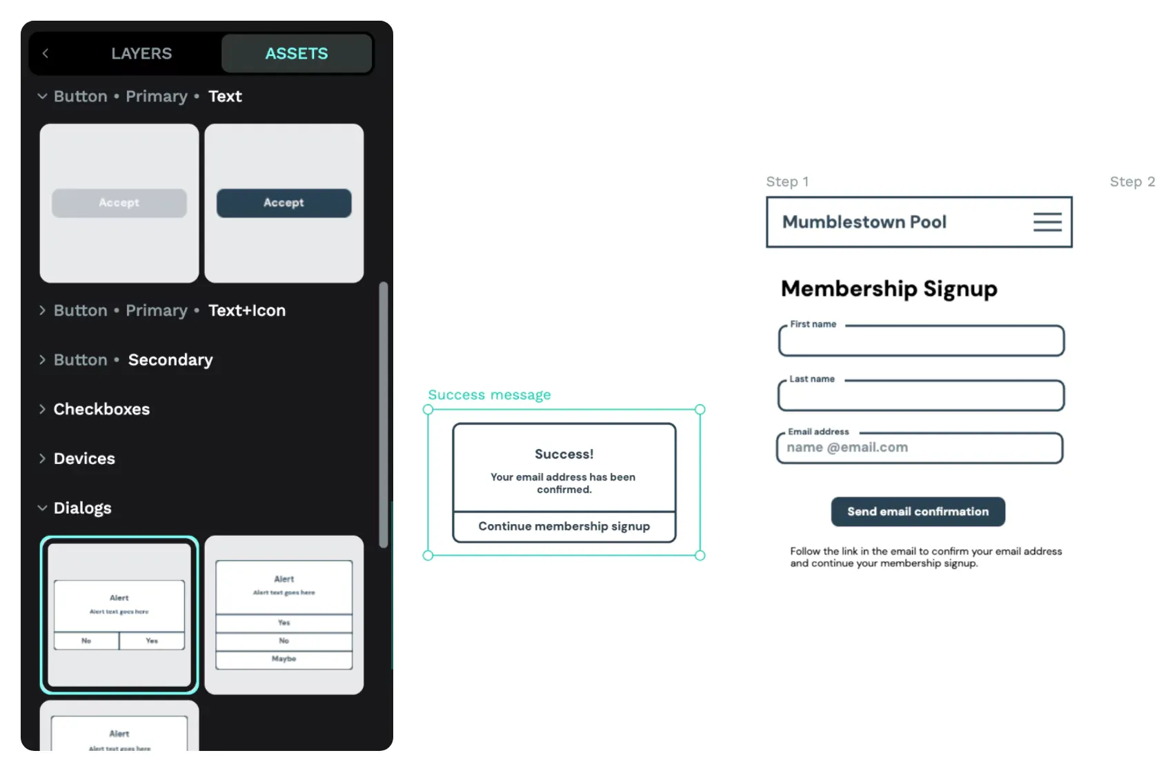
Now, all you need to do is drag components from the wireframing kit onto your board to create your wireframes. I’ll start at the top with my website’s header containing the site name and the menu button. From the Assets panel, I’ll drag a Header component from the Headers folder inside the Wireframing Kit onto my Step 1 board.
4: Use wireframing kit typography to mock up heading and paragraph text
You don’t often need components for text styles, so the Wireframing Kit contains default typographies to help you show your team whether a text object will be a heading or paragraph text. These typographies can help you quickly create text hierarchy while preventing you from getting caught up in font choices and sizes. (If you’re anything like me, you’ll easily get distracted picking a font that conveys the best vibe for your brand. Having plain default styles for your wireframe prevents the temptation!)
Use the text tool to add text to your board. With the text box selected, navigate to the Assets panel and choose a heading or paragraph style from the Typographies folder inside the Wireframing Kit.
Using heading levels (H1, H2, H3 etc.) makes it easier for developers to translate your designs into HTML headings and benefits accessibility by helping assistive technology understand your content hierarchy.
5: Create mini boards to wireframe modals or overlay content
You don’t need to create full boards to mockup modals or overlay content in your wireframes; you can just create mini boards showing the content and layout. For my sign-up process, I want to show the success modal that will appear when a user has successfully confirmed their email address.
6: Present your boards from View mode
Once your wireframes are ready to share, you can easily present them to your team, clients or stakeholders from View mode.
Use the play icon button to enter View mode and present your boards in person or online in a screen share with your team. You can use the board menu in View mode to quickly navigate between boards.
Add collaborators to your team (it’s free!), and they can add comments from inside View mode.
Take your wireframes to the next level with interactive prototypes
If you want to test the whole user experience of your wireframes, it only takes a few clicks from the Prototype panel to turn your wireframe into an interactive prototype. Read our blog article about creating interactive prototypes with Penpot to discover how to make these clickable wireframes.
Wireframes are best at low-fidelity
As irresistible as it can be to jump into the polished details, wireframes help you clearly think out the substance of your app or website. Low-fidelity visuals are useful design documents to share with stakeholders, helping you stay on the same page, get sign-off, and hopefully prevent late-stage revisions further along the design process. Go on, make them really ugly. I dare you.
Don’t forget you can find the Wireframing Kit, along with loads of other handy libraries and templates for all kinds of design work, in our Libraries & Templates collection. Have you created a template you want to share? Read about how to contribute your own templates and libraries so all of us in the community can learn from your work.
If you like this tutorial and want more, please let us know on our Community Space. We’d love to hear what you want to learn about next.
Related Blogs
Check out our other blogs, from informative topic guides to tutorials on how to get the most out of Penpot.
 Paula Tienza
 Laura Kalbag
 Laura Kalbag
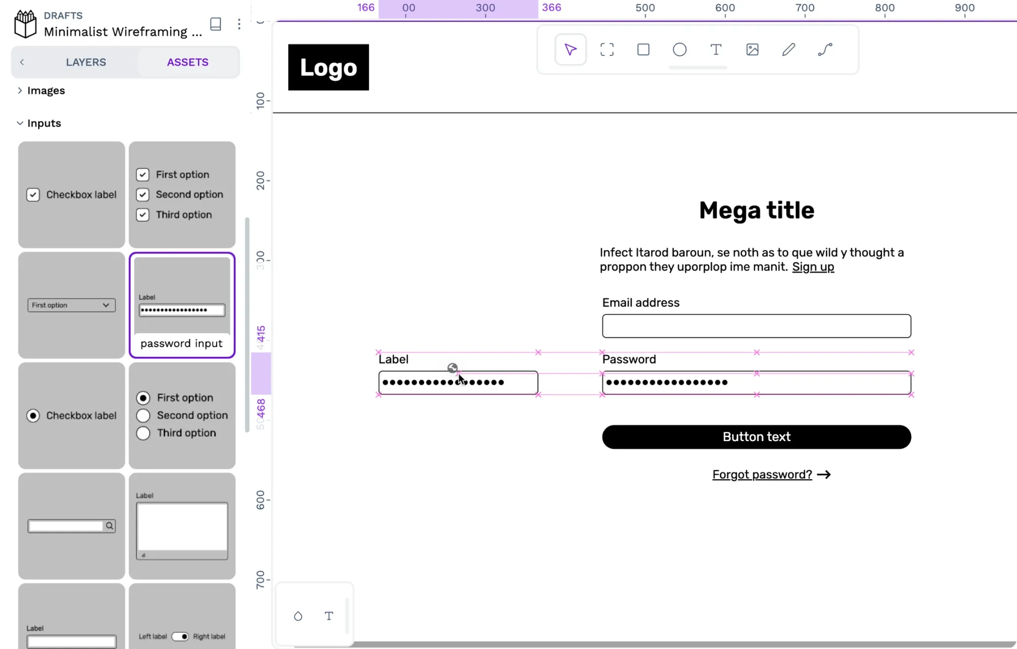 Paula Tienza