Design
Background grids vs grid layouts: what’s the difference?
Background grids are guides you use to help you manually position design elements by eye. Grid layouts automate layouts (often responsively) based on the design rules you provide.

Design
Background grids are guides you use to help you manually position design elements by eye. Grid layouts automate layouts (often responsively) based on the design rules you provide.
AI
The following “token-aware” approach treats prompts like structured contracts instead of a wish-list or diary, so you get better outputs in fewer iterations (and with fewer prompt credits).
AI
Learn how to write structured, token‑aware AI prompts in Penpot so you get cleaner design systems, fewer hallucinations, and faster, production‑ready outputs.
Penpot
Step-by-step guide to deploying Penpot with Docker. Covers installation, configuration, version management, backups, HTTPS setup, and authentication for self-hosted instances.
Tutorial
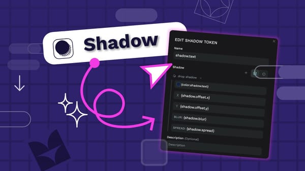
Using shadows carefully and consistently in your UI design can make it feel polished. Shadow design tokens help you implement the consistency and quickly update your shadows across your design system.
Tutorial
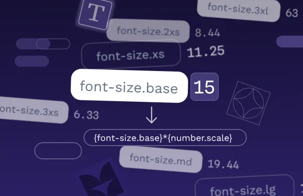
A proportional typographic scale is a hierarchy for font sizes that uses a consistent mathematical ratio. Design tokens are ideal for creating these scales.
Tutorial
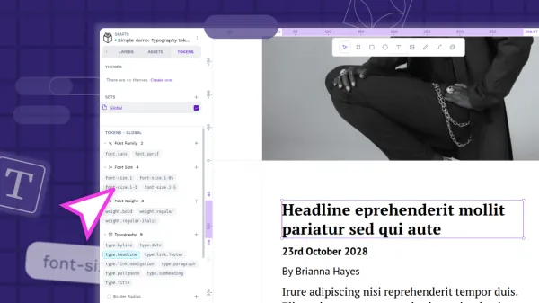
Typography design tokens are a way to save your text styles for reuse across your projects. The typography composite token combines multiple typography-related properties in one mega token.
Open Source
Once you've decided to bring Penpot into your own infrastructure, the next step is making sure your instance runs smoothly, stays secure, and scales with your team. Learn how to self-host Penpot in your infrastructure.
Tutorial
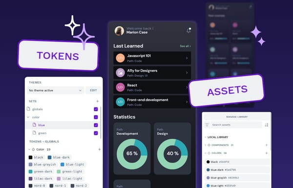
Color design tokens and asset colors are both ways you can store colors in Penpot for reuse. There are some key differences that might affect which you choose to use in your project.
Design
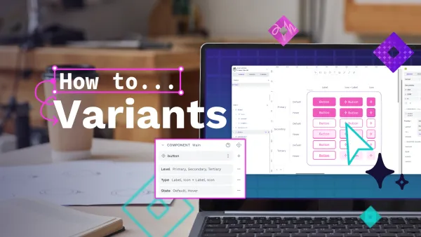
Component variants are a way to create different variations of a component. Does your component need different sizes? Colors? Levels of elevation? Variants make it easy to define these properties, and choose between them when you’re using a component in your designs.
Tutorial
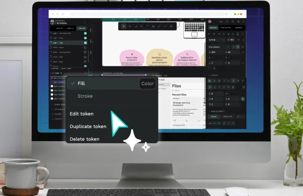
Design tokens are the smallest repeatable elements of your design that can be reused consistently across your Penpot projects and teams.
Tutorial
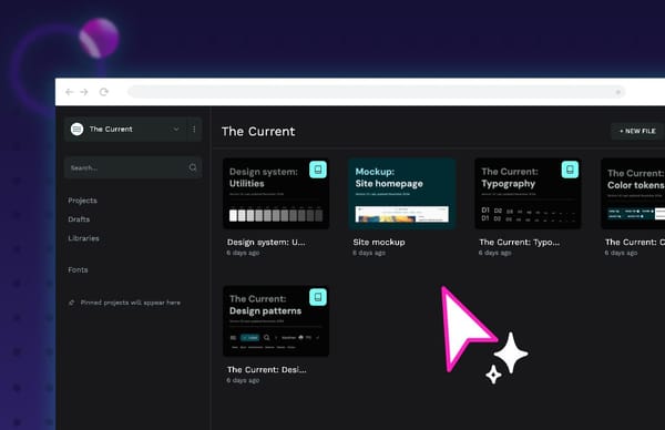
If you want to create a design system using Penpot, I’ve got some tips, tricks, and best practices for you.