Say hello to background blur
Have you ever heard what "glassmorphism" is? Maybe not, but I'm sure you've seen an increase in glass effects in UI design across websites, apps, and operating systems.

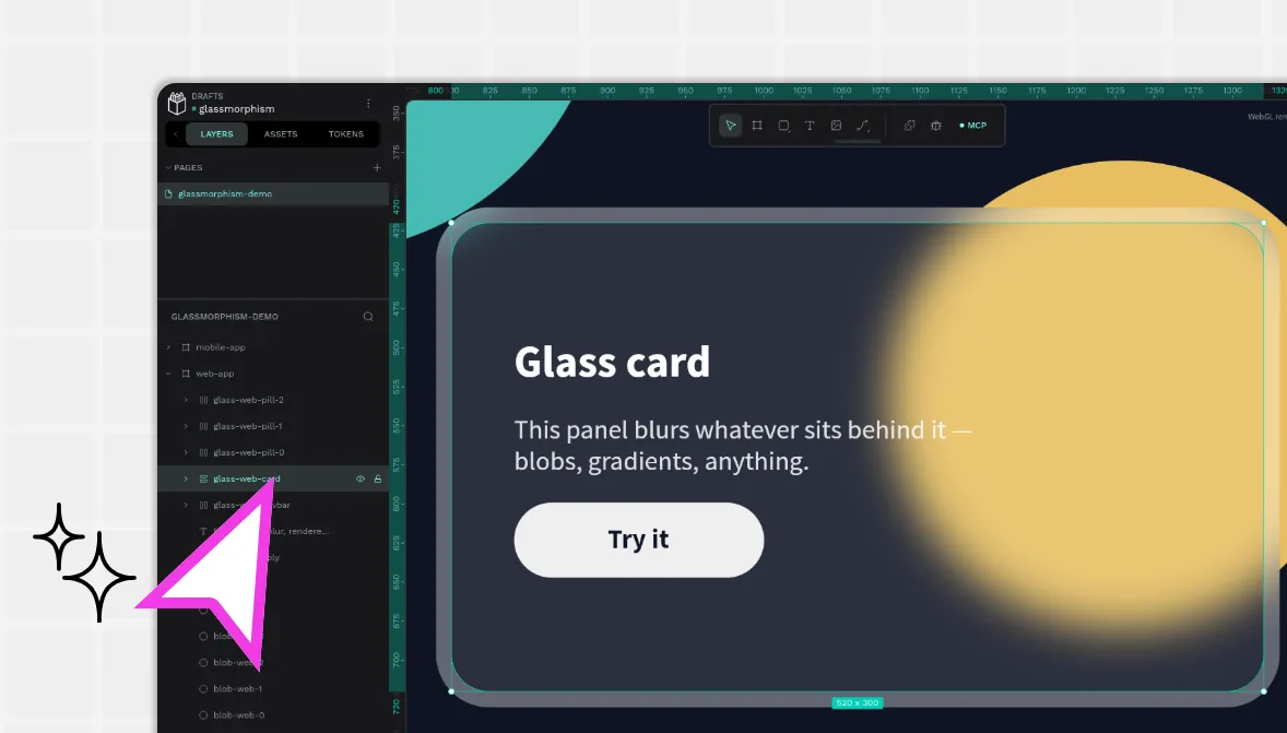
Have you ever heard what "glassmorphism" is? Maybe not, but I'm sure you've seen an increase in glass effects in UI design across websites, apps, and operating systems. This trend of simulating a "frosted glass" effect has expanded faster than cordyceps in The Last of Us, and Penpot users have been asking for it for years.
You've probably met it under a dozen different names: designers call it glassmorphism or frosted glass, the CSS spec calls it a backdrop filter, Microsoft shipped it as Aero and later Acrylic, and Apple has gone from vibrancy to its newer Liquid Glass. Same core idea every time: a translucent surface that blurs whatever sits behind it.
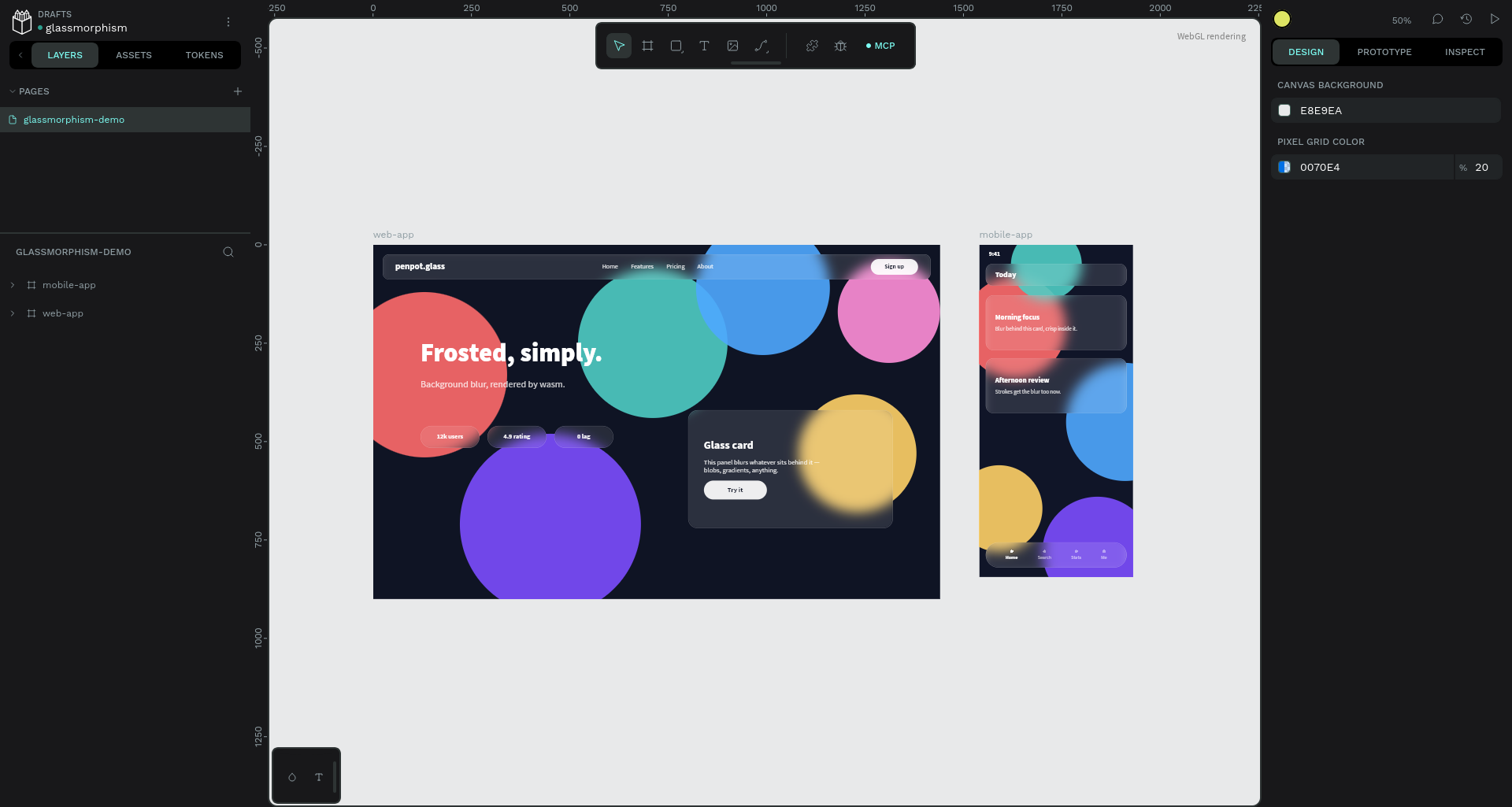
Thanks to the WebGL renderer, we've finally shipped it! It was not possible in our SVG pipeline, so once we had the WebGL renderer beta version, it was a matter of adding a few lines of code to start supporting it.
Why SVG render couldn't do it
On the web, the glass effect is a one-liner. Give an element a semi-transparent background and blur whatever sits behind it:
.glass {
  background: rgba(255, 255, 255, 0.15);
  backdrop-filter: blur(12px);
}
<svg width="400" height="300">
  <rect
    class="glass"
    x="50"
    y="50"
    width="200"
    height="120"
    rx="20"
  />
</svg>
It works on HTML elements, but the support on SVG objects (rect, path...) is less reliable as it's not supported across different browsers.
<filter id="blur">
  <feGaussianBlur stdDeviation="10"/>
</filter>
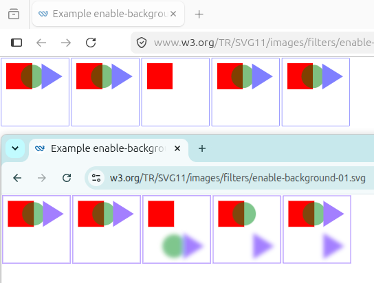
SVG can apply filters, but sadly none of them has the effect we're looking for. The code above only blurs the SVG element itself, but not what's behind. And regrading other filters that might help, sometimes they don't have enough support in modern browsers:
Because in-memory image buffers can take up significant system resources, SVG content must explicitly indicate to the SVG user agent that the document needs access to the background image before BackgroundImage and BackgroundAlpha pseudo input images can be used. The property which enables access to the background image is ‘enable-background’.BackgroundImageis not supported as a filter source in modern browsers (see the feComposite compatibility table). We therefore need to import one of the images to blend inside the filter itself, using an<feImage>element.
Skia to the rescue
Penpot's WebGL render engine is written in Rust, compiled to WebAssembly, and paints with Skia on WebGL. Skia is an immediate-mode rasterizer. This means that at any point while drawing, the pixels rendered so far exist, and Skia exposes exactly the primitive we were missing: a backdrop filter on a saved layer. When you push a layer with a backdrop filter, Skia initializes that layer with the current canvas contents, filtered.
// clip to the shape's geometry, in shape-local coords
canvas.clip_path(&shape_path, ClipOp::Intersect, true);

// blur in device space: sigma is pre-scaled by the zoom level
canvas.reset_matrix();

let blur = image_filters::blur((sigma, sigma), TileMode::Clamp, None, None)?;
let layer = SaveLayerRec::default()
    .backdrop(&blur)
    .paint(&Paint::default().set_blend_mode(BlendMode::Src));
canvas.save_layer(&layer);
canvas.restore(); // composites the blurred backdrop back, inside the clip
What about text?
Text is always the fun part. A rectangle has a closed outline to clip to. Text doesn't; clipping to its bounding box would frost a rectangle, not the letters. We used Skia blend modes: push the backdrop-blur layer, then mask it with the glyph coverage drawn in a DstIn layer, so only blurred backdrop survives where letters are. Paint the (typically semi-transparent) fill on top and you get frosted typography.
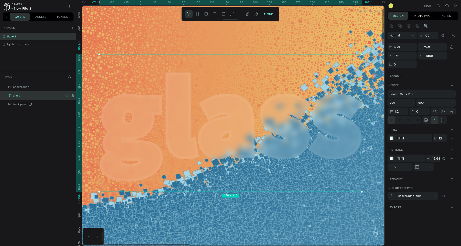
Strokes got the same treatment one step later: the blur region is the fill geometry unioned with the stroke outline (Skia can expand any stroke into a filled path), so a translucent border blurs what's behind it too.
How to use it
In the workspace, select a shape, add a Blur, and switch its type from Layer blur to Background blur. Give the shape a semi-transparent fill (set any opacity); a fully opaque fill hides it, exactly like real frosted glass behind a painted wall. It works on boards, rectangles, ellipses, paths, booleans, and text.
You can find the full user guide in our help center.
What's next?
We're working on a Skia-based image and PDF exporter, focusing on a true what-you-see-is-what-you-get experience, so you get the same outcome from any browser or OS.