Design systems with Penpot
Let’s walk through the Penpot features you can use to create your team’s design system, from shareable libraries to generated CSS and everything in between.

Design systems are collections of design patterns, code snippets, and guiding documentation. Teams can use these systems across projects to create more consistent user experiences and efficient design and development processes. Design systems are a great collaborative tool and save teams from reinventing the wheel on each new project when it comes to design, code, and branding.
Penpot is the perfect tool for building a design system, from shareable libraries to CSS generated from your components. Today, I’ll walk you through an overview of the features you can use to create a design system for your team using Penpot.
Create design token collections
Design tokens are rules representing the smaller reusable values in your system. Tokens can be any kind of value, but they’re most often used to standardize styles such as font, color, size, and spacing across designs. Each token has a name to make it easier to document, find, and reuse.
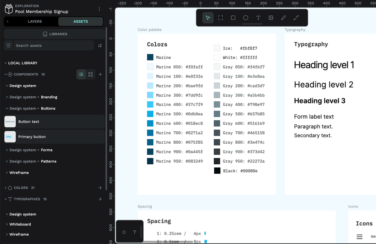
You can store color and typography tokens as Assets in Penpot. And there’s more coming soon. To preview the design token goodness coming to Penpot, check out our recent live stream launch.
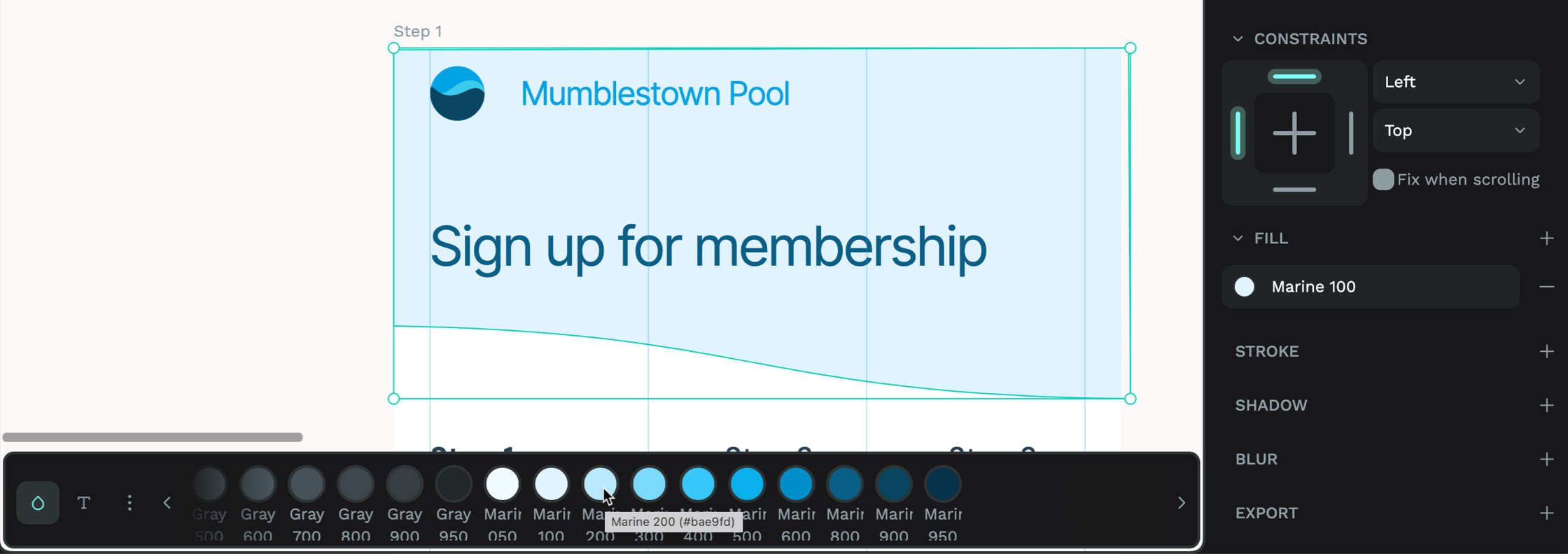
Store colors in the color palette
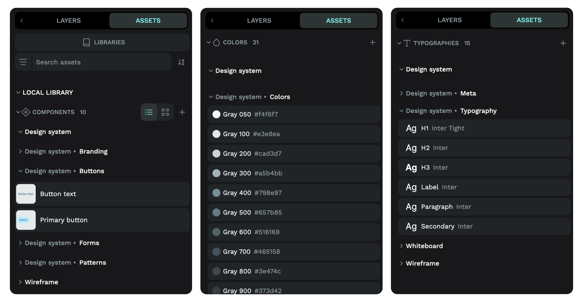
Save any color value in Penpot to store it in the Assets panel and reuse it anywhere in your file or as part of a shared library. To use your color more like a design token, you can also give it a name from the Assets panel, using slashes to organize your colors into groups and sub-groups.
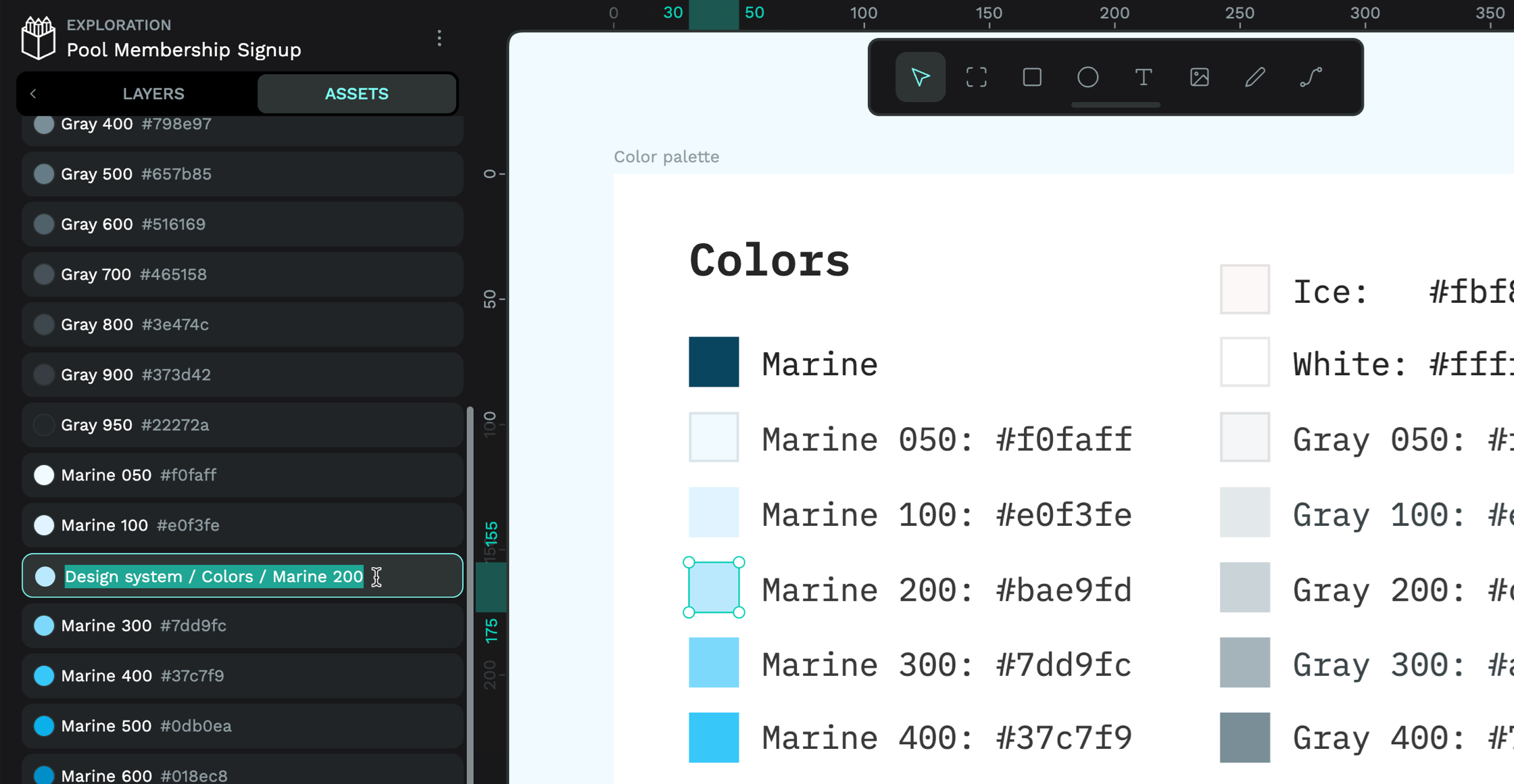
Once you’ve saved your colors to your library, you can quickly access them from the Color Palette at the bottom of the canvas. With an object selected, choose your desired color to add the color as the object’s fill color.
Design consistent typography
Penpot comes preloaded with a huge selection of Google web fonts. If you want to use a different web font in your design system, you can upload font files for your whole team from the Fonts area in the Penpot dashboard. You can also upload multiple font weights and style variants and group them as one font family.
Like colors, you can save and store Typographies in the Assets panel for reuse in your file or shared library. Typographies comprise the text’s font family, size, type (weight and style), line height, character spacing, and text case (lower case, uppercase, title case). Typographies are named after their font family by default. You can rename and group typographies using slashes from the Assets panel in the same way as colors.
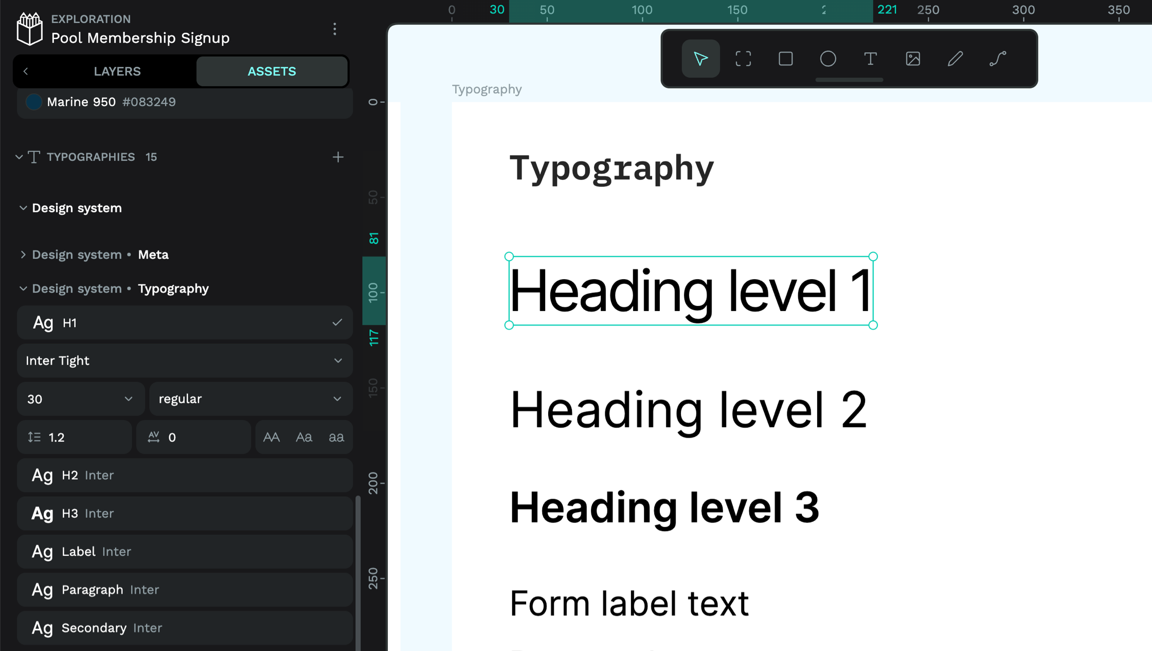
Once you’ve saved your typographies to your library, you can quickly access them from the Typographies palette at the bottom of the canvas. To apply a typography to a text object, select the desired text and choose your desired typography from the palette.
Build reusable components
Components are vital to any design system and can form the basis of anything from a simple reusable pattern to a complex layout with multiple nested parent and child components.
You can save any object or group of objects as a component in the Assets panel for reuse in your file or shared library. You can even save an empty board that only contains layout rules as a layout component. Once saved, you can name your components and group them using slashes in the name to make them easier to find amongst a large collection of components.
Creating a button with icon component and finding the component in the Assets panel.
After creating a component, you can quickly grab another instance of that component from the Assets panel or just duplicate the main component. When you use a copy or instance of a component, it is linked to the main component and can be updated or changed by any changes to the main component.
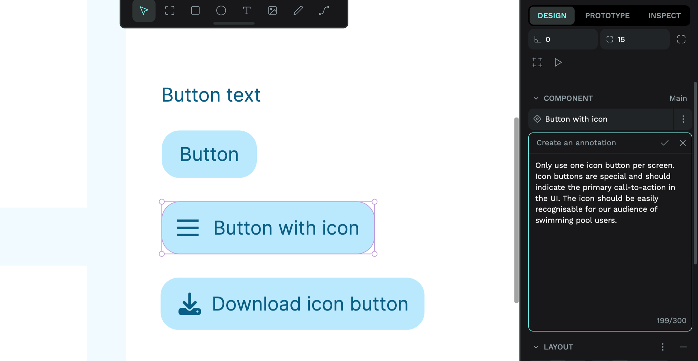
Sometimes, your components need some documentation to help your team understand how and where to use them. With your main component selected, you can add an annotation with any relevant information in the Design panel. Annotations are shown in the Inspect tab, making it easy for developers and other stakeholders on your team to quickly find information about your component without having to dig around in the assets or layers.
Component overrides, variants and swaps
You can override the defaults of the main component in a copy of the component. To create component variants, detach a copy of the component from the main component and save it as a new component. You can swap components quickly from the Design panel by pressing the component icon alongside the component name. From there, you can quickly pick any component variant saved in the same group or any other component in your library.
Use naming to group your component variants in the same collection and make it easy to switch between them.
Specify spacing and layouts
Spacing is fundamental in design systems because it determines how you group and align your design elements into a coherent layout. There are many different ways to do layout and spacing in Penpot, which I’m excited to explore further in the future. For now, I’ll direct you to the different places where you can control your spacing and overall layouts.
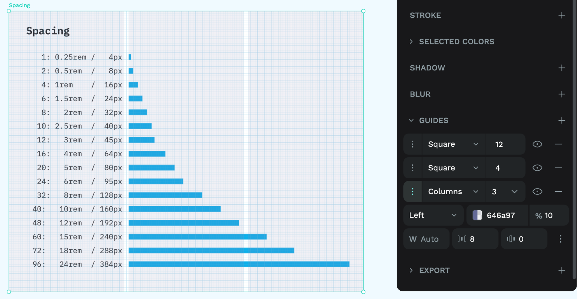
Measuring spacing with guides
If you come from a traditional graphic design background like me, you’ll love a background grid to which you can align all your elements. In Penpot, you can find background grids (“squares”), as well as column and row guides in the Design panel under Guides. Column and row guides can stretch to fill the space, or you can fix them to the left, right, and center, which is helpful if you’re working on flexible or responsive designs.
Board and container layouts
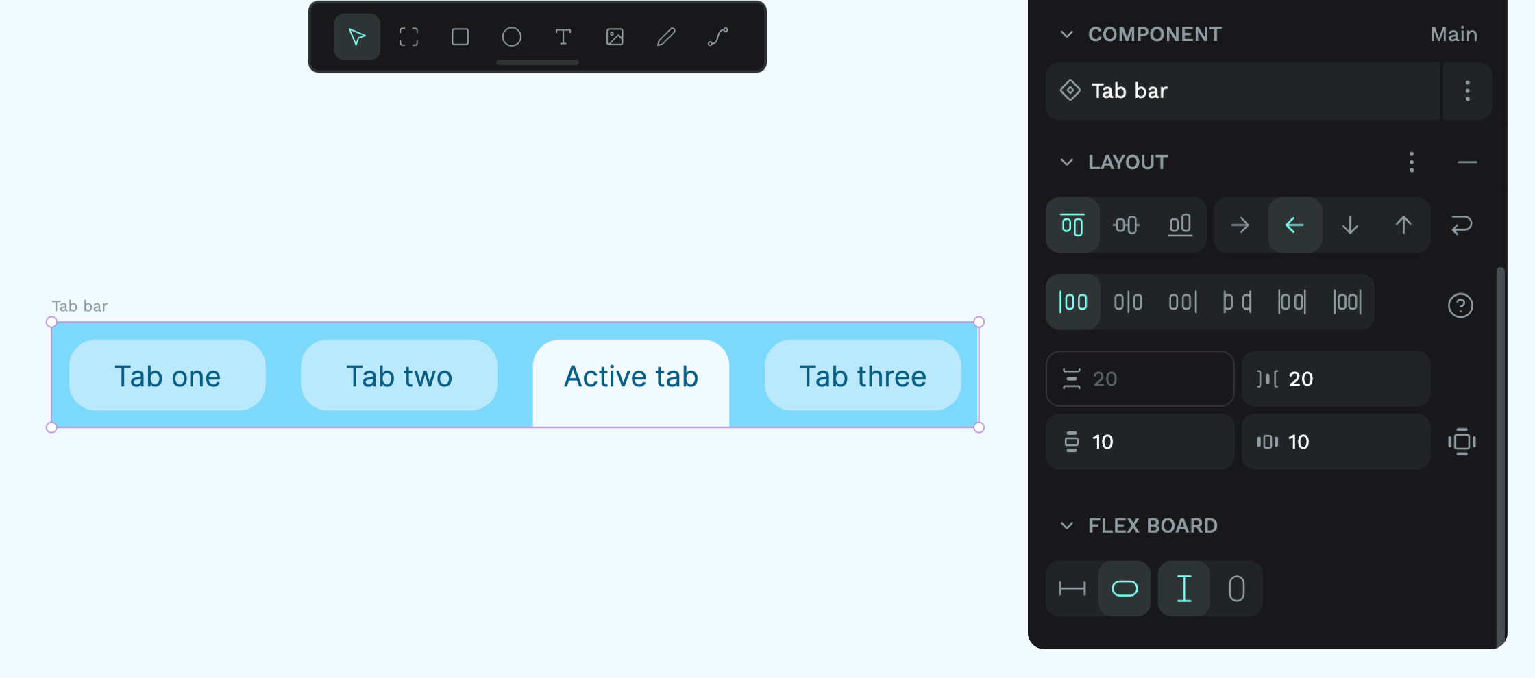
In Penpot, layouts work the same way as they do on the web, but you don’t have to do any of the coding. By default, your layout will be static (that’s absolute positioning for my CSS pals), where you position objects on the X and Y axis. Or you can create more advanced flexible layouts with flex and grid layouts. You can apply layouts to any board, group, or layer, allowing you to nest different layouts inside each other.
You can even save your board with its layout as a component to create reusable layouts.
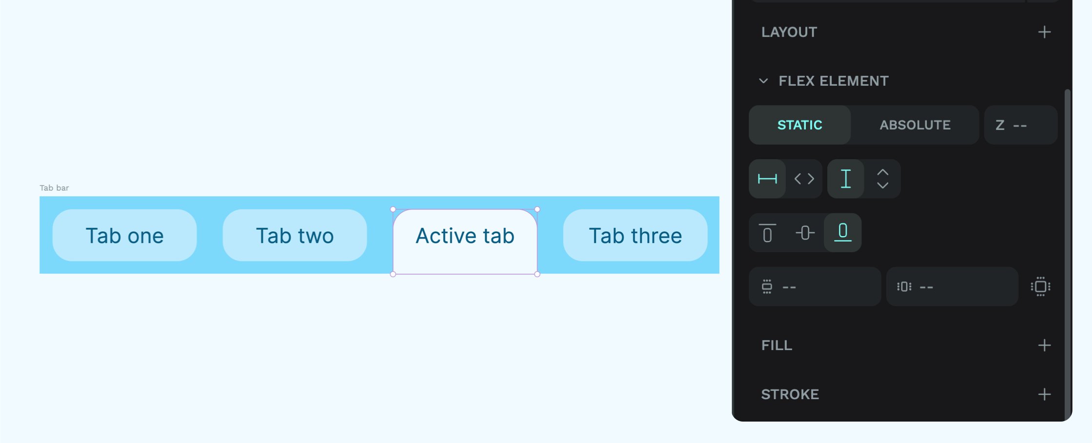
Object layouts
Once an object is inside another board, group or layer, you can set its constraints from the Design panel. Constraints determine how the object behaves when you resize its parent container. Once an object is inside another board, group or layer with a layout, you can also set layout-specific properties that determine how the object behaves inside that layout, including its alignment and margins.
Shared libraries
Any colors, typographies, and components saved to your Assets library can be used anywhere in your file. You can also share your assets with your team and across your projects with a shared library, which is perfect for design systems.
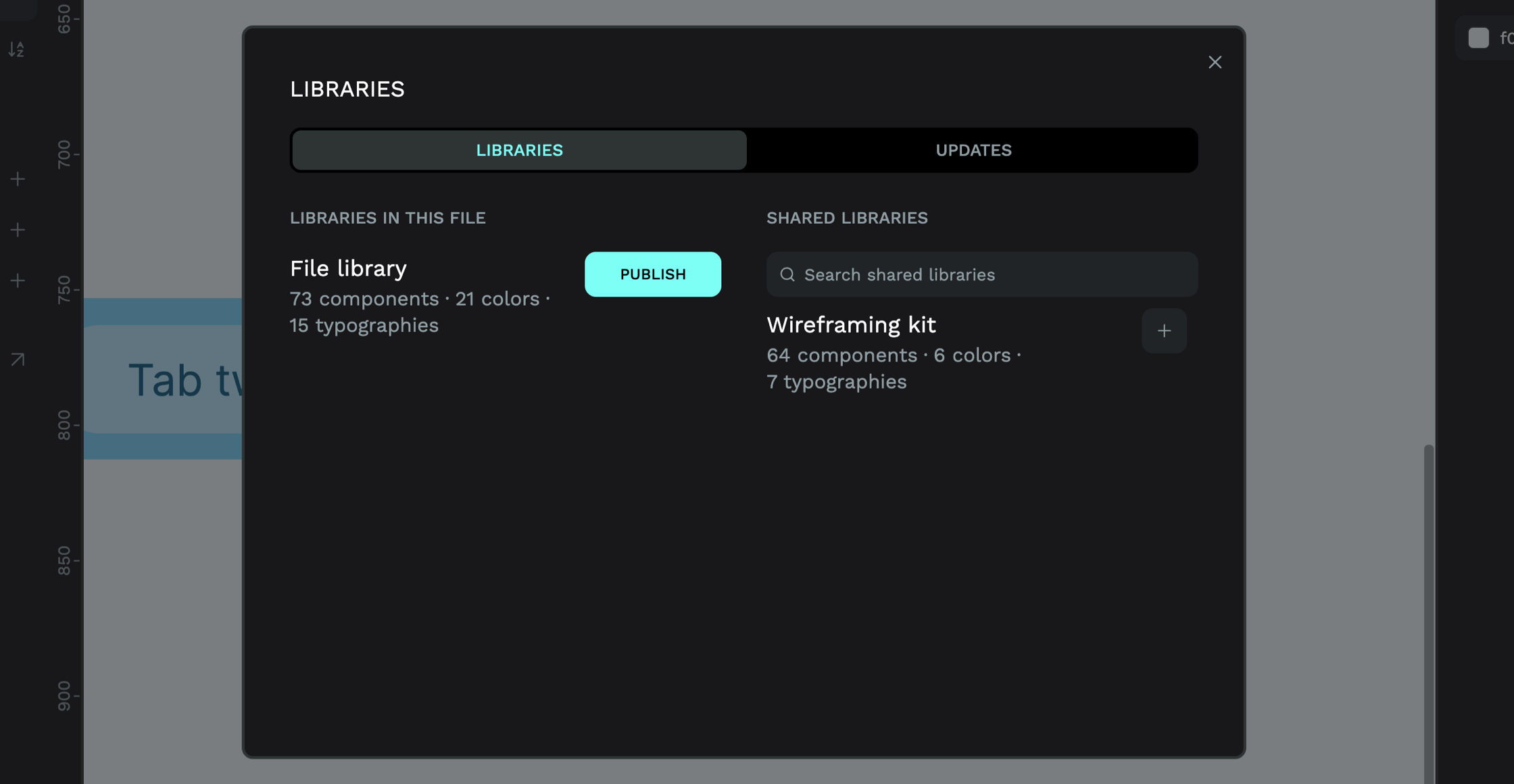
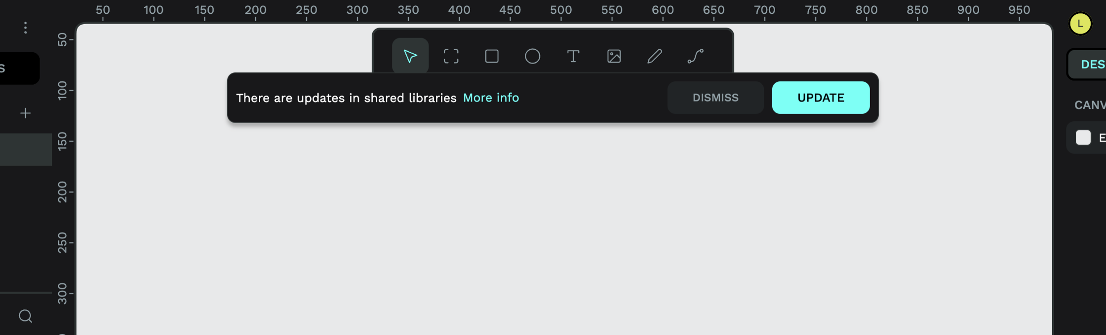
When you publish your file as a shared library, your file name is used as the library name. Any changes to your components in your original file will push out updates to any other files using your shared library.
Design systems that work for developers
Collaboration is the whole point of design systems, and Penpot has been created for both designers and developers. One of the reasons it’s useful to have layouts that work the same way as on the web is that developers can grab the code for the layout from Inspect mode, and it’ll work exactly as the designer intended.
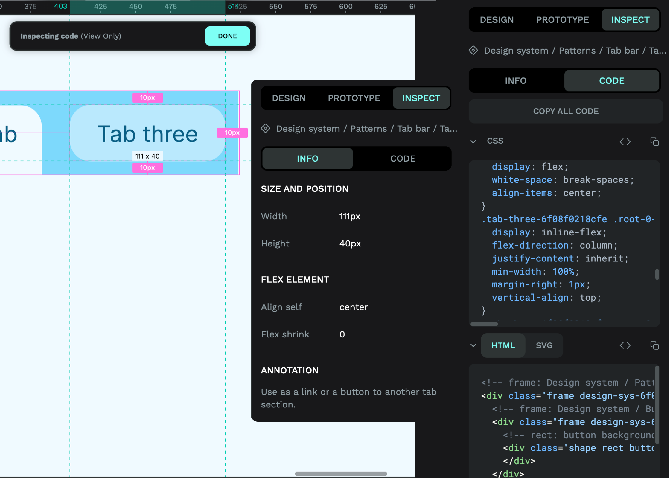
In Inspect mode, you can pick objects on the canvas without the risk of accidentally editing them (I’ve been there!) and get information on their dimensions, properties, and any component annotations from the Info tab without having to dig around in any panels. You can also switch to the Code tab to grab that object’s CSS, HTML, and SVG code.
Penpot is built with design systems in mind
You should now have a better idea of all the features you can use in Penpot to create your design systems and collaborate better with your teams. Sign up for a free account and start work on your design system today. Penpot was really designed with design systems in mind, and upcoming features like design tokens will continue to build on that.
Check out our blog post on 5 design system examples to learn more about design systems. You can also find the Penpot design system template in our Libraries & Templates collection to see how Penpot uses Penpot for Penpot. Very meta!
If you have any questions about using Penpot for your design systems or suggestions for tutorials that would help you in the future, feel free to post on our Community Space. We’d love to hear from you.
Related Blogs
Check out our other blogs, from informative topic guides to tutorials on how to get the most out of Penpot.
 Paula Tienza
 Paula Tienza
 Paula Tienza
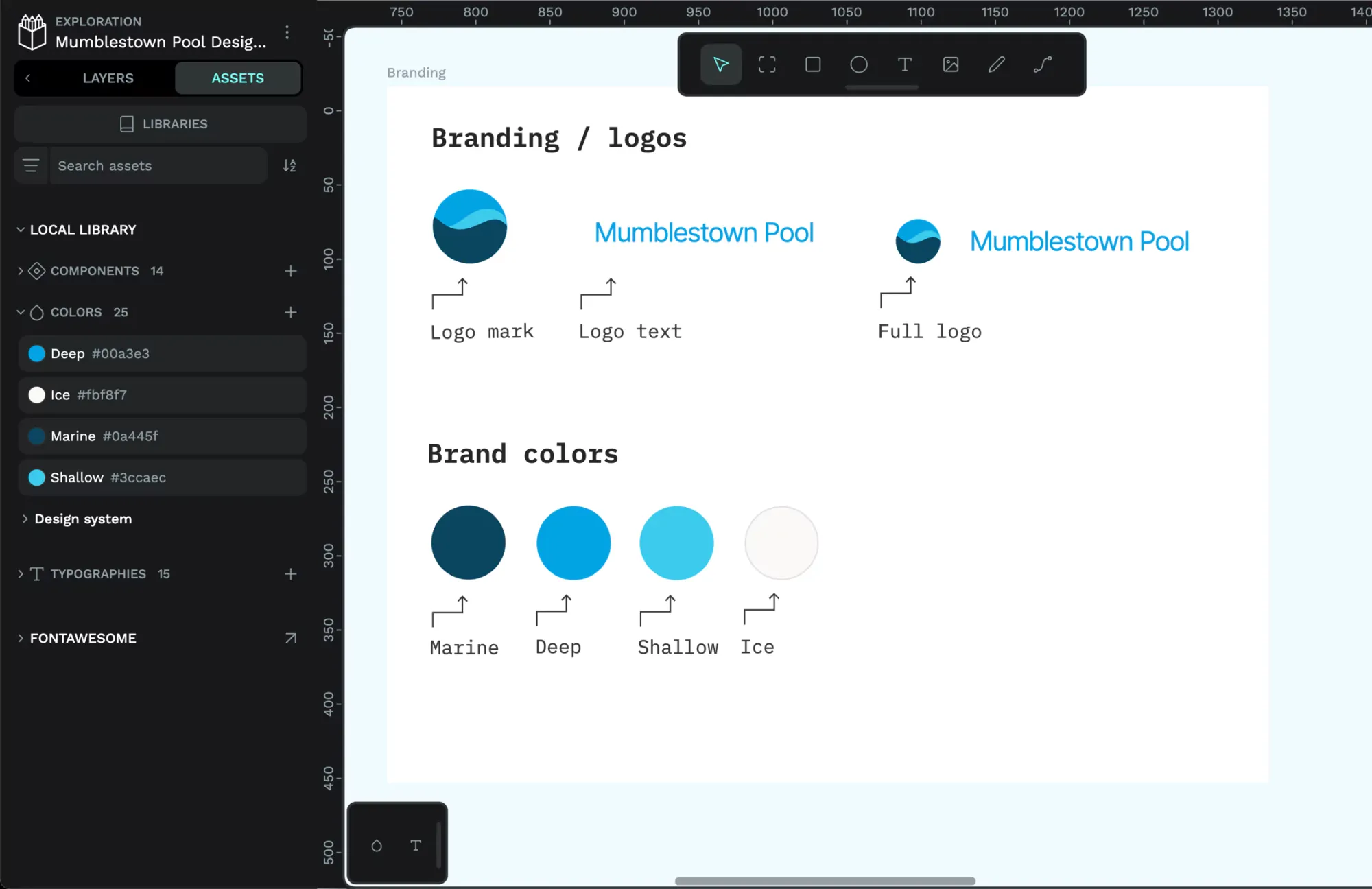 Paula Tienza