How To Choose the Right Typeface for Your Design: An Intro to Typography
Curious about the difference between Sans Serif and Comic Sans? Not sure if font or typeface are the same thing? Here are the basics around typography and why choosing the right look for your words matters.


Whether you're launching your first website or have a gaming app you're ready to test, the design process involves many decisions. One of those decisions involves typeface, an essential component of typography that can make or break your product's overall aesthetic.
Curious about the difference between Sans Serif and Comic Sans? Not sure if font or typeface are the same thing? Here are the basics around typography and why choosing the right look for your words matters. Typeface design started with Guthemberg and the invention of the print, it got structured and defined with the rational rules of Swiss School and later on found more freedom with designers and Milton Glaser, Sagmeister and the famous Emigre, still working as a foundry.
What is typography?
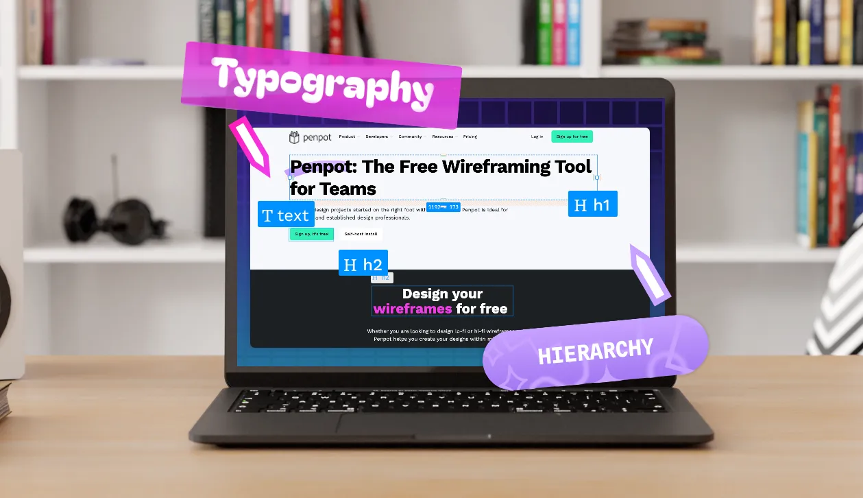
Typography is the study or art of placing type in an aesthetically pleasing way. Aspects of typography include spacing, hierarchy, alignment, sizes, and line lengths. It also includes typefaces and fonts.
Typography matters quite a bit in fields like marketing and graphic design, where each letter or number conveys meaning, and even a slight adjustment in the design could change that meaning. For example, typography choices affect the readability of a blog post or corporate website and the user experience (UX) of an app.
What is a typeface?
A typeface is a certain design of text and symbols. It's the visual representation that gives a printed headline in the newspaper, for example, its aesthetic and feel. Typeface examples include Times New Roman or Comic Sans.
Typeface vs font: What's the difference?
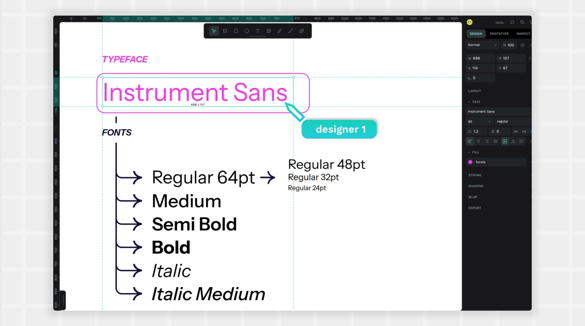
The terms typeface and font are commonly confused, as they are closely related. However, typeface refers to the design of the text (i.e., how the text looks), while a font is a variation of that design, such as whether it's bolded or the size of the text.So, Times New Roman is a typeface. But Times New Roman bolded at 14 points would be a font. All the different font variations belong to the typeface or font family because they have a similar look, with just the style and size changed as needed.
The following classification belong mainly to Latin/Western typefaces. For Chinese, CyriLlic and Arabic it might change. Nadine Chahine, for example, is a Lebanese typeface designer who worked with both Arabic and Western typefaces, read more about it in Arabictype.
What are the different typography categories?
Depending on who you ask, there can be five or more different kinds of typefaces commonly used in typography, including the following:
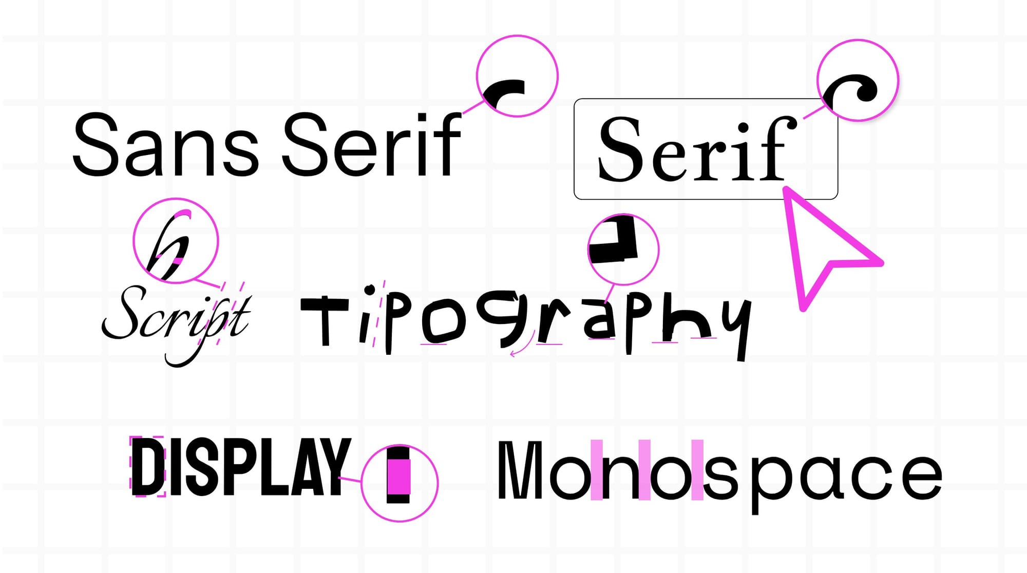
Serif
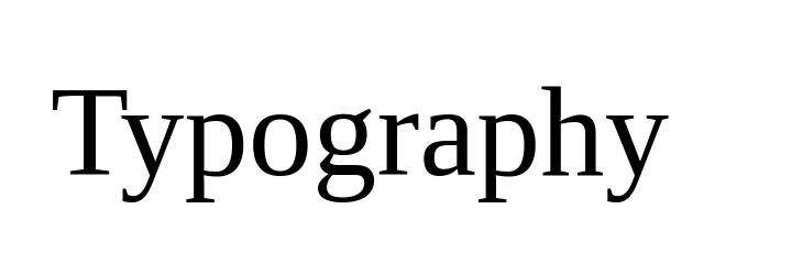
This typeface features upward strokes at the end of each letter, creating an elegant look. It is often found in newspapers and printed books. Examples of Serif include Times New Roman and Georgia Pro.
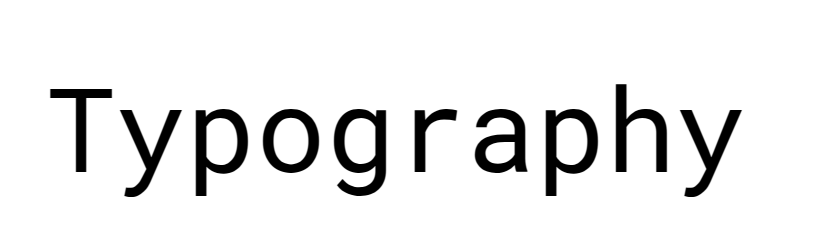
Sans Serif
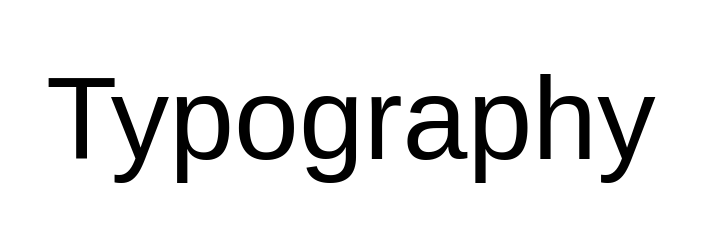
These typefaces lack the little upward strokes found in the Serif typefaces. They appear more modern — projects where simplicity is valued, such as app design, use them regularly. Examples include Arial and Helvetica.
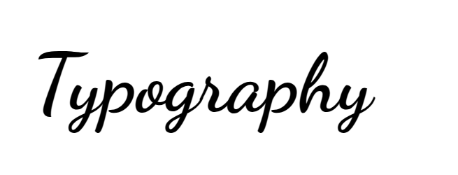
Script
These typefaces look like cursive or calligraphy and can add formality to a project, like wedding invitations. They are also used to create digital signatures on documents. Examples include Brush Script and Pinyon Script.
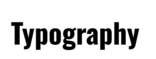
Display
While not suitable for longer portions of text, the Display typefaces work well for showing off as they use big, bold lettering. Consider this creative typeface family if you want to get noticed on a billboard or printed ad. Examples include Impact.
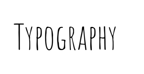
Handwritten
Since they're made to look like human handwriting, these typefaces aren't as formal as Script but can be a lot of fun. Comic San is perhaps the most well-known example and has earned a cult following from people who love and hate it.
Monospaced
Named from mono (meaning "one”), these typefaces contain letters and numbers that all take up the same horizontal space. Because the 0 and 1 aren't squished together like in some typefaces, coding use cases prefer the monospaced fonts. Examples include Courier.
How do you choose the right typography for your design?
The sheer number of options available makes picking the right typography a chore — and new font families get created every day! Here are some suggestions to ensure you start the job right.
Choose one to take seriously (or not)
Type and font can set the tone for your brand or product, so you must ask, "What does this font say about us?” If the typeface appears silly or whimsical, but you're a serious brand, consumers may be confused or think you don't handle your business professionally.
On the other hand, some script typefaces can appear stodgy or old-fashioned and may not be the best choice for a young brand that focuses on having fun. Start with a typeface family that reflects your brand personality, and go from there.
Talking about typography reflecting a brand’s values, in the last few years a new category found its place in the design world: Gender neutral fonts. Non-binary fonts can be created by: blending or omitting gendered structures, creating ligatures, questioning, deconstructing, and non-binarizing the norms and standards of graphic design and typography. Check out how the Bye Bye Binary collective worked on their open source gender free typography library.
Consider the long-term
Since typography is such a big part of brand recognition, you want to keep it consistent. Look for a typeface that can stay with you for the long haul as your company grows and adds new offerings.
Consider how a long-time customer will feel about the look and feel as they grow older with your brand, but pick a typeface that's modern enough to make new customers feel welcome, too.
Look past the letters
Typography is about more than just the fonts or typeface you use. It's also about how you line up letters and numbers on the page and the white space between them. Be sure to put your chosen typeface to work right away to see how different elements work together and how the fonts you choose add to the entire user experience. For example, picking a font that's easy to read on all screen types is just one consideration. It should also complement the overall brand design and align well with website elements like buttons and icons. The typeface is part of a holistic approach to designing the page.
Be accessible
The U.S. General Services Administration (GSA) offers suggestions for making typography choices more accessible, including picking fonts that those with visual impairments can more easily see. While there are no set rules for fonts outside of building signage (and select display screens), the department recommends Sans Serif options at a 16-point size for digital use cases when the screen can't be adjusted. However, most screens can be adjusted for sizing, making it unnecessary to create text so big. It also emphasizes that choices other than typeface (such as color or contrast) may be more important. What matters is putting yourself in the shoes of all users when making design choices.
Test and test again
You may think you have the perfect typeface, but your customers know better than you. Do a test run with your new typeface and fonts in various settings, such as print and digital advertising, your website, and even product packaging.
Be sure to ask your audience specific questions so you know why they like or don't like a design. Include those who have never seen your brand before in your testing to avoid bias or favoritism. Is it the typeface? Or just the size or placement? The feedback you get should be actionable enough to take to the next design phase. In case you already know your brand will be used in many animated assets, take it into consideration when choosing the fonts you want to use. Motion graphics can be adapted to the type but maybe going for a more versatile one can help speed up the animation process.
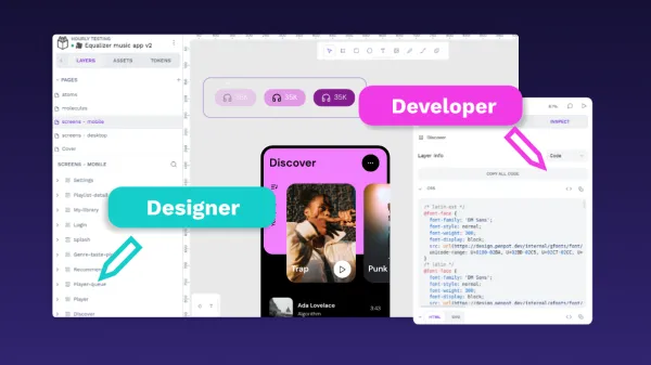
Design your next project with Penpot
Choosing the right typeface can take a lot of time, especially since the perfect font may be the bold or italic version of one you don't like. It may help to get all of your internal team members on board with their ideas, giving input from the very start and creating prototypes of your best designs for internal review. By using a design tool like Penpot, you can easily share new iterations, have team members comment on ideas, and collaborate freely without requiring everyone to download their own software. It's a cross-platform, browser-based solution that simplifies the design and testing process. It also makes it very easy to swap out fonts for new ones or even upload custom fonts to your design library. Ready to get started with a free account? Sign up for Penpot and begin designing in minutes.
Related Blog posts
We have even more posts about typography. Here’s a few examples of handy articles to help you get the most out of Penpot.
 Elena Scilinguo