What are design tokens? A complete guide
Design tokens create a single source of truth for design decisions, making your design system more maintainable, scalable, and consistent.

Any website or product design quickly moves beyond simple color and typography choices. Spacing, radii, interactivity, shadows, and other variables become variables that need to be defined. You end up with dozens of design decisions that must be systematically managed and scaled.
That’s what design tokens do. They are the fundamental elements of your design system that store critical design values like colors, spacing, typography, border radii, and other properties that define your product’s look and feel. They create a single source of truth for design decisions, making your design system more maintainable, scalable, and consistent.
Let’s examine design tokens, the problems they solve, and how they fit into your overall design system.
What are design tokens?
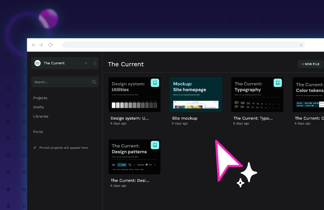
Design tokens are a conceptual framework for organizing design. They map attributes (for instance, a color hex code) to named variables. Let’s take this example:
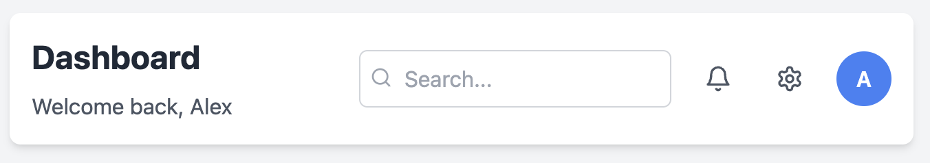
What do we have here? A simple dashboard header. If you were designing this with pure CSS, it might look something like this:
.dashboard-header {
  padding: 2rem 3rem;
  background-color: #ffffff;
  box-shadow: 0 2px 4px rgba(0, 0, 0, 0.05);
}

.dashboard-title {
  font-family: "system-ui, sans-serif";
  font-size: 3.2rem;
  font-weight: 700;
  color: #1a1a1a;
  margin-bottom: 0.8rem;
}

.user-avatar {
  width: 4rem;
  height: 4rem;
  border-radius: 2rem;
  background-color: #4476F6;
  color: #ffffff;
}

…
This is fine if you are just making this header component. But what about when you need to build other components? Are they going to have the same background color? The same corner radii? The same fonts and weights?
If you are designing within a system, the answer is a resounding yes to all these. Of course, you expect all design aspects to be consistent and cohesive across your entire product. But if you use hard-coded values, then the likelihood of this not happening increases significantly.
A design token-based approach creates a semantic layer between the actual values and their implementation. This allows changes to be made at the source, impacting every place a design token is utilized. This level of control and abstraction is what makes design tokens such a powerful tool in a design system.
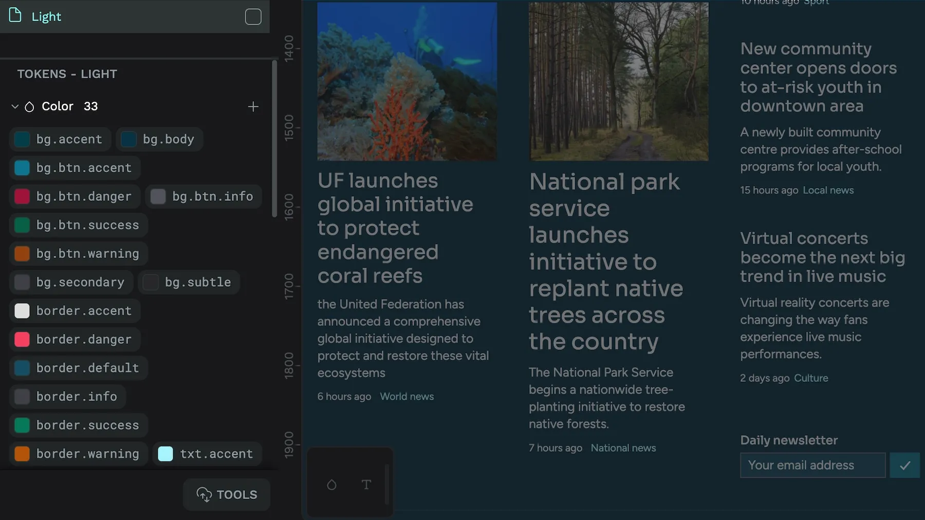
Basic design tokens
At the most basic level, a token has a name (its key) and a value. The name is used to reference a particular design decision, and the value could be a color, a dimension, or some other type of design-related information. Think about how we naturally describe design elements. We don’t say, “make it #FFFFFF” — instead, we say, “use the surface background color” or “apply the standard heading font.” Design tokens follow this same intuitive approach. They create a bridge between these natural design concepts and their technical implementations.
Let’s look at how we might structure these tokens in a way that reflects this thinking:
{
  "color": {
    "background": {
      "surface": { "value": "#FFFFFF", "type": "color" },
      "brand": { "value": "#4476F6", "type": "color" }
    },
    "text": {
      "primary": { "value": "#1A1A1A", "type": "color" },
      "inverse": { "value": "#FFFFFF", "type": "color" }
    }
  }
}
In this structure, we’ve organized our colors by purpose rather than values. The token color.background.surface tells us exactly where and how this color should be used — it’s for background surfaces in our interface. This semantic naming is crucial because it helps maintain consistency across your design system. You know precisely which token to change when updating the surface background color.
This becomes even more powerful when we look at how these tokens are used in our CSS:
.dashboard-header {
  background-color: var(--color-background-surface);
  color: var(--color-text-primary);
}
Anyone reading this code understands the purpose of these colors in our design system.
Design tokens go beyond simple color values. They can represent any design decision in your system. Take typography. Instead of remembering specific font sizes and weights, we can create tokens that represent our typographic scale:
{
  "typography": {
    "heading": {
      "font": {
        "value": "system-ui, sans-serif",
        "type": "fontFamily"
      },
      "size": {
        "value": "3.2rem",
        "type": "dimension"
      },
      "weight": {
        "value": "700",
        "type": "fontWeight"
      }
    }
  }
}
This approach creates a systematic way to handle complex design properties. When you need to adjust your heading styles across your entire application, you can simply update these tokens, and the changes will propagate everywhere they’re used.
Alias design tokens
The real power of design tokens emerges when we start creating relationships between them. For example, we might want some tokens to reference others, creating what we call “alias tokens.” These allow us to build more complex design decisions based on our fundamental choices:
{
  "button": {
    "primary": {
      "background": {
        "value": "{color.background.brand}",
        "type": "color"
      },
      "text": {
        "value": "{color.text.inverse}",
        "type": "color"
      }
    }
  }
Here, our button’s colors are based on our core color tokens. If we ever update our brand color, the buttons will automatically reflect this change while maintaining their designed relationship to our color system.
This hierarchical approach to design decisions makes design tokens powerful for maintaining and scaling design systems. They allow us to establish a single source of truth for our design decisions while retaining the flexibility to create complex relationships between different aspects of our design.
What are the advantages of a design token system?
A better “Designer Experience.” That is the overarching reason to consider design tokens within your design system. Design tokens allow designers to see the product as an entirety and give them easy control over that design. This makes their job easier, allowing them to build better products.
We can break that down into the specific ways design tokens can help.
1. Inconsistency
Design tokens solve one of the most persistent challenges in product design: maintaining visual consistency. Without tokens, designers and developers repeatedly recreate the same values, leading to subtle variations. A button might be #4476F6 in one component and #4475F5 in another–a difference barely noticeable to the eye but representing a breakdown in systematic design.
Design tokens eliminate this problem by providing a single source of truth. When you define your brand blue as a token, every component that needs that color references the same token. This means that the color is consistent today, and any future changes will be applied uniformly across your entire product.
2. Scale
As your product grows, the complexity of managing design decisions grows exponentially. What starts as a simple set of colors and typography can quickly expand to hundreds of components, each with multiple states and variations. Design tokens help manage this complexity by creating a structured hierarchy of design decisions.
Consider a simple example: you have a primary button that appears in twenty different places across your application. Without tokens, changing that button’s appearance means updating twenty different components. With tokens, you update one value, and all instances update automatically. Now multiply this efficiency across every design decision in your system–colors, spacing, typography, shadows, and more. The scaling benefits become clear.
3. Communication
Design tokens create a shared language between designers and developers. Instead of discussing hex codes or pixel values, teams can talk about “primary-brand-color” or “spacing-large.” This semantic approach bridges the gap between design intent and technical implementation.
For example, when a designer says, “Let’s use the surface background color here,” developers know exactly which token to implement: var(--color-background-surface). This clarity reduces misunderstandings and speeds up the implementation process. It also makes design reviews more efficient, as everyone is speaking the same language.
4. Technical debt
Every time a developer hardcodes a design value, they create potential technical debt. These values become embedded in the codebase, making future updates more difficult and error-prone. Design tokens prevent this accumulation of technical debt by centralizing design decisions.
Think about implementing a dark mode for your application. With hardcoded values, you’d need to hunt down every color value in your codebase and create a dark alternative. With design tokens, you simply create a new theme that redefines your color tokens, and the entire application updates accordingly. The same principle applies to any global design change, from subtle refinements to complete rebrands.
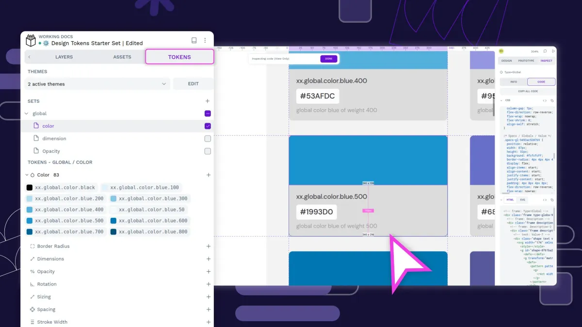
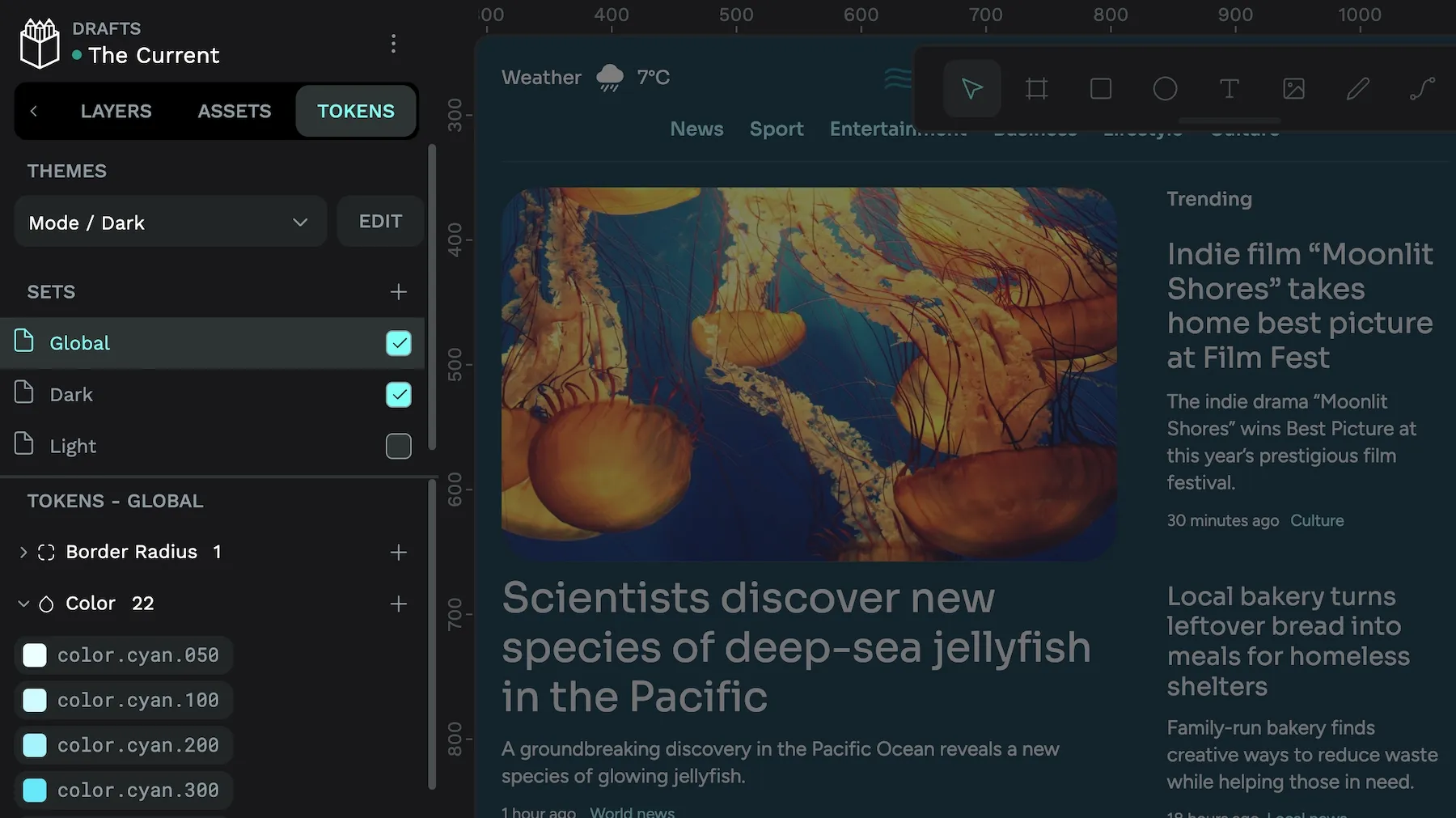
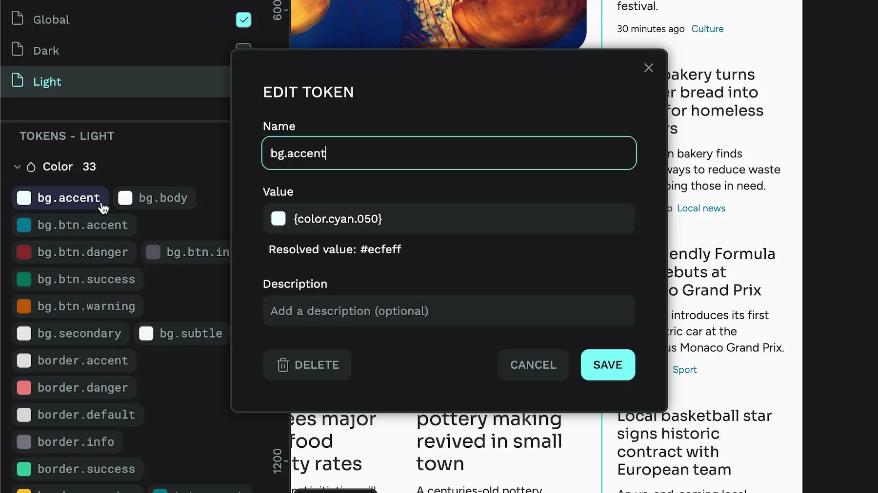
In Penpot you can create themes that combine your tokens sets which is indispensable for light and dark mode designs.
5. Future-proofing
Design tokens create a flexible foundation that can adapt to future needs. They separate design decisions from their implementation, allowing you to change how values are used without changing the tokens themselves. This abstraction makes your design system more resilient to change.
For instance, if you initially build your product for the web but later expand to mobile platforms, your design tokens can be translated into platform-specific implementations while maintaining the same design decisions. The token spacing-large might compile to pixels for the web, points for iOS, and dp for Android, but the underlying design intent remains consistent.
Moreover, as new design tools and technologies emerge, structuring your design decisions as tokens makes it easier to adapt. The semantic structure of tokens means they can be transformed into whatever format future platforms might require, protecting your design investment for years to come.
This systematic approach to design through tokens creates a foundation that solves today’s design challenges and prepares your product for the future. It’s an investment in the long-term maintainability and scalability of your design system.
How design token standards work
There have been several approaches to design tokens — Adobe’s three-layer architecture, Atlassian’s hierarchical system, and Figma’s Variable system — but this lack of standardization has held the adoption of design tokens back. What are your options if you don’t want to be locked into a proprietary system?
The community is coalescing around the W3C Design Tokens Format specification. This standard provides a common, platform-agnostic way to define and share design tokens across different tools and platforms.
At its heart, the W3C standard uses a JSON-based format that defines tokens through a clear, hierarchical structure. Every token in this system must have at least two properties: a value and a type. This requirement ensures that tools can properly interpret and transform the tokens. Here’s a simple example:
{
  "color": {
    "brand": {
      "primary": {
        "value": "#0066CC",
        "type": "color"
      }
    }
  }
}
Token types
The standard defines several fundamental token types that cover most design needs. Understanding these types is crucial because they determine how tools process and validate the tokens. Think of them as categories that help tools understand what kind of design decision each token represents:
{
    "stroke": {
        "thin": { "value": "1", "type": "strokeWidth"},
        "thick": { "value": "2", "type": "strokeWidth"}
    },
    "max": {
        "line": { "value": "760", "type": "sizing"}
    },
    "spacing": {
        "none": { "value": "0", "type": "spacing"},
        "xs": { "value": "5", "type": "spacing"},
        "s": { "value": "10", "type": "spacing"},
        "m": { "value": "15", "type": "spacing"},
        "l": { "value": "20", "type": "spacing"},
        "xl": { "value": "30", "type": "spacing"},
        "xxl": { "value": "40", "type": "spacing"}
    }
}
Token references
One of the most powerful features of the W3C standard is its support for token references, also called aliases. These allow tokens to build upon each other, creating sophisticated relationships between design decisions. References use a special syntax with curly braces:
{
  "color": {
    "action": {
      "primary": {
        "value": "{color.brand.primary.value}",
        "type": "color"
      },
      "hover": {
        "value": "rgba({color.brand.primary.value}, 0.8)",
        "type": "color"
      }
    }
  }
}
Composite tokens
The standard also supports composite tokens, which combine multiple values under a single name. These are particularly useful for complex properties like typography or shadows:
{
  "typography": {
    "heading1": {
      "value": {
        "fontFamily": "{font.family.sans}",
        "fontSize": "{font.size.xxl}",
        "lineHeight": "{font.lineHeight.tight}",
        "fontWeight": "{font.weight.bold}"
      },
      "type": "typography"
    }
  }
}
This standardized approach to design tokens solves a crucial design system problem: interoperability. When tools and platforms adopt this standard, design tokens become truly portable, allowing teams to work with their preferred tools while maintaining a single source of truth for their design decisions.
This standardization is particularly valuable as design systems mature, and organizations must support multiple platforms and tools while maintaining consistent product design.
How Penpot supports design tokens
At the heart of Penpot’s approach to native design tokens is deep integration with the W3C standard. Design tokens aren’t just an add-on — they’re woven into the fabric of how Penpot handles styles and components. This integration means that tokens can directly influence component styling logic, creating a more cohesive and maintainable design system.
For example, when you’re working with a component in Penpot, you can use tokens to control basic properties like colors, spacing, and complex variations through the system. This creates a powerful connection between your design tokens and the actual components they influence.
One of Penpot’s key strengths is its ability to act as a hub for design token management. Through its native support for design tokens, providing a more efficient and connected design environment, Penpot can:
- Maintain a single source of truth for your design tokens
- Improve communication between designers and developers with a common shared language
- Reuse and sync visual elements across tools with the standard format
For teams needing automation and integration, Penpot will provide a comprehensive REST API in upcoming releases that allows systems to create and modify tokens programmatically, sync tokens across different services, and build custom token workflows.
By combining the standardization of W3C tokens with powerful tooling and integration capabilities, Penpot provides a platform that makes design tokens more accessible and powerful than ever before. Design tokens will be live in Penpot very soon!
Related Blogs
We have more blogs about UI and many other design related topics. Here’s a few examples of helpful articles to help you get the most out of Penpot.
 Laura Kalbag
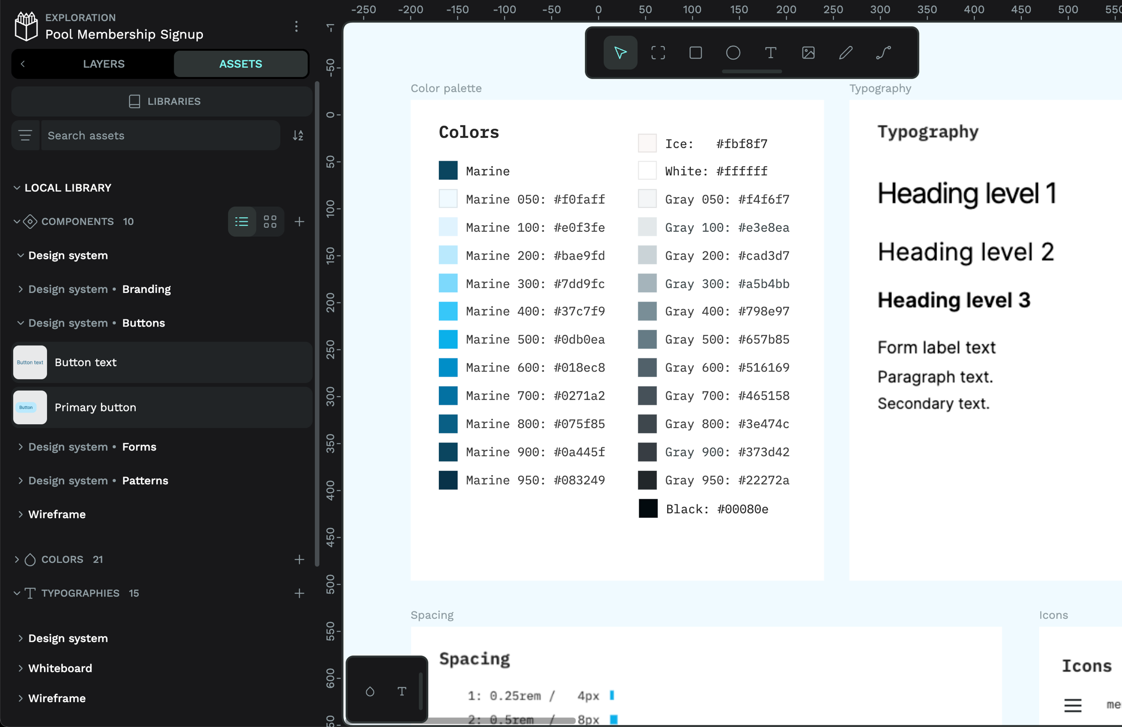 Paula Tienza
 Laura Kalbag