Using design tokens for a proportional typographic scale
A proportional typographic scale is a hierarchy for font sizes that uses a consistent mathematical ratio. Design tokens are ideal for creating these scales.

When choosing the font sizes to use in our UI designs, we could just pick random numbers. Usually we’ll use a fairly small font size for the majority of our text, and perhaps some slightly larger text for headings and more important information, creating contrast and a visual hierarchy. Using this hierarchy consistently can create a visual language for our readers. This visual language can form the basis for a design system, making design work more scalable and maintainable, and making it easier to translate designs into code.
What is a proportional typographic scale?
A proportional typographic scale is a hierarchy for font sizes that uses a consistent mathematical ratio. This ratio could be a simple number like 1.2 or 1.5, or a ratio inspired by music or architecture, like musical scales or the golden ratio.
When creating the scale, you start with a base font size, usually the smallest text, and then multiply that base by a fixed ratio to get your larger and smaller font sizes. Using a proportional scale helps create visual harmony, consistency and contrast in your design system, and it ensures your text elements are visually related to each other in a balanced and aesthetically pleasing way.
Design tokens for typography
Design tokens are a platform-agnostic standard format for saving and sharing named design values across your design and development teams. Design tokens are perfect for creating proportional typographic scales because tokens can reference other tokens’ values, and contain simple mathematical calculations. This means we can create a sophisticated typographic scale using very few design tokens. Once we’ve created our scale, it’s easy to tweak our values and update our scale across all of our designs.
Excited to just jump into typography tokens and scales? Download my typography starter kit template.
Designing a proportional typographic scale
When you design a proportional typographic scale, it’s important to consider the UI where your scale will be used. Content-focused designs like landing pages or text-heavy sites usually utilize a more dramatic typographic hierarchy with a greater difference between the biggest display font sizes and smaller font sizes for meta information.
In contrast, apps and more utilitarian UI designs tend to use a more subtle typographic scale, with a smaller difference between the largest and smallest font sizes.
Creating design tokens for a proportional scale
In the Typography tokens starter kit for Penpot, I’ve used just eleven tokens to create my proportional scale. But this could be done with even fewer tokens. Because design tokens use a platform-agnostic standard format, you can design and demo them in Penpot, and then export them to the design tokens JSON format to easily use in development.
When creating a typographic scale, the relevant design token types are:
- Number token: just a number. We’ll use this for our scale/ratio value as it can also then be used for other scales outside of font sizes. (For example, you could scale all of your design system’s spacing according to this value too.)
- Font size token: Font size tokens are for font sizes. (Surprise!) We’ll use these tokens to calculate each size in our typographic scale.
- Typography composite tokens: Typography tokens are composite tokens that bring together all the typography-related tokens. They’re like a shortcut for applying multiple text styles all at once.
Base font size design token
A good starting point is to design your base font size. The base size is usually the text size that is used the most in your UI. This could be paragraph text in a text-heavy design or label text in an app UI. At this stage, consider the accessibility of your text size. Is it readable for your audience? There isn’t a standard accessible font size because fonts of the same size can appear as though they are different sizes depending on the shape and spacing of their characters. Usually 14-16 pixels (or equivalent units) works for most interfaces and fonts.
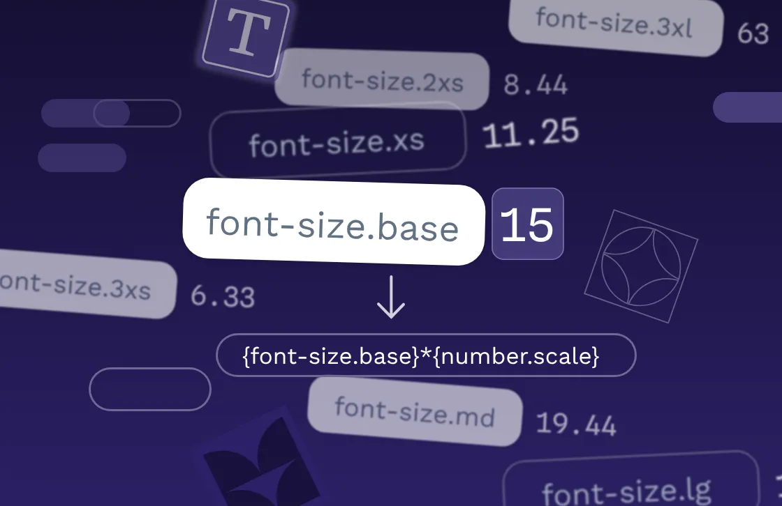
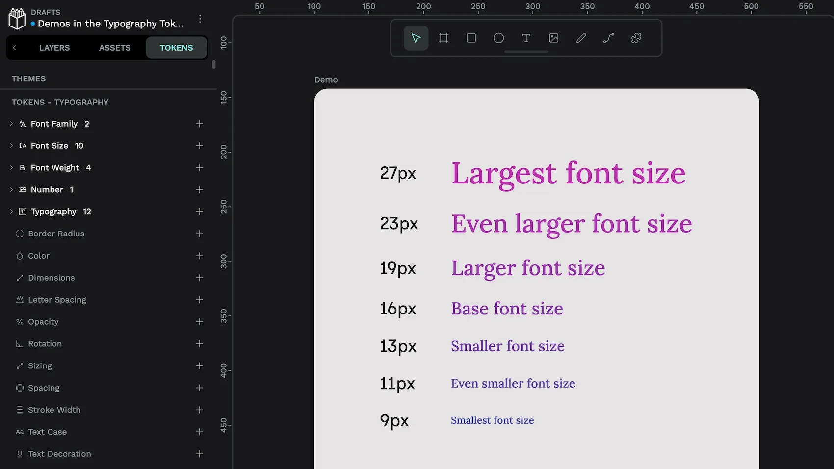
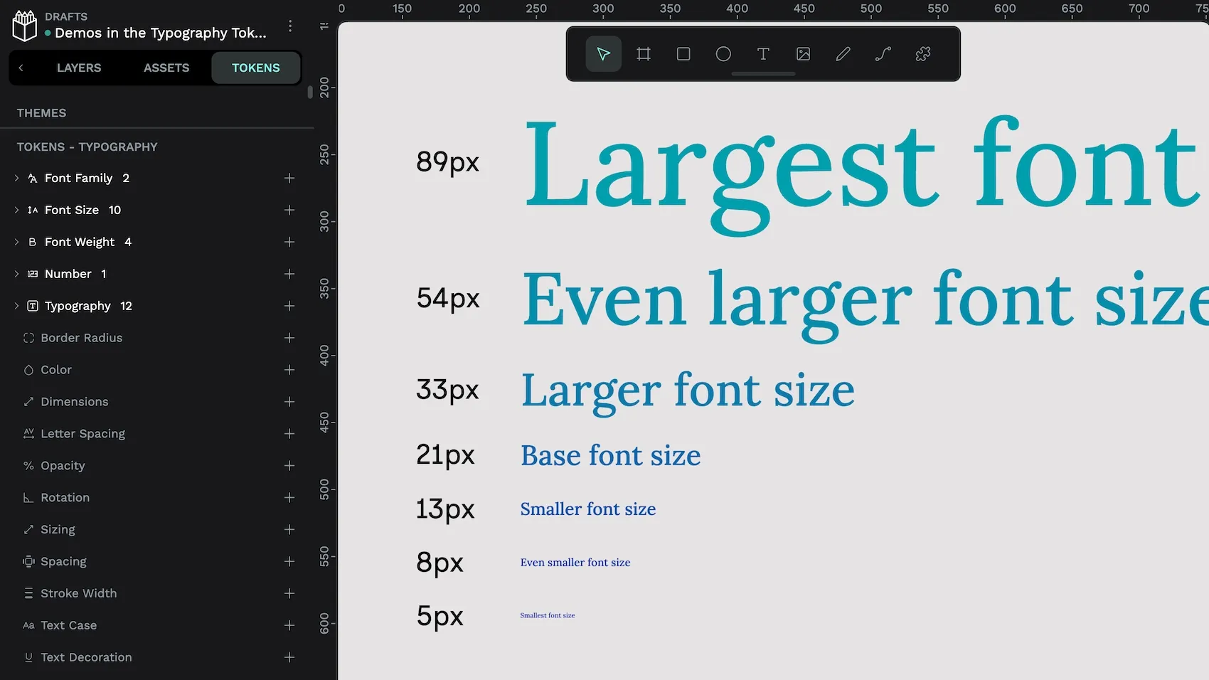
In the Typography tokens starter kit template, I’ve used 15px for my base size. I’ve defined this in the font-size.base font size token, which has that value of 15.
Scale number design token
Next we want to choose our scale. The scale multiplier (also called a ratio) is the number used to multiply the base font size to get the typographic scale. Popular scales include:
- 1.067 minor second
- 1.125 major second
- 1.200 minor third
- 1.333 perfect fourth
- 1.414 augmented fourth
- 1.500 perfect fifth, and
- 1.618 the golden ratio
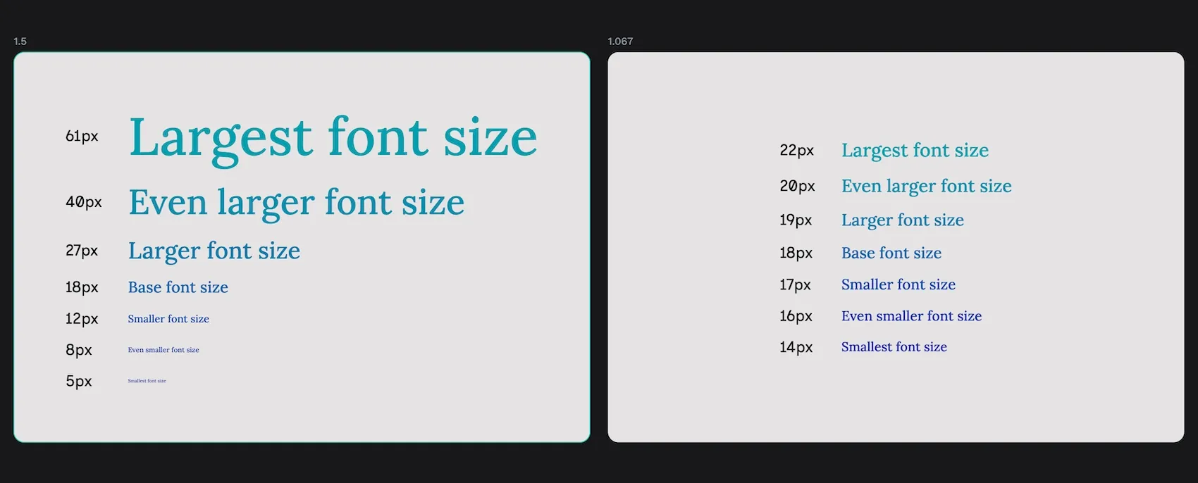
While these numbers seem similar, they can create very different scales. The higher the number, the more dramatic the difference between font sizes. In the Typography tokens starter kit template, I’ve used 1.333 (perfect fourth) for my multiplier. Perfect fourth is a good ratio to try first because it is in the middle of the range, not too subtle and not too dramatic. And when you try it out, you’ll have a good idea of whether you want to go with a bigger or smaller scale.
The scale is defined in the number.scale number token, which uses that value of 1.333.
Scale font size design tokens
Then it’s time to create the scale itself. In the starter kit, I chose to use “tshirt” sizes of 3xs through to 3xl as I find a fixed scale provides me with useful constraints for my designs. But you could use any other scale you want, like 0 - 1000, or even a more semantic scale that maps directly to text objects like paragraph, through different heading levels, up to a display title. (I prefer to do this at the typography token level, which you’ll find below.)
For a proportional scale, each font size token is created by multiplying the previous (smaller) token on the scale by the multiplier, or dividing the next (larger) token on the scale by the multiplier. Here are my font size tokens and their values from smallest to largest:
font-size.3xs(XXXS):{font-size.2xs}/{number.scale}font-size.2xs(XXS):{font-size.xs}/{number.scale}font-size.xs(XS):{font-size.base}/{number.scale}font-size.base:15.font-size.sm(Small):{font-size.base}As this token is the equivalent of the base token, I reference that token.font-size.md(Medium):{font-size.sm}*{number.scale}font-size.lg(Large):{font-size.md}*{number.scale}font-size.xl(XL):{font-size.lg}*{number.scale}font-size.2xl(XXL):{font-size.xl}*{number.scale}font-size.3xl(XXXL):{font-size.2xl}*{number.scale}
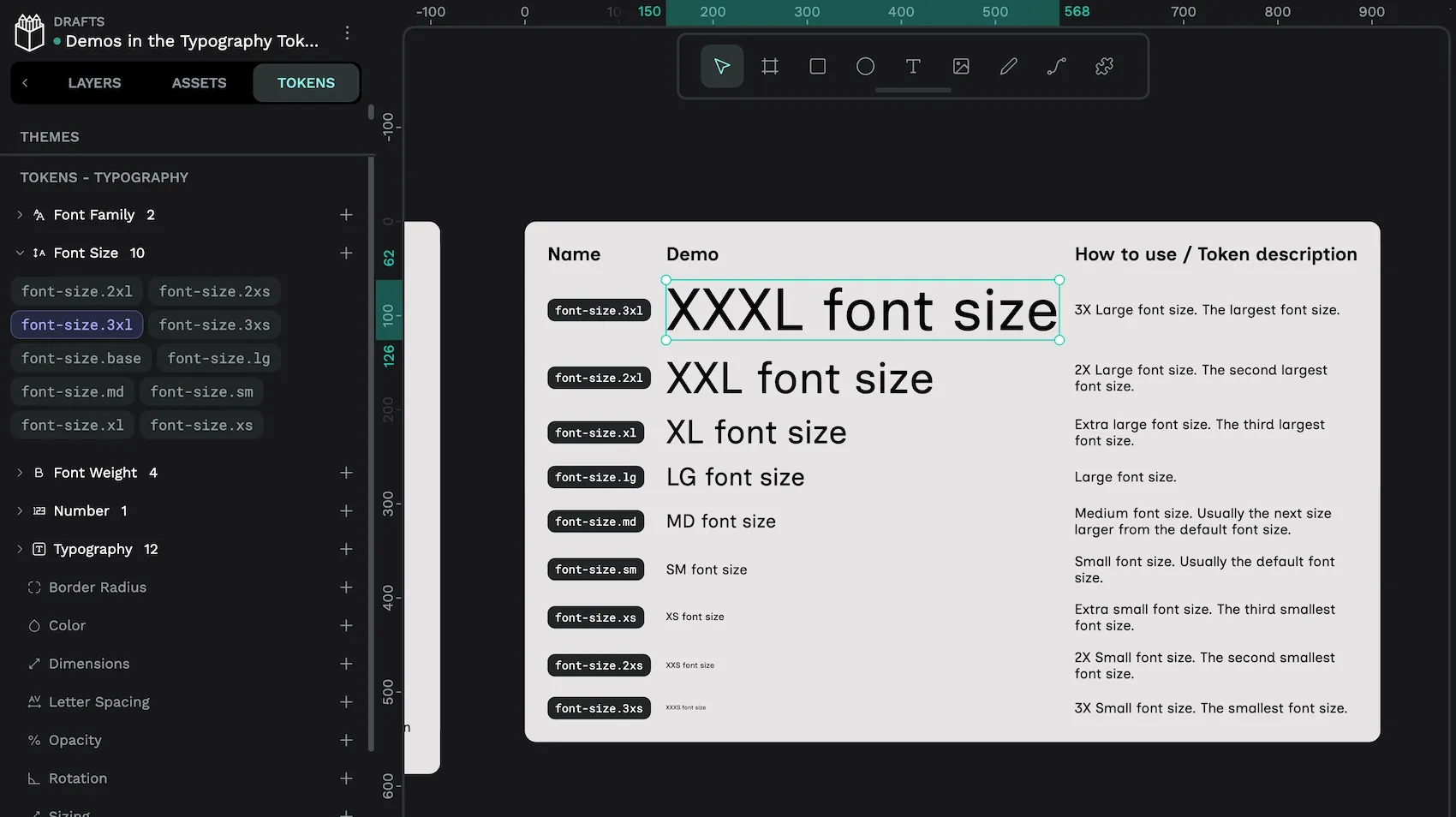
font-size.3xl font size design token is applied to the XXXL font size text.You can reference other design tokens in your design tokens with the token name inside { curly brackets }. So when these tokens are calculated, these are their resolved values:
font-size.3xs:6.3329font-size.2xs:8.4417font-size.xs:11.2528font-size.sm:15font-size.md:19.995font-size.lg:26.6533font-size.xl:35.5288font-size.2xl:47.3599font-size.3xl:63.1307
I’d discourage anyone from using the 3xs and 2xs sizes, as these are far too small for readable text. But the rest of the scale works well for my design, and I won’t need all the available sizes when designing the typography.
Typography design tokens
A typography design token is a composite token. A composite token is a token whose properties can be made up of other tokens. While you can use foundational tokens to make basic design decisions like what is the ideal bold weight, or calculate your proportional font size scale, typography tokens are ideal for combining these tokens in a semantic composite token that can then be applied to the text objects in your design. This can simplify the complexity of your design system. For example, you would use the link token for all links.
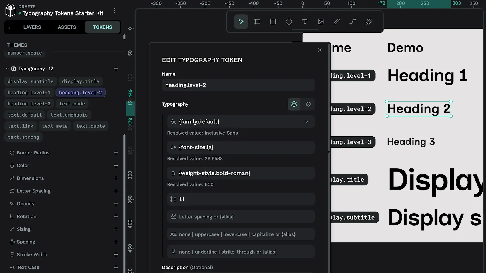
Here’s an example of a typography token for heading.level-2:
- Font family:
{family.default}. This references thefamily.defaultfont family token which resolves to theInclusive Sansfont. - Font size:
{font-size.lg}, referencing the large font size token in my proportional scale, and resolving to26.6533. - Font weight:
{weight-style.bold-roman}. This references theweight-style.bold-romanfont weight token which resolves to600, a bold non-italic (roman) weight. - Line height: 1.1. I chose a line height of 1.1 based on the combination of font family, font size and font weight. It can be tempting to reference a foundational token for every value, but if the value is unique to this typography, it is not necessary.
- Letter spacing, Text case, and Text decoration: none defined. You don’t have to add values for every property in a typography token. Without defined values, these properties use their default values of 0 letter spacing, no special text case, and no text decoration.
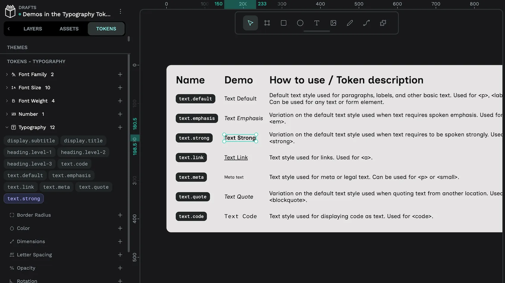
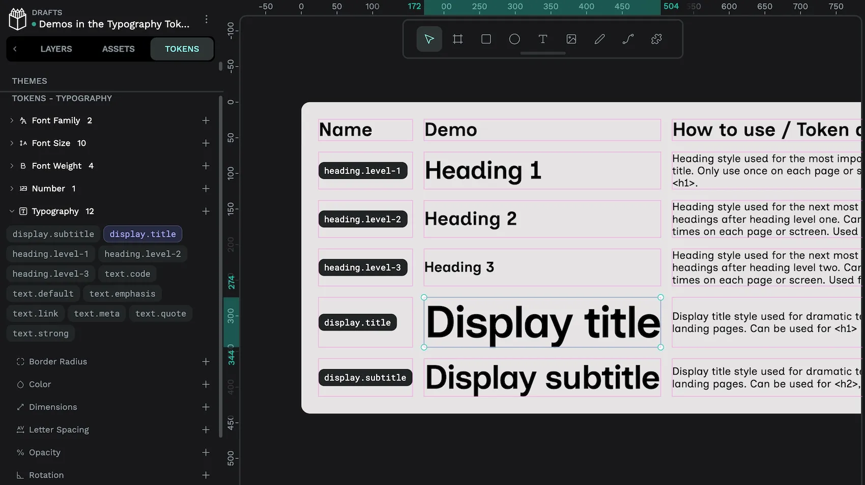
I have three different groupings for my typography tokens, display, heading, and text. The display typographies are the largest, most dramatic, titles, designed to be used in editorial design like the big eyecatching text on a landing page. The heading typographies map directly to HTML heading levels 1, 2, and 3. And the text typographies cover other types of (usually smallish) text used in UI design, like links, code, and other meta information.
When I’m assigning my proportional scale font sizes to my typography design tokens, I like to consider the different types of text I plan to use in my UI design. Then map those types to a hierarchy which I can reflect in font sizes. Some typography tokens might use the same font size if the different types of text are of equivalent importance. Here’s what I decided for the starter kit, from largest to smallest:
display.title:{font-size.3xl}display.subtitle:{font-size.2xl}heading.level-1:{font-size.xl}heading.level-2:{font-size.lg}heading.level-3:{font-size.md}text.default,text.emphasis,text.code,text.link,text.quote,text.strong:{font-size.sm}text.meta:{font-size.xs}
Typography design tokens starter kit
All of the examples in this tutorial are from my Typography tokens starter kit Penpot template, which you can download from the Penpot hub.
This is a template with 29 design tokens to help start your typographic system. You can use the file to experiment with typography tokens, or export the tokens to use in your own design projects.
If you have any feedback or requests for this template, please let me know in the Penpot community.
Top tips for typography tokens in Penpot
While experimenting with design tokens in Penpot, I’ve discovered some useful tips:
- Use font family tokens for your commonly-used fonts. Then reference these tokens in your typographies. If you choose to change your font later on, it will be easy to update the font across the entirety of your design by updating the font family token.
- Duplicate typography tokens when creating a similar token. With all of their properties, typography tokens can take a while to create. You can quickly create a new typography token by duplicating an existing typography token and tweaking its properties.
Scales like this will work for any type of proportional scale in your designs, not just typography. You could create similar tokens for proportional spacing, icon sizes, or border radii. You even do these calculations in number tokens that are referenced by spacing, sizing, and border radius tokens, creating an entirely proportional system.
When I first learned about typographic scales, I used to think they were pretty arbitrary. I’d wonder what does a musical scale or the golden ratio have to do with the landing page for a coffee machine rental service? It’s true that your choice of scale is entirely subjective. But what they do provide is a unit for harmony. You know that when you calculate all your values from this unit, you will have some form of consistency in your design. When that unit is defined as a design token value as part of a scale, it’s then so quick to make changes that can propagate throughout the entirety of your design system.
Related Blogs
We have many more posts about design tokens, Penpot, and UI design topics. Here’s a few examples of tutorials so you can learn more:
 Laura Kalbag
 Laura Kalbag
 Laura Kalbag
 Laura Kalbag
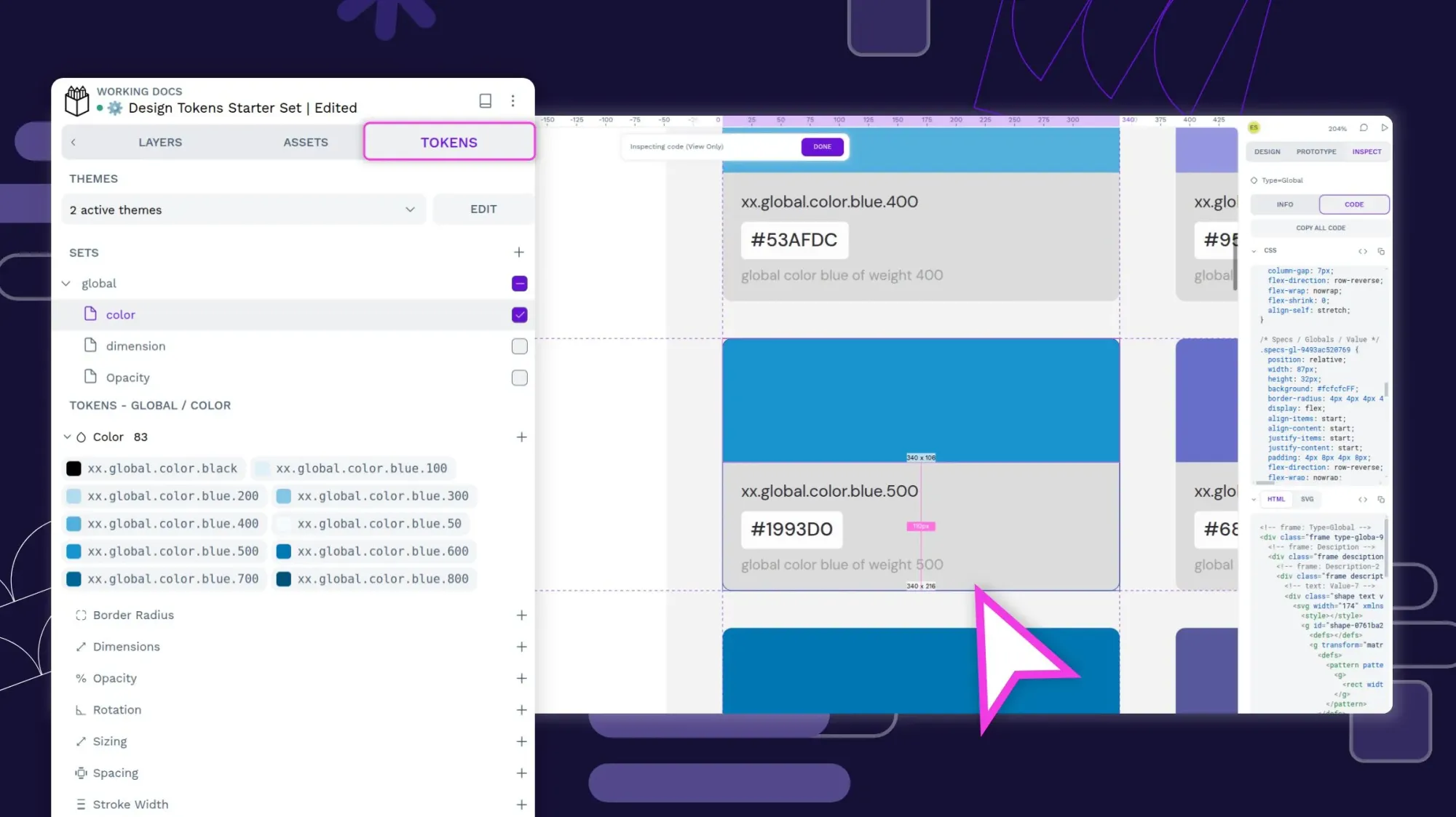
 Laura Kalbag