Tutorial: How to use components and shared libraries
Learn about components and how to use your team’s shared components for your design system in Penpot.

I’ve been designing long enough to remember when design tools didn’t have components… whenever I changed my mind about how a repeating element should look in my design, I’d have to copy and paste or painstakingly recreate that change across each instance of that element.
Components make it easier and faster to reuse a design pattern across your file, project, or team. A component can be as simple as a shape or a button or as complex as a menu or layout.
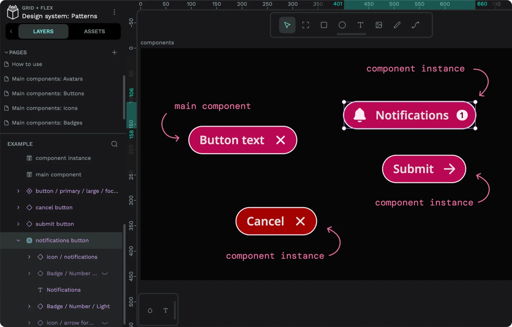
You create a “main component” from an object or group in your design and then use copies of that component (also known as “instances”) throughout your design. When you update the main component, its changes will be reflected in any instance of that component used across your file.
Component libraries are indispensable for design systems. They provide a collection of design tokens and patterns that you can pull into your projects. With more consistent patterns, you can improve the user experience and branding and save time and effort by creating similar designs over and over again.
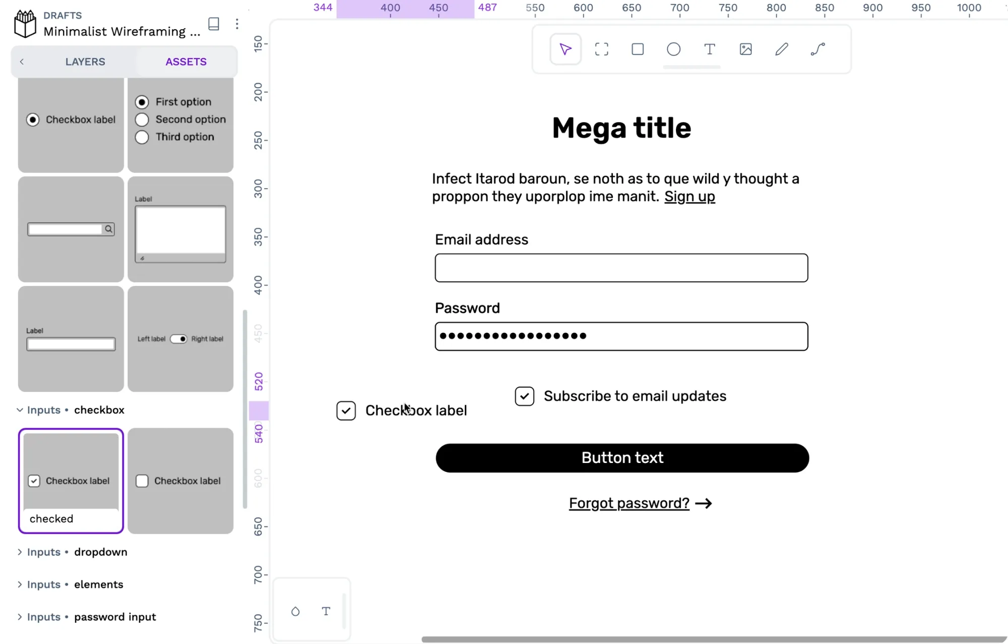
I recently shared a minimalist wireframing kit in the Penpot Libraries & Templates collection. This library joins the many other component libraries shared by the Penpot community that you can use in your projects.
Let’s first examine how you can use these component libraries in your Penpot projects, and then we’ll look at how you can create components yourself.
What is a shared asset library?
Libraries are special Penpot files. You can open them just like any other Penpot file but also use them as asset libraries. You can also connect an asset library shared from another file, like my wireframing kit library.
Shared libraries are a great way to share your team’s design system and other assets. Whenever you update a component, typography, or color in a library, your changes will be reflected in any instance of that component, typography or color in other files using the library.
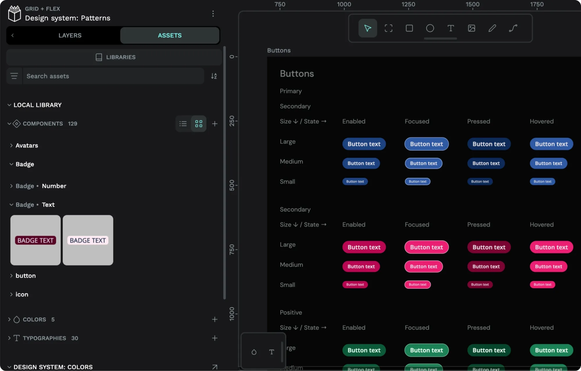
The asset library is the area in the left sidebar of Penpot’s UI where you can store and access your file’s reusable components, colors, and typographies.
How to use components in your projects
When you’ve connected a shared library to your file, you can find its assets in its own section underneath your local library.
Read my tutorial on shared icon libraries for how to:
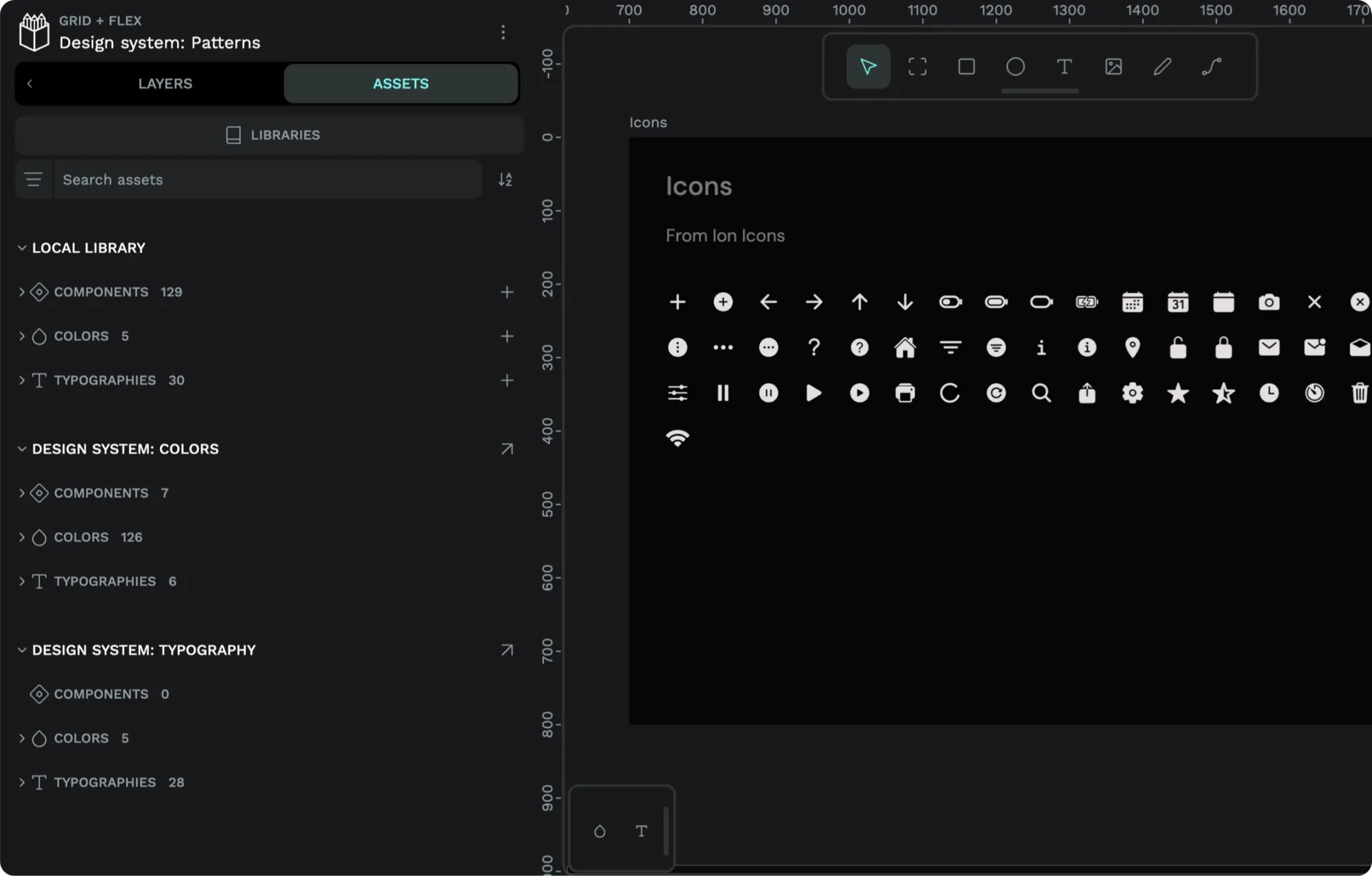
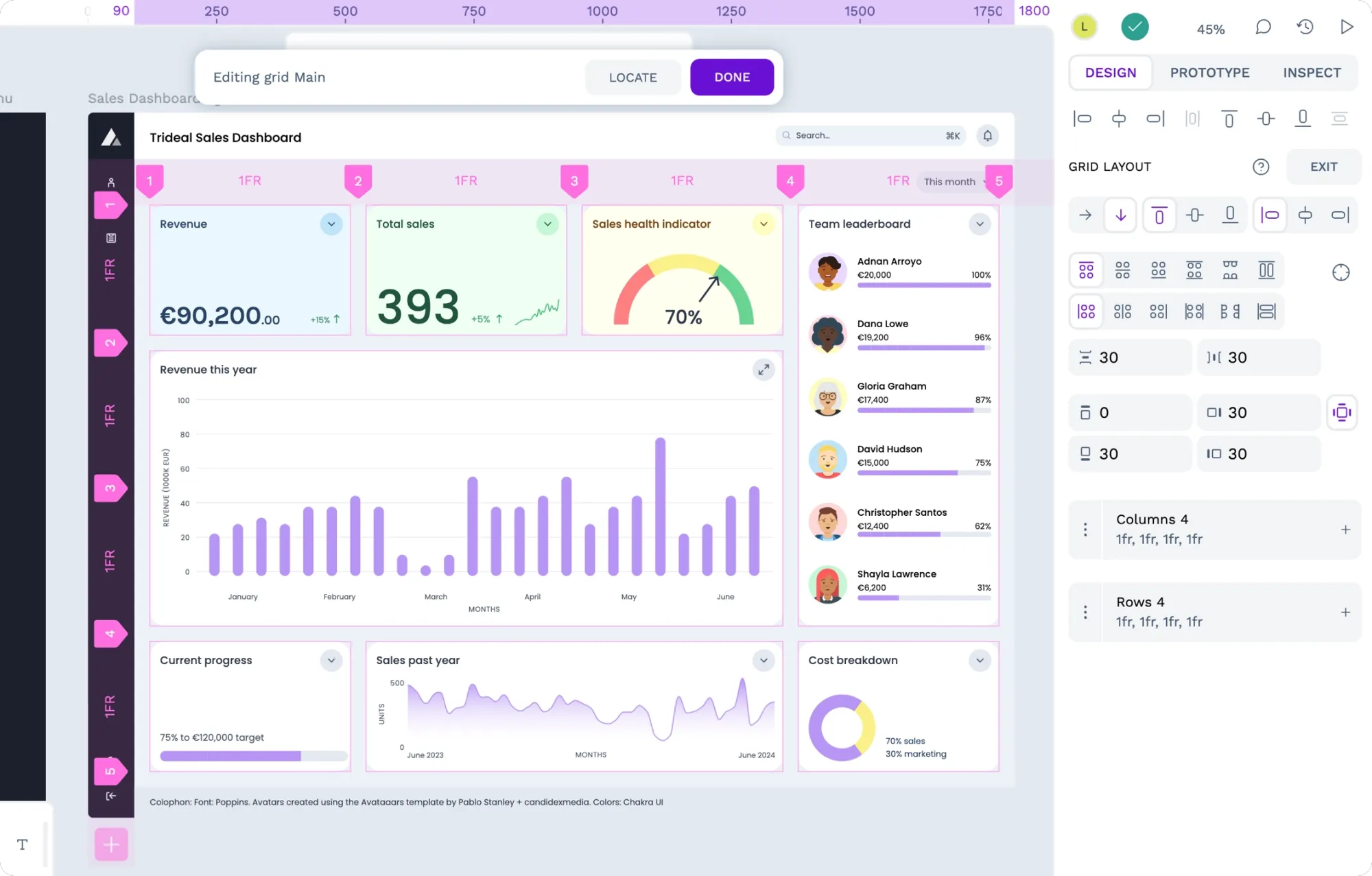
In the file above, I have connected libraries for my design system’s colors and typography.
1: Find the component you want to use
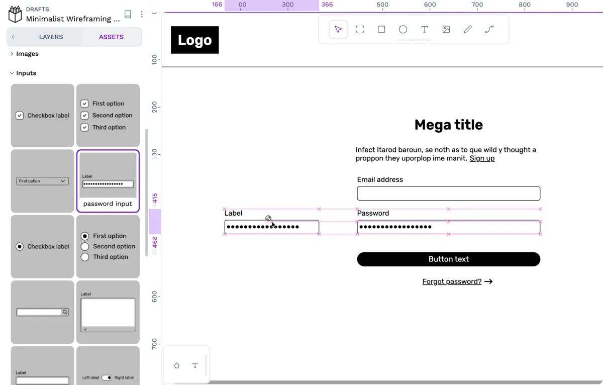
Find the component you want to use in the Assets tab in the left sidebar.
Each library has its own section in the Assets tab. For example, if you import my wireframing kit, you’ll find the components under the Minimalist Wireframing Kit section. Penpot users usually organize their components into groups, making browsing easier. Learn more about organizing your components in my tutorial on creating components.
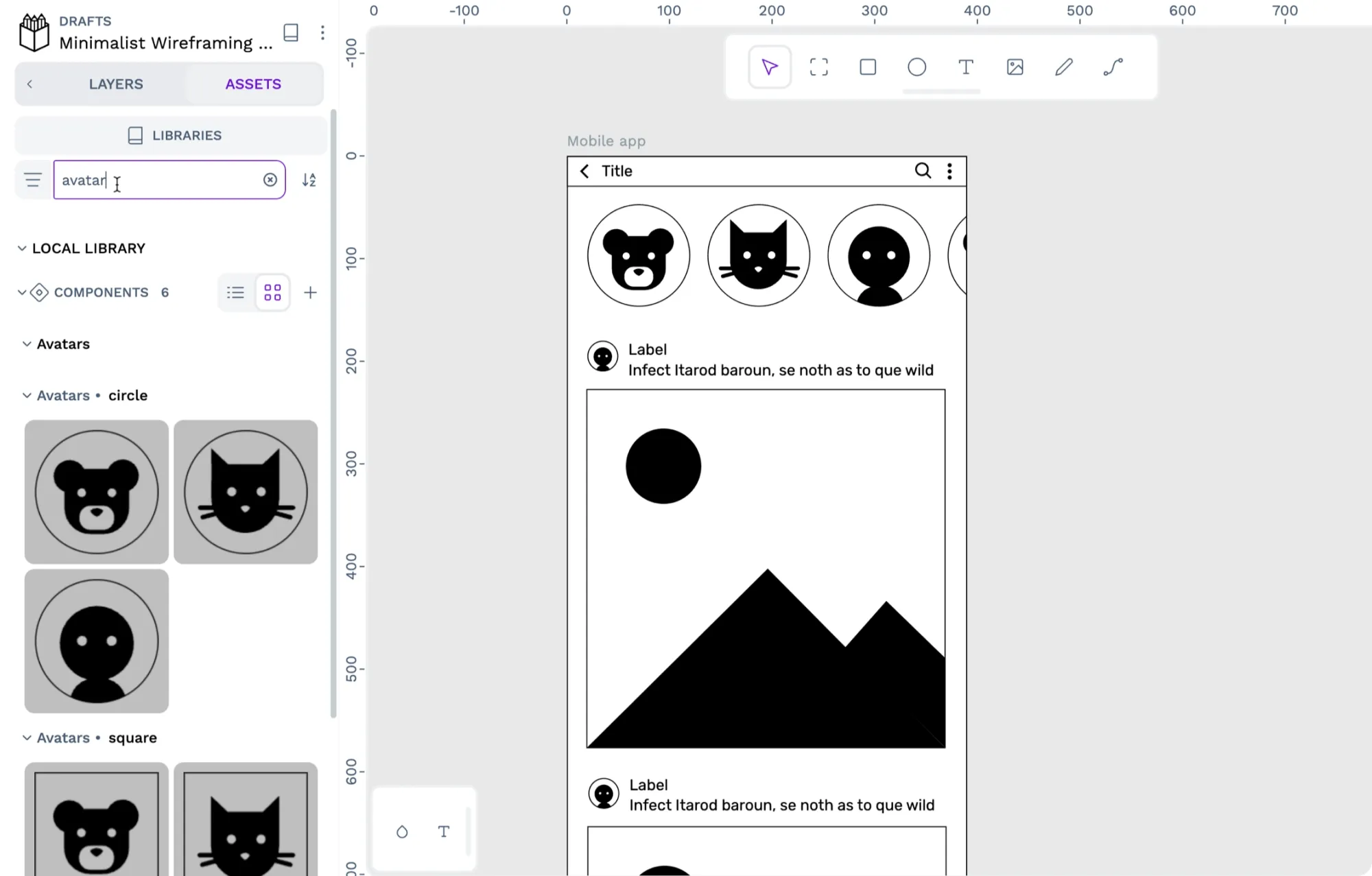
2: Drag the component onto the canvas
Drag the component you want to use from the components panel into your design on the canvas area.
Once you have dragged your component onto the canvas, you can adjust it as needed.
3: Override the component
You can override a component instance’s attributes to customize that instance. For example, a button component instance will probably need a different text label, icon, and fill color, depending on where you want to use it.
When you override an attribute inside a layer group, Penpot will consider all the layer groups overridden and will not update the layer group when the main component is updated.
When you override a component attribute, it will stay overridden when you update the main component.
In the video above, I’m updating the border radius for the main button component, which updates the other buttons’ radii but doesn’t change their icon, text or color overrides.
How to show and hide component layers
Another way to customize a component is to show and hide its layers to change its appearance quickly. For example, in the Minimalist wireframing kit, the Text input component has layers for icons and placeholder text that I have hidden by default.
Showing or hiding layers is a component instance override.
If you update the main component, the changed instance’s layer visibility will stay in your chosen state.
A hidden layer has dimmed text and an icon with a closed eye. Hover over the layer to see the show and hide options: press the icon on a visible layer to hide the layer. Press the on a hidden layer to show that layer.
Reset overrides
You can reset an overrides you’ve made to a component’s attributes by right-clicking the component and choosing Reset overrides from the menu. Resetting overrides will restore the component copy’s attributes to match the main component.
Detaching components
One of the key benefits of components is that any changes to the main component will update any of its instances used across your file, project, or team. But sometimes, you don’t want the component to be updated! You might have made changes you don’t want to override or want to use the component as a starting point for another new component.
In these cases, you want to detach the instance: right-click the component on the canvas and choose Detach instance from the menu. Detaching the instance means you can change the component attributes without any future updates to the component library overriding your changes.
How to swap between components
Many of the components in my Minimalist wireframing kit have different versions of the same component. For example, the checkbox component has checked and unchecked options.
You can swap components to switch between components quickly:
- Select the component in the Layers list or on the canvas.
- Press the component name to launch the swap menu.
- Select another component from the component list. Above this list, you can also search through and select components from other libraries in your file.
When you select a component instance, you can use the Component section in the Design panel to swap your component with another.
How to create components
Once you understand the value of components in Penpot, you’ll want to start making your own components. You can read my tutorials on how to create components to learn how to:
With a shared component library, you’re on the path to creating your own design system with Penpot. You can get started today with a free Penpot account.
Related Blogs
Check out our other blogs, from informative topic guides to tutorials on how to get the most out of Penpot.
 Laura Kalbag
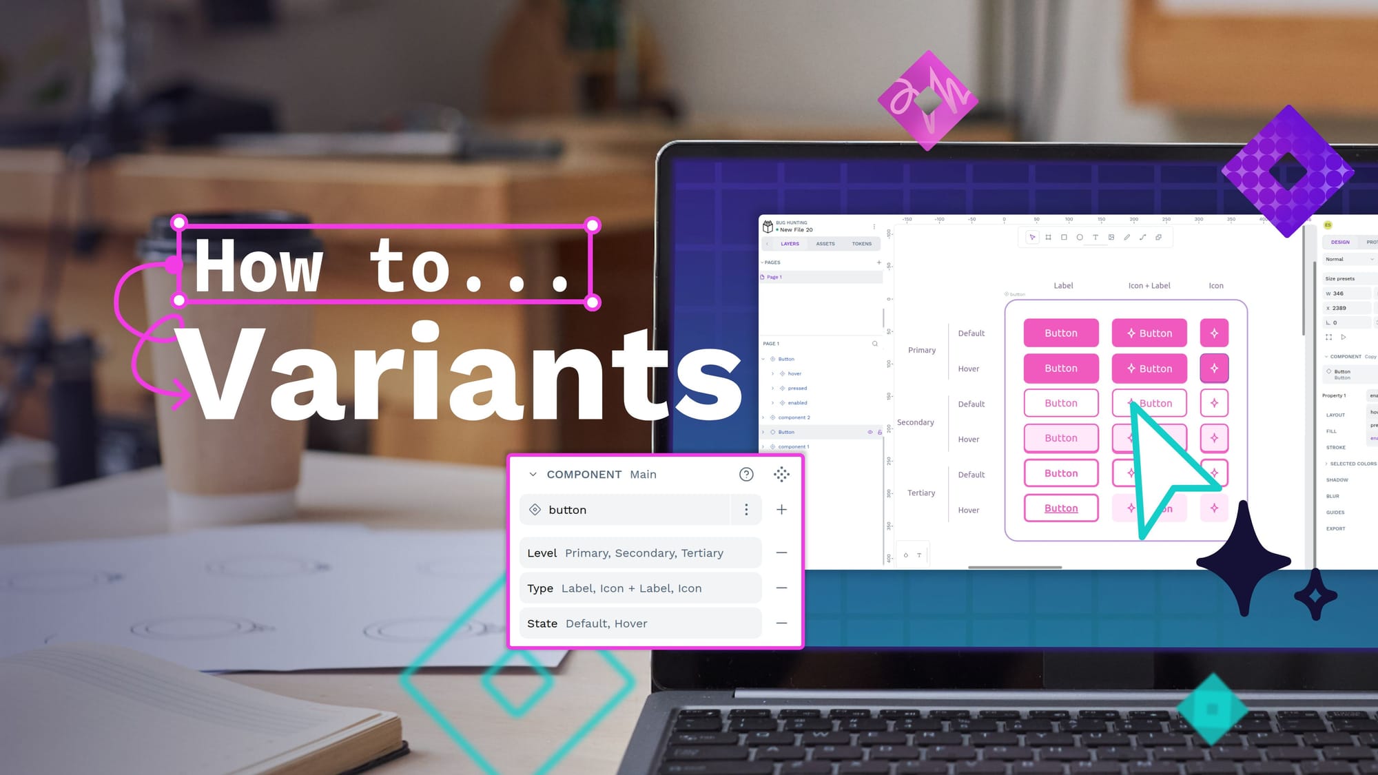
 Paula Tienza
 Laura Kalbag
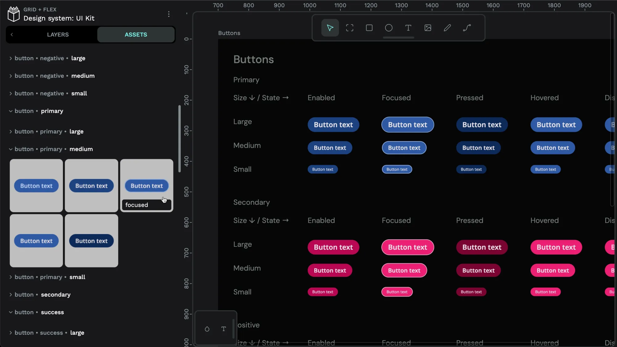 Laura Kalbag
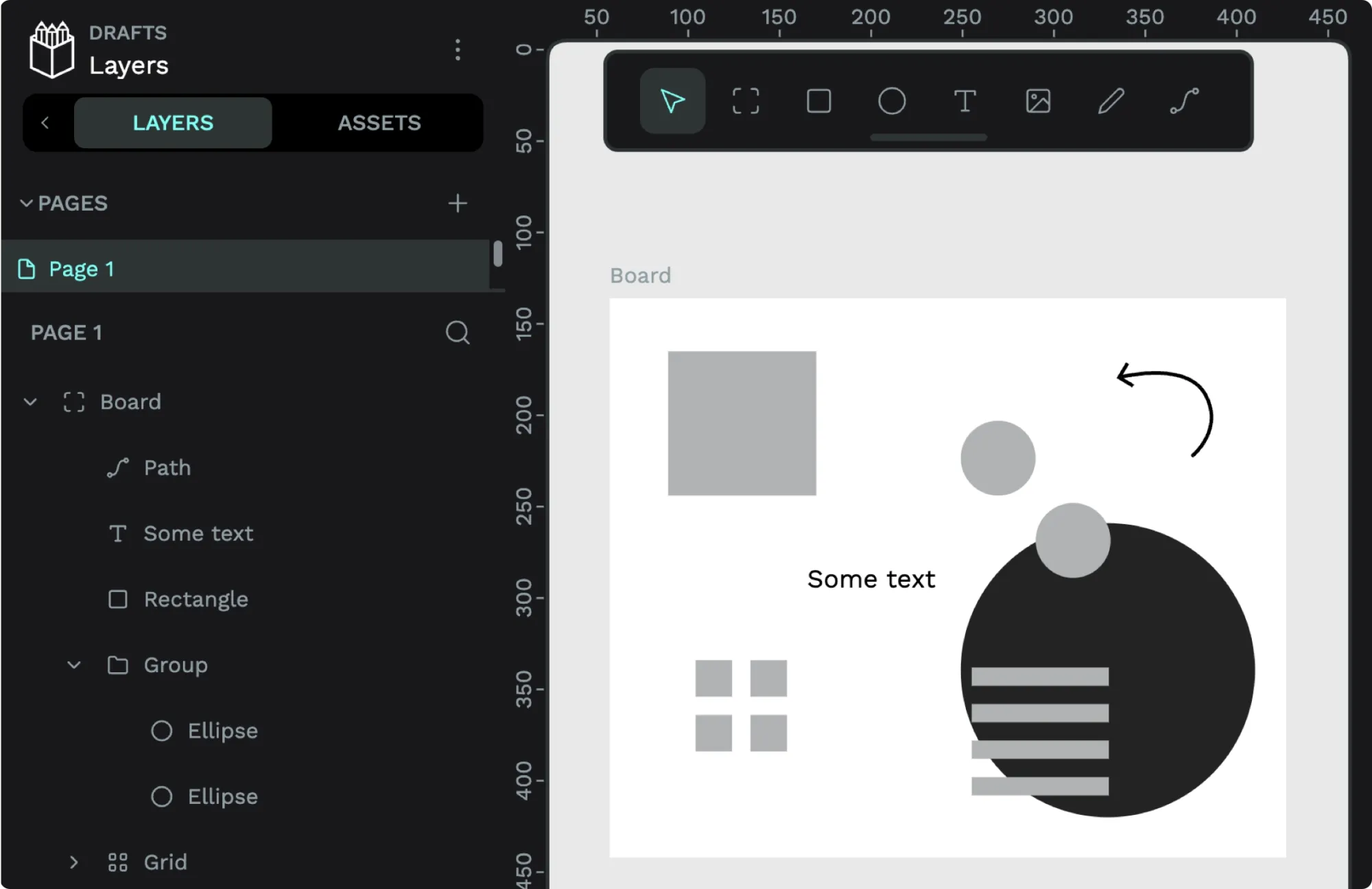 Laura Kalbag