Tutorial: How to use icons from a shared icon library in Penpot
I recently shared a css.gg icons library template in the Penpot Libraries & Templates collection. Here’s how you can use icons from this (and other) shared libraries in Penpot.
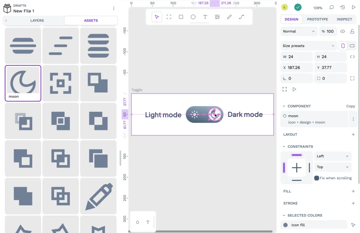
I recently shared a css.gg icons library template in the Penpot Libraries & Templates collection. This icon library joins the other icon sets shared by the Penpot community that you can use in your projects.
Icon libraries are indispensable for UI design. They provide a stockpile of uniformly designed icons that you can pull into your projects, saving you the time and effort of creating them yourself. So, how do you use these icons in your own Penpot projects?
What is a shared asset library?
Icon libraries are special Penpot files. You can open them just like any other Penpot file but also use them as asset libraries.
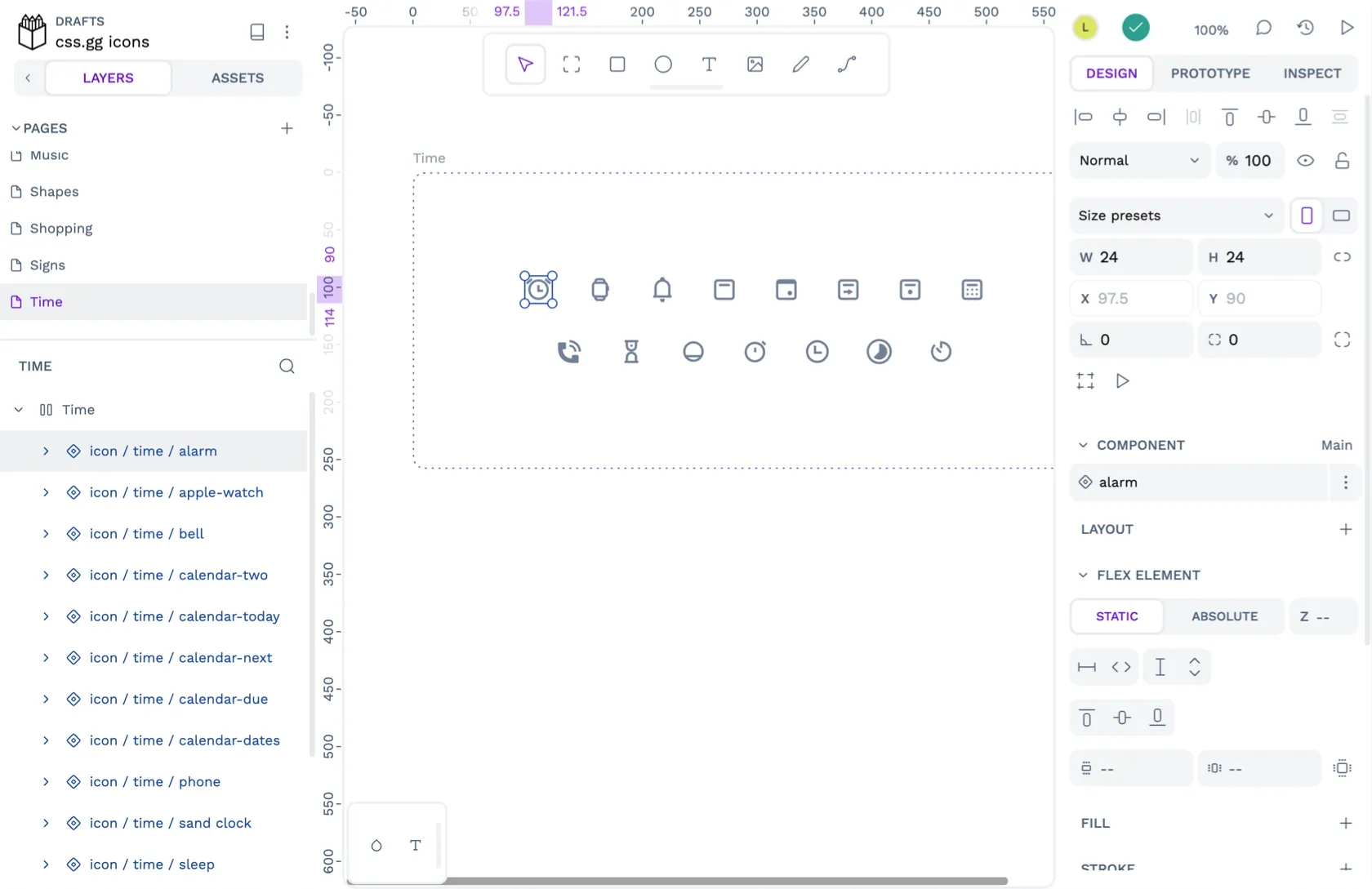
An asset library is an area in your file where you can store reusable components, colors, and typographies. The icons in an icon library are components.
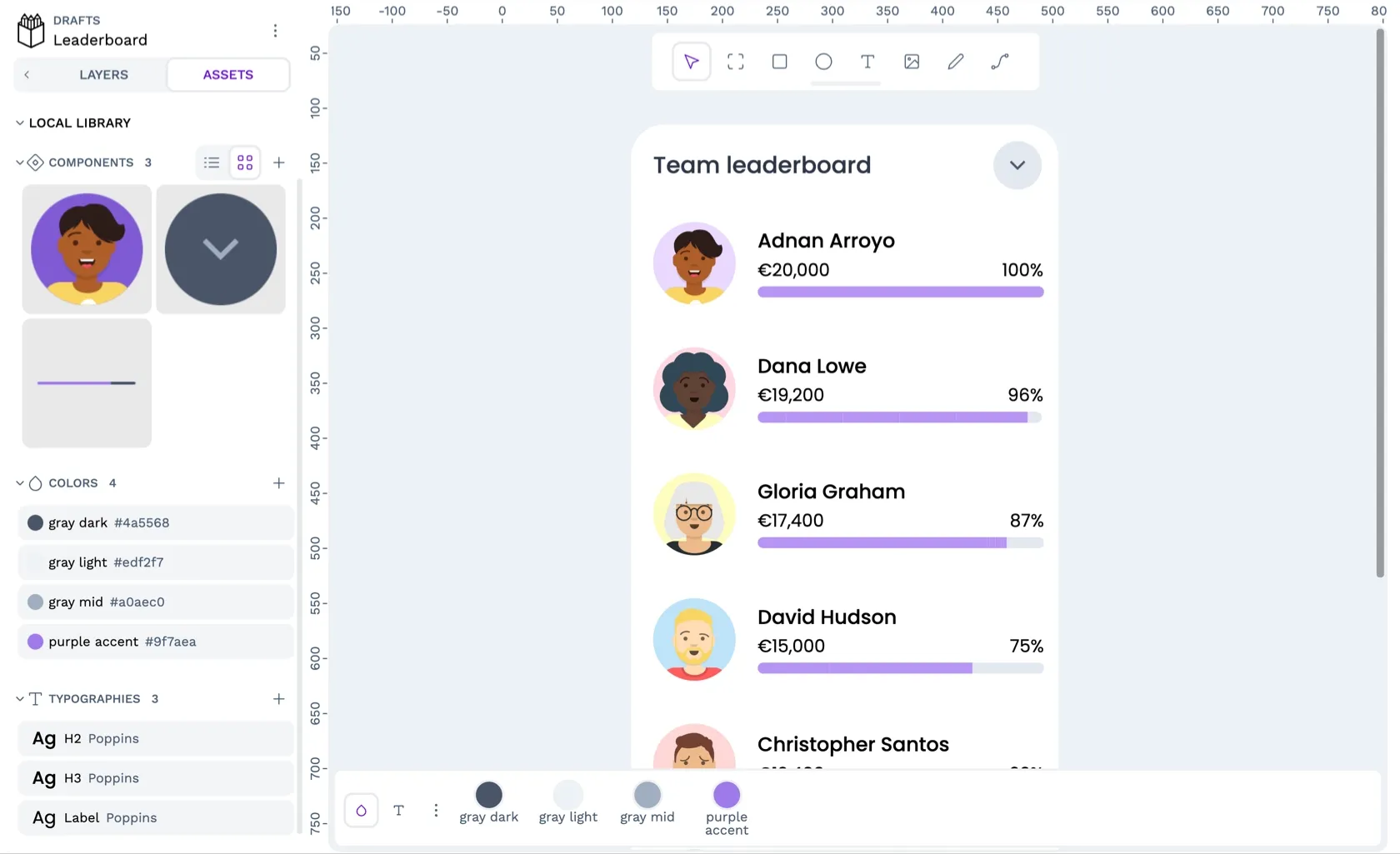
You can also connect an asset library published and shared from another file, like my css.gg icons library. Our user guide explains how to publish shared libraries with your team. Shared libraries are a great way to share a design system and other assets across your team.
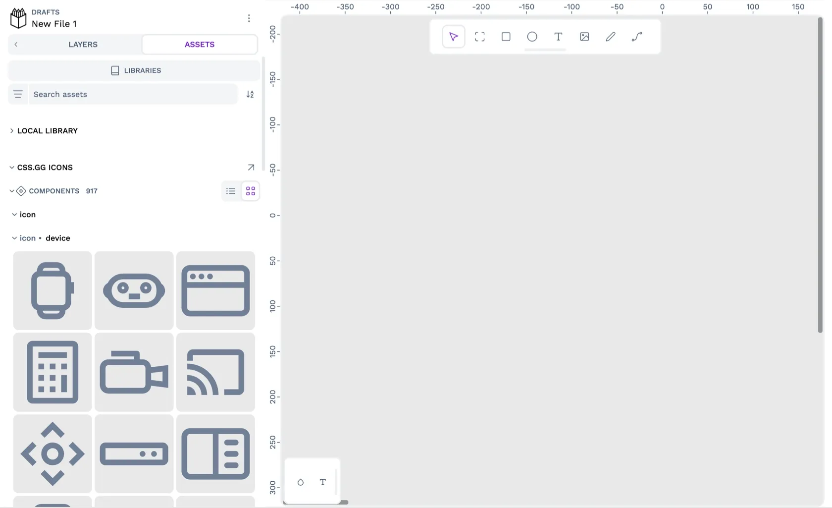
How to import an icon library
- Download the icon library file from the Penpot Libraries & Templates collection.
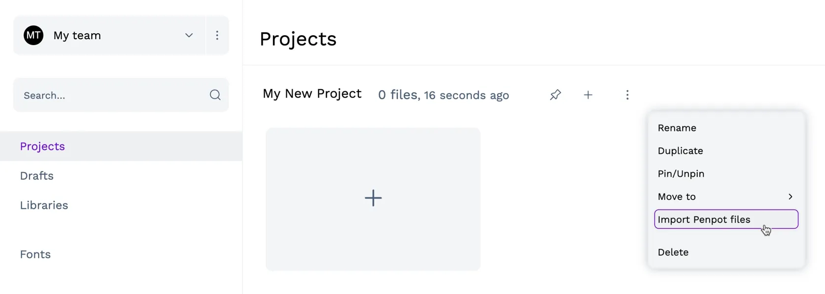
- Import the Penpot file into your Penpot team where you want to use the icons. Use the project options menu on the dashboard to Import Penpot file.
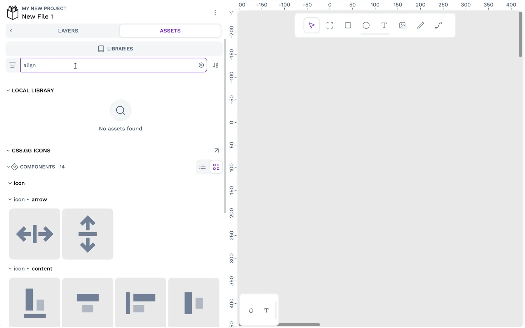
- Open the file where you want to use the icons. In the Assets tab in the left sidebar, launch the Libraries panel.
- In the Libraries panel, find the shared library in the Shared Libraries section and use the plus icon button to connect the library to your file.
How to import shared libraries from your team
You don’t have to download an icon library from the Penpot collection. If someone on your Penpot team has published a file as a shared asset library, you can connect that library to your file from the Libraries panel. The benefit of using a shared library from your team is that any updates made to the original file will update the asset library in your file.

- Open the file where you want to use the icons. In the Assets tab in the left sidebar, launch the Libraries panel.
- In the Libraries panel, find the shared library in the Shared Libraries section and use the plus icon button to connect the library to your file.
How to use the icon components in your projects
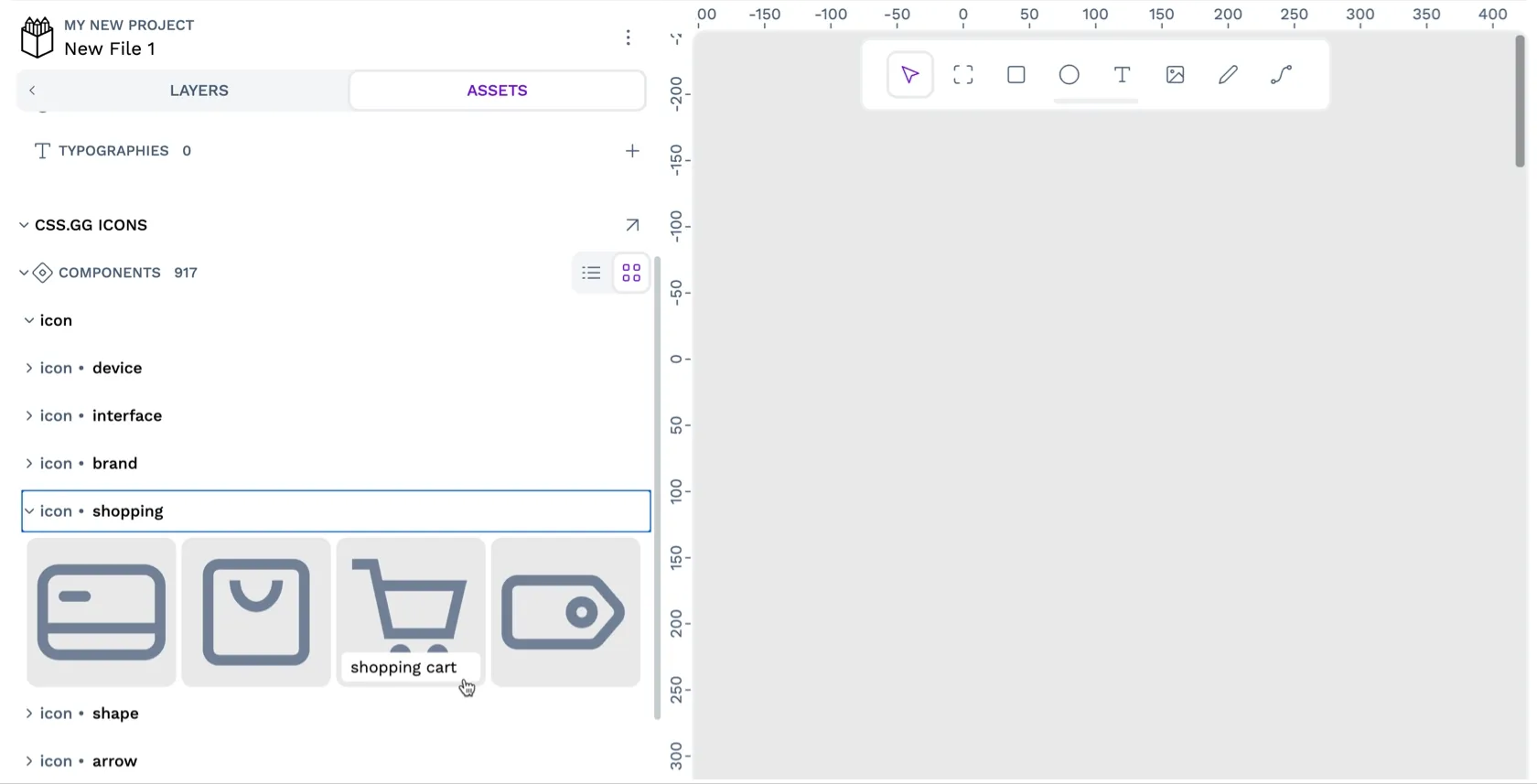
- Find the icon you want to use in the Assets tab in the left sidebar in the css.gg icons section.
- Drag the icon you want to use from the components panel into your design on the canvas area.
- Right-click the icon on the canvas and choose Detach instance from the menu. Detaching the instance means you can change the icon size and fill color without any future updates to the icon library overriding your changes.
Penpot <3 Open Source
I’ve created the css.gg icons library using icons from the css.gg icons project. Thank you to Astrit and the other contributors for making and sharing these fabulous icons under an Open Source MIT license. At Penpot, we love Open Source, and that’s why Penpot is free and Open Source too!
If you want to share your Open Source icons with the Penpot community, you can read all about how to contribute templates in our user guide. You don’t need to use Git or code to join in!
Templates are a fantastic way for designers to contribute to Open Source projects like Penpot. You can share design resources, help other designers learn how to use Penpot and educate newer designers on best practices in your field. Please let us know in our Community space if you have any questions about contributing to Penpot.
Related Blogs
Check out our other blogs, from informative topic guides to tutorials on how to get the most out of Penpot.
