Tutorial: How to create CSS Flex layouts in Penpot
Create CSS Flex layouts without learning how to code. This tutorial shows you how to use Penpot’s flexible layout tools using our sales dashboard UI template.

Flex layouts are one of the features that excite me the most about Penpot. (The other one is grid layouts!) For designing for the web and other platforms that work on devices and viewports of many different sizes, we need to be able to create properly flexible designs. Designing for this modern technology means we’re moving beyond fixed-width pixel perfection and away from creating each view multiple times over as we tweak the same design for mobile, tablet, laptop and desktop.
We’re thinking more flexibly. We’re designing systems that utilize patterns and rules to create reusable and consistent user experiences. We’re creating components that we can drop into any number of different container sizes and considering how they should behave in narrower and wider layouts. And we need our design tools to support this thinking and level of flexibility.
With Penpot, we can create CSS layouts without having to code. So, we can be assured that what we’re designing will have exactly the same layout when we export it as code, with no interpretation or translation needed by developers. This means both designers and developers use the same tools and terminology, working with a shared language that’ll make it easier to understand each other and collaborate more effectively on future projects.
When to use flex layout
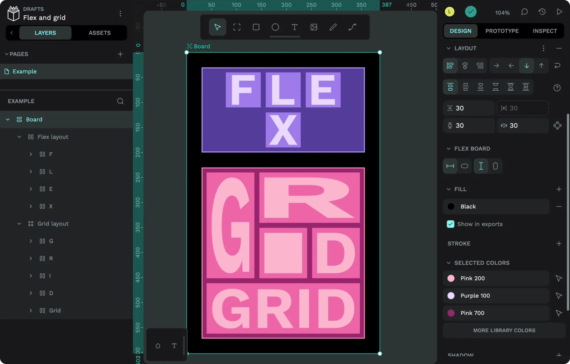
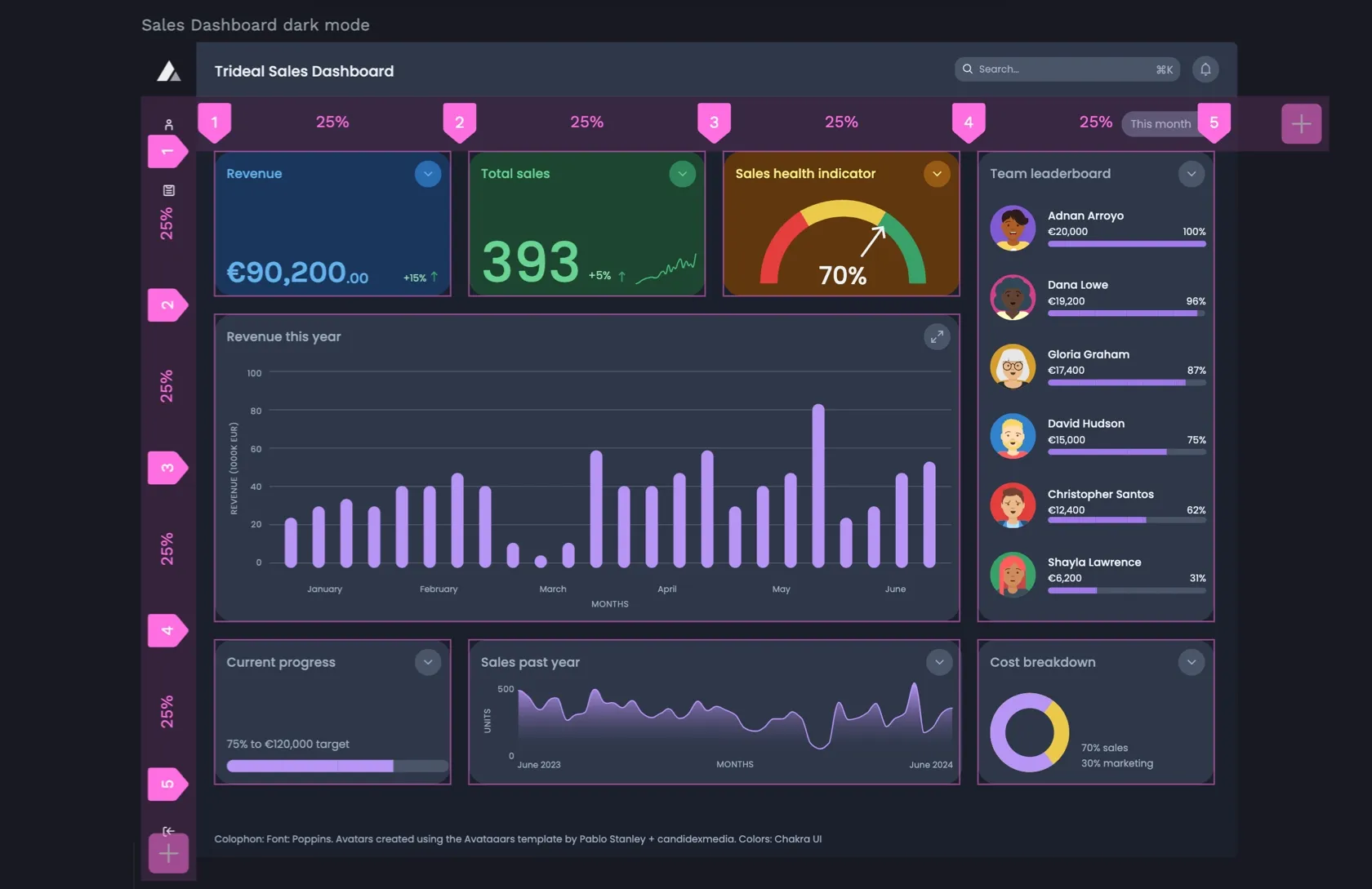
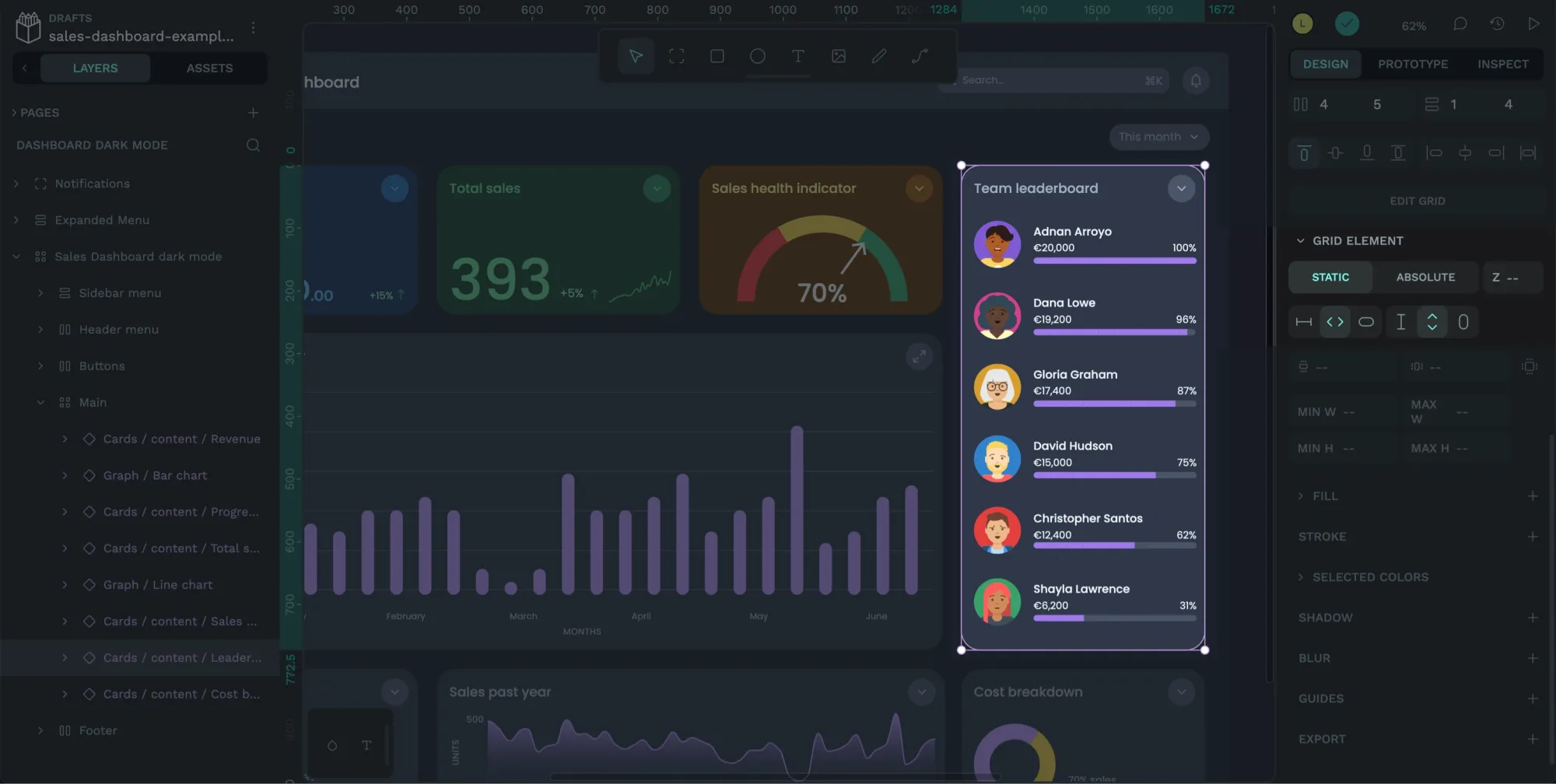
I’ve used flex layouts for seven(!) different areas of the sales dashboard leaderboard. And that’s just one small area of the dashboard layout. You can check out all the different layouts by downloading the Sales Dashboard UI template.
I’ve used flex layout because it gives me an easy way to space elements uniformly, no matter the number of elements, length of the text, or length of any other content contained inside each layer. Flex layout also helps me align elements consistently while allowing me to create a design that can expand and contract to fill the container I put it into.
Setting the flex items to 100% width means they grow and shrink to fill their container.
Creating flex layouts with Penpot
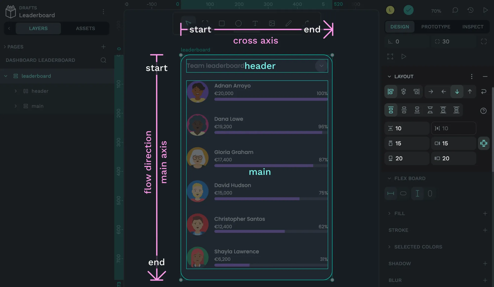
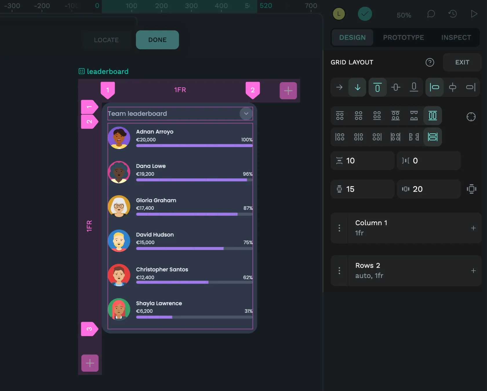
Let’s start with the leaderboard container itself.
- Apply flex layout
- Choose the flow direction and wrapping behavior
- Choose how items are aligned and distributed
- Add spacing between items
- Add padding around items
- Choose the layout sizing
- Choose the sizing of the flex items
1. Apply flex layout
Select the board or layer to which you want to apply the flex layout. From the Design panel in the right sidebar, use the Layout + icon button and choose Flex layout from the menu.
2. Choose the flow direction and wrapping behavior
The leaderboard container uses a column flow, meaning the content flows from top to bottom in a column. This is ideal for list-like layouts. The arrow icon buttons allow you to choose the flow direction.
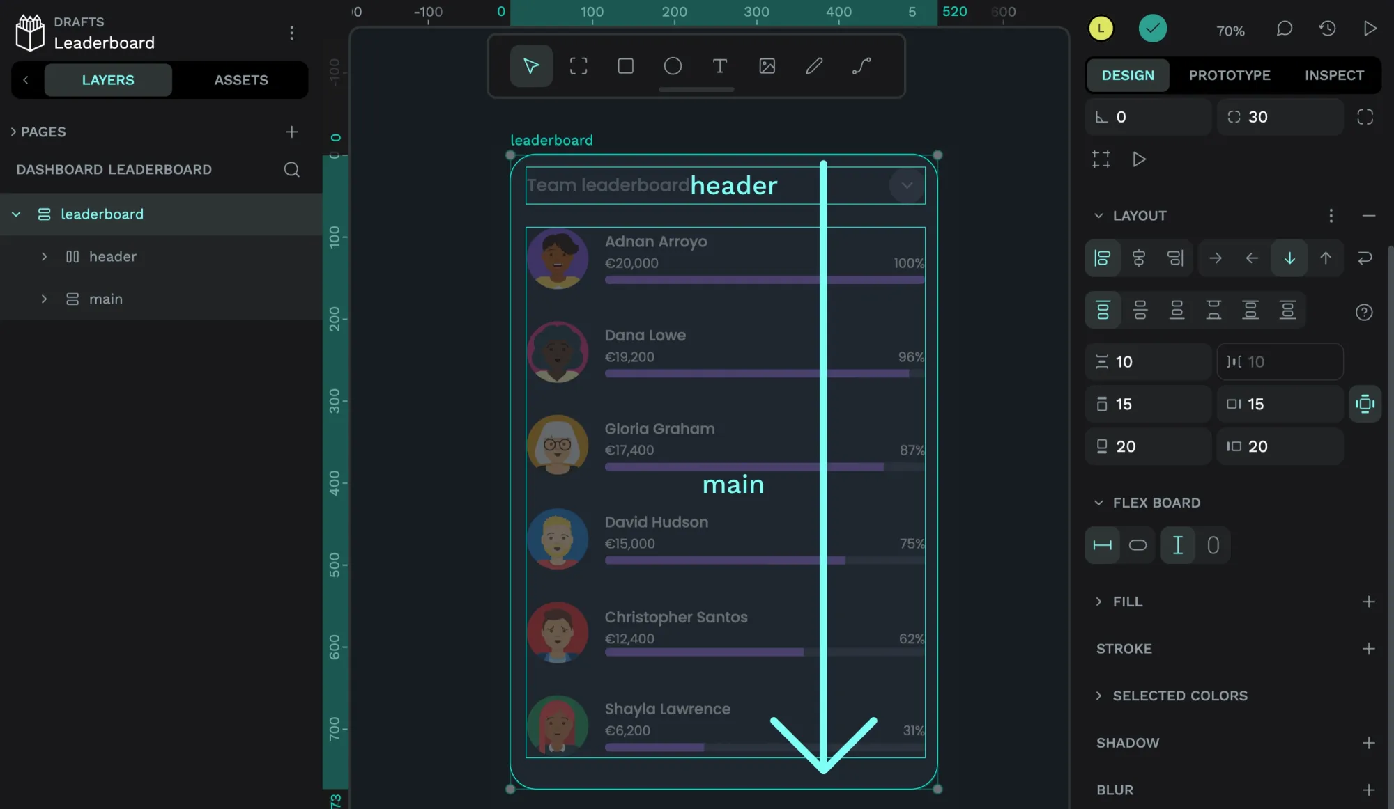
Because I always want the list to flow top-to-bottom, no matter how wide its container is, I’ve kept the Wrap curved arrow icon setting deselected.
With Wrap selected, the leaderboard items would wrap if the container was not tall enough to fit the items vertically across the container. Wrapping like this would be very useful in some situations, such as short and wide viewports.
3. Choose how items are aligned and distributed
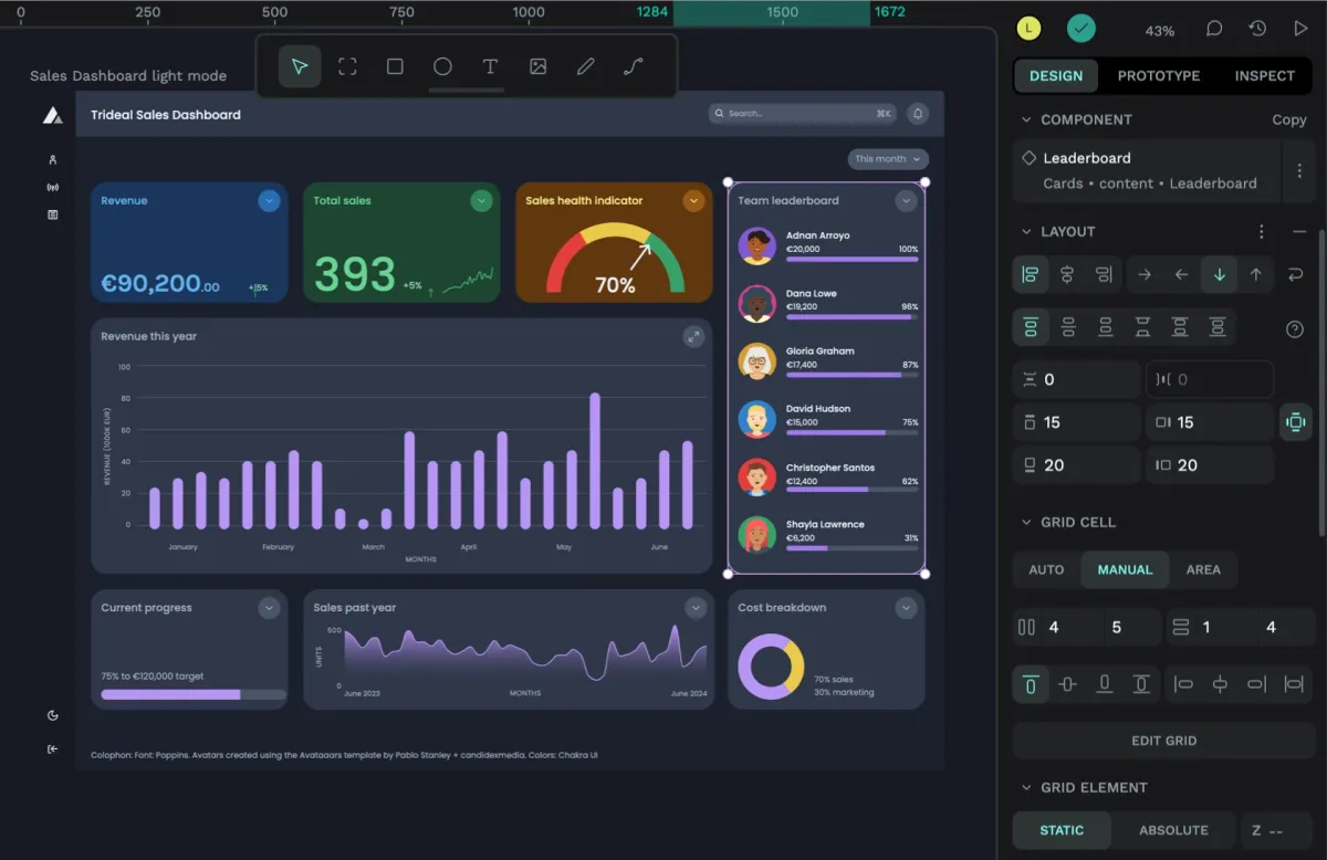
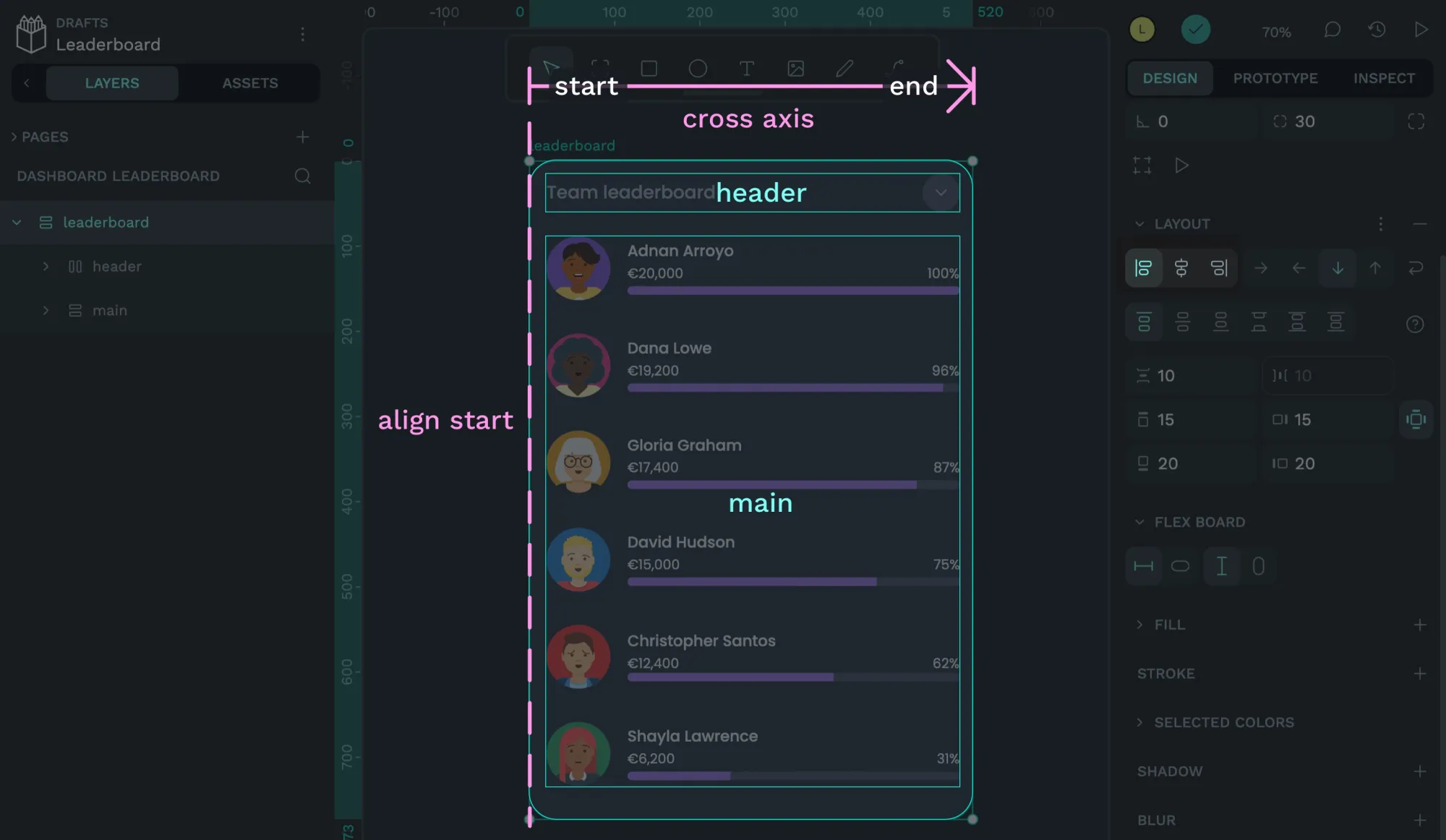
Often, the elements inside your layout don’t fill the entirety of their container. For example, the leaderboard component is in a “bento” grid layout and fills one grid cell width and three grid cells of height, no matter the size of its content.
This is where element alignment and justification come in. Content is distributed or “justified” along the main axis, following the flow direction I set in the first step. The items are “aligned” along the cross-axis, the opposite axis of the flow direction.
3.1. Item alignment
While the elements inside our leaderboard are mostly full-width, I’d want them to align to the left if they didn’t fill all the space. It’s worth bearing these edge cases in mind for flexible layouts. What if the page was wider? How would we want the content to behave? So, for the item alignment, I’ve chosen to align to start, which aligns the header and main layers to the start of the cross-axis, which is the left of the leaderboard layer.
3.2. Content justification
It’s also possible that the header and main layers won’t fill all the available vertical space in our bento grid. In that case, I’d want the main content to align to the top of the space.
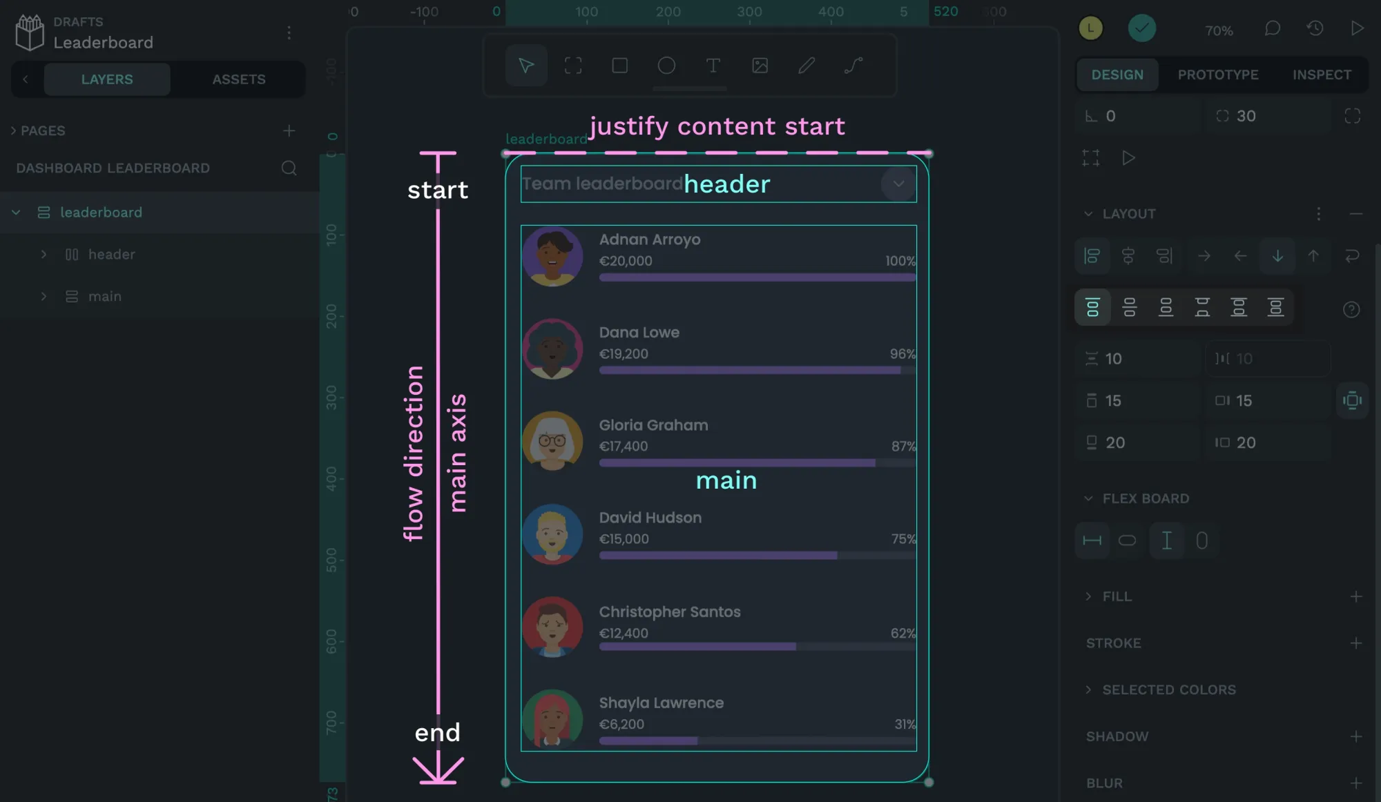
For this reason, I’ve chosen the content justification to justify to the start of the main axis.
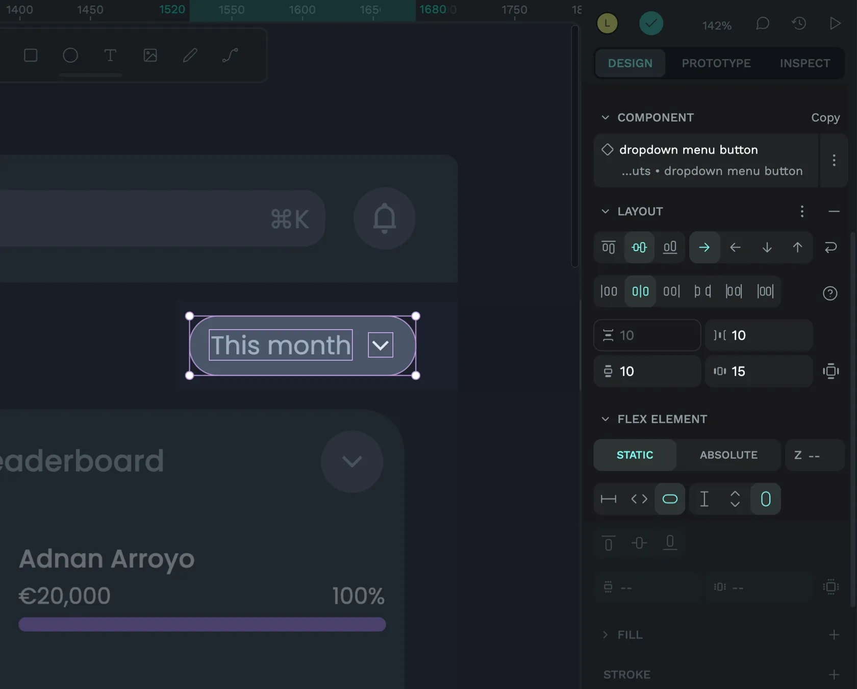
4. Add spacing between items
Next, I add spacing between the elements in the flex layout. If your flex layout flows as a row, this is called the column gap, as it’s the gap between columns. As the leaderboard uses a column flow, the gap is the row gap: the gap between rows.
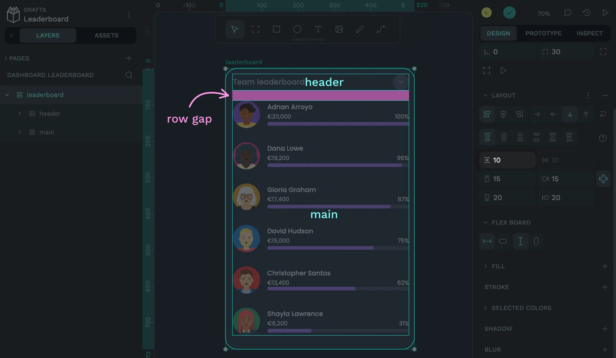
The gap will be added between each element in the layout, whereas the padding is added around the elements.
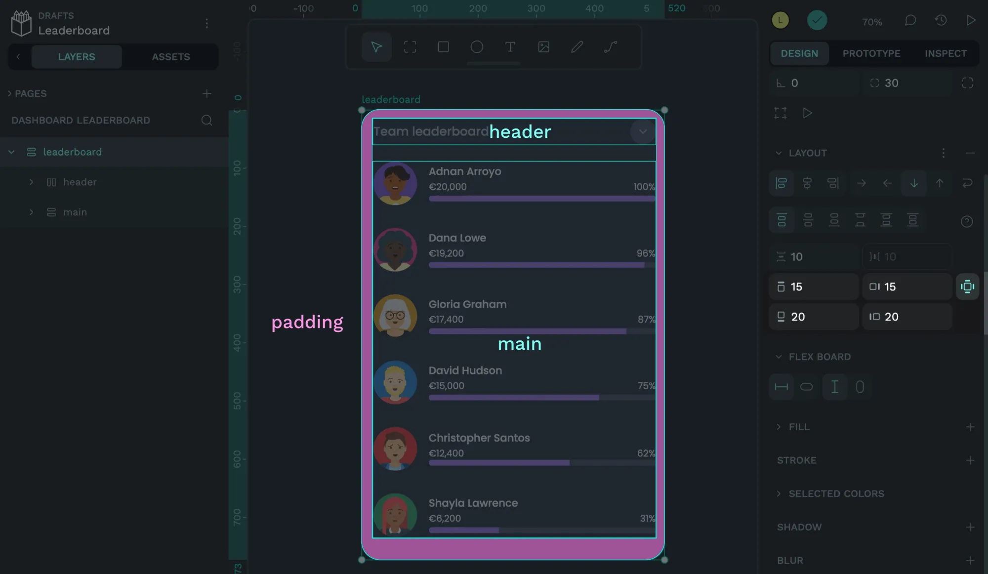
5. Add padding around items
You can set the horizontal and vertical padding around all four sides of your layout or set each side to have different padding when you enable the four-sided padding option.
6. Choose the layout sizing
Flexible sizing is another benefit of flex layouts. Both the height and width of the layout have the options:
- Fix: a fixed pixel value
- Fit: grow and shrink depending on the content inside.
You can combine options to have a fixed height and fit width, fit width and fixed height, fit height and fit width, and so on…
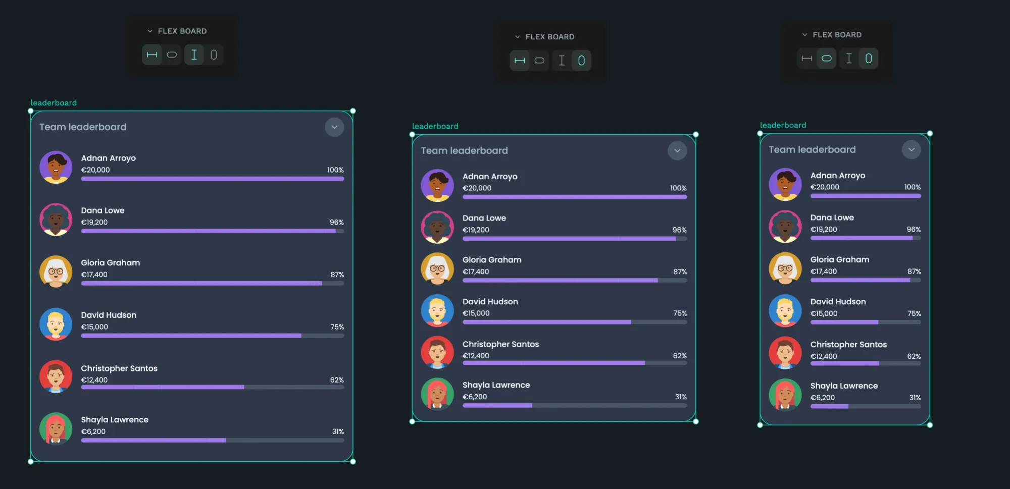
Once I place the leaderboard flex layout inside a parent layout, its size will be relative to that layout, which brings us to flex items.
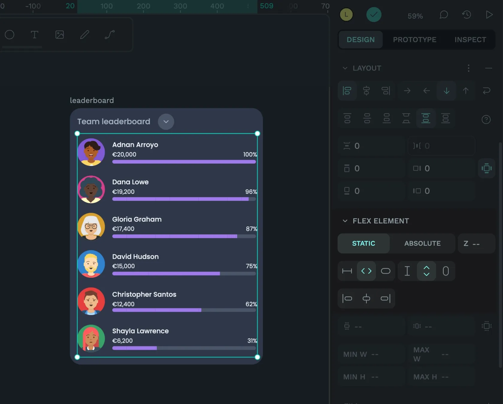
7. Choose the sizing of the flex items
An element that is inside a flex layout is also called a flex item. Flex items have several options for how you can size them relative to their parent flex layout. The options are:
- Fix: a fixed pixel value, regardless of the parent layout.
- Fit: grow and shrink depending on the content inside the flex item.
- 100%: grow and shrink to fill the space provided by the parent container.
You can adjust the flex item sizing from the Design panel properties when you have the flex item selected in the Layers panel.
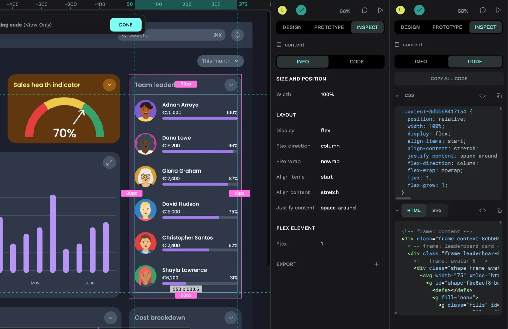
Deeper into the nested layout layers, each avatar has a fixed height and width, the progress bars have a fixed height and 100% width, and I’ve set the text containers to always fit the height and width of their contents. So, while the leaderboard layout can be expanded to fill space, you cannot shrink its height and width to smaller than the height and width of its contents.
Flexible grid layouts
Using the different combinations of layout and item sizing, you can see how we can utilize flex layouts for so many use cases. And you could even create this same layout using a grid layout.
More use cases for flex layouts
There are so many use cases for flex layout in the sales dashboard UI design alone. Here’s a selection of them:
Flex layout pattern: text on the left, button on the right
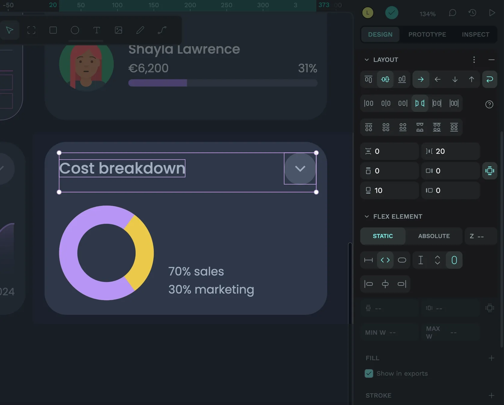
The sales dashboard UI uses the same pattern for all the card’s header areas of the cards: text on the left and button on the right. Using a flex layout for this pattern ensures that the button sticks to the right side of the container while the left-aligned text can fill the rest of the available space. There’s always a 20px gap between these two elements; if the text is too long to fit, the text and the button can wrap onto a second line.
Flex layout pattern: button with text and icon
Another common pattern I’ve used multiple times across the dashboard is a button (or link!) with text and an icon. Flex layout works well for this pattern as the button width will adapt to fit the length of the text inside. The text and the icon can be both horizontally and vertically centered inside the button, and there’s always a 10px gap between the text and the icon. You can use this exact layout whether the icon comes before or after the text.
Even more flex layouts
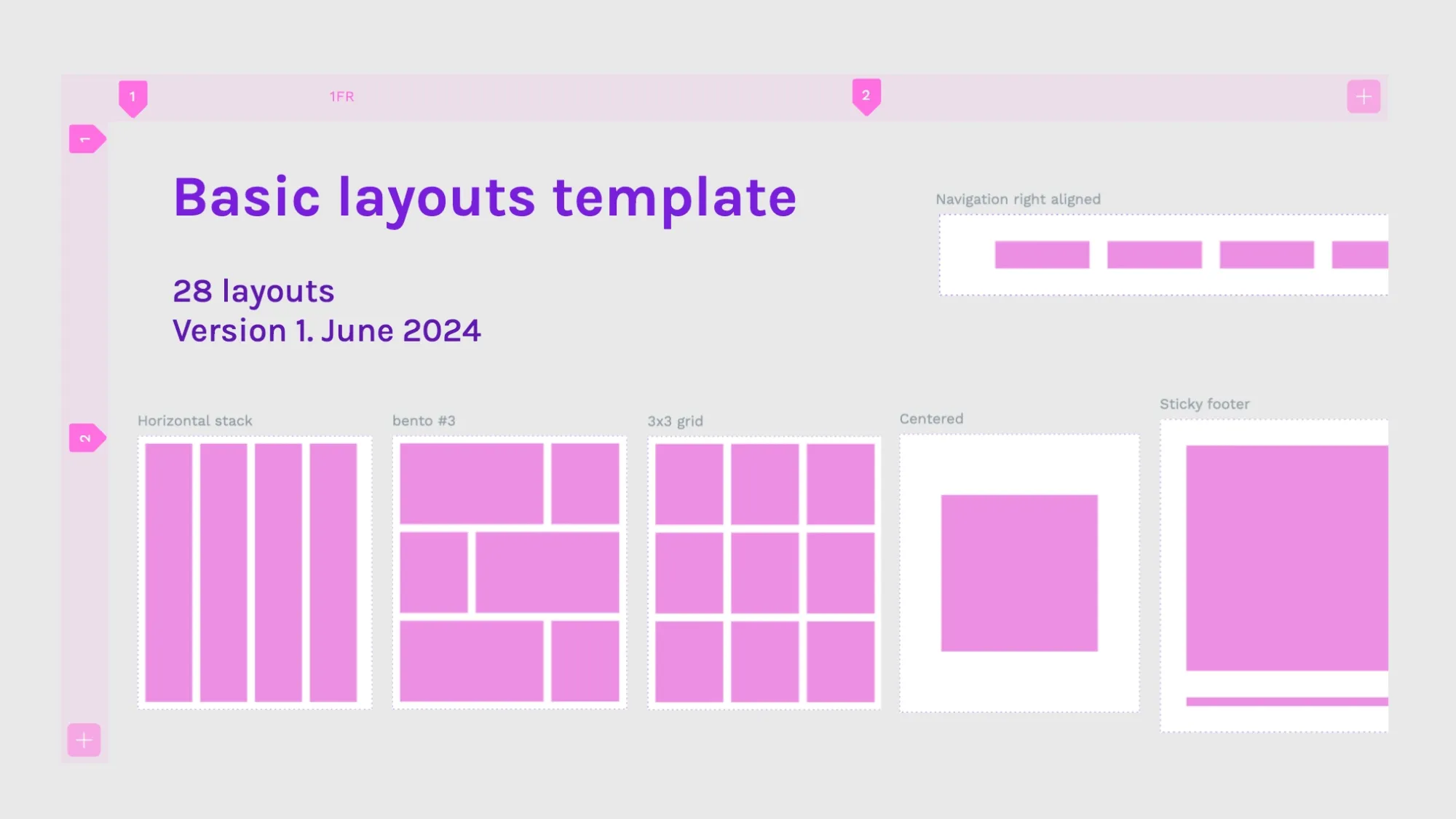
Are you looking for more examples and simpler layouts to learn from? Download my Basic Layout template for Penpot. The template contains twelve flex layout components that you can import or copy into your projects and use to learn more about flex layouts.
You can try Penpot’s advanced layout features by signing up (for free!) today. If you’ve used Penpot’s flex layout for your design work, please share your work on our Community Space. We’d love to hear more about how you used our layout tools.
Related Blogs
Check out our other blogs, from informative topic guides to tutorials on how to get the most out of Penpot.
 Laura Kalbag
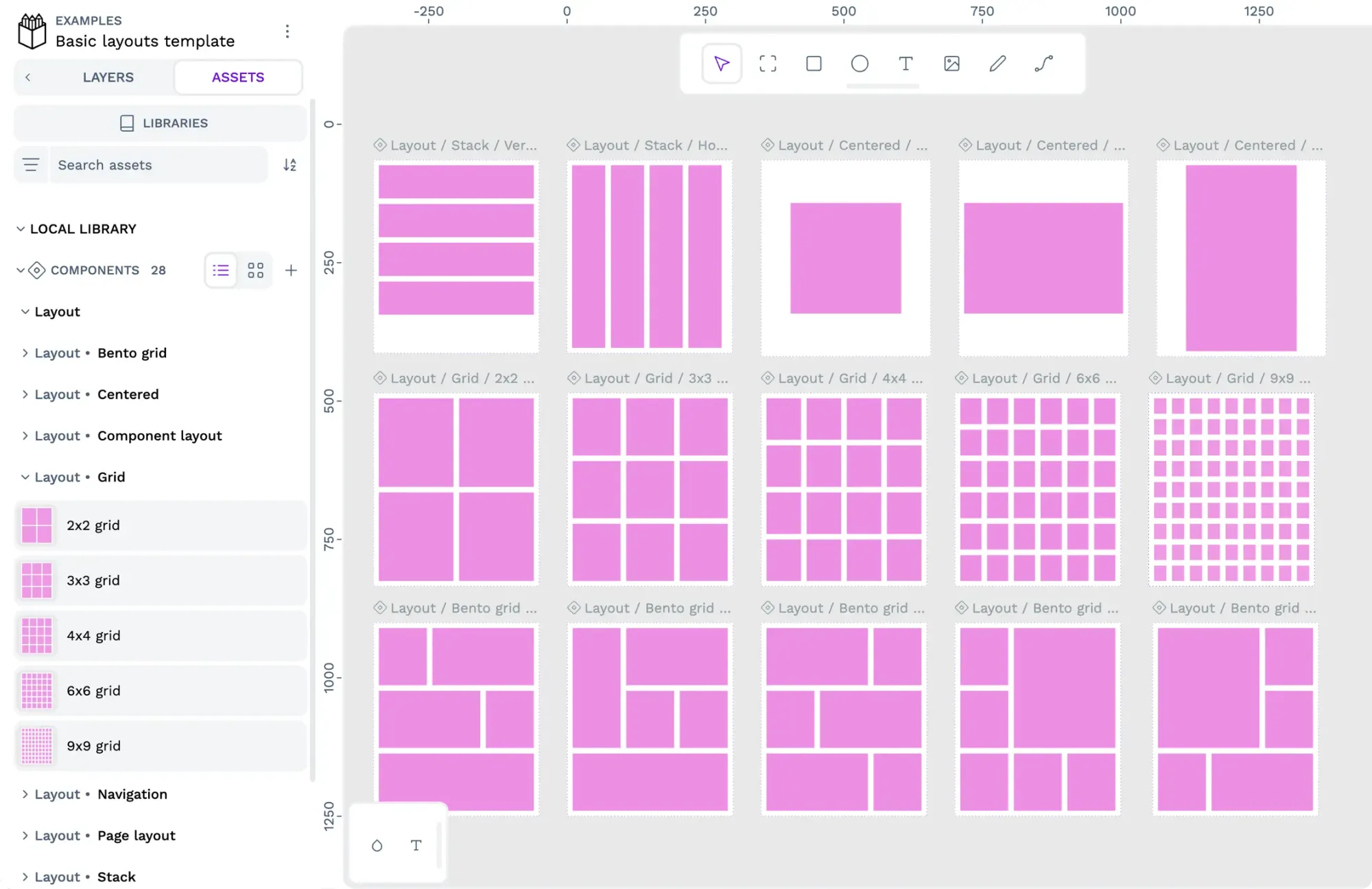 Laura Kalbag
 Paula Tienza
 Laura Kalbag