Tutorial: Creating Penpot color palettes and libraries
Learn how to use color and save reusable colors for your design system with Penpot’s color palette and shared libraries.

Color is one of my favorite topics. It has so much power to aid usability and set the mood and tone of a design.
Watch my live hands-on demo of color palettes and libraries with questions from the community.
In Penpot, you can save color values in your file’s local library and reuse these values across your design. You can also publish your local library as a shared library for your team to use across other projects. Once you’ve saved a color and used it for multiple items, you can also update the value to update it across your design.
Penpot’s versatile color picker
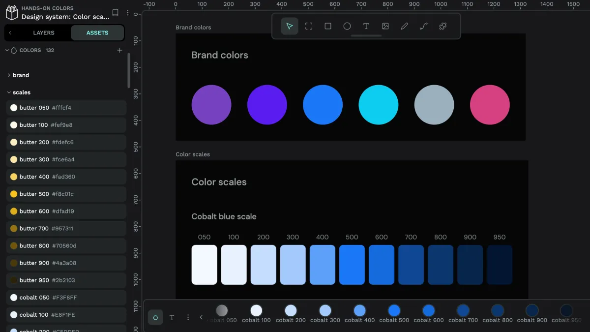
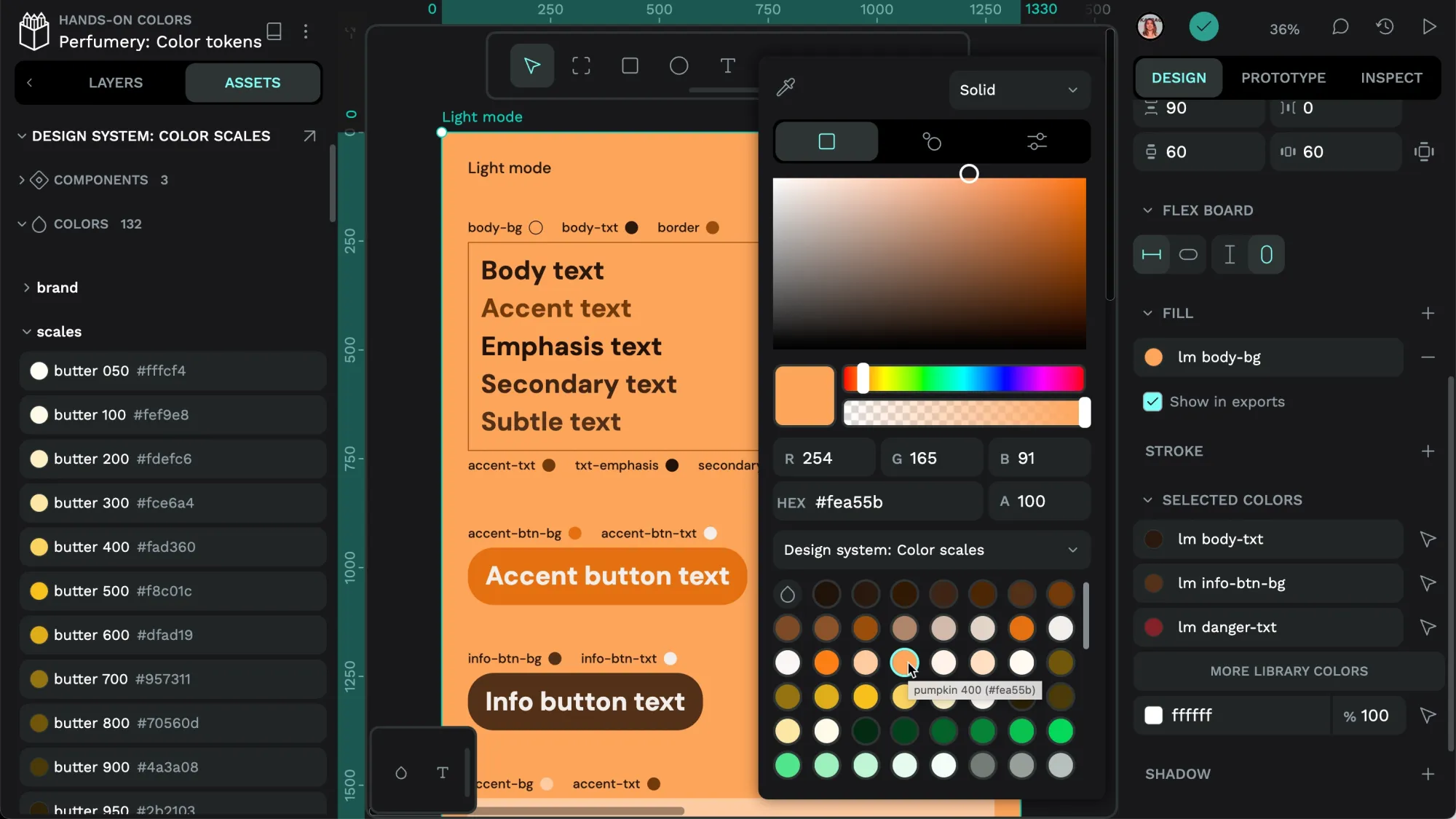
In Penpot you apply color as either a fill that fills the object or a stroke that outlines the object. Once you’ve added a fill or stroke, you can enter your color as a hex color code or use the color picker to grab or refine the color you want.
You can open the color picker by clicking the fill or stroke’s swatch (square of color). The eyedropper tool in the top left corner of the color picker helps you grab a color from anywhere in your design.
You can also use the eyedropper to pick a color from an image you’ve imported.
You can use the spectrums, sliders, and individual values inside the color picker to refine your fill or stroke color. There are three options tabs inside the color picker: RGB, Harmony, and HSV. In each tab you can also use the eyedropper, access colors already stored in your file library or shared libraries, or enter the color code as RGB(A) and hex values.
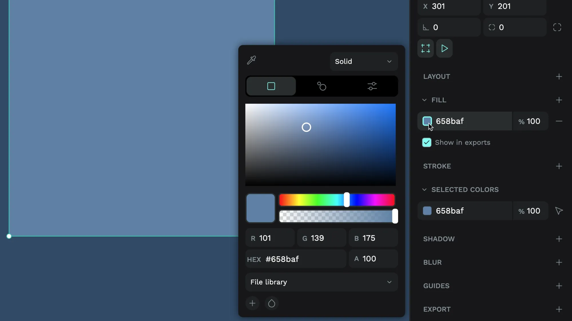
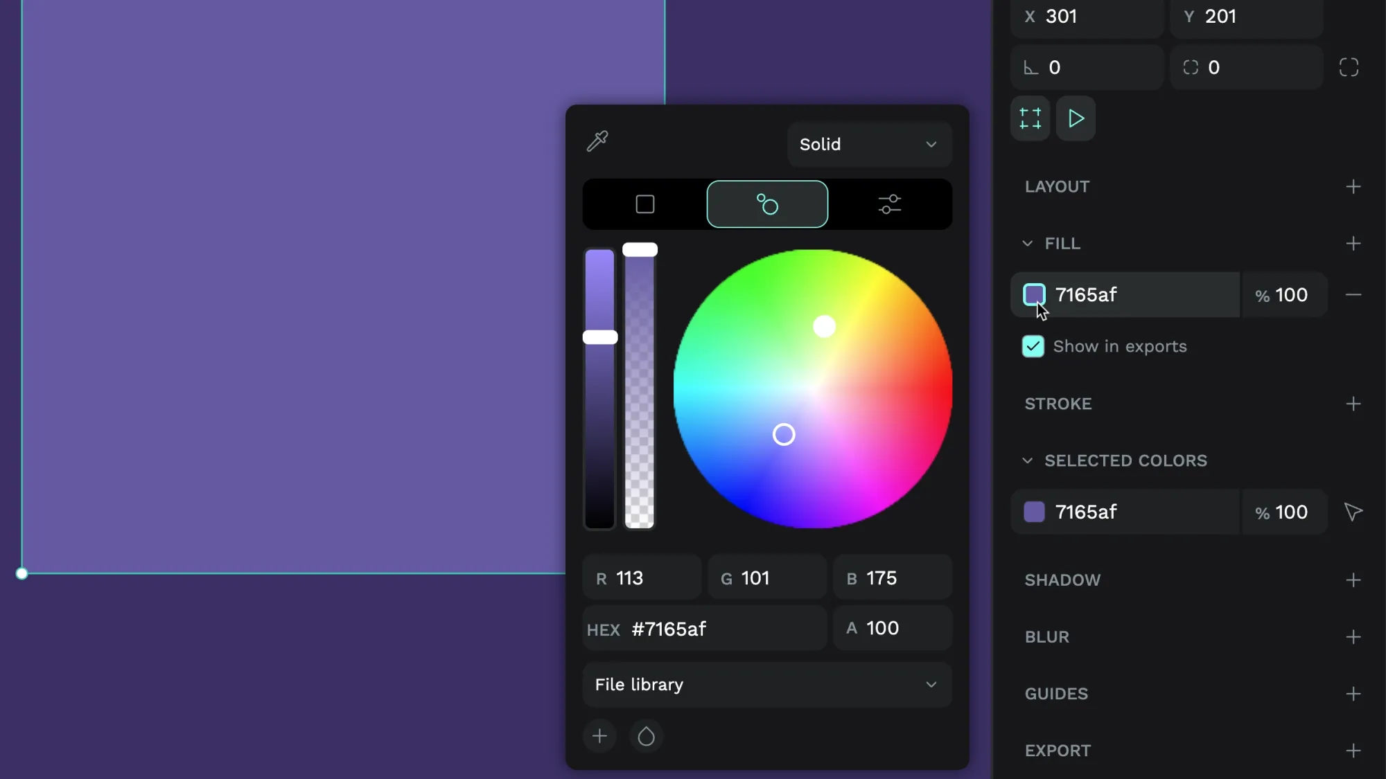
The brightness slider lets you choose between the brightest and darkest shade of the selected color, and the alpha slider controls the transparency of your fill or stroke color.
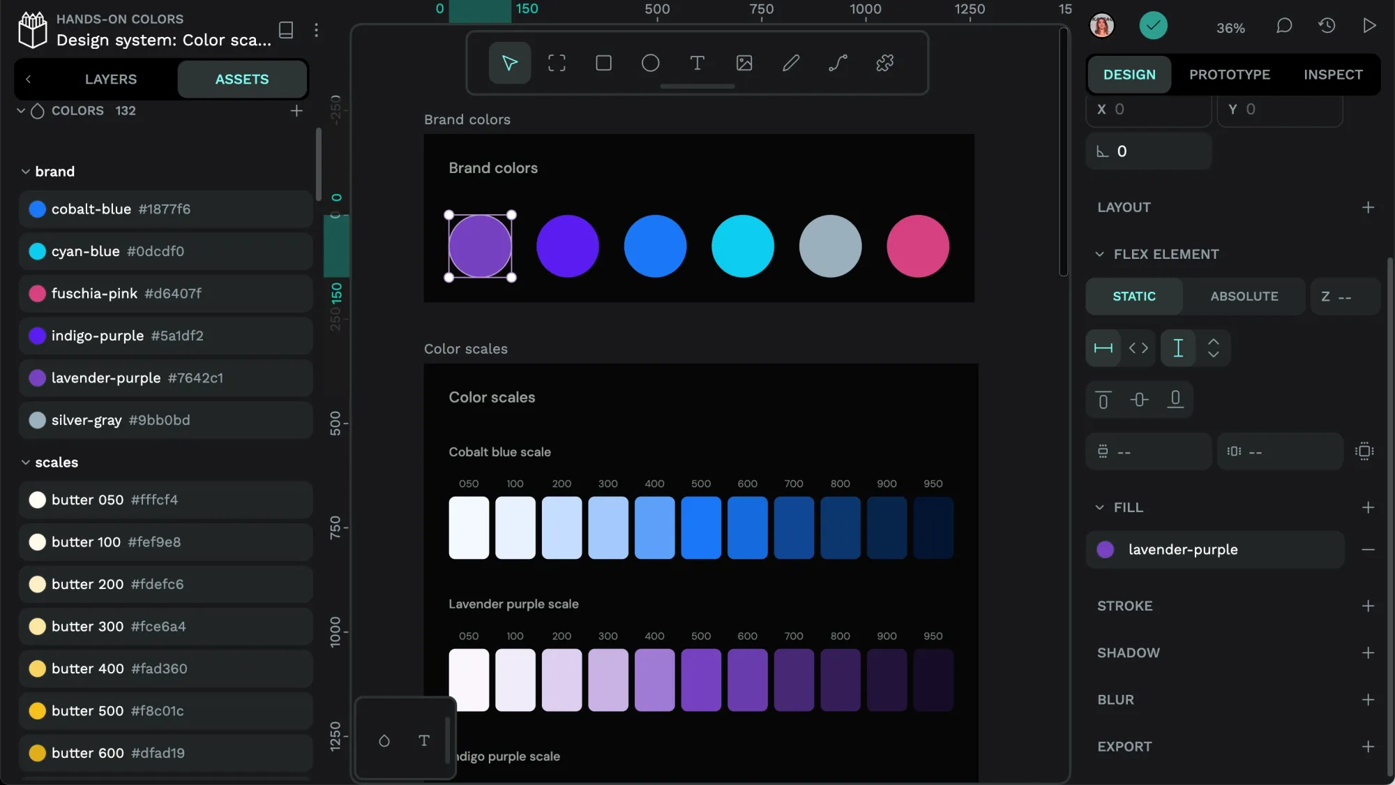
Save colors to your file’s local library
Reusing colors is a key function of a design system, but it’s also useful in simple UI design to keep color use consistent and save time when updating the color of multiple objects simultaneously.
You can save a color from the color picker:
- Select your chosen color’s fill or stroke swatch to open the color picker.
- Select the File Library in the color picker libraries menu.
- Use the + plus icon button to add the color to your local file library.
- In the Assets panel, under Local library colors, name your color.
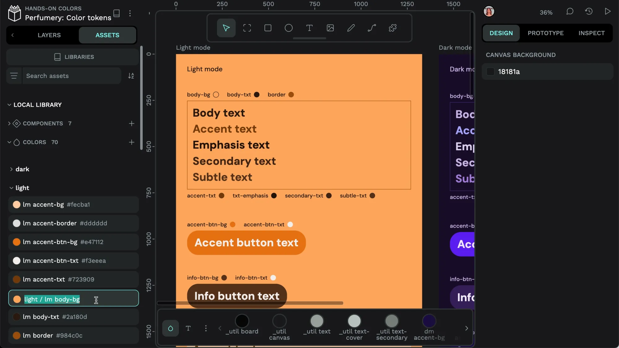
You can right-click a color in the Assets panel to rename, edit, or delete the color, as well as add it to a group.
Using the same named color for multiple objects saves you a lot of time if you want to change the color. Just edit the color from the Assets panel; it will be updated across all objects using that color. In the video above, I changed the dark mode body text color from light purple to white, and it updated across all the text using the dm body-txt color fill.
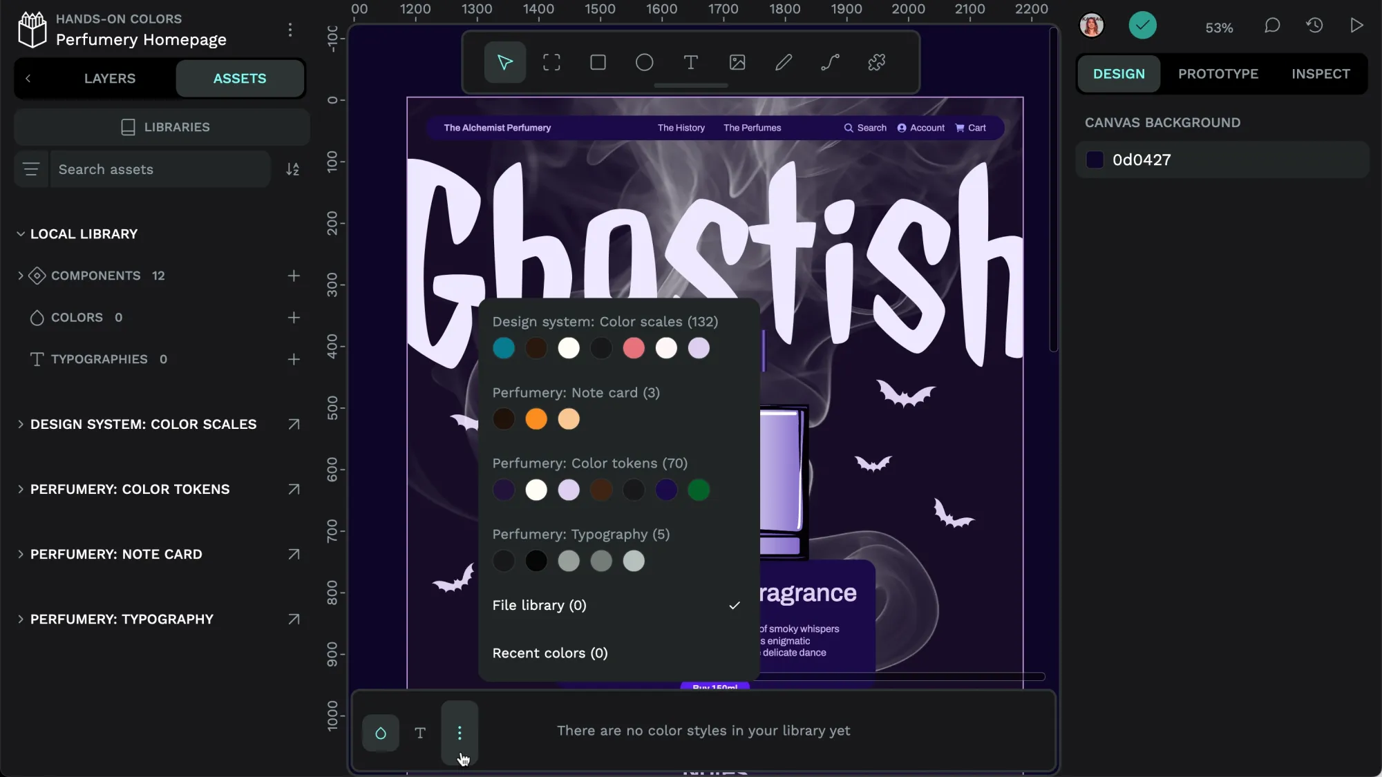
Using library colors
Once you’ve added a color, you can apply it to any fill or stroke. Library colors are accessible from the Assets tab, the color picker, or the color palette at the bottom of the workspace.
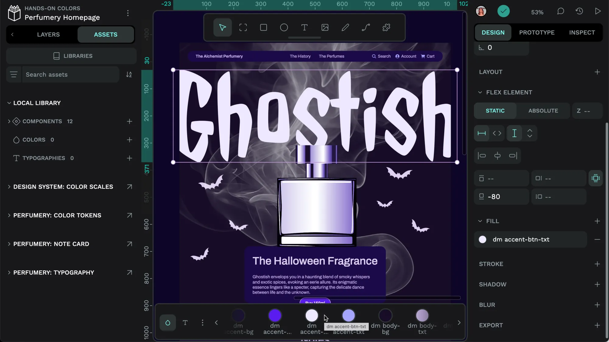
Hold down the alt key while picking the color from the palette to apply the color as a stroke.
Using colors from shared libraries
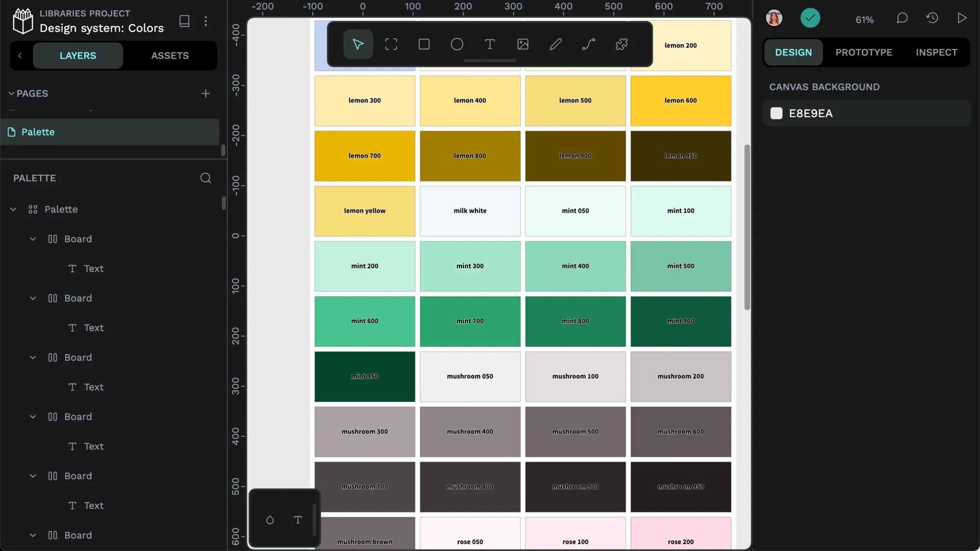
You can also connect an asset library of colors published and shared from another file. Shared libraries are great for sharing your team’s design system assets. In the example below, I use two different color libraries for my final design.
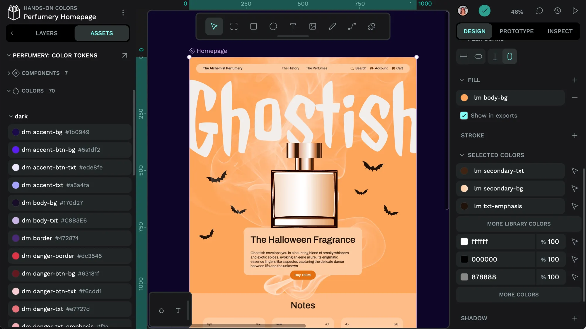
The file uses colors from the Color Scales library found in the Assets panel.
The 50 - 950 scale is a common way to organize color in web development frameworks.
How to connect a shared library
You can download shared libraries from Penpot’s template collection or make your own shared library for your team. Import the shared library file to your Penpot team, and then you can connect the library from the Assets panel:
- Open the Libraries panel.
- Find the library you want to use.
- Use the + plus icon button to connect the library to your file.
- You can find the colors from that library in the Assets panel, the color palette, or the color picker under the library name.
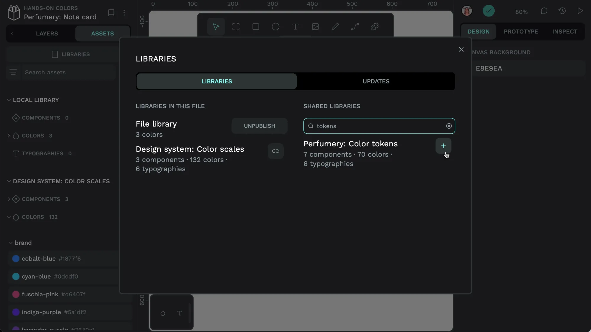
If you have connected multiple libraries to your file, you can switch between them in the color palette from the palette menu.
Publishing colors as a shared library
Your team is likely to have colors you want to use consistently across projects. These could be your brand colors, design system colors, or just a color palette you want to use for a new marketing campaign.
You can share these colors as a library with your Penpot team:
- Save the colors you want to share to your local file library.
- Go to the Libraries panel inside the Assets tab and use the Publish button to publish your library.
Colors and other assets shared in a library are only editable from the original library file, preventing your team (or future you!) from accidentally making changes to the library while working on another design. If you make an update to a library, you’ll receive a notification when you next edit a file that uses the library.
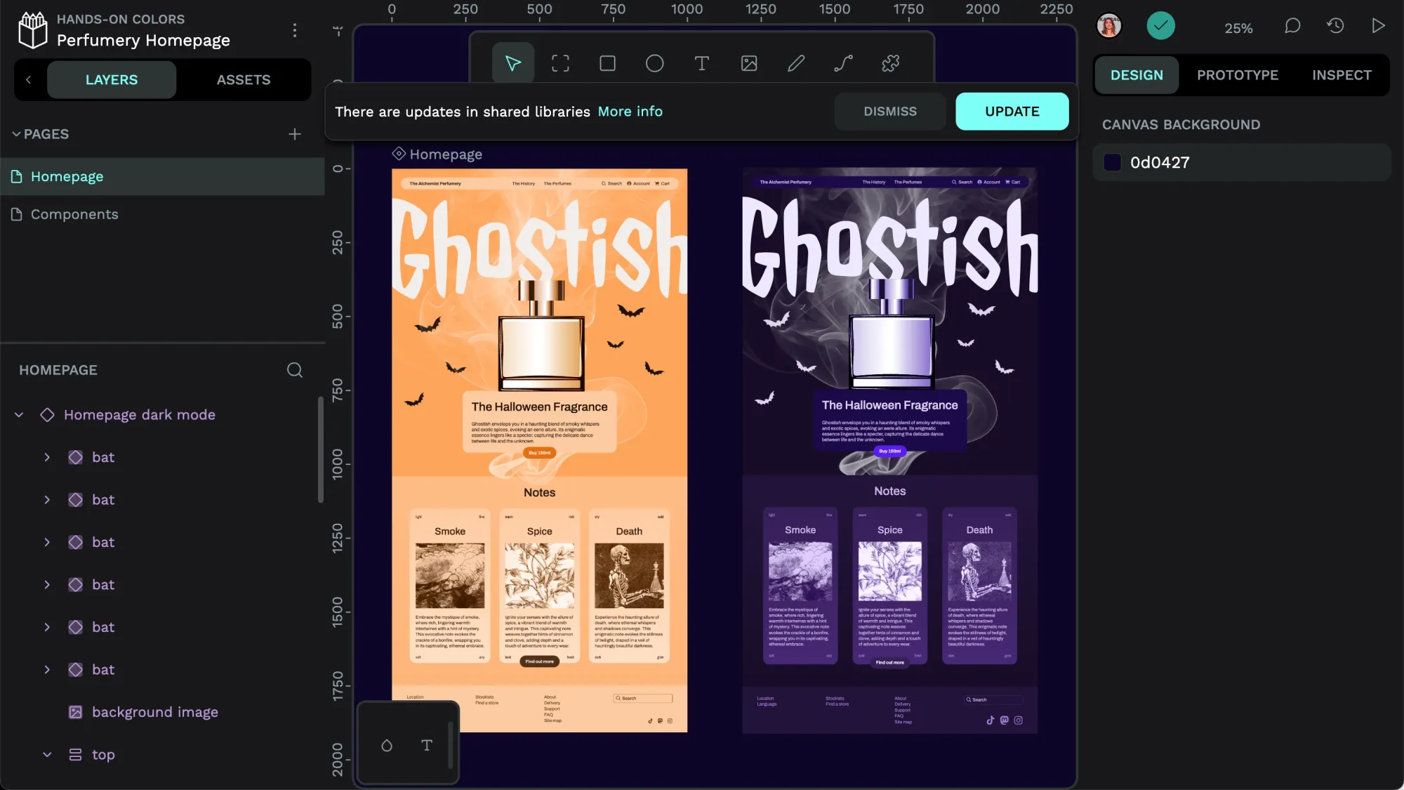
The more info section provides details on the specific changes that will be applied to your working file.
You can publish and share multiple libraries in your team and connect libraries to each other, referencing assets stored in other libraries. These are powerful tools for creating complex, interconnected design systems.
Penpot plugins for working with color
Penpot plugins are now available from the Penpot Hub. Two great plugins, the Contrast checker and Create palette from library plugins, already enhance your experience working with color.
Contrast checker
The Contrast checker plugin gives you the color contrast ratio between any two colors. The contrast is essential for assessing the readability of text color on a background color, and the plugin gives you information on how well your colors work for normal text, large text and graphics.
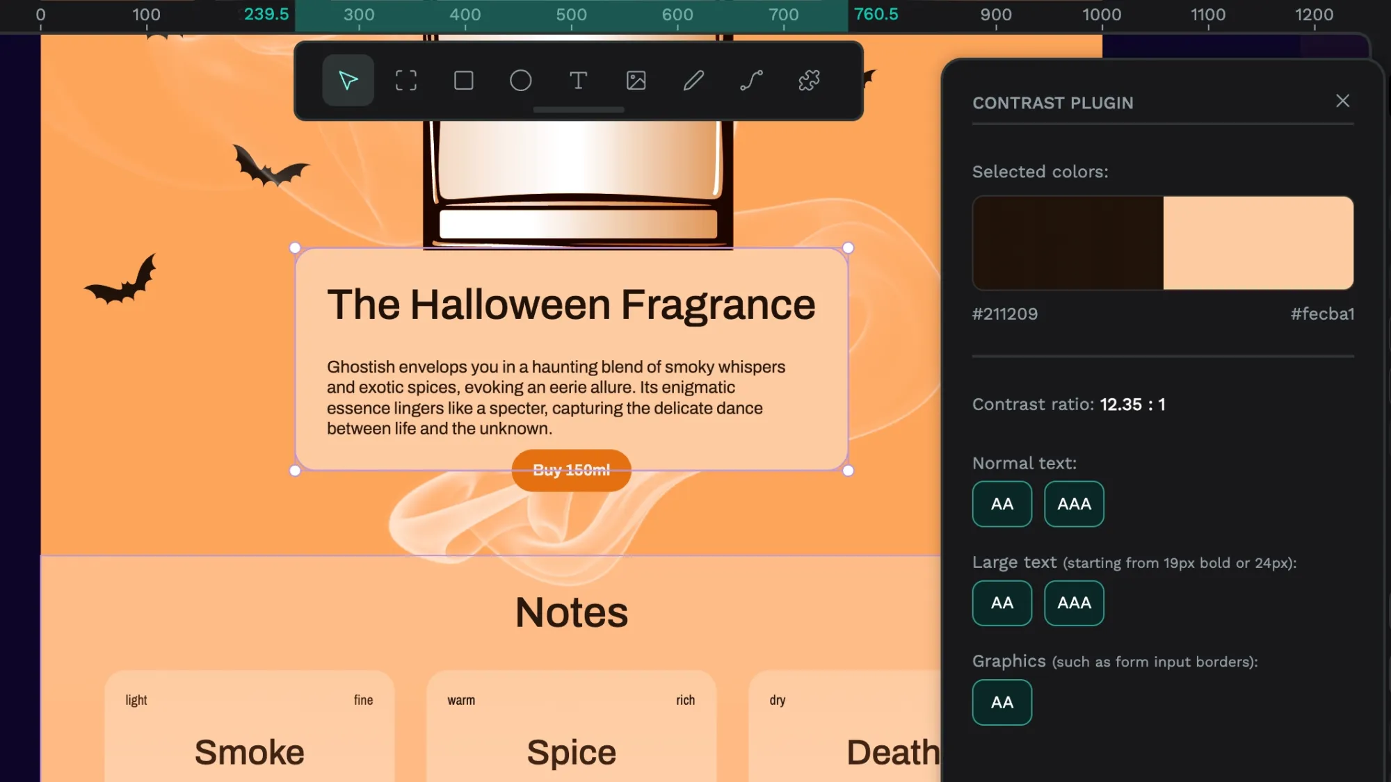
The background and text colors of the description box satisfy level AAA color contrast (the highest level of Web Content Accessibility Guidelines) for text and level AA (the second highest level) for graphics.
Create palette from library
The Create palette from library plugin takes all the colors in your Assets local library and renders them as labeled swatches on a board.
Read more about Penpot plugins, how to install plugins, and how to create your own plugins. You can sign up to use Penpot with your team for free.
Related Blogs
Check out our other blogs, from informative topic guides to tutorials on how to get the most out of Penpot.
 Laura Kalbag
 Laura Kalbag
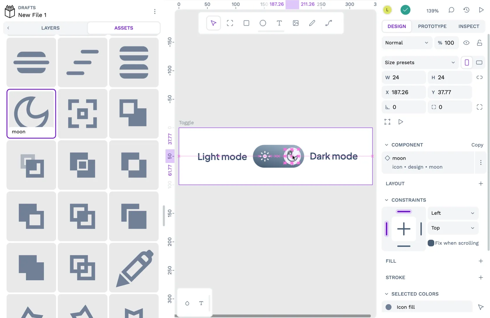 Laura Kalbag
 Paula Tienza