The best image format for every use case: A complete guide to using JPG, PNG, and more
Each image file type was created for a good reason, but it may not be the right reason for you. Because images can have different purposes, you’ll need to know your ultimate purpose in using an image before selecting the right type.

Images add information, context, and some visual excitement to your designs, but it’s not always apparent which image file types to rely on for the job. You may have even heard that some file types should never be used, but are these well-meaning advisors correct?
Each image file type was created for a good reason, but it may not be the right reason for you. Because images can have different purposes, you’ll need to know your ultimate purpose in using an image before selecting the right type.
By understanding each type of file, its advantages and disadvantages, and compatibility with your preferred software, you can pick the right image format for your existing design workflows and your end user. And you’ll still be able to convey your original vision for your project.
TL;DR: The main image file formats and what they’re good for
In web design, you’re most likely to encounter the following image types:
- JPEG (or JPG): Best for photos with complex color schemes
- PNG: Best for logos and images with text, or images with transparency
- SVG: Best for scalable and simple images, icons, and illustrations
- WebP: Best for high volumes of images displayed on one page
- GIF: Best for simple animations and social media
Another one you may come across is AVIF. It’s one of the newest image formats, and may not be supported on older devices.
Why do image file formats matter?
Each image file type has its own benefits and limitations. Designers and developers who understand these limitations can make better choices for their projects and ensure the best user experience possible.
For example, not every file format shows up on web browsers, limiting their use in web design (these include TIFF and BMP files). Other file types like PDF aren’t as widely used, as they are inaccessible to edit without proprietary software or the processes that support them.
To get the best balance between quality, accessibility, functionality, speed, and size you must understand the technical specs for each file format to determine if they can be used in your project.
When picking the best image format, consider the following:
- Can you reduce the file size while still having a high-quality image result?
- Will your image show up well on all devices and platforms?
- Do you need a transparent background so you can use it on any background color or pattern?
- Does your image require animation?
- Once created, will you need it to adjust to match the colors around it?
- How will the file impact loading times and site performance?
- How will you save, share, and compress your images? Do others without expensive or proprietary software need to use or edit the files?
There’s no best image format for all use cases, but some, like PNG and SVG, work well in most digital designs.
What are the two main image categories?
You’ve probably heard a lot about JPG, PNG, and even SVG, but these image file types (along with others) fall into two distinct categories.
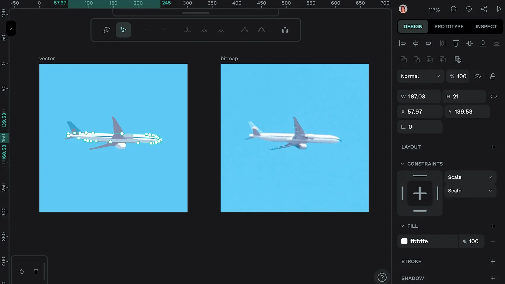
Vector files
Vector files are made up of intricate paths defined by mathematical formulas that appear as lines, points, and shapes. Designers like vectors because they can be scaled to any size without quality loss and have much smaller file sizes.
SVG, AI and EPS are all vector image file types. PDF can also be one if it’s created by a vector program, such as Penpot.
Raster files
Raster files are composed of tiny pixel grids with color information for each pixel. Some people call them “bitmap images.” As you scale them up, they lose resolution quality, but they work well for fine color detail and complex shading, like high-resolution photographs. Raster files start out much larger, but they can be compressed to be more storage-friendly.
JPEG, GIF, PNG, TIFF, and BMP, are the most common raster image file types. They can be manipulated by most image editing software and don’t require specialized tools.
5 best image file types and how to use them
So, what’s the best image file type? It depends on who you ask. There are unlimited ways to use images in your projects and applications — the best type for one project won’t measure up for another.
Here are the top image file types in digital projects today, with examples of when you’re most likely to use them.
1: JPEG
JPEG (or JPG) is the format created by the Joint Photographic Experts Group in 1992. It’s mainly used for photographs and applications where you want the most detailed color experience.

Pros:
- Highly compressible
- Smaller file sizes
- Used by many applications and easily viewed from any device
Cons:
- Quality diminishes when the file is compressed (known as “lossy” compression)
- Doesn’t support a transparent backgrounds
Best for: Emails, website images, photographs, social media, and promotional uses.
2: PNG
PNG stands for Portable Network Graphics and is the other most popular image format for everyday use by consumers and professionals. PNG files can be easily edited in most standard photo editing software, such as GIMP, making it an accessible file type for those without expensive tools.

Pros:
- No quality loss when compressed losslessly
- Supports transparent backgrounds
Cons:
- Larger file size
Best for: Images that require transparency, such as logos and screenshots with detailed text elements.
3: SVG
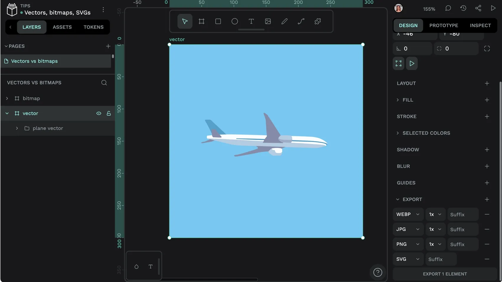
As the name suggests, Scalable Vector Graphics (SVG) is an image format that’s made for scaling without quality loss. It’s very popular for creating icons and decorative graphics for web page or app. It’s also a preferred file format when exporting elements from proprietary design software like Figma, Adobe Illustrator, or Sketch, as it can then be uploaded and edited with your choice of design tool, including Penpot.

Pros:
- Small file sizes for simple graphics
- Can be edited with text/code editors
Cons:
- Doesn’t work well with complex illustrations
Best for: Logos, icons, and simple illustrations in web applications.
4: WebP
WebP is a modern open source image format developed by Google that offers significant file size reduction while maintaining visual quality. It has achieved widespread browser support with global adoption reaching nearly 80% as of 2025, making it a viable option for most web projects without requiring fallback images.

Pros:
- Significantly smaller file sizes than traditional formats
- Supports transparency
- Supports both lossy and lossless compression in a single format
Cons:
- Some argue that properly compressed JPEG can match WebP’s size benefits in certain cases
- Newer formats like AVIF may offer additional compression benefits
Best for: Replacing large JPG, PNG, and static GIF images for better-optimized file sizes.
5: GIF
Graphics Interchange Format, or GIF, is the file type for the very simple animated images that often get shared on social media. There’s some argument about whether it’s pronounced with a soft or hard “G” sound, but most agree that they’ve helped liven up web layouts with how they easily communicate a feeling, idea, or meme :)

Pros:
- Support animated concepts that can’t easily be expressed with static images
- Small file sizes
- Widely supported across browsers, devices, and operating systems
Cons:
- Don’t work well for static images (low-quality when not moving)
- Limited to 256 colors
- Limited support for transparency where each pixel is either completely opaque or transparent
Best for: Social media memes and forum-type design formats with a more casual tone.
Tips for serving the best possible images
Designers regularly face the challenge of getting their images to appear just right without slowing down the loading time of web pages or apps. The form vs. function dilemma can be solved by following these best practices.
1: Choose the right format
Pick the best image file type from the start to eliminate the need to reformat or convert files. Basic rules include:
- Use JPEG for high-res photos
- Use PNG for images with transparent backgrounds or fine detail (including wireframes and prototypes)
- Use SVG for simple graphics and illustrations that need to scale
- Use WebP for fast-loading images on web platforms
2: Optimize file size
Large file sizes slow down web pages, so you’ll want to use the smallest file size possible to still get your vision across. Many designers opt for file sizes of no more than 200KB for web images. Compression tools and minifiers can automatically reduce the file size for you.
Generally speaking, you’ll want lossless compression for graphics since you’ll still want to see fine lines and text in your images. (Lossless image format preserves all data but may not get you a file size that is small enough.) Photographs that start out very high-res may be able to undergo lossy compression, where some of the data gets discarded, but they still display well on users’ screens.
3: Resize appropriately
It’s especially vital in responsive design to have images appear the right size on each device, screen, and browser type. This may require you to create several image versions in different sizes to not only test how they will look but also have them prepared for different scenarios.
For example, your logo may appear fine on the website but seem distorted on a social media header banner. To get the right results, play around with sizing and ensure you don’t lose quality or proportions from one user experience to the next.
Penpot can help you test your image in a variety of scenarios for a truly responsive design experience. This article on using flexible layout shows you how to get started.
4: Follow accessibility guidelines
Alt text is used to tell your readers what each image represents when a page is slow — or fails — to load. It also helps Blind and partially sighted people, and those who use assistive technology, to know what’s being displayed. It’s the right thing to do for users, and it can also help your web page get discovered.
An example of alt text when the image link is broken.
Another tip is to use appropriate alt text that accurately describes your image. Good alt text describes your images so that search engines and people with visual impairments know what your content is about.
Create your next project with Penpot
Because it can feel like a lot of work to keep image file types sorted and know what works best in all situations, it may be helpful to start your project with a tool like Penpot. It’s compatible with the above file types used by professionals and even offers simple resizing and scaling tools to help you visualize your project in a variety of ways.
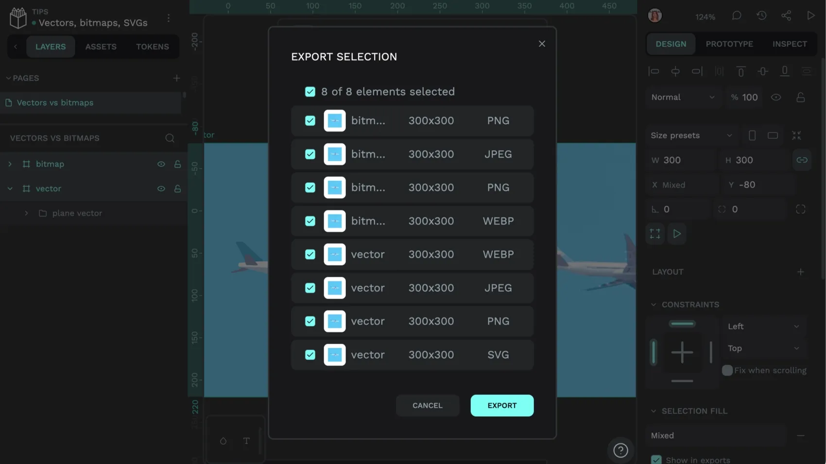
It’s also very easy to import your designs from other design tools, even if they were created with that tool’s proprietary image formats. Just export the file as the SVG file type from the original tool and import it into your Penpot file. You can access, edit, and build upon your existing work without missing a beat — and others from your team can easily collaborate with their best ideas and comments to help keep your project running smoothly and on time.
Get started with your free Penpot account here.
FAQs
How do I choose between JPG and PNG for web design?
JPG and PNG are two popular options with their own unique benefits. For example, JPG works well for photographs and complex color configurations when a smaller file size matters. PNG may be preferred for logos requiring a transparent background or when displaying crisp text like screenshots in images.
How do JPG and PNG affect website loading speeds?
JPG files are usually smaller than PNG, so they load faster. If many images are used on the same page layout, JPG may offer an improved user experience.
Is WebP a good image file type?
WebP generally offers better lossless compression than JPEG and PNG. WebP images support transparency. However, it’s designed specifically for the web and may not be suitable outside of that environment.
Which image formats does Penpot support?
You can export PNG, JPG, WEBP, SVG, and PDF images from Penpot. You can also import and use PNG, JPG, and WEBP images in your designs, as well as importing and editing SVG images.


