How to use component variants to scale your design system
This article explores how you can use component variants to simplify, scale, and future-proof your design system, helping you design more efficiently as your projects grow.


Design decisions for a small website or simple app may not seem too overwhelming at first. But what happens when that site or app grows to include hundreds or even thousands of choices for font, color, and spacing?
If you don’t design your system carefully, you could end up with a library of rarely used components that get inconsistently applied across projects. Or worse, designers start out using your design system but then detach and change components to better fit their needs.
Component variants help you expand upon your basic components, preventing you from having to come up with and code a uniquely separate component each time. Component variants can also reduce clutter and cognitive load for designers working with your design system.
This article explores how you can use component variants to simplify, scale, and future-proof your design system, helping you design more efficiently as your projects grow.
What are component variants?
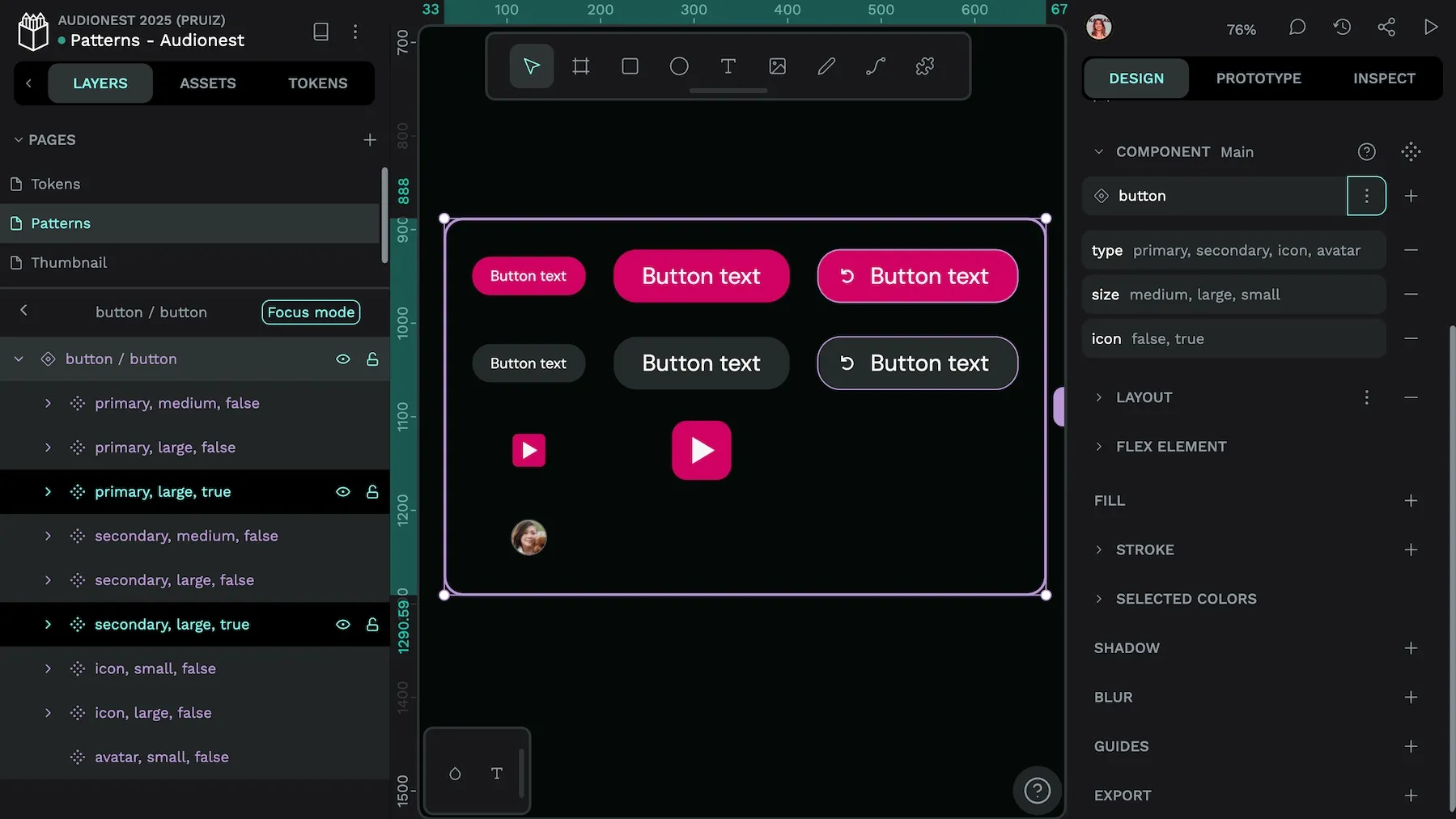
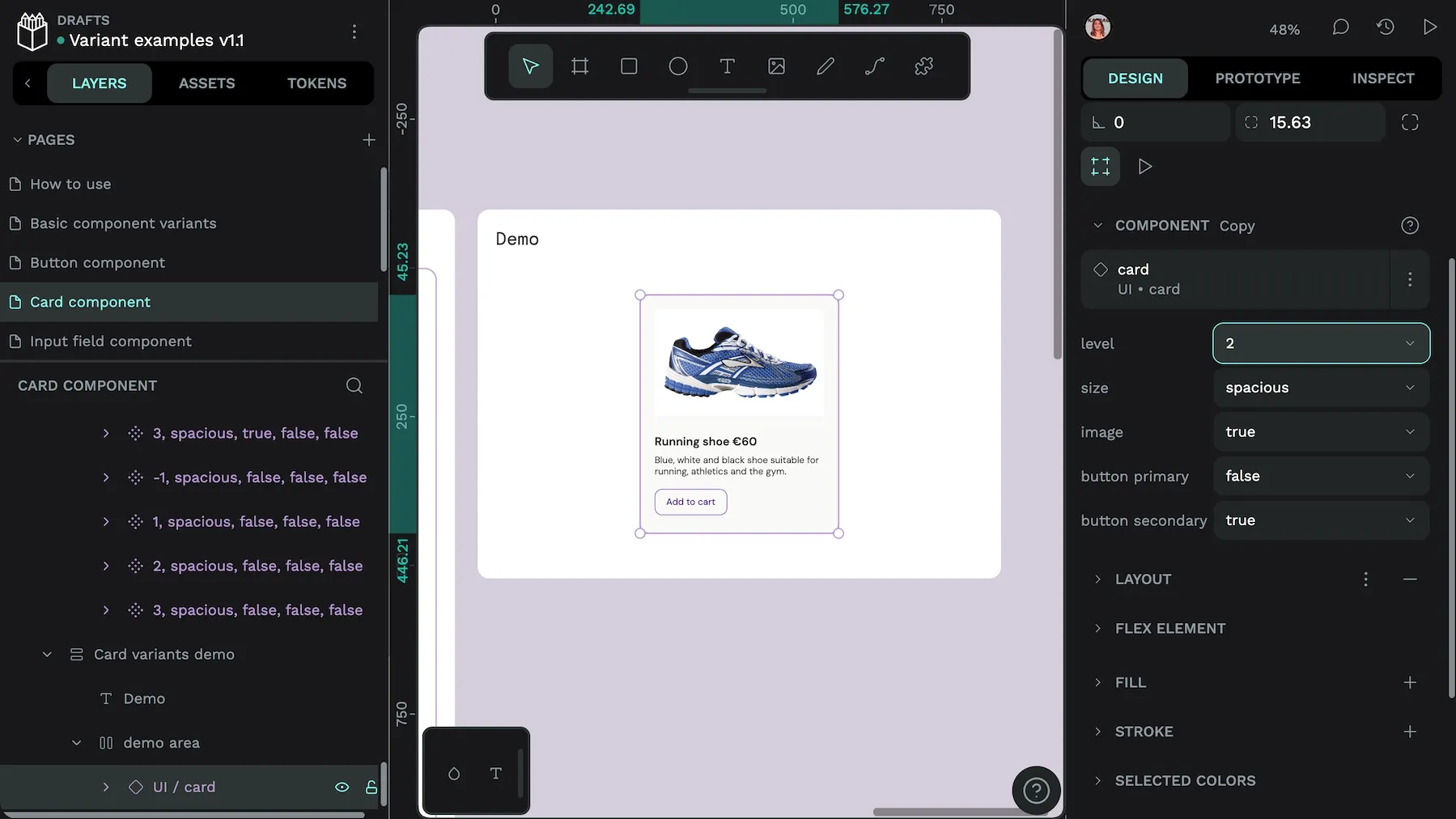
A UI component is a repeatable design pattern that can be easily reused across your designs. Common components include simple patterns like buttons, toggles, or form inputs. You can also create components from more complex design patterns like navigation menus, cards, or data tables. Component variants are structured versions of a component you can use to manage different options for your design pattern.
A button, for example, might have alternate variants for its primary and secondary styles, with each of these having a small or large size version, and each of those varying for default, hover, and active states.
Instead of creating a separate component for each of these dozens of designs, you can organize them as variants within your design system using properties and values. With these variants in your system, you can easily reuse them again in different places without having to create them from scratch each time.
Where are component variants used?
You may have heard of the term “component variants” when using or talking about Figma, a design tool that popularized the concept. But you can use variants in other tools too. Component variants aren’t tool-specific, teams can use them across platforms for web development, mobile applications, and more. Any design or development platform that uses components can benefit from using component variants.
Why component variants matter for scalable design
For a design feature to be truly scalable, it must support growth without becoming too complicated in the process. Component variants follow the basic principles of a design system, serving as a source of truth across all applications of the component. When teams use them properly, variants can help with managing complexity, maintenance overhead, team coordination, and future-proofing. These can all become tricky issues when your design system is growing rapidly.
Manage complexity
Variants reduce the need to create new components for every design variation. When teams add new states, sizes, or styles, they can use variants as part of manageable property-based systems.
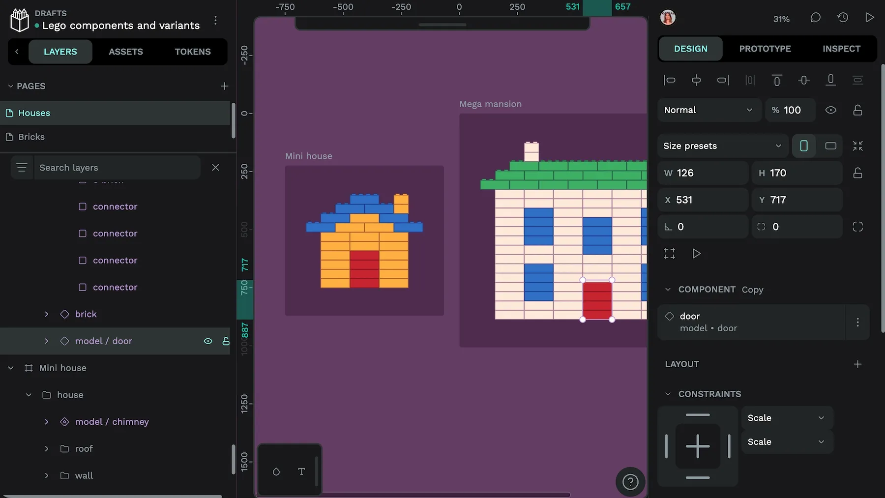
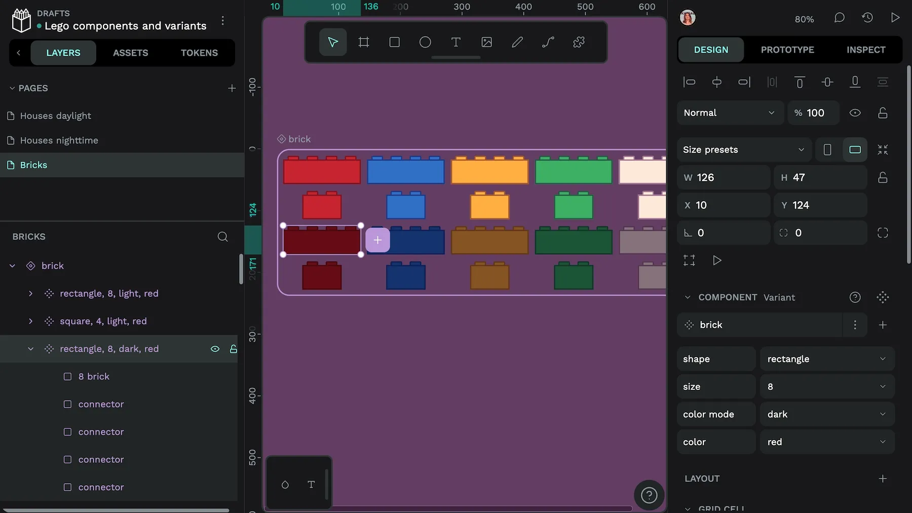
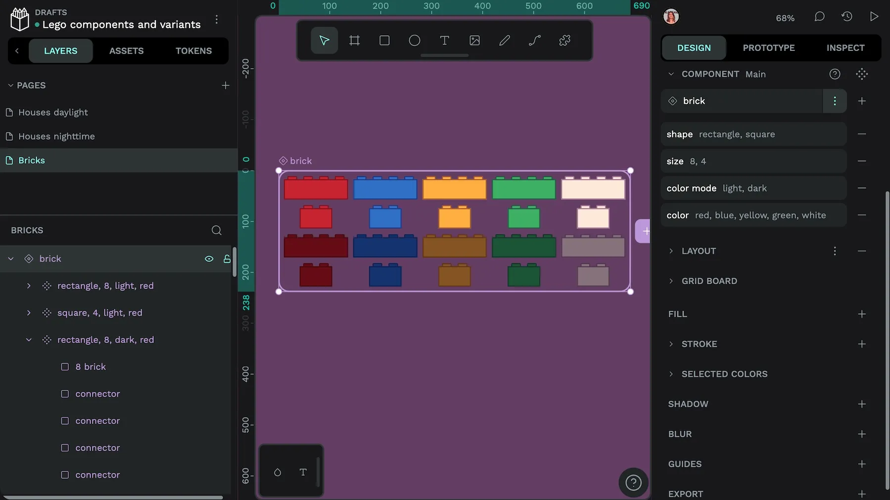
Think of it like Lego bricks. You can use the eight-unit red rectangle block to build a door for a mini-sized house. You can also use this same eight-unit red rectangle block to build a door for of a mega-mansion. The block has the same purpose whether you use it in a complex build or a simple one. You don’t need to go out and find new blocks for the more complex build—that just adds more clutter to your block collection.
Complexity can quickly become a problem in use cases like responsive design, where designers often need a slightly different version of a component for different user viewport sizes, operating systems, and devices. Component variants can help support all the different options needed to create a good user experience.
Maintenance efficiency
Components help keep design decisions centralized, so designers can update all component instances with a single change. And this can be carried through to component variants. For example, a simple spacing adjustment for several component variants only needs one small change instead of a manual update to every instance of that component. As your design system grows and changes, it’s easier to keep components consistent.
Going back to our example of the Lego brick, what if you wanted to swap out all the red, eight-unit blocks for blue ones? Instead of manually replacing them one by one, you could use a component variant and swap out the variant. It would then update from red to blue in all instances automatically.
Switching the door’s brick components to use the blue component variant.
Team coordination
As teams grow, more people can become involved in the implementation of new design changes. Variants create a shared vocabulary between designers and developers, whether there are two or twenty of each. Knowing that buttons have purpose (primary, secondary, tertiary) and size (small, medium, large), for example, ensures everyone is on the same page, and uses the same terminology, when discussing component variations. It makes the designer developer workflow (and handoffs, if you must) cleaner and more straight-forward.
Whether you’re talking Lego bricks or form submission buttons, when you say a variant name, everyone knows what you’re talking about.
Future-proofing
Variants can make it easy to add additional options to your design patterns months or even years later. Take dark mode, for example. If you design components using variants, you can easily add dark mode variants to each component later without recreating everything from scratch, or overcomplicating your existing design libraries.
We don’t know what tomorrow’s dark mode will be, so components and variants help you adapt quickly to new requirements, whatever they might look like.
Once you have a new variant, you can update multiple components to the same new variant.
How to structure component variants in your design system
Design systems are most effective when they’re well-organized with clearly and consistently-named components, including component variants. Consider both the design intent and the development implementation for any variant to help you name it appropriately and group it with similar items.
Try using these best practices to avoid confusion and make it easier to build upon your system over time.
Name based on purpose.
Use descriptive, meaningful names (“semantic names”) that describe how a variant should be used, rather than how it looks. For example, you might name a variant something like “size: small” or “state: hover” instead of “button: blue” or “button: home page.” This way, you will know at a glance what the button does and how it should be used, even after changing its location or component properties like color or border radius.
Property hierarchy
Keep properties organized in a way that feels logical according to common design approaches and how the user will interact. Start with the most important properties and end with the least.
An example of ranking could be:
- Fundamental properties: type (button) or purpose (primary)
- Size (small, large)
- State (hover, active, focus)
- Optional modifiers (high density, low density)
Grouping strategies
Categorize related component variants to make them easy to find and access. For example, you could group all button variants together based on user action like action: submit, action: cancel, action: delete.
These groupings work because they don’t tie you to a specific visual style. If you change your brand colors at some point, the components won’t need to be renamed or reorganized. Your design system is flexible and maintainable, even as your brand and design evolve.
Component variant examples
These are just a few of the components you can create and organize using variants:
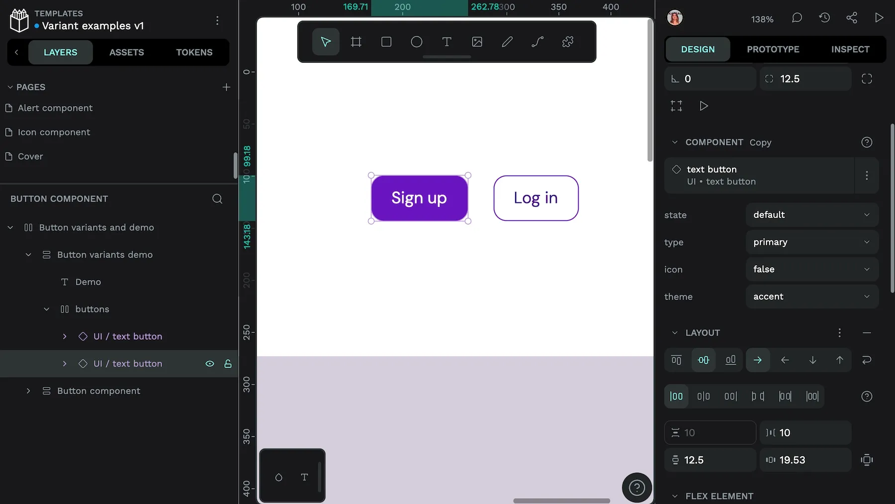
- Buttons: In addition to structuring around purpose, size, and state, trying using true/false properties for icons and icon positioning. Organizing buttons like this allows you to handle more UI scenarios without becoming too unwieldy.
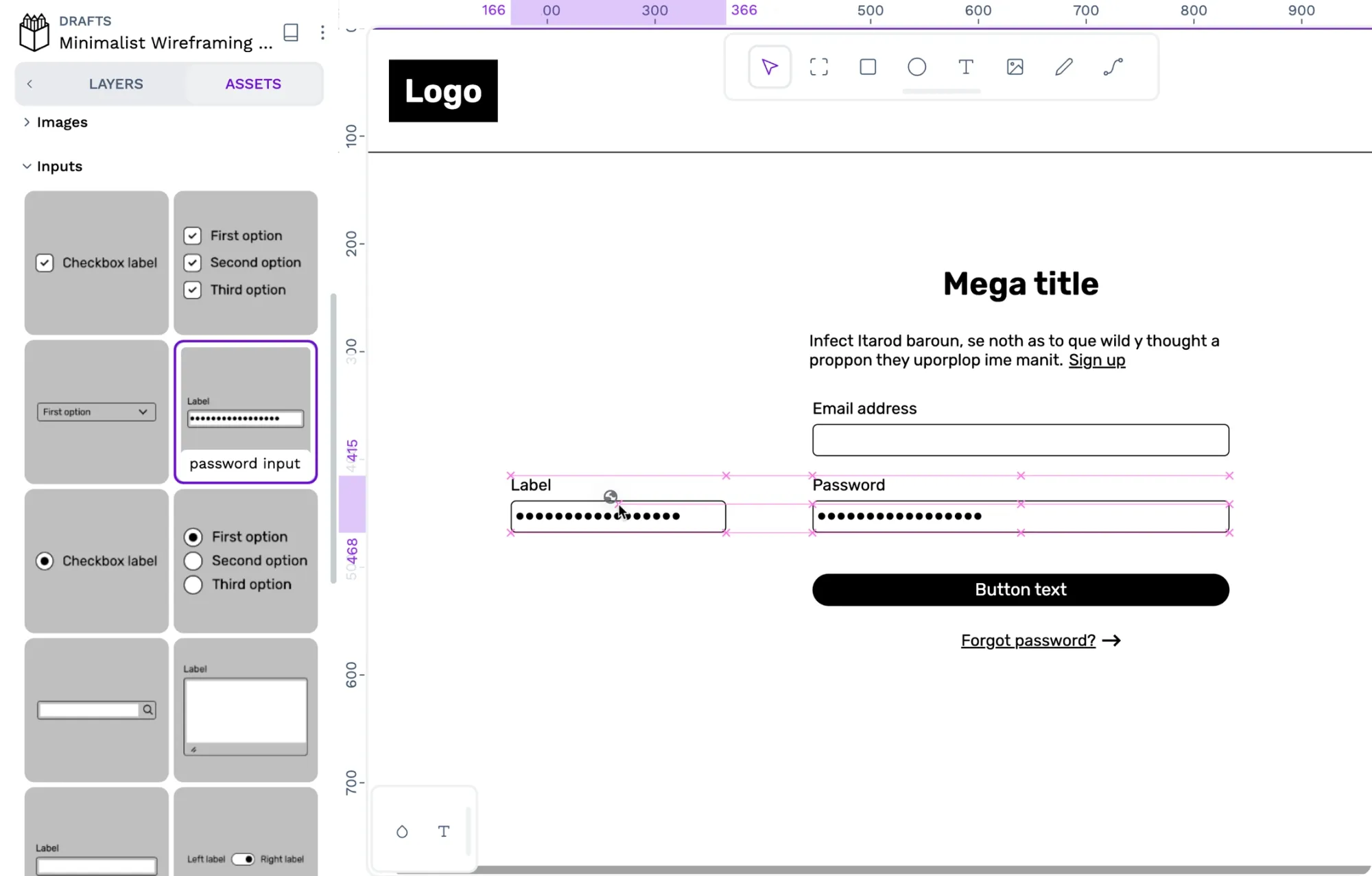
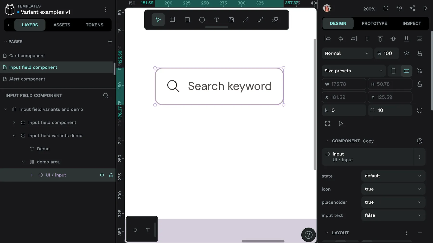
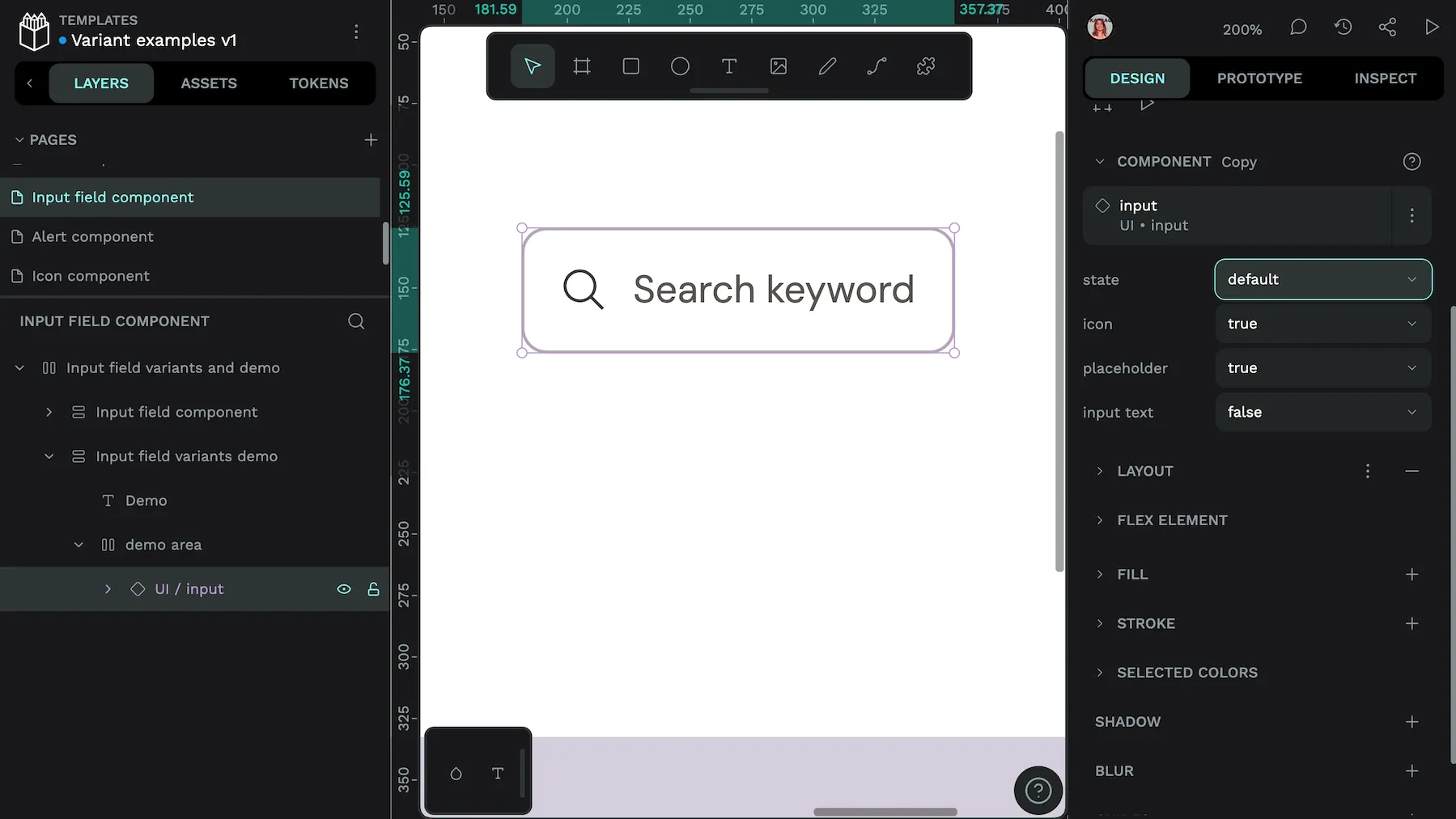
- Form inputs: Organize input variants by type (text, email, number), as well as size, state, and optional properties like error text. This structure can help accommodate the edge cases in your form requirements but also enforces consistency.
- Cards: Card variants could include type (interactive, featured), size (compact, expanded), and state. Consider nesting variants to separate content structure from the visual style and keep the number of total variants manageable.
Variant best practices: Document and minimize
Good documentation for your well-organized variants will help your design system scale. For example:
- Give examples of each variant being used in context.
- List examples of “dos” and “don’ts” to help guide proper implementation.
- Link documentation to code implementation.
- Schedule regular audits to keep component libraries relevant and accurate.
- Check variants before and after a big branding shift or update.
- Track each variant’s use so you can distinguish popular configurations from those you never use.
- Cull unnecessary variants to keep your library fresh.
Finally, avoid creating more variants than you need. While it’s tempting to provide a new variant for every possible combination, you may not need nearly as many as you initially thought.
Having too many variants can make the user experience inconsistent and encourage arbitrary visual choices that don’t support your overall design and brand values. For example, you might want to use nested components or swap component instances instead of creating a dozen new variants for each icon.
Implementing variants in your design system
Naming and organizing variants are just the start of using them wisely. Know the possible use cases and how they work to improve your workflows and get more done in less time. These are just some examples.
Variant styling with design tokens
If you name your variants semantically, it makes sense to take the extra step and connect them to your design tokens to enable more styling capabilities. For example, name your button component variants by purpose (primary) or action (hover) instead of color or style names. Instead of naming it something like “button-blue” or “button-ghost,” you could use “button-primary” or “button-secondary-active.” Then, when you’re ready to switch themes or support dark mode, you can utilize the corresponding design token.
To put this strategy into practice:
- Make token hierarchies that correspond to your variant needs.
- Use alias tokens for core color, spacing, and typography decisions.
- Map variant properties to these semantic tokens to keep design decisions centralized and maintainable.
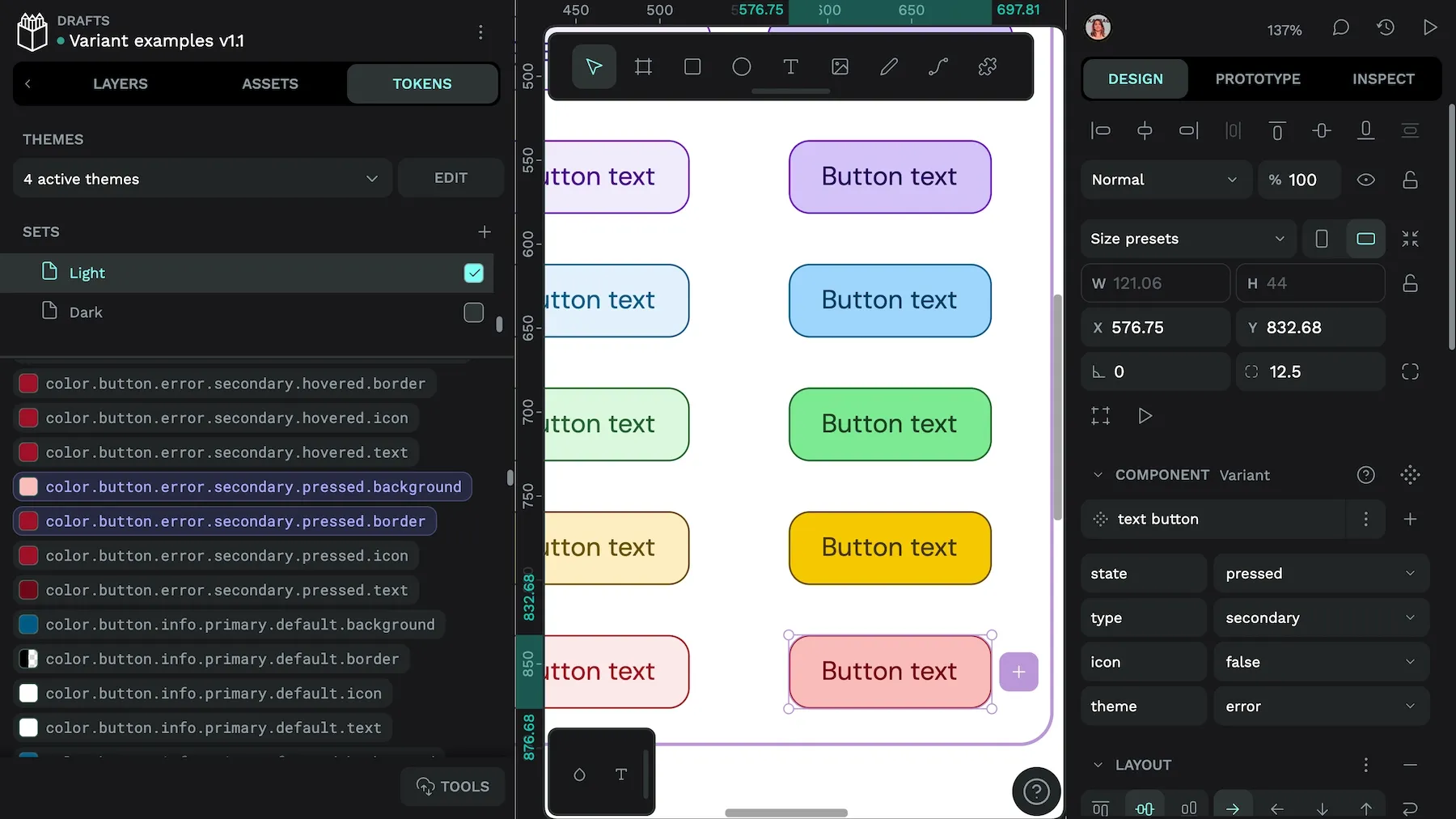
Update any new tokens with supporting documentation so both designers and developers know the proper way to use them.
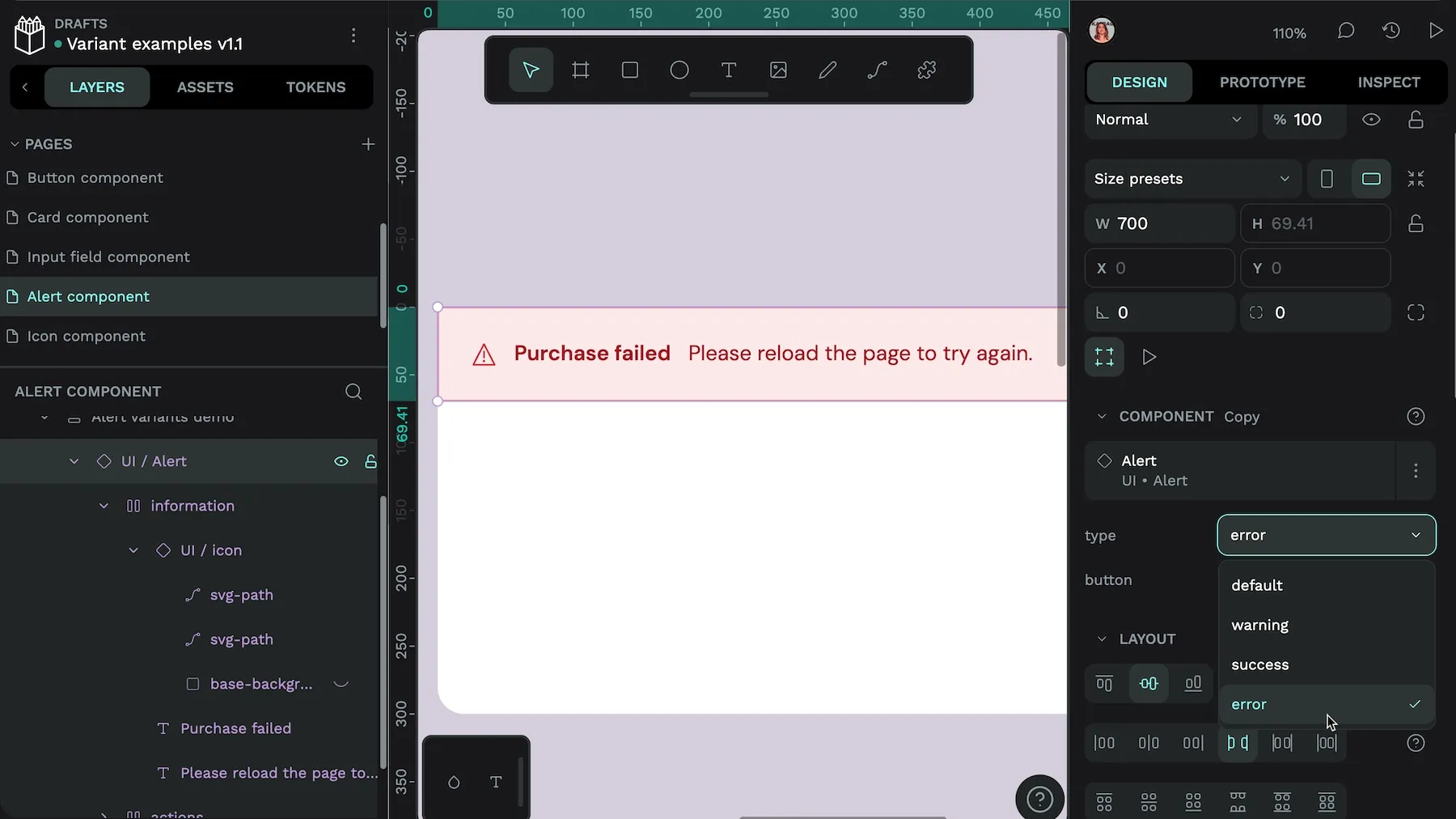
State-driven behavioral variants
We’ve already touched on state variants, such as buttons that change when users hover over them. You can take this one step further with a comprehensive system that covers all aspects of interactions for each component a user may engage with. Include variants like loading, error, and success states.
Responsive size and layout variants
Create variants that help your component display appropriately on different screen sizes and layout contexts, such as a massive monitor versus a small smartphone. You’ll want them to scale appropriately across the most common OS systems, browsers, and viewports, as well as different contexts (like horizontal or vertical).
Do this by defining property scales that work across all components and create consistent spacing or typography progressions that maintain the best proportional relationships. Before adding a variant to your design system, test it across multiple devices to ensure it’s truly usable.
Accessibility-focused variants
Your component variants should support the accessibility guidelines provided by the WC3 (World Wide Web Consortium) and our accessible design checklist by default, including keyboard navigation, sufficient color contrast, proper focus indicators, and screen reader compatibility.
But you can also use variants for user preferences, alternate states, and enhanced accessibility options including:
- High contrast mode: Include variants with extra high color contrast between text and background for users with low vision.
- Text alternatives: Create a specific variant specifying alt text for users who cannot see images.
- Reduced motion: Design variants for how components should be displayed when animations and other motions are disabled.
Be sure to test your variants with real users to make sure they’re truly accessible as intended.
Get design token and variant support on Penpot
Penpot’s collaborative nature makes it an ideal place to create, store, and share all the parts of your design system, including component variants. Your team can use the platform to create component libraries along with annotations to document their recommended use.

Penpot also natively supports design tokens for shared colors, typography, spacing, and more. You can also export designs as CSS code for easier handoff and development. At any point in the design process, team members can see the latest updates to components and use the commenting features to add real-time feedback for other team members.
Penpot’s open-source platform also means that your teams own their work, whether your design system contains a hundred variants or a thousand. You’ll never be locked into a subscription agreement to access your designs. What you make is yours and yours alone.
Ready to get started? Sign up today and see how Penpot can help you with your next design system upgrade.
Component variant FAQs
Why should I use variants instead of separate components?
Using variants makes it easier for teams using your components to choose the best option for their design, as well as making it easier to maintain and update your design system.
How do I organize and name my component variants?
Organize variants by grouping similar components and using clear, descriptive property names such as “State,” “Size,” or “Purpose.” Consistent naming and logical grouping make it easier for teams to find and use the right variant and helps align design and development.
Can I use variants for every possible component difference?
Not every difference needs to be a variant. Avoid creating variants for every minor change, as this creates unmanageable complexity. Focus on meaningful distinctions like state or size, and use instance swapping or nested components for highly variable content, such as icons or images.
Learn more about Penpot’s component variants
We have more blogs about Penpot and many other design and code-related topics. Here’s a few examples of articles and tutorials to help you learn more about component variants.
 Laura Kalbag
 Laura Kalbag
 Laura Kalbag
 Laura Kalbag