How Penpot makes design and developer collaboration seamless
Penpot bridges the design-development gap by eliminating the translation layer that creates friction in traditional workflows.

Design and development teams work best when they move together. The smoother the flow from design files to working code, the faster teams can deliver features without losing quality. But the truth is, this stage (sometimes called handoff) rarely feels smooth.
Oftentimes, developers receive abstract design specs that don’t quite map to real code and spend hours trying to reverse-engineer layouts, spacing, and interactions. Meanwhile, designers watch their vision get lost during implementations. The result is delays, confusion, and lots of unnecessary back-and-forth.
Watch our practical demo on how design tokens improve the designer-developer workflow.
Penpot takes a different approach. With Penpot, a developer doesn’t just get a pretty mockup and a list of specs. Instead, they can click into a design and immediately see the CSS, Grid, or Flexbox rules that match how they’ll actually build it. Assets export cleanly, naming is consistent, and the structure feels familiar.
If you’re looking to improve your design-to-development experience, Penpot might work better for your team than what you're currently using. In this article, we’ll explore Penpot’s features and how they reduce friction, and provide tips for developers.
What does designer-developer collaboration look like in Penpot?
In many tools, the workflow feels like being handed a PDF spec sheet. When designers ship files and developers try to interpret them, a long chat thread quickly follows.: “What’s the exact padding here?” “Is this button supposed to be reusable?” “This grid doesn’t match our existing codebase.”
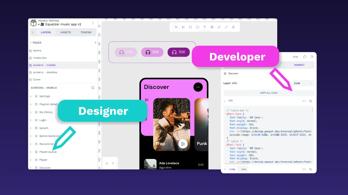
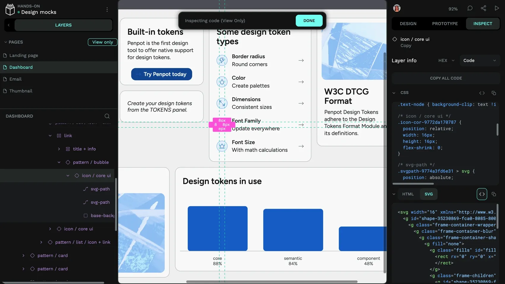
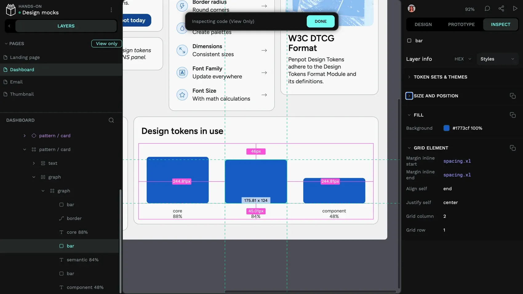
With Penpot, developers can use the Inspect panel to work directly with the information behind a design. When they click into the Inspect panel, they can see:
- The CSS rules for a container (
display: flex; justify-content: space-between;) - Semantic design token names for colors, typography, spacing, and more (like
color.background.brand), if the team has set them up - Export-ready SVGs instead of screenshots of icons
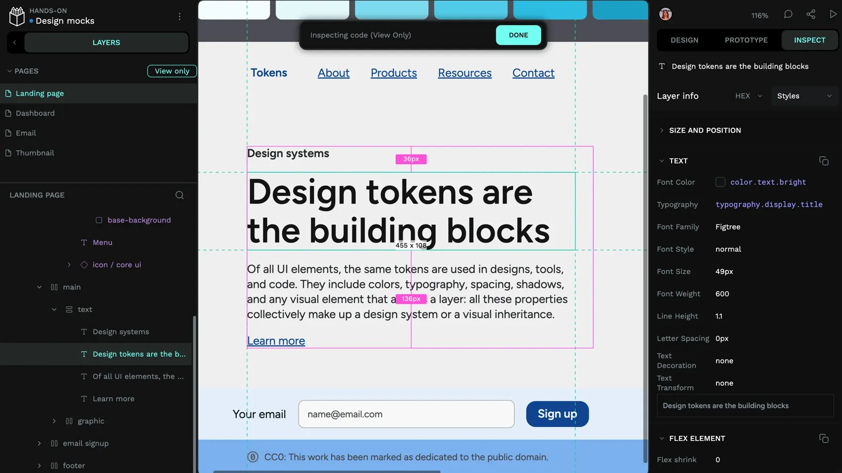
Instead of rewriting values or guessing how something should behave in code, developers can work with ready-to-use HTML, CSS, SVG, and exported assets, then adapt them in their project as needed. This helps designers and developers stay aligned around the same design files and code snippets, reducing discrepancies between the design and the implemented product.
What Penpot features help eliminate developer workflow friction?
Penpot was built using SVG, HTML, and CSS from day one. This foundation means every design element maps directly to web technologies without requiring translation layers or interpretation. Here are the core Penpot features that help improve the developer workflow.
Export-ready assets and design tokens
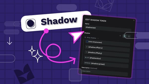
In Penpot, colors don't have to stay as raw hex values. By creating tokens, teams can tie a button color to a semantic name like color.background.brand that maps to a shared vocabulary between design and code. Using design tokens connects design concepts directly to technical implementation. Instead of discussing hex codes or padding, teams talk about color.background.surface or spacing.large. When a developer later converts these tokens to CSS custom properties using a transformation tool like Style Dictionary, they see var(--color-background-surface) in their stylesheets and understand exactly which design decision it references and why it's used.
Penpot supports exporting tokens as JSON in the W3C DTCG format, which can then be transformed into CSS variables, SCSS, or other platform-specific formats. With some setup, it can also be integrated into CI/CD pipelines to help automate deployment workflows. When a designer updates a primary color token in Penpot, they export the updated tokens as JSON, and development teams use tools like Style Dictionary to convert them into the CSS variables their build process consumes.
Create multiple color themes and breakpoints with tokens in one developer-friendly design.
Penpot also supports token sets and themes. Instead of hunting through codebases to implement dark mode or white-label variations, teams create token sets that swap out entirely. SaaS platforms can use this for client-specific branding where each client gets their own token set without touching implementation code. The same approach works for seasonal campaigns, A/B testing variations, or complete rebrands.
Comprehensive inspect panel with developer-focused details
The inspect panel provides measurements, spacing relationships, and style properties with direct copy functionality. Developers see distances between elements, CSS styles, and markup code for both HTML and SVG output.
The interface includes a view-only mode so developers can explore design files without accidentally modifying them. This encourages direct collaboration by giving developers direct access to design details in context. Instead of interpreting static specs or screenshots on their own, they can verify measurements with designers, experiment with styles, and resolve questions faster.
Open formats that fit naturally into your workflow
Penpot supports exporting files in an open format that includes SVG and JSON, and individual assets can be exported as SVG files that work in many other tools.
Because the underlying technologies are open, developers have more options for integrating designs into their workflows. Teams can use Penpot's plugins API and webhooks to connect with other tools, parse exported tokens with custom scripts, or integrate design outputs into build pipelines. There are already plugins for exporting to Tailwind HTML, Tailwind Styles, and assigning semantic HTML to your design elements.
Self-hosted Penpot instances give organizations full control over their own design environment.
How does Penpot improve the developer workflow experience?
When design tools speak the same language as development tools, projects move faster, quality improves, and team dynamics are more collaborative. Here are four ways Penpot improves the developer workflow experience.
1. Reduces interpretation and guesswork
When developers see actual CSS properties instead of abstract design specifications, implementation becomes straightforward. Questions like “Is this Flexbox or Grid?” or “What's the exact spacing calculation?” disappear because the inspect panel shows definitive CSS that matches the designer's intent.
2. Creates alignment between design and development tools
Traditional design tools create a disconnect between what designers can build and what's technically implementable. Penpot designs use the same layout systems that developers work with daily, which creates alignment between design and development teams.
When a designer builds with CSS Grid in Penpot, the developer gets actual CSS Grid properties to implement. For example, if a designer creates a three-column layout in Penpot using CSS Grid, the developer doesn’t just see three boxes — they see the underlying CSS rules (grid-template-columns: 1fr 1fr 1fr). This keeps design intent and implementation perfectly aligned.
3. Builds shared understanding through common terminology
Penpot creates a shared vocabulary between designers and developers. When both teams work with CSS concepts like flex-wrap, grid-area, or align-items, communication becomes more precise. Designers understand technical constraints better, and developers understand design intentions more clearly.
While there’s a small learning curve in picking up CSS terms, most designers find it intuitive once they see how these properties directly shape layouts. But this is where collaboration pays off: Developers can quickly explain how properties like flex-wrap or align-items behave, and designers can apply that knowledge visually in Penpot. Over time, both sides build fluency in a shared language.
4. Works with your existing development infrastructure
Penpot integrates into development workflows through its API, webhooks, and exported design tokens. Because everything is expressed in standard web formats, teams can parse exported tokens with custom scripts, automate token extraction, or integrate design outputs into CI/CD pipelines with some setup.
This flexibility means design artifacts become part of your broader development infrastructure rather than living in an isolated silo. Penpot also supports self-hosting, so teams that need full control over their design toolchain can deploy it on their own infrastructure.
Tips to reduce friction for developers with Penpot
Getting the most out of Penpot requires some intentional choices about how your team works together. These practices help maximize the benefits.
Standardize naming conventions that work in both design and code
Establish clear naming patterns for components, tokens, and layers that translate directly to CSS classes and variables.
Educate your team on CSS layouts
Even if designers aren’t familiar with CSS, Penpot’s visual tools help them work with grids and flex layouts intuitively. Developers benefit because the designs still translate into real, standards-based code rather than custom abstractions. Over time, designers naturally pick up the terminology, which makes collaboration smoother and reduces translation work for developers.
Keep files organized with clear implementation status
Create a project organization structure that developers can navigate confidently. In Penpot, you can organize files into projects (e.g., exploration, in-progress, production) and use page names or labels to indicate status. Designers can also add annotations to components — these are displayed in Inspect mode and help developers understand design intent and responsive behavior. This way, developers always know which designs are final and ready for implementation.
Encourage direct collaboration in design files
The inspect panel contains more accurate information than static specifications. Train development teams to explore Penpot files directly instead of relying only on exported documents or screenshots. This builds familiarity and reduces miscommunication.
Designers should also invite developers into the design process early — sharing work-in-progress files, walking through layout decisions, naming layers clearly, and documenting design decisions in context through annotations.
Get your designers and developers the design platform they need
Penpot bridges the design-development gap by eliminating the translation layer that creates friction in traditional workflows. Teams move faster because they work with shared technologies instead of parallel systems that need constant synchronization.
Beyond solving design-to-code workflow issues, Penpot offers web-based collaboration, design system management with native design tokens, and freedom from vendor lock-in. It's built on open standards, runs in any browser, supports self-hosting, and integrates with modern development workflows through its API, Penpot MCP server, and standard export formats.
Most importantly, Penpot respects both design creativity and technical reality. Designers get flexible, expressive visual tools that don't compromise their process. Developers get outputs that feel natural to implement because they're written in the same HTML, CSS, and SVG they already work with.
The result is faster, more accurate implementation and stronger collaboration between teams who finally speak the same technical language.
Ready to eliminate design-development friction? Get started with Penpot for free and experience seamless design and development collaboration.
Related Blogs
Want to learn more about Penpot for teams? Here are more articles:
 Laura Kalbag
 Paula Tienza
 Yamila Moreno
 Paula Tienza
 Carolina Alves Portugal