Design tokens for designers: A practical guide
Design tokens bring together design and development teams with a single, unified language for expressing color, fonts, sizing, and more.

From the first ideas to the beta version to the final product, creating a design for a website or app involves multiple team members working together at different stages. Teams need to use the same language, and have access to the most current design decisions, as they improve on each iteration. This means teams need to track and manage numerous design choices in an organized way.
Design tokens serve as placeholders for multiple design decisions. They keep these decisions bundled, standardized, and stored for easy use later. They also bring together design and development teams with a single, unified language for expressing color, fonts, sizing, and more. When team members reference a token name, everyone understands exactly which design property they’re discussing.
Let’s explore why design tokens are a valuable tool and how to integrate them into your workflow.
What are design tokens (and why should designers care)?
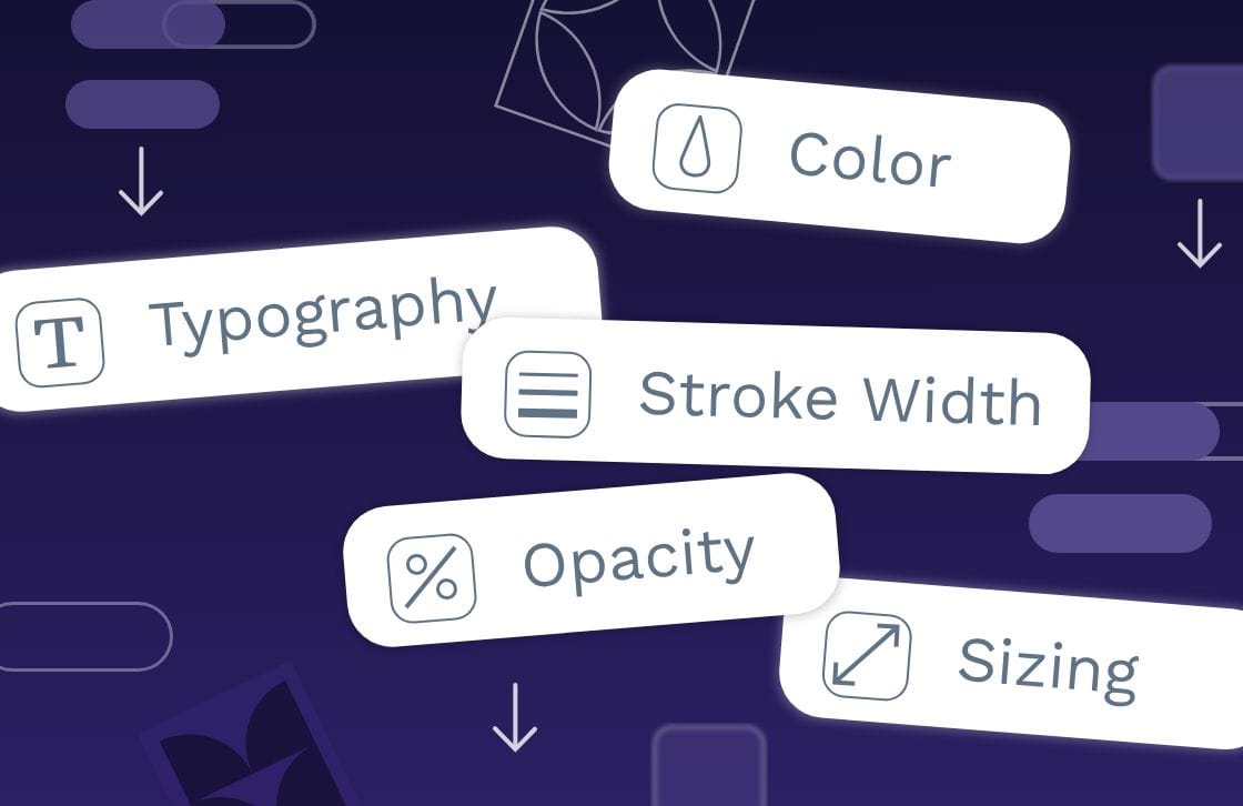
Design tokens are a fundamental part of a design system, with each token standing in for a design property such as color, spacing, or font style. They work by standardizing these values (color hex code, for example) with a name. Designers and developers can reference the token name to apply the predefined design property.
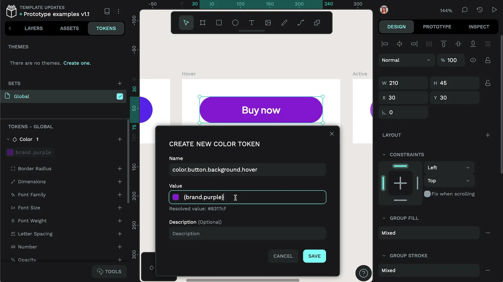
Let’s take the example of a design token for a web page. In this case, you might want to use the same background color for all buttons when the user hovers over them. You choose the color, then create the token in a tool like Penpot. You can name it to reflect the token’s purpose, such as color.button.background.hover.
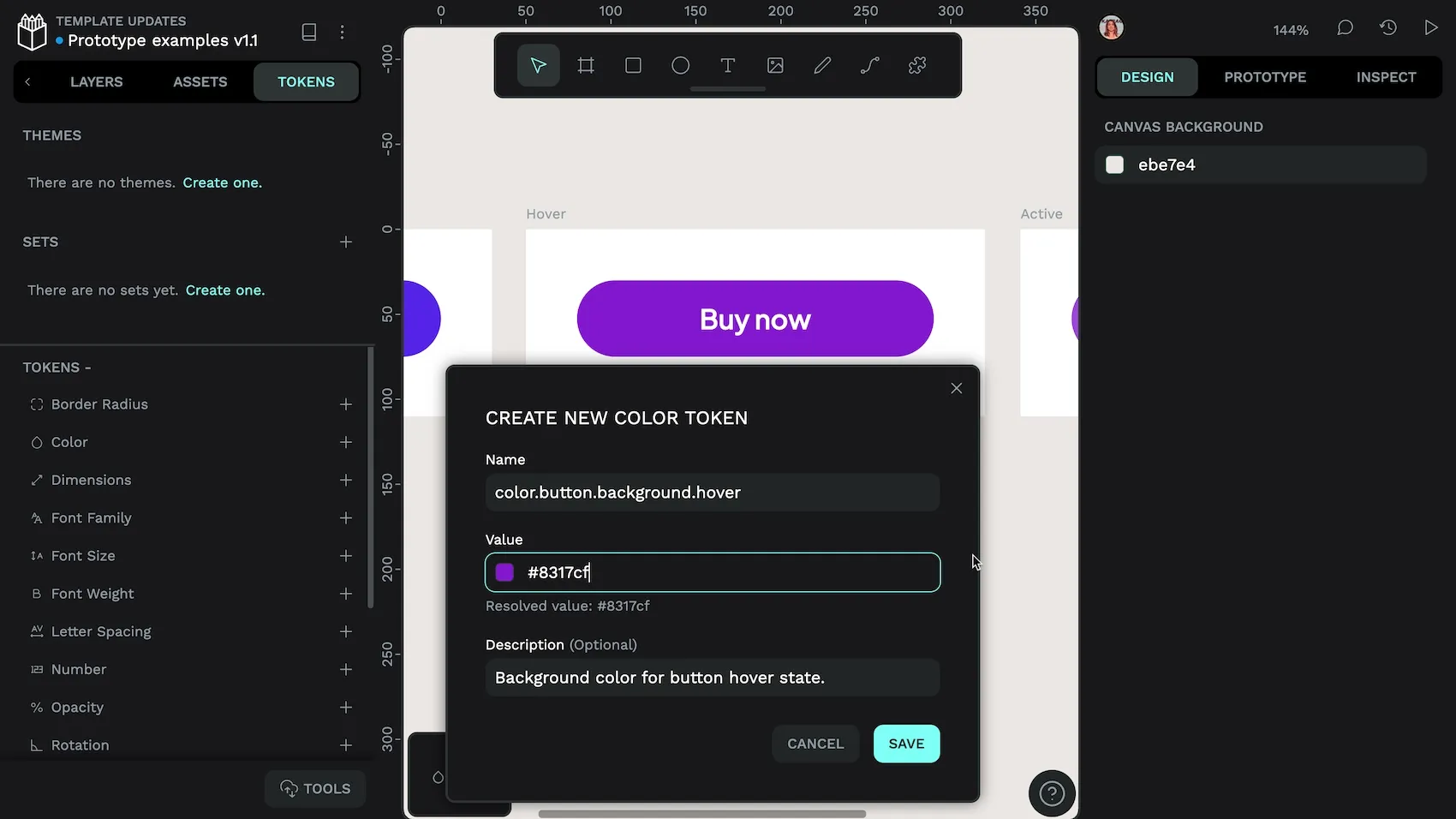
On the development side, design tokens are typically stored in a JSON file, which provides flexibility and ease of transformation across different platforms. For example, a design token for your button background hover color might be represented in JSON as follows:
{
  "color": {
    "button.background.hover": "#8317cf"
  }
}
Then, when it’s time to build your app or website, you can integrate the token code directly into your product.
Design tokens eliminate redundant tasks, allowing designers to focus on creativity rather than repetitive adjustments. In the button.background.hover instance, instead of going back to a list of recent colors to use for every button.background.hover scenario, you can simply use the design token.
How design tokens improve your design workflow
Design tokens minimize repetitive revisions, reducing back-and-forth between design and development. Here are four benefits to your creative process:
Design tokens are consistent
Designers might describe colors as “royal blue” or “baby blue” and understand exactly which shade they mean. It may not be as clear for other designers or team members, or those coding the design choices into the final product. Design tokens remove any guesswork and ensure the same shade of blue is used across all user experiences. Tokens also prevent accidental changes. For example, a button may start with a specific shade of blue. As you recreate this button on new pages, you might accidentally use a different shade, whether from an inaccurate color picker selection or just copying the wrong blue.
Users might not notice a slight color variation right away, but over time, it detracts from the brand identity and consistent experience users expect. Design tokens create a plug-and-play approach where every instance of the same token provides the same design result.
Design tokens are scalable
Products may start out simple enough, but as you add more features or versions, the design decisions multiply significantly. A color palette may begin with a dozen hues but can expand to hundreds without proper documentation. Over time, you could find yourself managing too many hex codes without clear documentation of when to use each.
Design tokens grow with you and even simplify the relationships between design values, as one token can reference another. Instead of trying to remember that the title text color should match the brand color, you can simply use the design token for that choice. It reduces the cognitive load required for managing a range of different themes, sizes, and states.
Design tokens are efficient
What happens when you want to change the size of the navigation links on every single page of your website design? You could go in and adjust them one by one. Or, you could incorporate design tokens from the start, so you only have to adjust the token for that particular navigation link. Making it larger in the token makes it larger everywhere. It prevents the need to make hundreds of manual changes and ensures adjustments happen the right way every time.
The same process works for development. When you’ve updated your design token, the new navigation link size can be updated quickly across the whole codebase.
Design tokens help teams collaborate
When designers talk to team mates about their design choices, design tokens ensure they’re talking about the same things. By referencing color.button.background.hover, all parties know what’s being discussed, resulting in fewer errors or misunderstandings. This can significantly speed up work timelines and keep projects under budget.
It also reduces friction between teams that are already stretched thin. Instead of asking for yet another change from the design team on a single button or page, you can request changes in the token—something developers will also appreciate!
Common design tokens that every designer should use
Design tokens can be used for many design choices, including these most common types:
Color tokens
Color tokens are design tokens that define the color palette used in a design system. They replace hard-coded color values (like hex codes) with named values, making it easier to manage colors across different platforms.
How to use: Ensure consistency in branding by applying the same colors across all elements of a design. Use a color.primary token for buttons, headers, and other key visual elements and a color.secondary token for meta text and subheadings. When it’s time to update colors across all experiences, you only have to switch out each token once.
Best practice: Use descriptive names for tokens so you always know what each token stands for, and avoid duplicating colors where possible.
Typography tokens
Typography tokens define text-related properties, such as font family, size, weight, line height, and letter spacing. They combine multiple properties into one token or “composite token.”
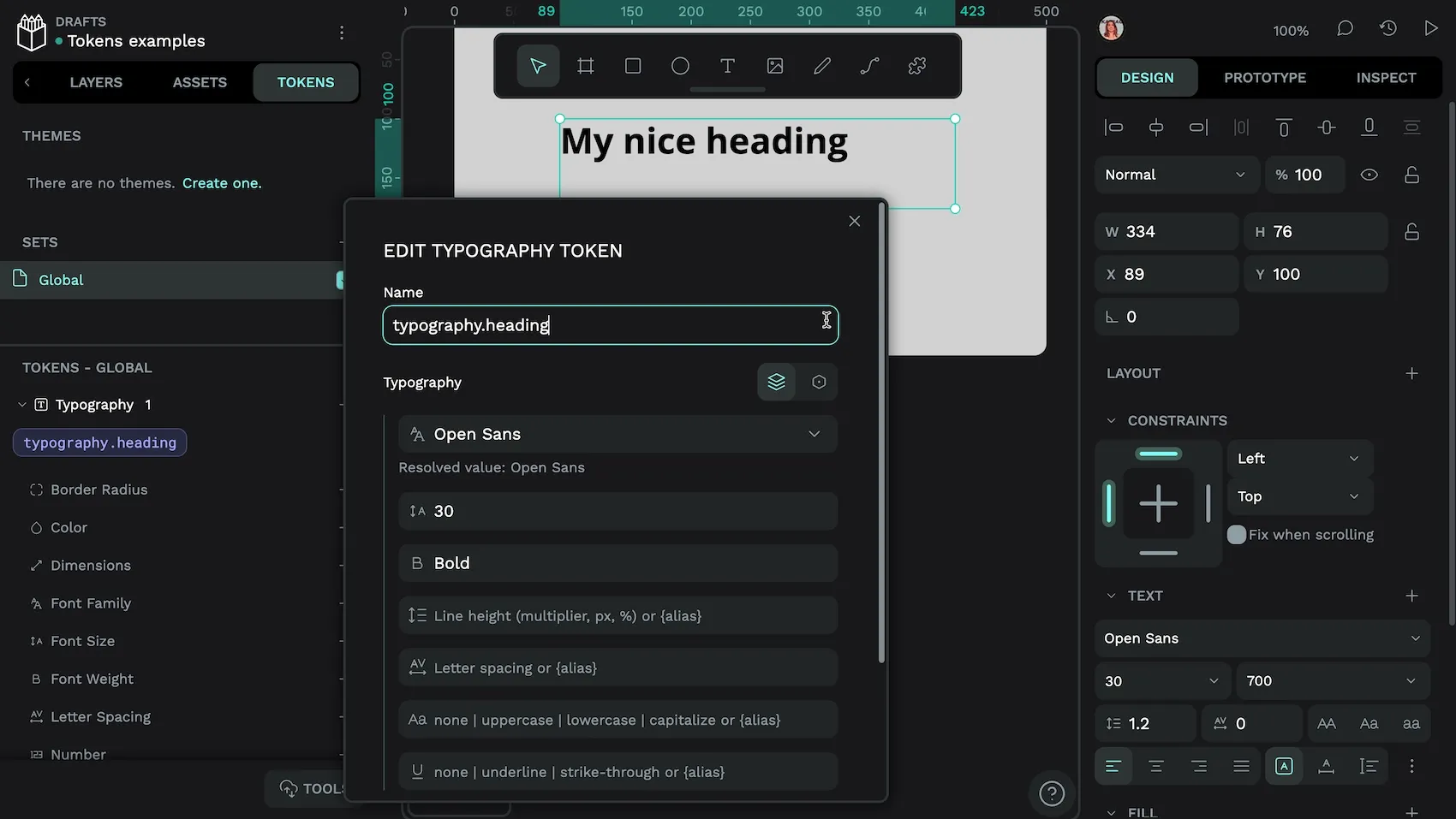
How to use: Design consistent typography across your design system, such as with your headings. A specific heading token might include the combination of the Open Sans font family, 30px size (or equivalent), and a bold weight. Each time you want to use this heading style, you’ve got this combination ready and available.
Best practice: Define multiple design decisions and include them in a single token to simplify headings and make them easier to maintain.
Spacing tokens
Spacing tokens regulate the gaps between UI elements for a cohesive layout. They help create a consistent visual hierarchy and user experience.
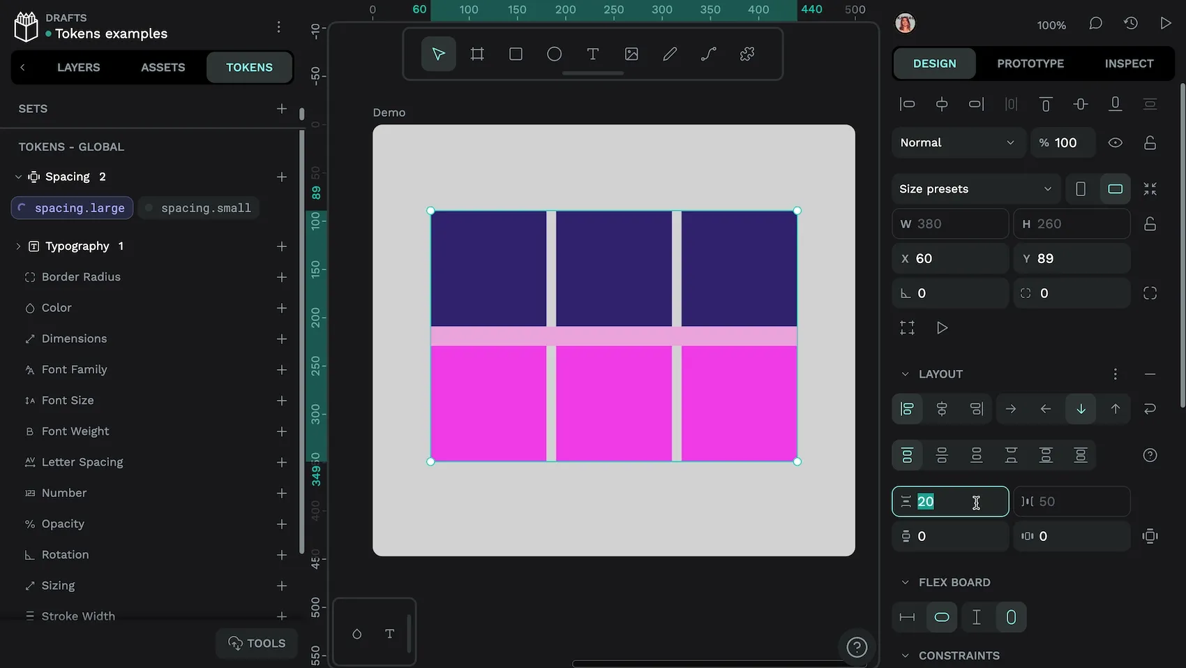
spacing.large token as applied to a flex row gap in Penpot.How to use: Create a token to define the spacing relationship between items. For example, use a small.spacing token to keep related items in a group and a large.spacing token to keep sections distinct.
Best practice: Use the design principle of visual hierarchy as you design your tokens. Think about how each token falls into the hierarchy and name it appropriately.
Component tokens
Component (or “semantic”) tokens are specific to individual components, such as a button or a menu, and define their unique properties. They aren’t a specific token type, but build upon other tokens, providing additional specificity for components like buttons or cards. For example, a semantic token named text.color.heading might reference a specific color token, indicating that this color should be used for headings in the interface.
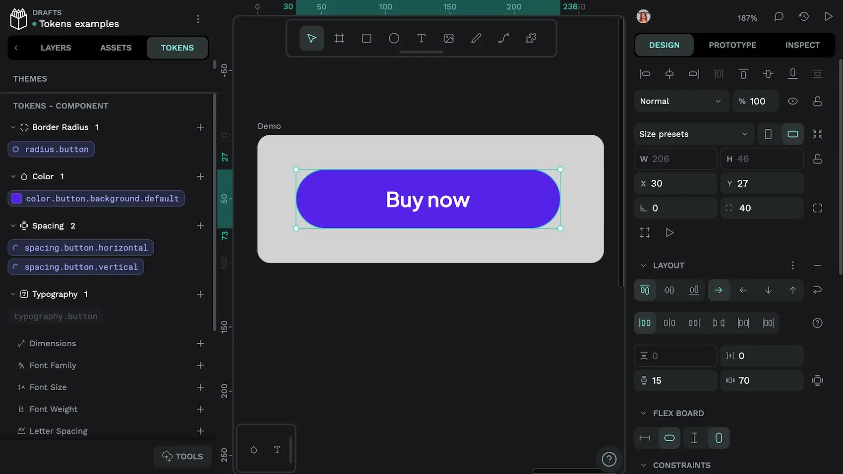
How to use: A button component token could include corner radius, padding, and color, allowing for different themes or styles for the same component in the future. You can customize it without altering the underlying design system, making it useful for multi-themed design systems.
Best practice: Component tokens hide the more intricate design details under a layer of abstraction. Design them carefully and keep the design decisions to just what’s needed for each design use case. Avoid making them too complex, or you won’t find very many places to reuse them, negating their usefulness as a shortcut.
How to use design tokens in your design workflow
Design tokens not only ensure visual consistency but also reduce the effort needed to collaborate around design decisions. Follow these steps to integrate design tokens more seamlessly into your design process.
Step 1: Identify recurring patterns and elements
Design tokens offer the best value when they’re used for design patterns you’ll use again and again. To identify these patterns, review your existing web design choices and look for consistent visual elements such as colors, typography, and spacing. Are there many places where you use the same decisions repeatedly? Jot these down as a possible place to use a design token.
At this point, you might also realize that some of your design decisions are truly outliers, such as a font weight used for just one subheading. You can change it to a more commonly used weight for a more consistent look and feel (and to minimize your number of overall design tokens).
This step keeps your design tokens relevant for only the use cases you’ll need them for and helps you consolidate decisions. It also gives you a great opportunity to review your designs for any overlooked inconsistencies.
Step 2: Create and name your tokens
To create tokens, choose name-value pairs for each identified design property. For example, you might create “foundation” or “utility” tokens for primary colors, font sizes, or spacing units. These tokens serve as a centralized reference point. This way, every team member who references them uses the same styles.
You can go one step further and create semantic (meaningful) names for your tokens, which improves clarity and usability across different experiences. For example:
color.brand-primarycolor.accentcolor.background.defaultcolor.text.secondary
Step 3: Store your tokens in a central design platform
Tokens act as a single source of truth. Designers and developers who use them will speak the same language when referencing details as granular as the rounded edge on a button or the space between two menu items. However, the newly created tokens only work if people know where to find them.
You can store tokens in a central design platform like Penpot to allow for easy access and management. Plus, everyone can trust they are using the most recent version of the token in their work.
Step 4: Apply tokens to your designs
Import existing tokens into your design tool, or use a platform like Penpot to create your tokens before applying them to your designs. Use your design tokens for every design decision to maximize their value.
Then, use Penpot to export the tokens in the DTCG (Design Tokens Community Group) JSON file format that developers can integrate directly into their projects.
Step 5: Iterate and update tokens
Regularly review and refine your design tokens to reflect changes in branding, user needs, or changes in technology. When you update the token in a centralized repository like Penpot, you can easily propagate these changes across all your designs, sync them to other platforms, and give your users a consistent experience.
Be sure to carefully communicate any changes to your design tokens to the team. Include documentation for how to implement token changes and keep everyone working from the same page. This documentation provides a historical record of design decisions and a context of how and where to use them within design system guidelines.
Streamline your design process with Penpot
Manage design tokens effectively with the right tools. Penpot offers design token management through a centralized platform where designers can efficiently create, store, share, and apply design tokens.
Here are some ways Penpot facilitates easier token management:
- Built-In tokens: Penpot is the first design platform to offer native support for design tokens, providing a more efficient and connected design environment.
- Open Source: Penpot follows the most standardized approach available for design tokens (W3C DTCG). This guarantees compatibility across multiple tools and technologies.
- Centralized storage: Teams can store design tokens in Penpot, so it’s easier to access and apply these tokens across different projects.
- Import/export: You can reuse and sync styles across tools with the standard design tokens format. If you’ve already been working with design tokens, you can even bring your existing design tokens into Penpot.
Try Penpot for free, and start creating your design tokens.
Related Blogs
We have many other posts about design tokens, design systems, and UI design topics. Here’s a few examples of articles to get you started:
 Laura Kalbag
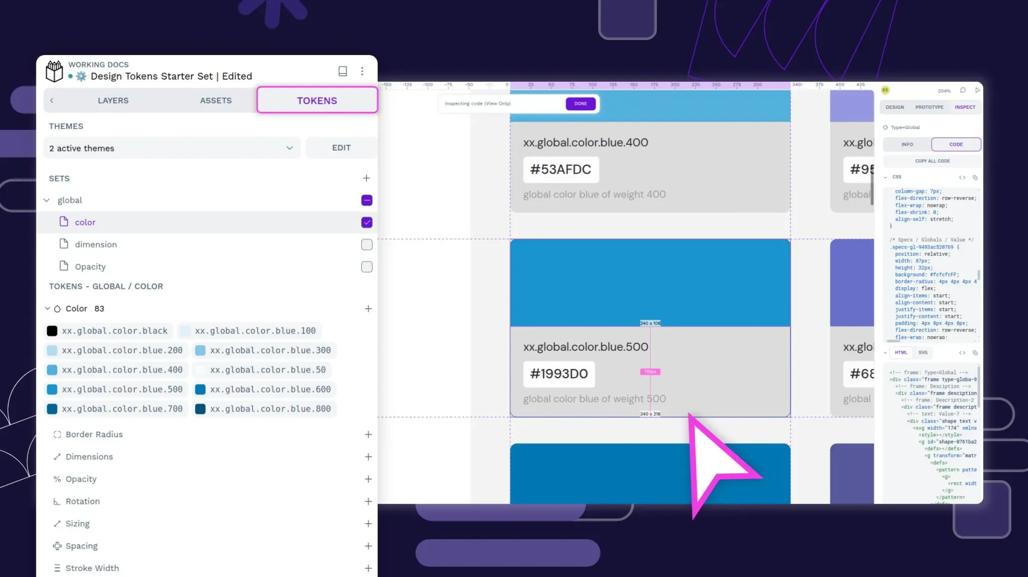
 Laura Kalbag
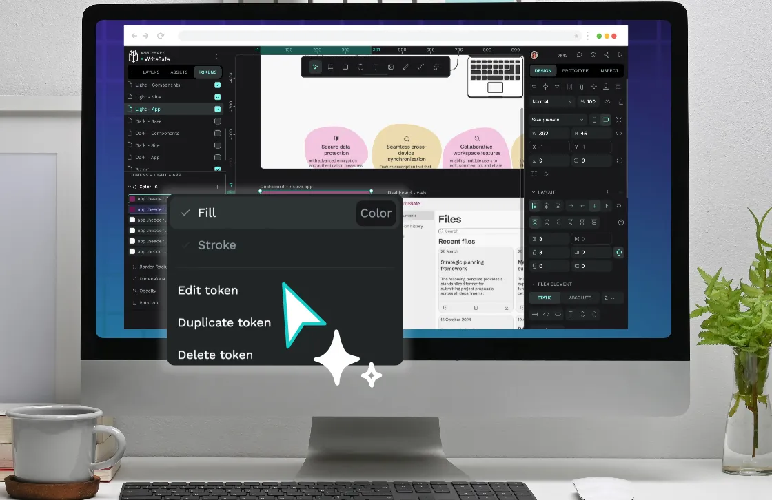
 Laura Kalbag
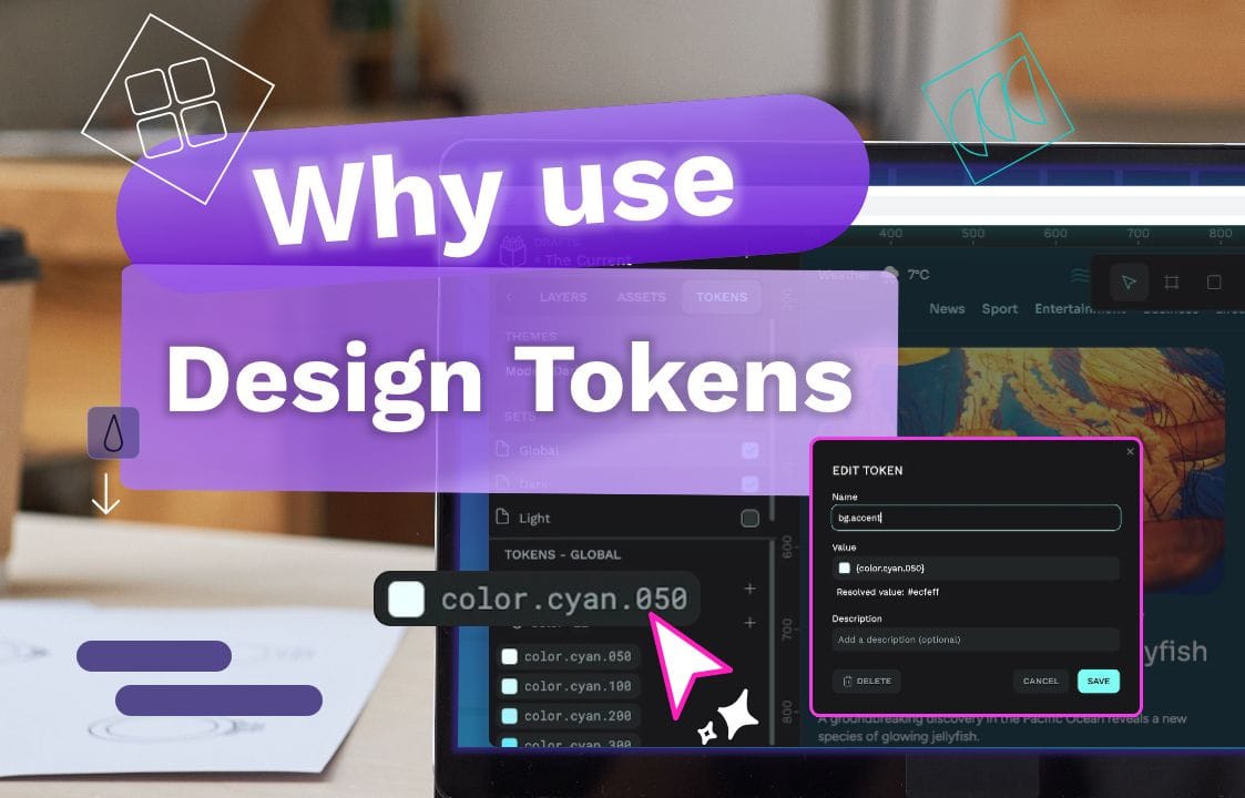
 Laura Kalbag