Tutorial: Creating interactive prototypes with Penpot
As UI and UX designers, we’re pretty limited by how much we can convey in static visuals. Interactive prototypes are a handy way to show exactly how our designs should behave.

Clicking through an interactive flow is valuable when demonstrating user journeys to stakeholders, handing off designs to developers, or even doing early-stage user testing.
In this tutorial, I’ll introduce you to some of the most common interactions you’ll prototype using Penpot. Penpot is brilliant for prototyping because you can work with your existing designs, whether they’re quick wireframes or high-fidelity mockups, and you don’t need to be able to code to create life-like interactions.
I’ve created a Prototype examples template with all the examples from this article which is available in Penpot’s Libraries & Templates. You can open the template in Penpot to follow along or try out the prototypes yourself.
Prototype navigating between views
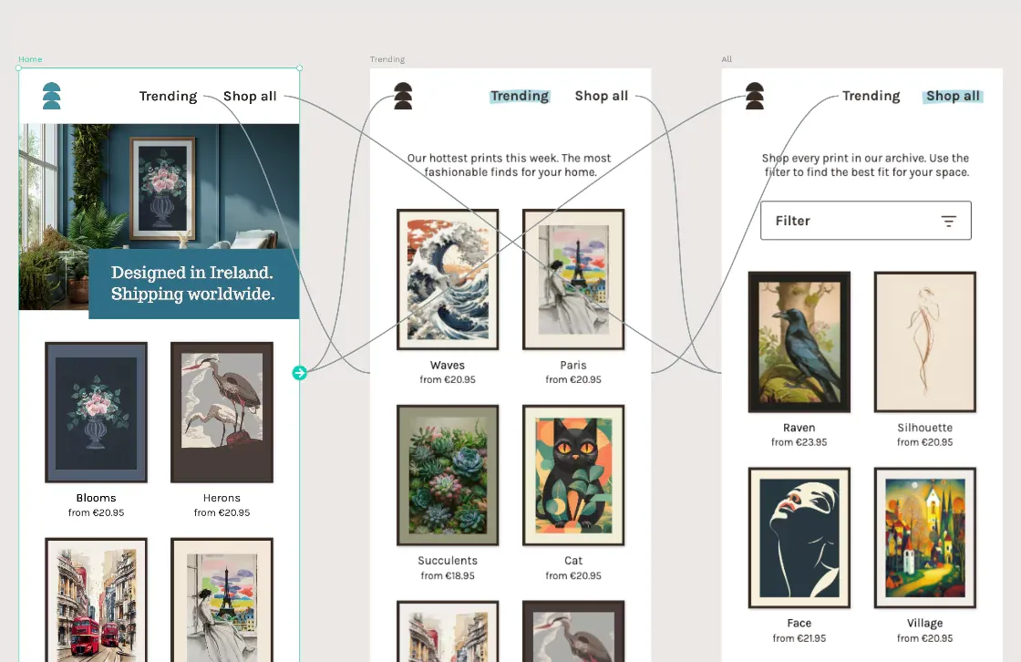
Navigating between views is one of the simplest tasks you might want to achieve with an interactive prototype. A view could be a page, a screen, or any process you can break into steps. In the example below, I’ll mock up the navigation between the Home, Trending and All views for a poster store website.
1: Create a board for each view.
You can lay your boards out however you want on your page.
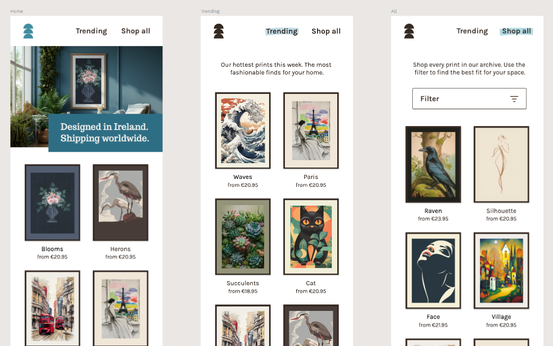
2: Name the boards.
Give each board a short, unique, and descriptive name. (You’ll thank me later!)
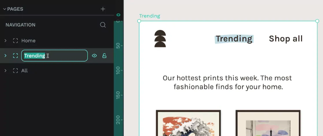
3: Enter Prototype mode.
Enter Prototype mode from the tab in the right sidebar.
4: Choose the layer.
Choose the layer from the left sidebar Layers panel that represents the button, link, or other interactive object your user will click to navigate to another view. You can also choose a group.
Here, I’m using a group of layers containing the Trending link text and a rectangle that creates a larger target area around the link text, making the link easier to click.
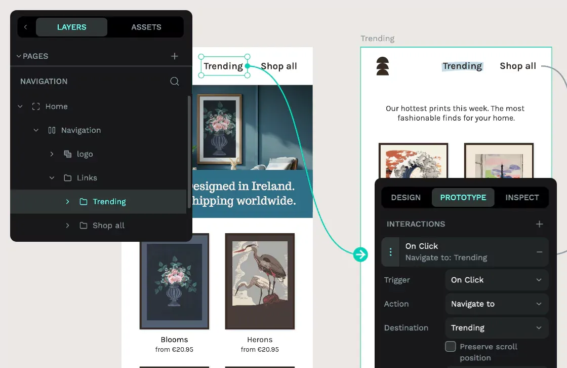
5: Add an interaction.
From the Prototype panel, use the + plus icon to add an interaction.
- Trigger: On Click
- Action: Navigate To
- Destination: Trending (board name).
6: Try your prototype.
Try your prototype using the View mode play icon in the top right sidebar. This button will open your prototype in a new tab. Click through your interactive areas to navigate around your views.
In View mode, you can use the links in the navigation to navigate between the pages.
7: Repeat steps 4-5.
Repeat steps 4-5 to mock up navigation for all the links and views you want to prototype.
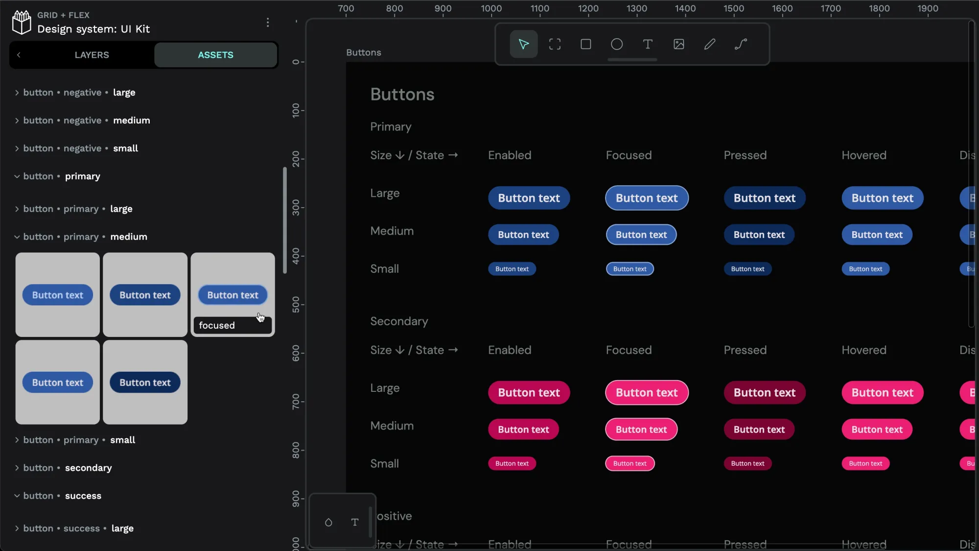
Prototype hover and active styles
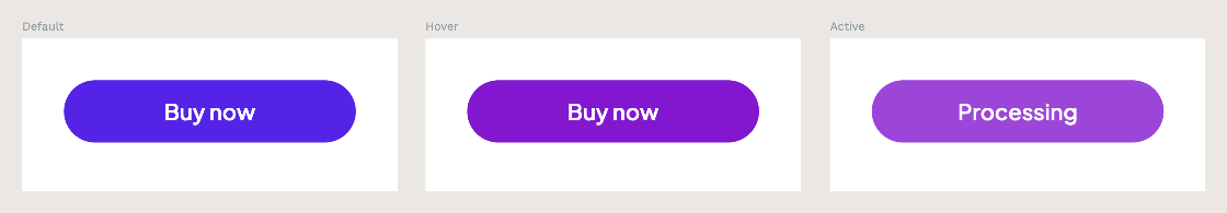
Sometimes, you want to prototype something as subtle as a hover style. You probably don’t need to do this for every single button or link in your mockup, but specifying hover, active, and focused styles is a must-have in your design system. Prototype these styles to check they’re visually distinctive enough to convey a change of state meaningfully and to design for any copy changes you might need. In my example, I’m prototyping the default, hover and active states. For the active state, my button text changes from Buy now to Processing.
1: Create the boards.
Just like the navigation example, create a board for each state and give those boards short, unique, and descriptive names. (Trust me, two boards with the same name is a pain.)
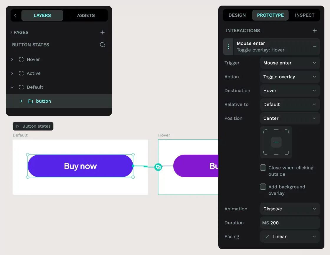
2: Add a mouse enter interaction.
From the Layers panel, choose the Default button group on the Default board, and from the Prototype panel, use the + plus icon to add an interaction.
- Trigger: Mouse enter; mimics the start of the hover effect.
- Action: Toggle overlay. Seamlessly layers the destination board over the current board.
- Destination: Hover (board name).
- Relative to: Default (board name); positions the destination board relative to the current board.
- Position: Center; aligns the destination board centrally relative to the current board. If the boards are the same size, the hover button will be positioned directly over the default button.
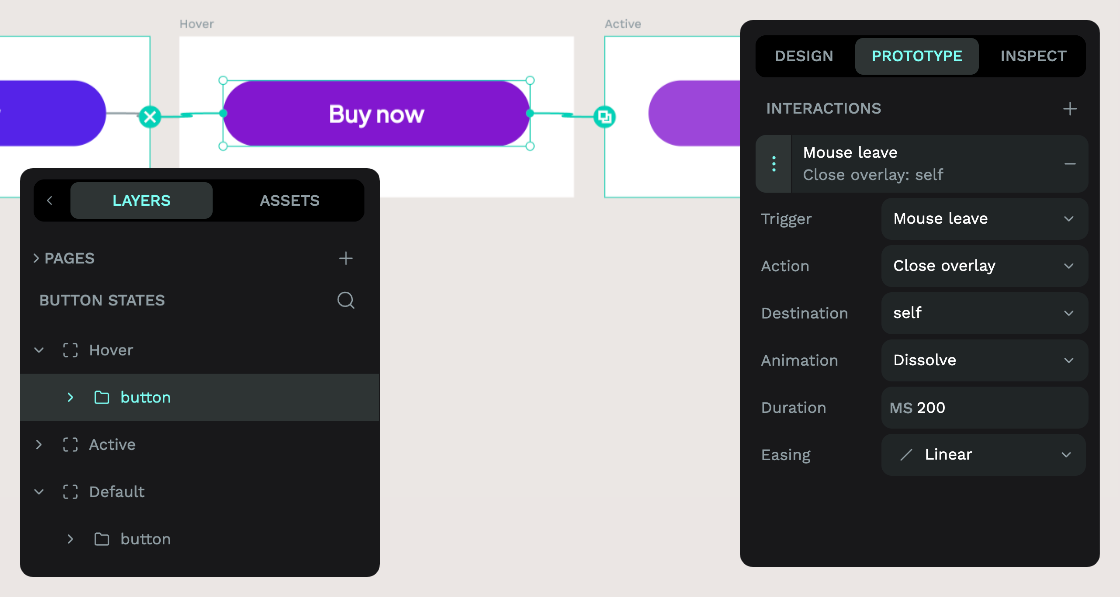
3: Add mouse leave interaction.
From the Layers panel, choose the Hover button group on the Hover board, and from the Prototype panel, use the + plus icon to add an interaction to handle what happens when the mouse leaves (…unhovers?) the button.
- Trigger: Mouse leave
- Action: Close overlay; closes the current overlay.
- Destination: self. Returns to the Default board.
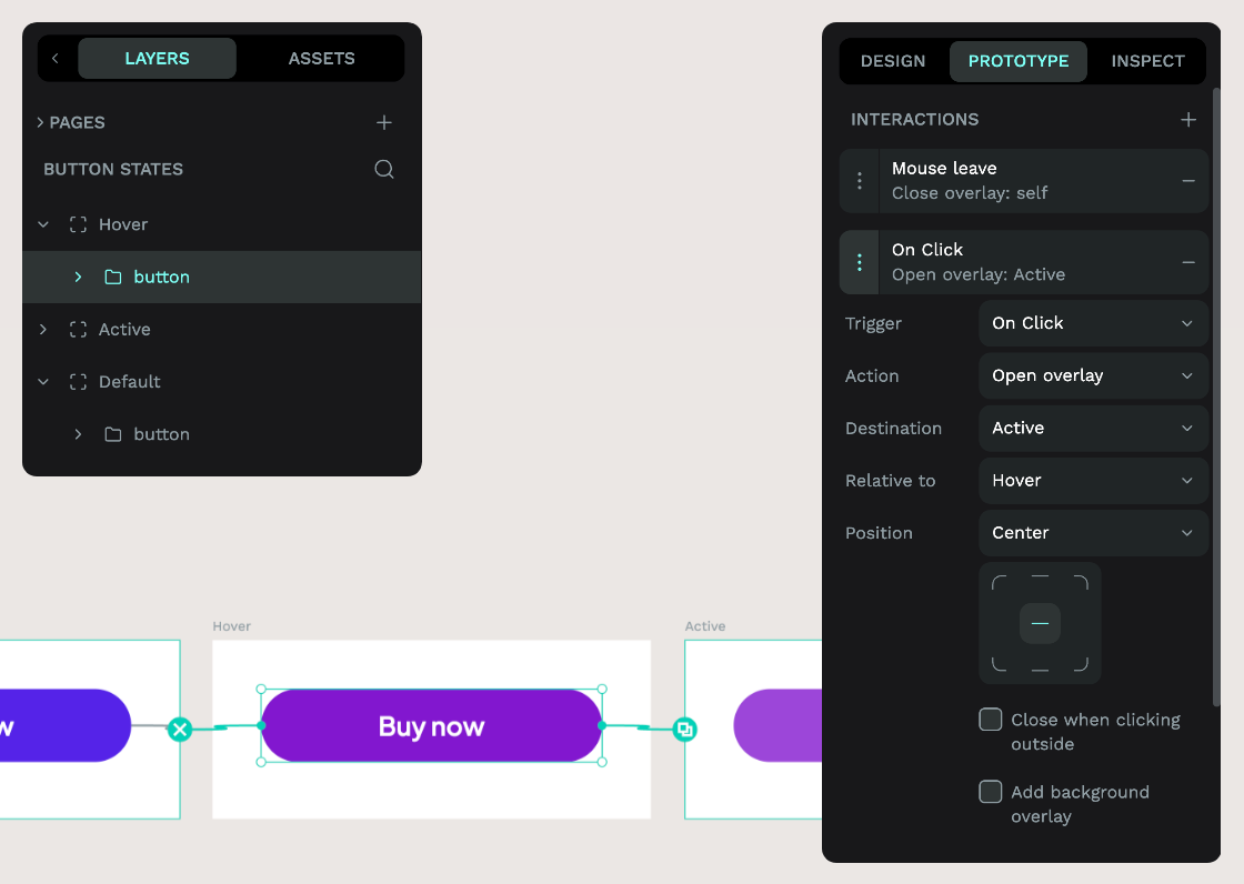
4: Add mouse click interaction.
Choose the Hover button group again, as the mouse will always be in a hover state before a click state.
- Trigger: On Click
- Action: Open overlay
- Destination: Active (board name)
- Relative to: Hover (board name)
- Position: Center
5: Try out your prototype.
Try out your prototype using the View mode play icon button.
In View mode, you can hover over the button to change the colour, and click it to change the text.
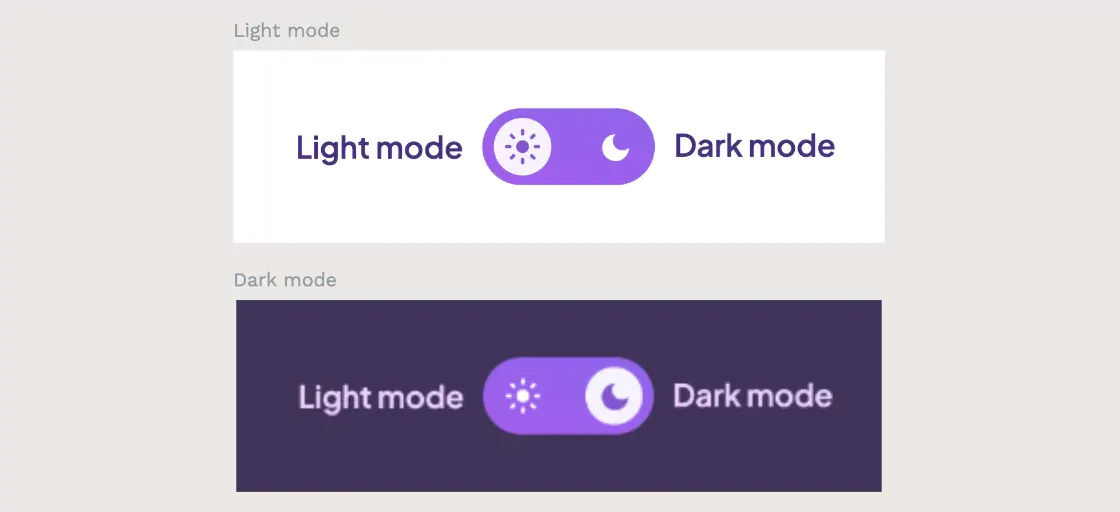
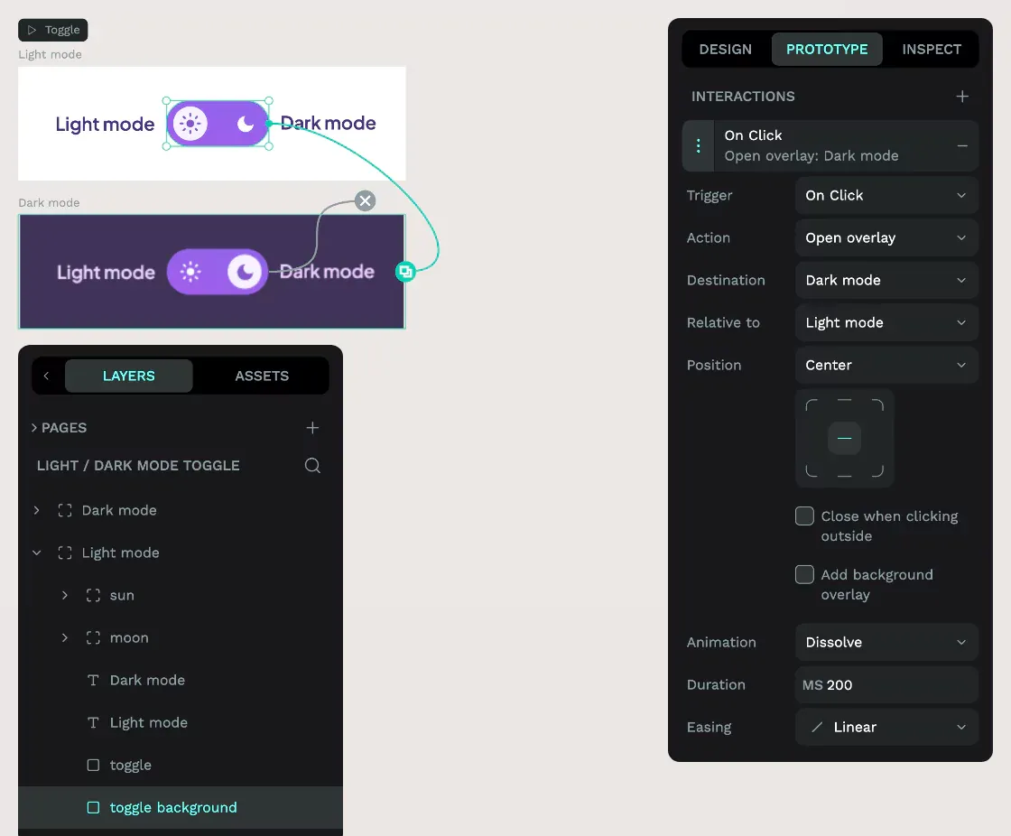
Prototype state changes
Remembering to mock up all the different states in your UI can be tricky. Prototyping the state changes prevents you from leaving developers to make up the design for themselves. For this example, I’m mocking up the changes in state for a light mode / dark mode toggle. I’ve not just prototyped the toggle itself but also included the labels and background behind it.
1: Create the boards.
Add a board for each state and give them short, unique, descriptive names.
2: Add Open overlay On Click interaction.
Choose the toggle background layer on the Light mode board from the Layers panel, and from the Prototype panel, use the + plus icon to add an interaction. I’ve chosen to add the interaction to the background layer here, as it means the toggle will be triggered wherever the viewer clicks.
- Trigger: On Click
- Action: Open overlay
- Destination: Dark mode (board name).
- Relative to: Light mode (board name).
- Position: Center; to center the dark mode directly over the light mode board.
3: Add Close overlay interaction.
To toggle from dark mode back to light mode, choose the toggle background layer on the Dark mode board from the Layers panel, and from the Prototype panel, use the + plus icon to add an interaction.
- Trigger: On Click
- Action: Close overlay; closes the overlay.
- Destination: self; closes the current open overlay.
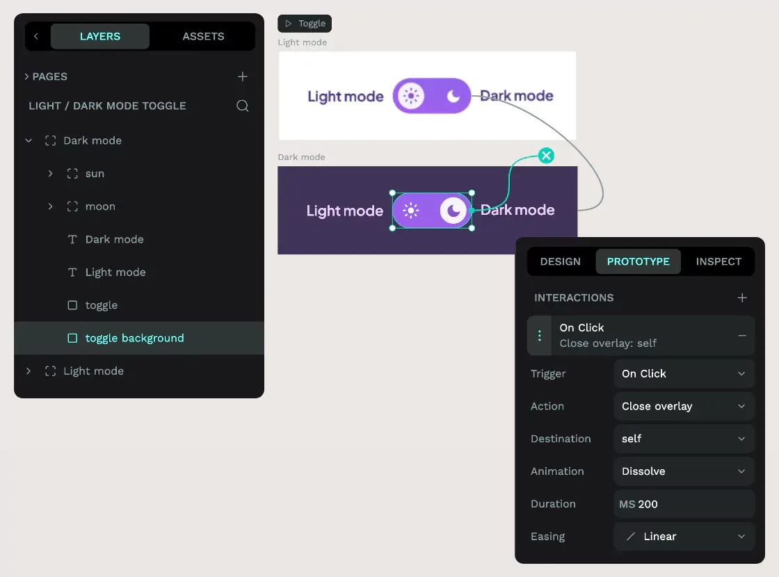
4: Try out your prototype.
Try out your prototype using the View mode play icon button.
In View mode, you can press the toggle button to toggle between the light mode and dark mode views.
Prototype overlays
So far, we’ve used overlays to mimic other behaviors, but now it’s time to use overlays to prototype UI overlays. In this next example, we’ll return to our poster store website and show how to prototype an overlay that appears over the page when the user triggers the Filter button.
1: Create the view board.
Add a board for your page view and, you guessed it, give it a short, unique, descriptive name.
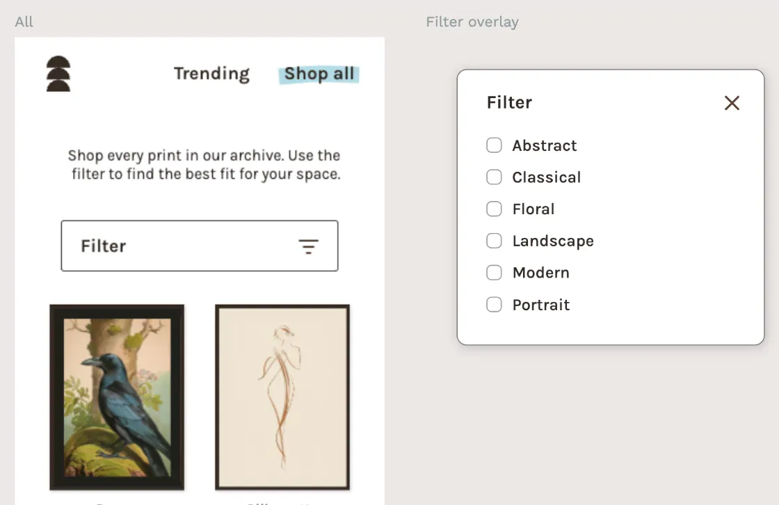
2: Create the overlay board.
Add a board containing everything you want in your overlay. Here, I’ve used a transparent background on the board itself and a shadow on the overlay background, which will help make my overlay pop when it’s layered over the page. Don’t forget to name your board.
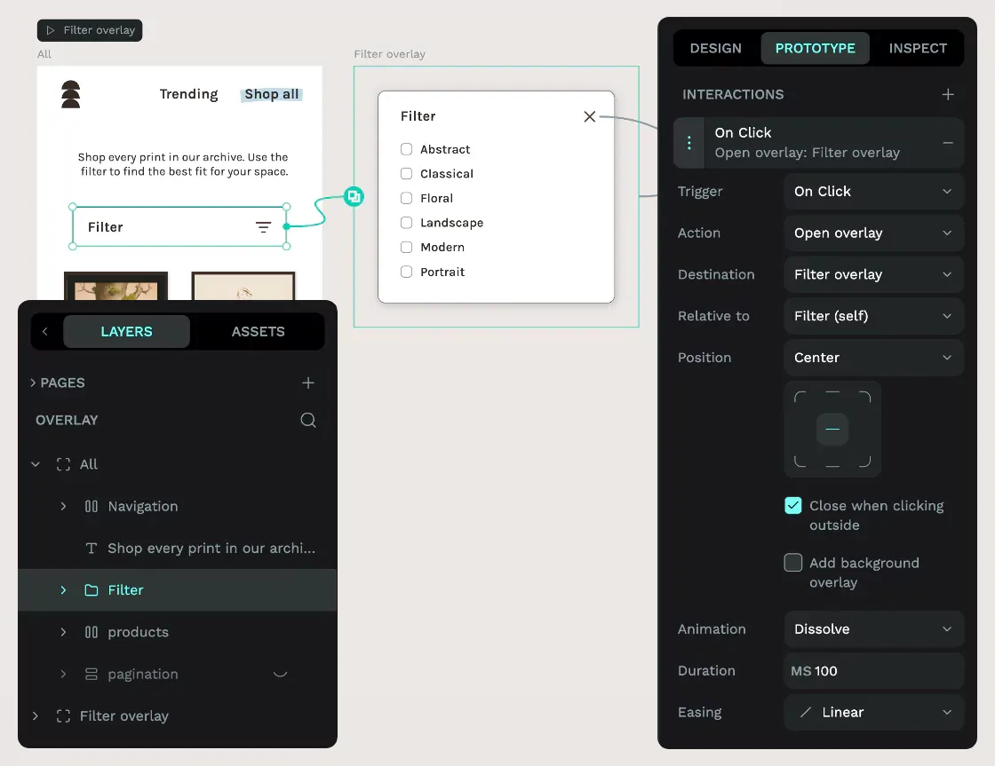
3: Open overlay On Click interaction.
From the Layers panel, choose the Filter group layer on the All board, and from the Prototype panel, use the + plus icon to add an interaction. This interaction will trigger the Filter overlay whenever the viewer clicks any part of the Filter group.
- Trigger: On Click
- Action: Open overlay
- Destination: Filter overlay (board name).
- Relative to: Filter (self) (group name); opens the overlay in a position relative to the Filter button that triggered it, ensuring your overlay appears where the user can see it.
- Position: Center. Center the overlay over the Filter button.
- Close when clicking outside: Check; makes the overlay behave like conventional overlays that are closed when you click outside their bounds.
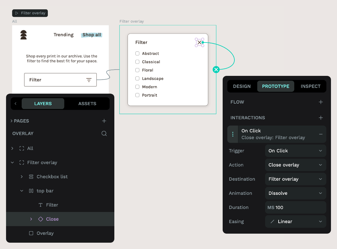
4: Close overlay On Click interaction.
From the Layers panel, choose the Close component layer on the Filter overlay board, and from the Prototype panel, use the + plus icon to add an interaction. This interaction will close the Filter overlay when the user clicks the close icon.
- Trigger: On Click
- Action: Close overlay
- Destination: Filter overlay (board name); closes the filter overlay.
5: Try out your prototype.
Try out your prototype using the View mode play icon button.
In View mode, you can press Filter button to open the modal and the X icon button to close the modal.
Prototype all the things!
I hope this tutorial has given you a head start prototyping with Penpot. You can download the template containing all the examples from our Libraries & Templates collection.
Do you have any questions or suggestions for future tutorials? Let us know on our Community. We’d love to hear from you.
Related Blogs
Check out our other blogs, from informative topic guides to tutorials on how to get the most out of Penpot.
 Laura Kalbag
 Laura Kalbag
 Laura Kalbag
 Laura Kalbag