7 wireframing examples for better designs
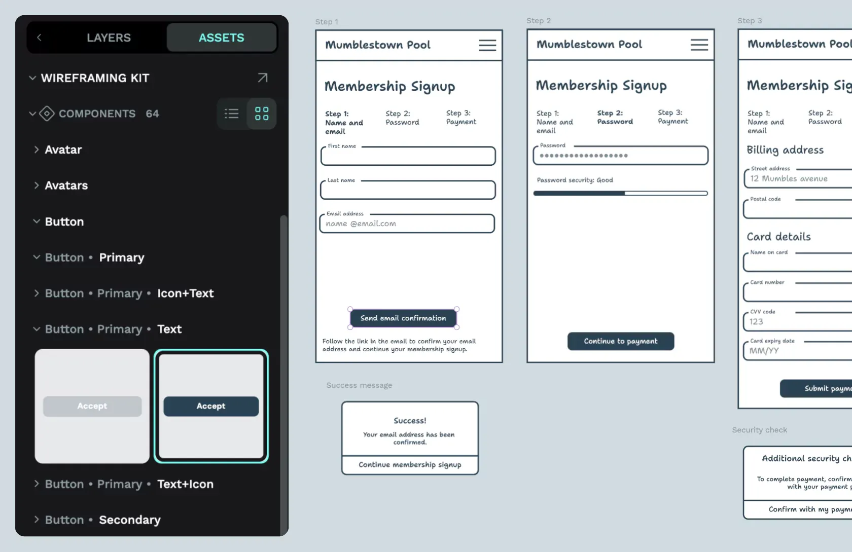
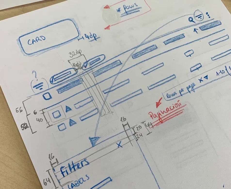
Wireframes are an integral part of designing any app or website. These analog or very low-fidelity drawings have one purpose: to show the basic layout and navigation of your idea.
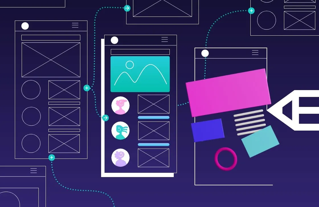
Wireframes are an integral part of designing any app or website. These analog or very low-fidelity drawings have one purpose: to show the basic layout and navigation of your idea.
However, what they lack in beauty or detail, they are more than makeup for by helping you flesh out your product, identify potential challenges, and make sure that what you have in mind can be realistically conveyed through an productapp or site. Wireframing is as much about figuring out what works as what doesn’t work.
Penpot Hands-on Demo on Wireframing video tutorial
However, unlike design systems, prototypes, and other design stages closer to a project's finish line, wireframes are typically only shared internally with other members of the design and development team. It’s rare to see a brand’s wireframe due to intellectual property or liability concerns.
At Penpot, we are all about helping the community build better, more beautiful products, and that includes sharing best practices for these behind-the-scenes projects, like wireframes. So, we’ve assembled a list of wireframes and best practices to help as you create your own.
These wireframes aren’t just examples you can learn from, though. We offer many for free in our templates library. Snag one and start making it your own (no coding or design experience required).
1. Sign-in page
It’s common to use the sign-in widgets included in WordPress or another content management system, but what if you want to make your own form?
Creating a wireframe helps you envision how the user feels when encountering the form and gives you room to experiment with static, pop-up, or overlay designs.
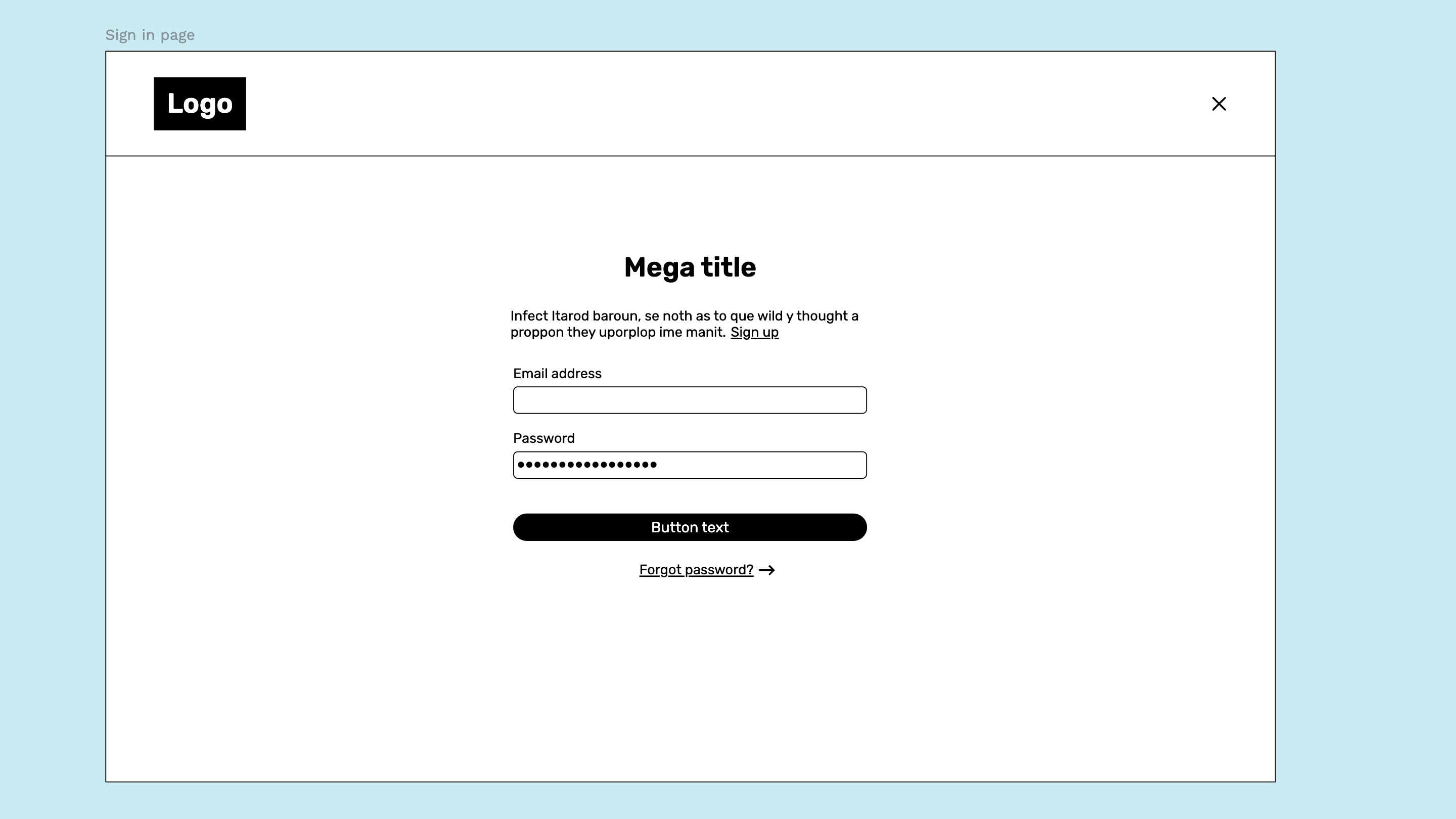
In this wireframing example, the designers used very simple shapes to indicate where each element goes, including links for signup and password help.
One reason this design works so well is that it anticipates some of the issues users may have (such as forgetting login information) and incorporates it into the design. It also mimics the masking of the password when entered in the field, something that’s not necessary in a wireframe but adds a nice touch. This demonstrates how you can make your wireframe more realistic without going overboard with too many complicated details.
The ways the wireframe treats text are also notable. The links are labeled in English, so other team members know what they signify, while the rest of the text (such as the title and proceeding text) is left as filler. This keeps the focus on actionable design elements, which is the purpose of a wireframe.
You can find the wireframing template available to download on our website.
2. Marketing page
Sometimes called a landing page, a marketing page is where someone who is completely unfamiliar with your offering can get the highlights and hopefully become persuaded to give it a try.However, marketing pages present a challenge because they are also the place where everyone is trying to have their say. The sales and marketing teams may try to smash too much into that space, which presents a design and user experience dilemma. While some designers may create text and assets first, creating a wireframe first puts some guardrails in place.
Focus on spacing, text amount, and overall navigation so the messaging can be filled in later and within the confines of the space. This can encourage teams to tighten copy, use only the best graphics, and put the most important information on the page with a design hierarchy.
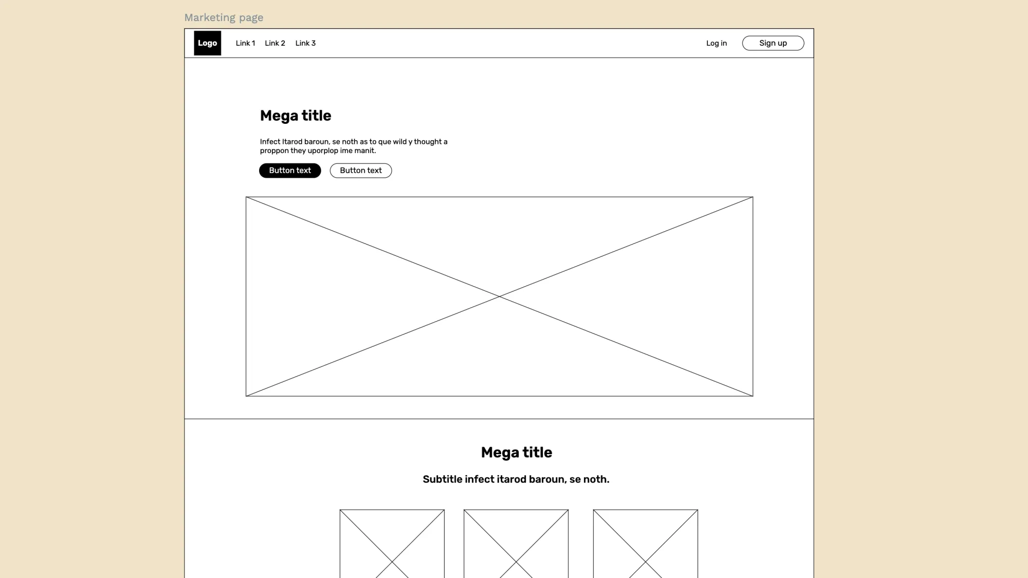
This example of a marketing page includes many elements, but you can scale back by deleting anything you don’t need. Highlights include the placement of buttons at various places on the page to capture leads or prospects at any point in their reading.
This wireframe also includes a CTA section for email signups or distribution of lead magnets. What’s especially useful is the text sizing, which communicates the design hierarchy. If readers only scan the page, they’re more likely to see the most important information first.
This marketing wireframe is a good reminder of the power of design and the likelihood that you’ll revisit things like font and size many times before you finally launch your final product.
3. Social media mobile app
It can be easy to brush off mobile app wireframes because they are smaller and have fewer design elements on them. However, it can be very difficult to know where to start, and that’s where a good wireframe comes in.
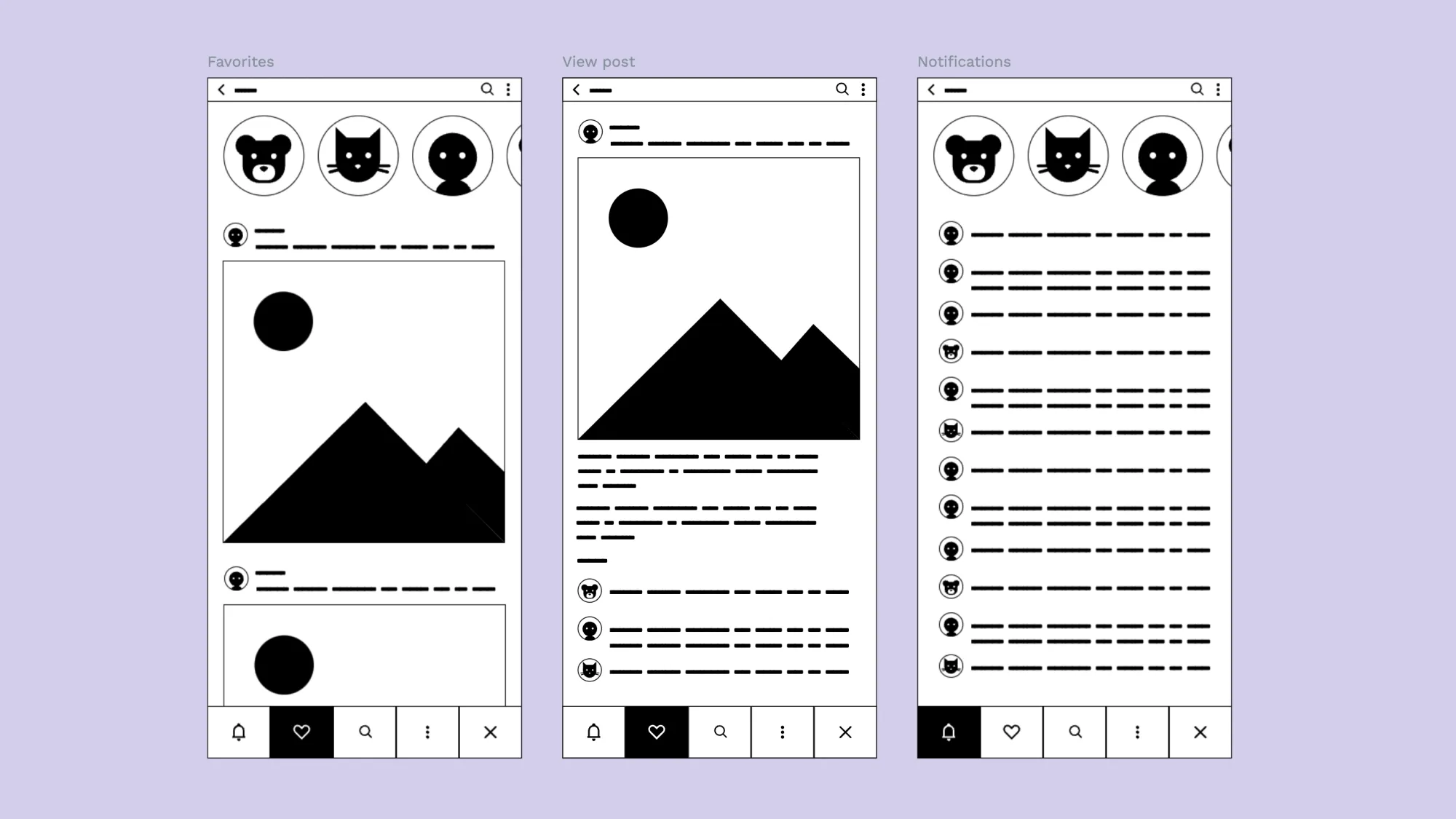
In this social media app example, the app’s primary design is apparent and free from other distractions (such as sample text or photos). There’s an avatar section at the top, a content feed, and some action buttons at the bottom.
While the designers may decide later to add additional elements, this simplified wireframe gets to the point and helps stakeholders see what the app will look like for users. It’s also set up with a size and proportion similar to modern smartphones, which gives designers a good starting point in a world where there are so many screen sizes to consider.
This is a good example of a minimalist (or “low-fidelity”) wireframe, one that will be easy for new users to adapt. You can swap out your own elements from a library stored in Penpot, giving you a more plug-and-play experience than some more complicated wireframes.
Use the minimalistic wireframing kit and design your own wireframe.
4. Professional networking mobile app
Another excellent app wireframe example is this one from our own Penpot library, which balances the functionality of a wireframe with some stylistic design choices.
It’s a wireframe template featuring six different screen variations, each designed to show a different place in the user journey. It’s also more high fidelity than the last example, with rounded edges and a design that is more detail-focused.
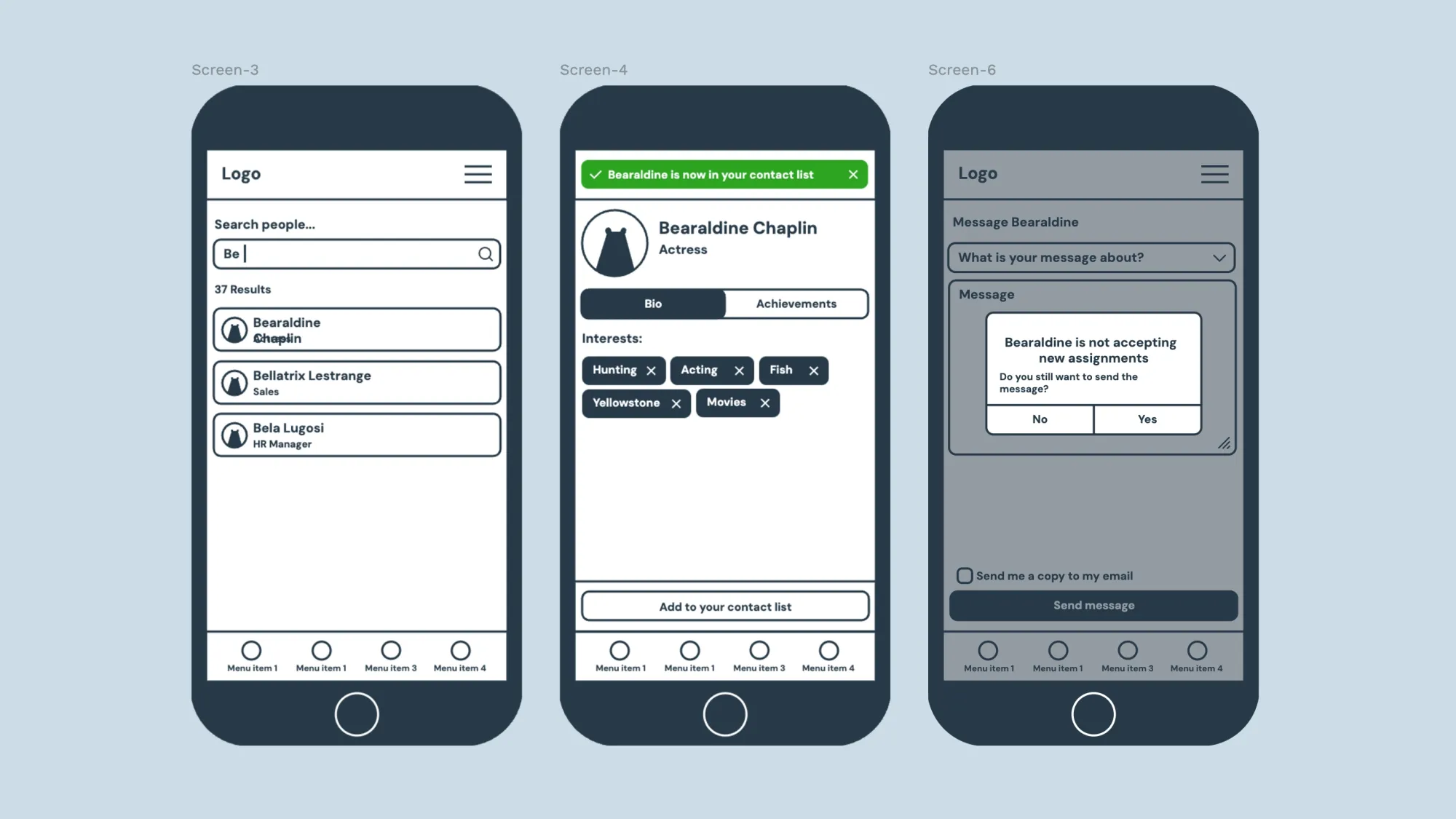
While your own app may not end up looking like this at all, this is an aesthetically pleasing option that some people may prefer over more rudimentary wireframe designs. If your team feels better working with beautiful templates, this is a great choice.
This screenshot also highlights a different approach to wireframe design, which includes the area outside the screen — representing the actual phone a user may be holding. While not necessary to convey the goals of the app, it does add an element of reality for very little extra design work and could get designers thinking about things like where a button appears in relation to the phone’s microphone or speaker.
As for the actual app experience, the wireframe uses more real text, showing you what’s possible compared to a wireframe with filler text. For some new designers, it may be just what’s needed to move into the next step of imagining their app and putting it into a tangible design.
This wireframe comes with many screen examples, but the images above show how easy it is to tweak a design to serve two purposes.
The first screen shows the wireframe for the messaging interface, while the others show what would happen if the user takes an action. While sometimes reserved for prototyping, it can be helpful to have a “cause and effect” set of wireframes to demonstrate the best features of your app.
It’s never too early to highlight stand-out technology or even show some of the challenges a user may run into (along with how you plan to solve them).
Check out the wireframe kit template
5. Expanded tool menus
This very specific Library Overrides use case for the open-source 3D design tool Blender highlights the flexibility of the Penpot tool.
In Blender, Library Overrides allow users to edit linked data without disrupting the original library data. To create a better user experience, a Blender developer used Penpot for whiteboarding and wireframing these override choices.
As you can see, this is very specific to Blender, but you can use it as inspiration for your own complex UI design features. You can adjust it to fit your own needs for communicating tool choices and hierarchies within your app or software product.
One notable highlight of this wireframe is how the designer used it to show two view modes: one for dependencies and one for datablocks. In their finished example, they create a toggle feature for viewers to click between the two versions and easily compare them.
It’s an excellent example of using different iconography and spacing to represent nesting features and expanded tool menus. Even if you don’t use it to communicate such a technical use case, it’s certainly inspiring.
6. Preferences
Ever since streaming entertainment gave people more choices over what options they see, people now demand to customize their digital experiences.
Tags have been invaluable in that aim. It makes sense to consider a tag selection screen for your app as a starting point for that customization.
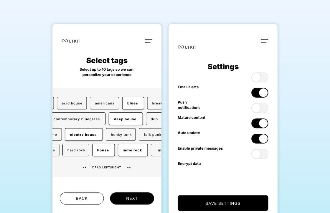
This wireframe stands out for communicating how well it can display on any screen size. The “drag left/right” indicator can inspire designers who aren’t sure how big to make their designs and who don’t necessarily want to rely on responsive design to render correctly on every device. It also gives designers more flexibility when they eventually have to decide what tags to include (or how many).
Another wireframe from the same UI kit features toggles. This settings wireframe shows how easy it is to give users control over a wide range of experiences with just a tiny amount of screen real estate.
This example is good because it can be modified with your choice of toggle, button, or slider and still create the same result: power for the user.
Download the Mobile UI kit starter template.
7. App welcome page
Most apps and even your phone have a welcome screen. This can be a great opportunity to stand out with a unique experience that fits into your brand goals. However, a wireframe should be simple, using just what’s needed to welcome users and get them onto the next stage of their journey.
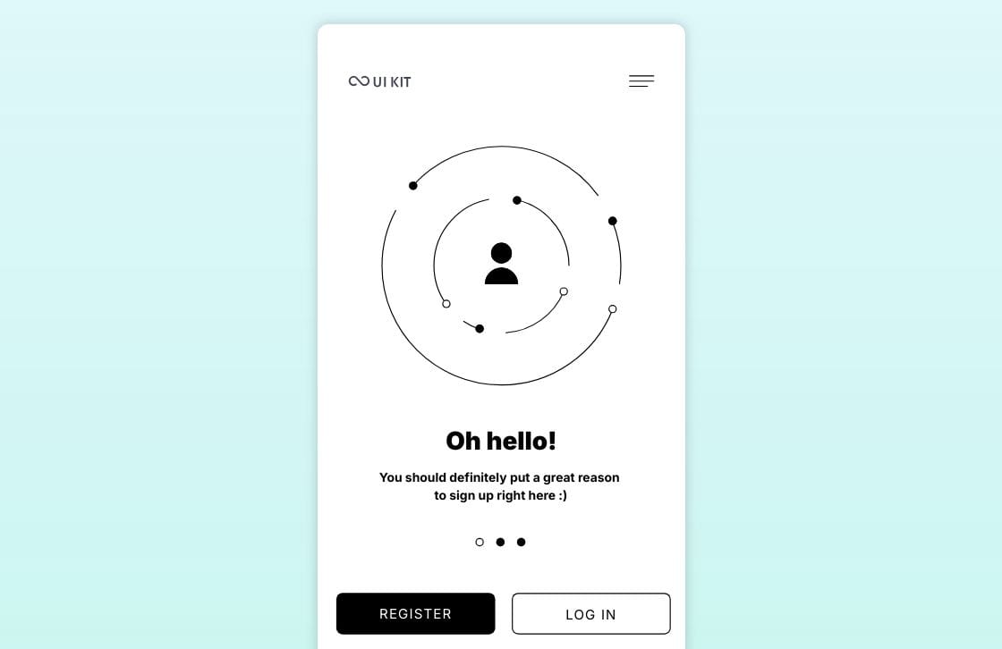
This wireframe example from our library is excellent for a couple of reasons. First, it clearly communicates the mission. Users should be able to log in or register with no additional confusing directions to follow.
Second, it’s very clean and has a lot of white space, which is a good design principle. It can inspire you to make the best use of the area without overwhelming the user.
Plus, you could easily swap out the center image with a logo, custom illustration, or animation and still keep the overall purpose of the wireframe. Whatever you choose, having a wireframe like this as a placeholder in your overall user journey can get your project off to the right start.
Use the UI kit starter template and start designing your mobile wireframes today.
How to use examples to improve your design
These sample wireframes should be the starting point for your own unique idea, and you should feel free to add, delete, or change details to make your product stand out. Here are a few tips to improve the workflow.
Focus on flow
Navigation is just one way users move around an app. Sure, they will click buttons and interact with menus, but they can also scan and study your product without taking action at all.
Consider how your overall design encourages them to look at the most important information first and helps them know where to look next. Don’t hide the essential details or place them too low on the page.
Look at wireframe examples to see how font size, spacing, and order help with the flow. Your wireframe should put what users want in the most accessible place possible.
Adapt to your own users
You know your users better than anyone, so lean into that understanding when creating your wireframe. Using the examples in this list as a starting point, ask questions about how your unique audience will engage with your design.
Try to consider:
- The amount of information they want access to
- How fast they may scroll or click through pages
- Whether they want more or fewer features to be shared by default
Another consideration is how they use other pieces of technology to improve their app experience, such as whether it’s necessary to include social sharing or shopping widgets in your design.
By taking all of these questions into account, you can ensure that the experience you give your users is top-notch and designed perfectly for them.
Avoid shiny-object syndrome
Some of the wireframes you’ll see may have newer or even relatively untested features that work well for their audience. However, this doesn’t mean it will work for yours.
If the wireframe feature doesn’t naturally fit into your audience's needs, it may not be necessary to include it at this earliest stage of design.
In most cases, it’s better to stick to the essentials, making sure your wireframe communicates the main goals of your app and includes those things that your audience just can’t live without.
Be accessible
Even in the early stages of wireframing, you can consider how all kinds of users may need to access your product or service.
With new standards recommending additional design integrations, it makes sense to work these into your product design now rather than try to wedge them in later at the expense of overall design harmony.
Some important things to think about at the wireframing stage are:
- How clear are your navigation options?
- Are interactive objects easily identifiable?
- Is there room for alternatives to any image or media content?
The Web Accessibility Initiative also shares tips for accessible design, beginning at the wireframe stage. Become familiar with them now so you can reduce work later.
Look at real-life, finished examples
Finally, the wireframe is only a basic representation of your big idea, so don’t limit yourself to other wireframes for inspiration. You can also examine the final products from brands you know and love and reverse engineer what you see.
Study their public websites and apps, making note of things you like and things you think will annoy your users. Include both types of observations in your wireframe so you won’t overlook them later in the process.
Remember, many of the best websites and apps started out as very rough wireframes that went through several iterations. You may not even be able to recognize the final product from the wireframe alone. It can be fun to reverse-engineer a site to see how it may have looked as a wireframe, though.
Next steps for your first wireframe
Now that you’ve seen some examples of what great wireframes look like, it’s time to get practicing.
With Penpot’s free wireframing tools, you can get started in minutes. Just sign up for a free account, start importing template files from our library, and get to work!
You can use our wireframing best practices guide for additional help on your design journey.
Related Blogs
Check out our other blogs, from informative topic guides to tutorials on how to get the most out of Penpot.
