6 advanced UI design trends to enhance your product's UX
Great design can be learned; many of the best designers started by watching others and using their best practices for their own work.

Just how important are user interface (UI) design and user experience (UX)? Very.
You may have a great product idea, but if it's difficult for the user to interact with, you may not capture their attention in the way you intend. Worse, they could become so frustrated with their interaction that they sour on your brand.
Fortunately, great design can be learned; many of the best designers started by watching others and using their best practices for their own work. For those designers motivated enough to try advanced UI design tactics, this year has brought about some fantastic trends to draw inspiration from, including more responsive layouts and scrollytelling.
Even if it's your first time creating an app or website, you can learn from these pro-level examples.
1. Buttonless design
Buttonless design, or the presentation of navigation elements without the traditional button, has grown in popularity with the advancement of hands-free tech. This can show up as the enhancement of a standard meatball or hamburger button-based menu with some added simplified clickable images or even voice prompts.
With more voice-assistant solutions in the average home, we may eventually see most apps move away from buttons and rely on voice commands, gestures, and biometric data from facial expressions.
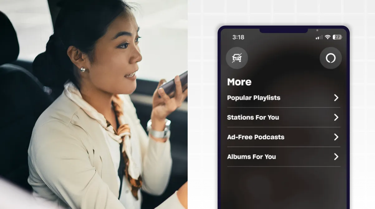
Buttonless interactions can help users do more when typing or clicking isn't feasible. We know, for example, that people use smartphones while driving (even though they shouldn't). Amazon Music responded to that reality with its Car Mode for the app. Users can control the app with voice prompts and only a small selection of touch-based interactions in a larger font than normal.
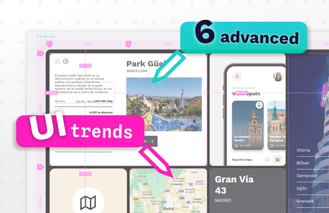
2. Bento box
The bento box UI design style is characterized by content displayed in separate compartments, resembling Japanese bento food boxes. This design choice helps users focus on one message at a time and showcases images in a visually appealing format.
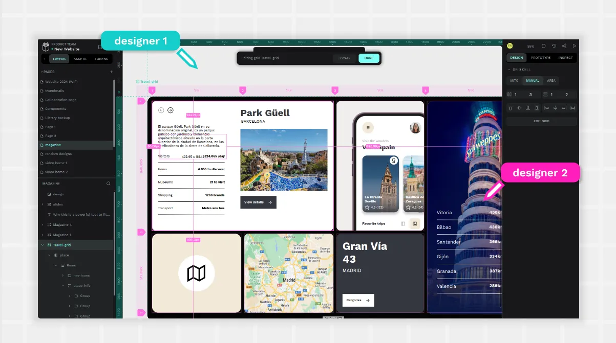
Bento design makes it easy for designers and developers to move items around and add new content without reinventing the entire layout. Using a tool like Penpot and its Grid Layouts, designers can set up containers for each element, knowing they will be truly responsive to screens of all types and sizes.
However, it can still be considered an advanced trend in that each container can hold any interactive element. Because you can stage elements to tell a story or guide users through a buying path, there's no limit to how these simple boxes can be used. In this video you will find a well explained example of Bento Grids together with other design trends for 2025.
An example of bento done well includes Pinterest. They have used this style for years to help users find pins they love and organize them easily to their own boards.
3. Microinteractions
Users have become accustomed to getting positive feedback from every digital interaction, allowing designers to delight them through microinteractions. These can be anything from changing the color of a button upon hovering to rewarding clicks with small animations. Microinteractions can be purely visual or include sound effects.
Success depends on creating experiences that add to the website's functionality and help users complete actions such as navigating, purchasing, or submitting information. If they become distracting or annoying, however, the point of the microinteractions will be lost.
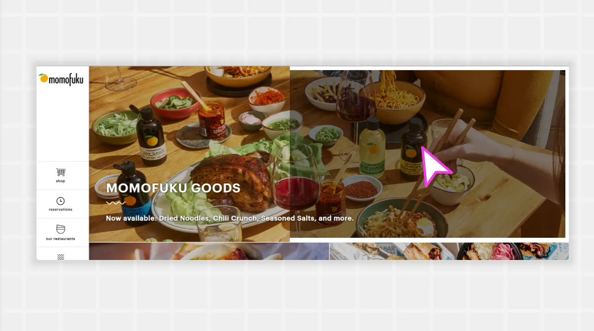
Famous gourmet food brand Momofuku does this very well with its desktop website. Hovering over almost any button changes the color, while mousing above images changes the border size. The menu responds by underlining elements as users mouse over them, too. This satisfying site does a great job of hitting that sweet spot between minimalist and interactive. In his book “Microinteractions: Designing with details”, Dan Saffer divides these subtle animations in 4 steps: trigger, rules, feedback, loop and modes. To know more check out his talk at Lisbon UXLx.
4. Scrollytelling
Interactive scroll-based storytelling, or Scrollytelling, helps users digest large amounts of information on the page at their own pace. It usually combines text and static visuals with interactive elements that only activate when the user scrolls to that point on the page.
The result has been some of the most compelling reports and journalism pages, combining true storytelling with easy-to-understand visuals for even the most complex data points.
Scrollytelling's benefits include high engagement, visual appeal, and user control. It's also very accessible, making it easier for slower readers or those who need to leave their computers for a bit before finishing. They don't miss out on auto-play videos or other elements that may continue in their absence.
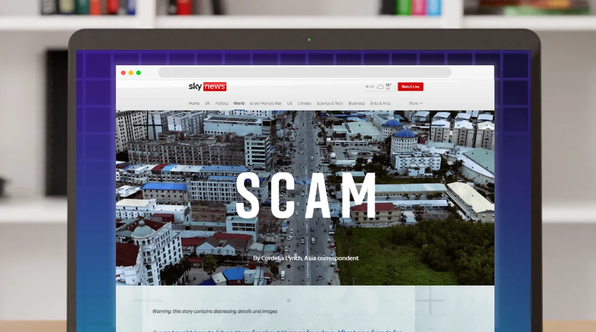
Journalism sites use scrollytelling the most, and SkyNews is a great example of using different media elements along a scrolling story path.
The story features an animated hero graphic at the top, followed by text and traditional static images. It then captures readers with scroll touchpoints halfway down the page, which go through an animation series to show several data points in a series. When the user is done reading them, they can continue scrolling to more static elements and finish the story.A fun example of scrollytelling is Macadam App webpage, the horizontal scroll brings you through the features and benefits of the app. Since the product is all about counting your steps this kind of scroll, together with the big titles, make the users feel as if they are walking together with the characters.
5. Gamification
People love to play games and engage well with elements that provide rewards for interacting with them. This is true for actual video games, but also things we don't consider games such as buying products or chatting with friends. One way UI design has evolved is in its use of gamification to drive engagement on non-gaming sites.
Whether it's to promote competition with others (leaderboards) or with oneself (completing a quest), gamification increases a user's time spent on a site.
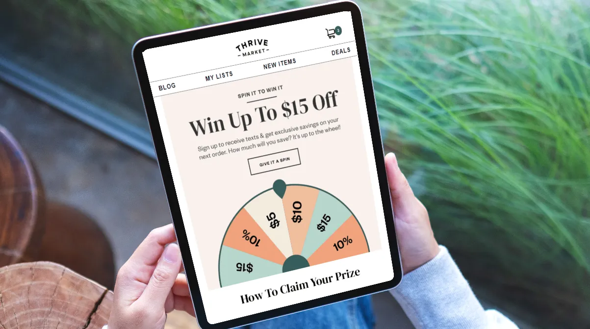
Thrive Market's membership-based shopping site gives users a wheel to spin, with discounts for signing up for SMS messages from the company. Prizes range from a percentage discount to a flat dollar discount from their next purchase.
While most members will want to sign up for texts anyway (to access the better free gifts and deals), this prize wheel may be the nudge members need to take action.
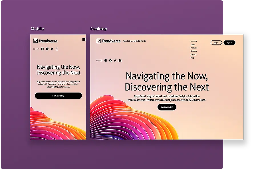
6. True responsive design
Finally, while responsive design has been the standard for some time, many sites have fallen short of showing up the same way on all devices. This brings a big opportunity to design with responsiveness in mind so a grandfather watching Netflix on his iPad sees the same experience as the teen streaming from her smart TV.
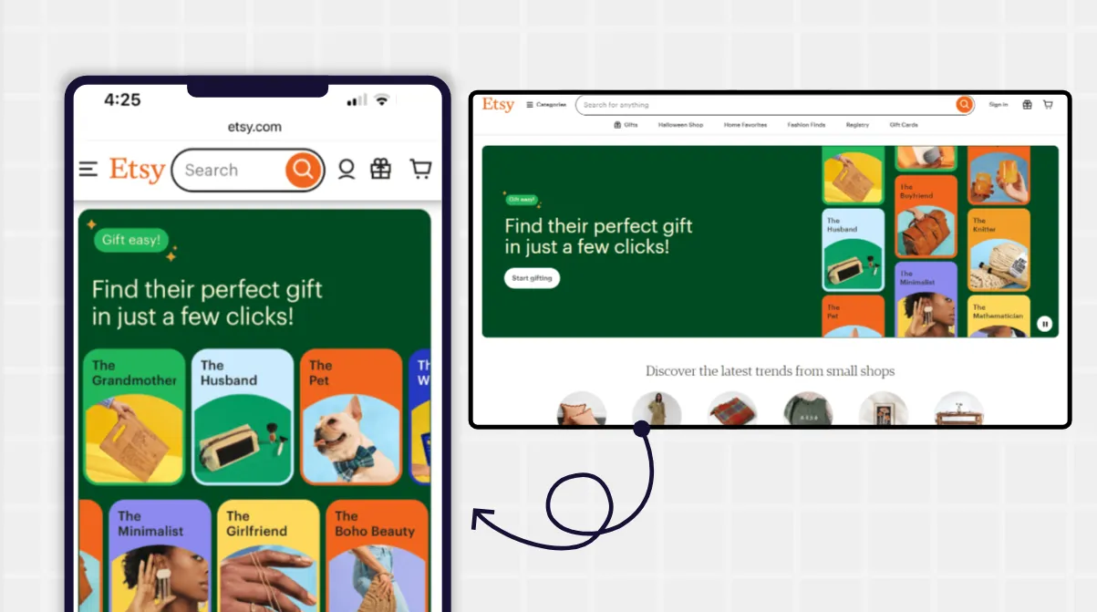
Etsy gives users a consistent experience, whether they access the mobile site, desktop site, or app. Browser and app views have the same look and feel, and shoppers can switch from device to device without missing a beat. The shopping journey remains smooth and continuous, so users can start product research on their phone before checking out from their desktop (or vice versa).
(Note: Penpot's design app makes it easy to deliver a responsive experience by giving designers a preview of how their layout appears on any number of devices. Just use the Inspect view to see how it would show up on different screen sizes.)
Better UI and UX with Penpot
Catering to the user's needs can be difficult, especially with so much new technology to keep up with.
However, one thing that won't go out of style is a seamless design layout, and Penpot makes it easy for you to start your first design in minutes. Just create a free account and use one of our many templates to build your first layout. We even have a resource library full of UI tips to help you create the best possible version of your design dream.
Related Blog posts
We have even more posts about UI tips. Here’s a few examples of handy articles to help you get the most out of Penpot.
 Paula Tienza
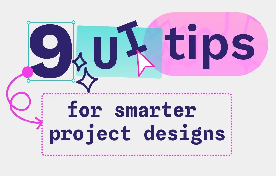 Paula Tienza
 Paula Tienza
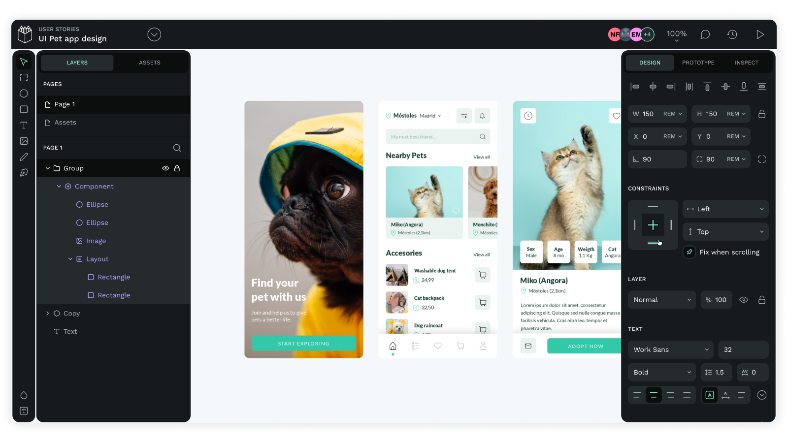 Paula Tienza