5 ecommerce UX examples (and what you can learn from them)
An outstanding ecommerce UX design can make your customers complete their purchases on your site. Find here 5 ecommerce UX examples.

Do you know why customers don't complete their purchases on your site? While cost and shipping charges can be a factor, a survey identified UX issues as major contributors.
Common reasons for cart abandonment in ecommerce sites include a checkout process that is too complicated (18%) and website errors (14%).
All of these problems can be solved with a better ecommerce UX design, but where can you get ideas for improving your site? Some of the leading brands today are also amazing examples of UX. You may be surprised at what you can learn from them.
1. Etsy
Etsy is one of the largest marketplaces online for handmade and custom goods, and they’ve invested a lot into making the buyer’s experience as good as they can.
This impressive focus on UX can be seen on the seller’s product pages. It includes everything a customer might need to make a purchase immediately, including information on price, speed of delivery, ratings, and promotional offers.
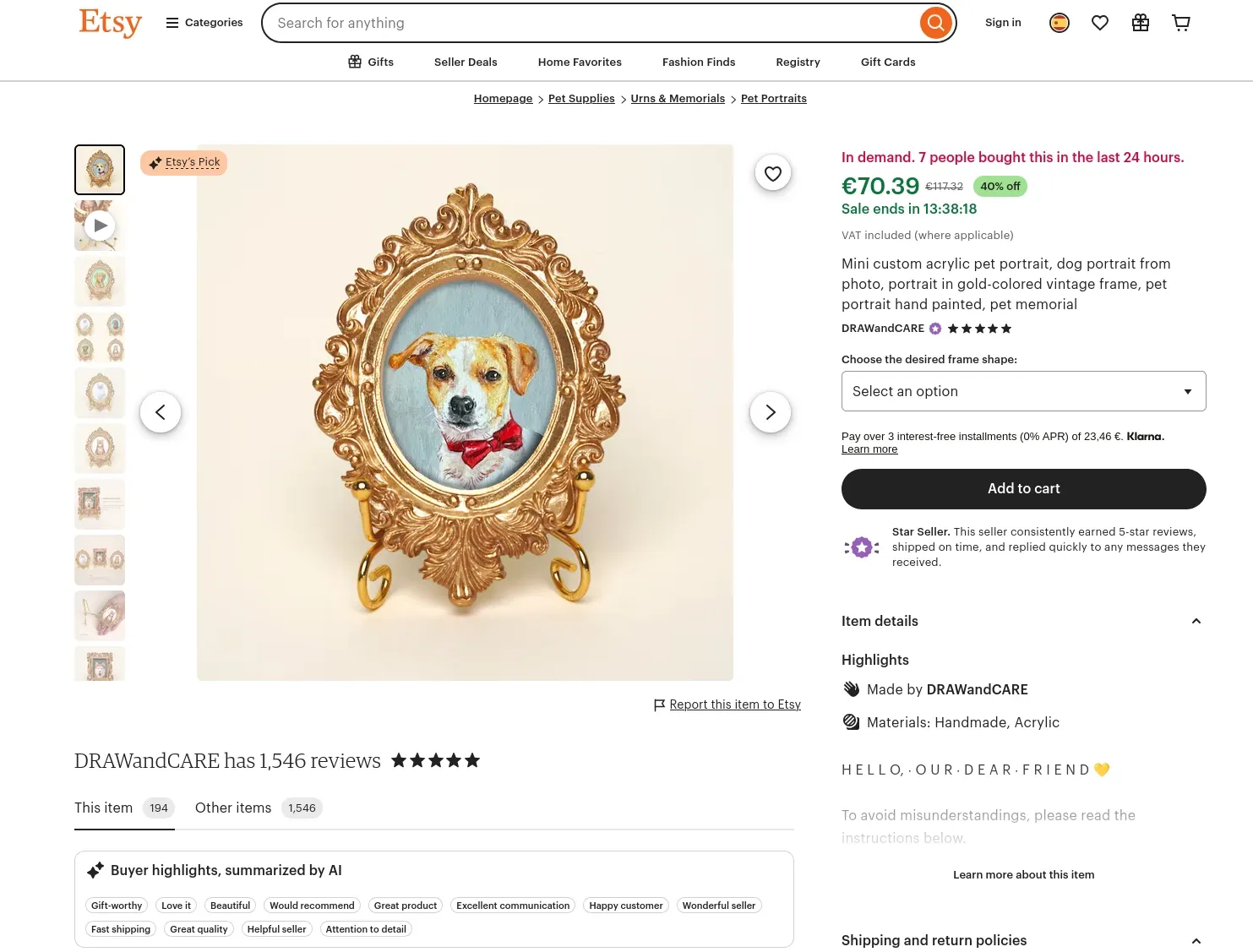
Rather than leaving all of these details to the cart and checkout process, Etsy’s UX overcomes buying objections and eliminates the surprises that prevent cost or time-conscious buyers from committing.
What you can learn
Depending on the ecommerce platform you use, you may already have some data on cart abandonment. Use it to drive design decisions.
Provide enough information on product pages to help customers avoid sticker shock upon checkout. Consider including bold price info, available promo codes, and social proof (like star ratings) on the product detail page.
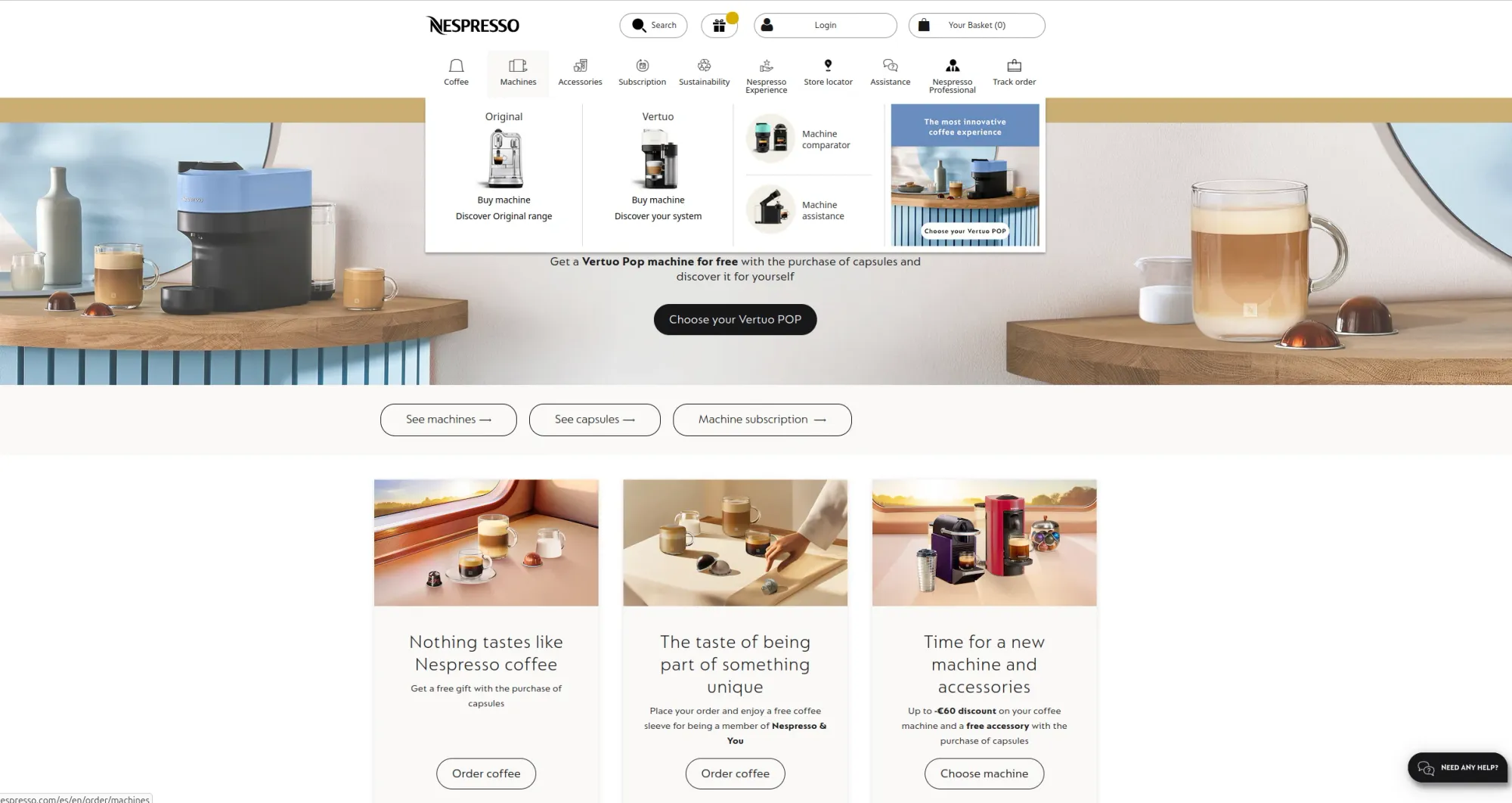
2. Nespresso
This gourmet coffee company has the challenge of balancing a high-end design with offering useful information to buyers. Too much information can clutter the look and feel, but its diverse product line does need some explanation.
How did it overcome this? By bringing together a crisp collection of fonts, iconography, and color themes with a unique navigation menu.
For example, the top navigation bar shows customers, at a glance, what it offers, including accessories and a recycling program. Hovering over a navigation bar item invites the user to choose from different paths. For example, a customer in the consideration phase can discover which espresso machine is better for them, while an owner can learn to clean their machine.
Further down the main menu is a sort of “choose your own adventure” tool. Users can plug in the coffee type, boldness, and time of day to get recommendations on varieties they may like. The site hosts a blend of tools for both the focused shopper and those who need a bit of hand-holding to find the right pick.
Further down the main menu is a sort of “choose your own adventure” tool. Users can plug in the coffee type, boldness, and time of day to get recommendations on varieties they may like. The site hosts a blend of tools for both the focused shopper and those who need a bit of hand-holding to find the right pick.
What you can learn
Nespresso seems to acknowledge the confusion over some of its offerings, specifically the two types of machines and how the recycling program works. Calling these out boldly in the menu reduces customer frustration and creates an upselling opportunity.
If you have a large product line, take the space to separate them in the navigational menu and provide a clear path for users depending on where they are in the buyer journey. A “this or that” approach does two things: it helps show off your entire product line and empowers customers to find just what they need at the moment.
Picking bold iconography for the menu headers makes finding the right menu choice accessible and even a little bit more fun.
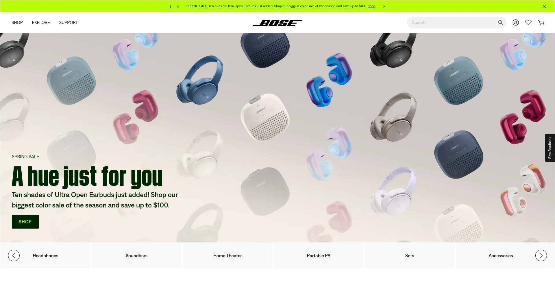
3. Bose
The Bose website’s use of white space works well for it. It helps balance what could be a cluttered site, especially since the speaker maker has so many more product categories than just a decade ago.
UX features of note include the choice to use scrolling arrows to see more of the product categories (versus squishing everything together to fit on one screen). The front-and-center prominence of its top products is also noteworthy. Without leaving the home page, customers can see “Trending Now” products complete with color choices and transparent pricing.
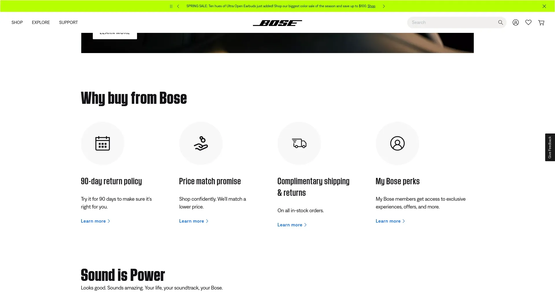
Perhaps the best UX feature on the home page is the “Why Buy from Bose” callout. The simple iconography and brief explainers help overcome buying objections for those who may traditionally buy electronics from a third-party seller, like Amazon. Acting as a sort of mini-FAQ, it answers questions about shipping times, returns, product guarantees, and price matching — without requiring the customer to find this information on another part of the site.
What you can learn
Bose has a lot of products to promote, too many to really spend much time with on the homepage. It chooses to keep its white space and simple design and just focus on a few things of importance.
If you want to follow in its footsteps, you can focus on:
- Highlighting just two or three trending products in detail, with full variety and pricing info
- Displaying all of your product categories using elegant navigation to avoid cramming everything onto the page
- Answering top questions customers have and overcoming challenges to buying from you directly.
4. Tesco
Shoppers shouldn’t have to choose between affordability and convenience, and that’s something grocery chain Tesco has embraced with its many thoughtful UX design options.
First is the ability to look through products, similar to how you would in the grocery store. When viewing products in a list, customers can choose “Rest of shelf” to see other items in the category.
There’s more. The decaf instant coffee category shows a few options, including those with promotional offers. Customers can narrow down the products further with a “Lifestyle options” filter. This helps shoppers choose by values or eating goals rather than price.
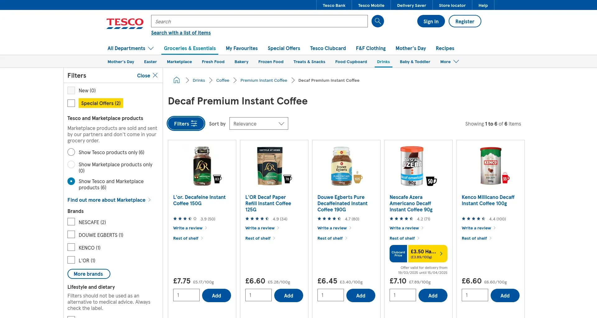
For those who are more price-conscious, however, Tesco has them covered. Lists of products boldly highlight (in yellow) the deals for the week; items that have been priced matched for competitor Aldi are also called out. The price per weight is clearly displayed to compare like-sized products easily.
For those who are more price-conscious, however, Tesco has them covered. Lists of products boldly highlight (in yellow) the deals for the week; items that have been priced matched for competitor Aldi are also called out. The price per weight is clearly displayed to compare like-sized products easily.

What you can learn
What makes a customer choose between two food products? We can't always know, and Tesco has shown what it takes to cover all of the bases anyway. With convenient filters for price and lifestyle values, even the most discerning shopper can find something they like.
To create a similar UX system for your site, consider the needs that shoppers in your market have. If you have enough products for a given value, such as a certain dietary restriction, include it as a filter. Not only can this help surface products new to a shopper, but it also reinforces that your brand aligns with their values.
5. Apple
Tech giant Apple tends to make all the best UX lists. The most "Apple-like" feature on its desktop site is the way it works branding into everything. For example, the homepage is essentially a list of new products and product developments, all with a similar format:
- Name of product
- Three to four short (one to two-word) taglines
- “Learn” and “Buy” links
- Photo of the product
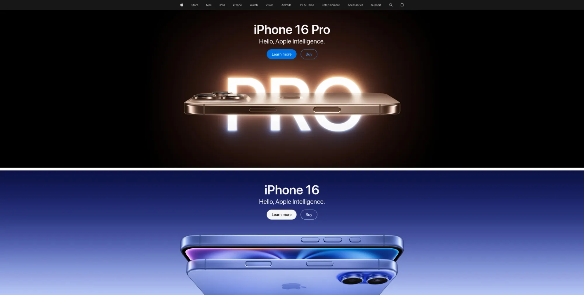
This very simple yet bold UX aligns with Apple’s brand; the aesthetic reinforces its premium price point. It also moves customers to either learn more about something and get the info needed to make a decision or make a purchase right away. Apple acknowledges that both customer types exist.
The clever taglines communicate the most important parts of each product and act as mini advertisements. Each word uses its real estate in the most efficient way possible.
What you can learn
Apple’s approach to UX is very on-brand. Even if you didn’t know it was an Apple site, you could infer it from using bold messaging, short taglines, and beautiful design. The company demonstrates what’s possible if you infuse your brand DNA into as much of the UX as possible.
If you already have clear brand guidelines in your brand kit or design system, this is your chance to communicate that through your ecommerce site. From font to color to logo choices, each design choice on your site can create a brand experience similar to what a shopper might feel when buying in-store. Leave customers feeling that there’s no other site that offers the same aesthetic and that your site is the best way to connect online with your brand.
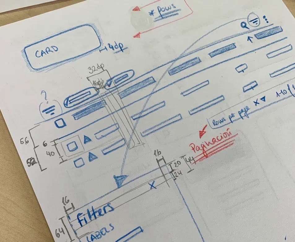
Where good ecommerce UX begins
Each of these examples likely started with an idea and a sketch, then came to life through a design tool like Penpot. Penpot is a free, open-source design platform that can help you through each step of the UX design process.
Not sure how to start? Take a look at our UI design guide for easy tips and advice on how to create your next great design.
Related Blogs
We have more blogs about UI and many other design related topics. Here's a few examples of helpful articles to help you get the most out of Penpot.
 Paula Tienza
 Paula Tienza