Why use Design Tokens? 7 practical reasons designers and developers swear by
From reducing human error to creating more harmony between teams, let’s explore the benefits of design tokens and why you might want to consider using them in your next project.

If you’re still relying on manual updates and scattered style guides, you’re missing out on the secret sauce powering today’s most nimble design teams. Design tokens are your shortcut to design consistency, lightning-fast brand refreshes, and effortless cross-platform updates.
Imagine swapping out your entire color palette or launching dark mode with a single click. You’ll have no more tedious code hunts or risky, last-minute fixes. Design tokens are one of the tools that product developers use to speed up the process and ensure a consistent, high-quality outcome.
From reducing human error to creating more harmony between teams, let’s explore the benefits of design tokens and why you might want to consider using them in your next project.
What are design tokens?
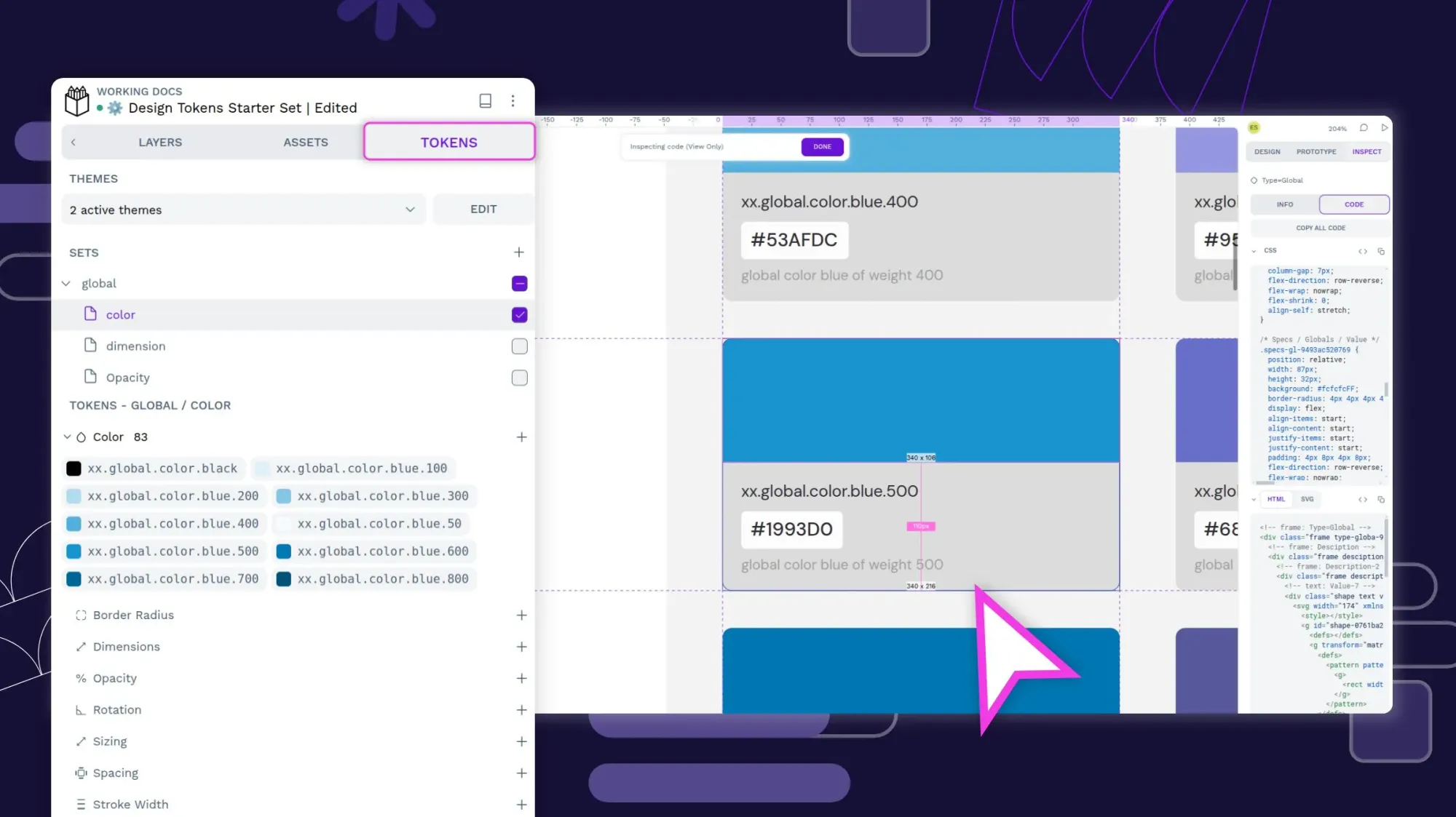
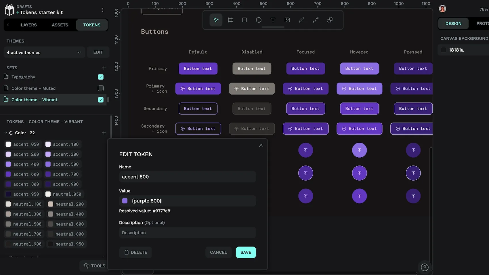
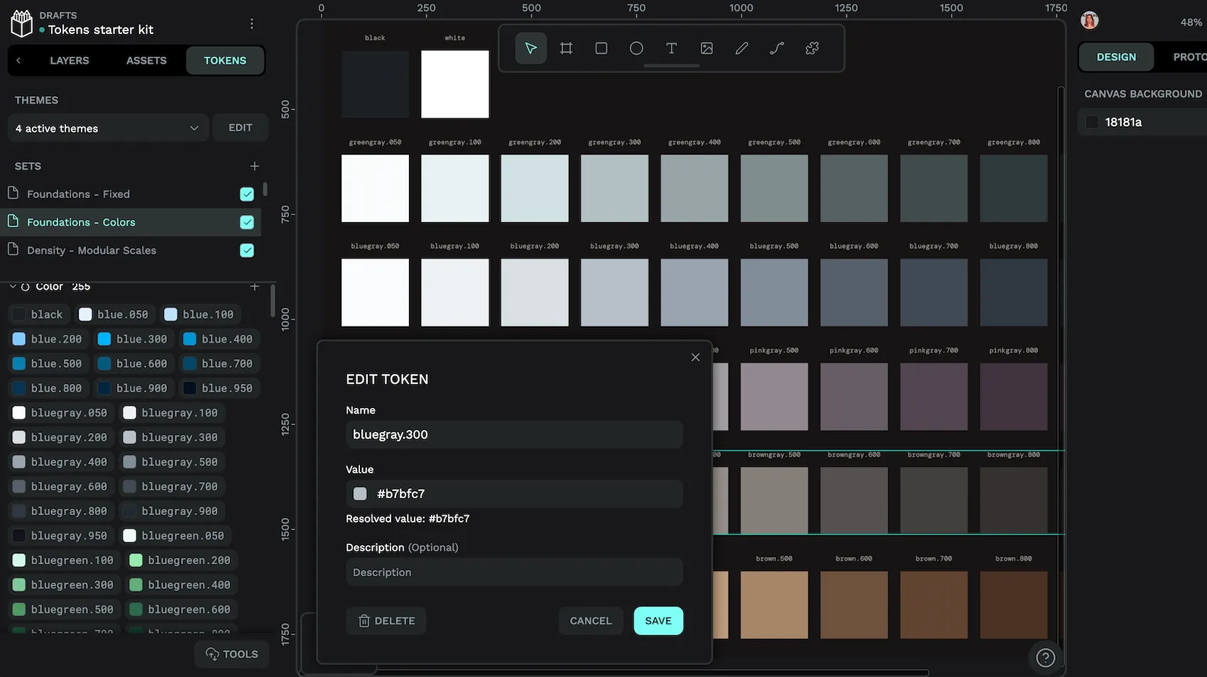
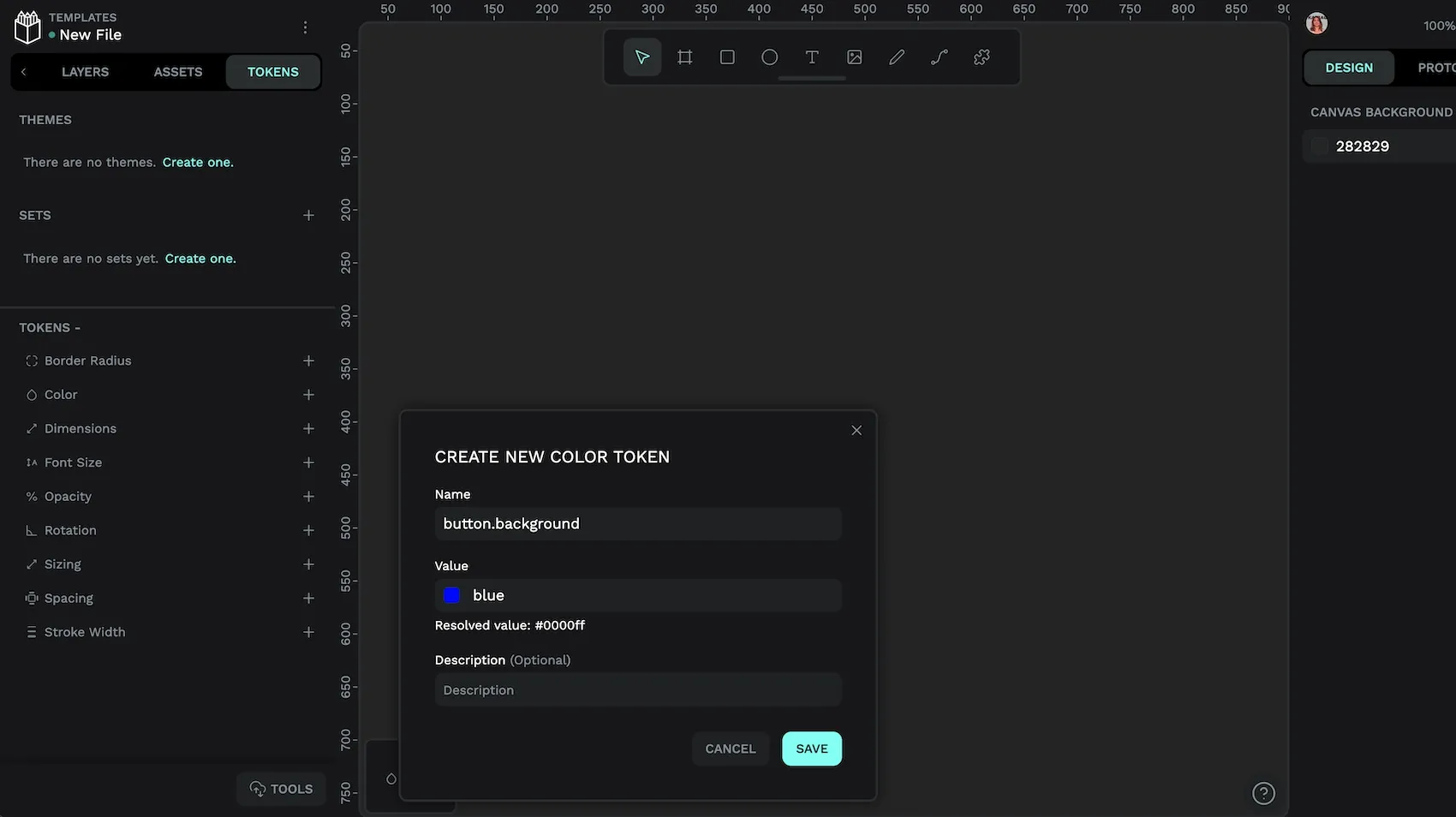
Design tokens are named, reusable variables that store visual design attributes, such as colors, typography, and spacing, to promote consistency across digital products like apps and websites. They replace more complicated pieces of code containing hex color codes or pixel sizes and instead express what they stand for through self-explanatory names.
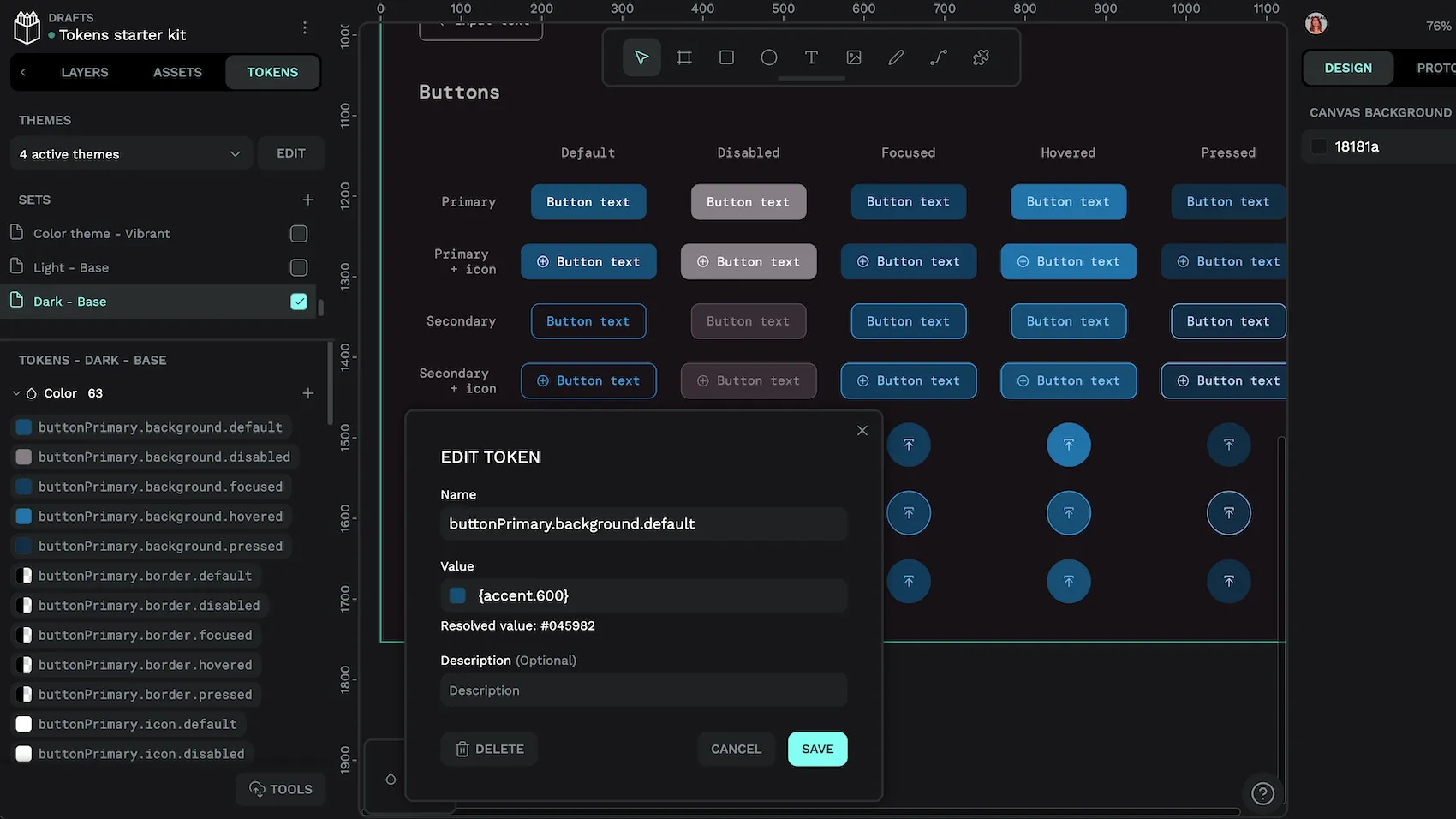
Let’s say you want to create a background color for a primary button in your design system. Instead of hardcoding a hex value of #045982 directly into your CSS, with a design token, you can reference the token name of color.buttonPrimary.default.background in the design code and supporting documents. Now, whenever you put the design token name into your design, the proper color will appear.
So using CSS variables, background-color: #045982; would now be written as background-color: var(--color-button-primary—default-background);.
Design tokens can be especially useful in scenarios where you are making large changes across your site or product. For instance, if you want to change your company’s primary background color for all CTA (call to action) buttons, you only need to change the hex code once in that specific design token. The change will then update automatically and properly across all design elements with this design token.
Design tokens can be part of a larger overall design system, codifying everything from button colors to email template fonts to the spacing between your logo and borders on a webpage.
7 practical reasons to use design tokens
Tokens turn your design system into a living, breathing engine that scales with you, keeps developers and designers in sync, and lets you roll out new themes or products in record time. That’s why top digital brands recognize these benefits of using tokens to outpace the competition.
1. Ensure design consistency across platforms
Design tokens make it much easier for your teams to maintain a consistent look and feel across products and platforms. Without them, you’ll have to remember what changes to make and implement them manually at every design point.
They act as a single source of truth for designers and developers — the same values are applied everywhere, no matter the platform or technology stack. Everyone who references or uses the design token will know exactly the design decisions that it represents (such as a specific display title font size) — no questions asked.
Design tokens also enable automatic propagation of changes. Update the design token and watch the design change populate everywhere that token was used. It reduces the chance of missing things and ensures big design changes (like a website refresh) happen instantly and not in clunky stages.
Why it matters: Design consistency is necessary for any brand that’s serious about its identity. A strong and cohesive visual display between your app, desktop experience, and mobile browser reinforces your messaging and avoids confusion in the market.
2. Speed up design and development workflows
Design tokens put your creative workflows on turbo by automating repetitive tasks, facilitating rapid iteration, and streamlining designer-developer collaboration. These are all a must when trying to stay competitive.
Before tokens, a company would have to manually find and update every place a color is used, including design files, documentation, and brand kits. This can slow down important iterations and create bottlenecks between the design and development teams.
With design tokens, the primary color token (for example, color-accent) is updated in a central JSON file. It’s instantly updated everywhere the token is used, including when the designers look at their mockups. Developers don’t have to search through their code to check instances of the color, as the color changes in the code once the token update syncs.
Why it matters: This strategy can cut design and development time (including back-and-forth communication) so teams can focus on higher-level tasks instead of updating code.
3. Make rebranding and theming seamless
Design tokens centralize all core design decisions into easily updatable variables. So, when companies want to make significant brand changes, updating assets is a straightforward process.
But more than that, it simplifies theming, such as using special assets for seasonal campaigns or creating light/dark modes. It lets designers group token values into theme files or collections, which can be swapped out as entire token sets instead of individual token files.
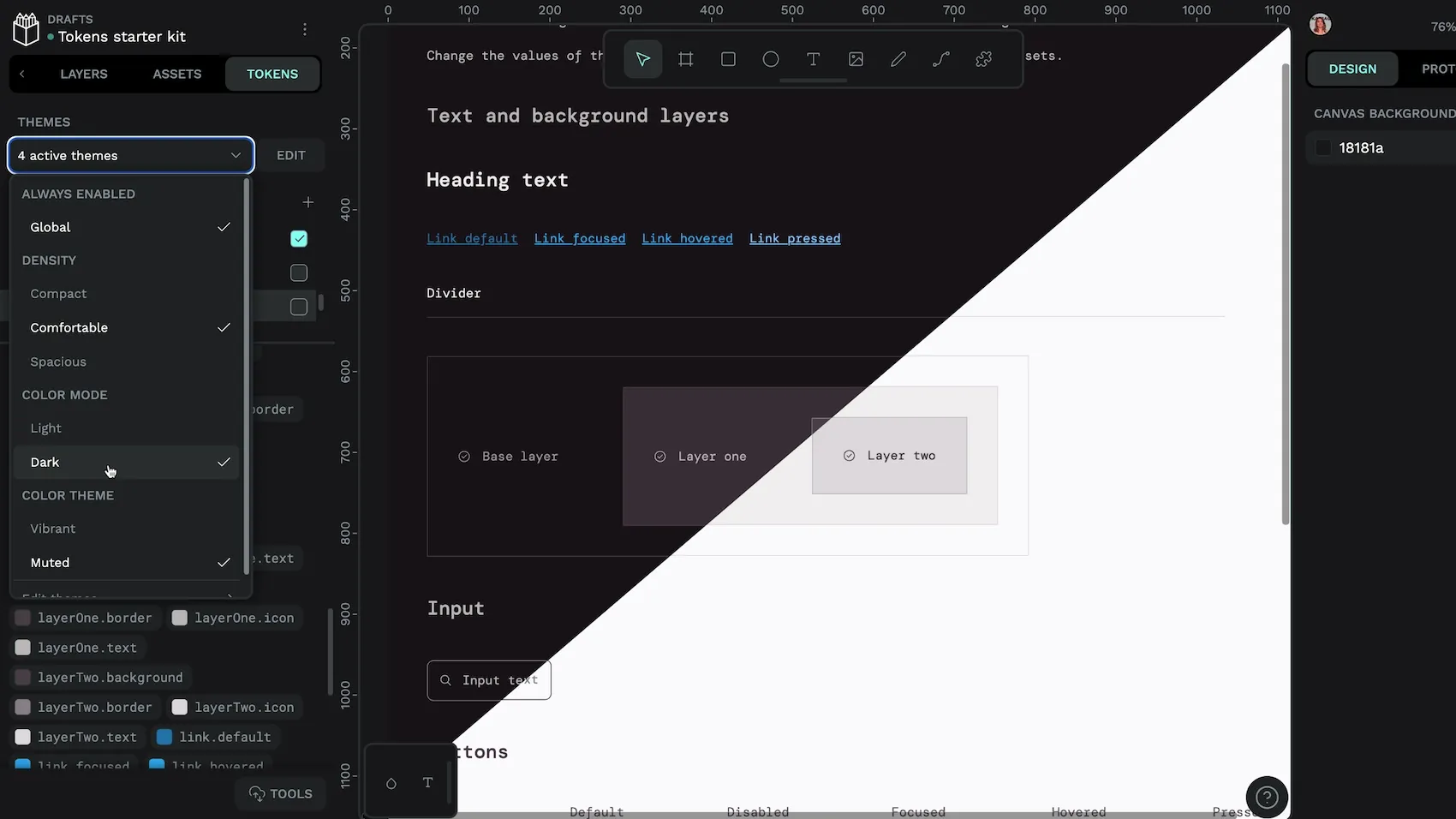
Tokens enable scalable theming by grouping visual variables into swappable sets. For instance, SaaS platforms supporting white-labeling can assign unique token sets per client. They can then streamline custom branding without individual code changes.
Why it matters: Design tokens let teams scale quickly with new themes for different occasions. They offer unlimited possibilities for branding, promotions, and white labeling without too much extra work or the possibility of confusing brand elements.
4. Bridge the gap between designers and developers
Designers and developers do very different things, but they both need to be involved in many of the phases of creation. Design tokens act as a shared language between them, reducing miscommunication during collaboration.
When used properly, design tokens:
- Replace ambiguous or platform-specific values with clear, human-readable names that you don’t need a tech background to understand. Each team can read and interpret them in the same way, allowing for smoother collaboration.
- Store well in a centralized library that integrates with both design tools (like Penpot) and codebases. As designers define tokens, they get expressed in a form that developer tools can also understand.
- Reduce the back-and-forth that has traditionally plagued designer-developer collaboration. Instead of using emails, Slack channels, or lengthy documentation to explain changes, designers and developers can reference the token name and know what’s required.
Why it matters: Since tokens naturally integrate into both design and development workflows and tools, less communication is needed to get the same jobs done. Collaboration can be reserved for important decisions, not simple color swaps or spacing updates.
5. Future-proof your design system
Even the best design won’t be relevant forever. Design tokens help teams have everything they need for future iterations of their websites and apps. The platform-agnostic variables that tokens represent can be updated quickly as needed, whether it’s two months down the road or tomorrow.
They do this by:
- Decoupling design values and implementation code, so design updates can be made quickly and without much help from developers.
- Working within platform-specific formats, such as CSS for web and XML for Android, so changes can be made across future technologies without starting from scratch.
- Using hierarchical taxonomies that allow systems to get larger without becoming overly complicated.
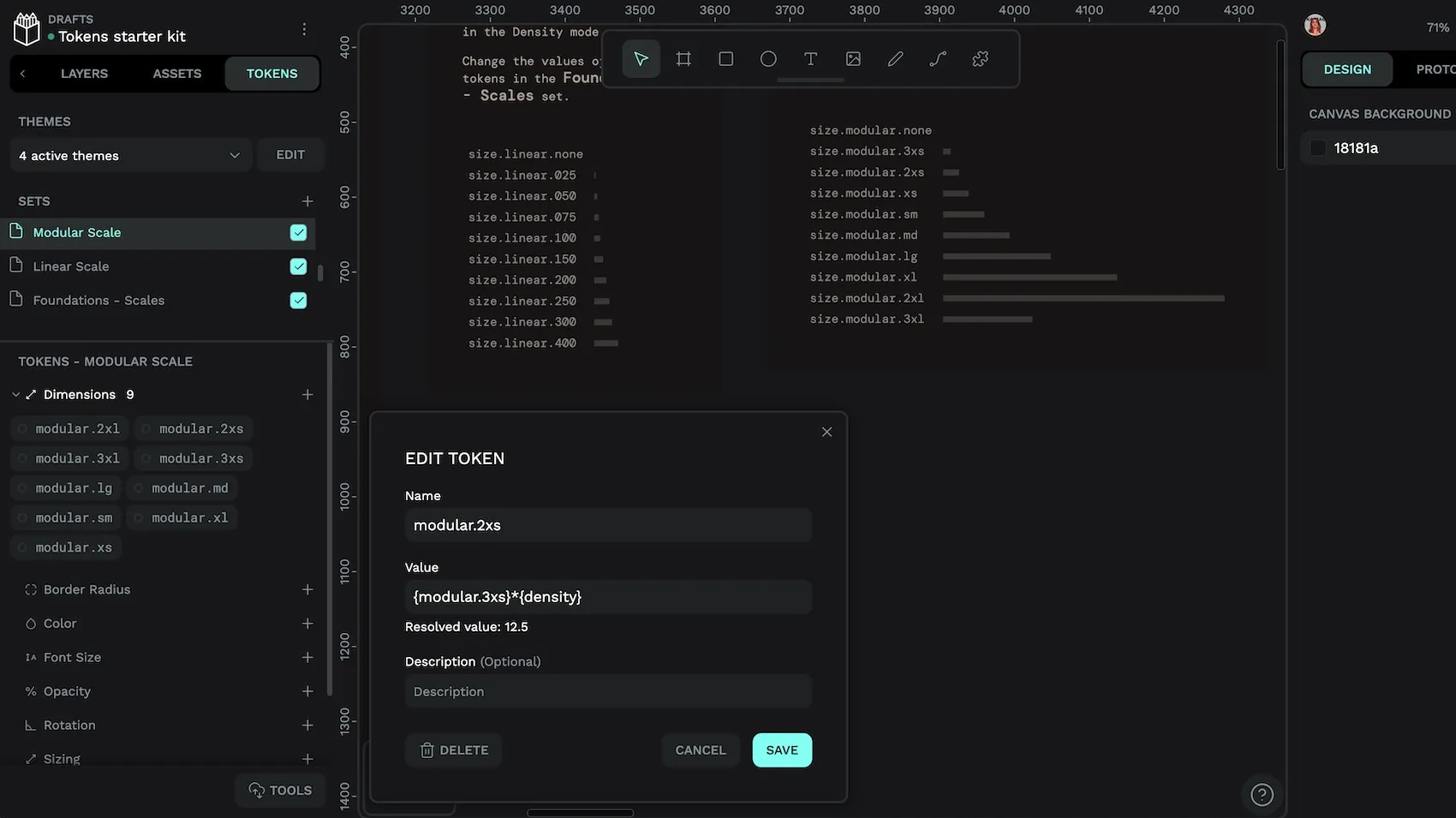
Why it matters: As design systems grow, the number of design choices will, too. Tokens simplify these choices into logical systems that stay consistent without risking inefficiency as companies scale to meet customer needs.
6. Reduce human error and technical debt
Design tokens centralize design decisions and automate updates, which enforces consistency without additional work. In most cases, this can lead to more reliable products, lower costs, faster delivery, and happier teams, making it a wise strategic move for companies investing time in creating digital products.
We’ve already explored how the tokens reduce human error; with updates syncing all token uses at once, there’s less tinkering and fewer opportunities to mess up the code. But there’s another thing to consider: technical debt, which happens when shortcuts or inconsistent practices make systems harder to maintain or extend over time. When more and more work is needed to keep a system afloat, it can have a negative return on investment.
Design tokens tackle technical debt head-on — they are inherently reusable. Each token is created once and is able to be used an unlimited number of times. You also avoid repetitive code changes and bug fixes that can drag down a developer team’s productivity and create opportunities for mistakes.
Why it matters: Reducing errors and technical debt lowers overall maintenance costs and frees up teams to innovate, launch new features, and make strategic fixes.
7. Power automation and smarter tooling
Design systems and tokens create many smart shortcuts for teams that help them work smarter and do more with the resources they have. A good example of this is “power automation,” or the use of workflow automation tools and scripts to streamline repetitive and time-consuming tasks.
Developers may do this by creating workflows triggered by certain events, such as updating a design asset or getting an approval sign-off. When the triggering event happens, automated actions occur, such as updating documentation or syncing files. Design tokens can be included in these workflows to further maximize the automation — a change in the token triggers design updates for every use case of that token.
Another example is “smarter tooling”, which uses automation, AI, cloud collaboration, and advanced integrations to help teams work even faster. It couples the efficiency of automation with generative AI and design to suggest improvements or even automate routine design decisions. It can even be “souped-up” with analytics to see if changes have the desired effect, will be sustainable over time, or meet customer needs.
Here’s a sample workflow with design tokens at the core of the automation and tooling:
- A designer changes the primary button color in Penpot.
- The change is exported as an updated design token file (e.g., JSON).
- A CI/CD pipeline (like GitHub Actions) detects the change and triggers a build.
- Style Dictionary converts the token into CSS variables and other platform-specific formats.
- The frontend codebase is automatically updated with the new color.
- The live product reflects the change instantly, and all documentation is updated.
The developer has already created some automations to make workflows more hands-off, but the addition of design tokens takes it one step further.
Why it matters: As teams are encouraged to use automation more often to streamline basic tasks, they’ll need new ways to improve workflows. Design tokens are easy to auto-sync and ensure that each use of a design does the same thing across all workflows without the need to manually check, adjust, or refine for each platform or use case.
Get started with design tokens with Penpot
Design tokens are the future of design and development, but not all tools support their use. Fortunately, Penpot natively supports them, making it simple to define, manage, and store design values in one easy-to-access place. That means your teams can have an almost end-to-end experience within the Penpot platform, using it to sketch out basic wireframes, create robust prototypes, and even express these designs as code.
Then, when it comes time to codify your design choices, you can create JSON files for developers to use later. Teams can collaborate at any point in this creation cycle through Penpot’s cloud-based, platform-agnostic interface, so everyone can use the tokens as a single source of truth.
Sign up for a free Penpot account and experience powerful design tokens for your next project.
FAQs
Are design tokens only useful for large teams or organizations?
Design tokens benefit teams of any size by promoting consistency, reducing manual work, and making updates easier. Even small teams or solo designers can save time and avoid mistakes by using tokens as their projects grow or evolve.
What types of design tokens are there?
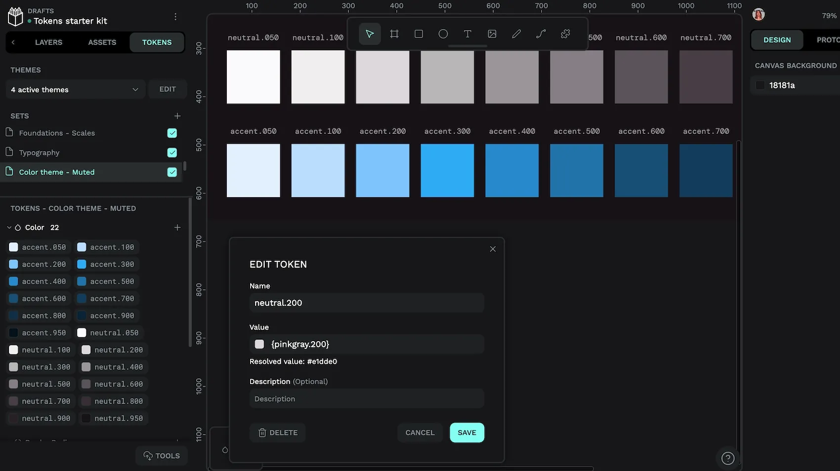
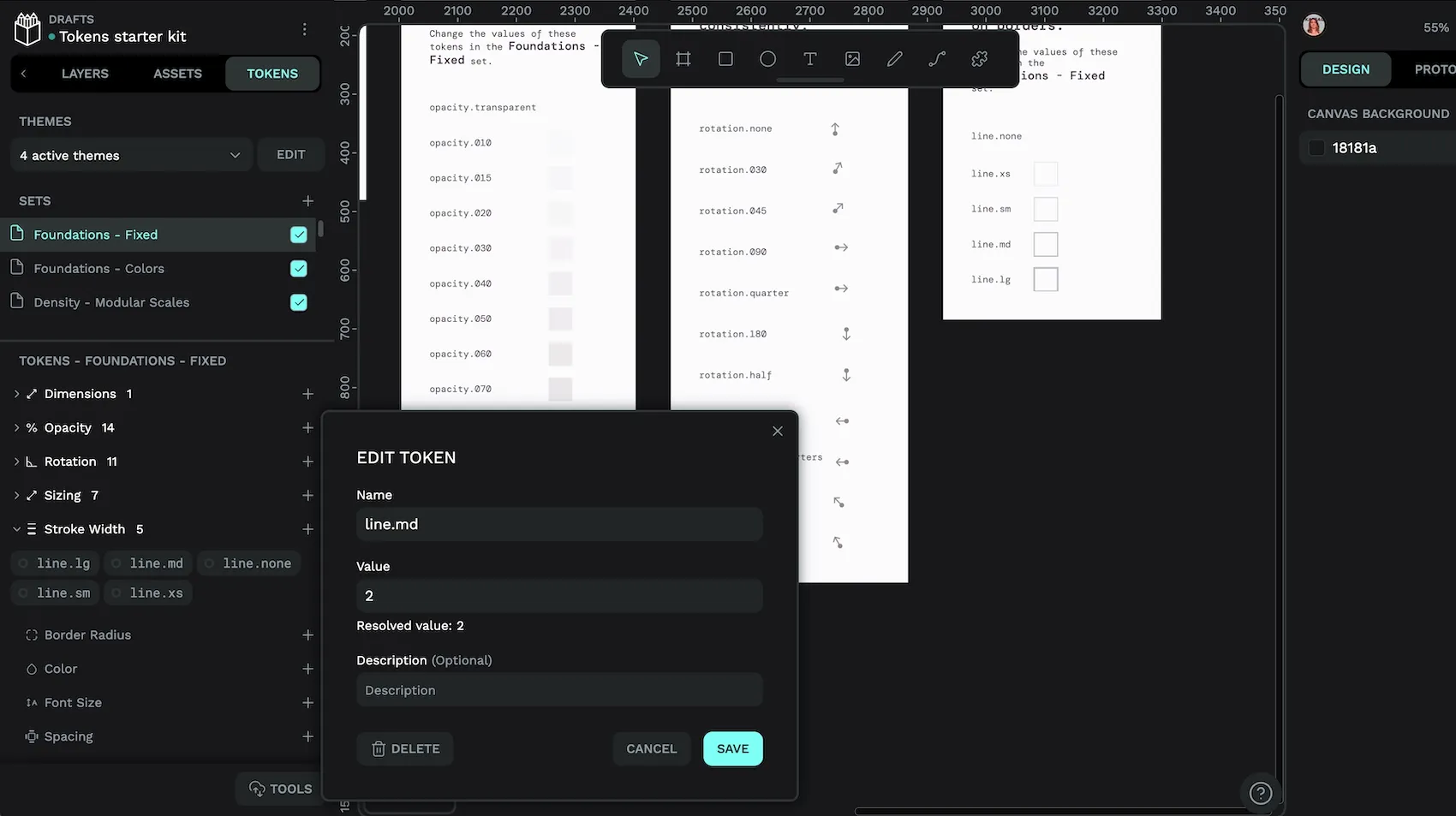
The draft Design Tokens Format Module contains a number of token types including color, dimension, duration, and number, including composite types such as stroke style, gradient, and typography.
Check out the token types supported in Penpot.
When it comes to categorization, design tokens generally fall into three categories: primitive tokens (basic values like colors or spacing), semantic tokens (which define usage, such as "text-default" for primary text color), and component tokens (specific to UI elements like buttons). Each has a use case within design and development, giving companies a wide range of options for how they create products.
You can read more about token types in my earlier blog post.
How do design tokens differ from traditional style guides?
Unlike static style guides, tokens can be updated in one place and instantly reflected across all platforms, ensuring consistency and saving time.
Related Blogs
We have more blogs about design tokens and many other design and code-related topics. Here’s a few examples of helpful articles to help you get the most out of Penpot and design tokens:
 Laura Kalbag
 Laura Kalbag
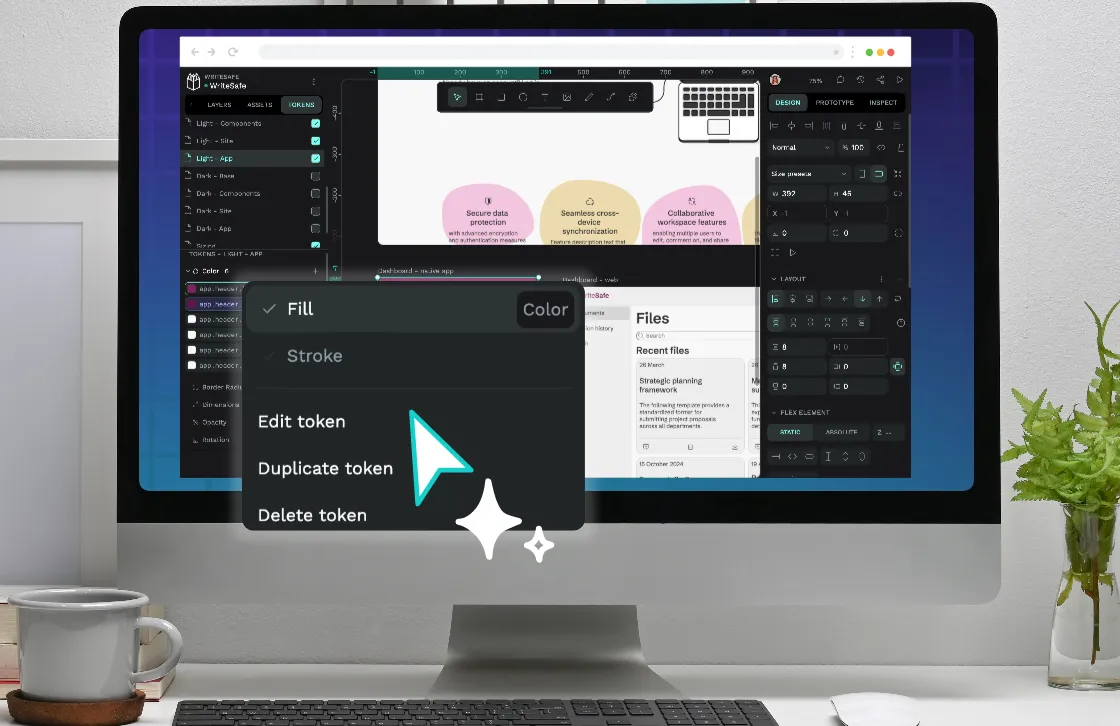 Laura Kalbag