What is Interaction Design? A Guide for UX Designers
In this article, we'll break down what makes interaction design different from other types of design, go over its key ideas, and share the tools and steps designers use to create great digital interactions.

Interaction design (IxD) is all about how people interact with digital products like apps, websites, and device interfaces. Unlike graphic design, which focuses on how things look, interaction design focuses on how things work and feel when you use them. It’s about creating intuitive, easy, and enjoyable experiences for users.
In this article, we’ll break down what makes interaction design different from other types of design, go over its key ideas, and share the tools and steps designers use to create great digital interactions. It’s for students, designers, and anyone curious about how digital products are made to feel so user-friendly.
What is Interaction Design?
Interaction design (IxD) is a specialized discipline within UX design that focuses on how users engage with and use digital products and the responses they receive from those interactions.
IxD creates a dialogue between users and digital products. Instead of being about how a product looks, interaction design focuses on the back-and-forth of the interaction, such as:
- Feedback mechanisms that respond to user actions
- Interactions that look and feel natural
- Intuitive experiences that don’t feel cumbersome or clunky, with many steps needed to complete a task
Even if they don't use the term, most UX/UI designers apply interaction design principles. Later in the design process, designers may look at specific moments when users interact with a system, such as clicking buttons, swiping screens, or receiving feedback from animations. These are interaction design issues.
Why is interaction design important?
Interaction design is important for creating frictionless and meaningful experiences for users. Without this focus on human-computer interaction, websites and apps wouldn’t be as effective in guiding users through their intended behaviors and fulfilling the site's purpose. They would lack some of the following must-have traits of successful design.
Usability
Interaction design improves digital products by making them easier to interact with and navigate — users can easily move from point A in the journey to point B, and so on. It also provides feedback along various steps in the user journey, such as system status or a successful submission. For example, it could show text that a payment has been processed or that more fields must be filled out before a form can go through.
When a digital product has a solid interaction design, the user might feel positive about it and use it longer or for more sessions than a less interactive competitor. They may even share it with their friends. It improves the chances of them returning and becoming loyal users.
Accessibility
A user interface design should be effective for as many people as possible, and interaction design supports accessibility goals, especially for users with visual or auditory impairments. Interactive design elements like alternative text on images or high-contrast colors improve usability for all users. The more people who can enjoy your digital product, the larger your potential user base. Check this accessibility list to review your designs.
Interaction design best practices also help you comply with Americans with Disabilities Act (ADA) legal requirements.
Increased user satisfaction
A seamless and enjoyable user experience connects with your digital product and your brand. Quality digital design can help build goodwill and trust in your brand because users who enjoy a digital experience may begin to depend on it — and you. For example, a bank customer who successfully uses an app to deposit a paycheck or transfer funds may feel confident they can do it again (and give the bank credit for the positive interaction).
This is especially true when combined with customized experiences. We know that personalization brings warm and fuzzy feelings to consumers, so why wouldn’t you want this for your design?
Key principles of interaction design
Successful interaction design can put your users at ease and help them accomplish things in their daily lives. So, how do you get there? While the details may be unique to your brand or aesthetic, these general principles are the foundation for anything you create.
Consistency and standards
Users need every page or feature of your design to have the same look and feel. It reduces their cognitive load and allows them to navigate a website easily. When your product has uniform components, design elements, behaviors, and patterns, users can navigate easily and feel in control.
Design uniformity allows visitors to use what they learned from previous interactions to interact with your product again.
How to do it:
- Use familiar design patterns, such as blue underlined text for links and shopping cart icons for cart functionality.
- Keep visual consistency in your color palette, typography, and illustrations.
- Make every interactive element do the same thing on every page.
Example: A streaming app maintains a consistent color palette in all its app versions, across all devices and platforms.
Feedback and visibility
When people interact with a digital product, they want to know that they are doing it correctly and that their interactions matter.
Immediate, visible feedback reassures users and encourages them to keep interacting with the site or app. This will reduce confusion and help them build trust, but it will also help them understand the results of their actions. By knowing what happens next through visual cues, they can make informed decisions and be in control of their digital experience.
How to do it:
- Give immediate visual or sound cues (color change, progress indicators, etc.) for important user actions.
- Communicate system status clearly and concisely through text or pop-ups.
- Make feedback relevant to the context. For instance, error messages should clearly state the issue and how to resolve it.
Example: A very easy-to-understand example is the "Double tap to like" feature on Instagram provides immediate visual feedback (a heart animation) when users interact with content.
User control and freedom
People don’t want to feel “trapped” in a digital experience — this can happen when they can’t back out of a screen or execute their choices. Interaction design gives people maximum freedom to navigate as they wish and change their minds easily without having to exit a tab or close the app entirely.
How to do it:
- Give clear navigation options and let users return to previous pages or features.
- Offer undo/redo for important tasks.
- Present customization options to adapt the interface for a more customized experience.
Example: A return to home button at the top of a page gives users a quick way to return to where they started.
Simplicity and learnability
Create a simple site or app so users can dive right in and start using it right away. Make it do just one thing really well, and help users understand from the start what they should accomplish when engaging. If the site is the first of its kind (to support a new technology or trend), be the first to market with a learning path to help users master it quickly.
How to do it:
- Prioritize the most important information and focus on essential actions.
- Use clear, concise language that describes elements well.
- Make a learning plan that works with all users (tutorial, FAQ, Help Center).
- Give positive reinforcement for actions taken, such as a “Success” text pop-up upon submission.
Example: New users of a learning app see a pop-up tutorial guide that shows them how to interact with various elements.
The 5 dimensions of interaction design
These different design aspects must work together to create a truly interactive experience.
Words
Words refer to the language used in interactions. They guide users through the interface by giving clear instructions.
Do’s: A music app’s “Create Playlist” button has a clear, concise label that is easily understood.
Don’ts: A button with “Click Here” text doesn’t tell users what will happen when they click it.
Visual representations
Graphics and UI elements help users understand and navigate a website or app. They are clues to how things work and should be usable by everyone.
Do’s: A vacation rental app uses a simple, recognizable magnifying glass icon to show where the search function resides.
Don’ts: A web browser uses a non-standard icon for the “share” function instead of a widely understood and recognized arrow.
3. Physical objects or space
This dimension considers the tangible devices a user interacts with, such as a smartphone, keyboard, or touchscreen on a laptop. It also includes the physical environments they engage from, like a car, office, or the comfort of their home.
Do’s: The "Pull to refresh" gesture on mobile apps mimics the physical action of pulling down a page to reveal new content.
Don’ts: An ecommerce site’s mobile app dropdown menu has too many options to select one at a time without “fat thumbing” and causing frustration.
4. Time
Time refers to animations, transitions, and response times that affect the user's perception of the interface.
Do’s: LinkedIn's loading animations provide feedback to users while content is being fetched, keeping them engaged and informed about the process.
Don’ts: A streaming channel’s auto-play feature that starts playing content after a few seconds can be jarring and disruptive to users deciding what to watch.
5. Behavior
Behavior includes how users interact with the system and its feedback.
Intuitive example: Asana's flying unicorn animations celebrate task completion and add a delightful, motivating element to user interactions.
Non-intuitive example: A messaging app’s delete message feature leaves a "This message was deleted" notification, which doesn’t provide additional context about who can see the message and doesn't fully meet user expectations of privacy.
How to implement interaction design into your product
Use these steps to put interaction design principles to work and make your next project a success.
1. Define project scope and goals.
Ask stakeholders, “What problem do you want to solve?” They may offer key performance indicators (KPIs) to work from, which can help you narrow down your scope to the most important outcomes. Then, create a project plan that outlines the scope, timeline, and deliverables. Be sure to include the constraints and limitations of the plan, including budget, technology, and resources.
2. Conduct user research
Do formal and informal user interviews to get insights into user needs and behaviors. Ask questions in the proper context of your project and the problem you hope to solve. For example, do users need to have text prompts for new product features? Or would they prefer a separate tutorial or FAQ page?
From the data you get, develop user personas and empathy maps; analytics can help if you’re looking for new insights that may not yet be on your radar.
Then, map out user journeys to identify the existing pain points and the opportunities to solve them with your product.
3. Ideation and conceptualization
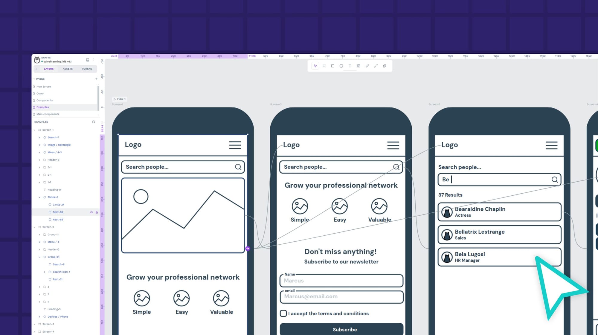
During this creative phase, organize brainstorming sessions using techniques like mind mapping. Sketch out your rough ideas on paper to start. Then, create wireframes to visualize the basic layouts and functionalities. (Our guide to wireframing can help you focus and keep you from getting bogged down with the details.) Share your vision with others in your organization, and collect critiques to refine ideas.
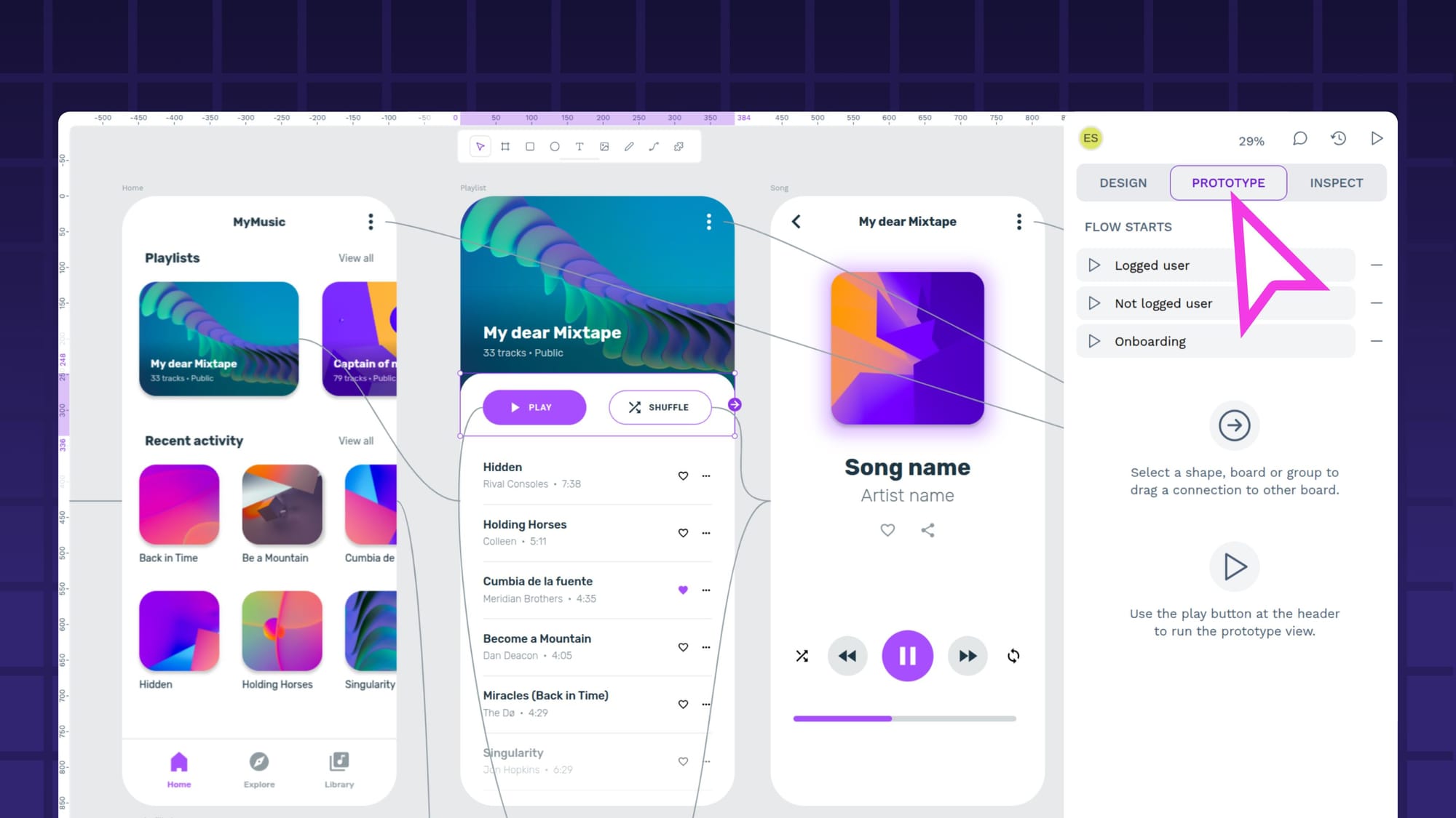
4. Design and prototyping
Develop a consistent design system with color palettes, typography, and UI components. Once you have these essential building blocks, create high-fidelity mockups with extra details using design software like Penpot. Each design iteration should have increasing levels of complexity to demonstrate how the project is being refined over time.
5. User testing and iteration
With each revision, make your design more realistic. For example, later versions could incorporate animations and micro-interactions to enhance user experience and demonstrate those usability principles central to interaction design. You should test each version with a select group of users to see if each version invites natural and frictionless interactions from your ideal audience.
Take feedback seriously and identify areas for improvement. Use A/B testing to compare different versions of improved designs and see if your changes had the desired effect.
6. Design collaboration and development
Prepare detailed design specifications and style guides to support a smooth handoff from designers to developers. Assets should be exported in the appropriate format for developers, or you can invite them to access, review, and download their own files from a shared, cloud-based tool like Penpot. The collaborative design platform also supports notes, so you can add feedback at every stage of the design process, where your developers can be sure to see them.
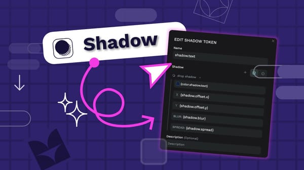
When handing off the designs to development, CSS code and Design Tokens may be helpful, as it ensures developers know exactly what the designers had in mind; there’s less room for error. Penpot generates this automatically, bringing everyone on board with each design change.
7. Launch and post-launch evaluation
Once the product is live, there’s still work to be done. Continuously monitor user analytics and engagement metrics to make sure users engage how you want them to. Look at your most visited pages or features. Is it what you expected?
Conduct post-launch surveys to gather user feedback, and use incentives if they help boost the response rate. If you don’t have the budget to give outright gifts, consider adding time to their subscription or granting access to premium features. Perform additional usability testing on the live product so you can see how users experience the product and iterate your designs and final product accordingly.
Check in with customer support, too, as they generally hear from unhappy users before anyone else. Then, plan for ongoing design iterations and improvements based on real-world usage and the feedback you’ve received from your customers.
Get started with interaction design using Penpot
Penpot’s design platform works well for UI and UX professionals who need a unified way to implement interaction design concepts. It works across all devices and keeps both design and development pros communicating, collaborating, and working together to achieve a winning product.
Use Penpot to store your color palette, icons, and other important elements of the design system. Then, build your wireframes and prototypes within the same platform. Whether you’re building a product from scratch or launching the 2.0 version of an app, Penpot stores your ideas and iterations in a convenient cloud-based tool.
Sign up for a Penpot account today and start putting your interaction design knowledge to work.