What is a component library?
Designers and developers create better products when they can collaborate easily and create consistent design decisions. One of the more practical ways to accomplish both aims is to employ a component library.

Designers and developers create better products when they can collaborate easily and create consistent design decisions. One of the more practical ways to accomplish both aims is to employ a component library. Made to give organizations a plug-and-play approach to their UI elements, component libraries take some work to create but pay off big in time saved later.
What is a component library?
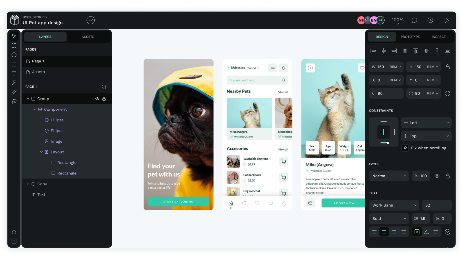
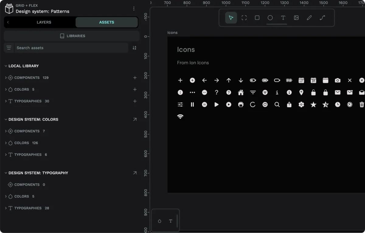
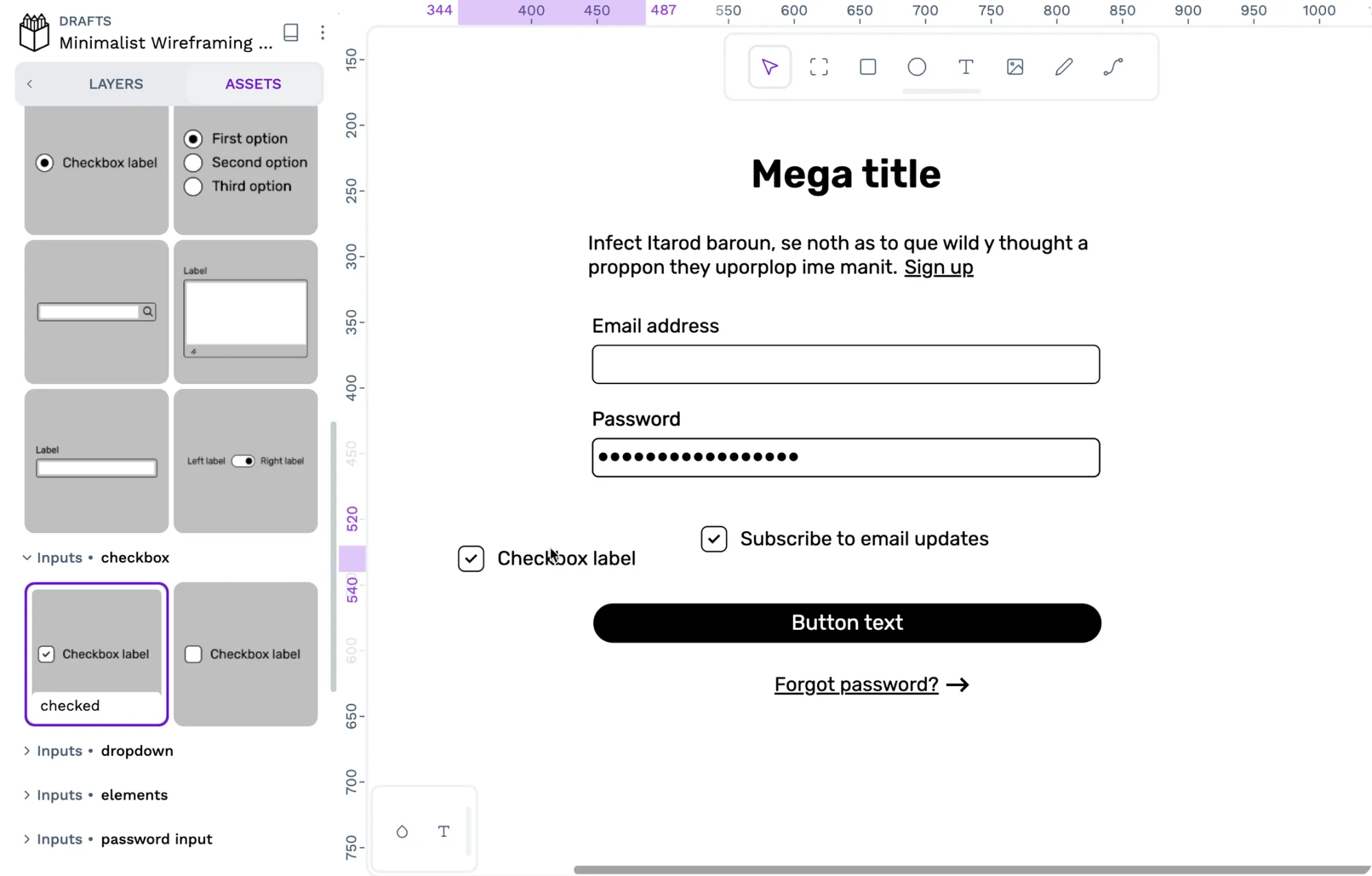
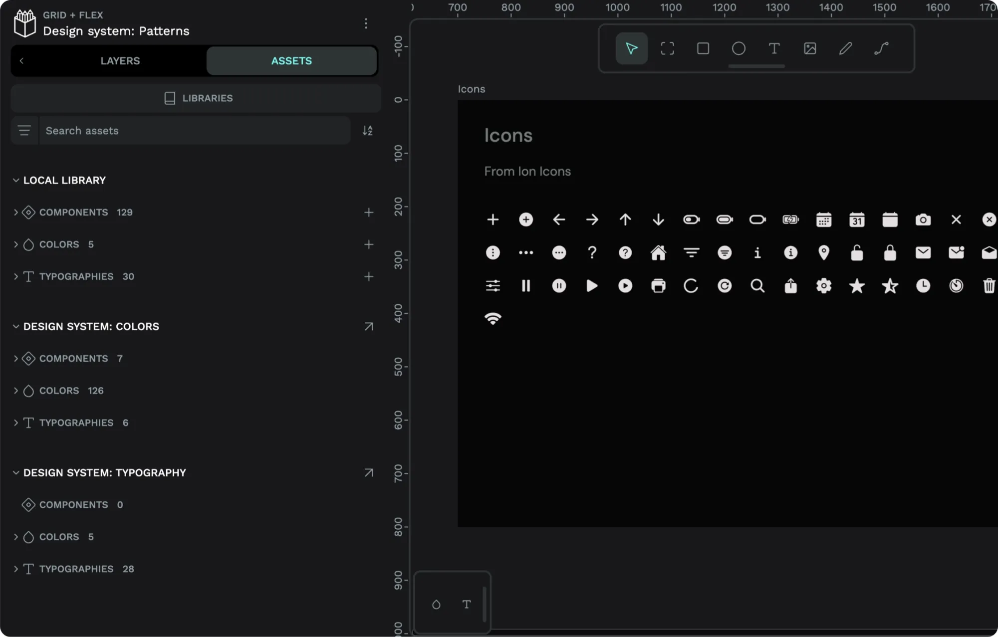
A component library is a group of pre-made UI elements that have been tested and pre-approved for use within a product’s development. These components are already greenlit for inclusion in new products after being vetted for consistency and adherence to design principles.
Join our next live demo on Color palettes and shared libraries or watch afterwards.
They may include buttons, icons, forms, or any other UI element needed to finish a digital product and can be reused over and over without the need to create new elements from scratch.
Popular component libraries are often shared online as open-source libraries for anyone to use. They may be searchable and come with supporting documentation to help developers begin using them easily. As components are updated – or new items get added – the developer teams usually get notified of the changes so they can update their assets and workflows.
Component libraries are just one part of a design system but can also be used outside of a design system.
What are the benefits of using a component library?
Getting a project across the finish line requires so much of both your design and development teams, not to mention other teams involved, such as Marketing or Growth. They have to be on the same page about what to include so that they don’t create extra work for others. The component library reduces many of the miscommunication that happens in a typical project and can serve future projects well, too.
Here’s a quick rundown of the advantages it offers:
Saves work
Reusable components give you a plug-and-play option for adding to projects. Instead of creating new items each time you start a design, you can dip into the component library for tested elements that already work with your brand.
Offers consistency
Are those buttons actually the same? Or are they off in size, shape, color, or gradient? To avoid having to ask, go with a component library. Its standardized approach to design gives you free rein to use the elements you want within a preset collection. These pre-approved components have already been scrutinized and given the “go” for meeting consistent UI design standards.
Reduces miscommunication
Even the most cohesive teams get it wrong from time to time. Instead of relying on marketing to tell design what to ask of development, pluck an element from the component library instead. Yes, to make it into the library, these teams must have already come to an agreement on what works and what doesn’t.
The reusable nature of a component library means they only have to have those conversations in the first go-round. After that, each component can be implemented with minimal back and forth. Frustration-free design and development is possible!
Simplifies coding
The elements of a component library are like the building blocks of your web project. After they’ve been coded and tested, they should be good to go for some time. When it comes to maintaining your site, you can work on one block at a time, test as needed, and then put the updated element back into the library. If a page or app feature isn’t working right, you can more easily dissect its code and update it across all instances.
With developers spending less time making elements, they can focus on your bigger problems: testing, rolling out new versions of your app, or getting started on that next big product.
Puts the users first
Websites and apps have high user experience expectations, and not meeting these expectations can have consequences for your product, your brand, and, ultimately, your business. In fact, companies that engage in “user-centered design” see better results for usability, user satisfaction, and more.
Component libraries can be a big advantage for organizations that need to balance user expectations with customer and business needs. Creating the components according to focus groups, testing, and established methodology enables user-friendly experiences; scaling and reusing the components in the library helps teams meet those metrics that matter in the budget meeting. A component library is one of the best examples of a win-win in design and development today.
When should you use a component library?
Component libraries are ideal for organizations that have many projects in the pipeline and want to quickly scale their best work to be used in a variety of situations. They are also great for organizations that have a good brand identity and a general idea of how to execute that identity across all digital platforms.
In short, it’s for brands that know how to be intentional and see themselves reusing components again and again.
It may not be suitable for those who have a tiny one-off project where components can’t or won’t be reused. The time needed to develop the elements and supporting documentation may be more than it’s worth.
It’s also not ideal if you are doing something outside your brand scope or reinventing your identity. (However, once you do get that new identity established, it may be worth giving a component library a second look.)
Finally, if you have the time and talent to code all of your components from scratch, you may not need a component library at all.
Tips for creating your own component library
Most companies that use a component library find it worthwhile, but it does take a good amount of time to create and document. Here's what you can expect if you are building your own:
Establish the goal of your component library
Yes, it is to create projects, but to what end? Include the mission of your company and the project. Identify who the user will be and the problem you hope to solve.
Pick your technology
Since your library will be full of pre-coded assets, you’ll want to have the code language established ahead of time based on your team’s competencies or platform needs. This is also the time to establish the framework, such as React, Vue, or Svelte. (Some companies choose more than one and create assets for each.)
Things like code editors, compilers, and other tech must-haves will be picked at this stage, too.
Make your components
Build the assets you will use for your projects based on your values, design kit, and other guiding documents. Test each component according to your internal QA processes.
Create documentation
Write up the purpose of each element, how it’s used, and technical guidelines. This is also a great time to make demos of your components in a prototype. Others will be able to see the component in a use case that demonstrates its strengths and capabilities.
Package and publish your component library
You’ll need to pick more tools here, such as a bundle, and then publish the library to a registry. Once it's published, you can share it internally with your teams or even with an external audience to promote your brand and build goodwill within the coding community.
Maintain your library
While the hard work may seem like it’s done, having a library requires ongoing maintenance. In addition to quickly fixing any bugs reported by your teams or the larger community, you’ll want to audit your elements regularly. Any time you fix or add something, document it for the change log and share it with those who need it.
Getting started with a component library
A component library is a significant undertaking, but it can repay your hard work with incredible rewards.
Imagine being able to grab a button or form from your component library and know that it’s coded and ready to go into any project. That freedom is valuable and one of the reasons these element collections are popular with companies of every size.
To learn more about how to create your own component library, sign up with Penpot and check out our lesson on how to take advantage of all of our library features. You can also explore our library examples so you can find the inspiration you need to get started.
Related Blogs
Check out our other blogs, from informative topic guides to tutorials on how to get the most out of Penpot.
 Laura Kalbag
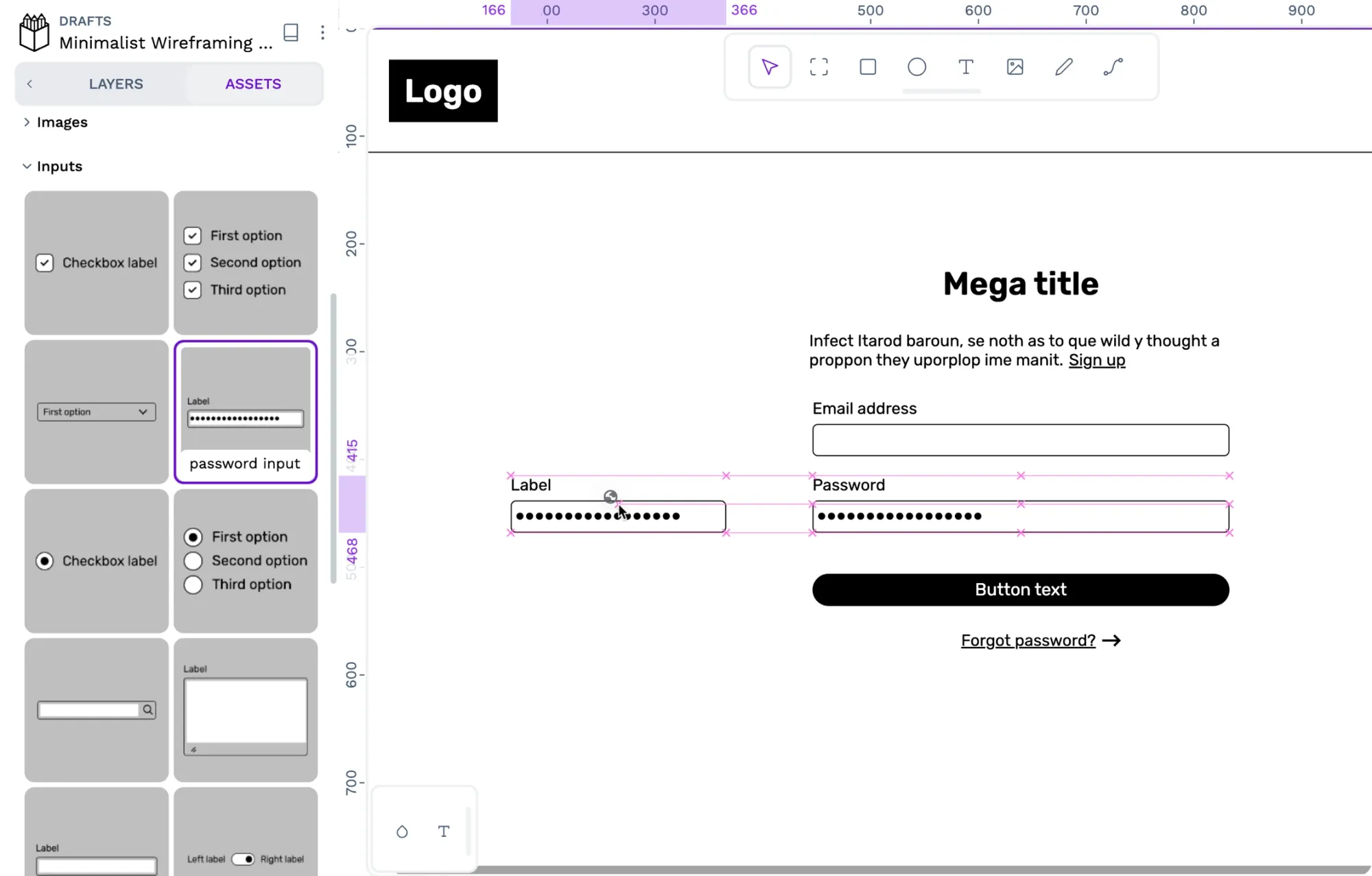 Laura Kalbag
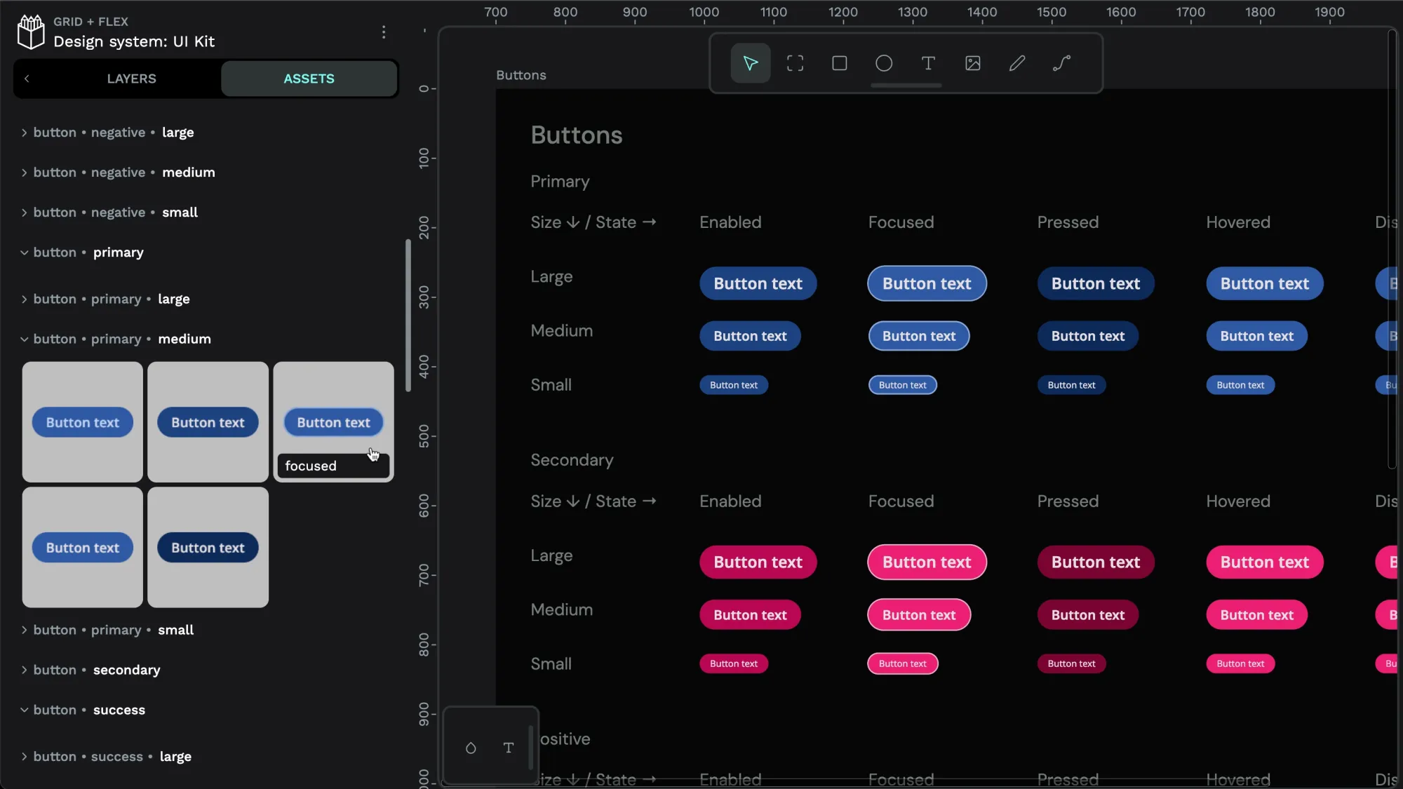 Laura Kalbag
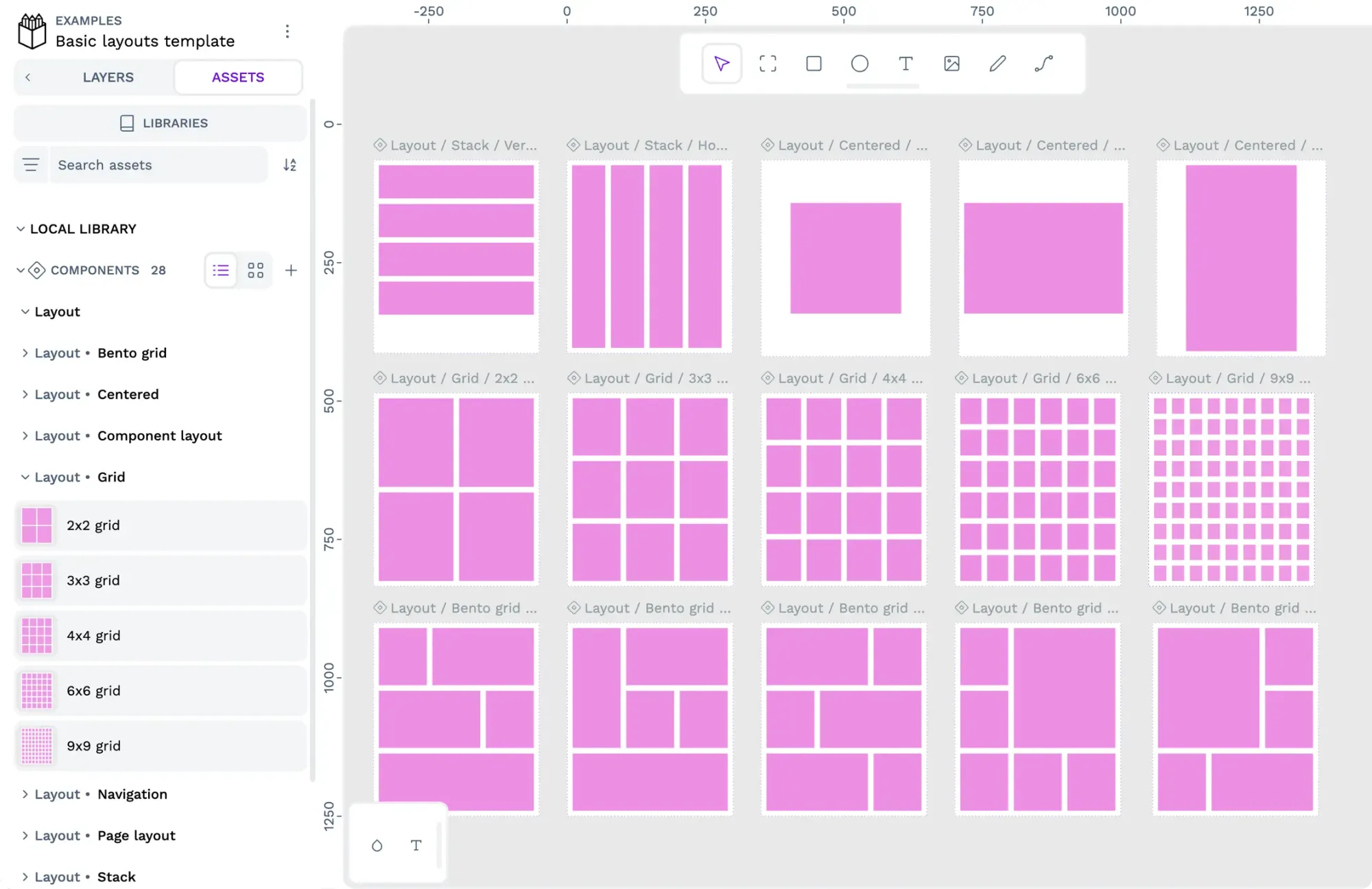 Paula Tienza