Understanding the z-index: A beginner’s CSS guide
What's z-index? Learn how to manipulate the z-index, why it matters, and how Penpot makes it easier to manage stacking without touching a line of CSS.

Webpages are constantly shifting; menus open, elements animate, and layouts adapt to different viewport sizes. For web development beginners, that means one small change can suddenly break everything you thought was working. The last thing you want is for your carefully crafted design to be ruined when your layout shifts just so slightly.
That’s where understanding how the z-index works can help. It controls how elements stack visually on top of one another, so your layout behaves as expected with no hidden buttons or footers buried behind content.
In this guide, we’ll walk through how to manipulate the z-index, why it matters for responsive design, and how Penpot makes it easier to manage stacking without touching a line of CSS.
What is the z-index property in CSS?
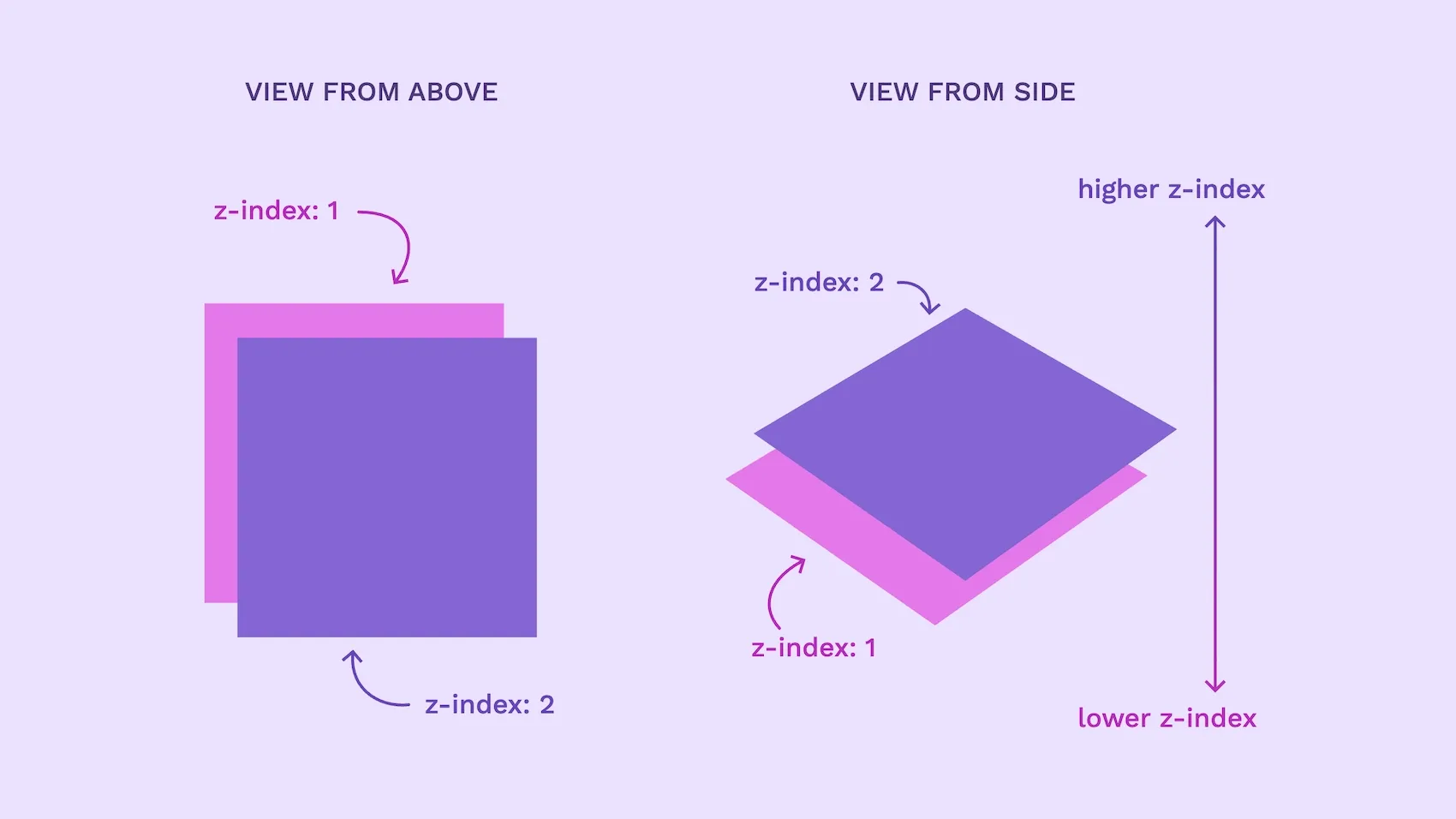
The z-index property in CSS controls how elements stack on top of each other on a webpage, specifically the visual stacking order. When two elements overlap, the one with the higher z-index value appears in front.
Stacking is controlled by paint order within the same stacking context. Paint order is the order in which the browser draws elements on the screen. Typically, elements loaded later paint on top. z-index lets you override that order, or be explicit about their order, when elements overlap.
In many layouts, you’ll want intentional overlap to guide the user’s attention. Imagine a navigation bar that stays on top of the content as you scroll the page. Without setting the z-index values, the navigation might get hidden behind the content, or the navigation links might be visible while its background disappears.
Another reason to learn how to use z-index is to handle layout changes in responsive design. When your design changes to fit a new viewport size, elements can shift in unexpected ways. z-index gives you control over which items stay on top, so important content doesn’t get hidden behind background elements.
Implementing the z-index property in CSS
z-index applies to positioned elements and to flex/grid items. It also matters when an element creates a stacking context (for example using transform or an opacity that introduces transparency.) This means the element needs a position value like relative, absolute, fixed, or sticky. Without one of these, the browser will ignore the z-index. If an element is not positioned, isn’t a flex/grid item, or doesn’t form a stacking context, z-index has no effect.
Once the element is positioned, you can assign it a z-index value to control its stacking order. A higher z-index brings the element closer to the front. For example, an element with z-index: 10 will appear in front of one with z-index: 1.
The z-index property also supports negative values, like -1, which push elements further back in the stack.
Here’s a basic example of what the CSS might look like when positioning two different colored boxes:
.background-box {
  position: absolute;
  top: 0;
  left: 0;
  height: 200px;
  width: 200px;
  background-color: MediumPurple;
  z-index: 1;
}

.foreground-box {
  position: absolute;
  top: 50px;
  left: 50px;
  height: 200px;
  width: 200px;
  background-color: Violet;
  z-index: 2;
}
In this example, the foreground box (z-index: 2) will appear in front of the background box (z-index: 1) in places where they overlap.
Using layers vs. z-index
Using z-index isn’t the only way to control the visual order of elements. In most design tools, including Penpot, you can also manage stacking through layers.
Layers determine how elements are arranged in the design workspace. The higher a layer appears in the layer panel, the more “on top” it looks during design. This system works well because it’s intuitive for most people—you can quickly see how a layout is supposed to look. However, it’s important to remember that it won’t always reflect how elements will actually appear when you load the live page.
That’s why understanding z-index is still important. While layers help you organize your design, browsers use stacking contexts + z-index when rendering. Properties like transform, opacity, and filter can create new stacking contexts that affect what appears on top. If you need a tooltip or modal to reliably appear in front of the rest of the content on your page, then you’ll need to set a higher z-index value in your CSS.
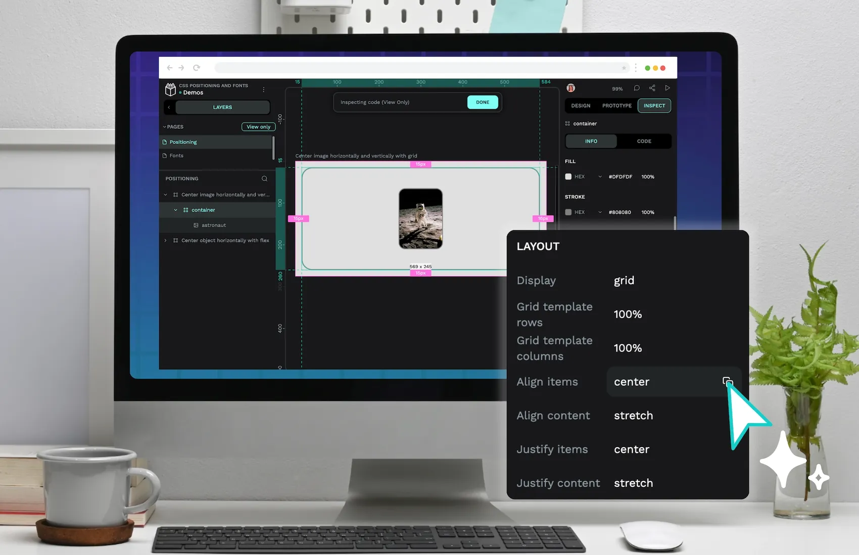
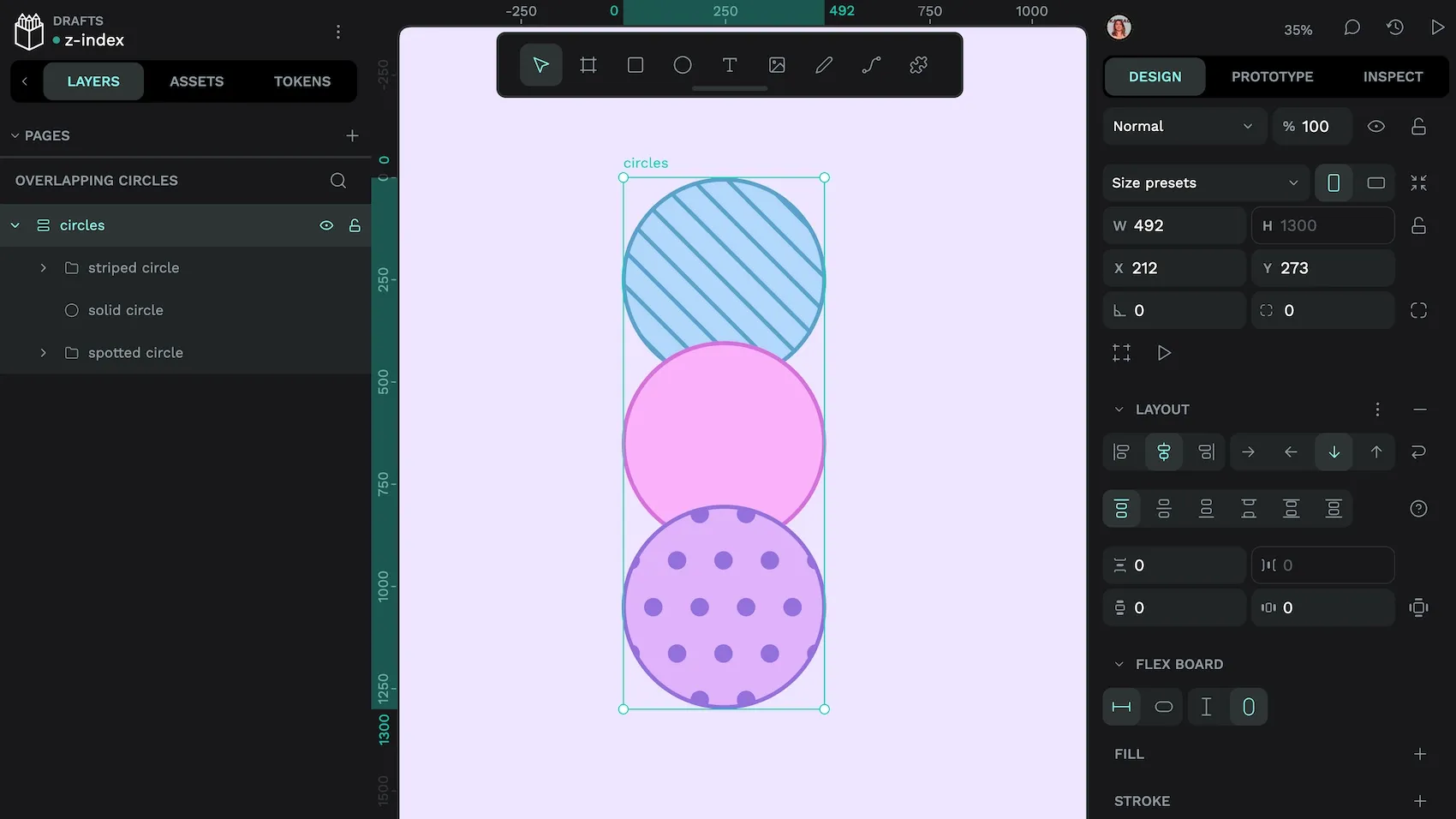
Using Penpot to adjust the z-index
Penpot makes it easy to control stacking with z-index, especially when working with responsive layouts. Once you’ve placed and positioned your element using flex or grid layout tools, you can use negative margin values to create overlapping elements.
The negative margin on either side of the center circle brings the other circles closer.
From there, you can assign a z-index value to any element to control how it will be layered into your overall design.
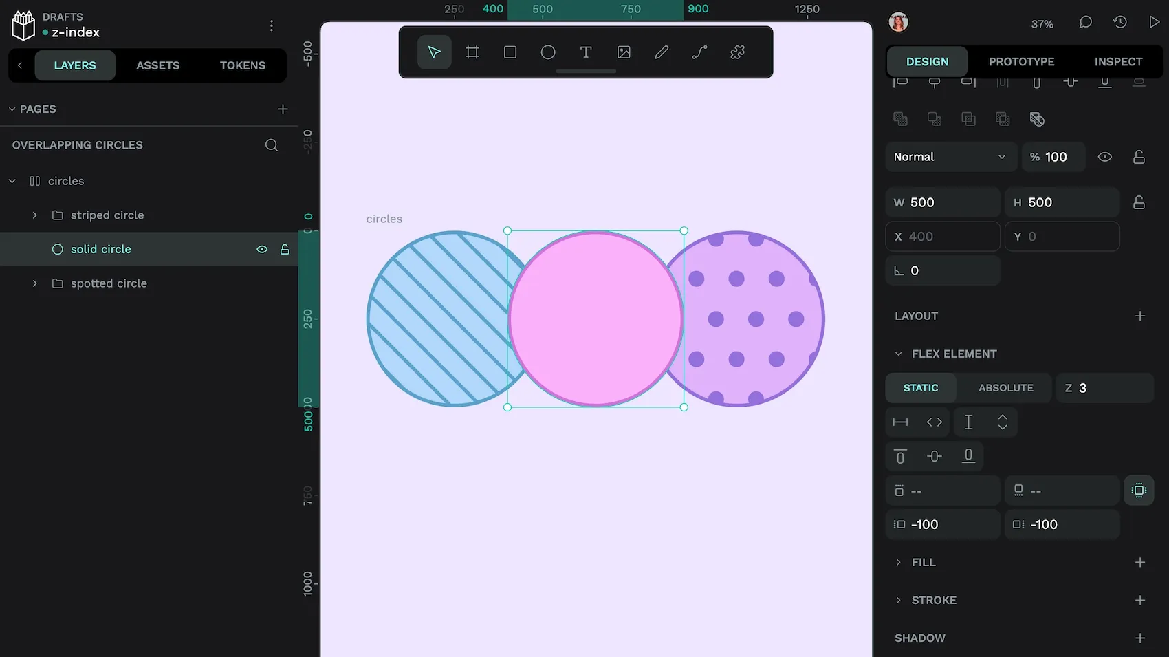
z-index of 3, it appears above the other circles.This makes it incredibly easy to create page designs that don’t just look good, but behave the way you expect them to when you push them live on the web. By combining layers for design clarity and z-index for browser behavior, Penpot gives you full control over how your layout stacks, without having to write CSS from scratch.
4 simple ways to use the z-index property
The best way to understand how z-index works is to see it in action. Here are four common layout patterns where setting the right z-index is essential for creating intuitive, usable designs.
1. Overlays
Overlays like modals or loading animations should always appear above everything else on the page. To make sure they’re never covered, give them a high z-index value, like 500 or 1000. This keeps them above other elements like navigation bars or dropdowns. But remember, the actual number is only meaningful within its stacking context. Ideally, overlays should sit outside parent stacking contexts (for example, render at the end of <body> and use position: fixed; inset: 0;).
Rather than choosing random numbers, use a consistent scale (like steps of 100) across your project. This gives you room to insert new layers later without having to rewrite your entire stack.
2. Custom dropdowns
Custom dropdowns menus should stack above their trigger and page content but stay below overlays. Assign a z-index that’s above nearby siblings in the same context. One option is to use design token tiers like z.dropdown, z.popover, z.overlay rather than absolute numbers.
If you do go for a scale of z-index, being intentional about your scale will help you a lot here. If you know that modals start at 500, then keeping your dropdowns in the 200–400 range makes it easier to keep everything organized.
3. Sticky headers and footers
Sticky elements like navigation bars, footers, and banners stay fixed to the top or bottom of the screen as users scroll.
For sticky headers/footers, set position: sticky (or fixed). Only apply a higher z-index if they overlap other content; keep it below popovers/overlays. Large numbers aren’t required—relative order within the context is what matters.
4. Carousels and stacked cards
When building image carousels, card stacks, or swipeable content, use z-index to control which item appears on top.
For example, the currently active slide or the most recent post might use a z-index of 2, while older or inactive items sit behind with z-index: 1 or 0. This approach keeps your UI intuitive—what’s interactive stays in focus, and background items don’t interfere with clicks or hover effects.
Create smarter design today
The z-index property might seem like a small detail, but it plays a big role in building polished, responsive interfaces. From dropdown menus and sticky banners to tooltips and guided pop-ups, smart stacking helps users focus on what matters and ensures key interactions never get buried.
All of these seemingly complex patterns benefit from sensible use of z-index. Find out more about how to implement complex patterns for beautiful user experiences with our beginner’s guide to UI design.
Frequently Asked Questions (FAQs)
What happens if an element isn’t positioned?
z-index applies to positioned elements and flex/grid items, or when an element forms a stacking context (for example transform, opacity, filter). Otherwise, it has no effect. Without z-index, stacking follows paint order for siblings in the same stacking context (typically, later siblings paint on top), but different stacking contexts can change which element appears above.
In that case, the stacking order falls back to the HTML source order. Elements that appear later in the markup will appear on top.
What happens if two elements have the same z-index value?
If two positioned elements share the same z-index, the browser uses their order in the HTML to decide which one appears on top. The element that comes later in the markup will stack above the one that comes before it.
How big should my z-index values be?
How high you go is a matter of personal preference. However, it’s best to keep your z-index values organized and intentional. For instance, many people prefer to use steps of 10 or 100 to keep their values consistent and easy to adjust should they need to.
What’s the difference between semantic and visual layering?
Visual layering refers to how elements appear on the screen. This is controlled with CSS properties like z-index.
Semantic layering refers to how elements are structured in your HTML. It follows the logical content order—headings, paragraphs, sections, and landmarks—and helps assistive technologies like screen readers and search engines understand the page.
Good UI design uses both z-index for visual stacking and clean, semantic HTML for accessibility, SEO, and proper reading order.
Related Blogs
We have more blogs about CSS and many other design and code-related topics. Here’s a few examples of handy articles to help you learn more about CSS.
 Laura Kalbag
 Laura Kalbag
 Laura Kalbag
 Laura Kalbag