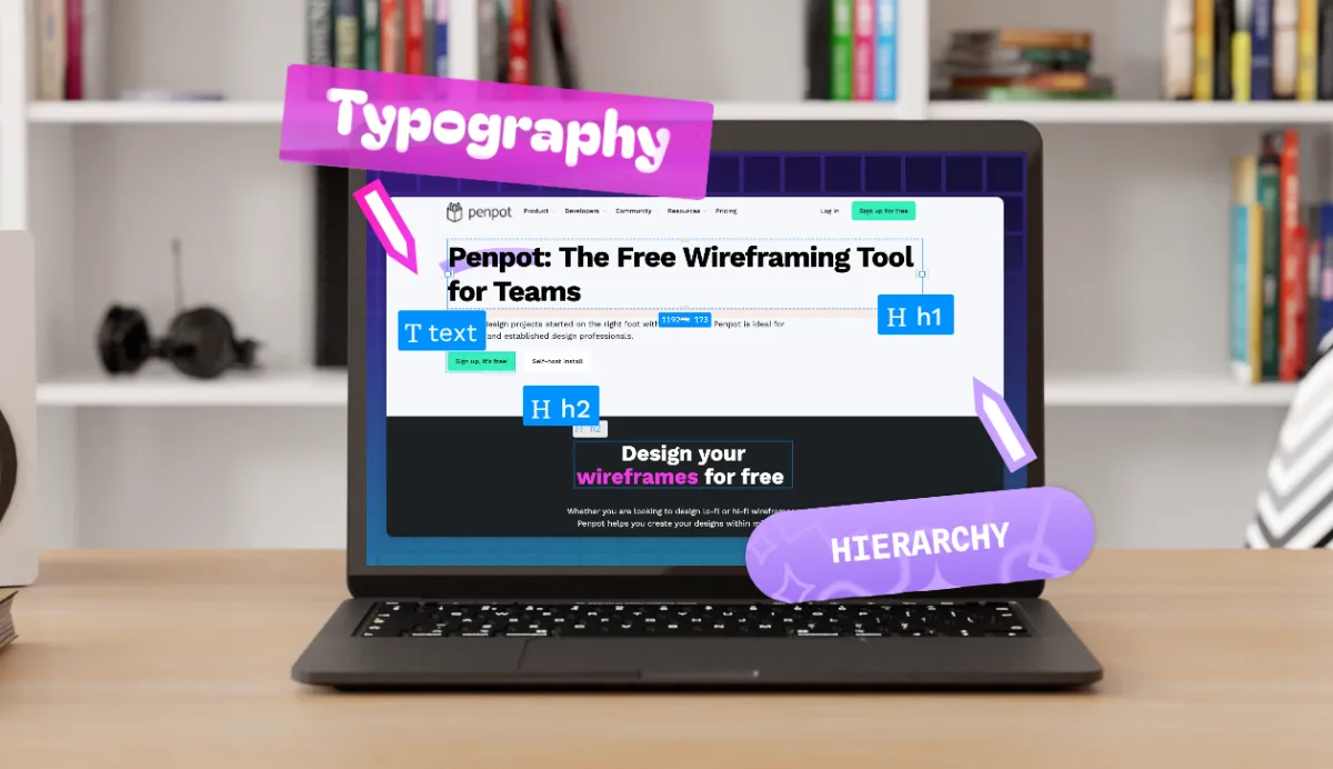
Typography hierarchy: How to improve readability
We read thousands of words on our mobile devices and computers daily, but not all of these words get the same attention. How do we decide which words to stop for?

We read thousands of words on our mobile devices and computers daily, but not all of these words get the same attention. How do we decide which words to stop for? From the bold H2 headline in a viral article to the white space in a social media image, it may not be as much about what the words say but where they fall in the typography hierarchy.
This core principle guides the design layout of product websites, social media platforms, and even your favorite e-book. If used correctly, it can bring attention to your message and create a more accessible digital experience. Discover the benefits of a well-structured typography hierarchy, its mechanics, and practical implementation tips so you can apply them to your own user-friendly projects.
What is a typographical hierarchy?
Typographical hierarchy, or typography hierarchy, is a system for organizing your design layout to help readers find the information they seek more easily.
Why? Web and app users will likely scan for information and not patiently read the entire page from top to bottom. Typographical hierarchy emphasizes the more important information over nonessential details and respects the reader’s (often short) attention span on the page.
A typographical hierarchy uses several design traits to help users prioritize information. Common considerations include: size, font, color, alignment, and weight,
- Size: Larger text grabs attention first, making it great for headlines. Smaller text naturally signals less importance.
- Weight: Bold or light font weights help distinguish key information and add visual structure.
- Color: Using color (or shades of a single color) helps separate content and improve clarity, especially with good contrast against backgrounds.
- Contrast: Strong differences in size, weight, and style are crucial—small differences often go unnoticed. Make the contrast clear and intentional.
- Case: Uppercase letters in headers can create emphasis, though full caps in body text should be avoided for readability.
- Placement and Alignment: Where text appears matters. Centered or offset text draws more attention and can signal higher importance in the layout.
but other attributes may be used that are specific to the use case or brand.
What are the benefits of improving your typographical hierarchy?
A well-executed typographical hierarchy makes it easier for readers to use and understand your site, digital product, or print layout. That generates several benefits, including:
- Enhanced accessibility for more readers, including those who use supportive technology and assistive devices.
- Better engagement from readers who can now easily navigate your site and interact naturally with its contents.
- Professional appearance that shows you care about your offering and your customers.
While not tied directly to human readers’ engagement, a better typographical hierarchy can also help the bots used by Google, Bing, and other search engines find and index your content properly. These bots may not be able to scan a messy layout with no reasonable hierarchy, leaving the site out of important search results.
What are the main levels in a typography hierarchy?
Typographical hierarchy displays content at various levels, with the more important levels using more dominant font, size, weight, and other traits. Effective design layouts typically use each of the following levels for web page and mobile app experiences.
Headings
Headings grab the reader's attention and clearly explain what that section will be about. Headings (also called “headers”) can be designated as follows:
- H1 for the main title or biggest headline for the page. It usually appears at the top and is the most noticeable text.
- H2 for major section titles, just slightly smaller than H1 titles.
- H3, H4, and so on for titles shown increasingly smaller and less bold. As the number increases (i.e., 4, 5, 6), the title becomes less noticeable and signifies less important information to the overall page purpose or thesis.
H2 and smaller headers are also referred to as subheadings.
Body text
A layout with a solid typographical hierarchy uses body text for all the paragraphs or readable content between titles and subheadings. It also lacks fancy fonts or heavy weights, so readers can easily navigate it.
However, some text may be bolded, italicized, or underlined to emphasize keywords or possible actions (such as clickable or hyperlinked text).
Body text can also be broken up by bulleted or numbered lists to space out the information even more and help readers scan more easily.
Quotes and callouts
Designers may use callouts for very important or unique information, such as quotes in a long piece of content or interesting, relevant statistics. Callouts typically use different color backgrounds and feature bolder text in quotations to make sure that readers’ eyes are drawn to them wherever they are on the page.
These special text areas beg to be read as a piece of mini-content and can usually be understood on their own, without relying on the surrounding text.
Footnotes
Footnotes are text sections that are typically designed with a smaller font and used for citations or links to research and legalese. Most people won’t seek these sections out but refer to them only if prompted by a superscript number in the preceding text.
For example, the body text could say:
Our cola comes with 30% less sugar than the competition.3
With a footnote at the bottom of the page saying:
3. In a recent independent study of two cola types.
Because footnotes often contain a lot of information and links, proper spacing and alignment are especially important.
5 tips for creating a better hierarchy
While there are some standard practices for creating a good hierarchy, a lot of “getting it right” depends on what looks good to the eye. You may try several of these best practices a few times to find an aesthetically pleasing result that supports the user experience (UX).
1. Experiment within the same font family
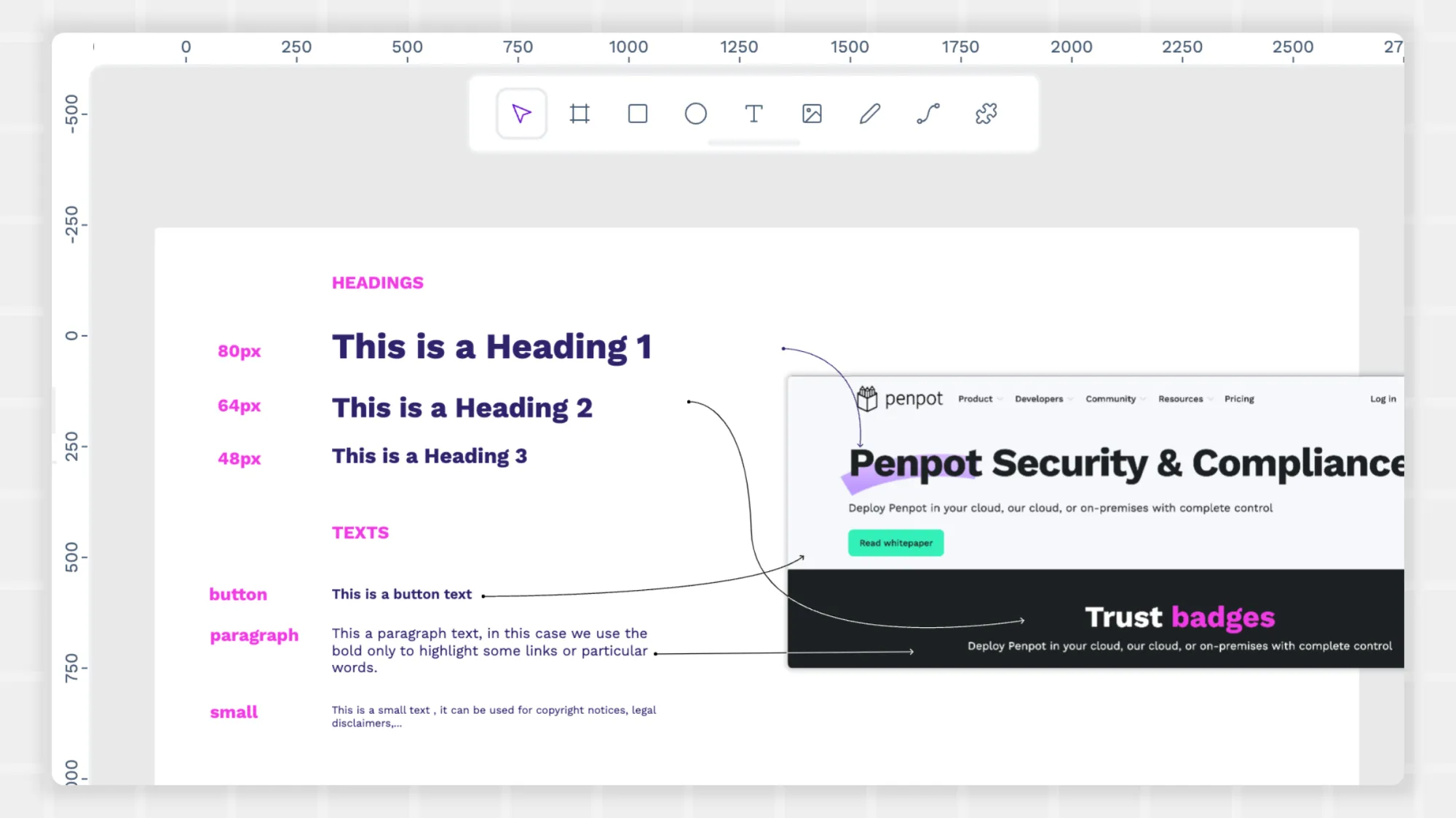
Use the same font family to create a consistent look and feel throughout the page. For example, you can use any font from the Serif family for a cohesive experience. Some pairings, like a classic serif and Garamond, go well together. Others, like Times New Roman and Georgia, may be too similar to stand apart. Experiment with italics, bolding, and condensed versions of these fonts to emphasize different content sections.
If you’d rather use the same font for most of your project, create contrast between sections through the typographic scale — a collection of various font sizes that work together well. It’s a bit more complicated than just picking sizes that appear to be in harmony. Instead, it uses mathematical ratios to determine the exact font proportions. Some designers and developers prefer this approach.
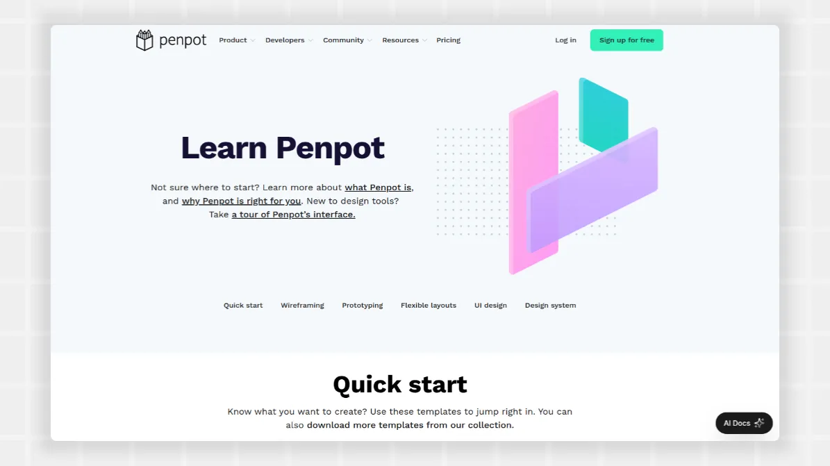
On the Penpot website, we use the “Work Sans” typeface in a variety of sizes and weights. This allows us to emphasize headers while still giving the whole page a cohesive feel.
Another method is fluid typography, which automatically adjusts font size for each reader’s screen. This responsive design approach uses relative units instead of pixels or other font measurements, ensuring the typographical choices are appealing on all devices.
2. Direct readers down the page with headers
Readers will naturally gravitate down the page as they read, whether it’s consuming everything they see or skipping here and there.
Use the largest headings and paragraph fonts for essential info to ensure readers don’t miss the information they came for. You don’t have to use Title font or H2 headers for every notable piece — reserve those for content supporting the page's thesis. Other important sections can still benefit from H3, H4, and other headers.
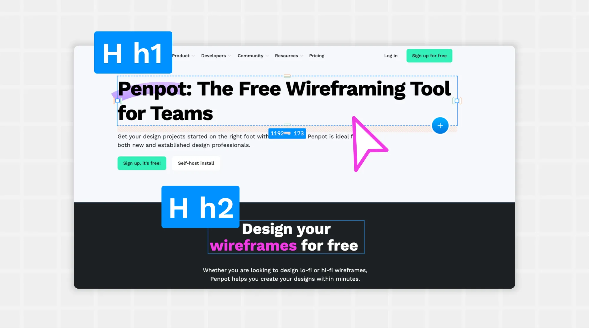
3. Create white space
White space gives readers the break they need from walls of text and invites them to explore more places on the page. Without it, messages blend into one another, and the most important parts of your design won’t easily stand out.
In the example above, you can see how the use of white space in the overall page design helps the sections stand out. There is plenty of padding around the elements and text so readers know where to focus and get the most important takeaways we are trying to impart.
4. Consider subtle differences
You can create an eye-catching experience without going overboard with bold design choices. Having text in too many colors or introducing too many graphics confuses the reader — they won’t know which information matters most.
Instead, put a single word in a different color within a headline, choose italics for certain paragraphs, or make different sections a variation of the overall color.
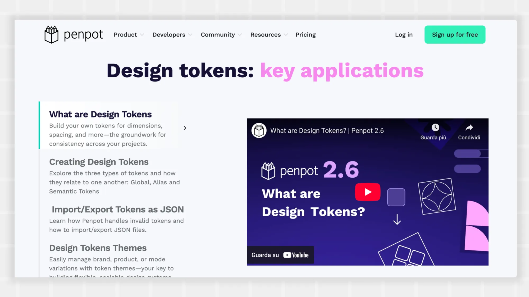
In this example from our design tokens pagehomepage, the use of a pink font for “design tool” helps draw in the reader’s eye and emphasize the term as one of the core takeaways of this section.
5. Prioritize accessibility
Use typographical hierarchy to help more people enjoy your site by using clear fonts, ample spacing, appropriate font sizes, and sufficient color contrast. This ensures readability for users with diverse abilities.
Avoid displaying text as an image or embedded element, as this can make it unreadable for those with assistive devices like screen readers.
Typography hierarchy is just one part of what makes a website or page accessible. The Web Accessibility Initiative (WAI) has published a checklist you can reference to ensure your page meets the needs of more people. The checklist includes tips on how to incorporate typographical hierarchy into the larger scope of an accessible design.
Typography hierarchy examples
Big brand sites and startups alike are great resources for finding excellent examples of typography hierarchy. Use these examples to inspire your next designs.
Audi
The luxury car maker Audi frequently changes its messaging for seasonal promotions, as seen at the top of the page. The lone headline is left-justified (not centered like the rest of the page) and features a lot of whitespace in the background photo of the cars.
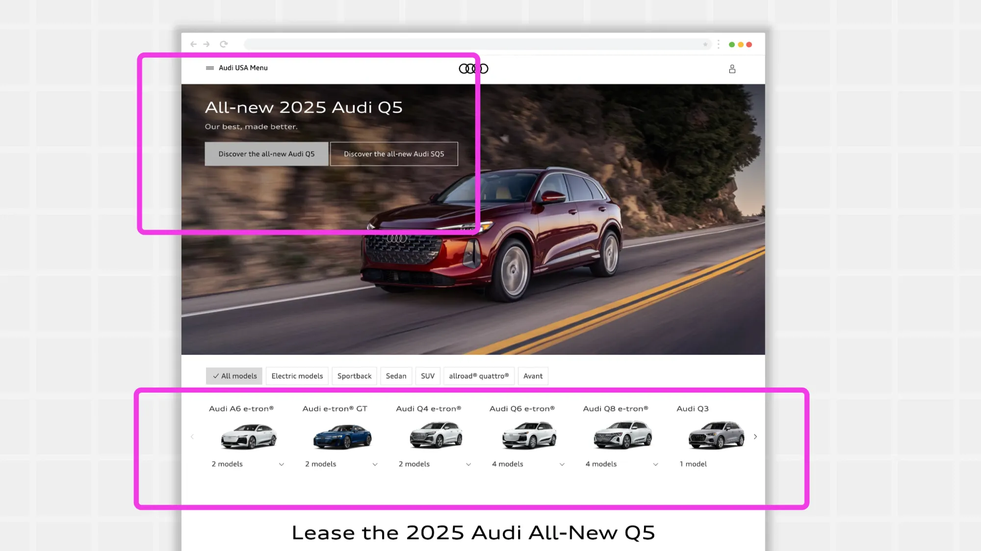
The design also encourages readers to stop in the middle of the page. In this case, the “.099% financing” appears larger than the headline at the top of the page and is surrounded by pure white space to help it stand out.
Even though there’s a lot of information on the site, Audi chose to keep most of it below the fold, using several columns and a small uniform font in the footer to direct visitors to pages about models, offers, customer service, and brand information.
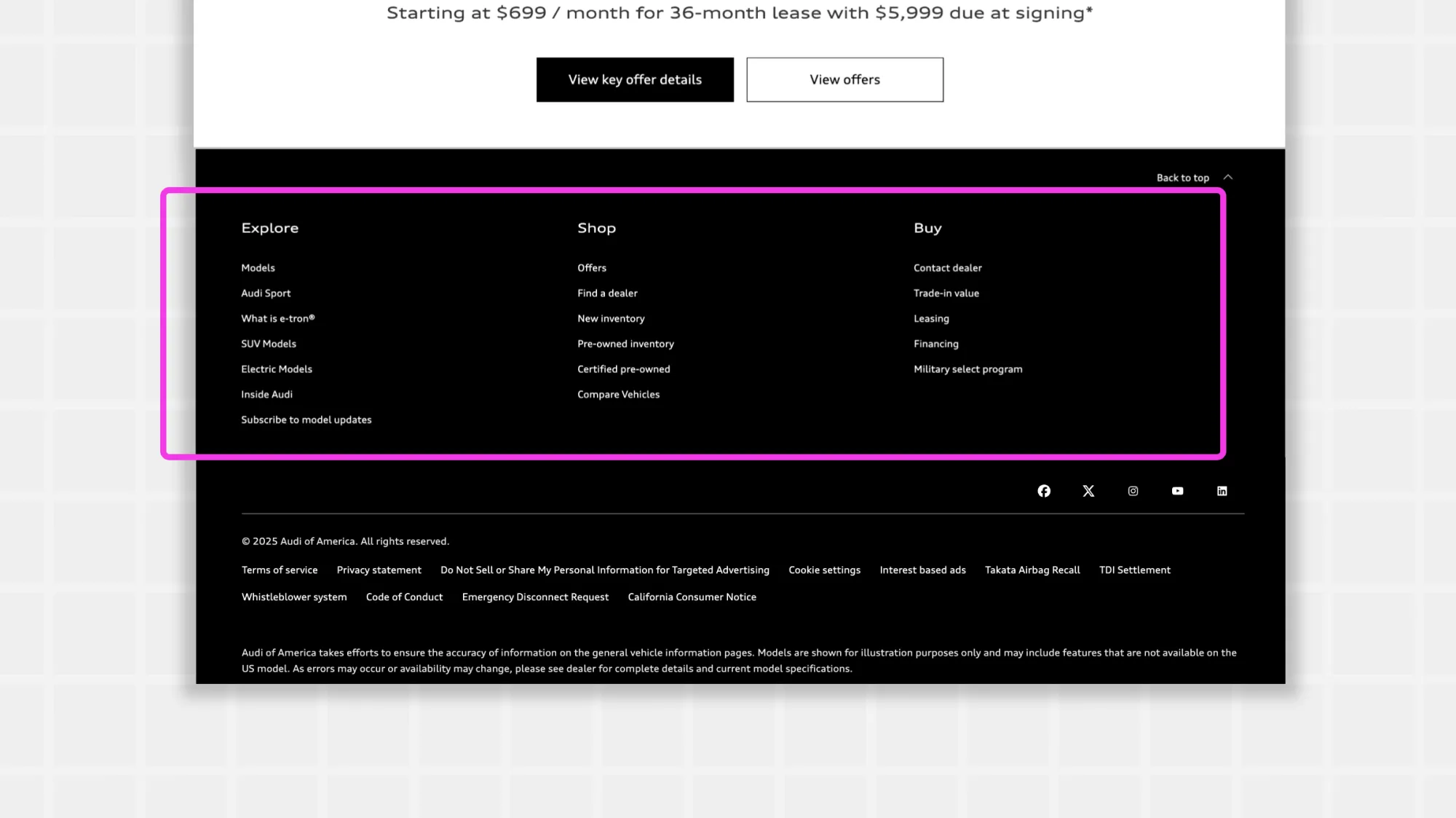
Why it works: Audi could have used its homepage to feature a particular model or showcase car features but focused on one thing instead: the financing offer. With large, bold headlines in the same font family, it’s easy to see what Audi wants readers to do. And since shoppers typically look for good deals this time of year, it gives them what they came for without having to scroll or click through other pages.
GitHub
Considered one of the best examples of open-source technology in action, GitHub applies typography hierarchy on both its public-facing and community pages.
The home page, for example, features many large images. It makes sense for a tech software product that can be hard to visualize outside of examples.

However, GitHub breaks up this imagery with headlines that direct readers to the most relevant info first. It leaves plenty of white space (or, in this case, purple space) around the text and images, so it doesn’t feel claustrophobic.
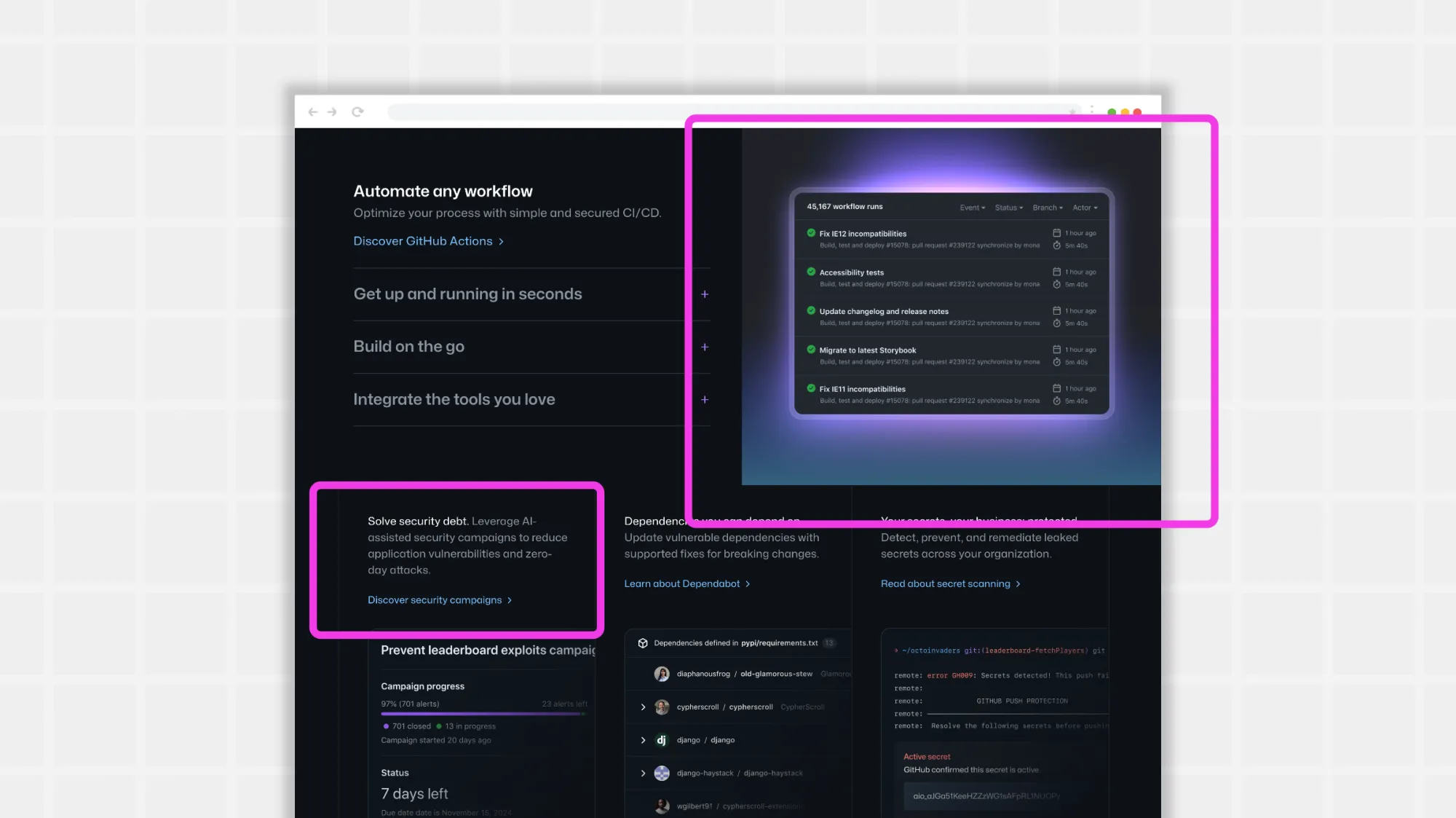
The site is focused on creating accessible products for all, and the font choices reflect that. Various sizes of the same, well-spaced lettering draw in the eye and keep text easy to read on any screen size.
The more text-heavy areas rely on bold font, font sizing, and the color blue to help readers prioritize the information. It both breaks up the text and keeps it engaging.
Why it works: GitHub’s audience likely deals with a lot of text in a day, so they are used to reading. However, GitHub respects their time and attention by calling out the highlights of their product with organized headings, appropriate bolding, and a few colors sprinkled in where it matters.
With such an image-heavy website, it’s even more important to help the text sections stand out without distracting from the main points. Github does this nicely.
Design better with Penpot
It may seem like there are a lot of rules for creating an effective typography hierarchy. However, you should feel free to try new things and see what really works for your audience.
Penpot is a powerful tool that makes it easy to experiment with your favorite fonts, sizes, colors, and layouts. You can even get some help with your first design. Penpot’s library of templates features excellent typography hierarchy and ensures you don’t have to start from scratch.
Are you looking to take your designs to the next level? Sign up for a free Penpot account today and see how smart, open-source design can improve your next project.
Related Blog posts
We have even more posts about typography. Here’s a few examples of handy articles to help you get the most out of Penpot.
 Elena Scilinguo