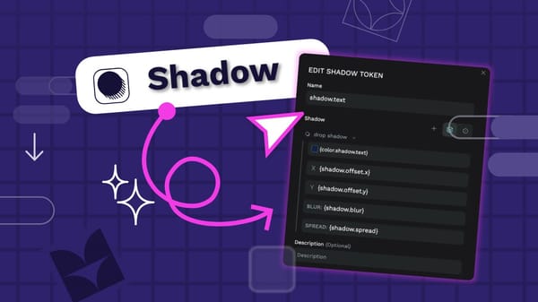
Tutorial: How to create responsive CSS Grid layouts in Penpot
With Penpot, you can create CSS Grid layouts without any code. This tutorial explores creating a bento grid layout for a sales dashboard UI.

In my last tutorial, I explored how to build a CSS Flex layout with Penpot. This time, we’re looking at the same Sales dashboard UI design, but we’ll focus on the responsive grid layout. You can download the examples in this tutorial from the Sales Dashboard UI template and Penpot’s Libraries & Templates collection.
Using a grid that fills the height and width of its container means its contents can flex and adapt to fill the available space. Grids can be flexible!
Grids have been used as layout systems in graphic design forever. Newspapers have long used columns to optimize the display of large quantities of text in a fixed space. In the 21st century, graphic designers popularized using grids with empty spaces to create both order and tension.
Regardless of art school history, designers have long used grid layouts because they’re very effective systems of organization. Aligning elements horizontally and vertically on a page is not just aesthetically pleasing; it also helps the viewer understand the hierarchy of the content and provides them with visual paths to follow.
Most design tools have supported producing layouts based on grids, usually using a pixel grid guide and sometimes even having guides or rulers for columns and rows. As designers, we could manually align our elements to these guides. However, it was challenging to translate these alignments to the web. (Well, aside from the cursed era when we used data tables for page layout… the less spoken of those old days, the better!)
Translating our grid-based designs to the web became even more complicated when we needed to design responsive layouts that could work across different devices and viewport sizes. Modern CSS layouts solved these problems by introducing CSS flexbox and CSS grid layouts.
CSS Grid layout
CSS Grid layout allows us to create complex two-dimensional layouts using columns and rows. We can design content to fit into a grid cell spanning one column and one row or grid areas that span multiple columns and rows.
With Penpot, we can create CSS Grid layouts without having to code. We can create the grid-based designs that we love while knowing that our layouts will be precisely the same when we export them to code. Using the same tools and terminology means that designers and developers can speak the same language when discussing grids. The developers do not need to interpret or translate, and there is no more fuss around handoff. Watch our video on CSS Grid Layout with Penpot.
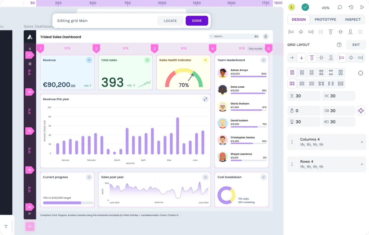
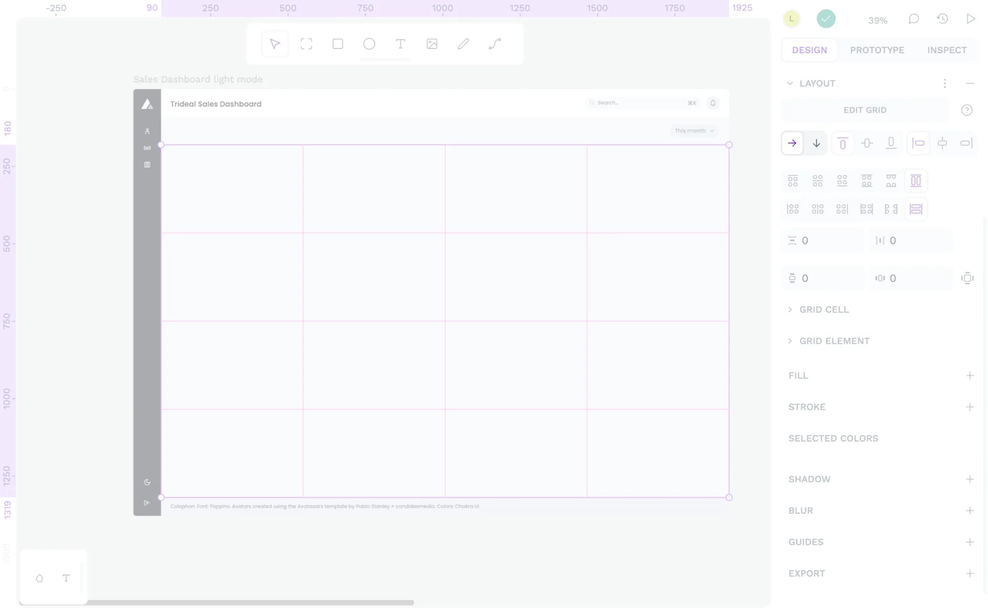
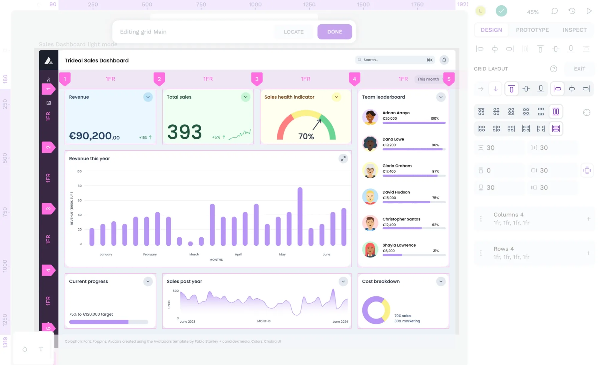
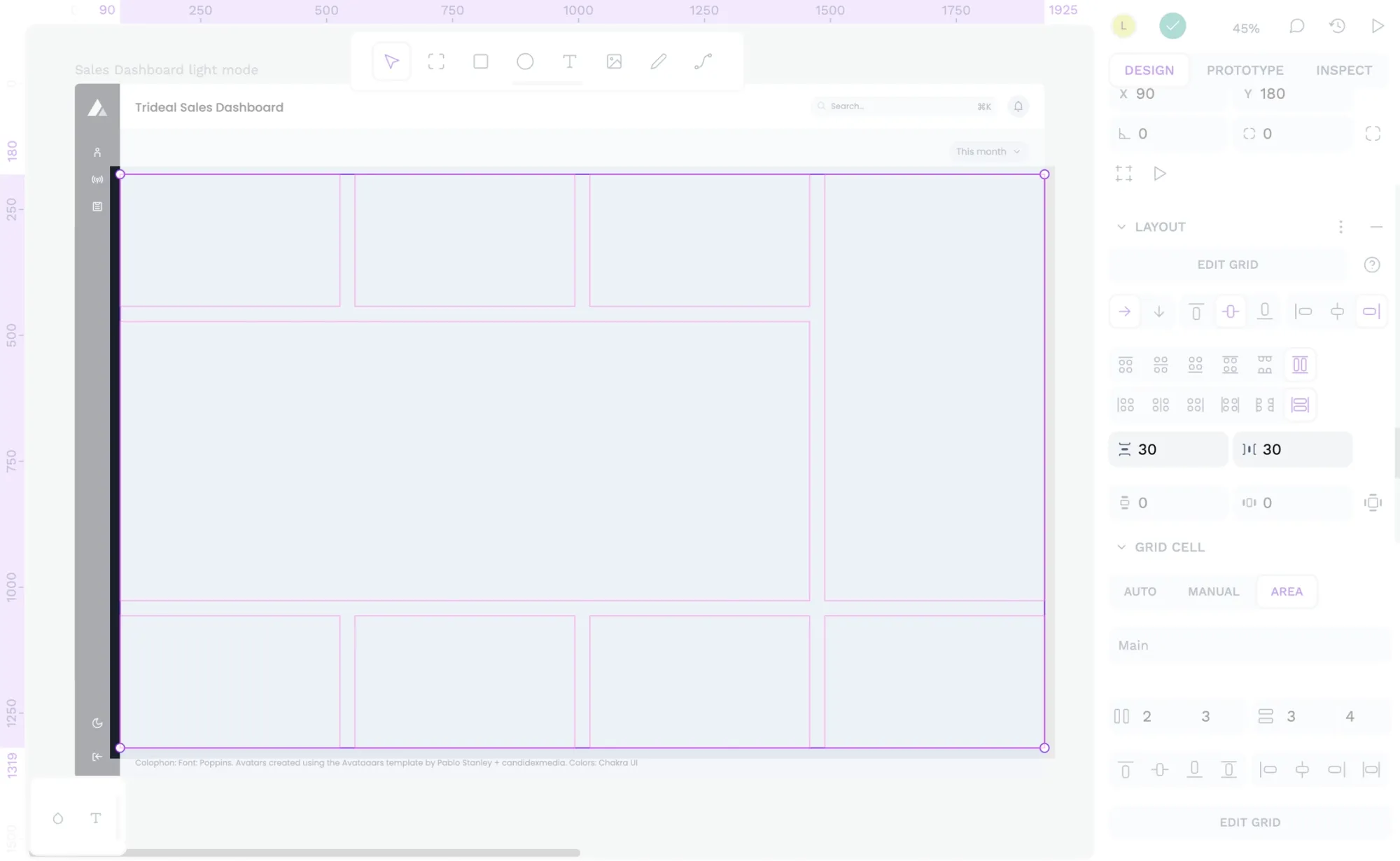
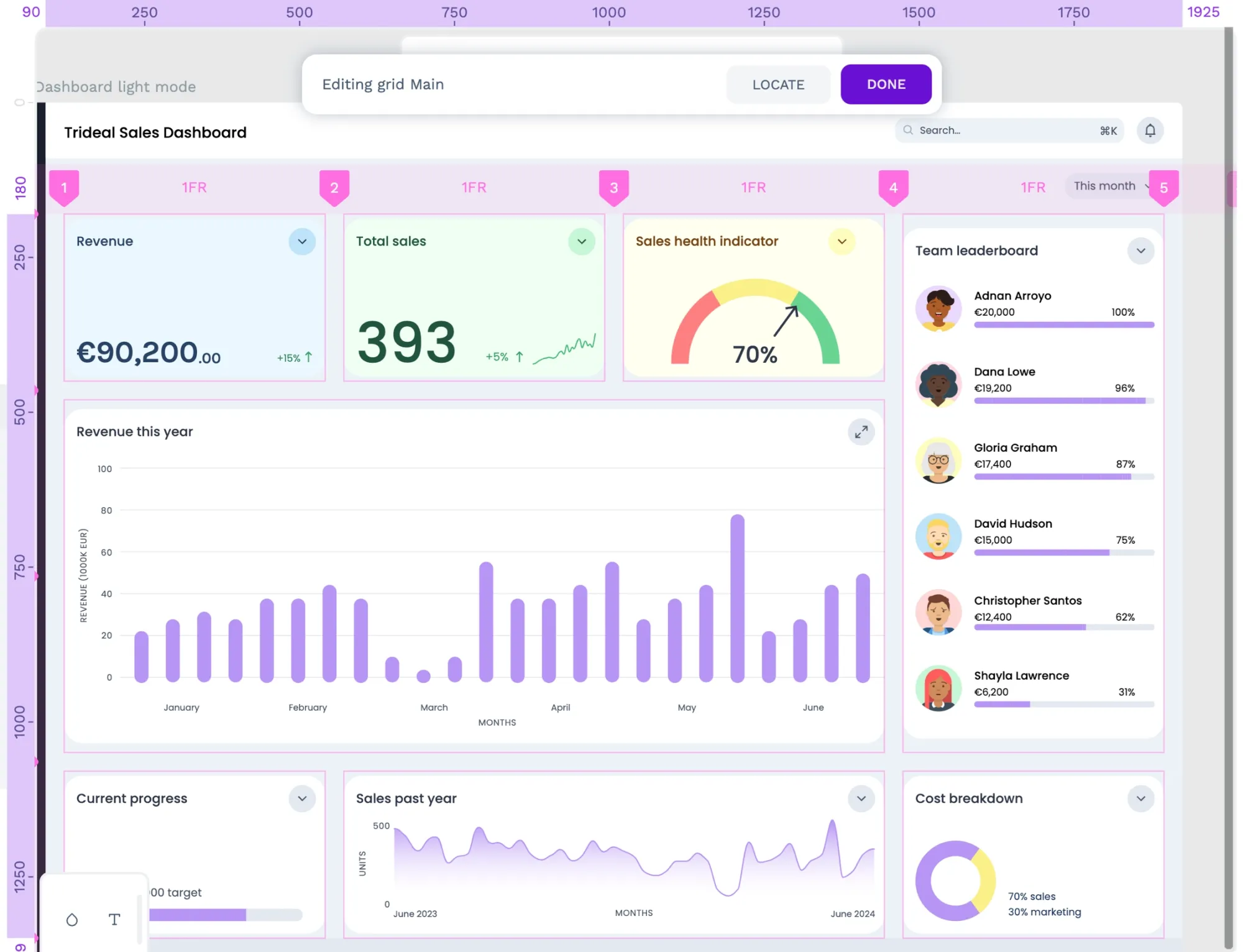
I’ve used a grid layout for the main area of the Sales dashboard UI. I wanted a bento box-style layout where users could easily swap around the cards representing different data depending on their preferences. Using a grid layout ensures I can keep each grid cell’s height and width proportions while the overall grid layout can grow to fill wider viewports and bigger screens. Let’s walk through how I created it.
Creating grid layouts with Penpot
- Apply grid layout
- Create the columns and rows
- Choose flow direction
- Edit grid cell positioning
- Choose how items are aligned and distributed
- Add spacing between items
- Add padding around the items
- Choose the layout sizing
- Choose the sizing of the grid elements
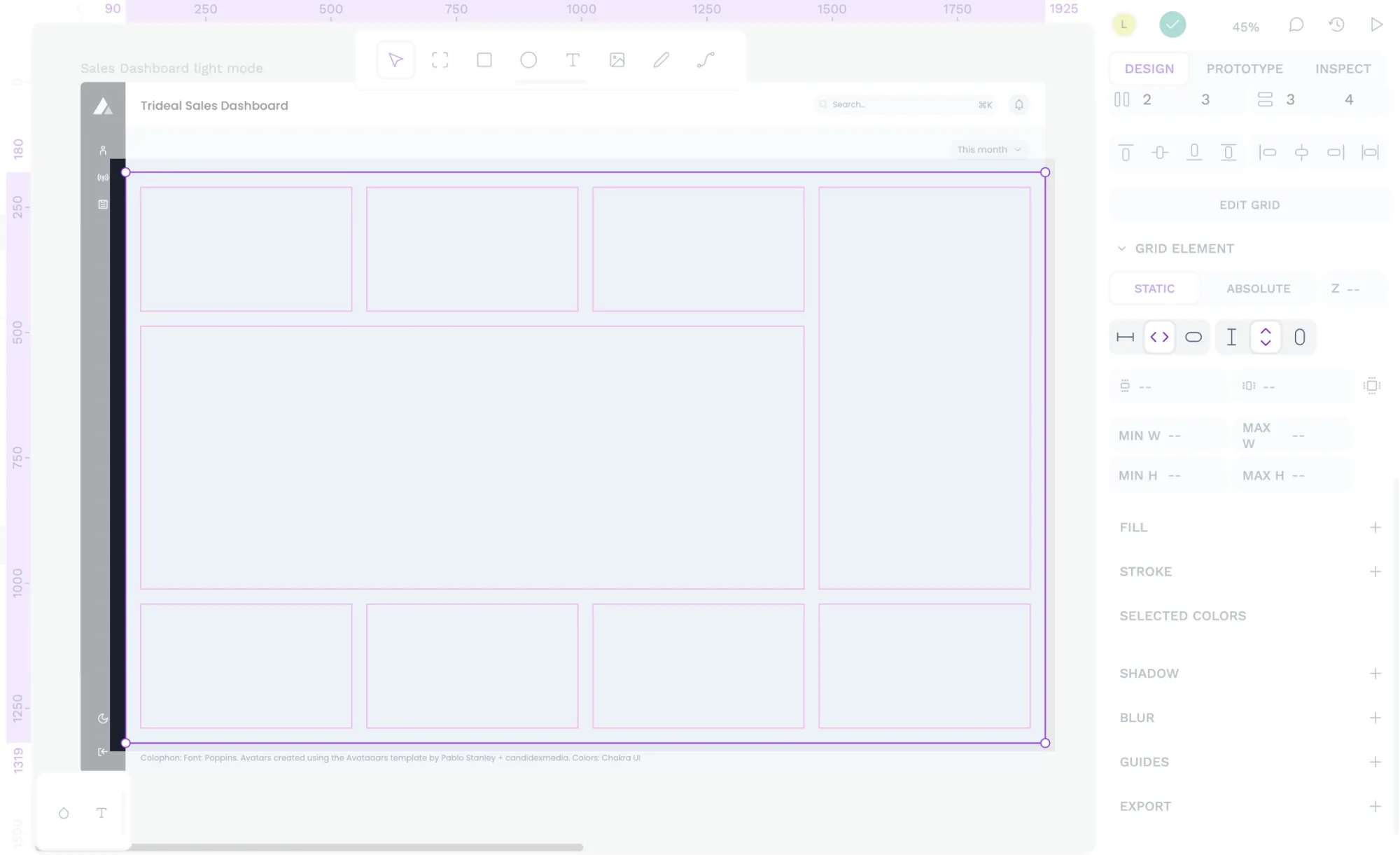
I’ve applied the grid to the main group area that contains a collection of cards.
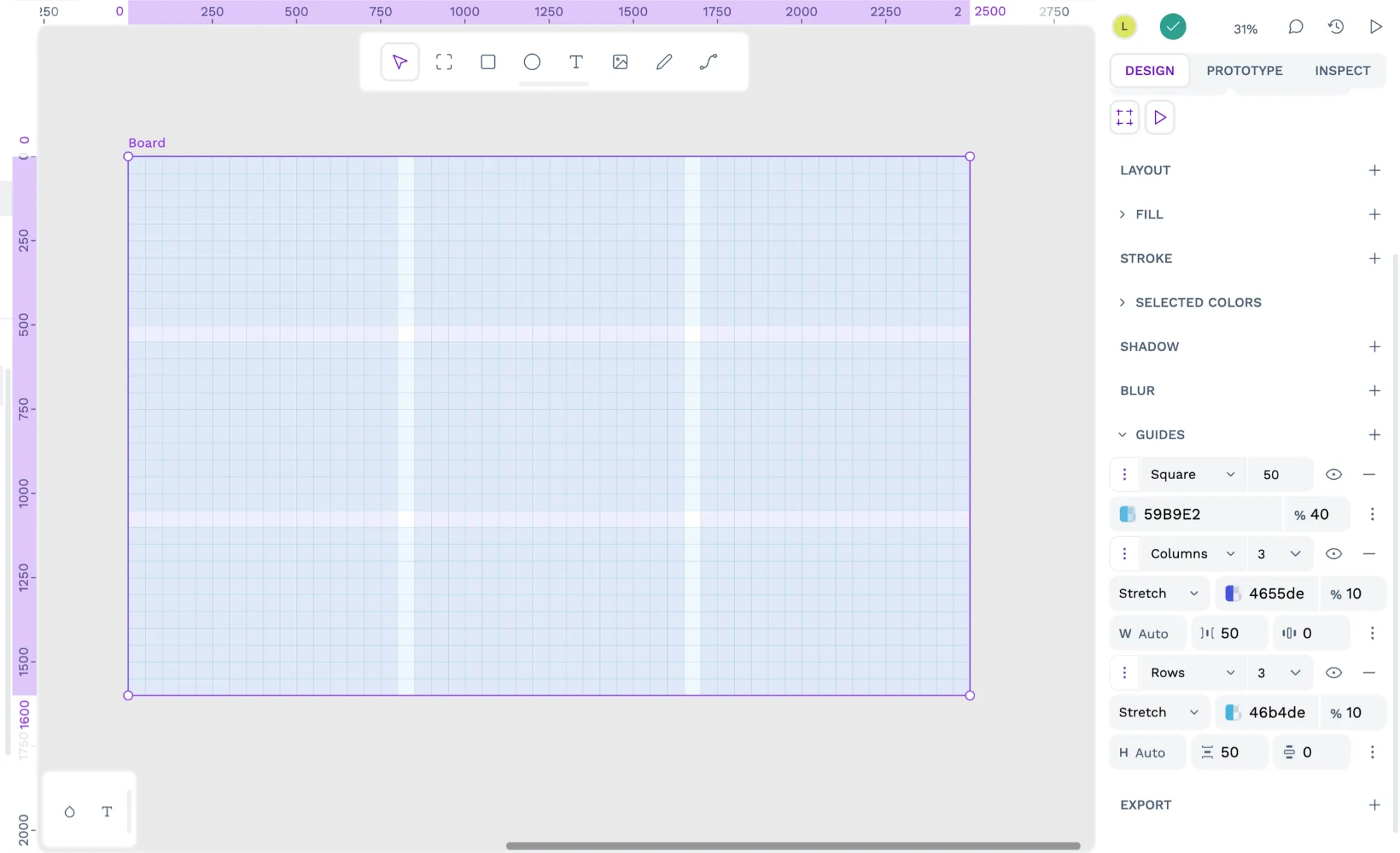
1: Apply grid layout
Select the board or layer to which you want to apply the flex layout. From the Design panel in the right sidebar, use the Layout + icon button and choose Grid layout from the menu.
You can start with an empty grid layout and place elements inside, or start with an existing group of elements and apply the grid to those elements.
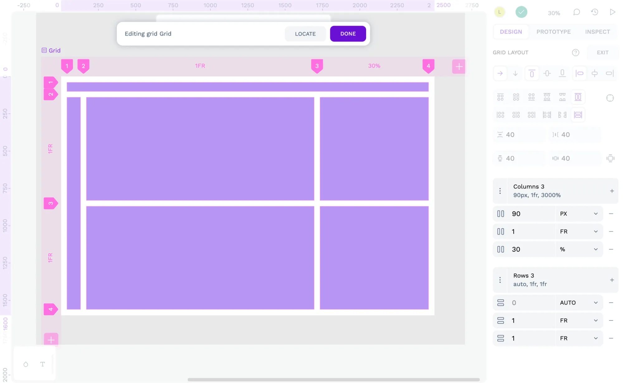
2: Create the columns and rows
Use the Edit grid button in the Layout section to change the column and row settings for the grid layout.
You can use the + plus icon button to add more columns or rows or use the triple dot icon button to open more detailed row and column settings. Once you’ve finished editing the grid, use the Done button to exit the grid editing mode.
The grid I chose for the bento layout is simple in its initial setup: it comprises four columns and four rows of 1fr height and width. I’ve used the fr fraction unit for the height and width of each column and row. The fr unit represents a fraction of the available space in the grid. So, regardless of my container or content size, each column and row will be the same width and height.
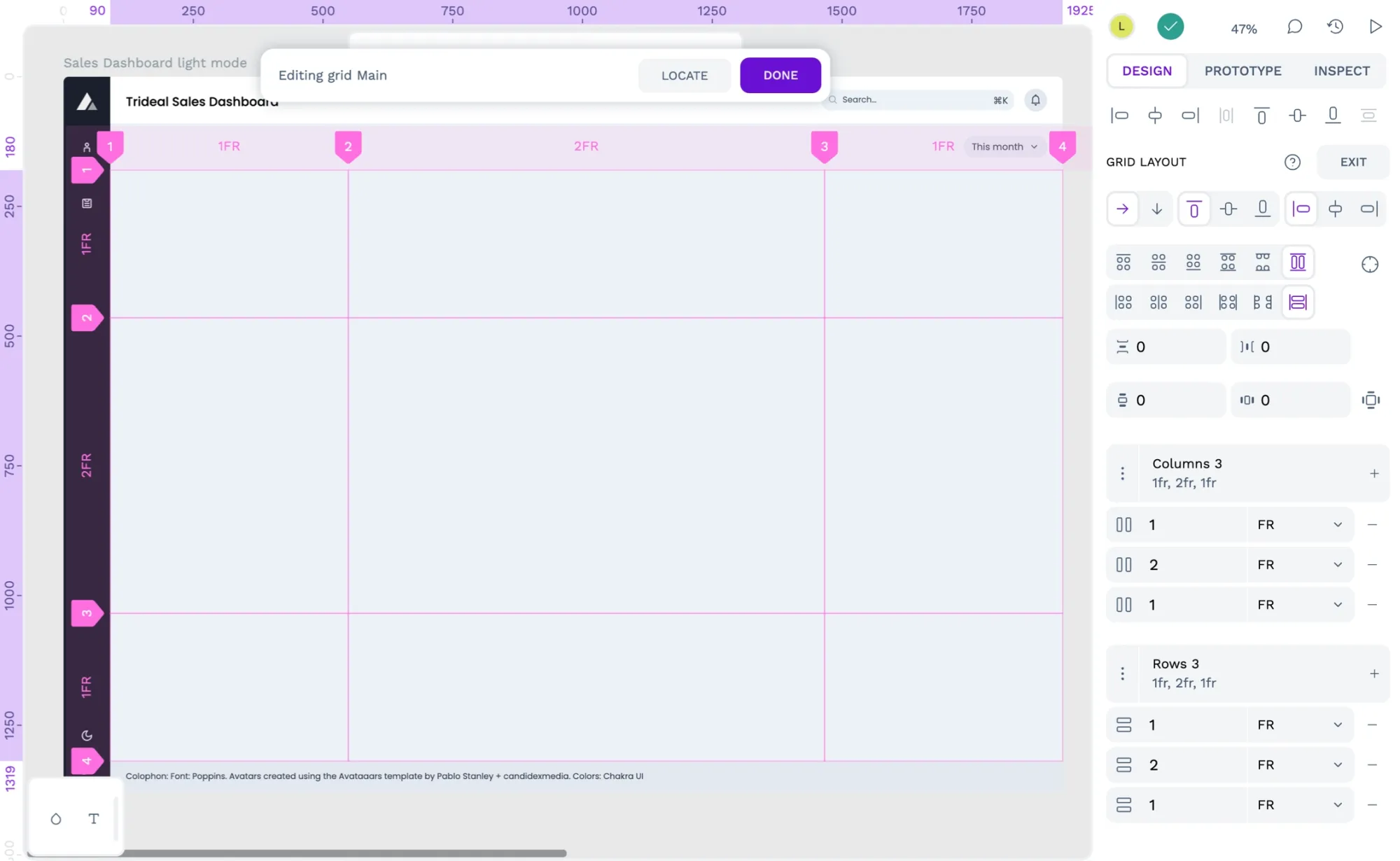
If you want to work with a fixed height and width grid, you can also drag the row and column line handles to resize the columns and rows to your exact pixel size requirements.
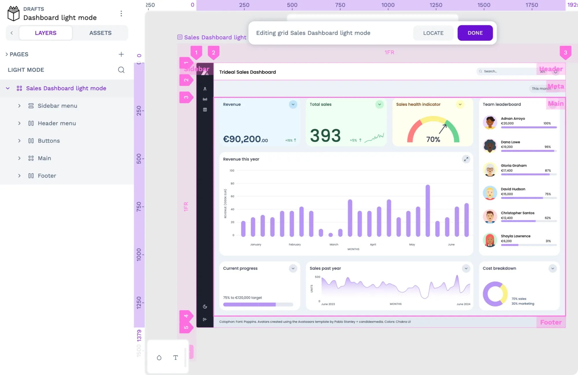
3: Choose flow direction
Much like flex layout, you can change the flow direction of the elements inside your grid layout. Flow direction determines whether your grid cells are filled by row or by column.
Pasting elements into the grid first by row and then by column.
In a grid layout, you can position the elements inside your grid automatically or manually. In grid editing mode, you can select a specific cell on the canvas to enter grid cell editing mode on the right sidebar. When you’re editing a grid cell, you have three options for controlling the cell’s positioning:
- Automatic positioning means each element inside your grid will fill one grid cell according to the grid’s flow direction.
- Manual positioning means you assign a specific grid element to a specific grid cell.
- Area positioning is the same as manual positioning, but you can also give each grid cell its own name.
You can also position grid elements manually for some grid cells and automatically for the rest.
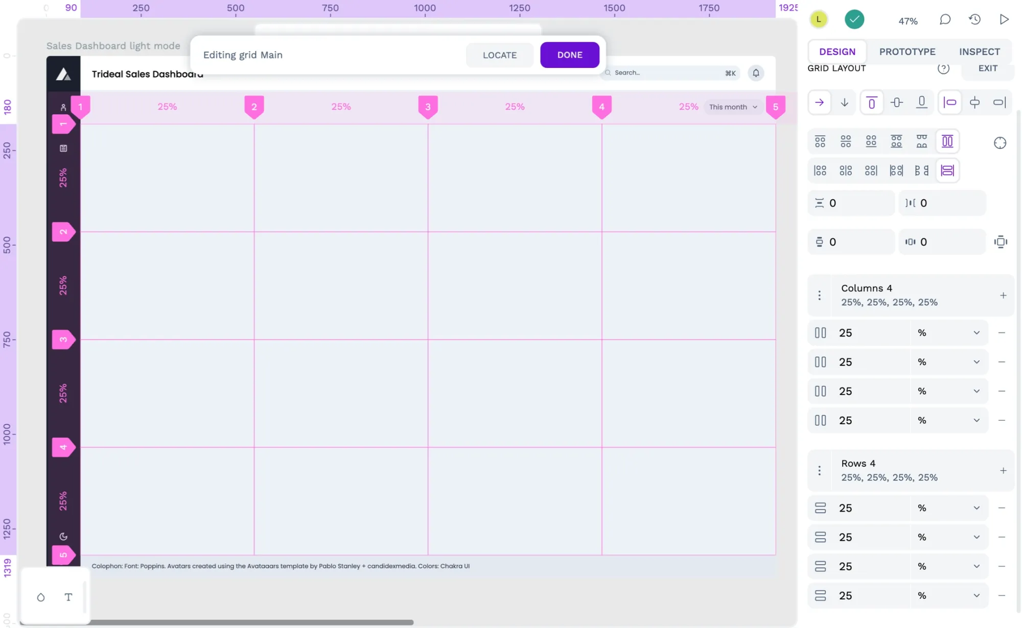
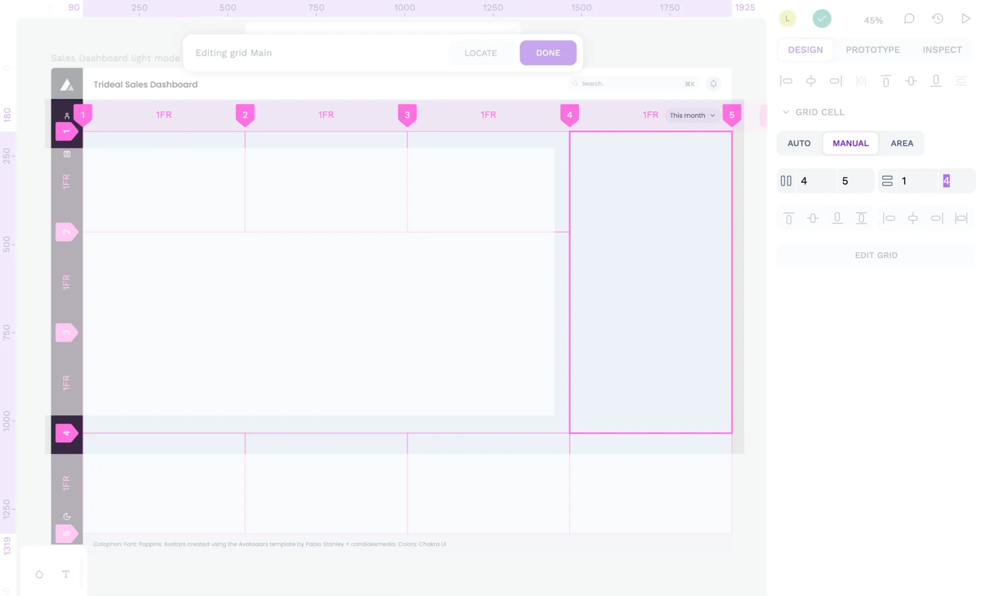
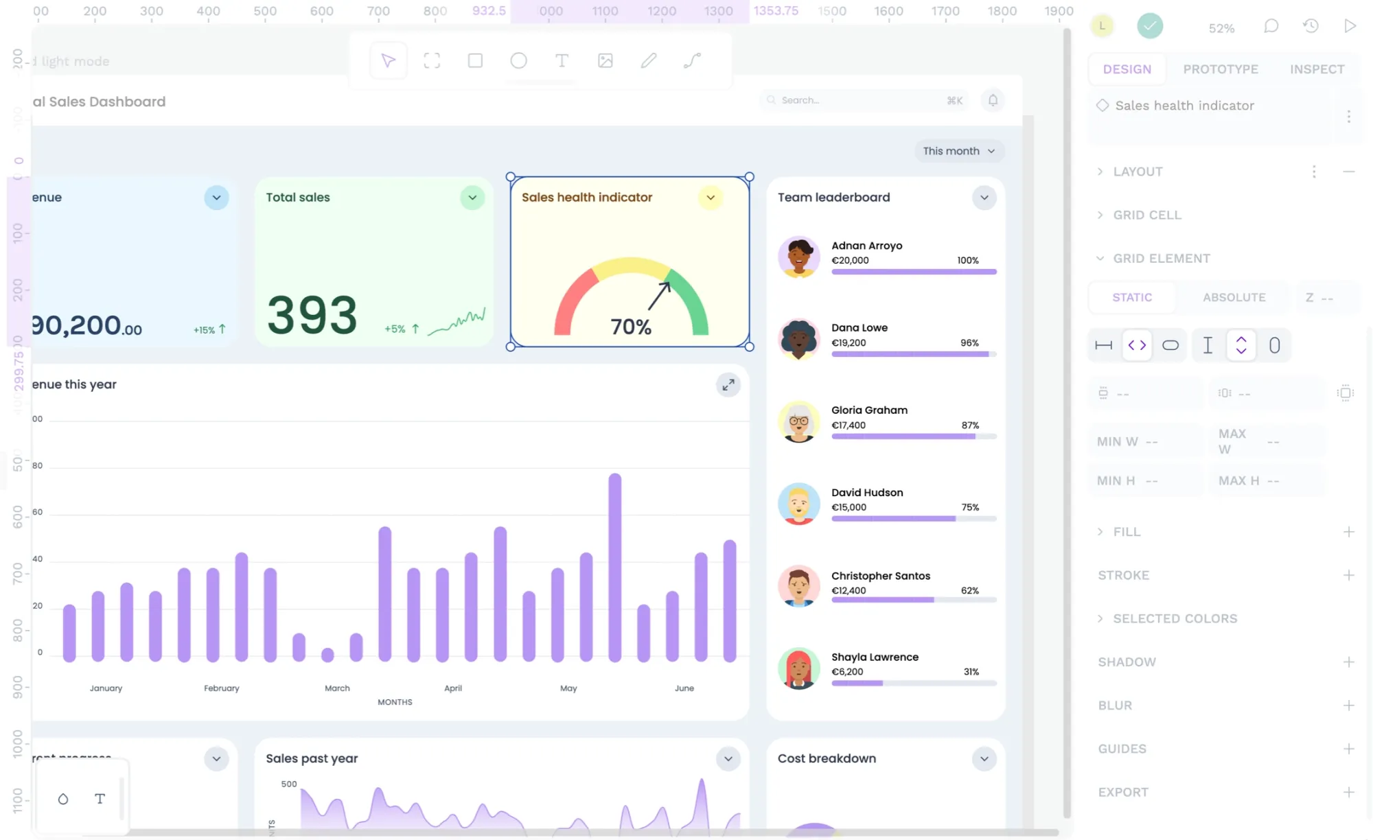
4: Edit grid cell positioning
One of the benefits of using grid layouts is that you can arrange content so it spans multiple grid cells, which is a vital feature for a bento box layout. When editing a grid cell, you can change each grid cell’s start and end column and row lines.
5: Choose how items are aligned and distributed
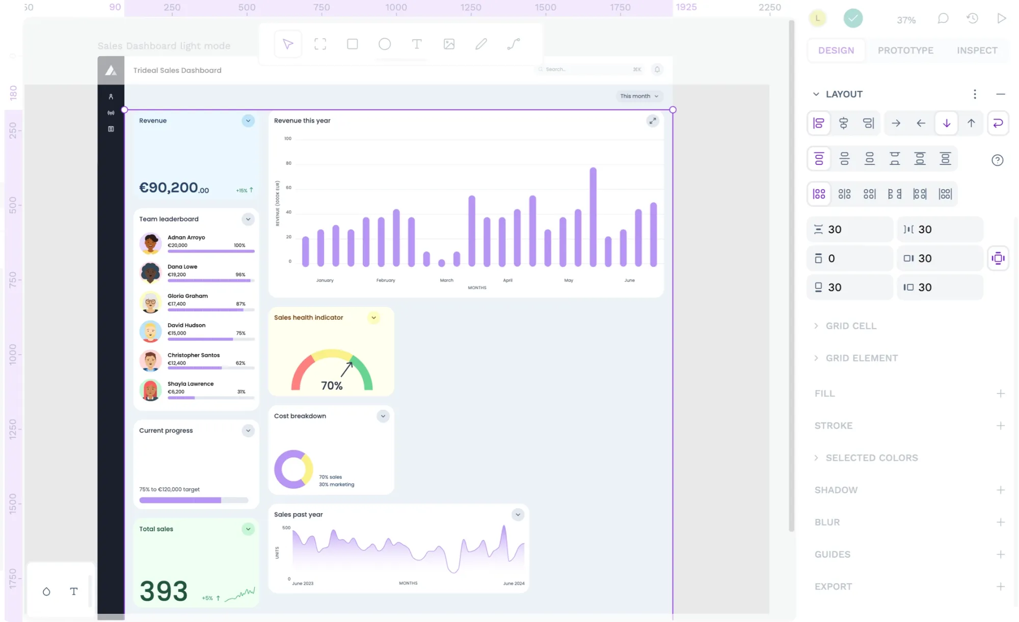
This bento grid layout’s item alignment and content justification are pretty simple. I wanted the cards to fill the cells so the grid structure was visible. However, I still want to specify sensible defaults for how the grid items inside the grid are aligned and distributed.
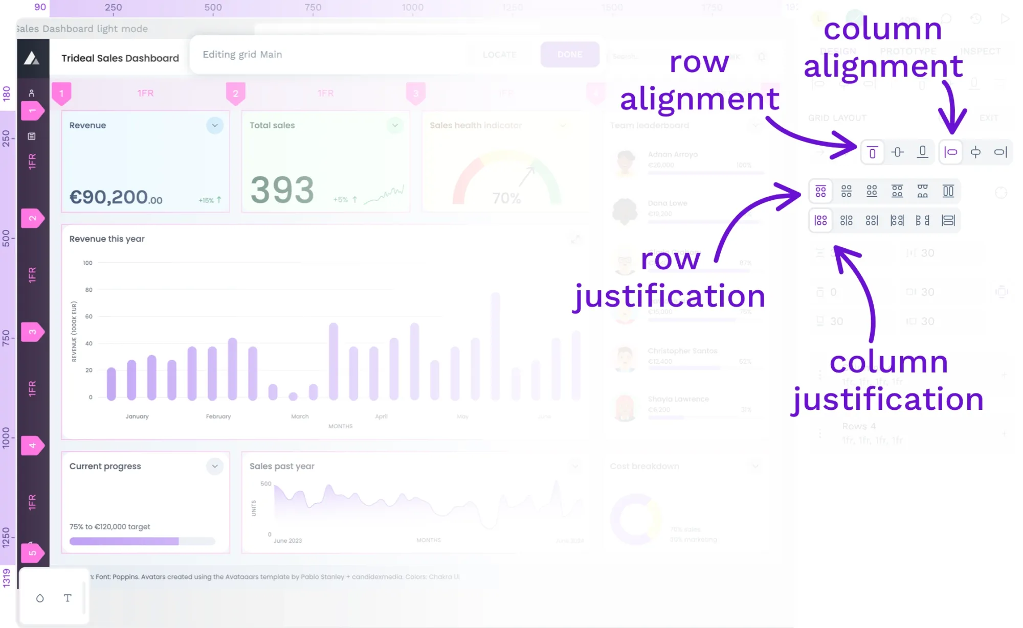
The Design panel has four sets of buttons so you can have fine-grained control over your grid layout’s element alignment and justification:
- Block (column) item alignment: Align items to the start, center, or end of the column
- Inline (row) item alignment: Align items to the start, center, or end of the row
- Block (column) item justification: Distribute items in the column direction
Inline (row) item justification: Distribute items in the row direction
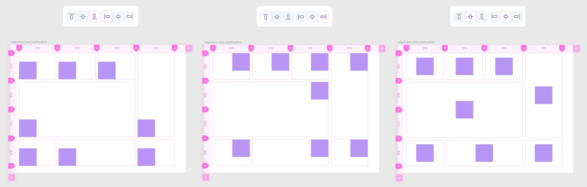
For the bento-style grid, I used stretch justification for the items across both rows and columns. Stretch justification pairs well with the flex layouts inside, which will fill the available space.
You can also override the block and inline alignment and justification in the grid element settings for each grid cell, which is handy if you want one item to be aligned differently from all the others.
6: Add spacing between items
Depending on what you’re using your grid layout for, you might want spaces between the grid cells. Spacing is a key element in the bento style layout as it emphasizes the structure of the grid. The spaces between cells are called gaps:
- Row gap: the space between each row
- Column gap: the space between each column
Column and row sizes specified in fractions (fr) are calculated after the row and column gaps have been added, so you can keep your layouts flexible without having to do any complicated math!
7: Add padding around the items
Padding is important if you need space around the outside of your grid layout. I’ve added 30px padding to the outside of my bento layout to mirror the spacing between the cells and add breathing space.
When you enable the four-sided padding option, you can also set each side to have different padding, just like flex layout.
8: Choose the layout sizing
You can flexibly size the grid’s height and width or specify fixed values that will dictate the space available for the grid cells. If your grid layout is a board or does not have a parent container with a grid or flex layout, there are two options for choosing the height and width of your layout:
- Fit content: grows and shrinks depending on the content inside
- Fix width/height: a fixed pixel value
As the bento layout is part of a page layout, it is sized as a grid element (more on that below!) A grid element has an additional option for its height and width:
- Width/Height 100%: fill all the available space in the parent container
9: Choose the sizing of the grid elements
If you haven’t already added content to your grid, now is a good time to do so. When you have positioned elements inside your grid, you can determine how the overall grid affects their layouts.
You can drag or paste elements onto your grid, and they will snap into the available grid cells.
An element inside a grid layout is also called a grid element. Grid elements have a few options for how you can size their height and width relative to their parent grid layout. The options are:
- Fix: a fixed pixel value, regardless of the parent layout.
- Fit: grow and shrink depending on the content inside the flex item.
- 100%: grow and shrink to fill the space provided by the parent container.
You can adjust the grid element sizing from the Design panel properties when you’ve selected the grid element in the Layers panel.
Grid layouts that wrap
Grids aren’t the only way to create layouts in Penpot. Flex layouts are an even more flexible way to create responsive layouts and can sometimes even be used instead of grid layouts.
Flex layouts are beneficial when the container has no fixed height or width and you don’t know how many elements will be in the final layout. They are also best for flowing between dramatically different container sizes, such as mobile and desktop layouts.
With flex, the elements inside the layout reflow to fit the available space.
More grid layouts
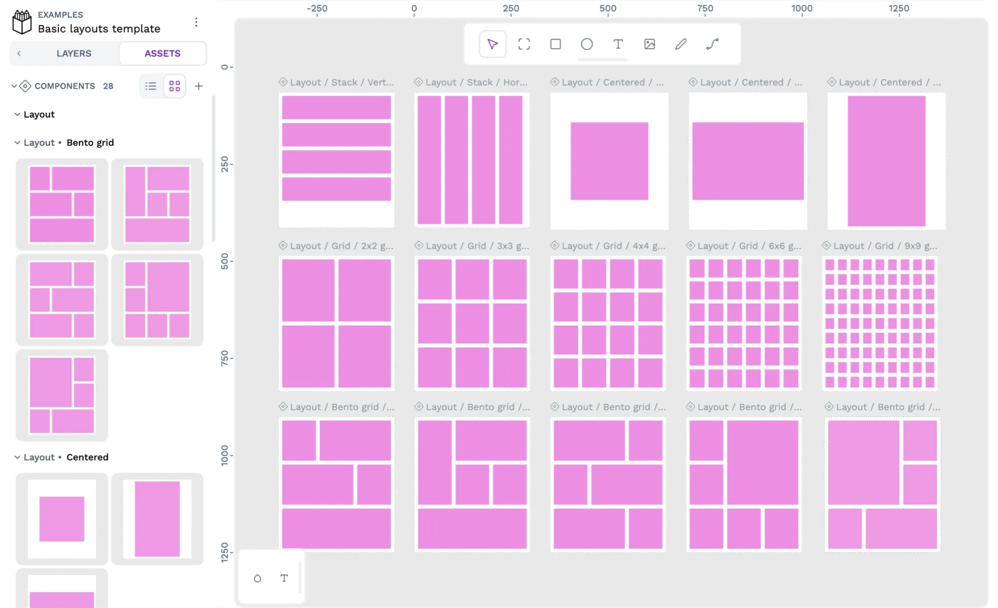
Are you looking for more examples and simpler layouts to learn from? Download my Basic Layout template for Penpot. The template contains sixteen grid layout components that you can import or copy into your projects and use to learn more about grid layouts.
You can try Penpot’s advanced layout features by signing up (for free!) today.
If you’ve used Penpot’s grid layout for your design work, please share your work on our Community Space. We’d love to hear more about how you used our layout tools.