Tutorial: Creating and using shadow tokens
Using shadows carefully and consistently in your UI design can make it feel polished. Shadow design tokens help you implement the consistency and quickly update your shadows across your design system.

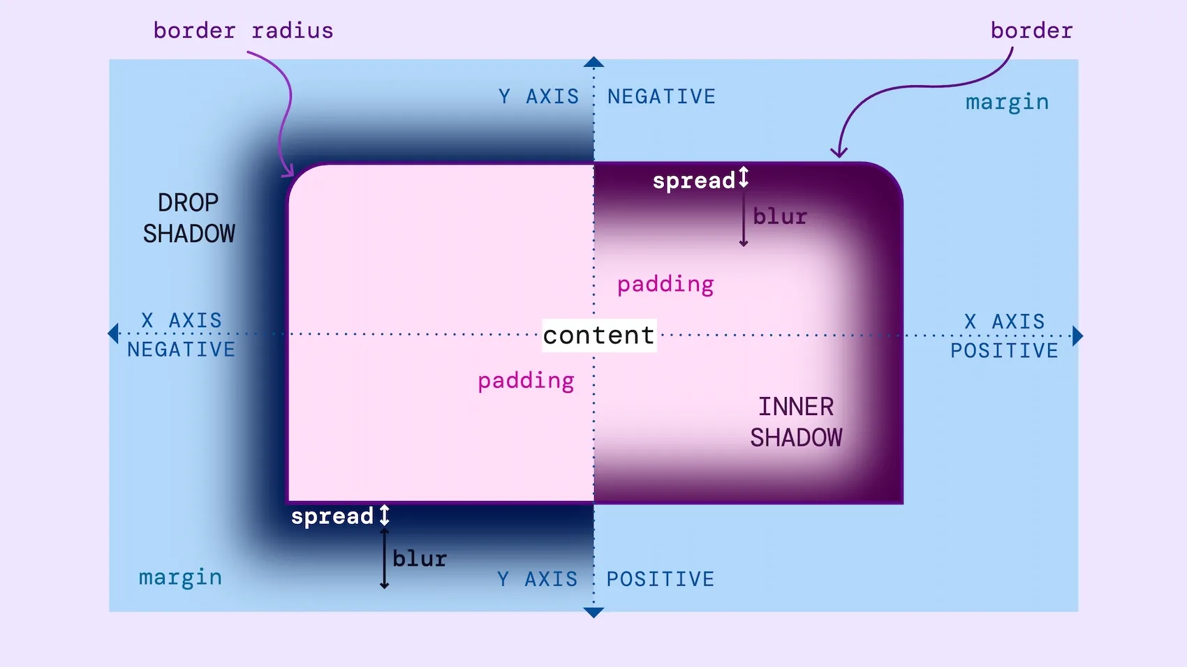
Sometimes we use shadows in our interfaces to mimic how lighting affects objects in real life, drawing our attention to them. If an object appears closer to us, we are more likely to focus on it. If the object feels further away, it feels less urgent. In UI design, we call this technique of creating visible layers or visual levels “elevation” .
Shadows are also helpful for subtly separating and layering content areas. They create softer divisions than background color changes or borders. We can also use inner shadows to push objects away from us, making them appear pressed into the surface.
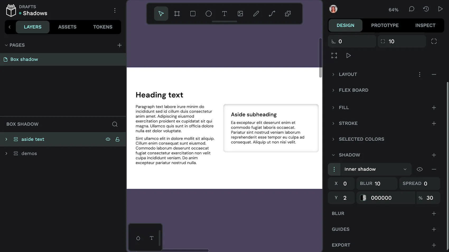
In Penpot, you can apply a shadow to an area or to text.
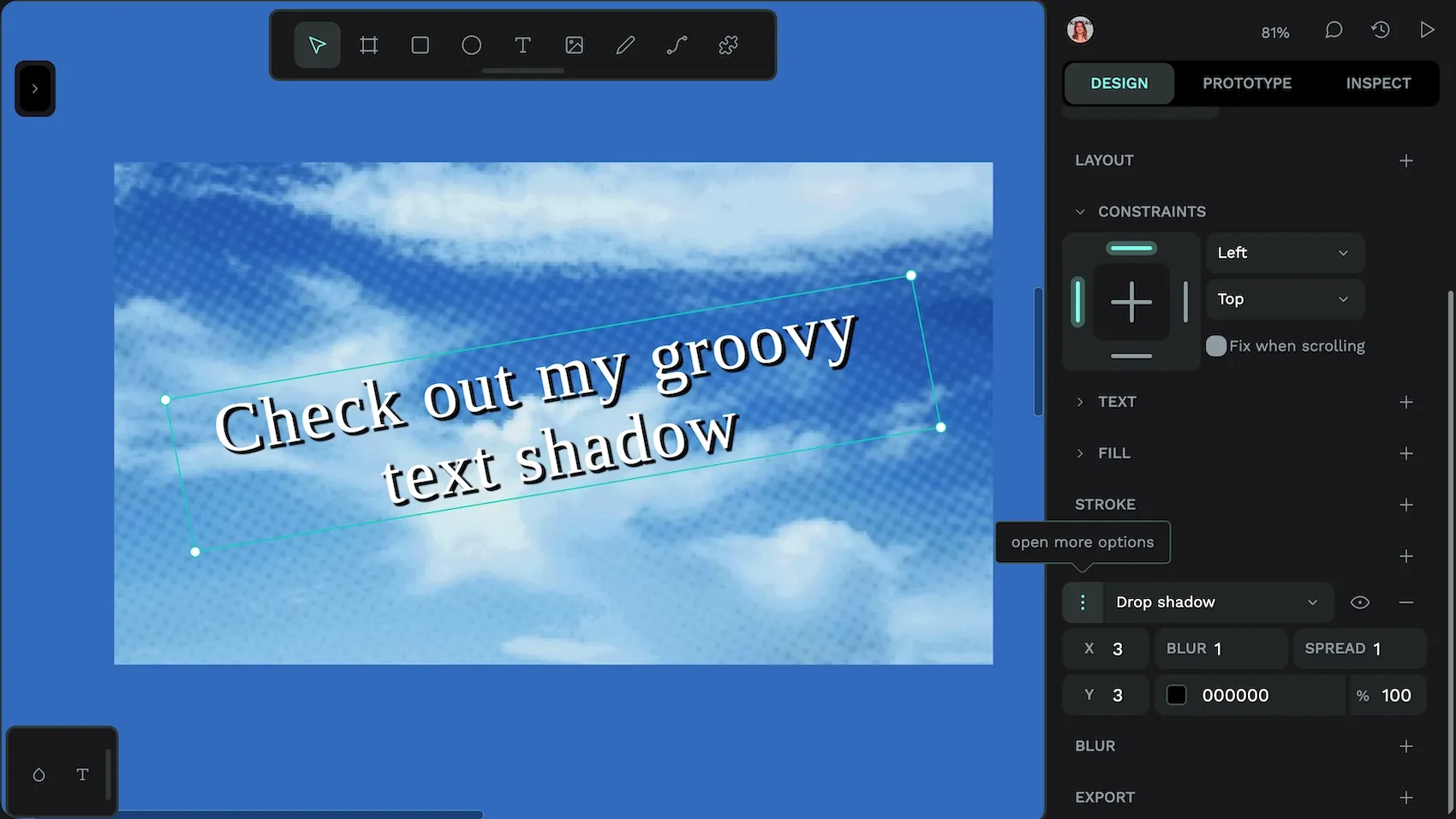
Text shadows can feel dated or excessive if overused, reminiscent of early web design trends. But they can be useful if you need to add extra contrast to text to make it easier to read over the top of a gradient or an image.
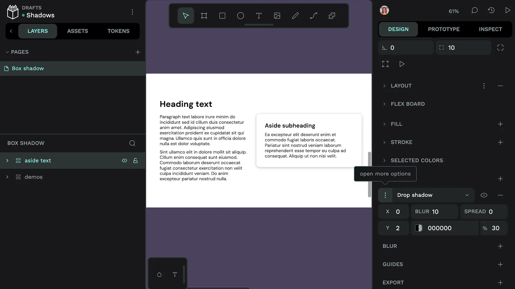
Showing and hiding the shadow shows how it can make the text more readable.
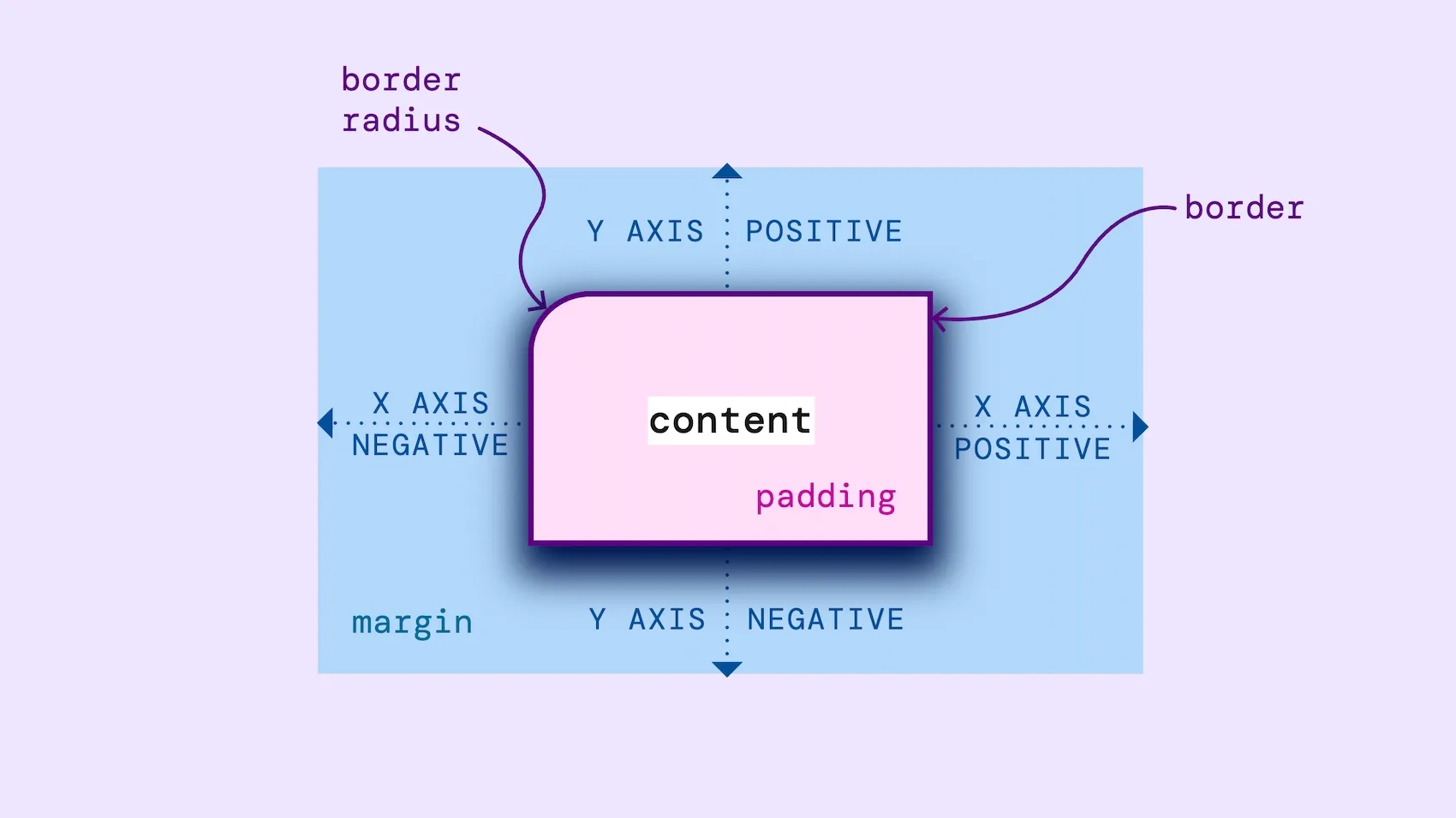
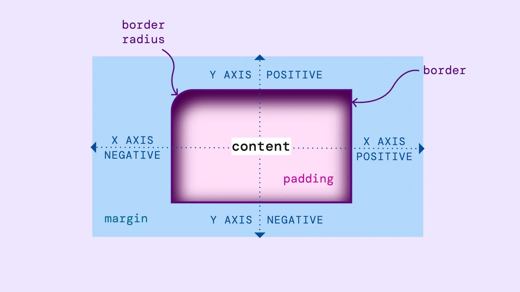
As shadows are copying real life objects, you need to design them carefully to make them feel natural. Shadows are created by an object coming between the light and the surface. So if you only have one imaginary light source, all your shadows should be on the opposite side of the object from the light source.
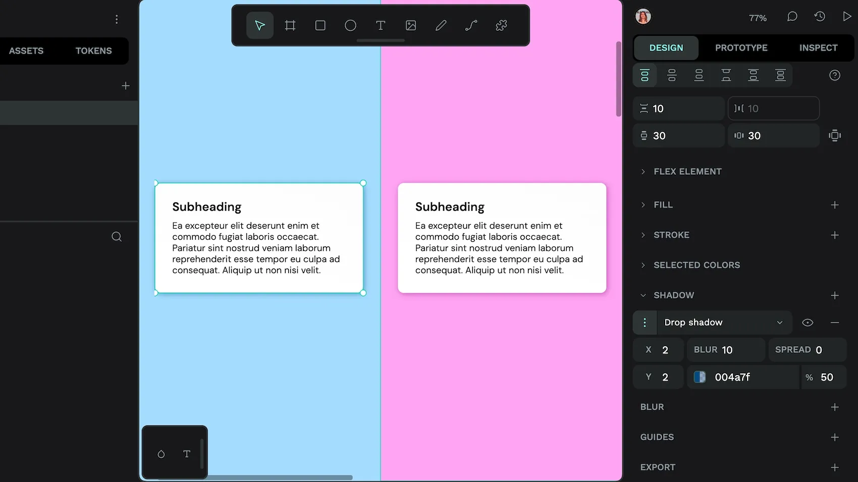
Also, shadows are rarely black, they are a darker color of the surface they appear on. Bear that in mind when you’re working with shadows and color: shadows on a blue surface are darker blue, shadows on a pink surface are darker pink.
Now that you understand how shadows work in UI design, let’s explore how design tokens can help you manage them consistently.
What are design tokens?
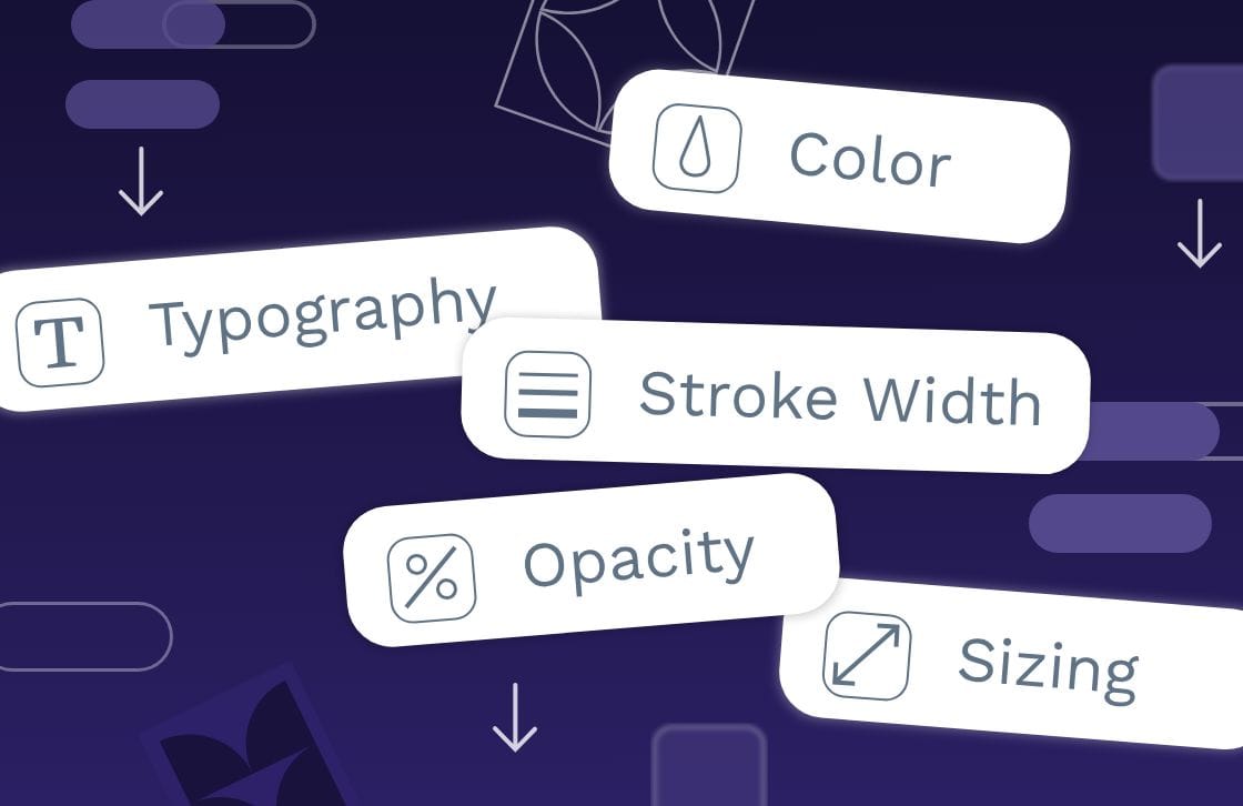
Design tokens are a way to save and share named design values across your design and development teams. For example, you might name the shade of red you use for error messages error.text or a typography composite token that features all the design properties for your page.title.
Design tokens use a platform-agnostic standard format, which means they’ll work in any platform, tool, or framework that supports design tokens. Shadow design tokens are particularly useful for creating consistency in the direction and spread of your shadows. This ensures a cohesive and polished user experience. (And avoids making your shadows look unnatural!)
How to create shadow design tokens
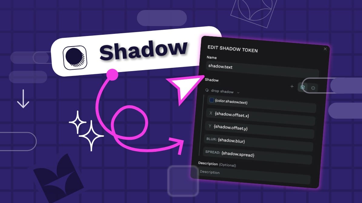
To create a shadow token in Penpot, go to the Tokens tab in the left panel and use the + add button alongside the Shadow token type. Then fill in your shadow token’s properties.
The shadow design token is a composite token, which is a token made up of multiple properties.
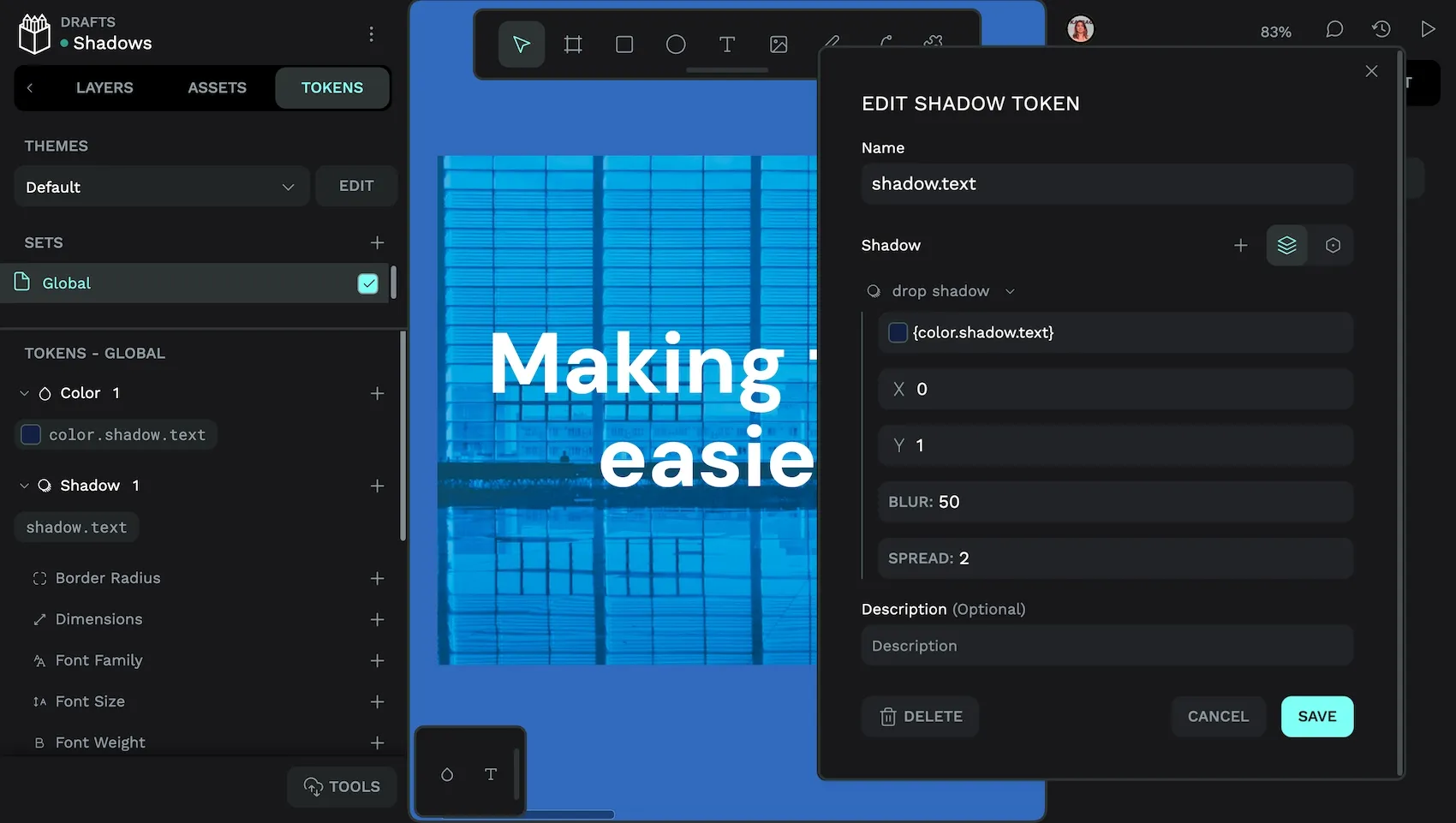
Like other design token values, your shadow token values can reference other design tokens { inside curly brackets }.
- Drop shadow / Inner shadow: toggle whether the shadow is on the outside or inside of the object.
- Color: (color) color of the shadow
- X offset: (number) offset distance of the shadow along the horizontal X axis
- Y offset: (number) offset distance of the shadow along the vertical Y axis
- Blur: (number) blurriness of the shadow
- Spread: (number) length of the shadow
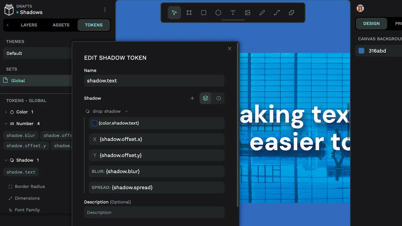
As shadows are usually mimicking real life lighting effects, you’ll want to keep their offset and spread values consistent across all your shadow tokens. The X and Y offset values don’t need to be the same, but keep the ratio between them consistent. This will give the impression that you have one consistent light source (and shadow direction) for your design, and prevent the unnatural effect caused by shadows pointing in different directions. When designing shadows, your Y offset is usually larger than your X offset. This is since light typically comes from above, pushing shadows downward.
This is one of the use cases where design tokens come in handy. You can set your offset and spread values once in utility tokens like shadow.offset.y, shadow.offset.z and shadow.spread. (Use the number token type.) Then reference those tokens in more semantic tokens you apply to your design, like shadow.box.inner or shadow.text.
Then, if you want to tweak your offset or spread values, you only need to edit the utility tokens to update all your semantic tokens. And your shadows stay in sync.
Read more about the shadow tokens and their accepted values in the Penpot User Guide.
How to create multiple shadows in one shadow design token
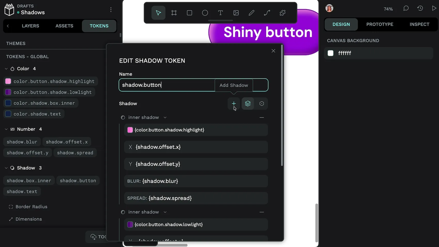
You might want to use multiple shadows on one object. This could be to create the illusion of multiple light sources. Though it’s more likely you’ll use a second “shadow” to create a highlight effect, making your object feel shiny.
To create multiple shadows on one shadow token in Penpot:
- Go to the Tokens tab in the left panel.
- Use the + add button alongside the Shadow token type.
- Add an inner shadow with any properties you want for the highlight style. In your X offset and Y offset values, you can use a
-minus in front of your{shadow.offset.y}and{shadow.offset.z}token references to pull the highlight in the opposite direction from other shadows. (Example:-{shadow.offset.y}.) - Use the + Add shadow button below the shadow name to add another shadow to the token. Use an inner shadow with any properties you want for the lowlight style.
- Use the + Add shadow button again if you want to add a drop shadow to your token.
The first shadow you add will appear at the top of the list and will render on top of other shadows in the visual stacking order. This matters most when you’re using multiple inner shadows or multiple drop shadows that will overlap each other.
How do I apply a shadow design token?
You apply a shadow design token like any other design token in Penpot:
- Select the layer or canvas object where you want to apply the shadow token.
- Go to the Tokens tab in Penpot’s left panel.
- Right-click the shadow token you want to apply.
- Check the shadow property in the token menu to apply the token.
Alternatively, you can click the shadow token to apply it directly to the selected layer.
Remember that less is more when it comes to shadows in your UI designs. Fewer shadows used purposefully will have more impact. You also need to consider the space around your objects to ensure drop shadows don’t overlap or get clipped. (Consider using margins to avoid clipping!)
The best way to learn more about shadows and design tokens is through practice. Start by designing your shadows, then create a small set of utility tokens for your most common shadow patterns. Then you can build semantic tokens for specific use cases like cards, buttons, and modals. As you work, you’ll discover opportunities to refine your approach and create even more efficient token structures.
Related blogs
Want to learn more about design tokens and UI design? Here are more articles and tutorials to get you started:
 Laura Kalbag
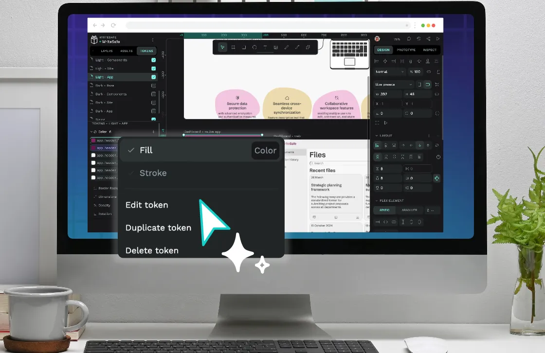
 Laura Kalbag
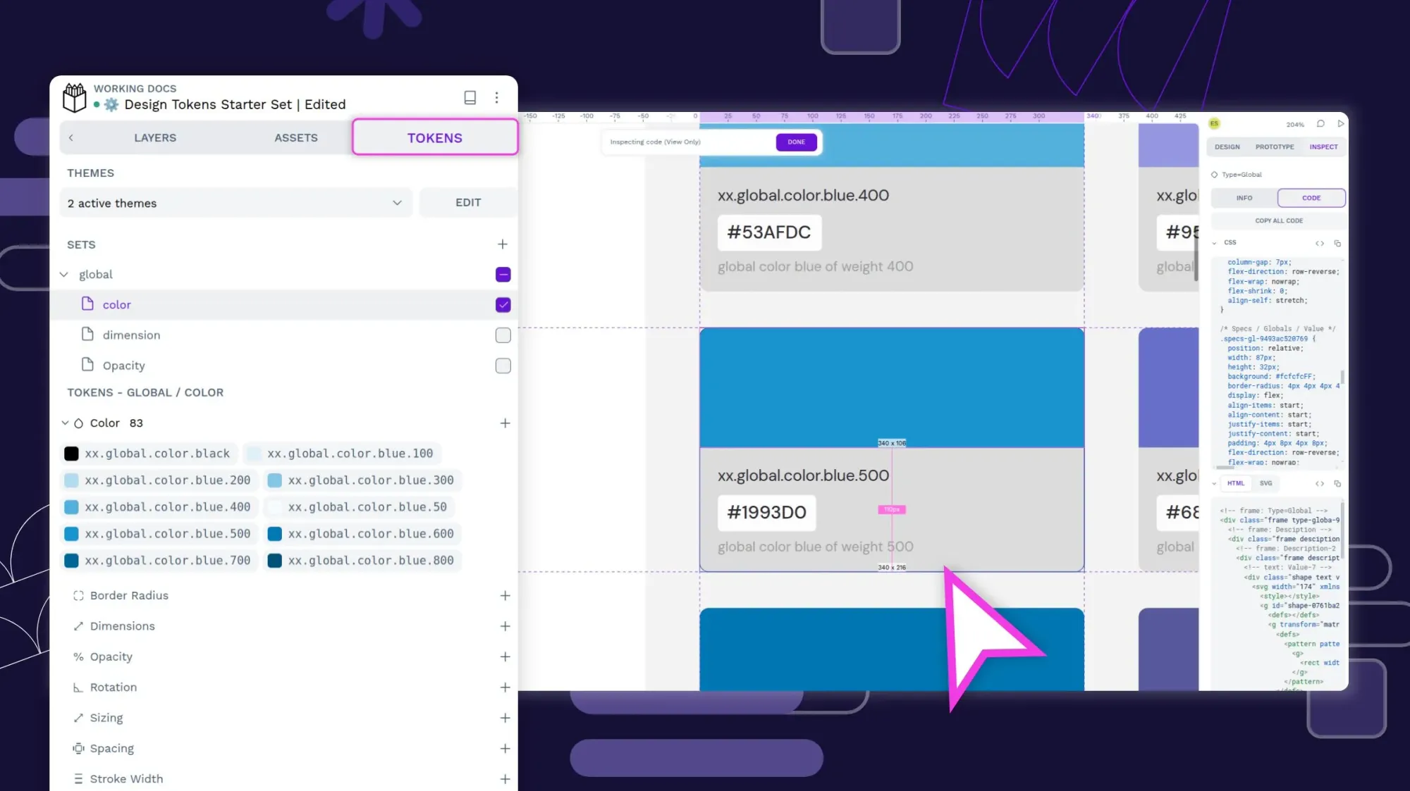
 Laura Kalbag
 Laura Kalbag