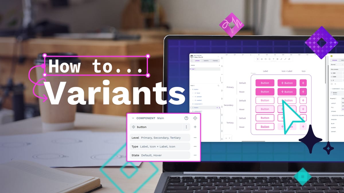
Tutorial: Creating and using component variants in Penpot
Component variants are a way to create different variations of a component. Does your component need different sizes? Colors? Levels of elevation? Variants make it easy to define these properties, and choose between them when you’re using a component in your designs.

Component variants are a way to create different variations of a component. Does your component need different sizes? Colors? Levels of elevation? Variants make it easy to define these properties, and choose between them when you’re using a component in your designs.
How to use component variants
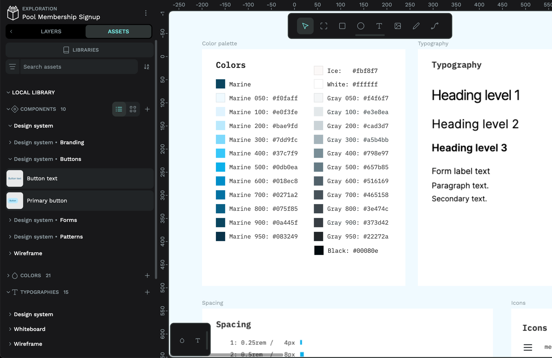
You can find components in their dedicated section under the Assets tab. Components from the current (local) file appear at the top, with connected library components grouped by library underneath.
- Drag your chosen component onto the canvas. You can tell if a component has variants from the dotted diamond icon displayed over the component preview.
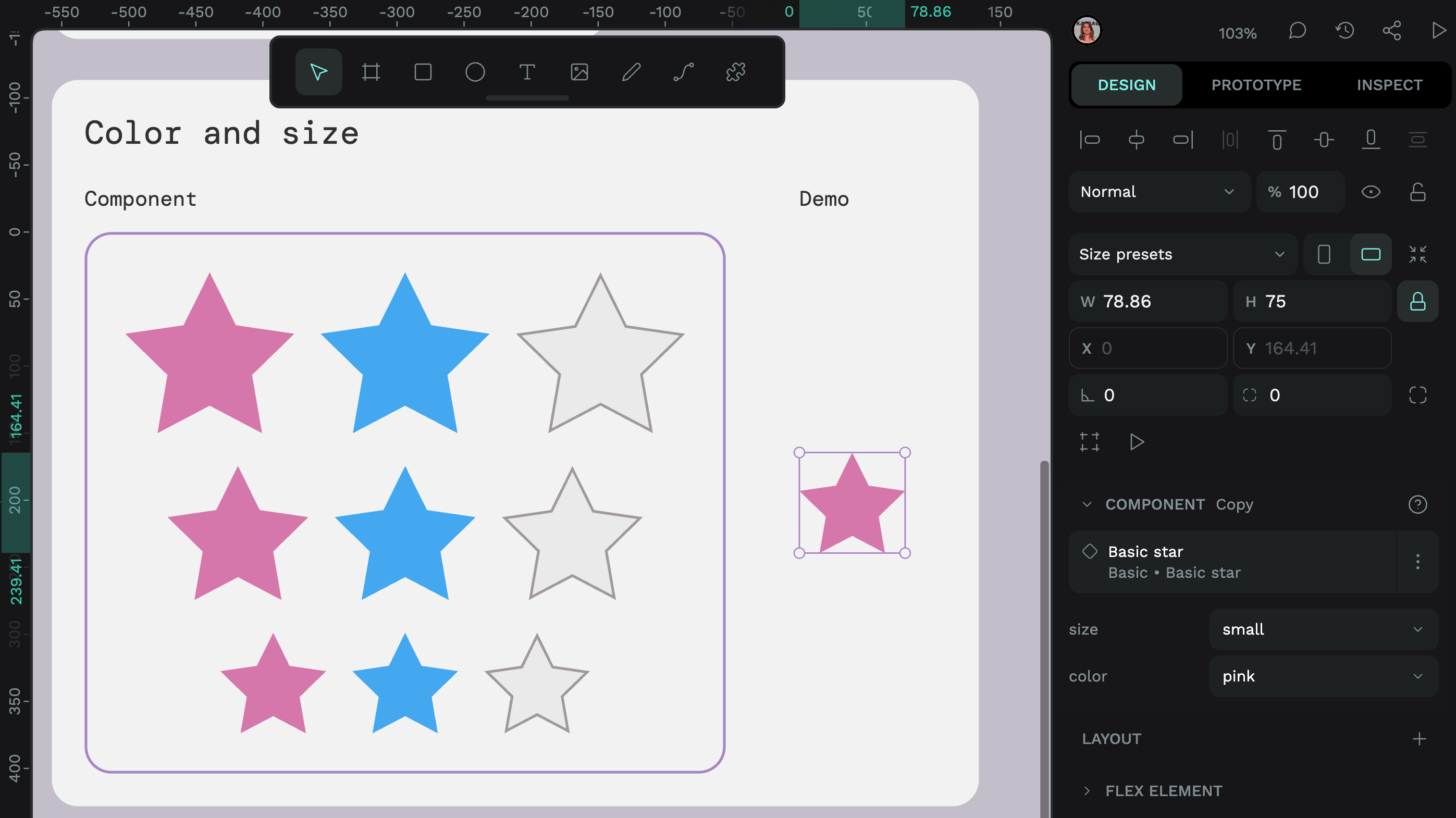
- Select the component on the canvas or from the Layers list. You can then find the component’s variants in the Design panel, listed under the component name.
- Pick your desired values from the variant property menus. Changing the value will update the component on the canvas.
When you change the text content inside a component, your text changes will be preserved when you switch between variants, as long as you don’t change the text layer’s name. Read more about variants and overrides in Penpot’s user guide.
You can try out some components with variants in the Variant examples template in the Penpot Hub.
How to create component variants
In order to create a component variant, you must first create a component.
Create a component
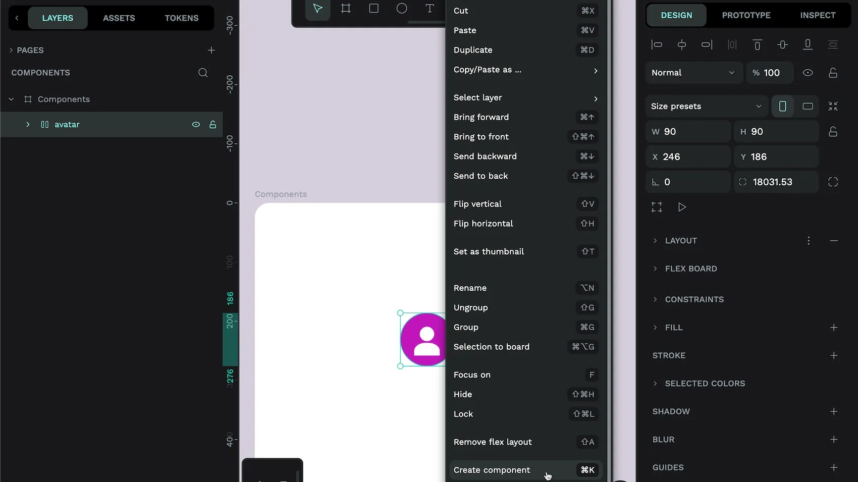
- Select an object, multiple objects or a group on the canvas or in the Layers list.
- Right-click the selection and choose Create component from the menu or use the
cmd/ctrl+Kkeyboard shortcut. - Your main component will now appear in the Assets panel, and will be indicated on the canvas and in the Layers list by a double diamond icon.
The main component is the original component that is stored in the Assets library. When you use that component elsewhere in your design, it is called a component copy (or instance.) You can override some aspects of the main component in your component copies, like the text or the color. You can also easily reset your component copy back to match the main component by right-clicking the copy and choosing Reset overrides.
Create component variants
After you have created a component, you can create variants for that component.
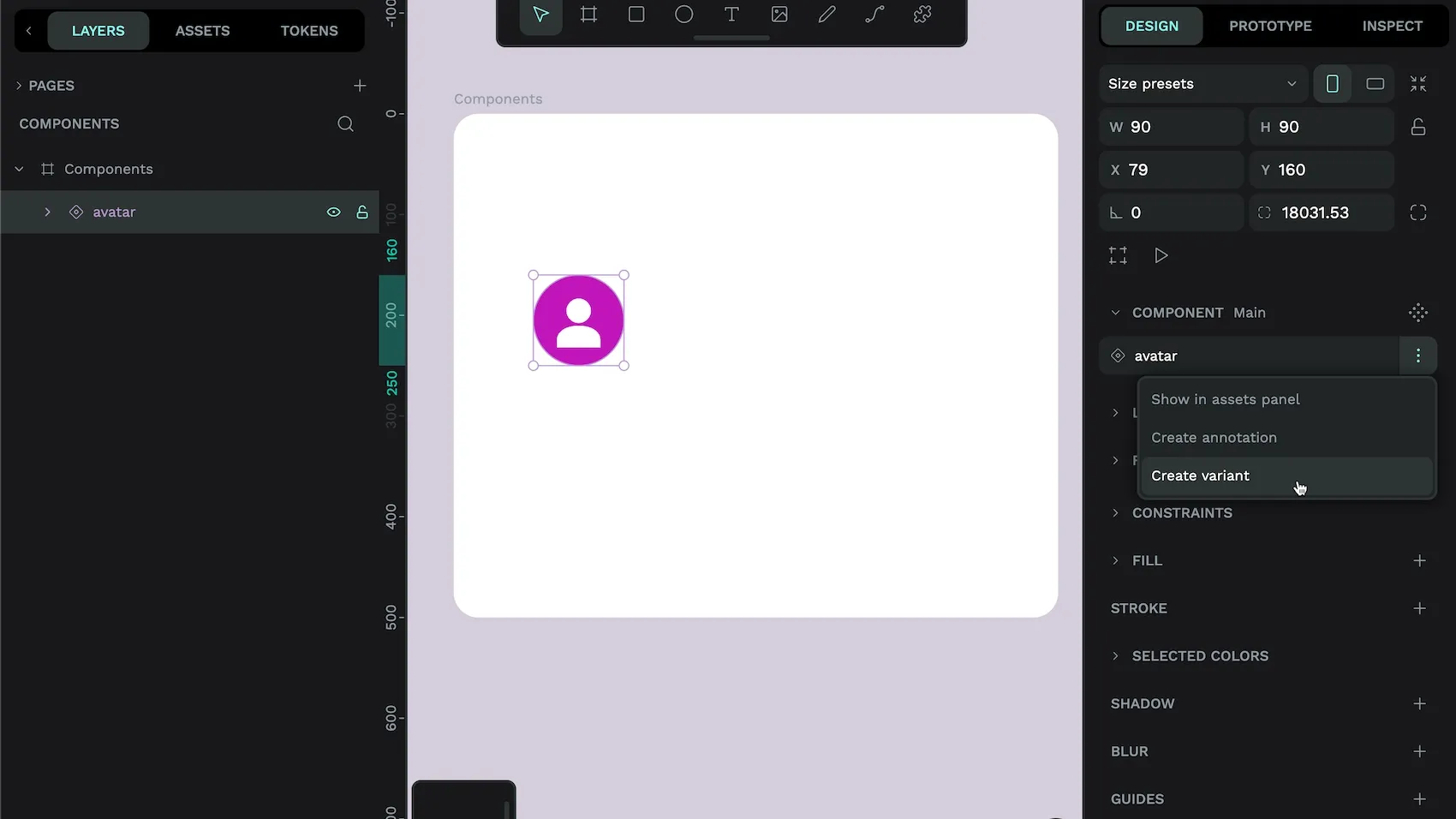
- Select your main component from the canvas or the Layers list. If you can’t find your main component on the canvas, you can locate it from the Components section in the Assets panel by right-clicking its name and choosing Show main component.
- From the Design panel, choose Create variant from the options menu alongside the component name. Read more about other ways to create variants, including using keyboard shortcuts.
- A duplicate of your component will be created as a new variant, alongside the original. Each variant will share a default property named Property1. The first variant will have a value of Value 1 for Property1, and the second variant will have a value of Value 2 for Property1.
- Select each variant on the canvas or from the Layers list to name the property that differs across each variant, and its different options/values. For example, the variants could have a Property name of Color, with one variant using the value Yellow, and the other variant using the value Blue.
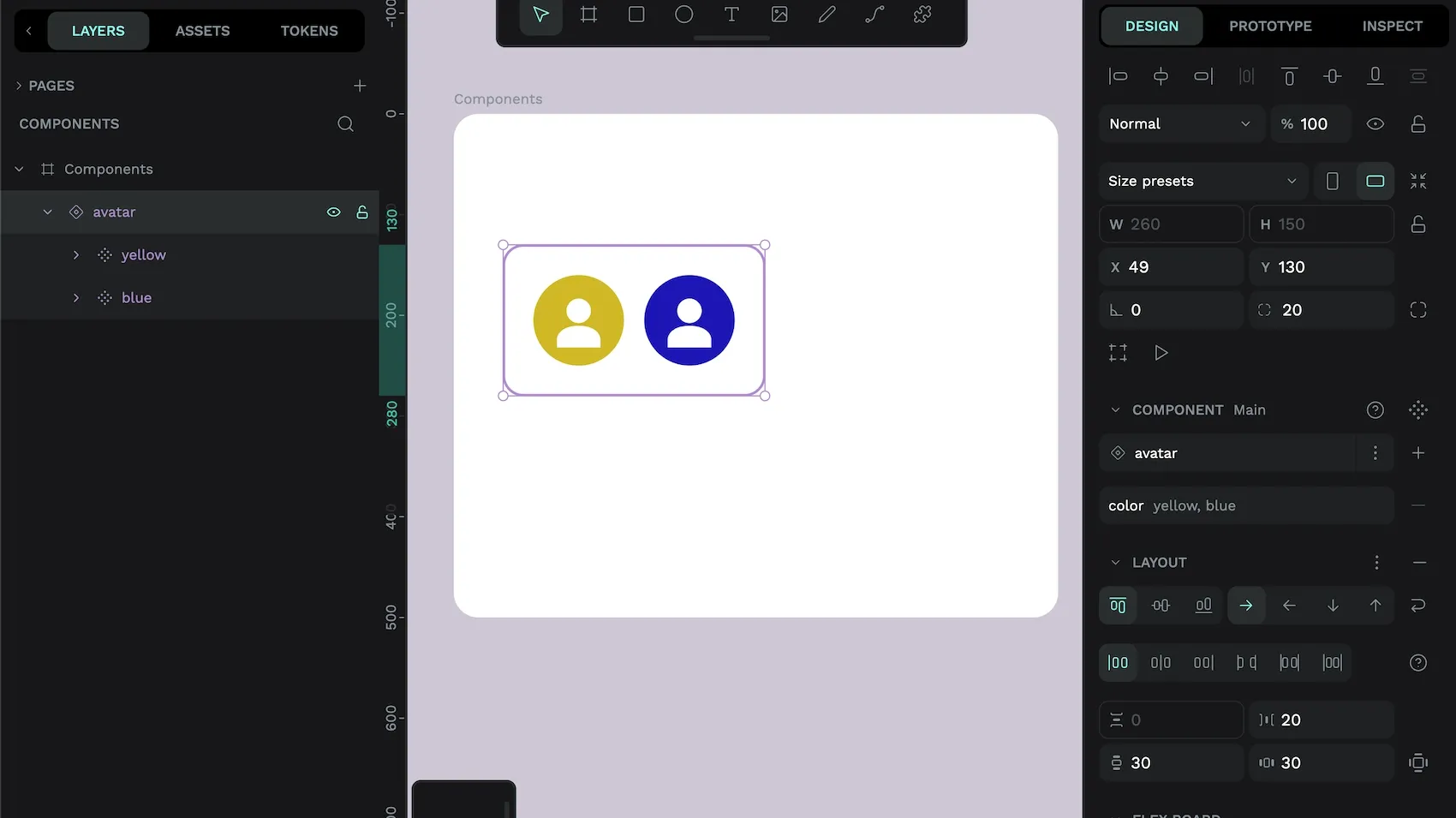
A main component with variants will have a thick purple border around the variants on the canvas.
Create variants from existing components
You might already have components in your Assets library that would work perfectly as variants of the same component. You can easily turn these components into variants.
- Select each main component on the canvas or from the Layers list.
- In the Design panel, choose Create variants from existing components from the Component section.
- Your components will be converted into variants of one component.
Learn more about component variants
If you’d like to see more examples of component variants in action, check out the hands-on demo for variants or the tutorial with 5 examples of component variants. Discover all the advanced details on connection conditions and overrides in the Penpot User Guide on components.
 Laura Kalbag
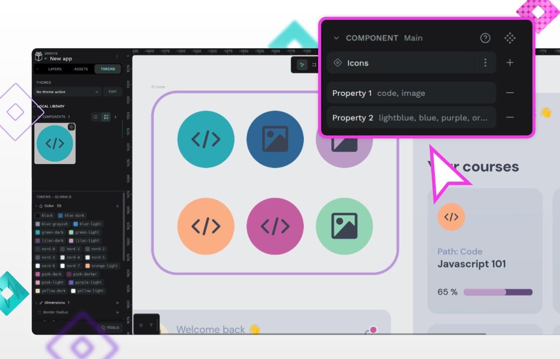 Laura Kalbag
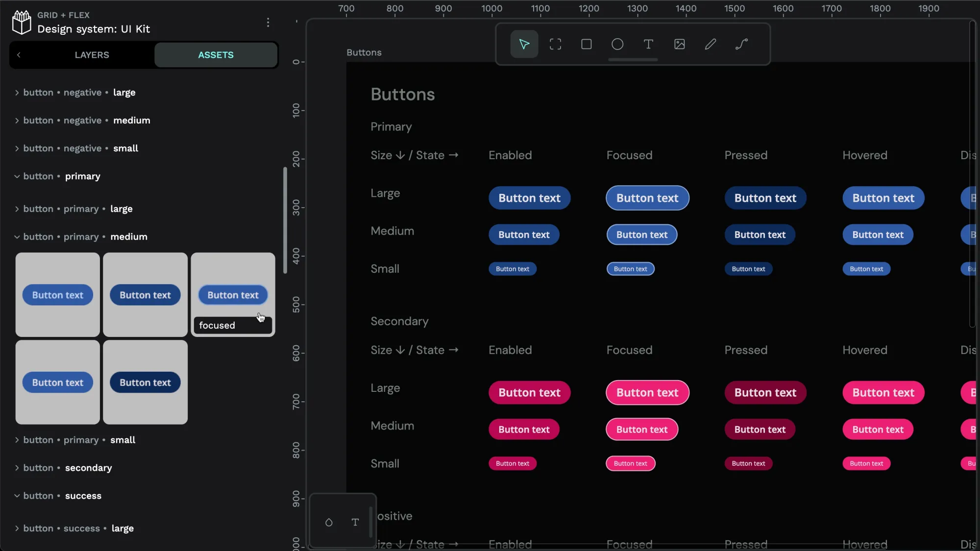 Laura Kalbag