Tutorial: Creating and applying typography design tokens
Typography design tokens are a way to save your text styles for reuse across your projects. The typography composite token combines multiple typography-related properties in one mega token.

Typography tokens are a way to save your text styles for reuse across your design projects. Like other types of design tokens, typography tokens are made up of a name and a value. There’s also a special typography composite token that combines multiple typography-related properties in one mega token. Think of it as a shortcut to applying multiple values (or even tokens) to a text object in one go.
Design tokens are a platform-agnostic standard, which means you can create and use them in any platform that supports the standard. This makes it easy to share and sync your design values across your team. Tokens are particularly useful for design systems and development, where consistent specific values help make big projects more manageable.
Even if you’re not writing code or building a complex design system, design tokens help you create more maintainable design projects. Once you’ve created a token and applied it to multiple design elements, you just need to edit the token’s value to update all of your design elements simultaneously.
What are typography design tokens?
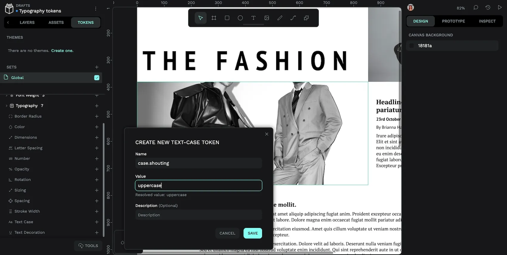
Typography design tokens help you define named values for the most common text styling options:
- Font family: also known as font name or typeface.
- Font size.
- Font weight: including thin and light to bold and heavy weights, as well as font style like italics.
- Text case: including uppercase, lowercase, and capitalize.
- Text decoration: including underline (useful for links!) and strikethrough.
Read more about the types of typography tokens and their accepted values in the Penpot User Guide.
You might want to create your typography design tokens when you’re designing your typography, trying out different font families and size combinations as you create your tokens. However, it can be difficult to name tokens consistently when designing them one-by-one.
You might find it easiest to create typography tokens when you have already established a typographic hierarchy. For example, when you’re at the point in the design process that you’ve decided to use that same hierarchy throughout your design, and you want to share it with your team. At that stage, you’ll better understand your typographic system in order to create a naming structure that works across all of your tokens, making them easier for you and your team to discover and maintain.
Creating these simple typography design tokens in Penpot is the same as creating any other token:
Creating a design token in Penpot
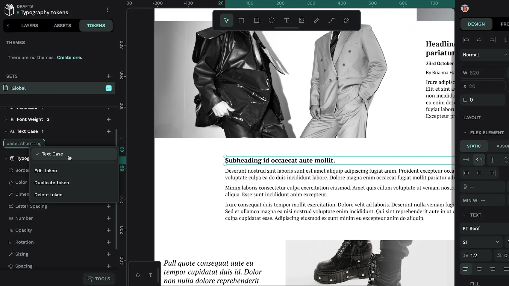
- Go to the Tokens tab in Penpot’s left panel.
- Scroll down to the token type you want to create.
- Use the + icon button alongside your chosen token type.
- Provide a unique name for your token.
- Specify your token’s value. (You can reference other tokens’ values inside
{curly brackets}.) - Hit Save to save your token.
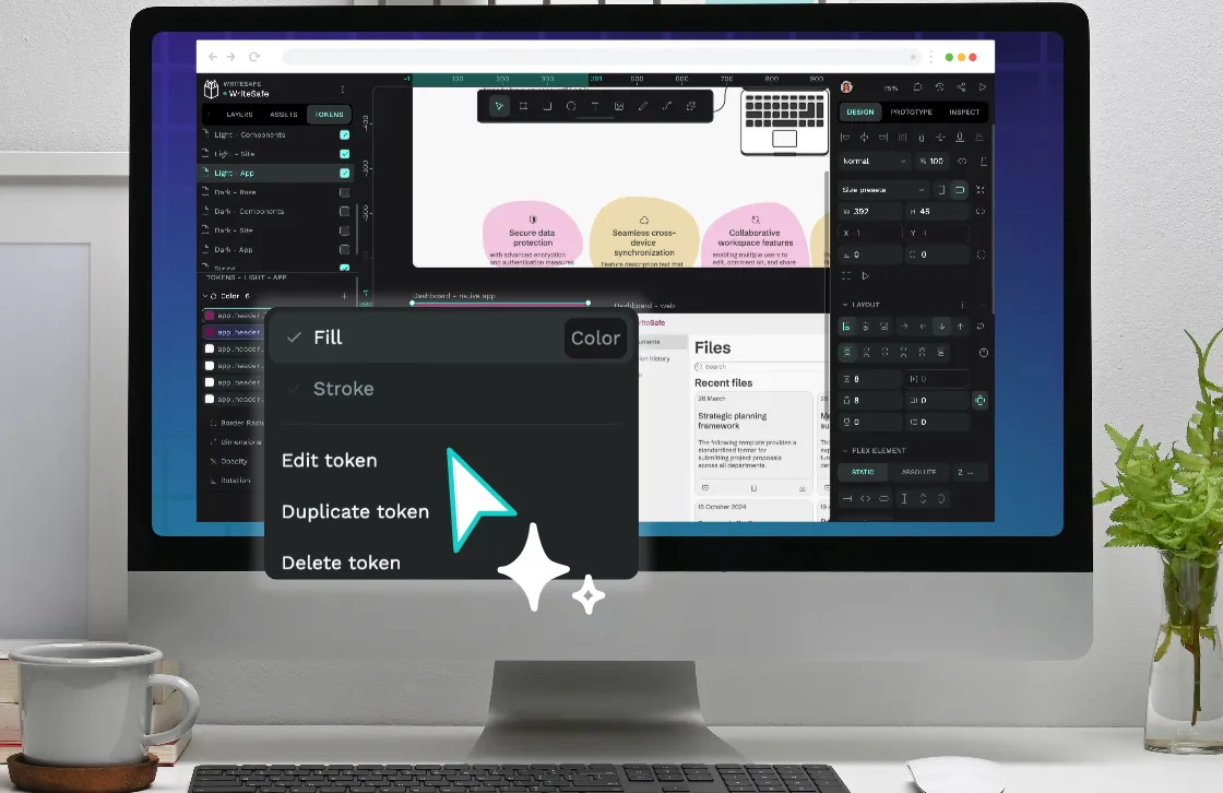
Applying a design token in Penpot
Applying these simple typography tokens are also similar to applying any other token in Penpot:
- Select the layer or canvas object where you want to apply the token.
- Go to the Tokens tab in Penpot’s left panel.
- Right-click the token you want to apply.
- Choose which property you want to apply to the object.
When an object is selected, any applied tokens are highlighted in purple in the Tokens panel.
For tokens that only apply to one property, you can left-click the token to apply it to the selected object.
The composite typography token
As I mentioned earlier, the typography composite token (or just “typography token”) combines all the text-related properties in one mega token. Composite tokens reflect how we often design our typography, combining a font family, line height, and font weight to style a text object consistently across our project. For example, styling all paragraph text or all navigation links consistently.
I’d recommend you first create any foundational tokens that you might reference in your composite typography tokens, analyzing which values are shared across multiple text styles. For example, capture the different font families used, and a font size token scale. Then create the composite tokens to represent the purpose of your typography in your designs, for example typography.headline or text.label.
Creating a typography composite token in Penpot
Creating a typography composite token is similar to creating other tokens, but with multiple values:
- Go to the Tokens tab in Penpot’s left panel.
- Scroll down to Typography token type.
- Use the + icon button to open the create token dialog.
- Provide a unique name for your token.
- Specify values for each typography property. You can reference other tokens’ values inside
{curly brackets}. If you leave a property value empty, it will use the property’s default value. - Hit Save to save your token.
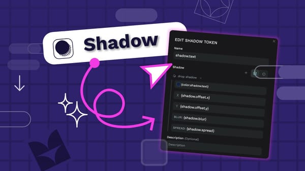
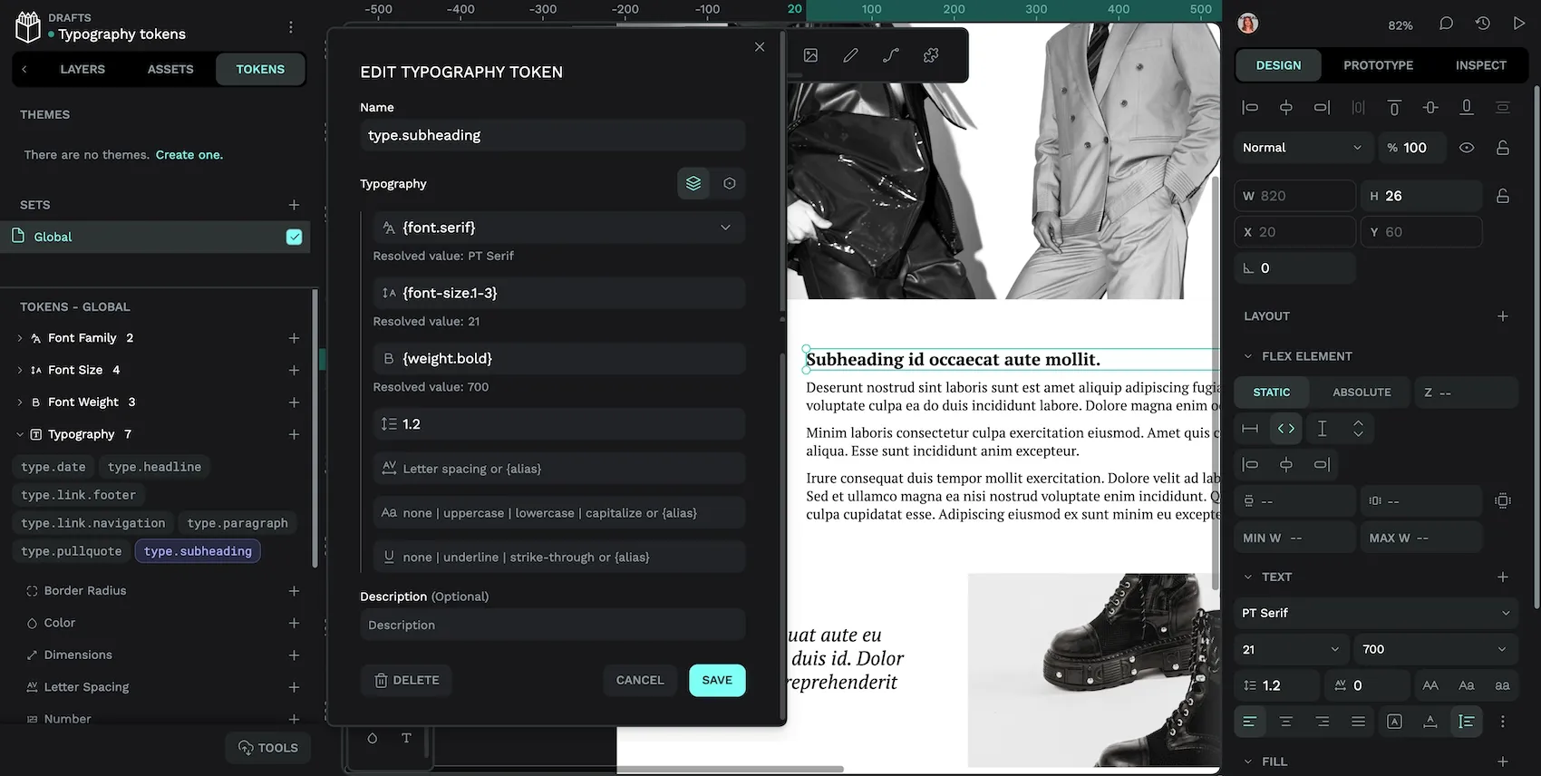
Let’s look at creating a typography composite token for this magazine design’s byline:
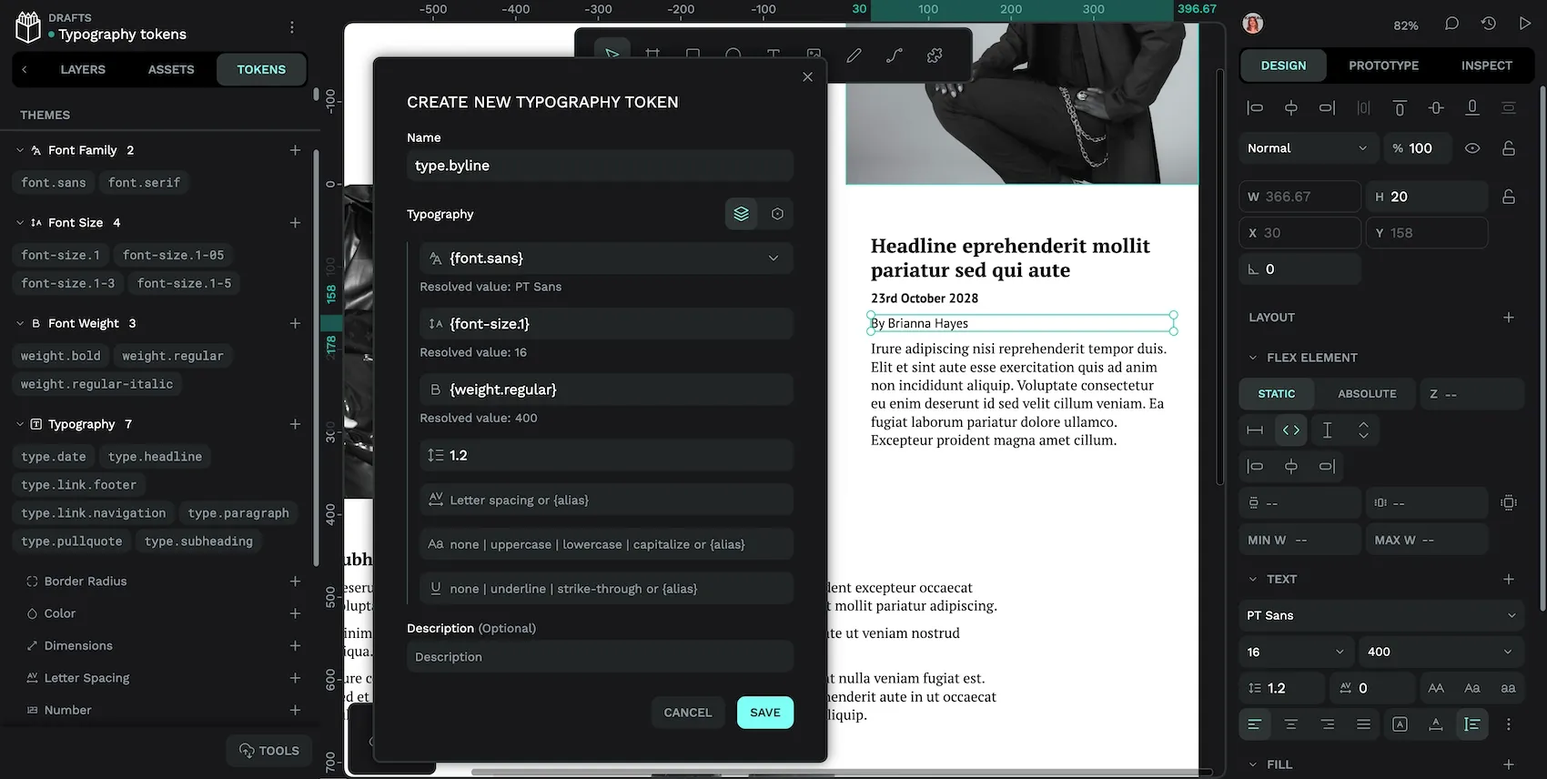
- I used the name
type.bylinein keeping with my naming convention for the other typography tokens.typeto group all the typography styles, followed by their purpose. - For font family, I referenced the
{font.sans}font family token I created earlier. This will ensure my byline token is using the same sans-serif font family as other typography tokens in my design. - For font size, I referenced the
{font-size.1}font size token. The font size tokens are using a linear scale, with1as the default font size. - For font weight, I referenced the
{weight.regular}font weight token. You have to use a font weight that is supported by your chosen font family. Theweight.regulartoken has a value of400(a “book” regular weight that isn’t too light and isn’t too bold.) Both myfont.sansandfont.seriftokens support each of the values in myweight.bold(600),weight.regular(400) andweight.regular-italic(400 Italic) font weight tokens. - For line height, I’ve used a value of
1.2, which is a “unitless multiplier” of the font size. I usually design a line height depending on the font size and font family, so referencing another token doesn’t make much sense here. For this reason, there isn’t a separate line height typography token, and you can only define line heights as a part of typography composite tokens. - For letter spacing, text case and text decoration, I’ve left each value blank. This is because I want to use their default values, so specifically defining these values would be unnecessary.
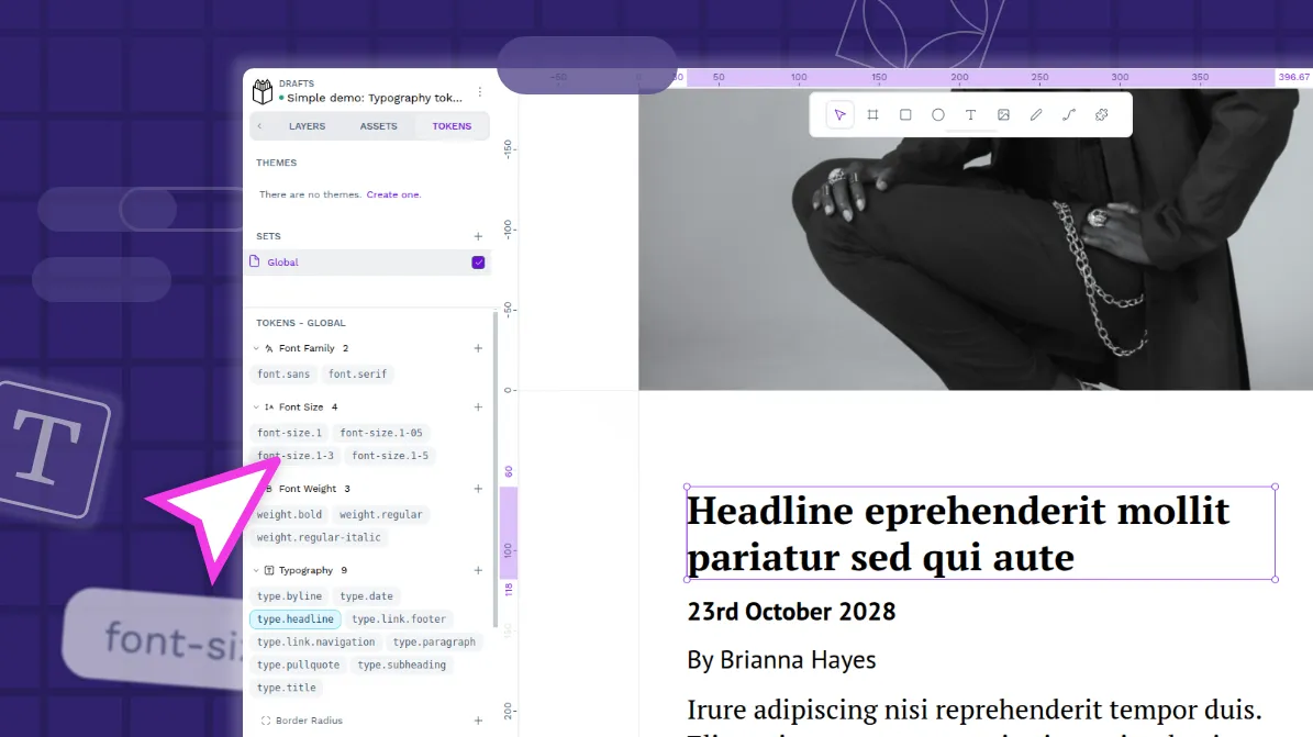
I find it helpful to keep the other typography tokens visible in the left panel while I create a new token, so I can refer to their names for references. If you’re working from existing text styles, it can also help to have those styles visible in the right Design panel. (Select a text object using those styles to have them show in the Design panel.)
Sometimes you might create a typography composite token that doesn’t use references at all. In this design, I have a very unique style for my magazine title. I want to create a design token for its typography because I will use the magazine title elsewhere in the project in the future, but because of its dramatic design (unique font, large, bold, uppercase), it doesn’t share any properties with the rest of my design’s typographies so it doesn’t make sense to create foundational design tokens for these properties.
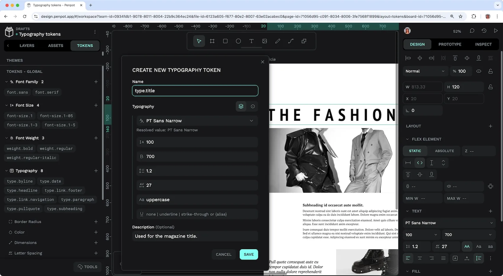
type.title typography composite token doesn’t use any references.How to apply typography composite token in Penpot
Applying a typography composite token in Penpot is simple:
- Select the layer or canvas object where you want to apply the token.
- Go to the Tokens tab in Penpot’s left panel.
- Left-click the typography token you want to apply.
Applying the type.byline typography composite design token to the byline text object.
Be aware that when you apply a typography token, it will override and/or detach any other text properties previously applied to the selected object. When a token is applied to an object, it is highlighted in purple in the Tokens panel.
Naming your typography tokens
In this current magazine design, I’ve named my tokens by their functionality. If you’re working on a system for an app or more complex system, you might also look at component-based naming patterns like card.header.title or button.primary.text.
When it comes to naming typography tokens, I recommend you describe the purpose of the token rather than its appearance. For example, instead of type.sans-with-underline, use type.link. This is for future maintainability; a link will always be a link, but you might change all of the properties that make up its appearance.
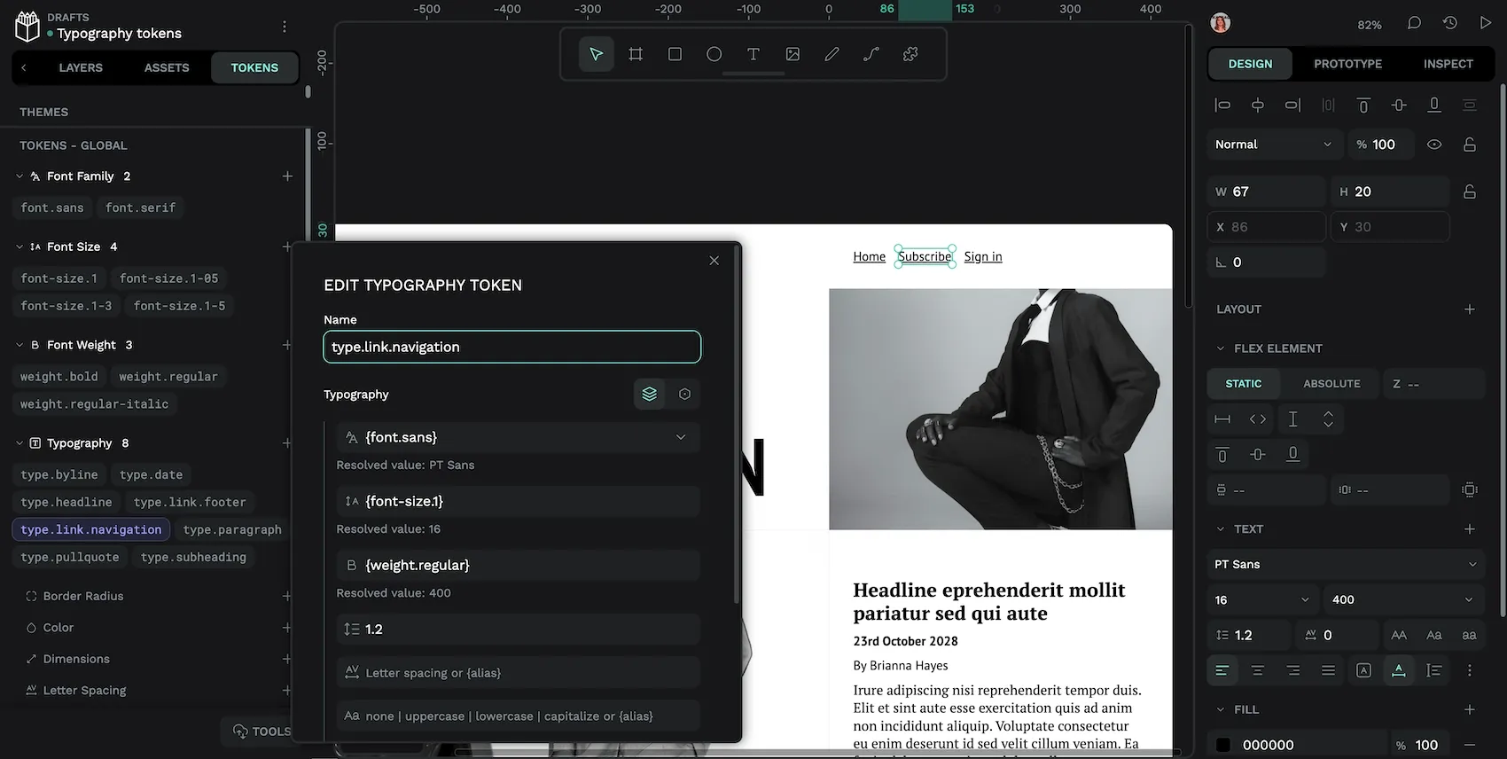
If you have variations in your typography styles that apply to similar objects, you might consider a grouping/category for their in their name. For example, the link styles in my design are different for the header navigation (using underlines) and footer navigation (no underlines.) So I’ve named those tokens type.link.navigation and type.link.footer.
Typography design tokens aren’t just for big teams or design systems, they can help you reduce repetitive design work and create more consistent user experiences regardless of project size. Giving names to values that represent your design decisions can help your team develop a shared language, or even just your future self remember which font size you settled on for your footer navigation.
Related Blogs
We have so many more posts about typography design tokens, design tokens, and Penpot. Here’s some good starting points:
 Laura Kalbag
 Laura Kalbag
 Laura Kalbag