Tutorial: Create and share components in Penpot
Learn about creating components and libraries of shared components in Penpot for your team’s design system.

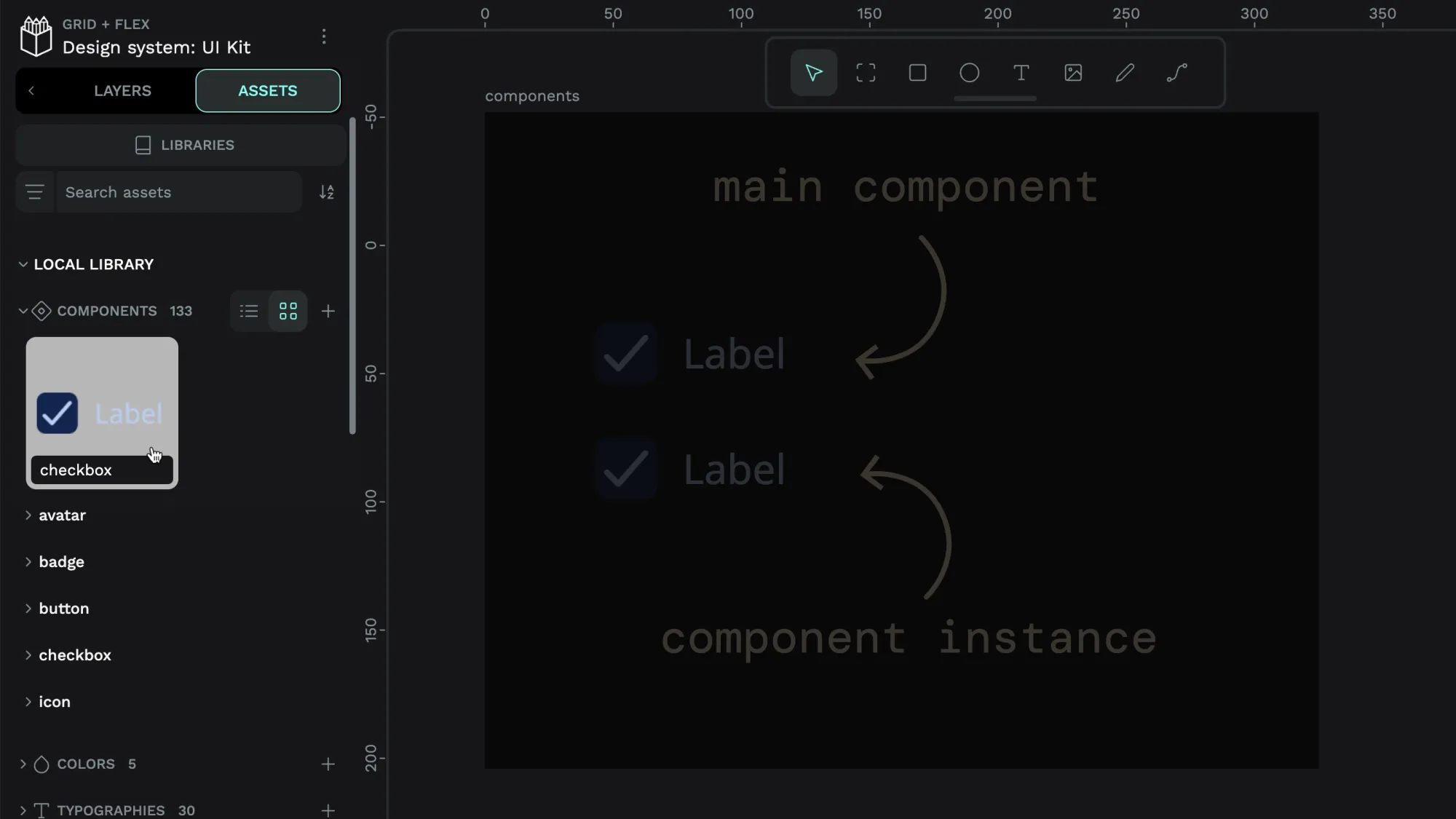
In Penpot, you can make any object or group of objects into a reusable component, making it easier to share and reuse a pattern in your design.
When you update the main component, any changes will be reflected in any copy (also known as “instance”) of that component used across your file, saving you time and effort.
If your component is part of a shared library, Penpot will update its instances across your team’s projects.
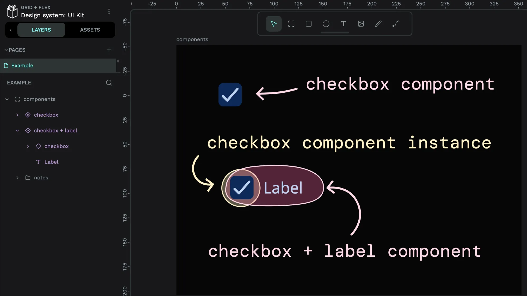
You can override the component instance’s label with different text depending on where you’re using it.
Components save you the time and effort of repetitively creating similar designs. Component libraries are an integral part of design systems as they provide a collection of patterns that you can pull into your projects. With more consistent patterns, you can improve the user experience and the branding across your design projects.
Are you looking for how to use components and shared libraries in your Penpot projects? Check out my other tutorials for:
- How to use components from your Assets library.
- How to swap between components.
- Creating and using component variants.
Create components
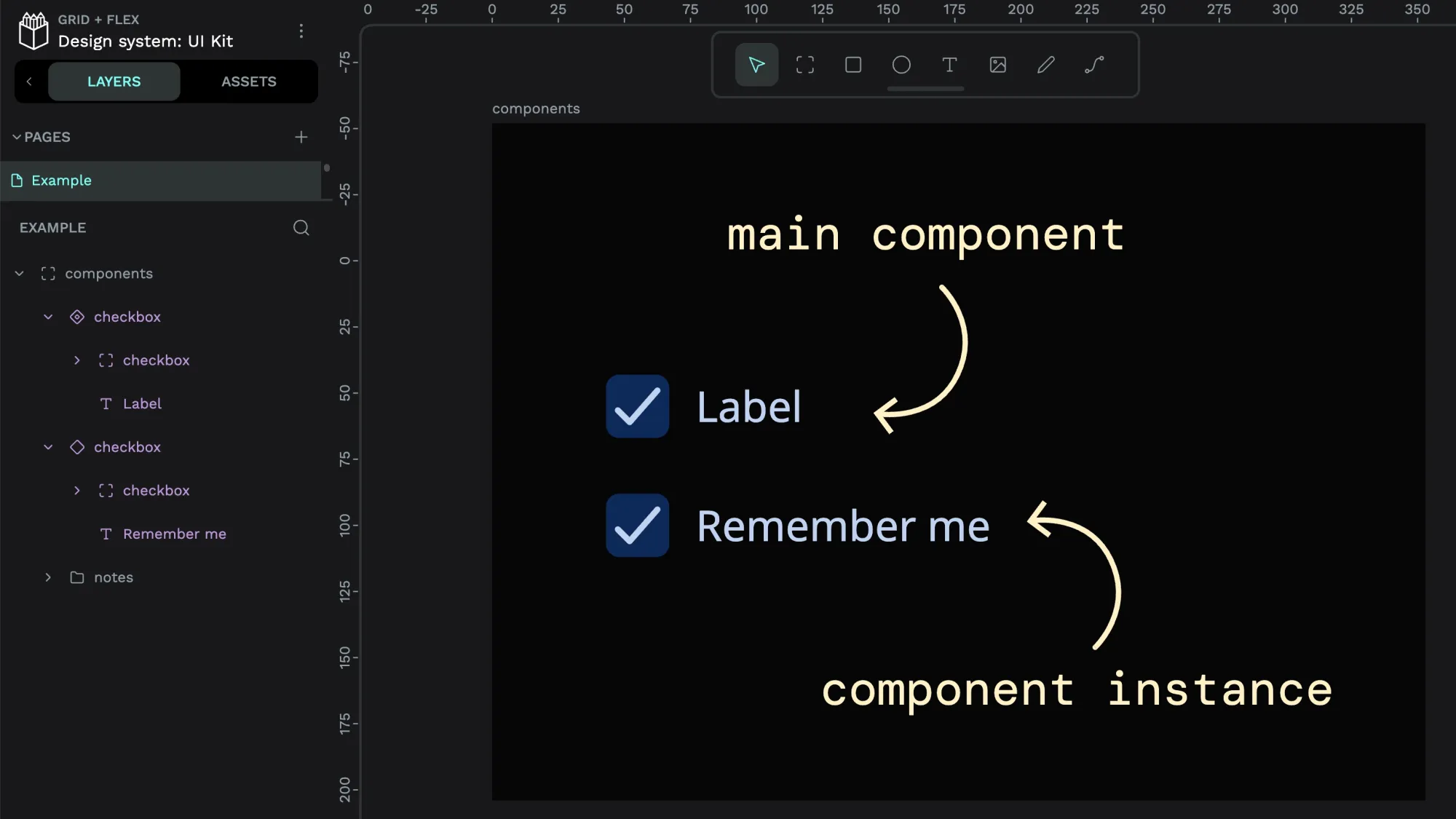
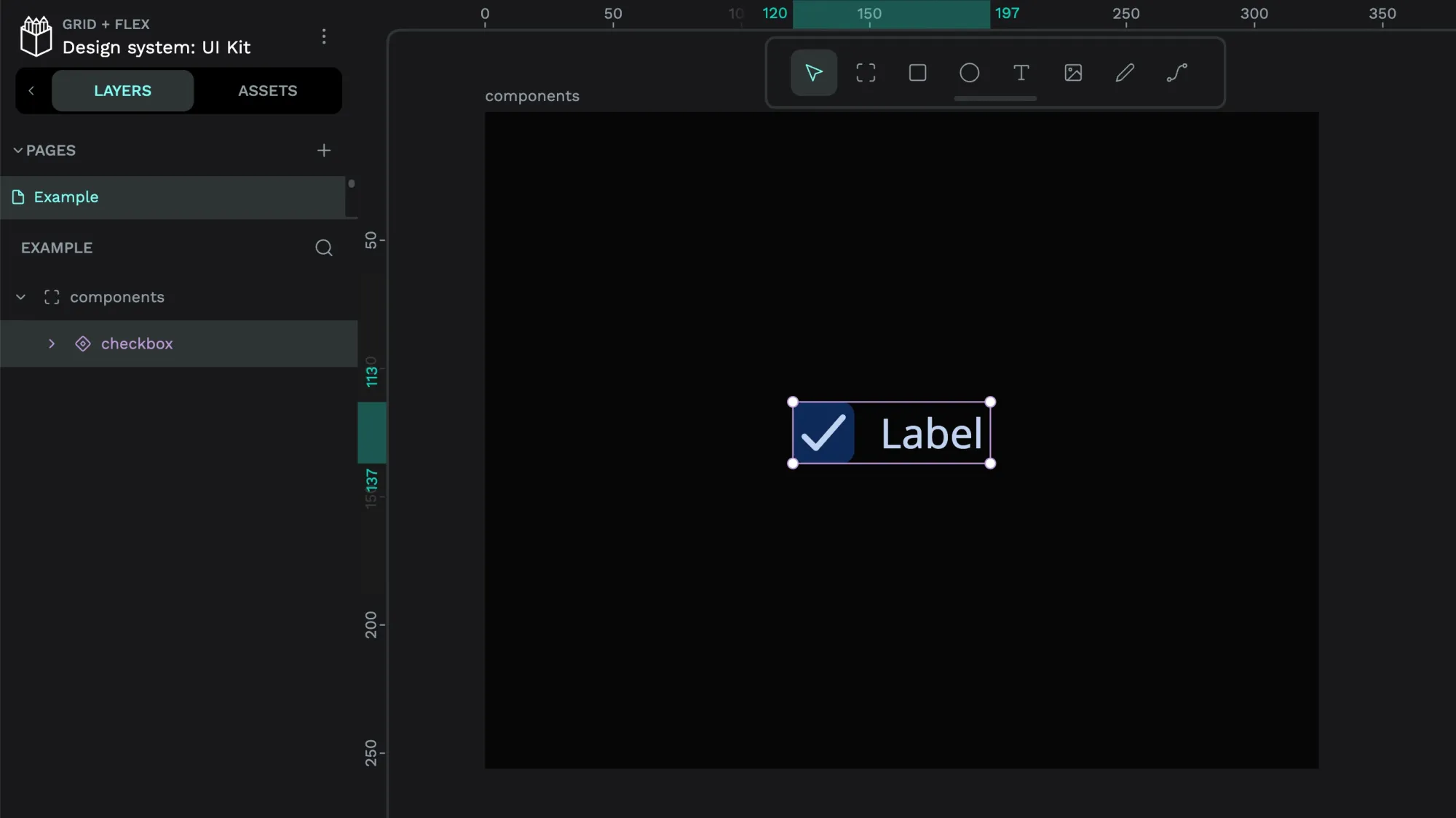
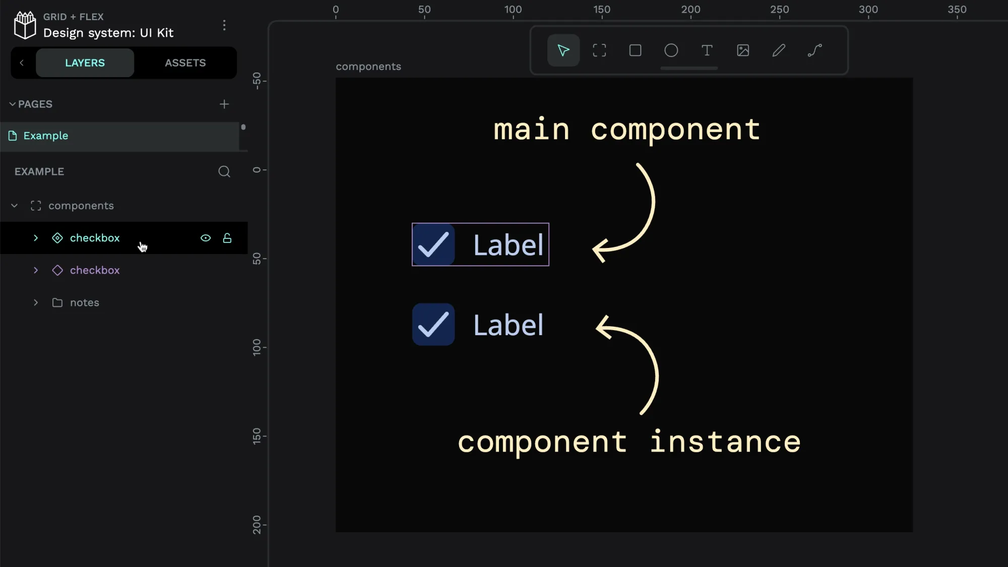
A main component is your component’s source of truth. You can create a main component by right-clicking an object or group and choosing Create component or using the keyboard shortcut.
Any object on the canvas can be a component unless it already contains a main component.
By default, your component will have the same name as the layer you used to create it, but you can rename the component by renaming the main component’s layer.
Penpot won’t stop you from creating multiple components with the same name, so consider your component names carefully if you don’t want to confuse yourself or your teammates in the future!
You can switch between the thumbnail and list views in the Assets panel to make it easier to read longer component names. You can also group components to make them easier to organize and browse.
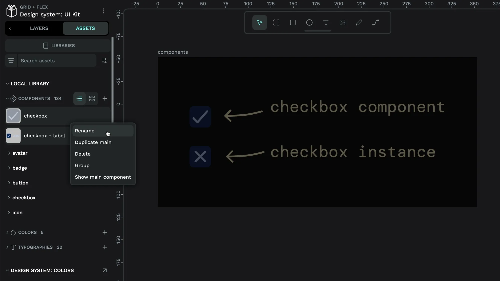
Component instances
Once you’ve created a component, you can use instances of that component in your design by dragging it from the Assets panel or copy-pasting the main component. Each component instance will have the same layer name as the main component, but you can rename the layer if you want.
When you right-click a main component, you have options to:
When you right-click an instance of a component, you have options to:
- Show the main component in the viewport.
- Detach the instance so it is no longer connected to the main component.
- Reset overrides to reset the instance to match the main component.
- Update main component to change the main component to match the instance.
Nesting components
You can nest component instances inside main components, which is essential for more complex patterns and maintaining design systems. For example, in my checkbox example, the checkbox and label are components, and the checkbox itself could be a component, too.
Layout components
You can even save Flex and Grid layouts as components. Read more about layout components in my tutorial, and download a template full of layout component examples.
Component variants
If your component instance has a specific style or state you want to reuse elsewhere in your design, make it into its own reusable component variant.
Organize components
When working in a team, it’s helpful to provide documentation so your teammates understand the use cases and intention behind your component.
Naming components
Naming components is difficult. The number one rule is ensuring your whole team agrees on a shared language that helps everyone name new components and find existing components.
Here are a few tips I’ve found that help me when naming my Penpot components:
- Keep the names descriptive but concise and readable. For example, avatar is more specific than round picture.
- Choose names based on meaning rather than visual features such as color or pixel size. If you change the visual design later, you don’t want the component name to lose relevance. For example, blue button won’t age as well as primary button.
- Create naming conventions by reusing the same keywords for related components. For example, card overview hovered and link underlined hovered makes it easy to find all components with a hovered state.
- Use words separated by spaces to help you easily find the component when you search using a keyword. For example, check icon is easier to find than check-icon.
- If you repeatedly use the same keyword, it might be easier to create a group of components with that shared keyword as the name.
- Group components to make them easier to find, browse, and load faster during browsing.
Alternatively, you can find the component in the Assets panel and right-click it to rename, group, or delete the component.
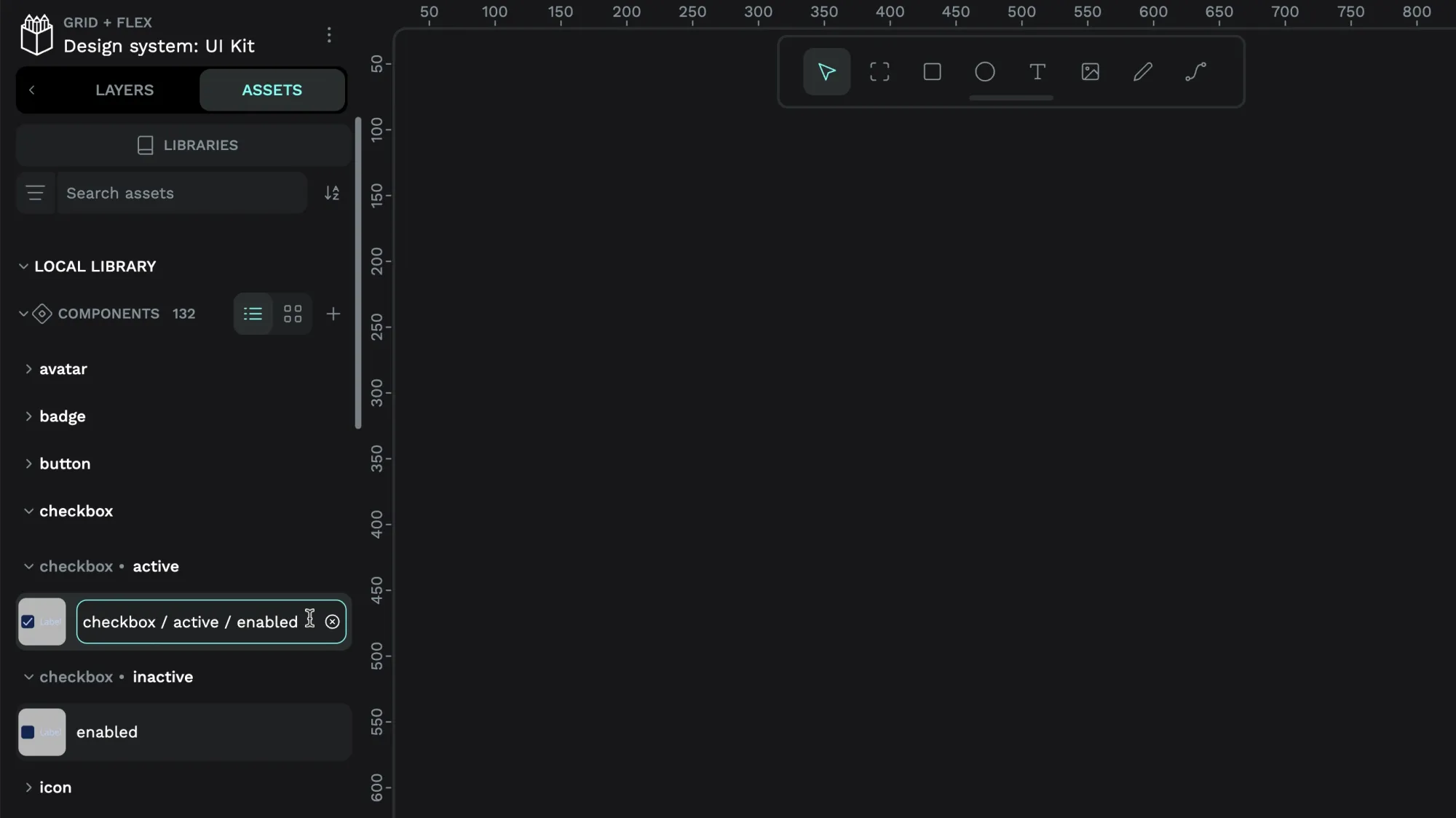
Grouping components
You can group your Assets, including components, into groups and sub-groups using slashes in the asset name. For example, a component named checkbox / active / enabled will appear as a component named enabled inside the active group inside the checkbox group. You can nest groups as deeply as you like.
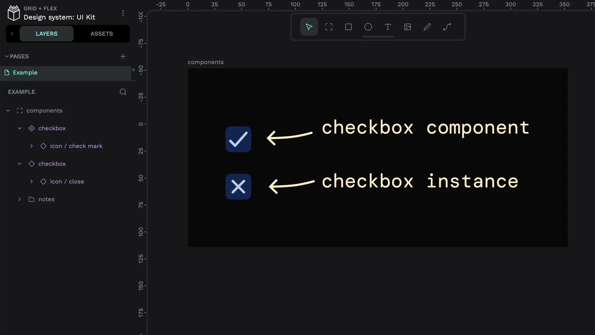
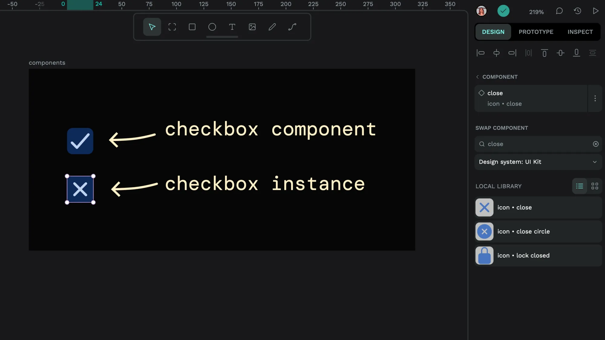
Component swapping
Nested components pair nicely with component swapping. For example, I could nest an icon component inside the checkbox component and then quickly swap the check icon out for the cross icon.
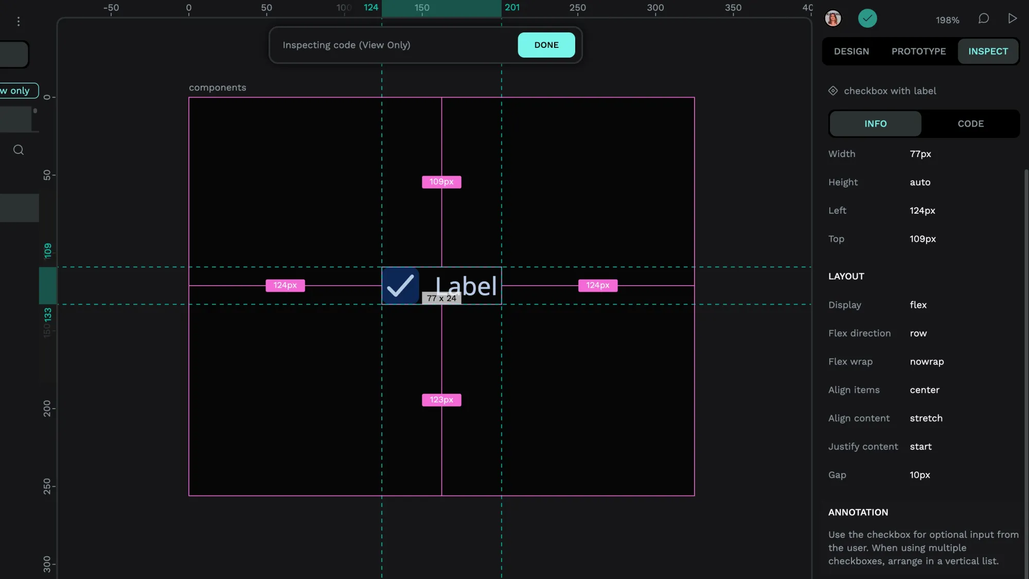
Annotating components
Annotations can also help you remind your future self how to use that component! You can do this from the Design panel:
- Select your component on the canvas.
- From the component menu in the Design panel, choose Create annotation
- Enter your annotation text (maximum 300 characters.)
- Use the check icon button to save your annotation text.
Once you’ve added an annotation to your component, it is displayed in the Design and Inspect panels whenever the component is selected.
Publish your components as a shared library for your team
Our user guide explains how to publish shared libraries with your team. You can also read my tutorial on shared icon libraries for how to:
A component library and organized assets are a great starting point for your design system with Penpot. With a free Penpot account with unlimited seats, you can share your design patterns with your team today.
Related Blogs
Check out our other blogs, from informative topic guides to tutorials on how to get the most out of Penpot.
 Laura Kalbag
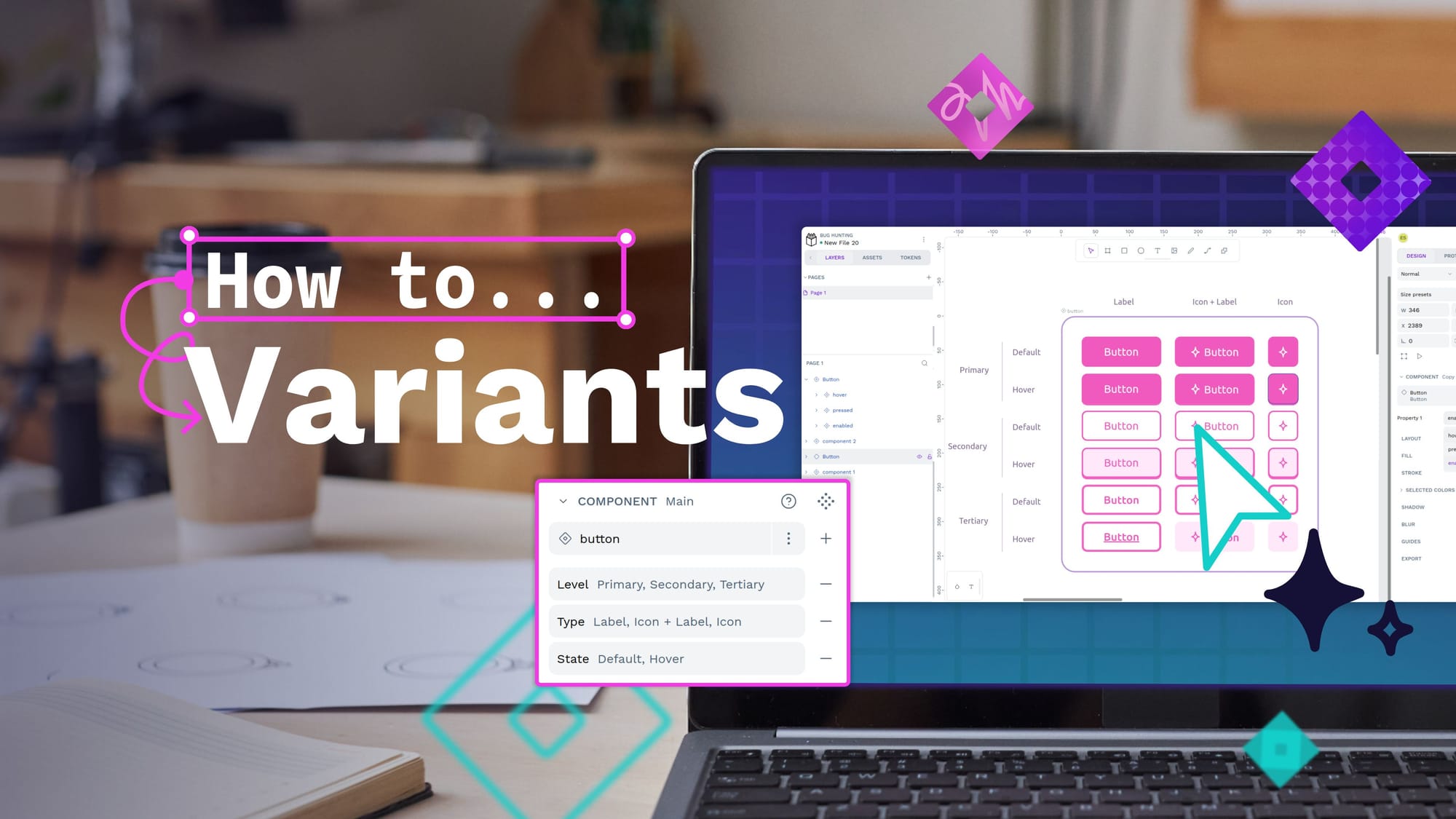
 Laura Kalbag
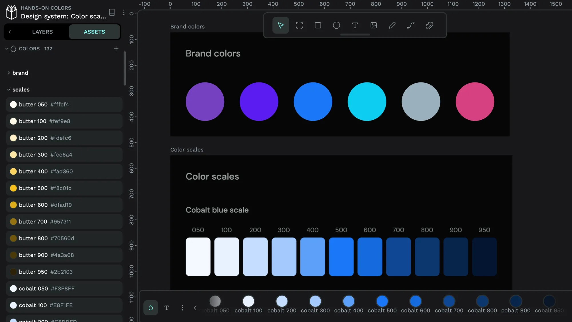 Laura Kalbag
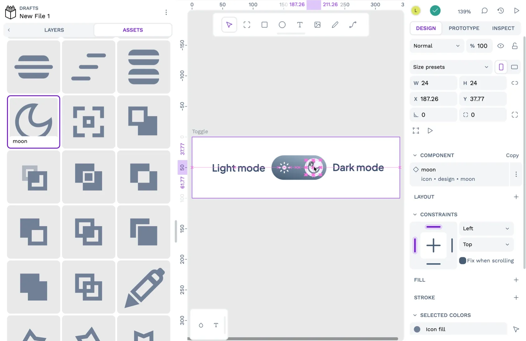 Laura Kalbag
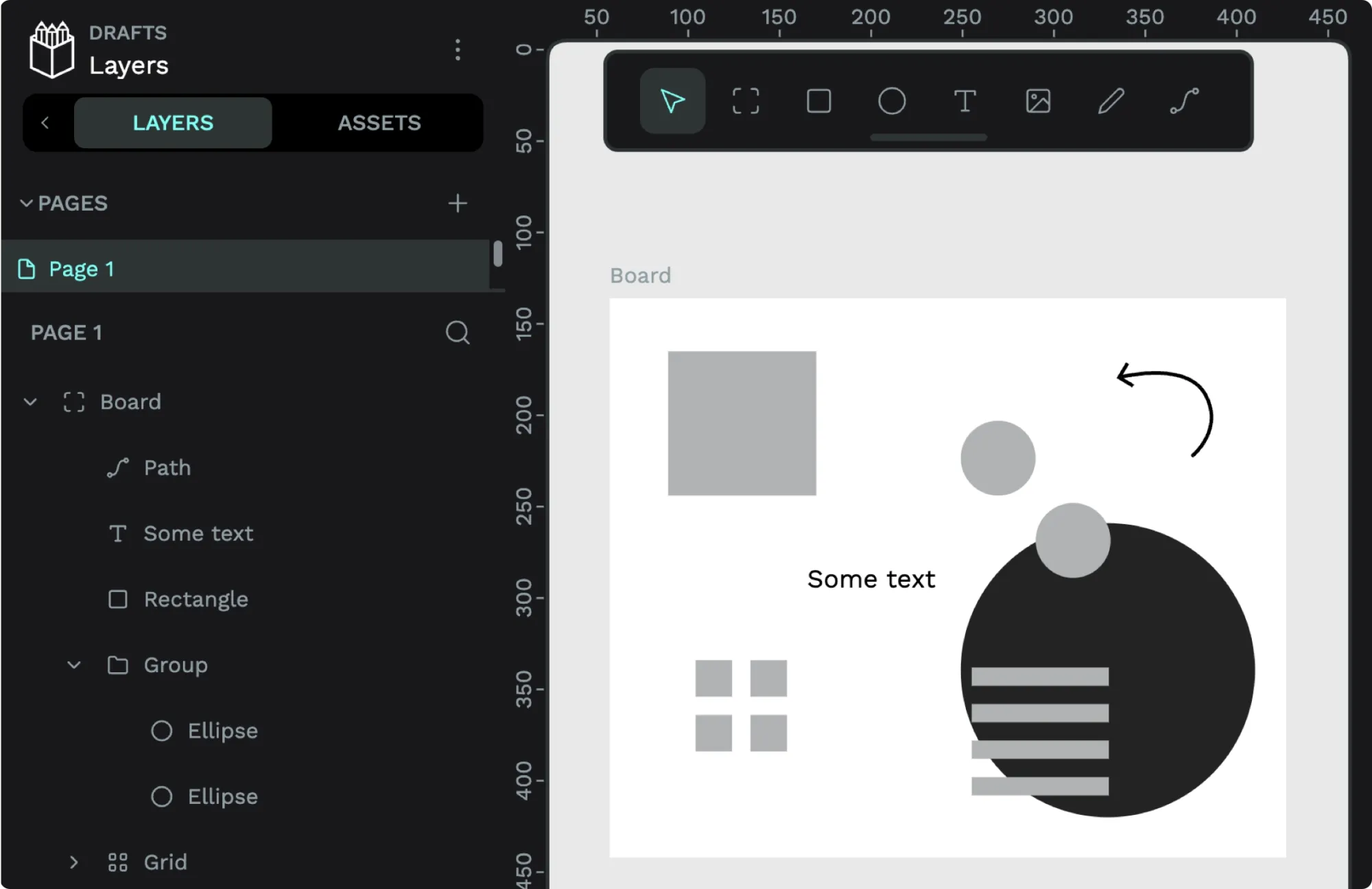 Laura Kalbag