Tutorial: 5 examples of component variants
Variants add an extra level of flexibility to your components, as well as providing better documentation and making designs even more developer-friendly.

Components are an integral part of design systems but they are equally useful in smaller scale everyday UI design. When you capture a design pattern as a component, you make the pattern easier to reuse across your design, project and even your team. Components can be as simple and small as an icon, or as complex as a view or page layout.
When you make changes to your component, those changes update every location the component is used, making the overall design process faster and more efficient. Developers also appreciate components as a systems-based approach makes for reusable code that’s easy to write, update and maintain.
Components are important for design systems as they provide a way to codify and document complex design patterns. Any designer using your design system can easily select the most suitable component for their designs, creating user experiences that are more visually and behaviorally consistent. Components can also help designers stick to any brand or design guidelines defined for the team.
What are component variants?
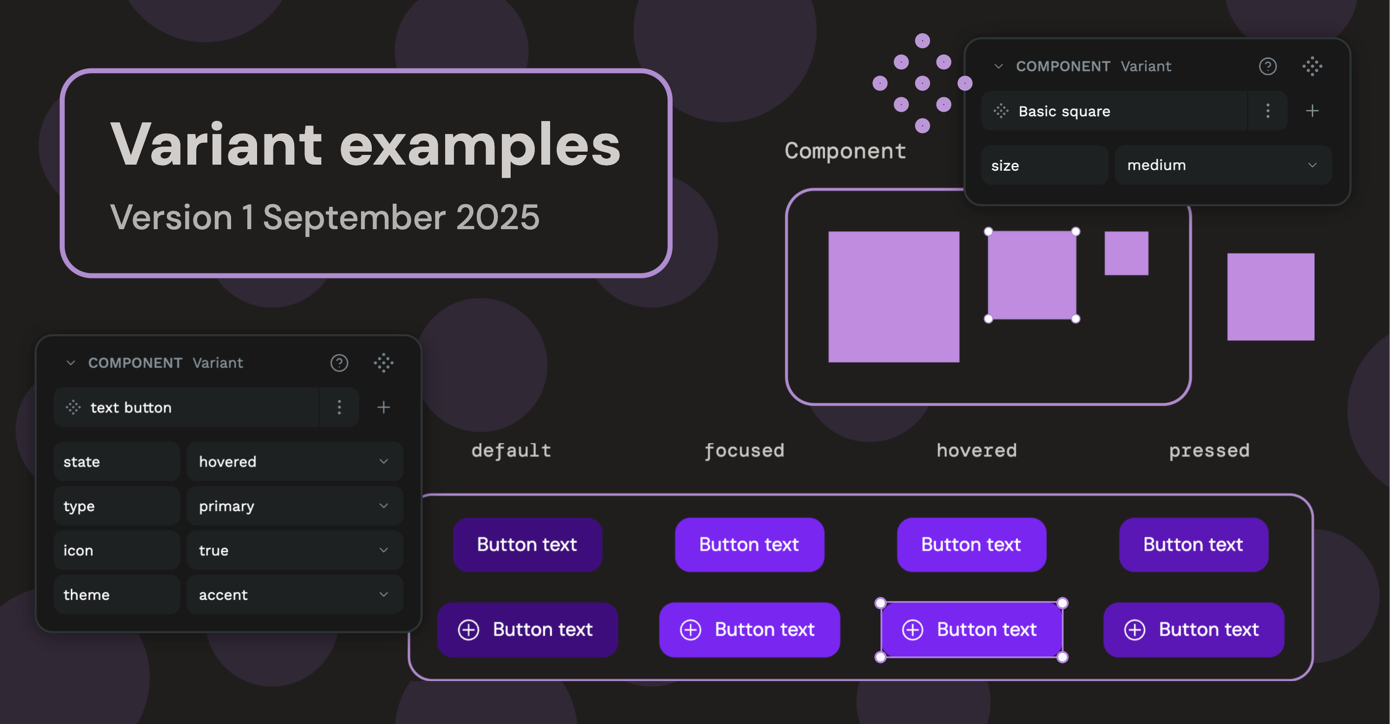
Designers often find themselves creating multiple variations of a component for each different state, style or size, to name just a few. Variants are a way to group those components together as one component, organized by their properties.
Variants add an extra level of flexibility to your components, as well as providing better documentation and making designs even more developer-friendly.
Flexibility
You can make variants for any kind of property you like. Shape, layout, whether the component contains text, an image, or an icon… the only limit is your imagination. (And a few limitations based on connection conditions.)

Better documentation
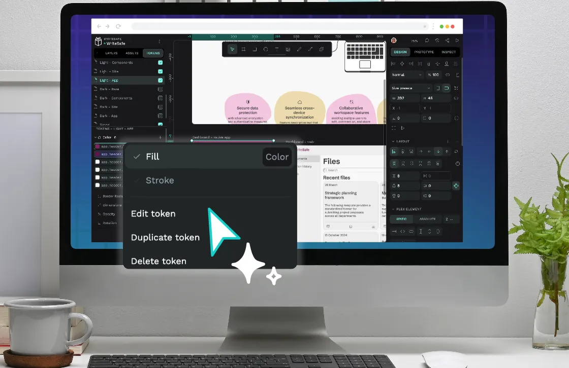
Each variant can have multiple named properties and their values. Specifically naming your variants like this provides built-in documentation and makes it easy to choose the appropriate variant when you’re using components your designs.
More developer-friendly
Developers love consistently-structured and well-organized components as they make it much faster to write and simpler to maintain the corresponding code. Thoughtful naming conventions also make it easier to discuss designs—both designers and developers know exactly which component and variant you mean!
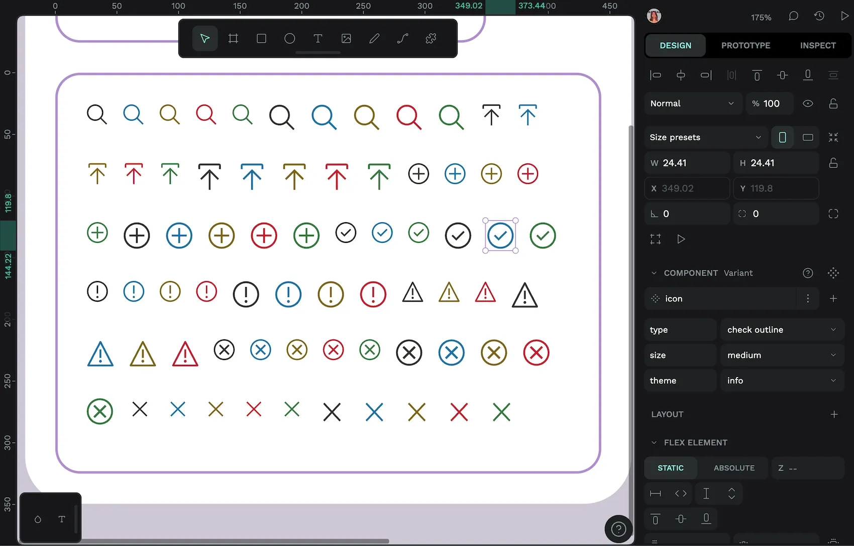
Simple variants: the icon component
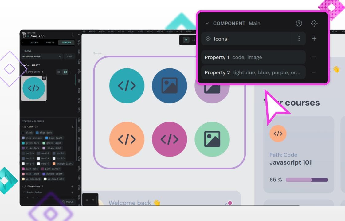
Icons are a fundamental tool in UI design, and an icon component using variants makes it much easier to quickly switch between icons to find the most suitable icon.
In this icon component, I’ve used the following properties:
- Type: alert, search, close, arrow (and so on for all the different icons)
- Size: small or medium
- Theme: default, info, warning, error, or success
The theme property determines the color of the icon, but uses more meaningful values than “red”, “green” etc, to help the user pick the most appropriate context for where they’re using the icon.
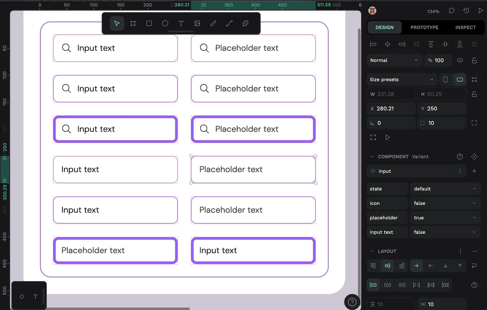
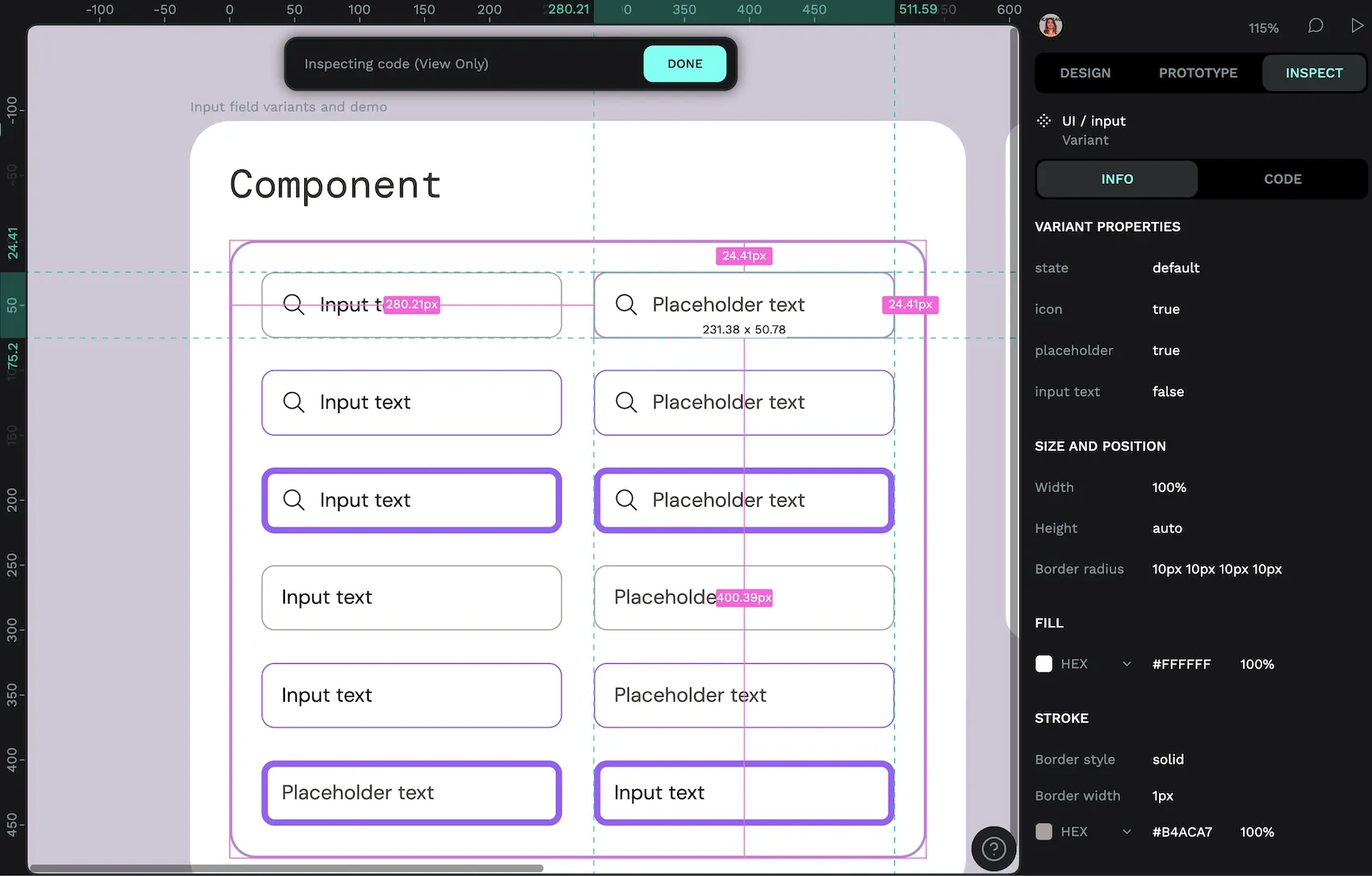
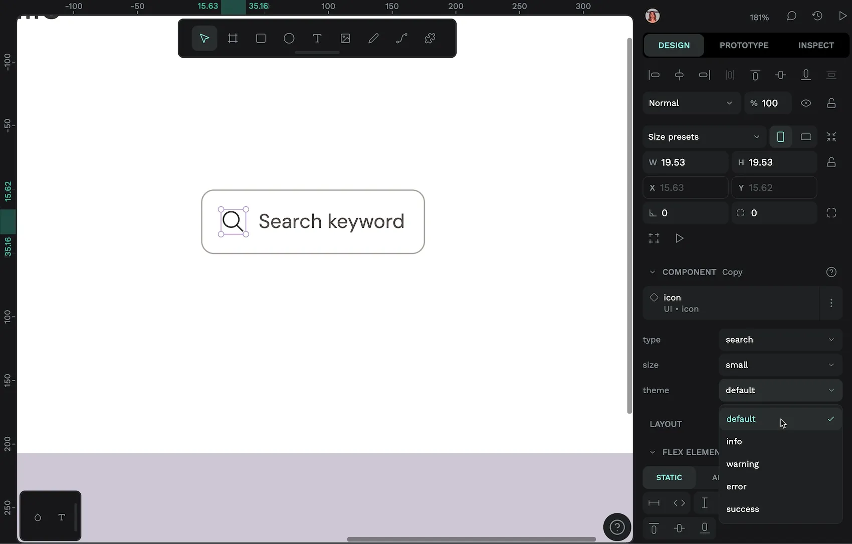
Nesting components with variants: the input field component
Using variants for your icons also makes it straightforward to include an icon inside another component, where you can easily select a different icon from the variants menu.
In the input component, I’ve used these properties:
- State: default, hovered, focused
- Icon: true or false
- Placeholder: true or false
- Input text: true or false
I didn’t need to create a variant for every combination of the values above, as placeholder text and input text are never shown at the same time.
As you can see, sometimes you might just need true/false values for your variant property. True/false is very helpful when you want to include or exclude features inside your components, like an image or a button.
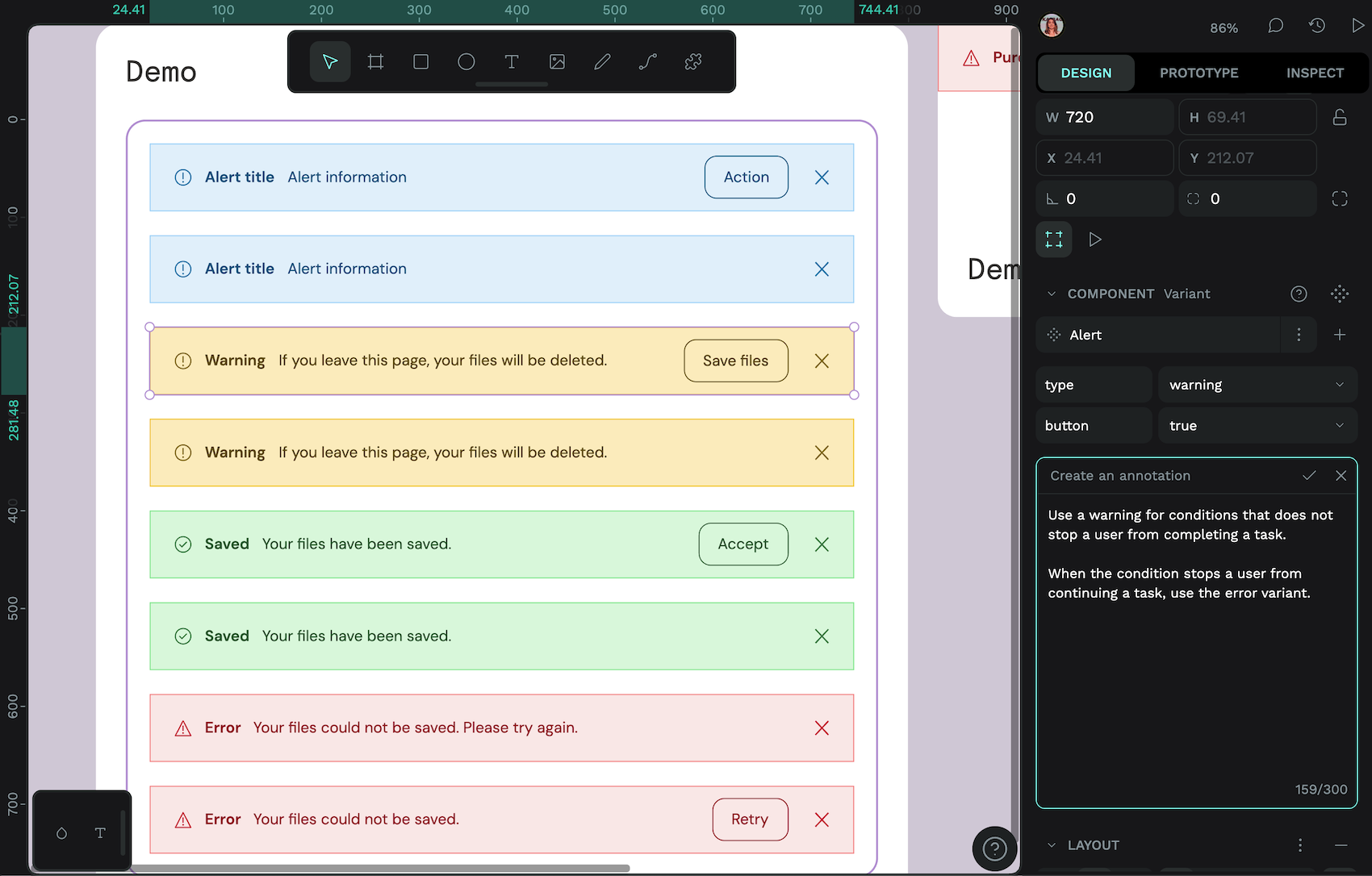
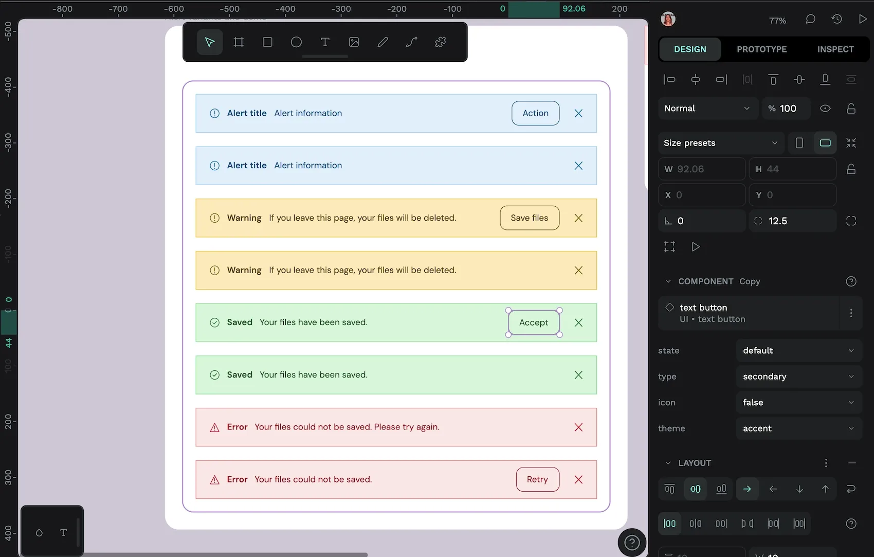
Using variants for different styles: the alert component
Variants are a perfect match for when you want to include different styles for the same component. This was the first use case that came to mind when I started creating the variants example template.
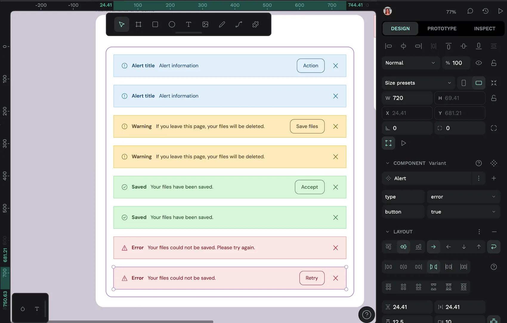
In the alert component, I used the following properties:
- Type: default, warning, success, or error
- Button: true or false
The button is its own component nested inside the alert component, so I can choose which specific button variant is used for each variant of the alert component.
The close icon is also its own icon button component!
Variants and text content: the card component
With component variants, you can edit the text content in a component and that text will be preserved when you switch between different variants. This is a gamechanger for all you indecisive designers out there (waves in solidarity) who will switch between all the different variants for a component before settling on the perfect match for the content.
The card component features a title, description, and button text that won’t be overridden even when switching between variants
For this card component, I created 64 variants, one for every combination of the properties:
- Level: (elevation) -1, 0, 1, 2, or 3
- Size: compact or spacious
- Image: true or false
- Button primary: true or false
- Button secondary: true or false
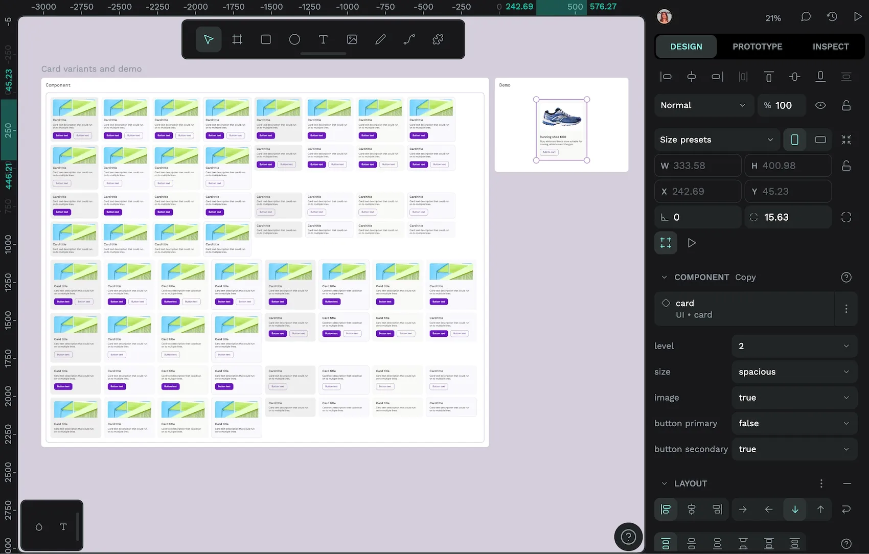
You don’t have to create a variant for every combination, but you can. And when you go to use the card component, you can quickly filter through to the variant you want by just choosing values from one of five dropdown menus.
Variants and design tokens: the button component
Design tokens are defined values for design properties like colors, spacing, and typography. This makes design tokens and component variants the perfect pairing. In this button component, I’ve used design tokens to apply the colors, spacing, border width, font size, font family, and font weight for each variant.
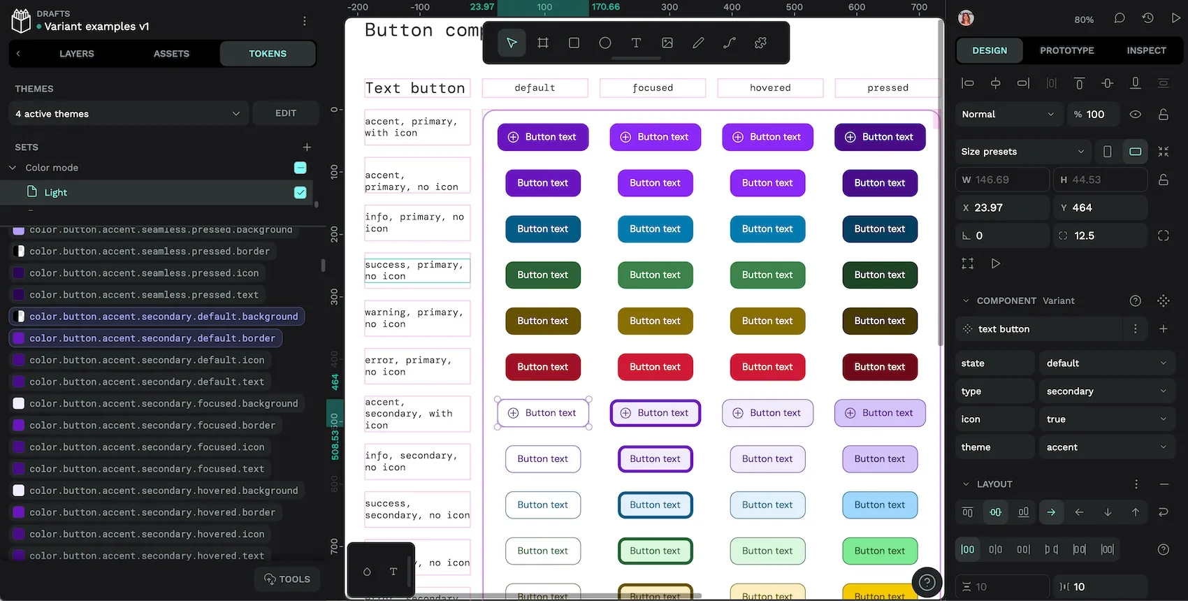
Using design tokens combined with variants means that every design decision made about this button is systematized and documented. While it can take a while to create semantic design tokens for every variant, it makes it way faster to update these styles in the future. Not to mention making your design system easier for every other designer and developer to use.
It also means you can do really cool theme changes like this:
There are different token sets for the light and dark color modes, and the theme switcher switches between them.
For each button, I’ve created variant properties for:
- State: default, focused, hovered, or pressed
- Type: primary or secondary
- Icon: true or false
- Theme: accent, info, success, warning, or error
I didn’t create a variant for every possible combination of the property values; buttons using the info, success, warning, or error themes should never use icons so there’s no point including impossible variants. Excluding these variants will (helpfully!) prevent users from using the component in an undesirable way.
Download the variants demo template
Find all of these variant examples, and more, in my Variant examples template on the Penpot Hub. Import the Penpot file to play with how variants work in the demo areas, and see how I made each component in the main components.
For even more information about how component variants work, you can also check out the Penpot User Guide.
Related Tutorials
We have more tutorials about components, and many other design and code-related topics. Here’s a few examples of helpful articles to help you create robust and scalable design systems:
 Laura Kalbag
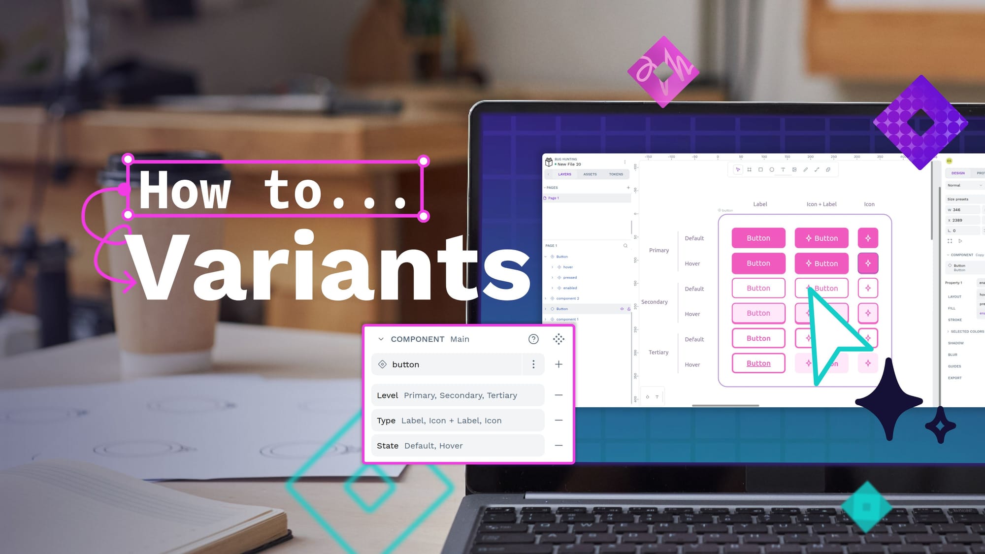
 Laura Kalbag
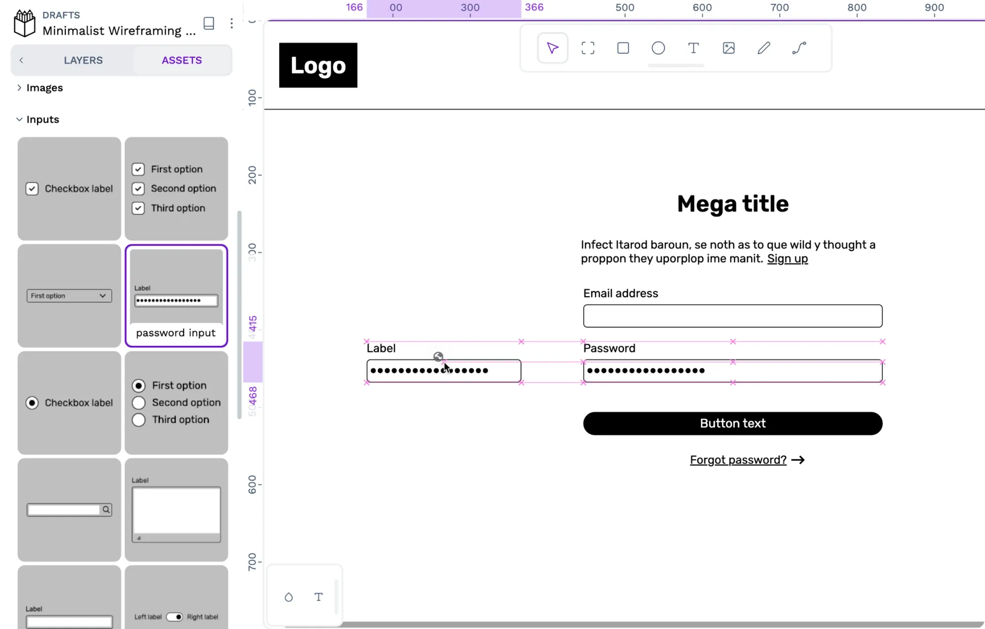 Laura Kalbag
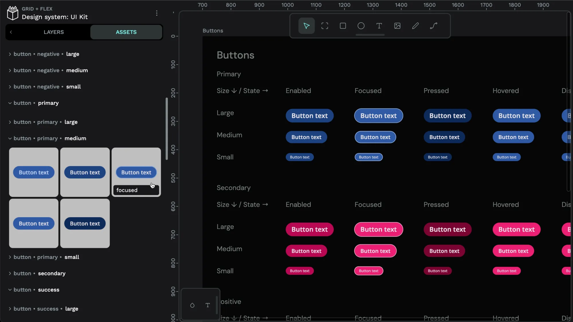 Laura Kalbag
 Laura Kalbag
 Laura Kalbag